A Franco-Vietnamese charity.
Association Azuréenne des Enfants du Vietnam (AAEDV, “Azurean Association for Children in Vietnam”) is a Franco-Vietnamese charity, active in Vietnam since 1995.
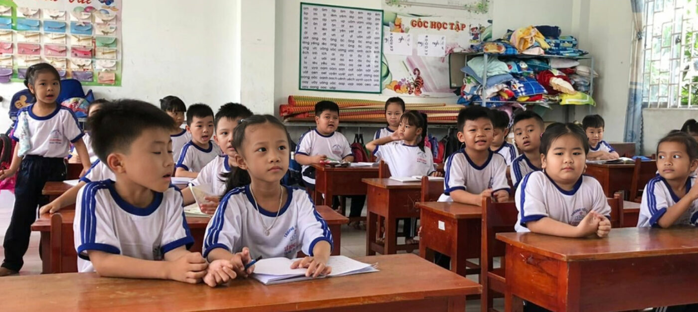
Its main mission is to help children from very modest families in the Vĩnh Long Province, in the heart of the Mekong Delta, a highly agricultural region, located over 180 kilometers southwest of Ho Chi Minh City.
The NGO is committed to distributing scholarships & financial assistance for/to children’s access to medical care.
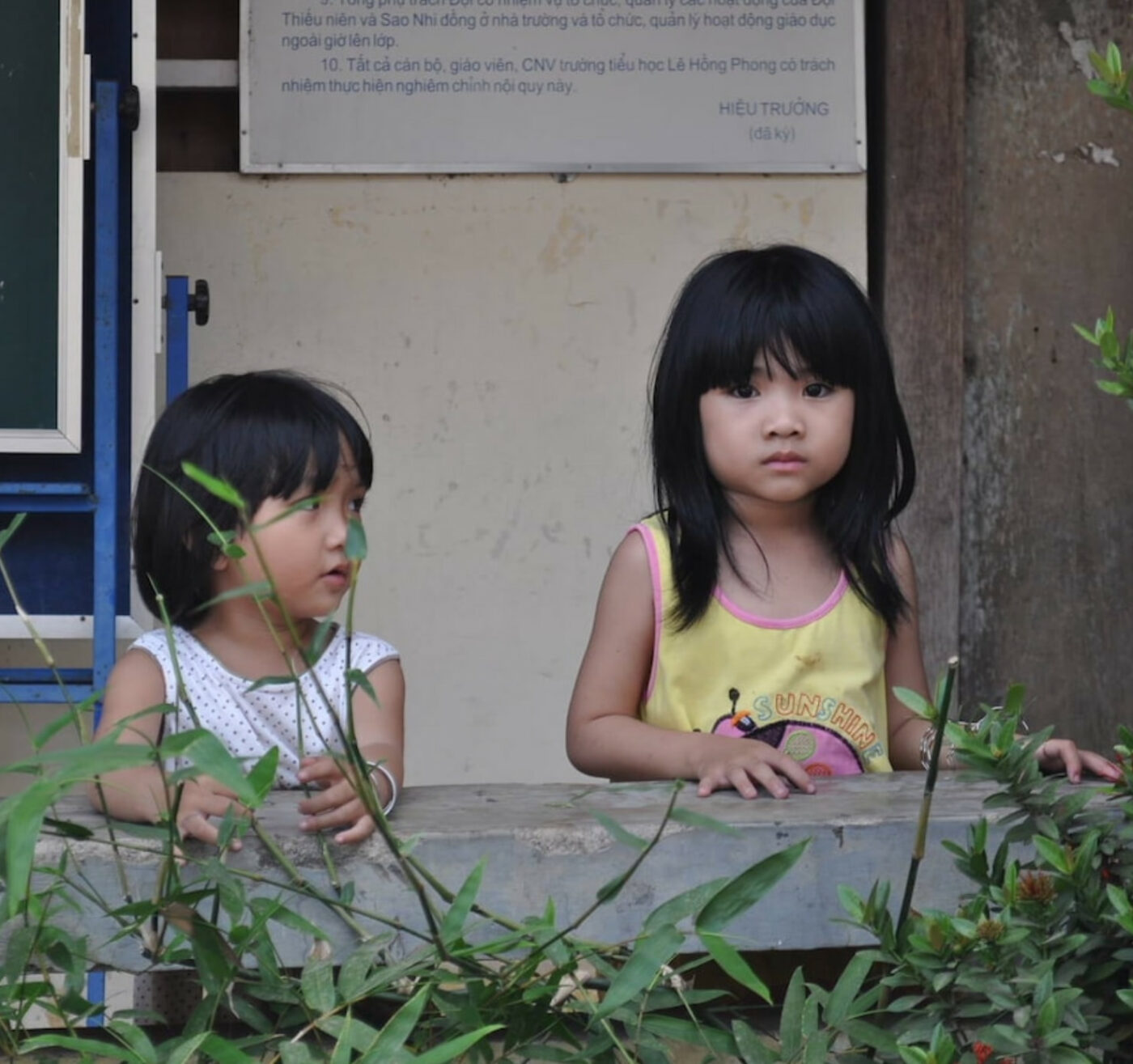
Vinh Long, a remote village.
Vinh Long, a remote province in southern Vietnam, has long faced poverty due to colonization, the Vietnam War, and agricultural challenges. Government efforts, such as economic reforms and poverty alleviation programs, have made progress in improving living conditions, but more work is needed to eradicate poverty and reduce inequalities.
This is why the AAEDV charity, since 1901, started building bright futures for vulnerable children in Vietnam by developing educational campaigns from the grassroots, to help children remain close to their families.
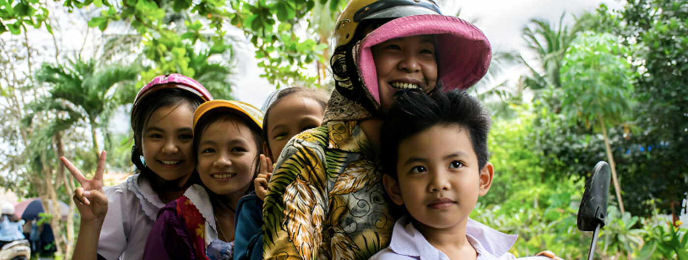
A journey to kindness.
To bring more visibility and recognition to the association and thus increase donations, AAEDV needed a new visual identity that better represented its commitments. An identity synonymous with a fresh start and bringing more meaning to their actions.
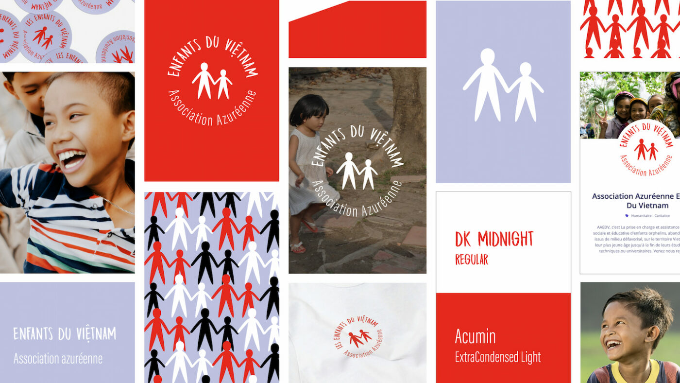
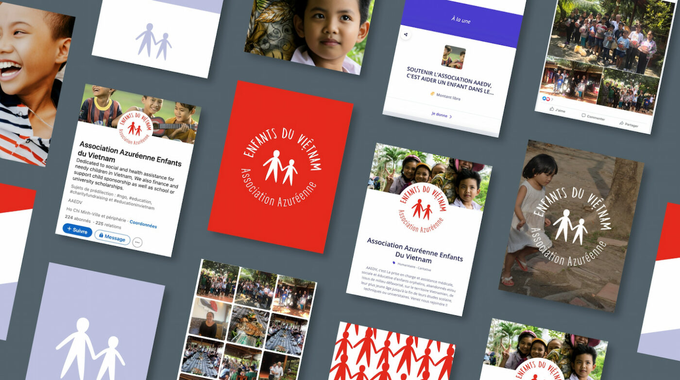
This is where CBA comes in to support the association on this trajectory. CBA created a clean, more emotional, and concrete design that aligns with their image and their actions in support of underprivileged children in Vietnam.
The main objective was to create a connection between the association and the public.
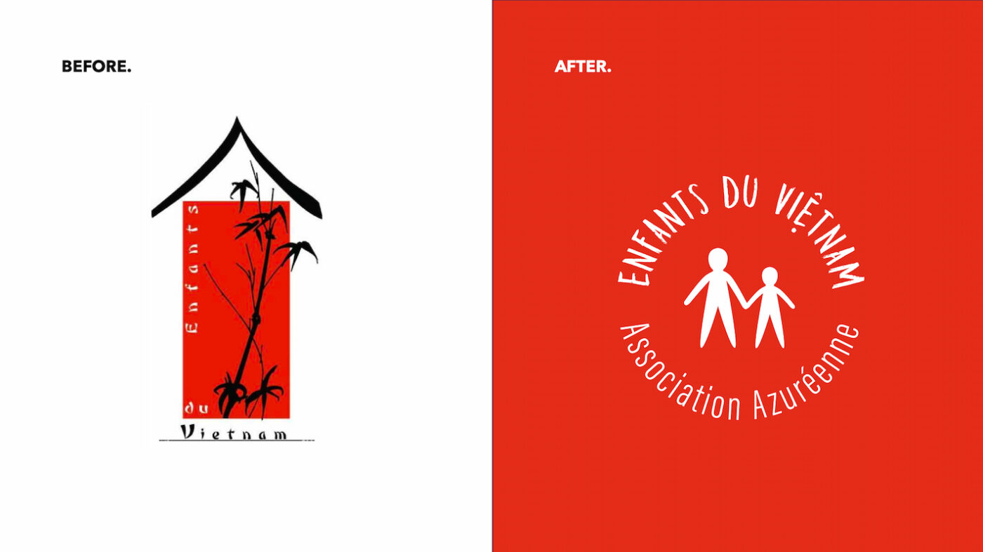
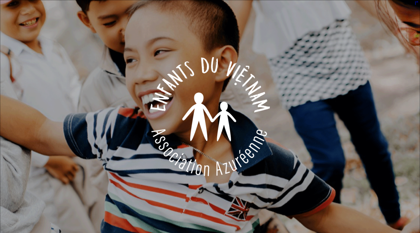
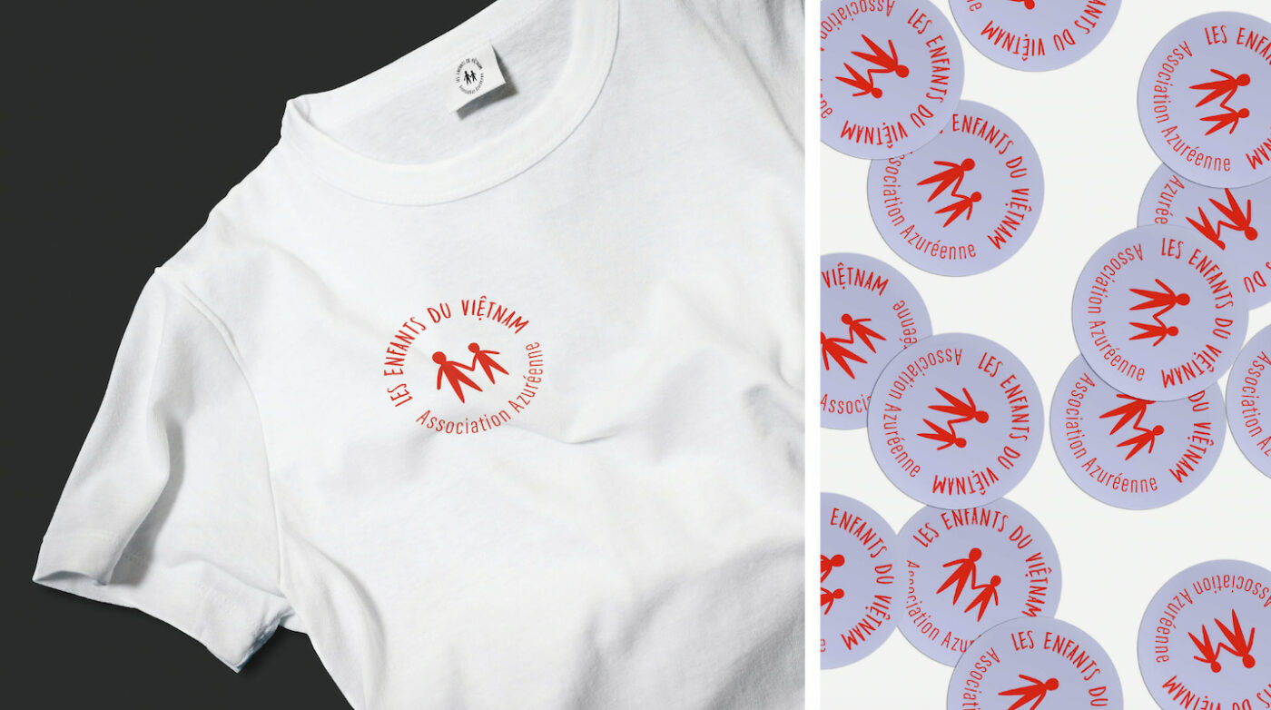
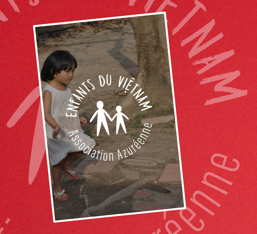
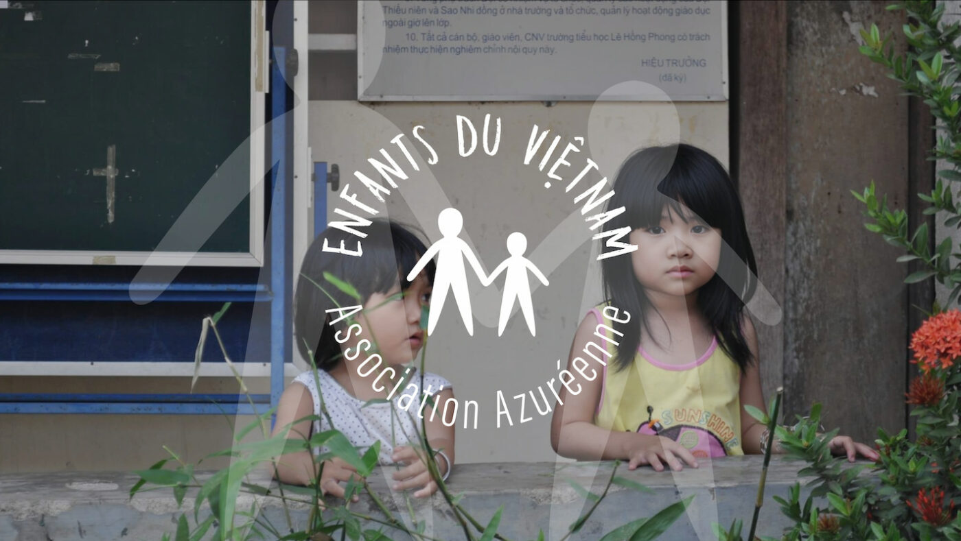
As the founder was very attached to the existing logo, our teams used it as a starting point, evolving it to make it more modern and meaningful, giving it more roundness and adding elements such as an adult and a child, which are significant of the association’s primary mission.
An emotional branding.
CBA has opted for a lighter, more modern typography, while retaining iconographic features such as the “hat” on the Vietnamese “E”, which was originally created as a metaphor for the foster home.
It is also a nod to the pronunciation of the word in Vietnamese.
CBA deliberately chose to keep the red colour of the initial logo as a transition since it is considered in Vietnam as a strong color with a positive connotation.

A meaningful journey.
The charity has received six donations and numerous financial supports since the rebranding. Their commitment and missions have become more understandable to the public thanks to the new visual identity which was relayed on the charity’s social media platforms.
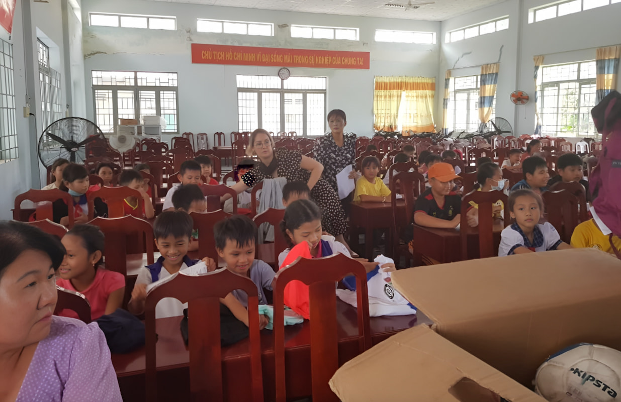
Following the rebranding, two CBA employees continued their charity work with the NGO and Decathlon Vietnam donated more than 14 boxes of donations.
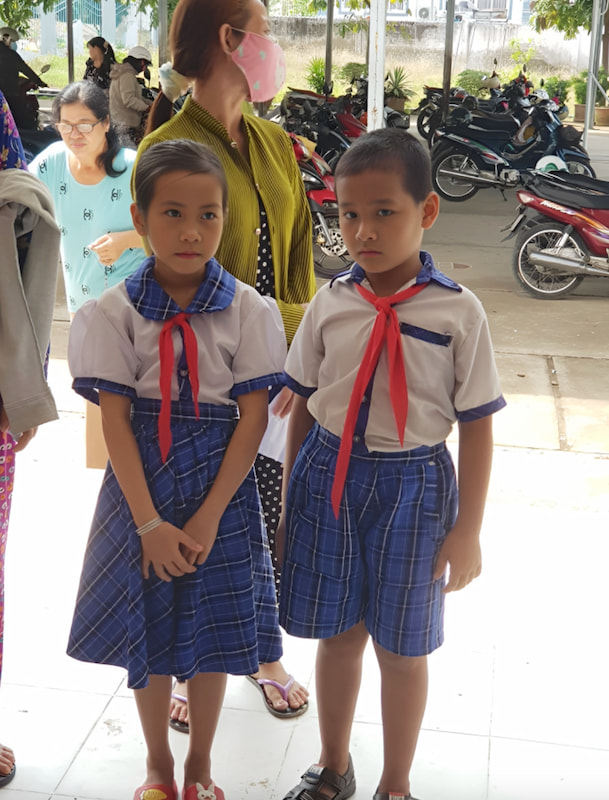
More than 80 children received donations such as balls, rackets, rollerblades, and games!
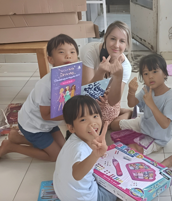

What I found interesting about this NGO is that it is small and that the money goes directly to disadvantaged families to enable them to send their children to school. There are no intermediaries involved, and it is run solely by volunteers. In addition to their primary activity, the charity also organizes fundraising events for exceptional cases, such as the need for medical operations.
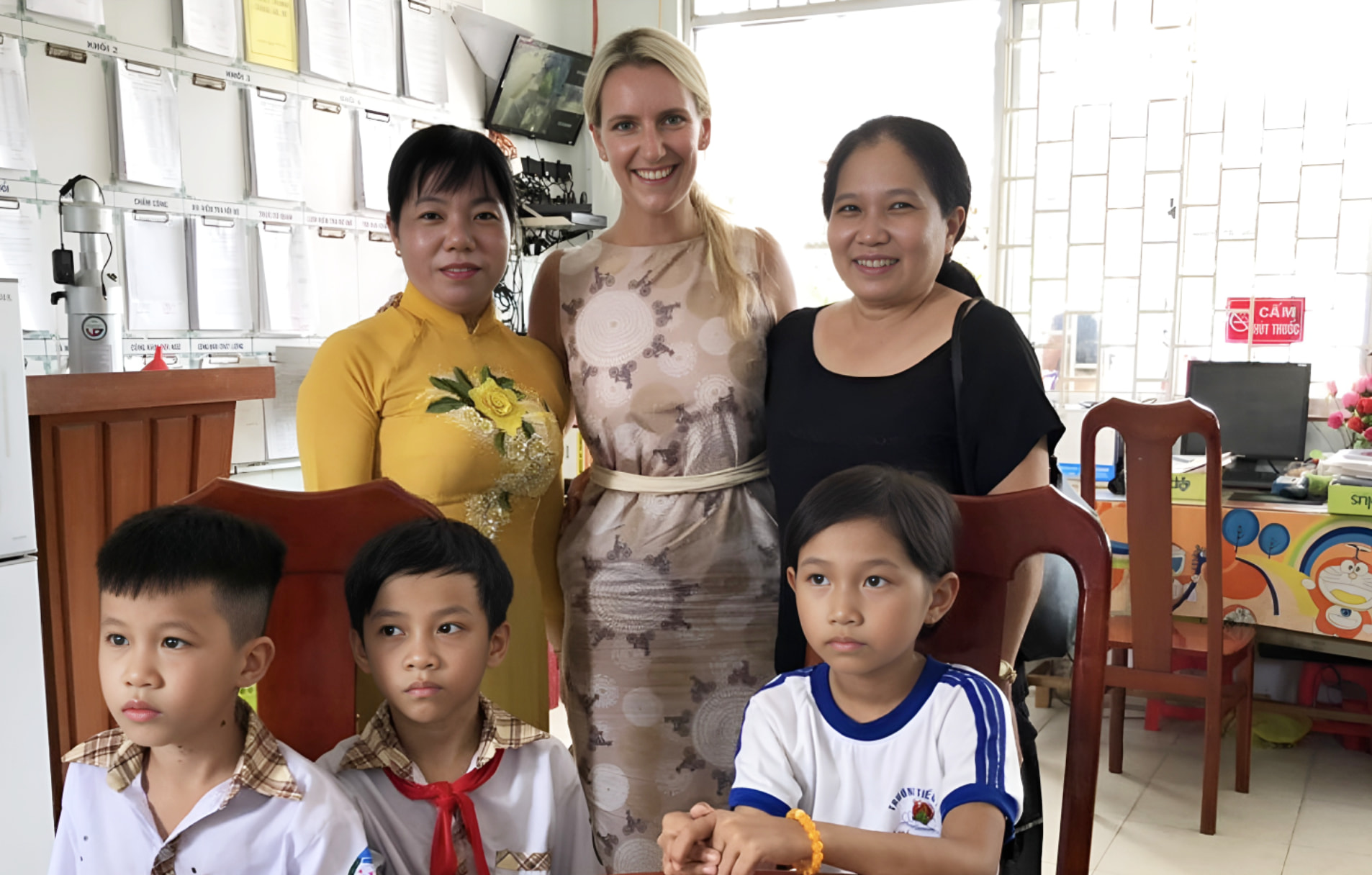
Moreover, on a personal scale, when I joined CBA, we didn't have any projects in Asia yet (except for the Lux project we had won with Paris and London). However, I asked if we could help this NGO, and the answer was positive! This convinced me that I would be happy to work for CBA - because these values are very important to me, aside from the fact that we remain a business and need to generate results.
