How can we design a store that promotes and supports women's empowerment?
The starting point was getting an in-depth understanding of the target market in terms of needs, aspirations and desires in order to design the strategy and visual identity of a new brand, a brand whose ultimate expression is in a concept store synonymous with creativity, self-expression and interaction.
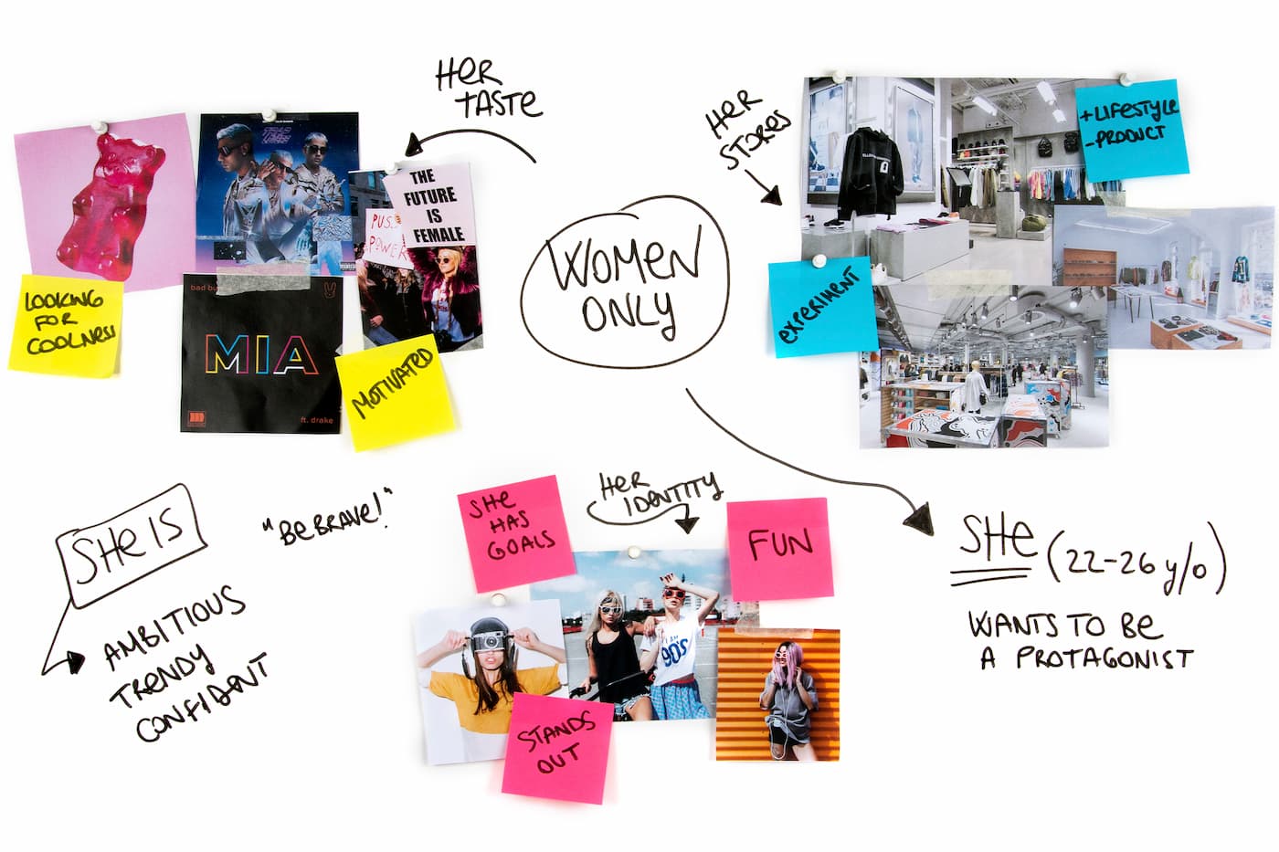
We studied and interviewed the female target market for AW LAB in order to find out everything about them. From music to sport, from their favourite shops to their travel plans, all the way up to the dreams they have for their future, all the information gathered was key to the creation of a Muse: the aspiration target at the heart of the creation of the new brand, a self-assured, ambitious girl who isn’t afraid to experiment with her style and who wants to be protagonist and author of her own future.
So, guided by the Muse, we then focused on the principles through which the brand positioning took shape: a brand dedicated to her which presents itself as an ally capable of providing the motivation and the tools necessary for her to fully express her identity.
There are 3 main characteristics at its heart:
- A strong sense of belonging to a community with shared values and support.
- A great deal of ambition in positioning itself not just as a trendsetter, but also in wanting to help consumers to make their aspirations come true.
- A spontaneous yet confident approach which is close to the consumers and capable of speaking their language.
By virtue of this positioning, we were able to come up with the name for the new brand, HERE, a name which contains the word HER, underlining the attention to women, but which ultimately shows a desire to exist in the here and now, to be close to consumers in their everyday lives.
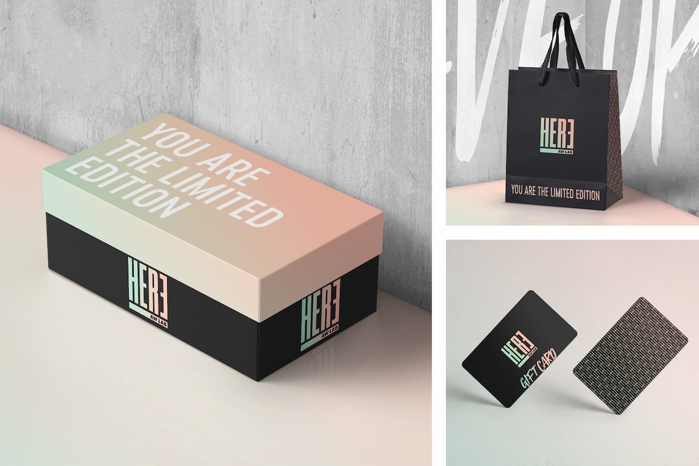
The brand logo is easily recognisable and its precise proportions echo the AW LAB logo. The mirrored final ‘E’ highlights the presence of the word ‘HER’ whilst also representing a woman looking at herself and the expression of her individuality in the mirror.
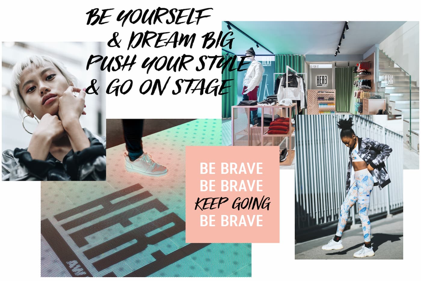
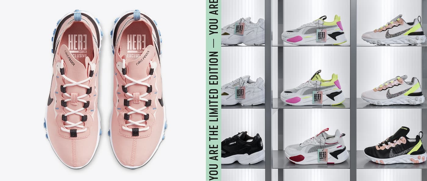
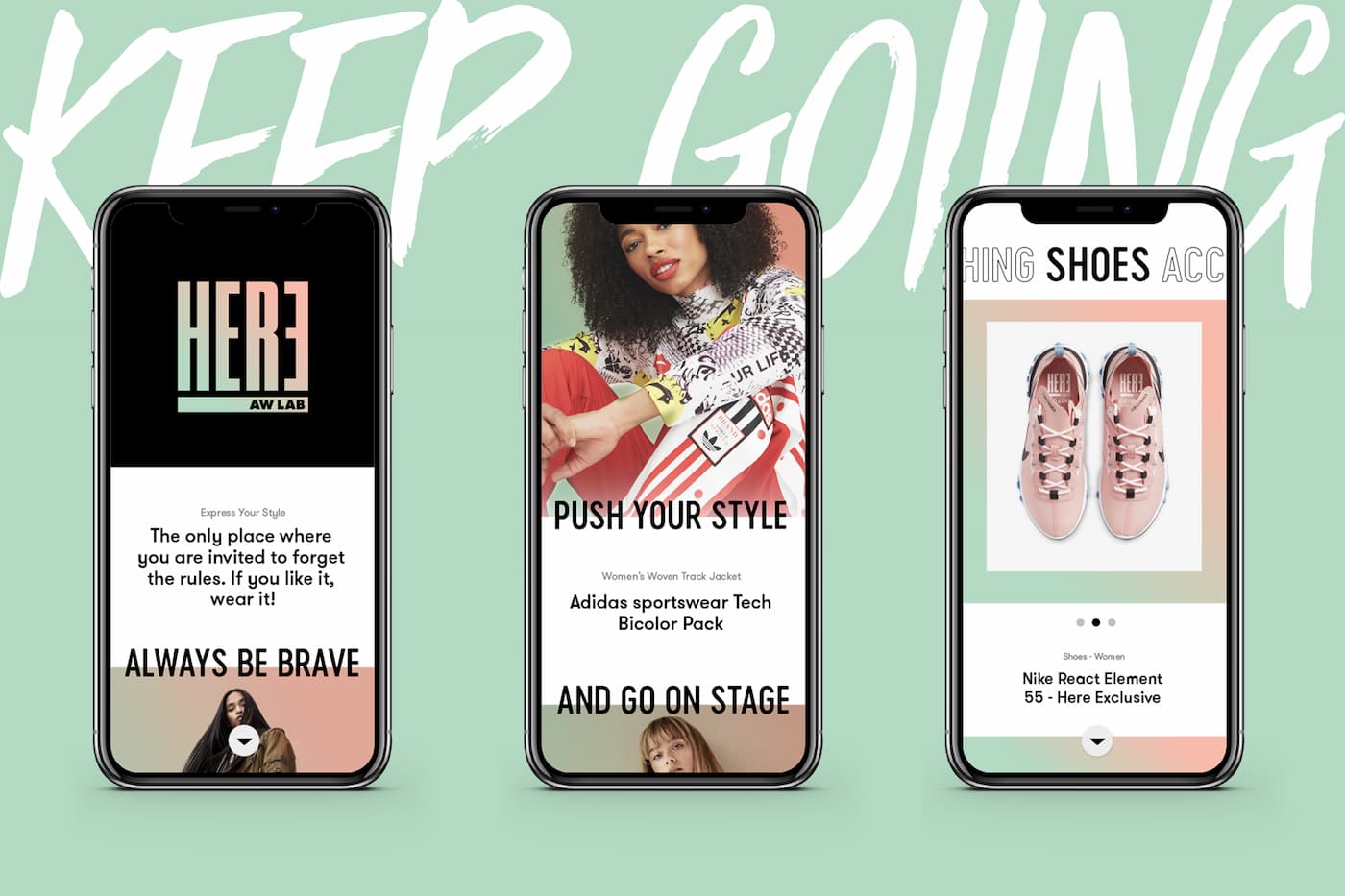
The colour palette, which is applied to all the materials, shows the strongly feminine personality of the brand, whilst the use of 3 different yet complementary typeface families, along with an iconic and unfiltered photographic style, provide an expressive language capable of giving a voice to the street style culture of the brand’s community.
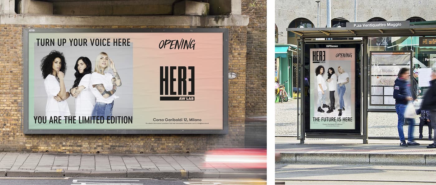
The main expression of the brand exists in the physical space which strengthens and lends a voice to the female community: indeed, Here will play host to talks, workshops, photoshoots, contests and meetings with prominent figures from the art scene, all with the aim of helping young women to nurture their dreams and aspirations.
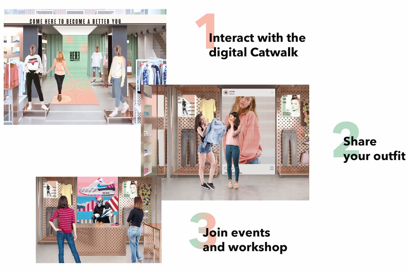
The store experience is determined by a constant interaction with the consumers:
- A 6-metre-long interactive catwalk starts at the entrance, taking visitors through the store in a way that allows them to interact with the dynamic content.
- A digital totem offers visitors the opportunity to share their look on social media and to become the new Brand Ambassador of the community.
- There is an outdoor flexible space which is suitable for hosting events and workshops.
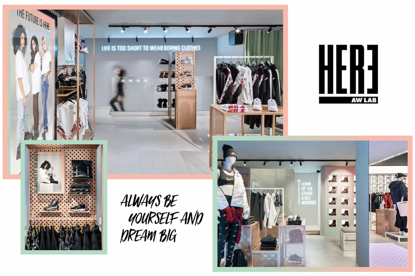
The entrance and ground floor are designed as an exhibition area where custom furnishings show inspiring overall looks. The upper floor, which is also home to a lounge and a make-up station, is designed to be a consulting area where store assistants can help consumers.

