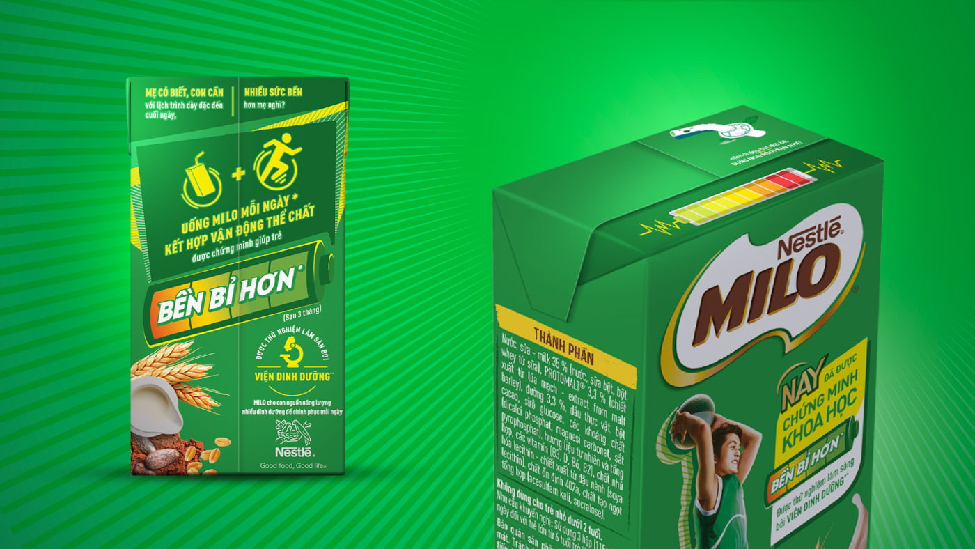
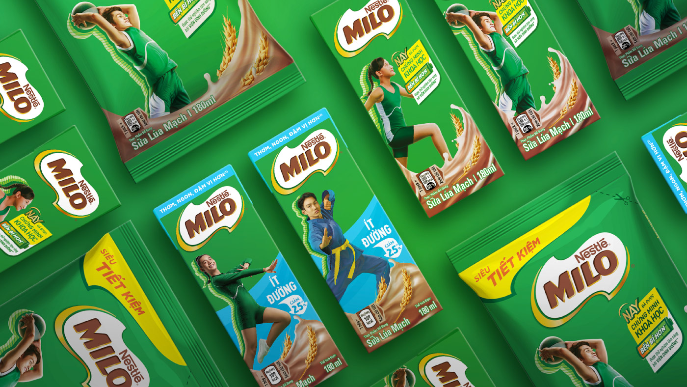
Expressing endurance in a Milo way for the Vietnamese market.
Nestlé Milo is the world’s leading Cocoa Malt Beverage brand. In 2013, CBA was asked to create a consistent global visual identity system for the brand and define a proprietary expression of the brand’s sports territory. The agency created a consistent global brand and packaging design and developed the “Liquid Energy” style as ownable and powerful visual device to communicate on sports in a unique and consistent way.

Owning endurance while reinforcing MILO’s role as a trusted partner.
The current MILO’s packaging design was not resonating with consumers and product’s scientifically proven attributes were not fully explored. Also, the endurance benefit needed to be claimed on pack and properly explained to parents. The design solution needed to be visually connected with MILO’s brand assets, applied on the talent representation while also bringing taste appeal to the packs.
Connecting creative strategy with energetic targets.
The concept “Energetic Endurance” was developed having one bold iconic element that would immediately translate the product’s benefit. As the new Hot Chocolate identity offers a rich and foamy beverage, the evolution of the brand is asserted through a lighter, more connected, and creative logotype.

Vivid endurance and clever iconography.
Following CBA’s Creative Strategy, the new MILO RTB was developed having a bold battery icon that effectively encapsulates the endurance idea. Being eye-catching in a busy shelf environment was one of the key objectives achieved. On top of the battery element, other relevant information was displayed, like the scientific proven and clinically tested benefit. All claims were visually grouped on a RTB device that allows the packaging design to breathe.


On the back of pack, the full brand story was told while all the elements were simplified and the overall layout decluttered, making the information more visual to resonate with young consumers and busy parents.


Electrifying outcome with numbers that endure.
The new MILO Vietnam RTB was used on different touchpoints beyond the pack becoming a key campaign element on the-product’s relaunch. Numeric results also include:
• Reached 79% of the target audience (~ 13M Vietnamese moms) with best-in-class consideration and ad recall uplift.
• Volume uplift of sales out 8% and consumer off-take 5% during launch month (vs. pre-launch period, launching month in Mar-Apr’24).
• Gained 1.8M mentions on social media during 2 months of campaign with maximum sentiment score.
• #1 SOV across social media and TV among liquid milk brands.
• #1 outstanding campaign on social media in Apr’24, according to BSI chart issued by Buzzmetrics social tracking.
An award-winning case.
Our work for Nestlé MILO Vietnam has won a Silver for Transform Awards Asia in 2024, category Best Localisation of an International Brand.
Did you like this project?
Seize the opportunity to provide your customers with an unprecedented experience!

