Since 1925, LUX has been the soap of the stars, bringing glamour to the homes of millions of women. However, in recent years, the opulent expression of glamour & femininity has become dated & out of step with the brand’s purpose. The world is changing and so are women as consumers. Therefore, a shift needed to cater to developing consumers–especially Gen-Z.
Inspiring women to rise above everyday sexist judgements & express their beauty & femininity unapologetically
The billion-dollar Unilever brand, in collaboration with 3 offices of CBA Design –Singapore, London and Paris– sought a full revitalization of its Brand Visual Identity (BVI) to inspire millions to be self-assured, powerful, glamorous, and independent. In addition, the brand’s purpose was redefined to attend social challenges for women around the world: rise above everyday sexist judgements and express their beauty & femininity unapologetically.
A badge of honour
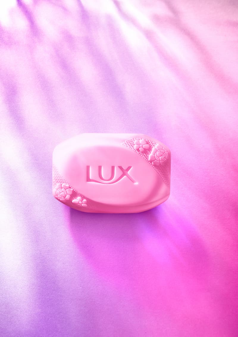
The first step was to elevate the LUX brand logo. We want to wear it like a badge of honour, show the pride we take in our brand and its purpose – not only modernising the feel of the brand but aiding brand recognition and standout.
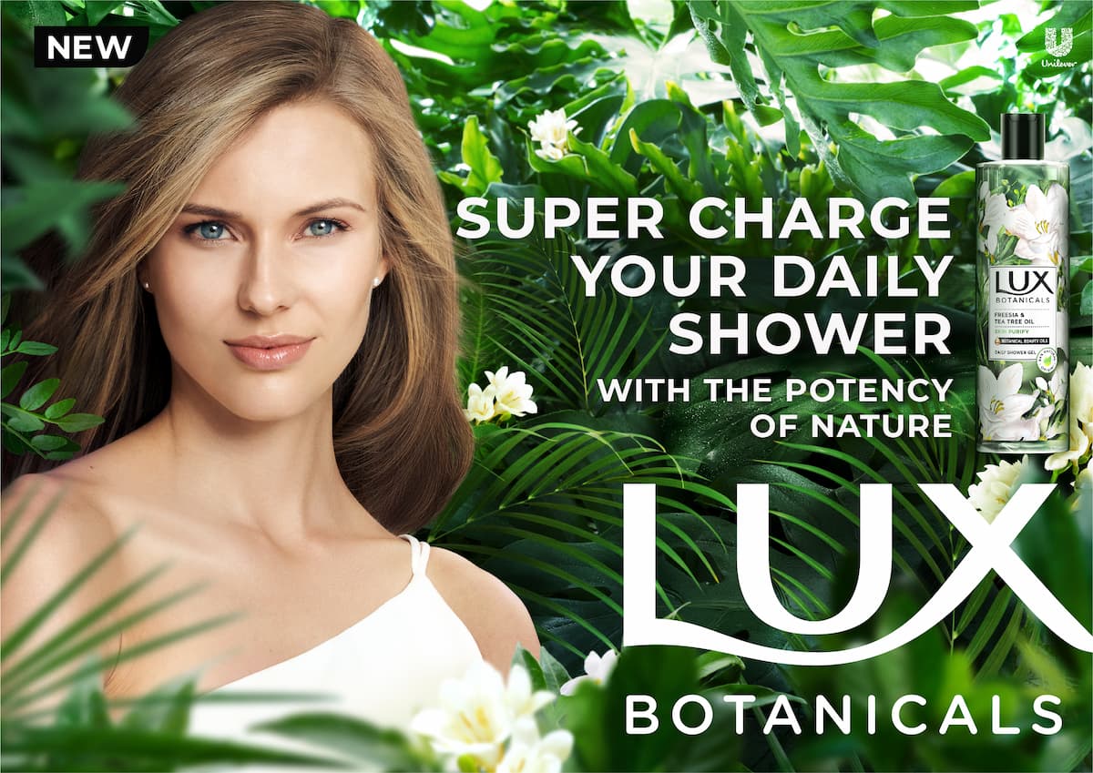
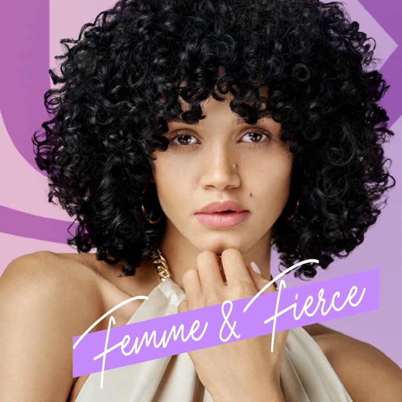
Strong, multi-faceted women are at the forefront of the brand. Women who exude confidence and real glamour by refusing to be defined or limited by their beauty. LUX women are glamorous but relatable to reflect the Millennial and Gen-Z women the brand serves.
To ensure LUX’s purpose is embedded into every piece of creative communication, 4 key creative guiding principles were defined to abide by : knowingly confident, sensorial luminosity, powerful glamour and harmonious contrast.
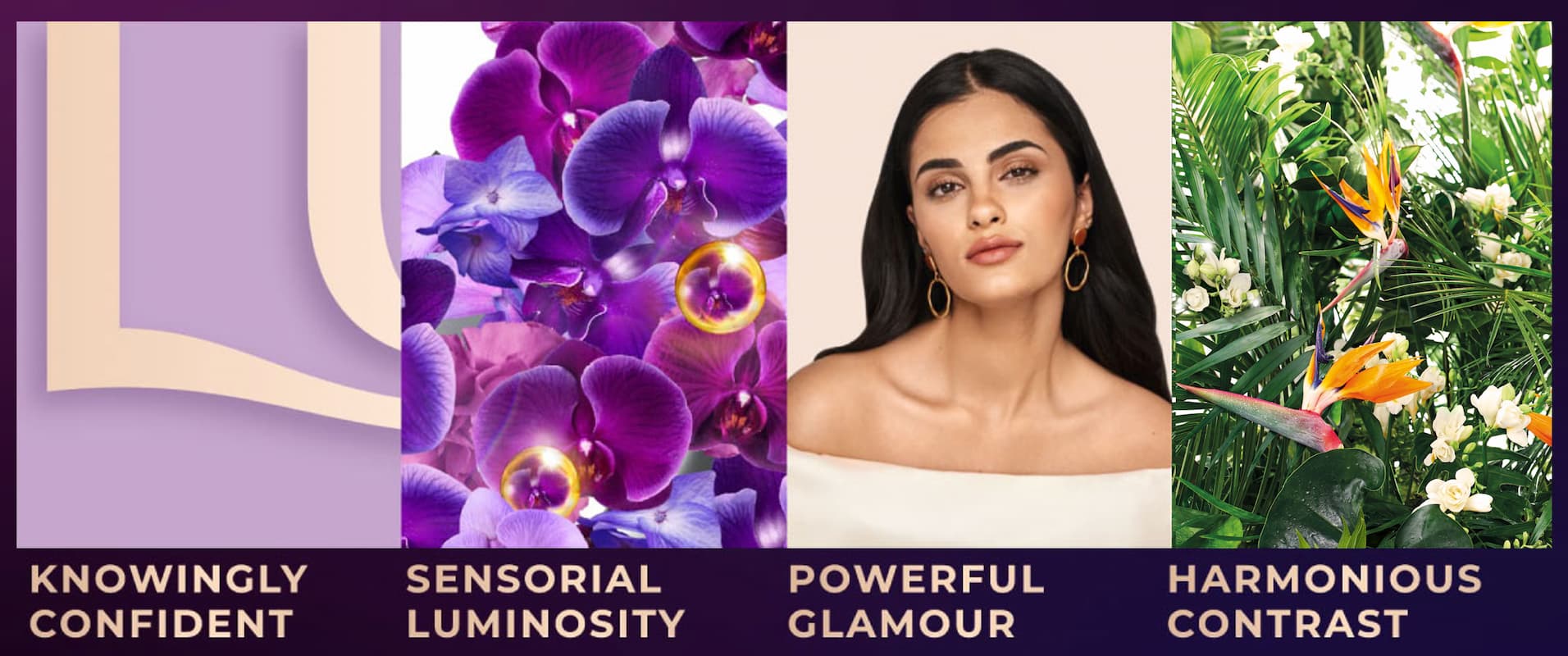

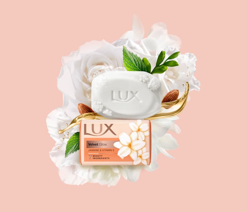
The new LUX masterbrand is born from the best of LUX, brought to life with new confidence, modernity, and purpose. Each product pillar builds from the masterbrand to bring their unique proposition to life. The fine fragrances of the Core Liquids. The delicate glow of Core Bars. The natural potency of Botanicals.
The creative idea is to meet women’s expectations by remaining modern, simple, and elegant while retaining inherent femininity.
- TYPEFACE & ICONOGRAPHY: Modern, simple and elegant to work with the global brand. Ensuring communication is clear and direct whilst maintaining an inherent femininity.
- GLOBAL TYPEFACE: Identifying local language font type for consistency through global applications for China, Arabia, India and Thailand.
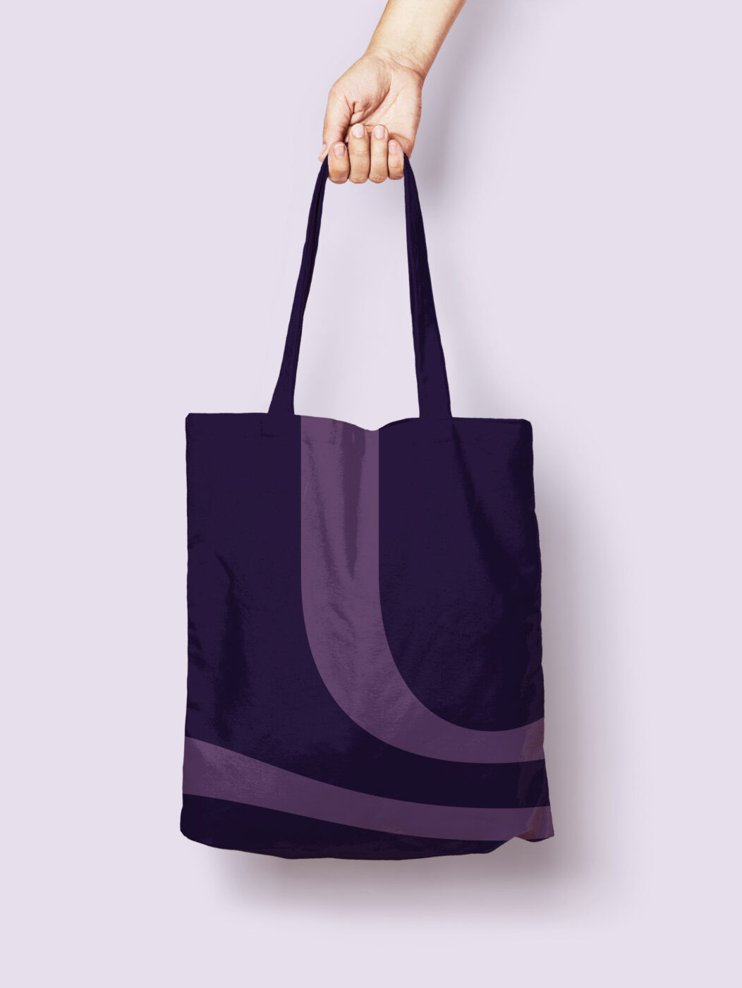
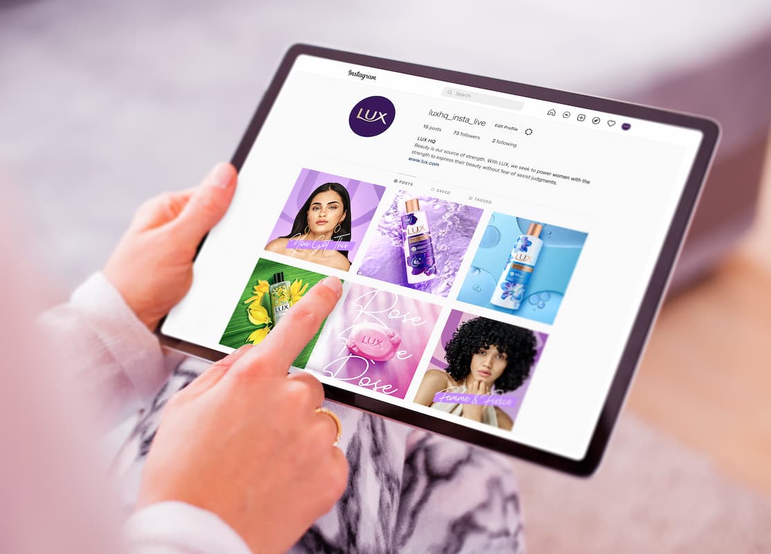
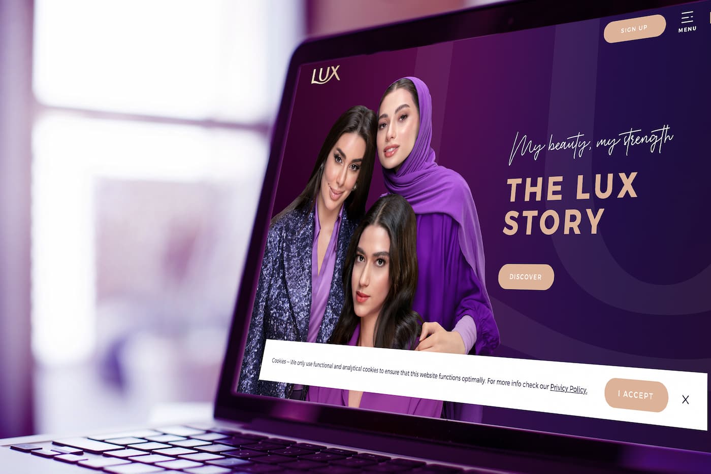
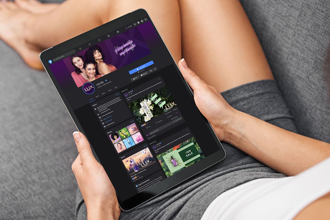
To fully express the new glamorous world of LUX, the BVI is brought to life through multi-channel touch points, stretching and flexing the new assets to create the full LUX experience.
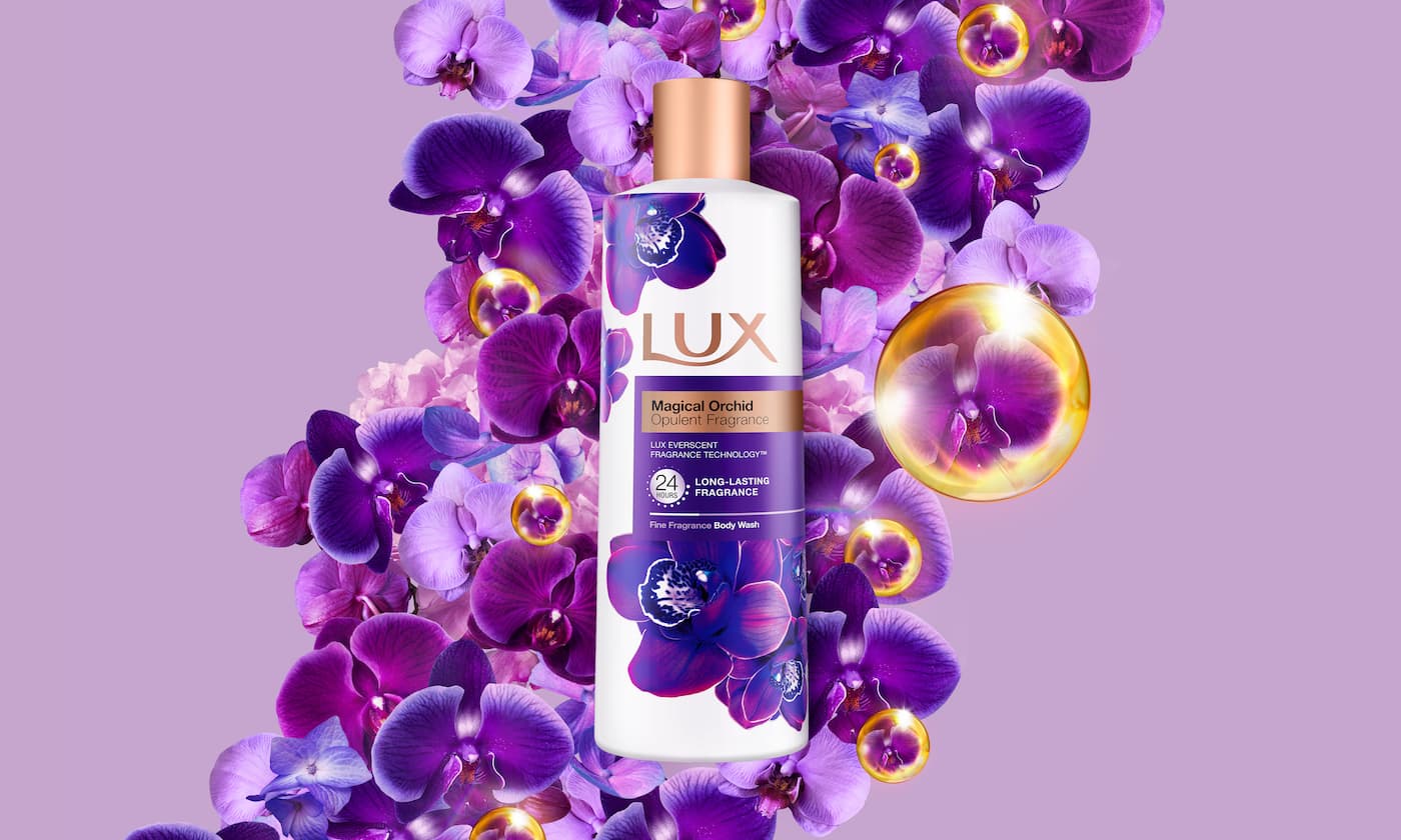
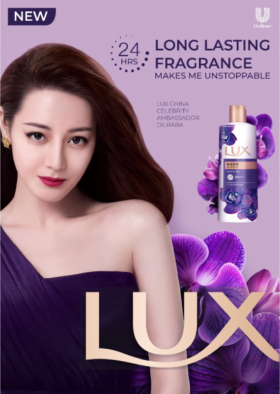
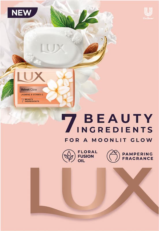
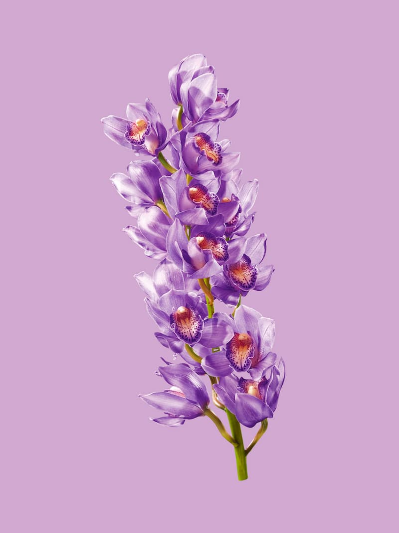
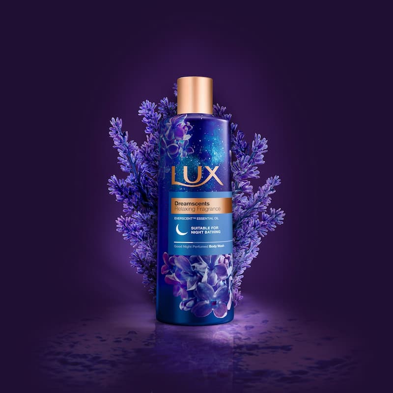
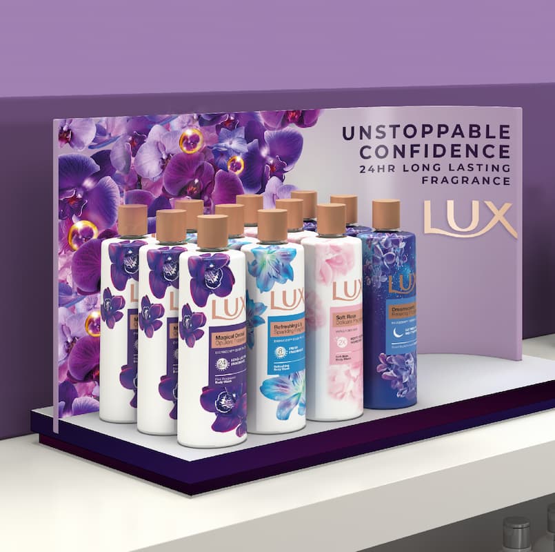
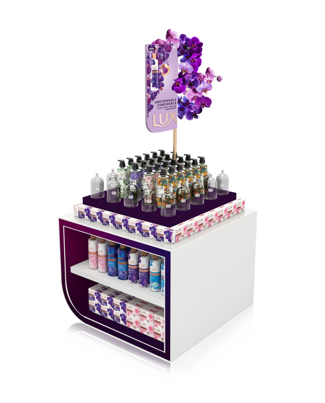

In 2021, the Beauty market saw a resurgence (versus hygiene), which served as the perfect opportunity for the brand’s design relaunch.
With the consistent use of the new visual principles, LUX saw a significant uplift in its business in key markets around the world. The Chinese market, for example, presented continuous growth at the end of 2021. In India, the business increased its market share, making it a complete turnaround in the new brand identity and communication efforts. LUX went back to number one brand in terms of category penetration in Pakistan and Brazil. After years of declining business, the combination of new brand identity with communication efforts allowed the brand to show a remarkable turnaround with strong double-digit growth in market share and penetration gains at the end of 2021.
