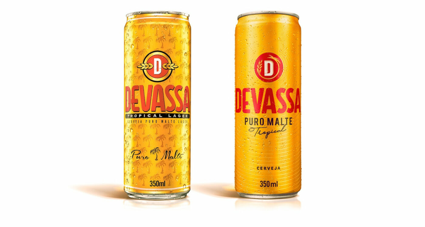
In one more partnership job of CBA B+G + Heineken, the gigantic Dutch company asked us to redesign Devassa brand mark, with the challenging task of keeping its authentic approach and its original, vibrant, and creative Brazilian spirit.
Over the years, the positioning and communication of the brand – created by entrepreneurs from Rio de Janeiro in 2002 – has gone through different moments. Its recent repositioning relies on the quality of its pure malt recipe with a key differentiator – the tropical flavor, tailored to the Brazilian taste and climate. Perceiving these pillars as Devassa’s strategic differentials, we set out to the challenging job of rebranding.
Brazilian taste and climate.
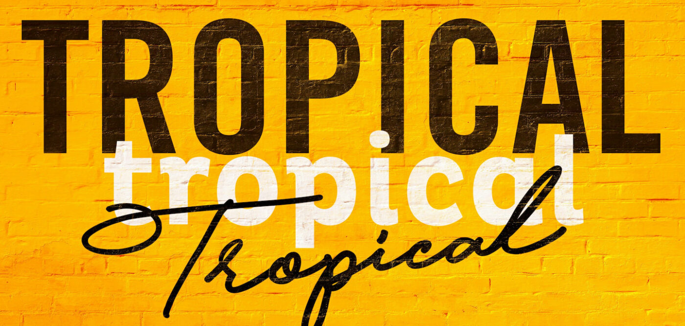
We deep dived into the brand’s strategic information and documents, tracking its history since market launch, to understand how the brand’s moves have helped to create today’s perception of value. Devassa is tropical – this is its greatest equity. It is a beer tailored to the Brazilian taste and climate. But how to turn ‘tropical’ elements into the ‘tropical of Devassa’?
Giving new meaning to ‘tropical’. Cruising contemporary Brazilian borders with the movements, and creative & transformative spirit of the brand and, based on that, develop a new graphic representation and visual identity for Devassa brand mark.
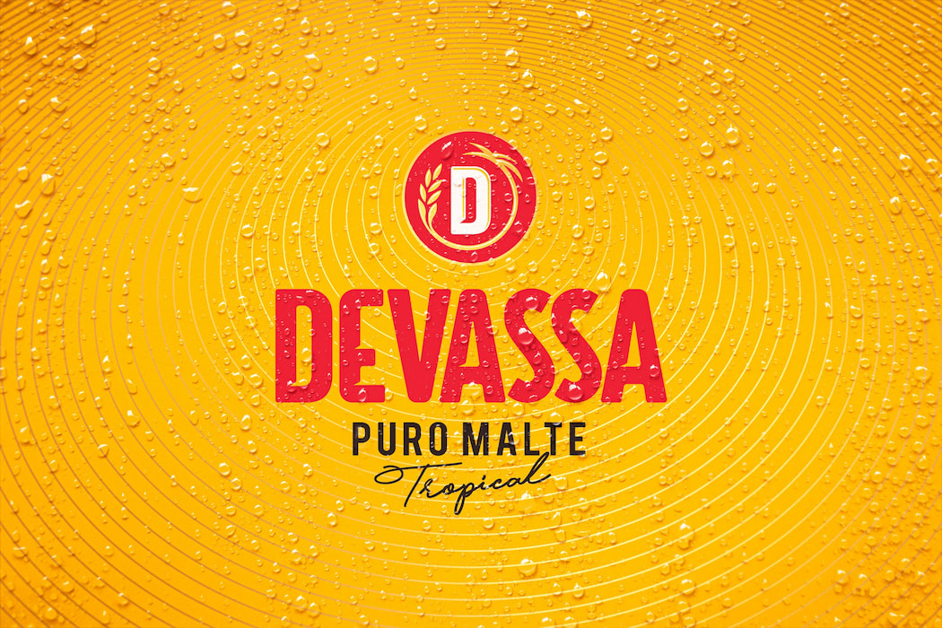
Tropical D
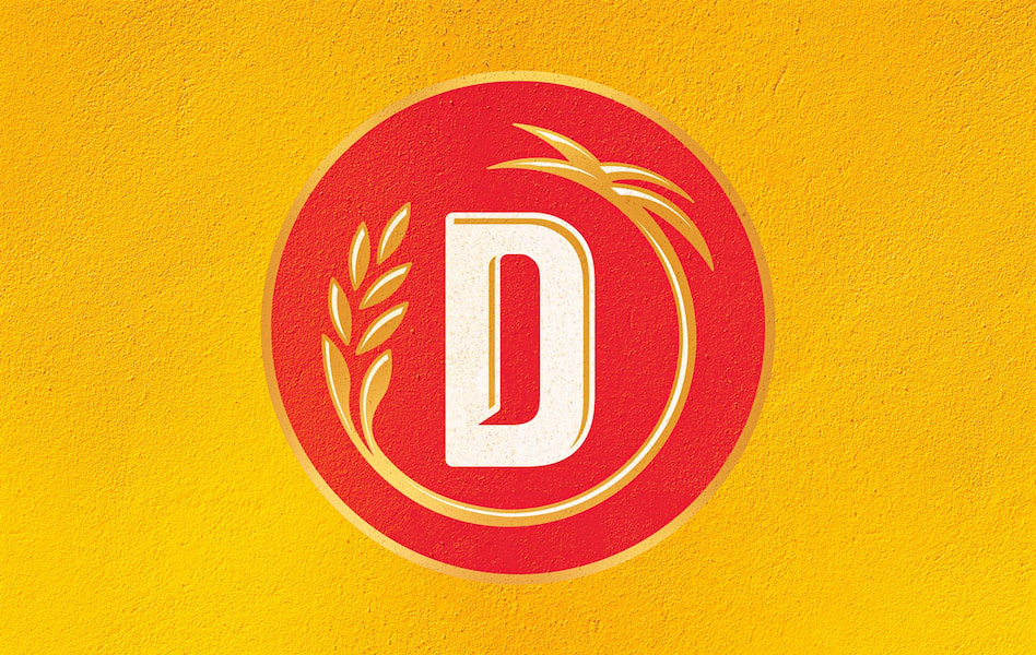
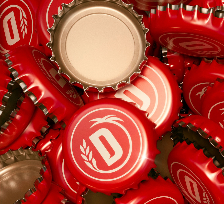
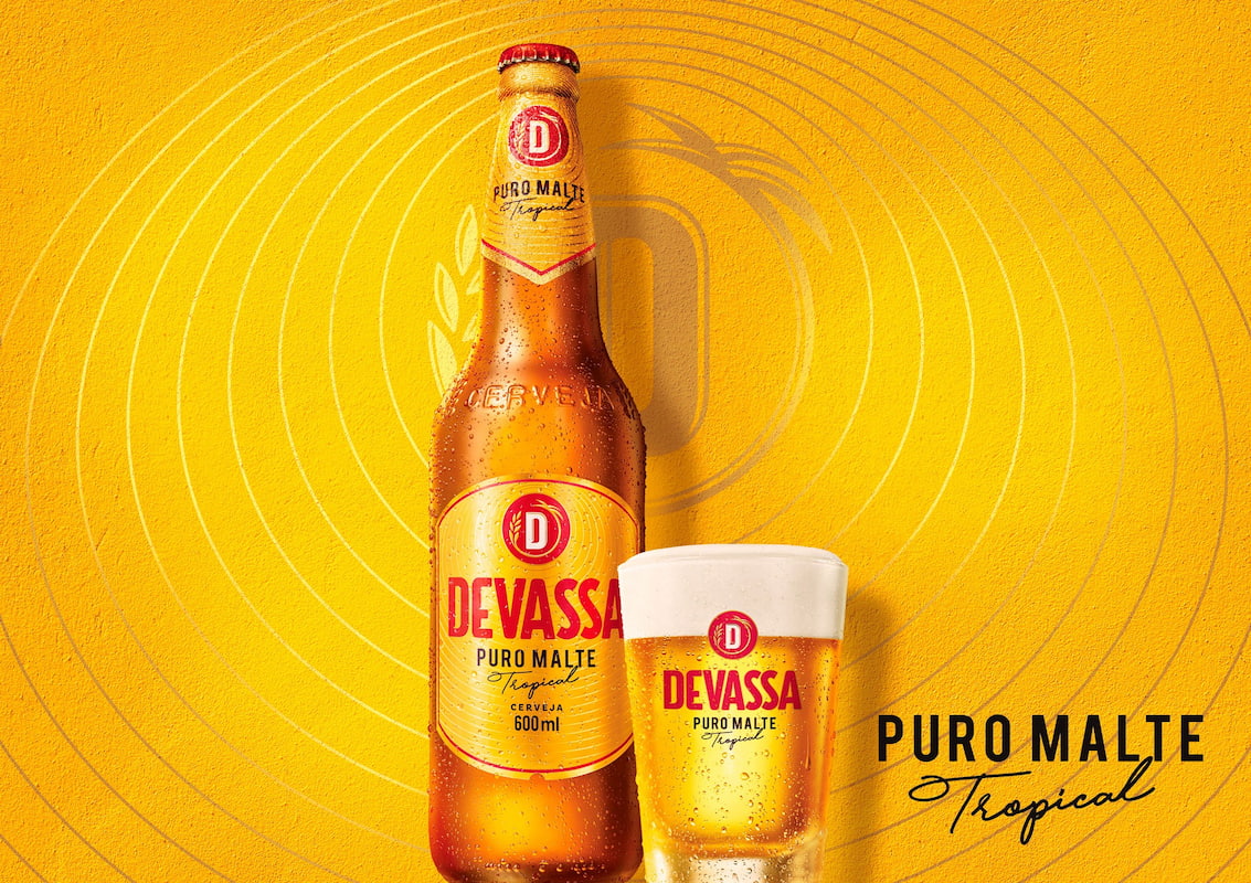
In the tropical of Devassa, the cultural expression and a creative & transformative attitude become the basis for the new identity, making room for an iconic representation of the brand’s DNA – the further-reaching tropical energy is represented by the circular element emerging from the letter ‘D’, symbol of the brand mark.
This is the new graphic representation of the unique flavor of the Tropical Pure Malt beer.



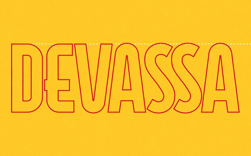
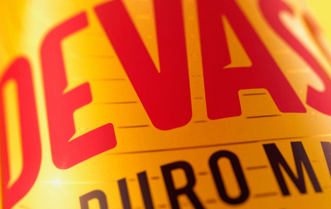
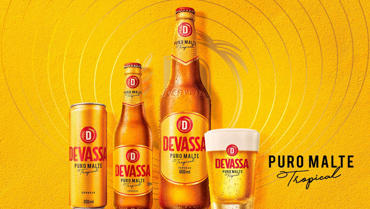
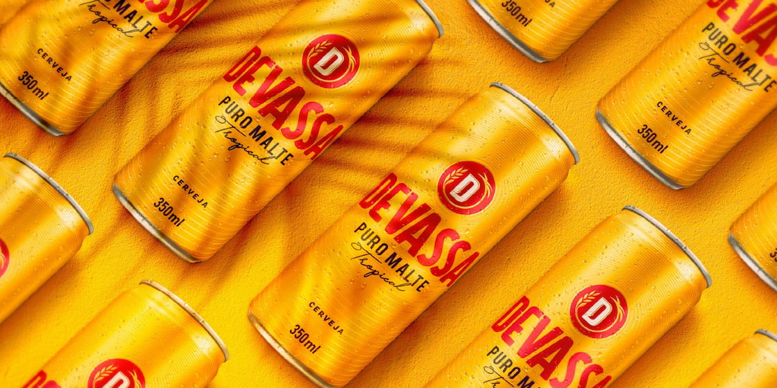
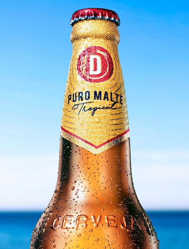
Based on the new assets, we set out for the labels, the portfolio rearrangement and, eventually, the communication key-elements. With the new look & feel ready, we developed the new brand guidelines to orchestrate each and every brand touchpoint.
Flavoured beer.
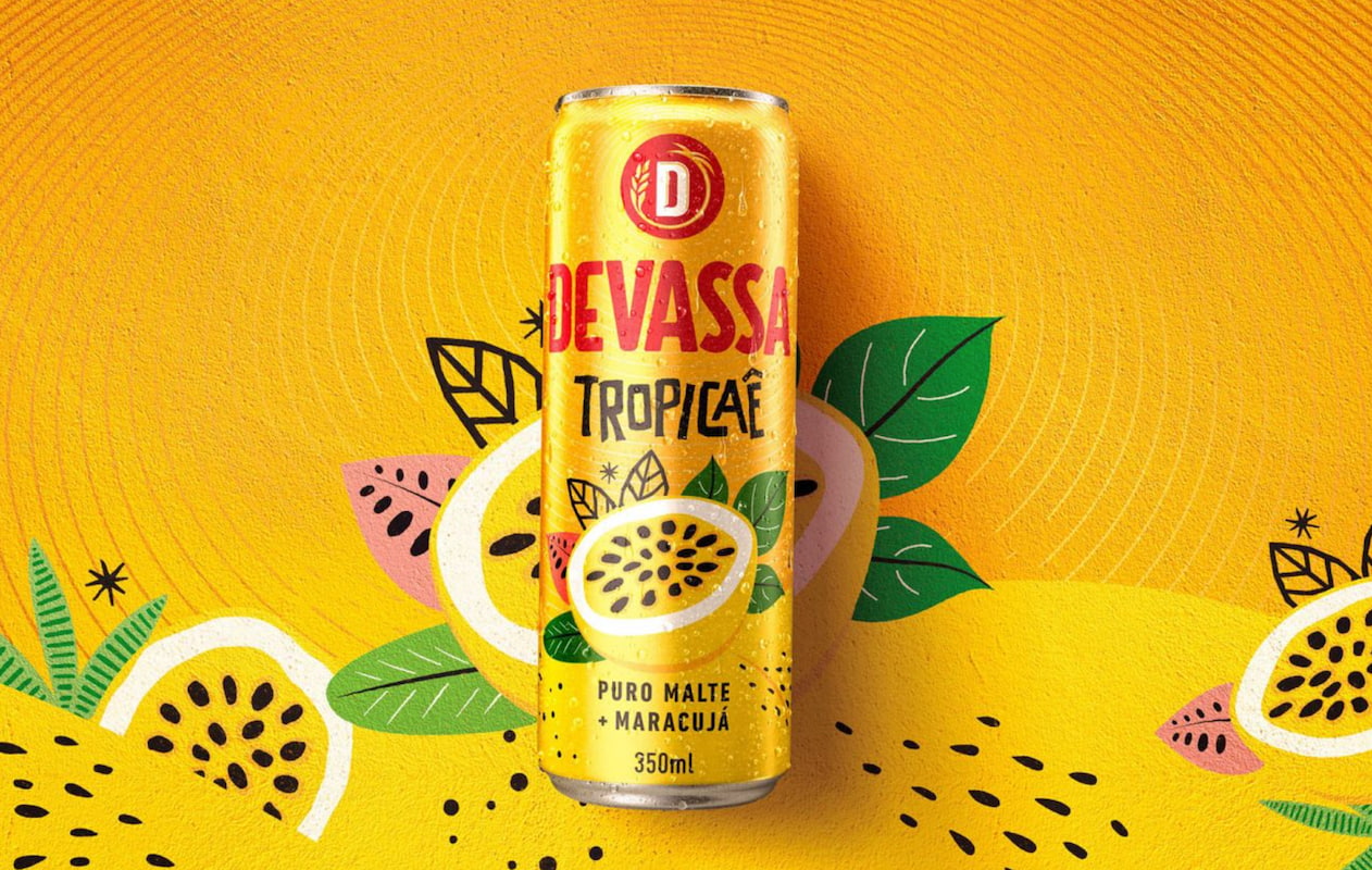
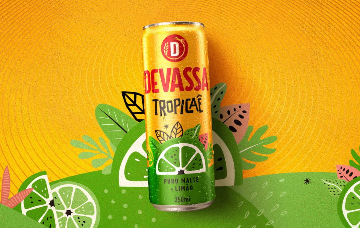
We developed the visual concept of Devassa Tropicaê, a beer flavored with tropical lemon and passion fruit flavors. The taste of beer with all the tropical fruit. Born in an innovation workshop led by us, the new product contains natural fruit juice and is available in the Northeast region of Brazil.
A branding and design work that strengthens Devassa’s new positioning, evolving and highlighting its original attributes, yet enhancing a new context of values and cultural representations.
