How do you reinvent a leading heritage brand facing commoditization, by amplifying its unique DNA for lasting impact and increased visibility?
BrandingPackaging
/ THE UNORDINARY IDEA.
Pleasure to re-enchant the world.
/ CONTEXT & CHALLENGE.
Two decades of audacity; and the risk of becoming ordinary.
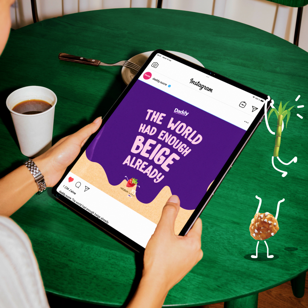
Since 2005, CBA has helped Daddy dare to stand out. Facing a stagnant, commoditized sugar market threatened by delisting, we shifted Daddy from commodity product to lifestyle brand: we invented the segment’s iconic pink, a quirky tone of voice, and a promise of pure pleasure. Daddy became the market leader, a position we amplified in 2015 with a masterbrand approach rooted in “seeing life through rose-tinted glasses.” In 2020, sustainability led Daddy to pioneer kraft packaging. A laudable intention, with a paradoxical effect: the brand’s joy and shelf visibility faded, the sugar aisle turned monotonous, and Daddy, perceived as too “intellectual,” risked losing the emotional connection that was its soul; and the ability to justify its premium against private labels.
The challenge: reactivate Daddy’s power to re-enchant and reconnect with consumers, while valorising its deep commitments in an uninhibited way.
/ THE OPPORTUNITY & UNORDINARY IDEA.
Tapping into the universal aspiration for joy and meaning.
In a sometimes-somber world, everyone aspires to joy, lightness, and meaning. From this universal aspiration, we drew a key insight: pleasure, Daddy’s historical DNA, was not an end in itself, but a powerful lever to transform daily life and inspire positive impact. This timeless idea, “seeing life through rose-tinted glasses,” is not a new promise but the reaffirmation and amplification of a foundational vision, proving the enduring power of daring ideas. This vision once again guided a new redesign of Daddy’s identity, reaffirming its role as an enchanter. We placed the iconic pink back at the center, not merely as a colour, but as the vibrant symbol of transformative pleasure.
Daddy doesn’t just sweeten life. It illuminates it, colors it, and gives it meaning.
/ THE CREATIVE SOLUTION.
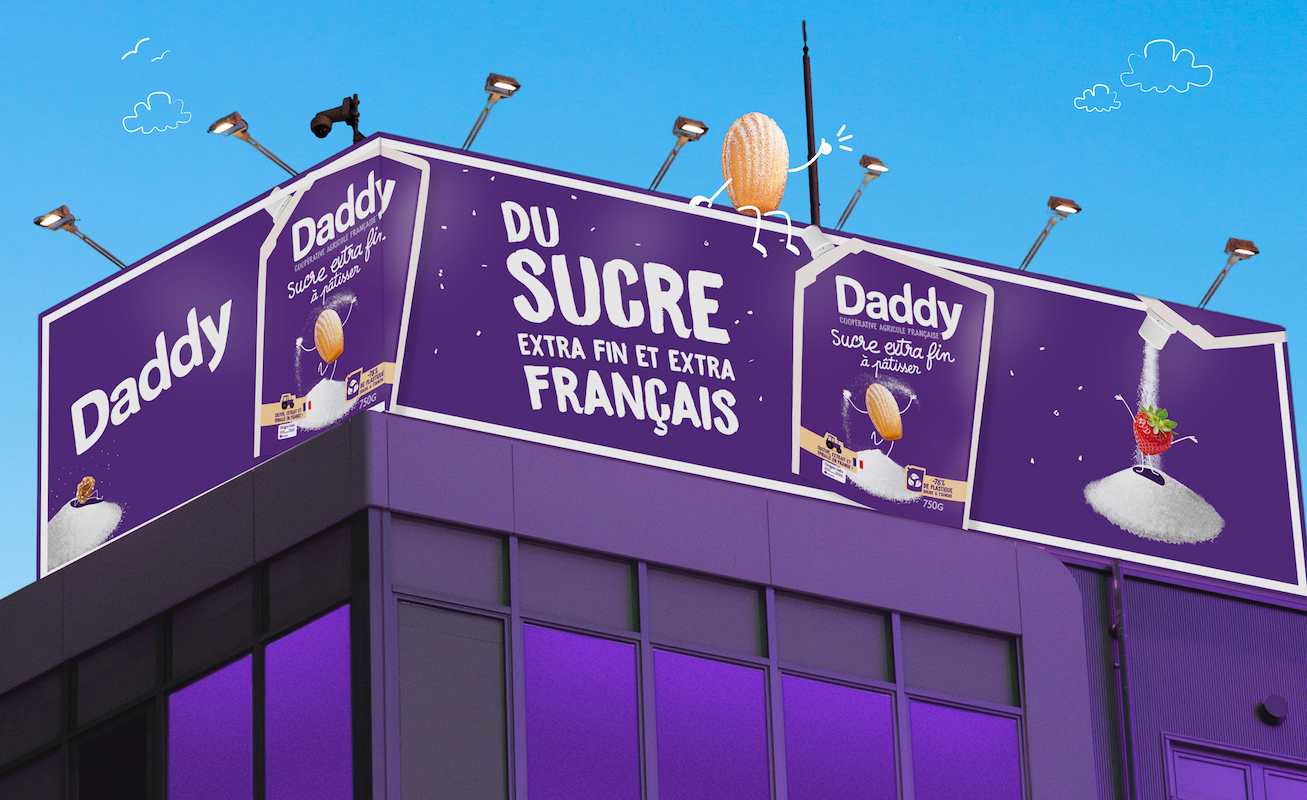
A vibrant, sensorial ecosystem that re-enchants every touchpoint.
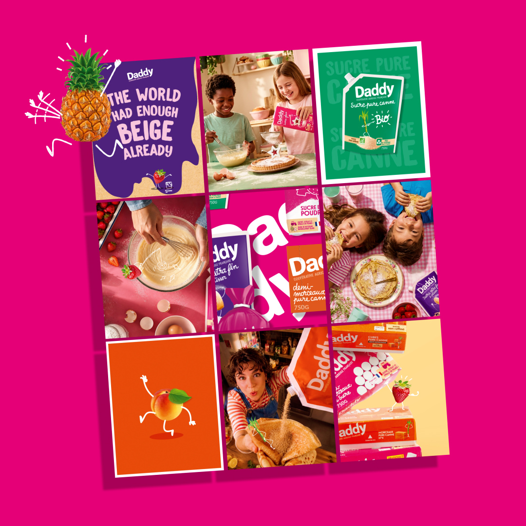
We didn’t just redesign packs; we recreated a universe.
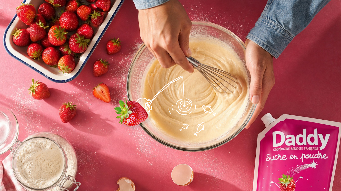
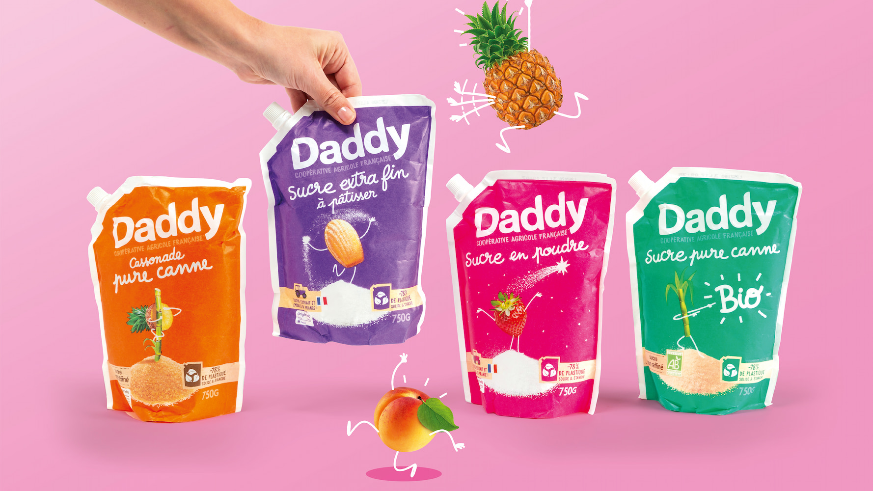
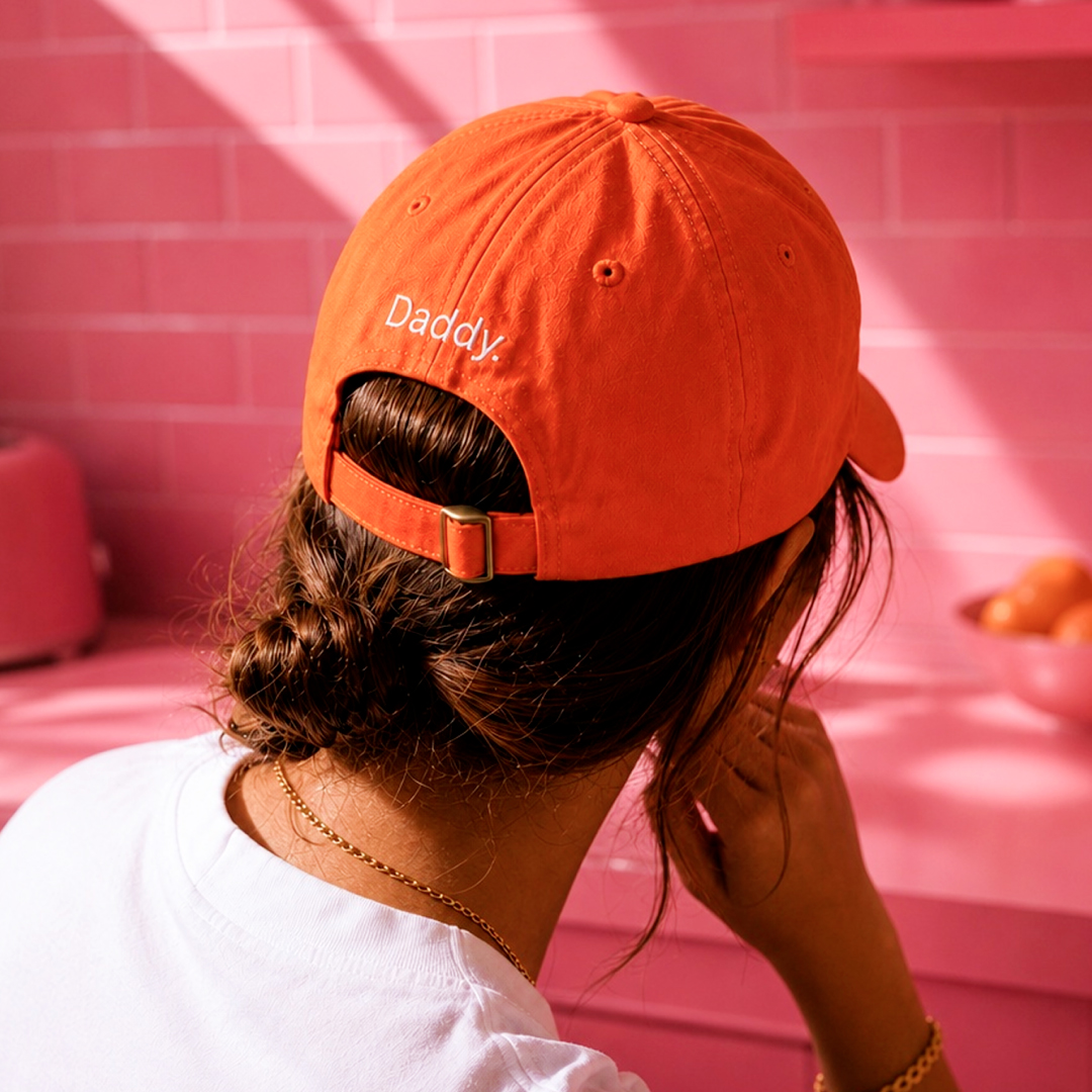
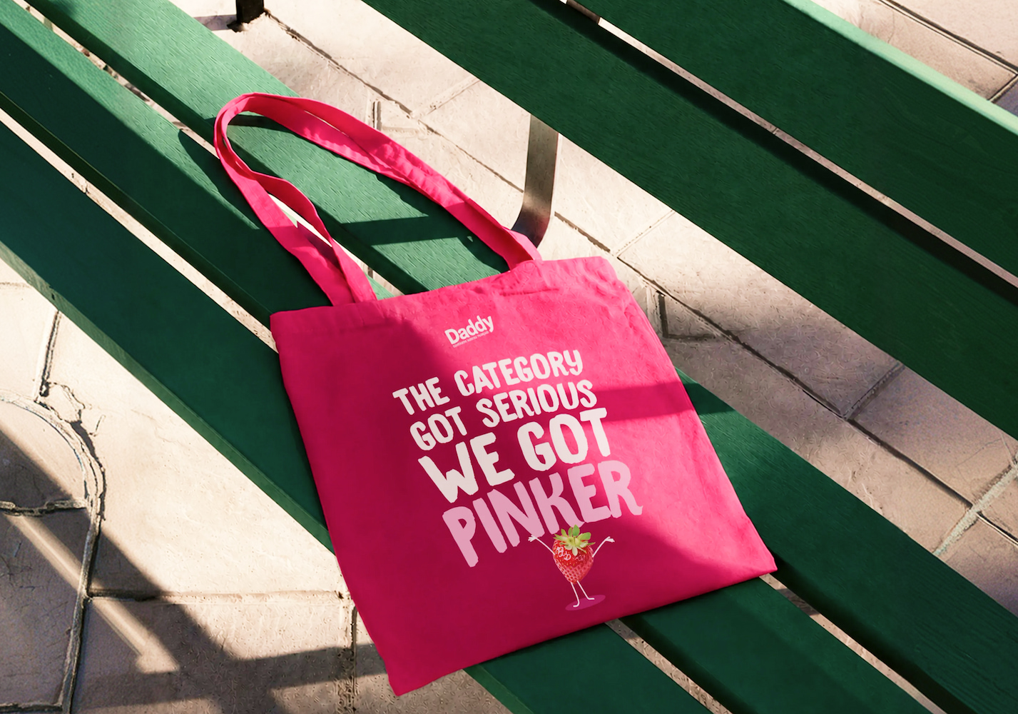
The iconic pink, back at the center. Created by CBA in 2005, it returns as the vibrant symbol of re-enchanting pleasure: sweet, gourmet, contagiously optimistic.
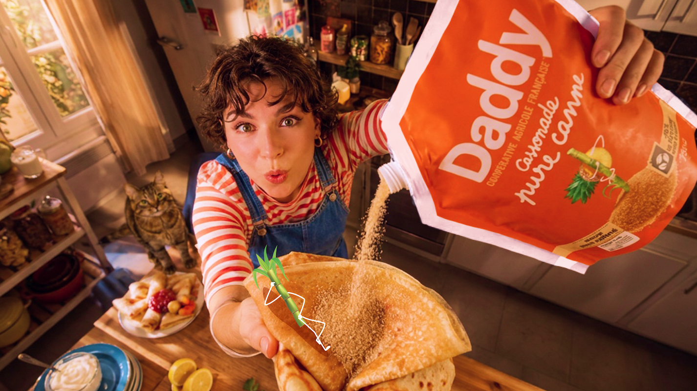
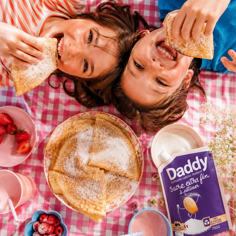
A joyful, narrative graphic ecosystem. Playful illustrations and pictograms encode Daddy’s story (French origin, ingredient provenance, CSR commitments) turning every pack into a small work of art.
The mascots return. Daddy’s emblematic characters come back to cubes and sticks as “agents of re-enchantment,” with collectible multi-design packs that invite consumers to choose their favorite and strengthen brand attachment.
A re-enchanted brand language. Daddy’s unmistakable tone of voice (Ah, Oooh, Hihihi) is amplified across the identity, injecting positivity even into the most factual messages.
The cooperative at the heart. Sugar-beet origin and artisan savoir-faire reinforce Daddy’s legitimacy as a producer and cooperative brand, told with lightness and confidence.
Kraft, intelligently reintegrated. Kraft keeps its ecological virtues, now within a more colorful, structured design that explains the “why”. Visibility without compromising commitment.
/ THE RESULTS.
A return to joy, and to leadership.
Daddy’s re-enchanted identity translated into measurable business impact:
Leadership: a consolidated market position. 18.7% market share value at the end of 2025.
Visibility: enhanced shelf impact. +2.5 points of market share value since the new packs arrived on shelves.
Brand equity: a strengthened emotional bond and justified premium. Daddy is now the brand that reaches the most buyers in the category, with a 36.7% penetration rate (+2 points).
Innovation: a platform unlocking new product development and new audiences, starting with Muscovado, Daddy’s premium cane sugar range for baking.
Daddy is not just sugar. It's the pleasure that re-enchants the world, one grain of madness at a time.