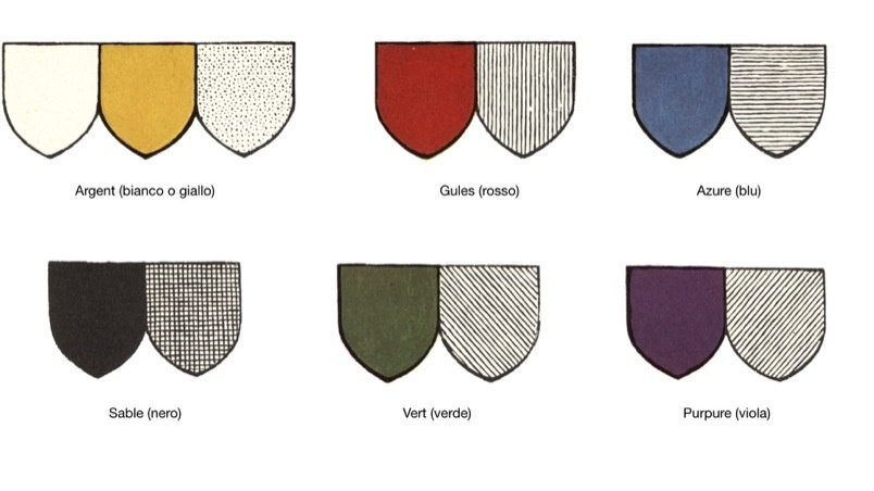
The colours most used in heraldry are red, blue, black, green and purple. Yellow and white represent gold and silver, while the natural colours are used for fur and wood. When the real colours could not be used, they were represented in black and white with the method developed by the Jesuit Father Silvestro Pietrasanta; he attributed a distinctive graphic sign to each colour, varied with different densities of light and shade.
As in the past with heraldry, colouring also plays a determining role in branding as it identifies and enhances the social, cultural and marketing aspects by amalgamating the philosophical, psychological and sociological components of goods and services. Many business failures have been caused by an incorrect choice of colour, as the same message can be conveyed differently depending on the colour used. In fact, the meaning of a colour changes depending on the context and the way in which it is presented.

Designing colour combinations capable of inducing associations which cover a variety of services and products requires specific training: the same colour may lend itself to a series of associations with completely different results. We must not forget that the influence of the colour component in consumer choices is so deep that it is sometimes misused and becomes a mere persuasive tool, driven by trends set by the multinationals.
Colours can also be used in a misleading way to bypass our awareness, with the aim of promoting products that do not meet the expectations set by their image, driving us to make purchases that we will not be satisfied with.
Red
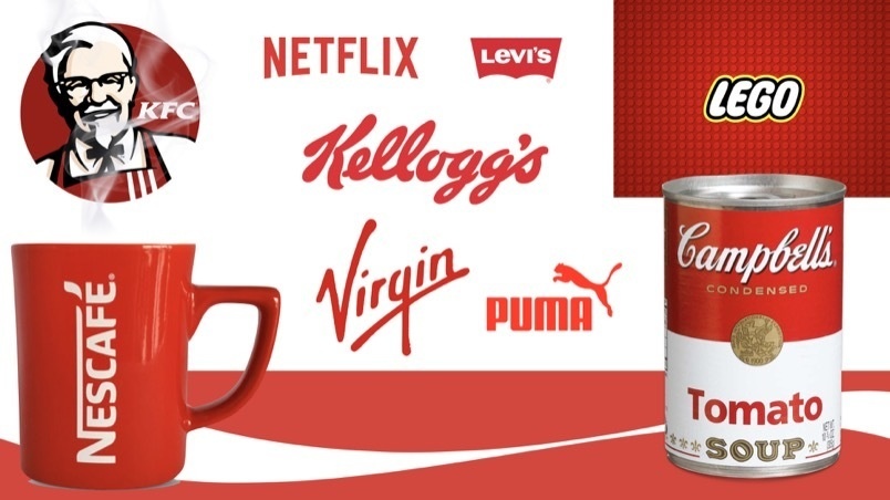
Many brands have chosen red as their iconic colour. In fact, to focus its wavelength, the focal point of our eye moves forwards, giving the illusion that red objects are closer. Red also affects our perception of time, causing it to feel slightly accelerated (the warm colours used for fast foods convey the idea of speed when eating meals). The combination of warm colours is used to communicate heat, power and energy; they transmit happiness and are therefore very widely used in the entertainment and leisure sector. In the food sector, the use of saturated reds tending towards orange characterises products with a strong or spicy taste.
Orange
Orange is very widely used in the various fields of communication due to its visibility and ability to attract interest, encouraging the success of low-cost formulas and products.

Yellow
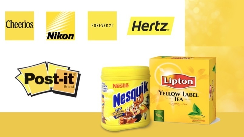
Yellow is the most cheerful colour in the colour wheel: it is the colour of the sun, of joy, of optimism, and is bold and original. Brands using yellow characterise widely distributed products and services that are therefore easily and immediately identified. When pure yellow is placed on a white background, however, the reverse effect is obtained and the information is no longer readable.
Green
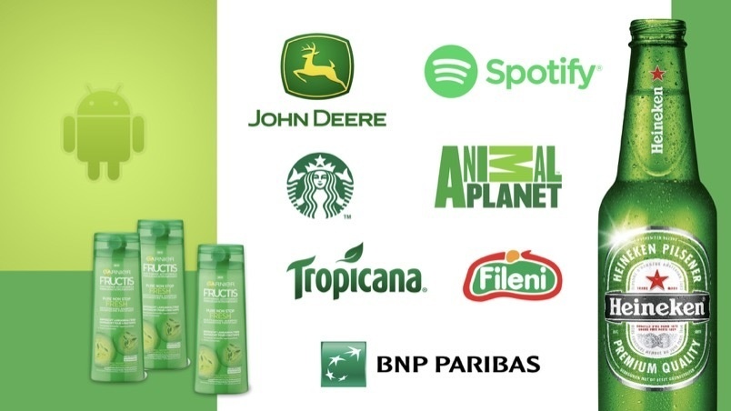
Green, mostly associated with nature, is a warm and relaxing colour which is widely used in many product categories. In general, it tends to be used to communicate security and sustainability in goods and services, and is therefore often found in graphics projects involving insurance, financial or legal companies. A balance between warm and cool tones, green is refreshing and thirst-quenching, making it very common in the food industry.
Blue
Blue is without a doubt the most preferred colour when you want to inspire maximum approval. Shades ranging from baby blue to dark blue are used, as evidenced by the brands belonging to the most important international representative organisations. Blue communicates reliability and security of products and services in all sectors. Although this colour is rarely found in actual food, when used in the food industry it is associated with freshness and is used to represent essential household products such as salt, sugar, pasta, milk and its derivatives.

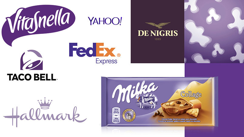
Purple
The purple colour range is among the least frequently used colours in brand design, especially since in the most saturated shades, it appears to be the least bright. The few brands that have chosen this shade, which has strong religious significance, have often managed to establish themselves on the market specifically because of the recognisability of this unusual colour. These shades are very often used in the packaging for intimate hygiene and female body care products.
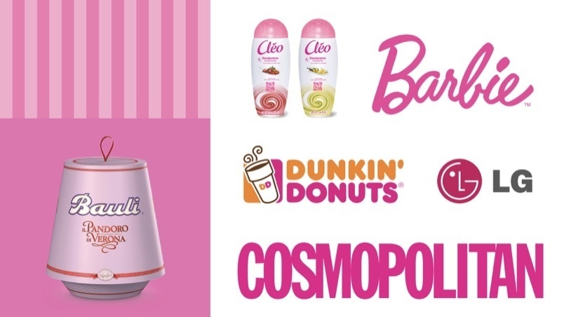
Pink
In the food industry, pink is largely associated with a sweet taste, while in almost all other sectors it remains linked to the feminine stereotype or is used as a decidedly unconventional colour.
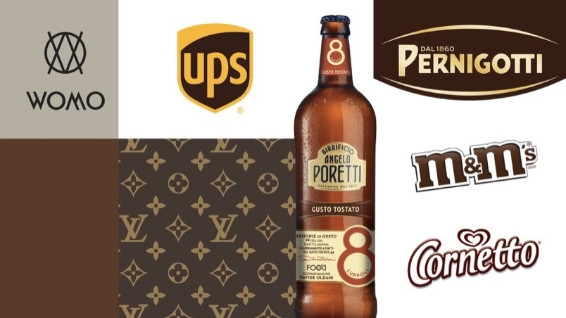
Brown
The brown colour range is widely used in the traditional food industry due to its many synesthetic associations. The strong link with natural materials, such as wood and leather, makes the brown colour range very suitable to communicate the artisan quality of products.
Polychrome
Over recent years, particularly in the technological sector, polychrome brands are emerging. A unique combination, it expresses diversity, great dynamism and openness to new things and to the future. Multicoloured brands identify the company’s aim to be impartial and suited to anyone, regardless of their sex, age, social class, and political ideas.
Vice President of IACC International, President of IACC Italy, Designer, Colour Consultant, Professor in the “theory of form and colour” at SPD (Scuola Politecnica di Design, Milan). From 1990 to 2006, he collaborated with the Atelier Mendini in Milan. From 2003 to 2013, he was Professor of Chromatology at the Accademia di Verona, the Nuova Accademia di Belle Arti (NABA), the Domus Academy and the Department of New Technologies at the Accademia di Brera in Milan.
Article originally published on Printlovers.
CBA Design Paris
