France
Paris
Switch to your local agency
Retour au menu

For several years, Lefebvre Sarrut, European leader and world No. 4 in legal and tax knowledge, has undergone a major transformation for the benefit of its clients.
A new step has now been taken, that of a common identity in France as a link between its essential brands in their field (Éditions Francis Lefebvre, Éditions Dalloz, Éditions Législatives, Francis Lefebvre Formation, Dalloz Formation, Elegia Formation, CSP Docendi and Bärchen).
Supported by the CBA Design agency and today, Lefebvre Sarrut is transforming and giving birth to Lefebvre Dalloz: a global response to the needs of professionals today and tomorrow.
To do this, CBA rethought the group’s global brand strategy: new brand architecture, creation of the new commercial brand and its brand platform, new visual identity, new graphic territory, drafting of the new sales pitch, and finally the making of a reveal film.
The goal? Create a commercial synergy by decompartmentalizing the business units and increasing sales. To do this, the agency had to face two challenges:



The objective of this common identity is to enhance this synergy and to gain clarity for our customers on the added value of our group in France, speaking with one and the same voice. It is also internally a real business project, a team project, that of the employees of Lefebvre Sarrut in France.
Olivier CAMPENON, Chairman of the Board of Lefebvre Sarrut.


In order to create a unity between the different areas of expertise and thus generate more notoriety as a commercial brand, CBA worked on a modern logo, with a proprietary typography, which evokes digital simplicity.
The 3 points on the logo represent the 3 areas of expertise as well as the 3 brand names (Lefebvre, Sarrut and Dalloz) and allow horizontal alignment to be created, to give a notion of cohesion and horizontal vision. In addition, the point demonstrates some determination. Determination of a strong, united group that strives for innovation and modernity.
These 3 points can be extracted to create an iconographic element in its own, creating a vertical language to give a notion of evolution and to mark a progressive rhythm of dynamism of the group.


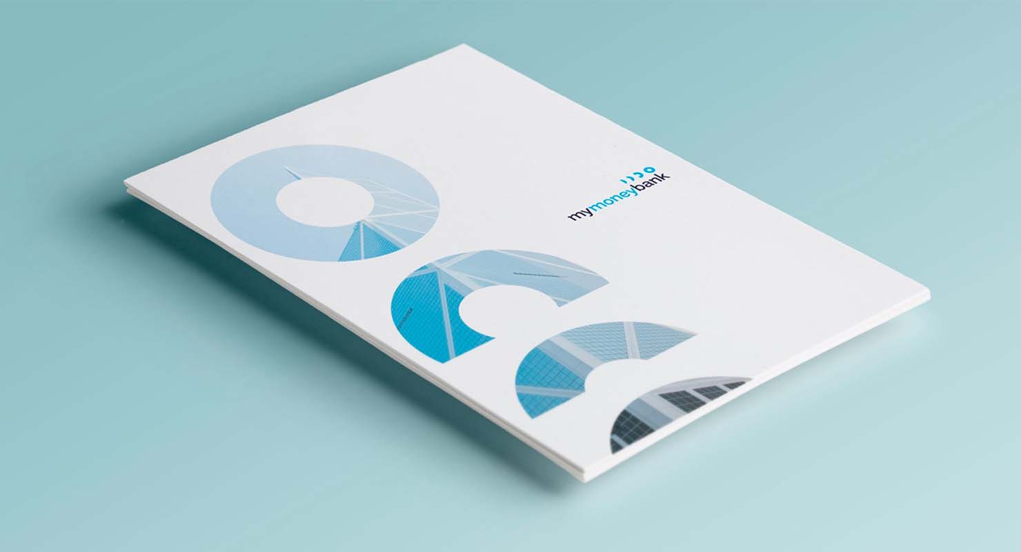
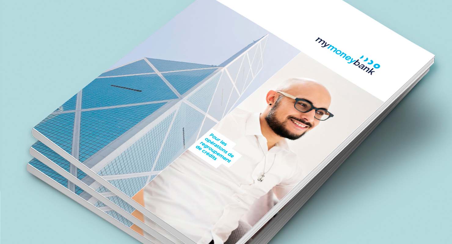
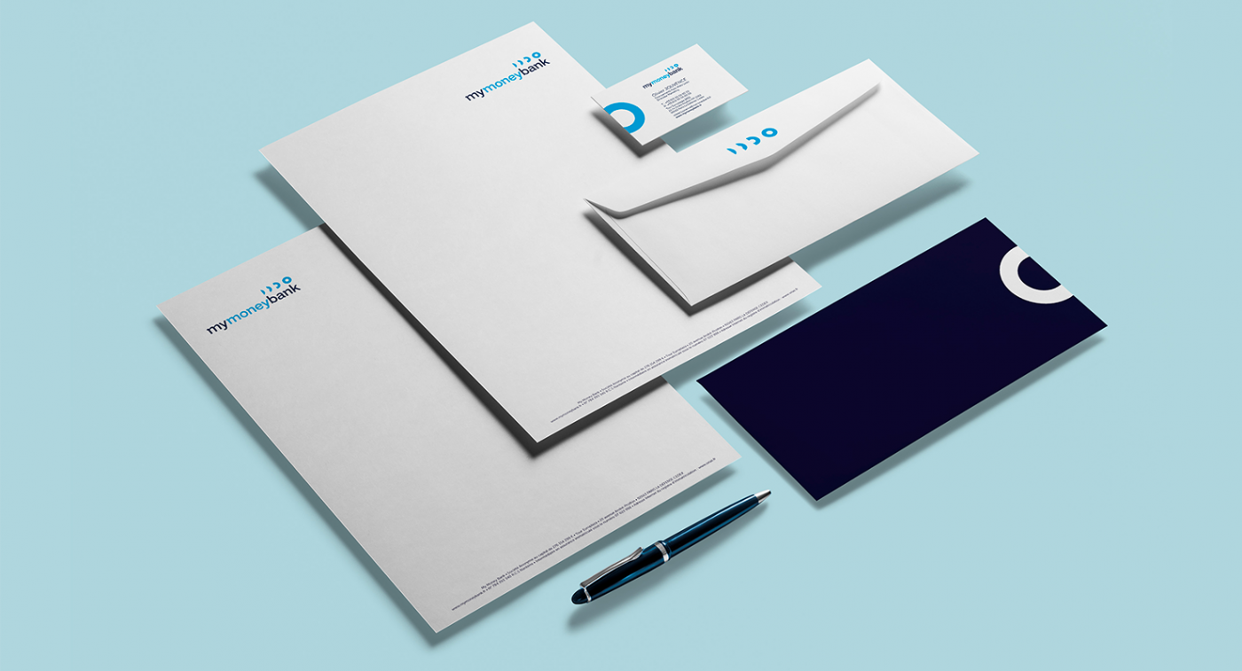
In early 2017 GE Money Bank, the financial specialist in automobile credit, a subsidiary of the American group General Electric, formalized its takeover by the investment fund Cerberus, which manages more than $ 30 billion in assets.
As part of this takeover, Cerebus mandated CBA Paris to support it in the transformation of its brand.
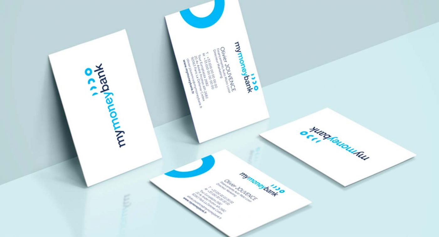
The challenge was to assign a specific identity to this new autonomous entity while maintaining a link with the customers acquired before this transformation.
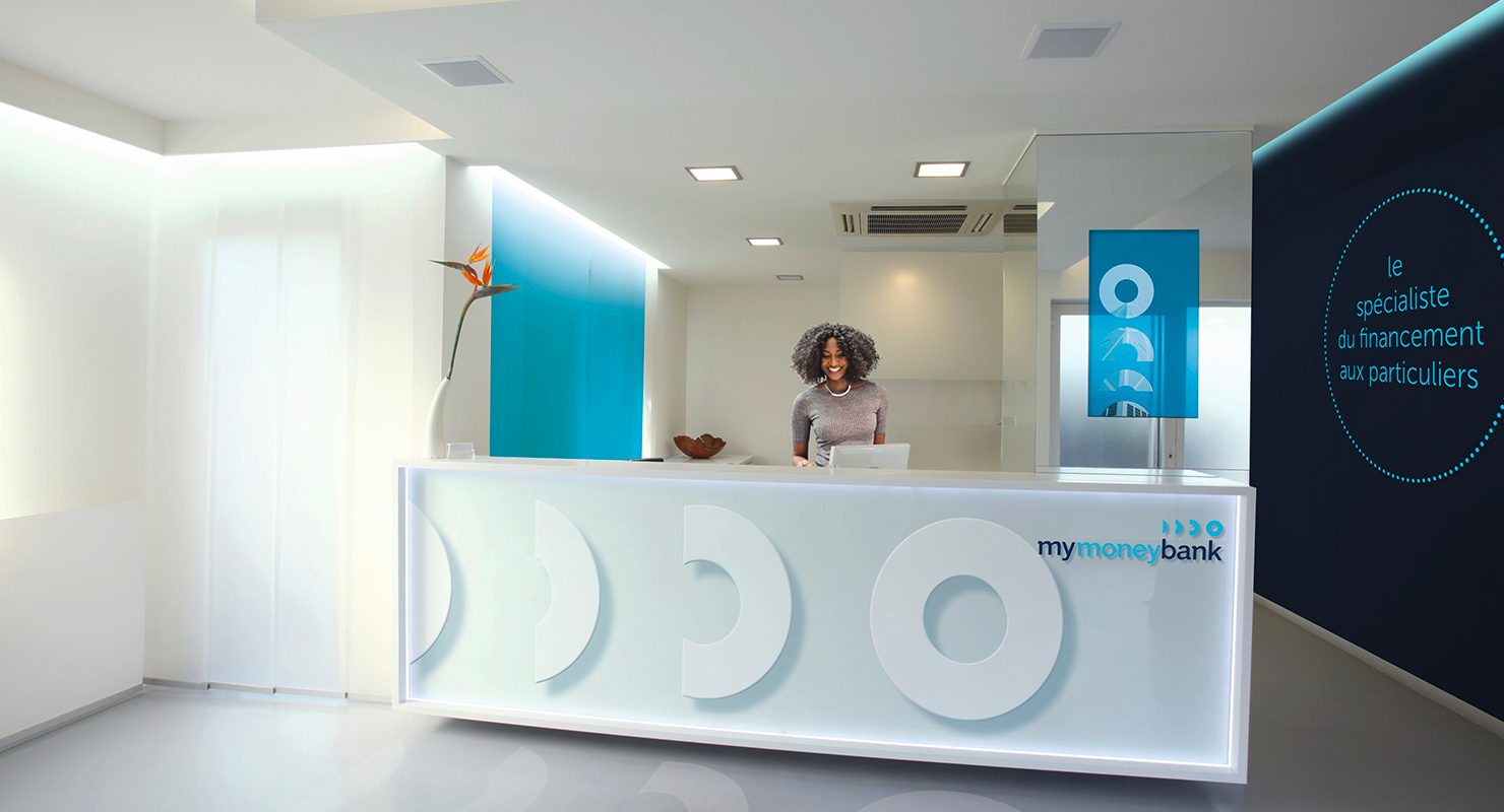
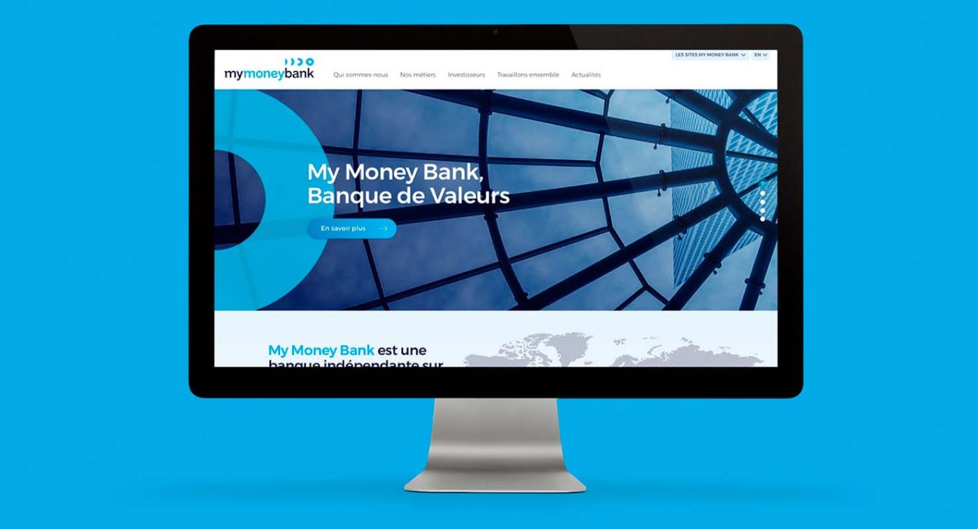
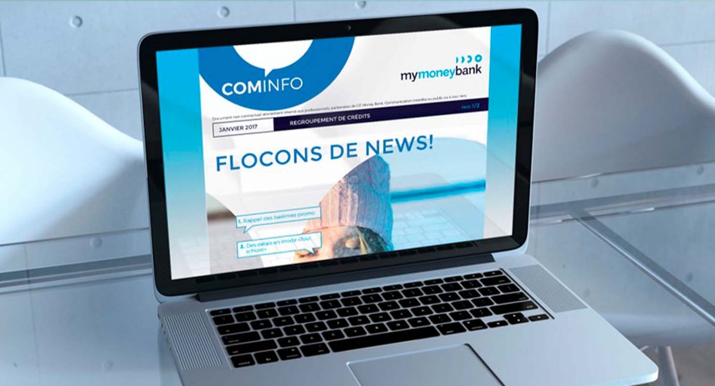
CBA was asked about the issue of naming, visual identity, brand territory, and then on the digital transformation of the brand.
Beyond these first projects, and building on the success of the solutions offered since 2017, CBA supports My Money Bank on all of its communication topics.
Faced with a food-processing industry that is walking on the head, with pesticides, additives and junk food, consumers no longer want to be driven without knowing where they are going. They need transparency, more than ever, they need to know what they are eating.
Being a committed food player since 2009, and with .nod, Biofuture offers to consumers the experience of truth by fighting against the nonsense of the food-processing industry.
For Biofuture, it is time to change direction and defend a new standard: the taste of good, without concessions, for us and our environment.
Its new brand .nod illustrates this fight by challenging what should be the new normal.
.nod
To trigger this committed, positive and gently impertinent awareness, Biofuture called on CBA to support it from the naming to the communication strategy, including the creation of the brand platform.
The main challenges for CBA were to define the strategic fundamentals of the brand in order to deploy an identity and graphic ecosystem that makes sense with 2 main ambitions:
In the last 50 years, the food standard has turned upside down. The norm today is pesticides, additives, ultra-processing, opaque origins… We feed on chemistry and everyone thinks it’s normal! In a world that is walking on its head, we are convinced that the best way to go back to the right way was to go backwards! .nod (= bon which means good in French), the first brand that is spelled backwards, is an invitation to change direction and to ask ourselves if normality should not be good, “without chemistry”, raw, local…
With .nod let’s eat the right way!
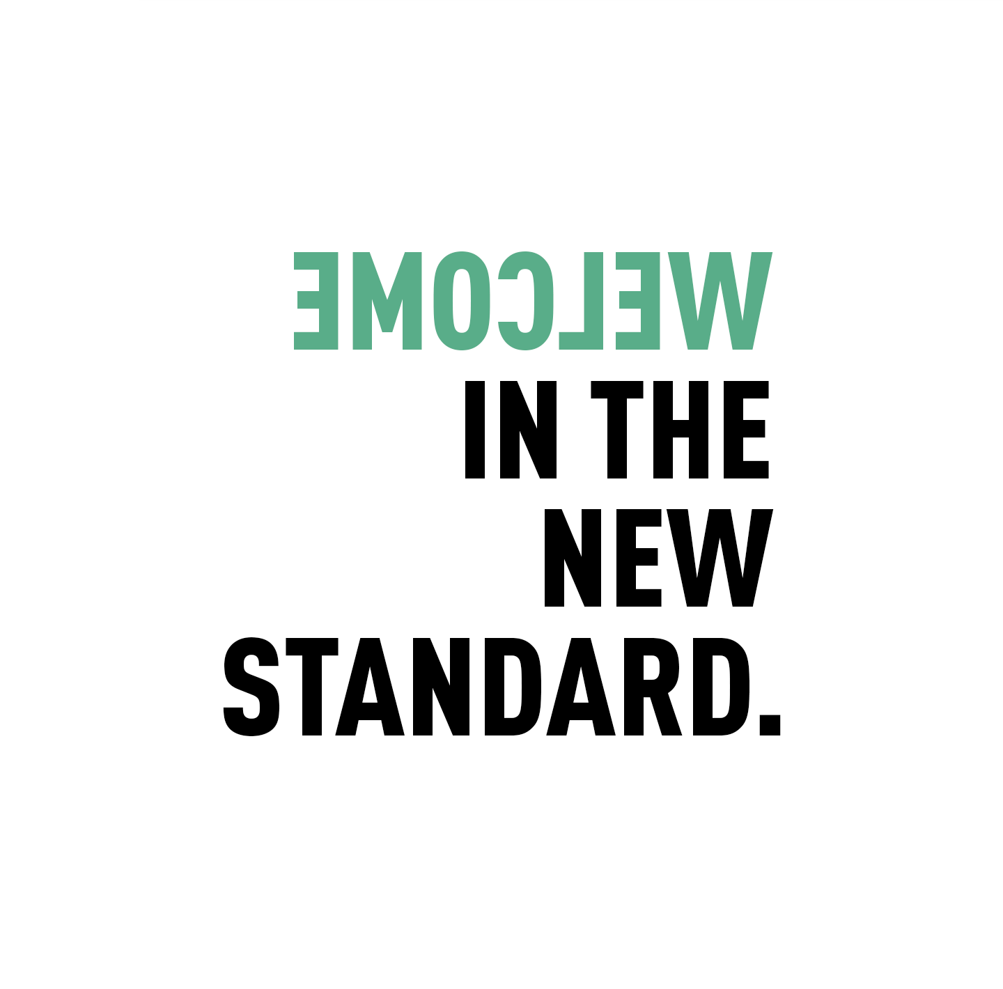
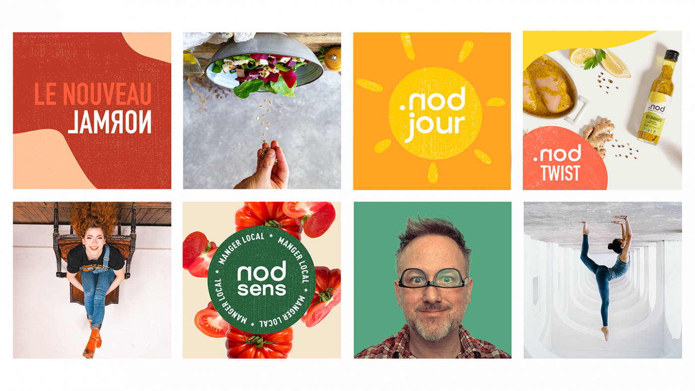
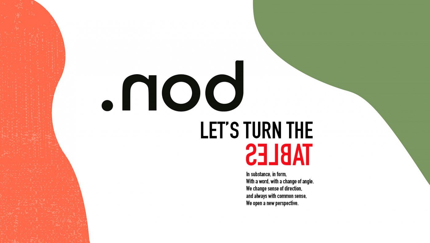
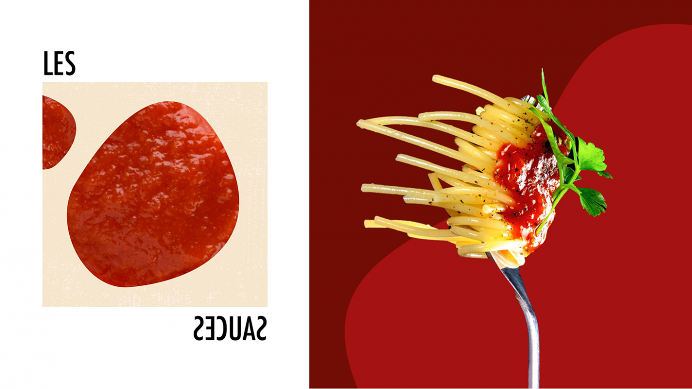
Based on this observation, the agency wanted to put the spotlight on an innovative creative concept: common sense is to change it. Therefore, CBA has developed a visual identity in line with this concept, i.e. “upside down” creations with an aesthetic that emphasizes taste. The goal of this graphic territory is to be against the tide.
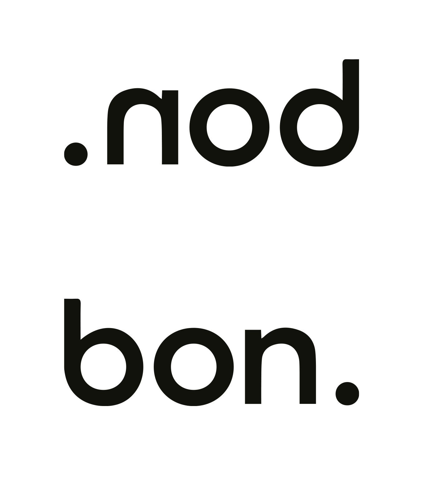
The logo has also been designed: by using the mirror effect, it allows you to read the word “bon” (“good” in French) hidden in the brand name. The dot, at the beginning of the word “nod” or at the end of “bon”, depending on which way you look at it, emphasizes the simplicity of the products; .nod products are good, and that is all!
Between typographic plays with a single word inverted and visual games through abstract and random shapes, the graphic territory reflects the impertinence and the peps side of the brand.
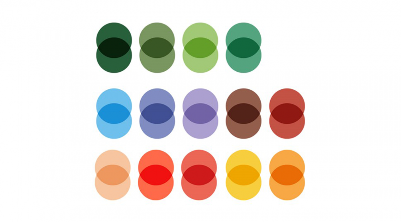
Finally, this graphic territory presents bright, fresh and vitaminized colors that reflect the products; tasty condiments that brighten up all your dishes.

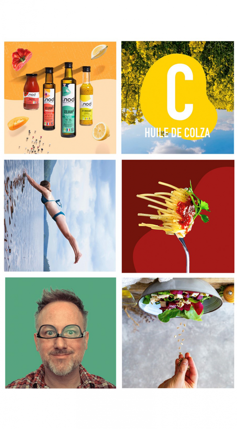
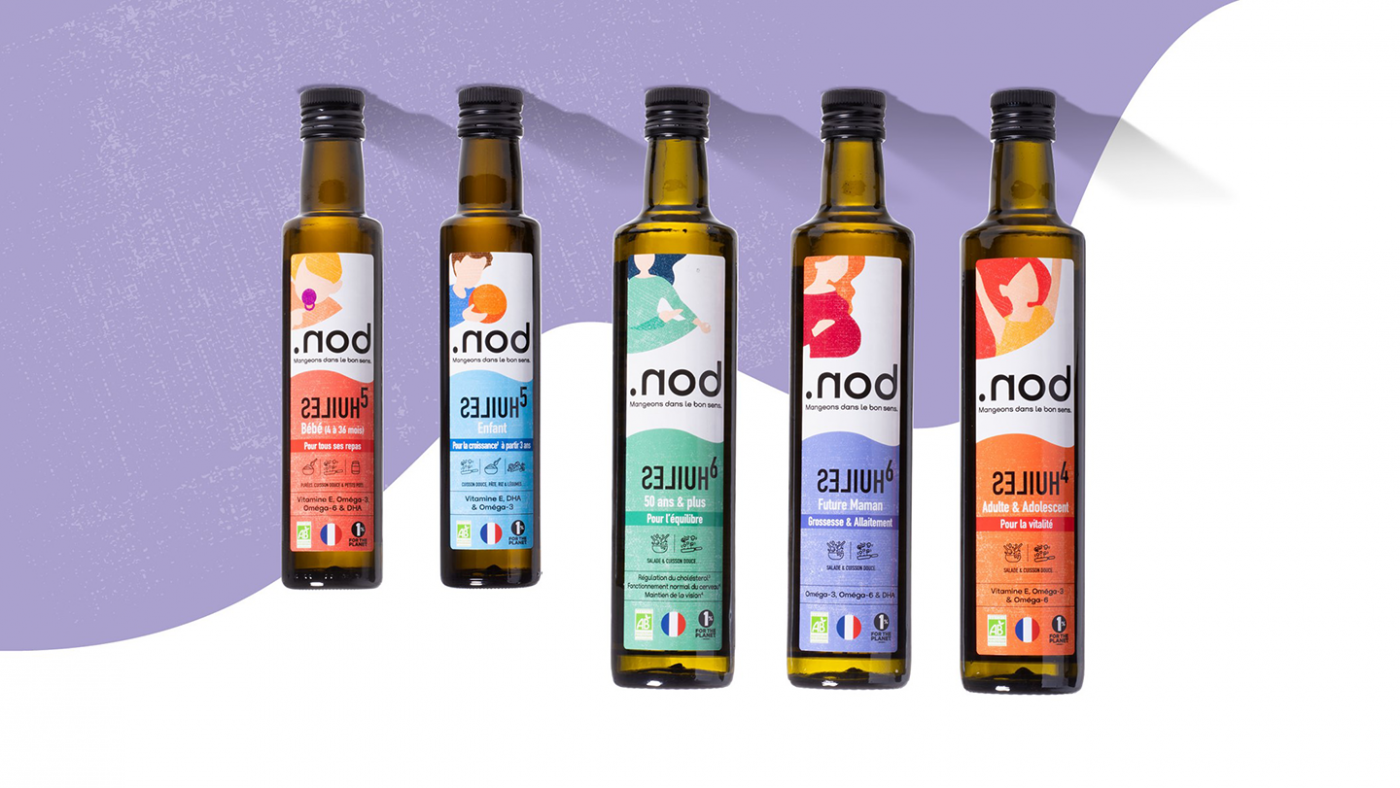
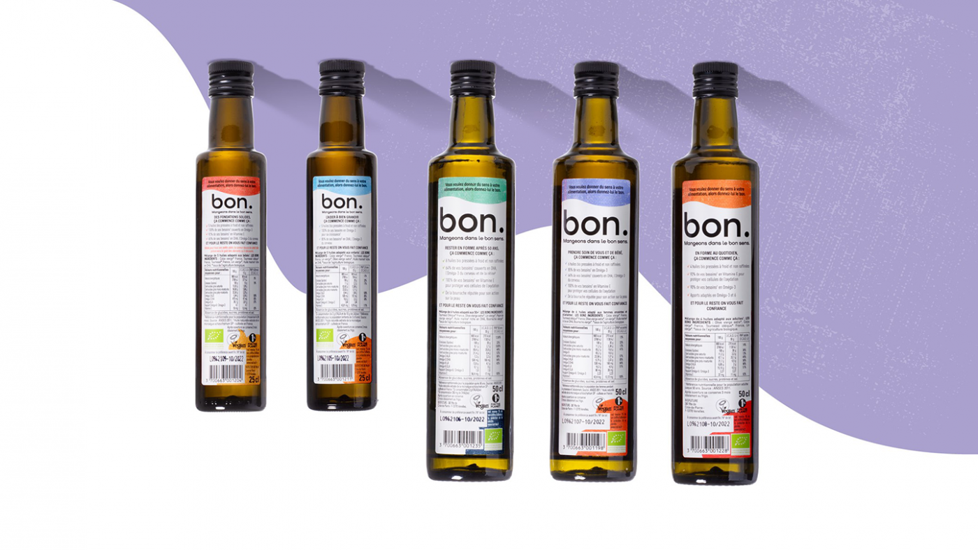
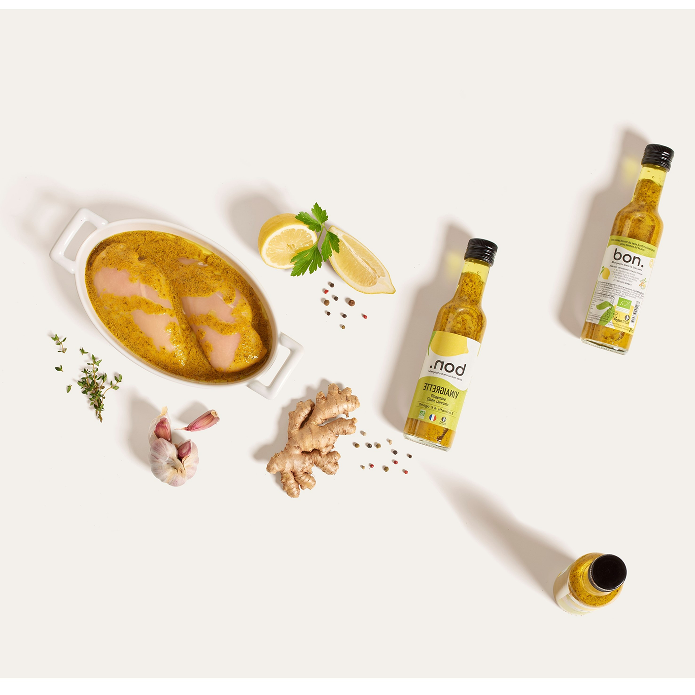
In line with the visual identity designed by our teams, the packaging also plays with the sense of the product. Whether they are placed upside down or right side up, the name remains legible. This play on the orientation of the packaging allows the brand to highlight its products, to make it unique without leaving consumers indifferent.
Finally, the packaging uses the colors of the graphic palette, allowing the products to be differentiated depending on the tastes and flavors and making it recognizable at a glance.
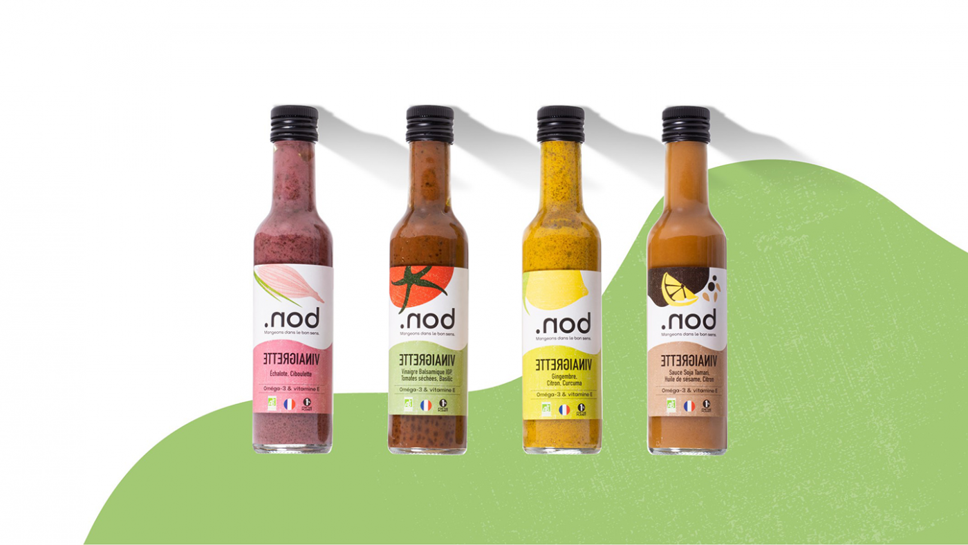
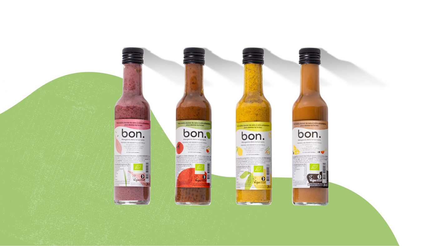
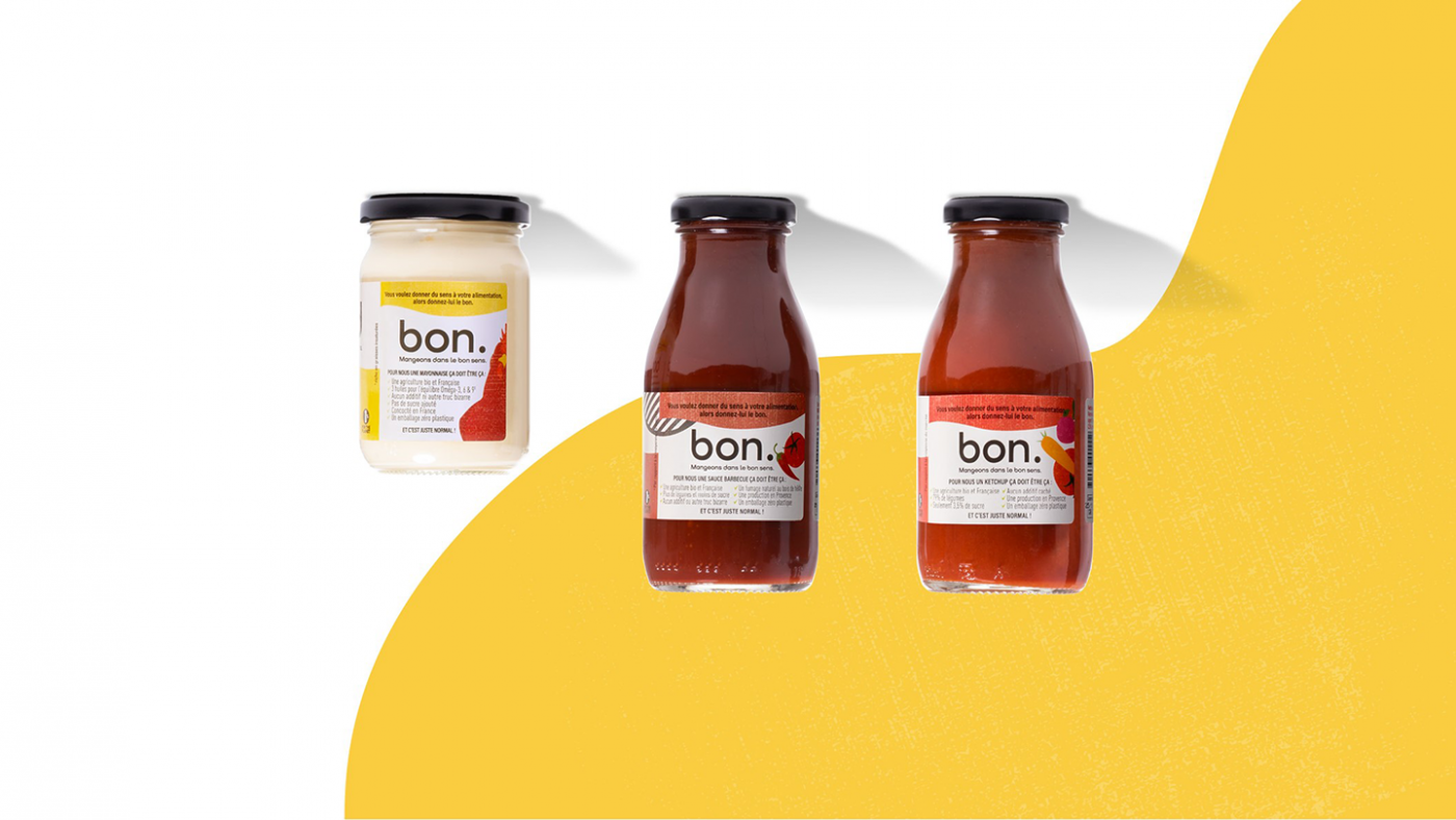
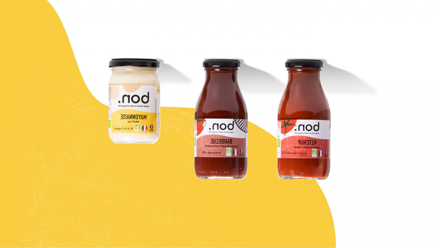
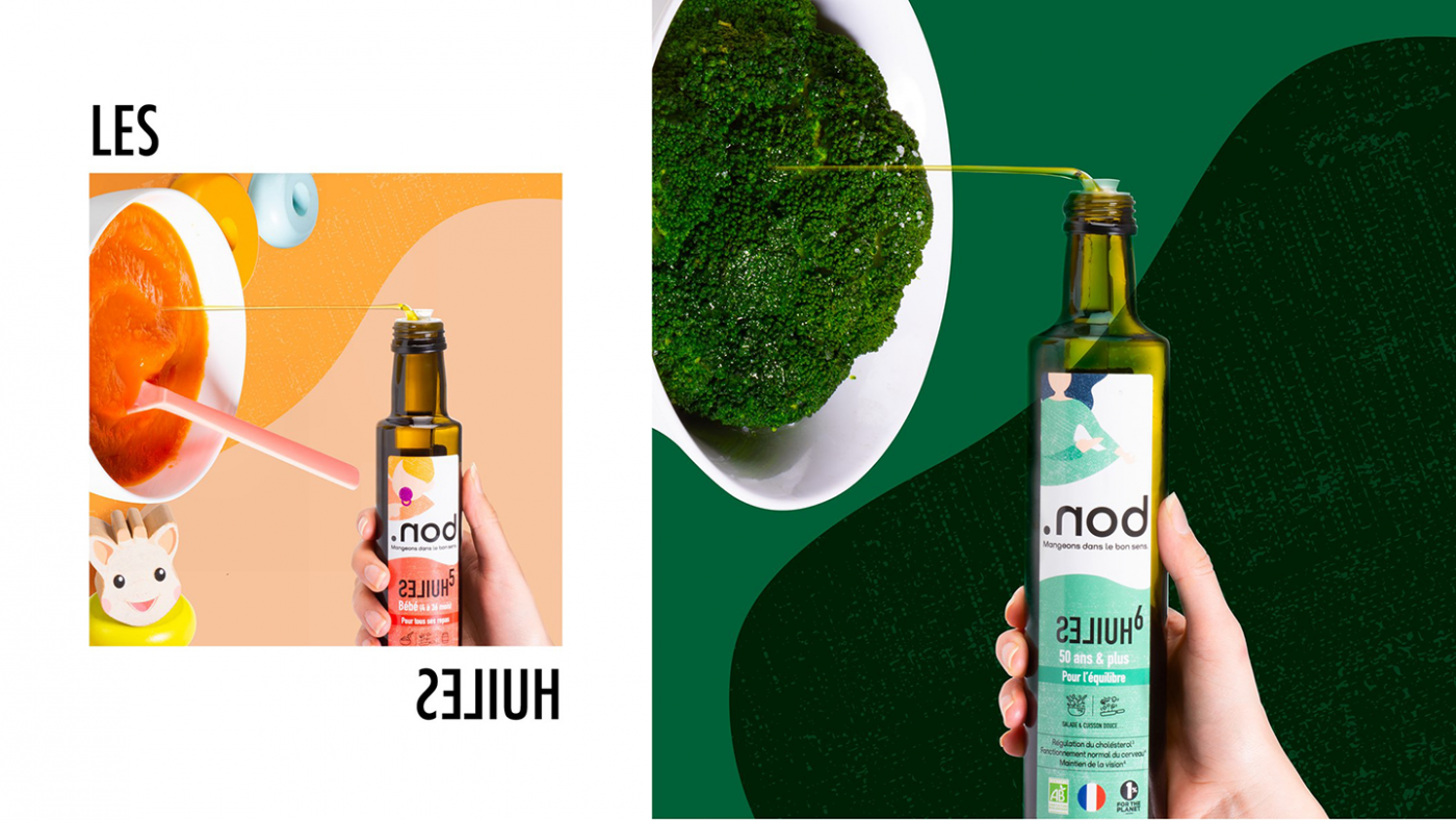
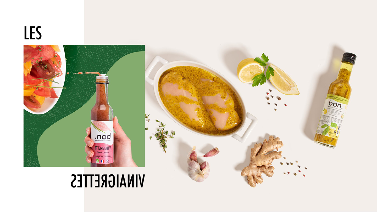
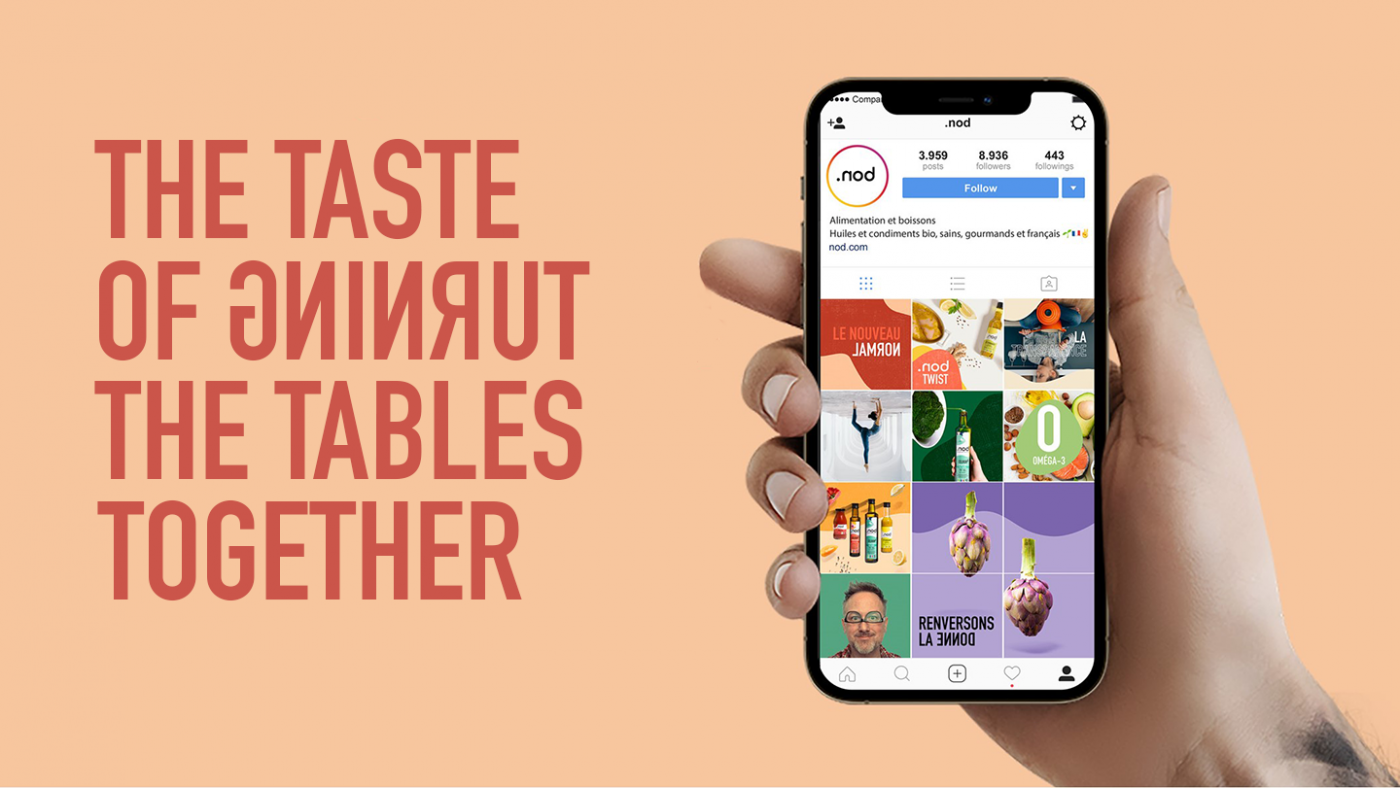
CBA also defined .nod’s social media strategy based on the brand’s message. The agency wanted to initiate a dialogue between a real brand and (increasingly) demanding consumers by launching a movement that would bring together good and common sense. Therefore, CBA has created a candid and human tone of voice, in line with the brand platform and without falling into a moralistic or alarming communication: we are not perfect, that’s okay, but we do our best and we don’t hide anything from consumers. The goal is to be aware of the impact of our consumption and to want something different.
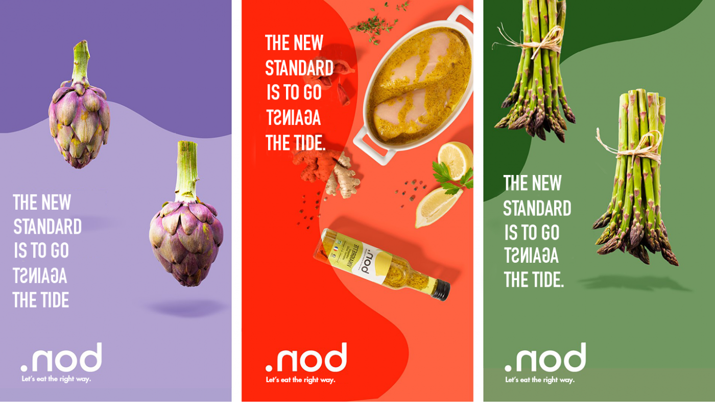
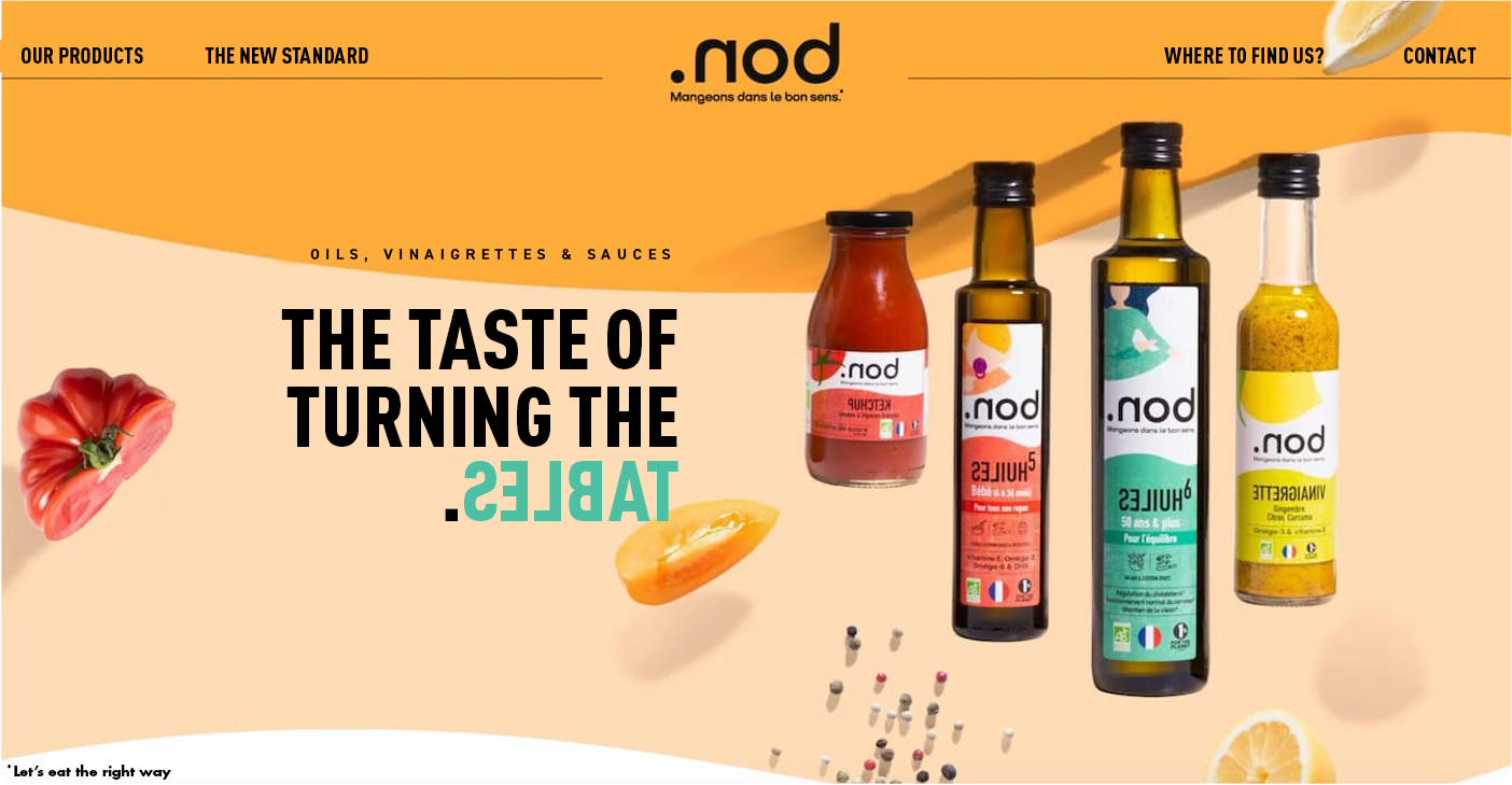
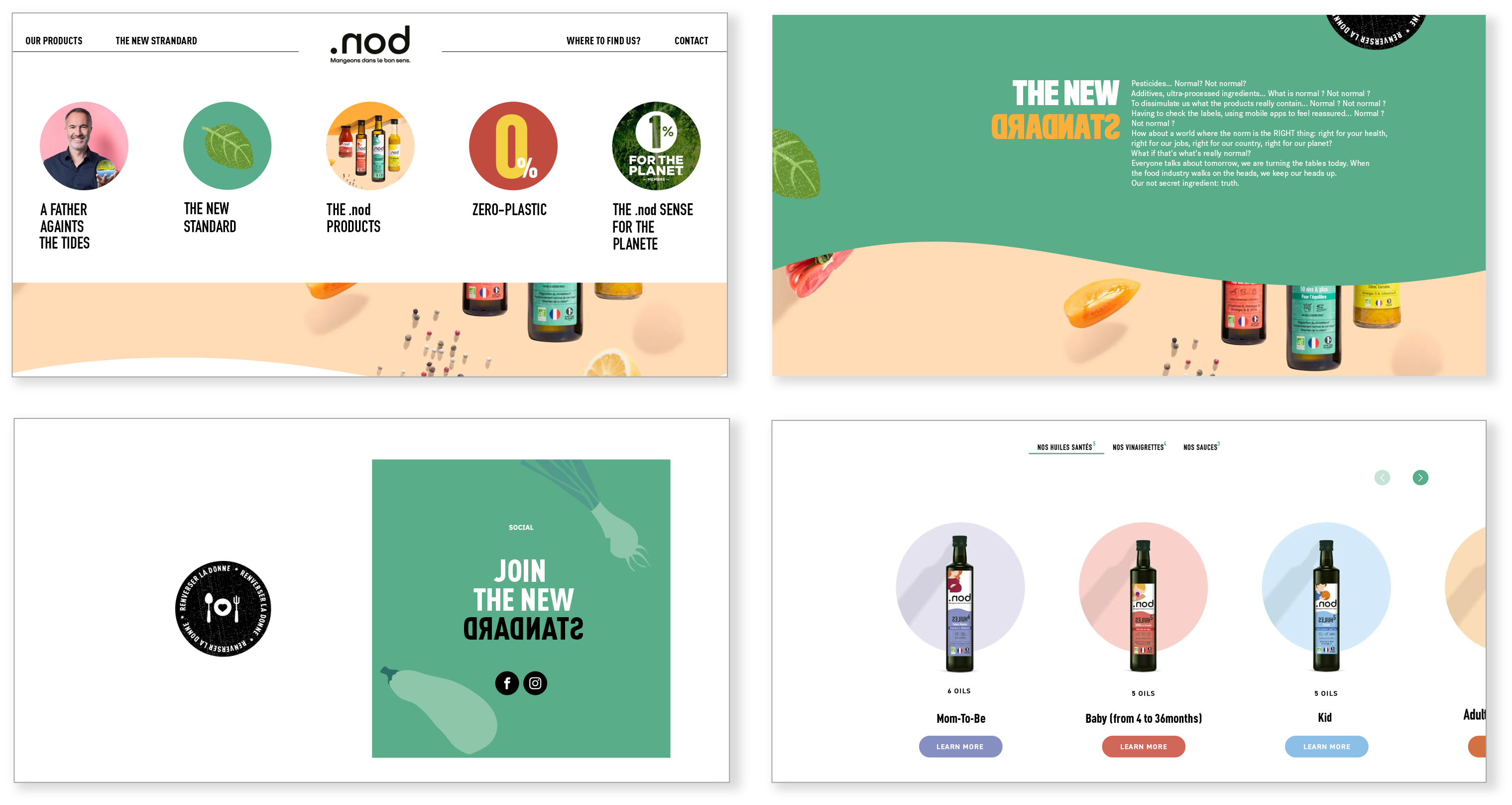
So, ready to turn the tide with .nod?
Shangri-La Group introduced its first European hotel in Paris in 2010, and settled in the former private mansion of Prince Roland Bonaparte, the great nephew of Napoleon I. At the time, CBA worked with Shangri-La to create the new visual identity of the restaurant, and to imagine an elegant connection between the prestigious past of the hotel and the unique experience offered by the Chinese hotel chain.
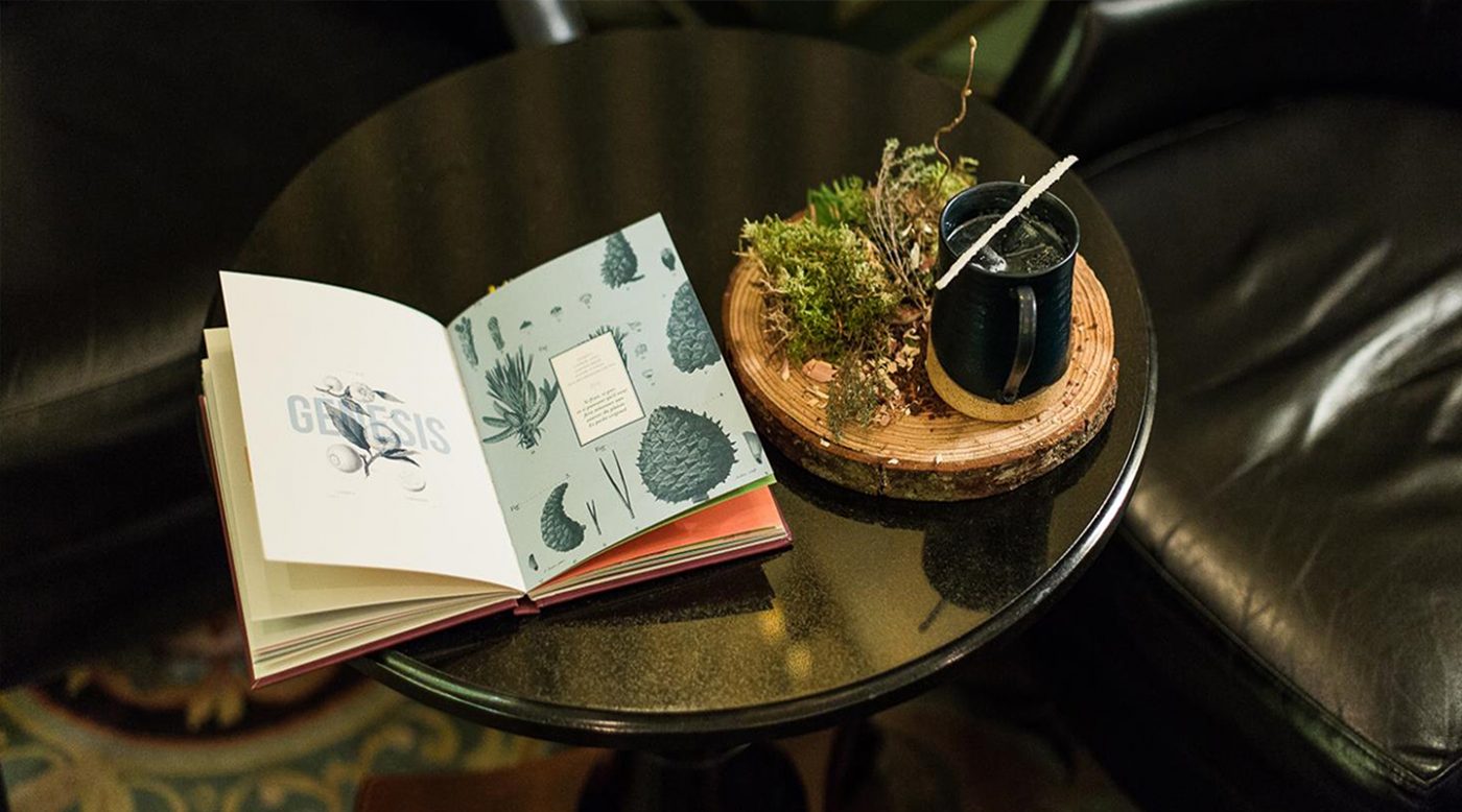
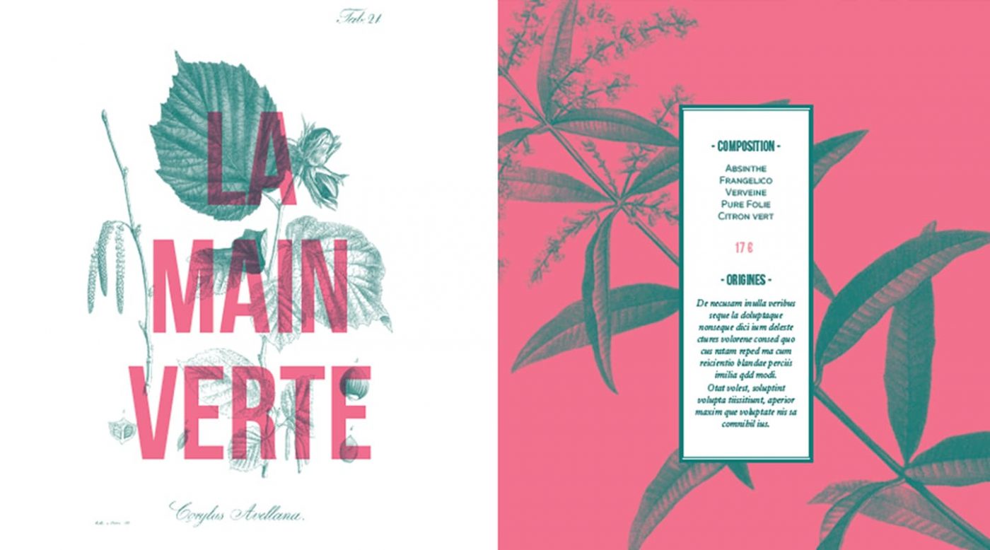
Today, Shangri-La Group decided to relaunch its cocktail offer, and CBA had the great opportunity to work with the brand once again. For its cocktails, Shangri-La imagined something bigger than just a menu, something more memorable. The brand and CBA therefore thought of a book, presenting 15 cocktails created by the hotel chain, in a beautiful and refined way.
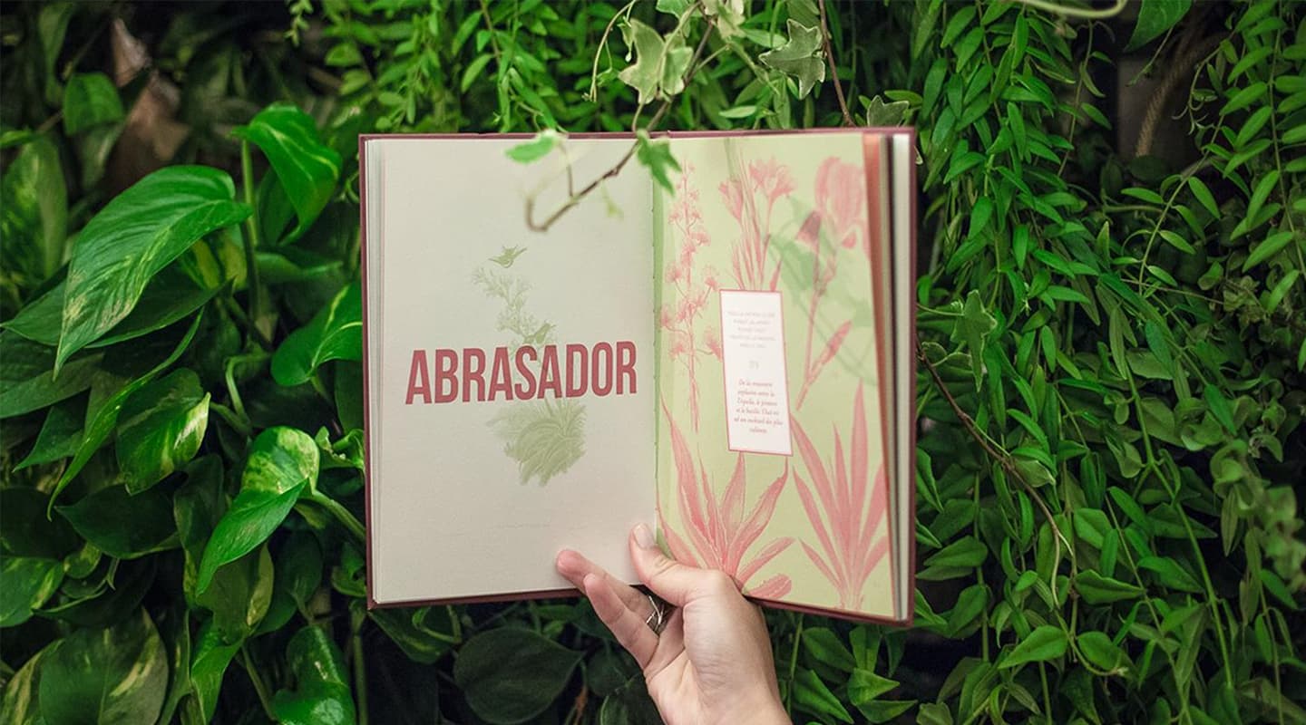
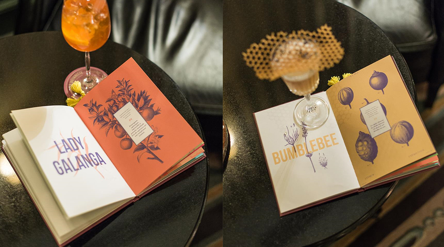
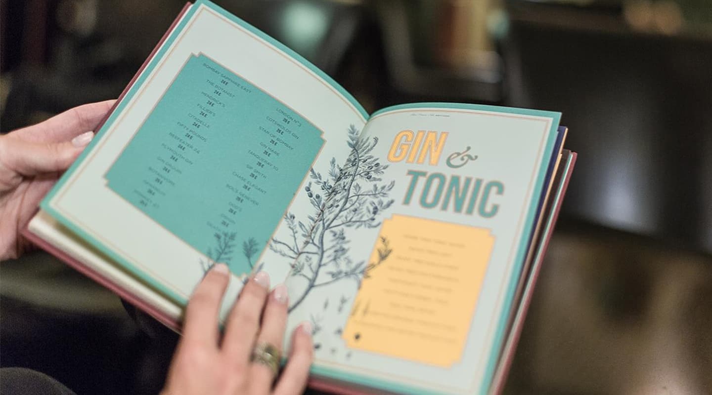
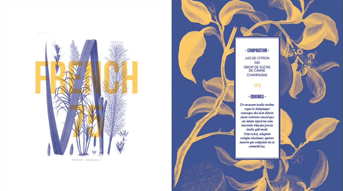
CBA imagined the names of the cocktails (by tasting them all!) and created the visual identity of the book, inspired by the origins of Shangri-La and by the atmosphere and historical dimension of the place.
Rolland Bonaparte was the owner of the biggest European Herbarium, and CBA therefore decided to use reproductions of plants and herbs, adding punchy and offset colors to them to keep a humoristic and free spirit. The names of the cocktails were although thought in this spirit, using puns to illustrate the personality of the drinks. A “Lady Galanga” anyone?
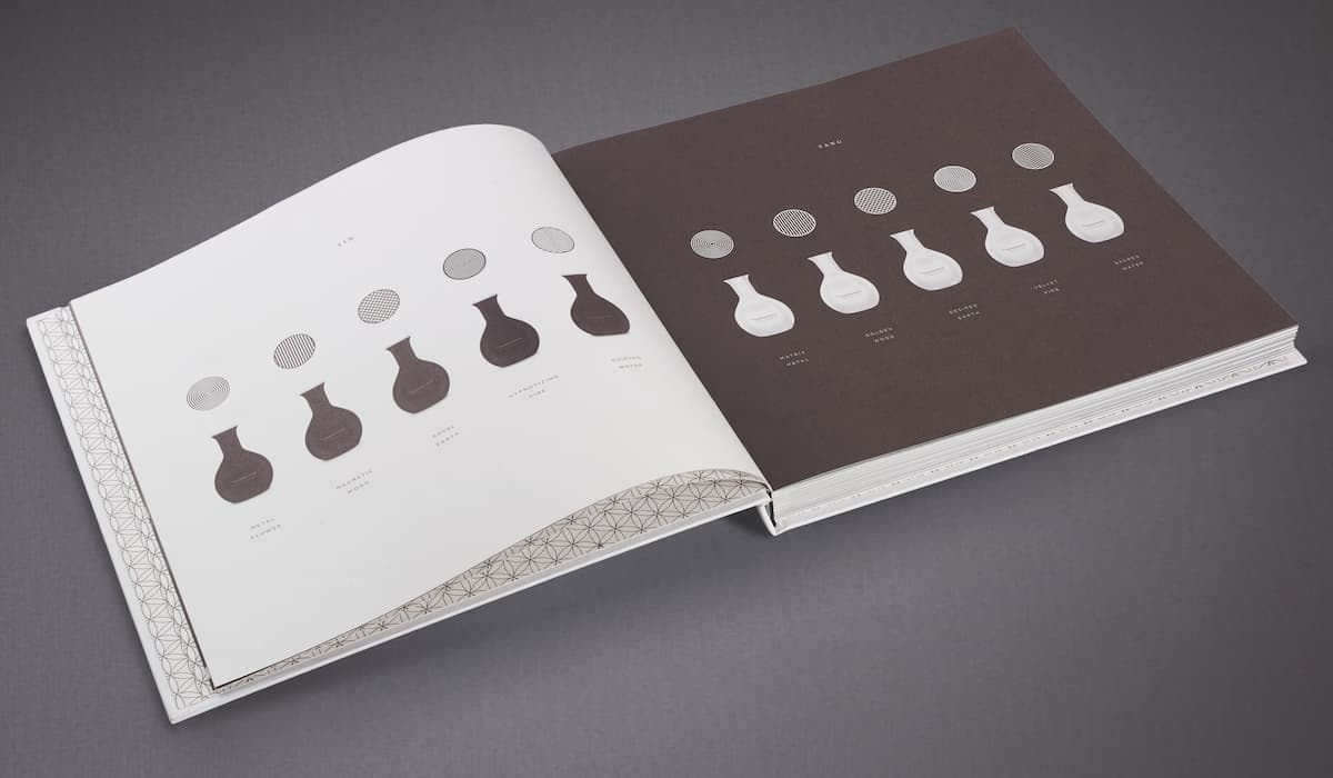
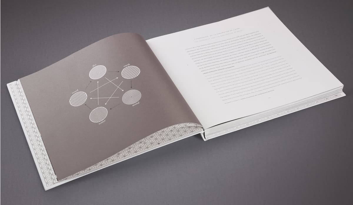
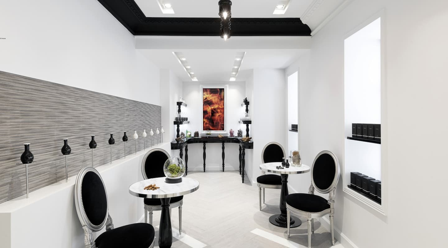
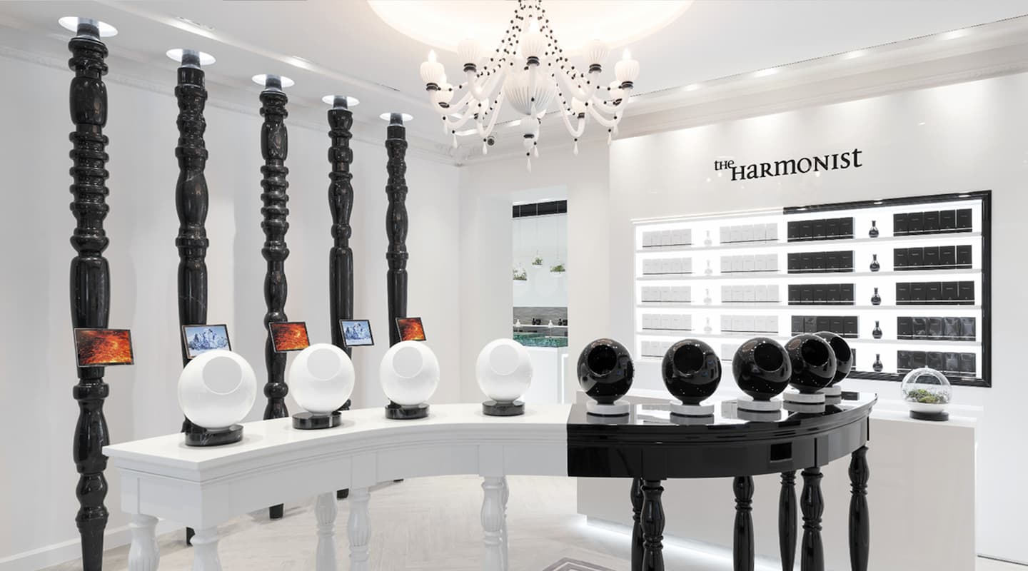
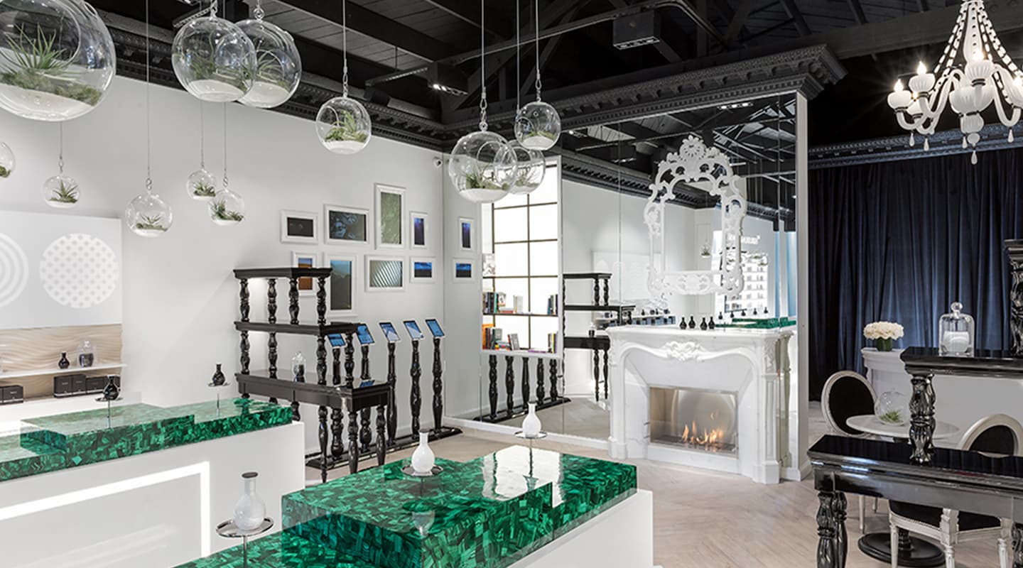
Water, wood, earth, fire and metal are the five fundamental elements of Yin and Yang, from which The Harmonist, a new fragrance house that opened its doors in 2016 in Paris and Los Angeles, got inspired. Feng Shui, an ancestral Chinese art that consists of choosing objects, colors and elements to create a space full of positive energies, now takes the shape of a perfume.
The idea of this first collection imagined by The Harmonist is to take advantage of the fragrant powers of the 5 Earth elements to “stimulate harmony as a real source of beauty.”
As well as the olfactory experience of these precious nectars, it is also the possibility to find a perfume “adapted to your Yin or Yang element, and in phase with your ambitions” that constitutes the fundamental originality of this new perfumer. “For each fragrance, a power of Harmony”.
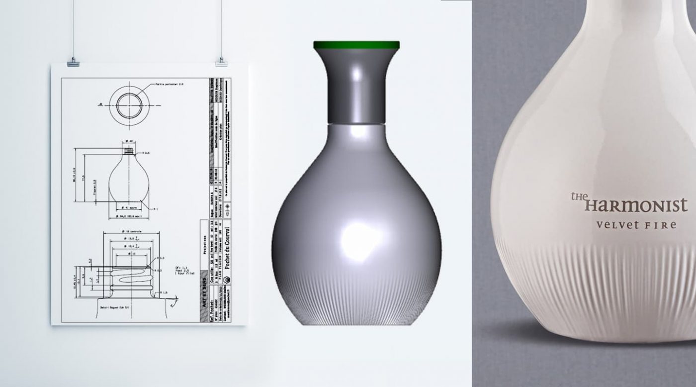
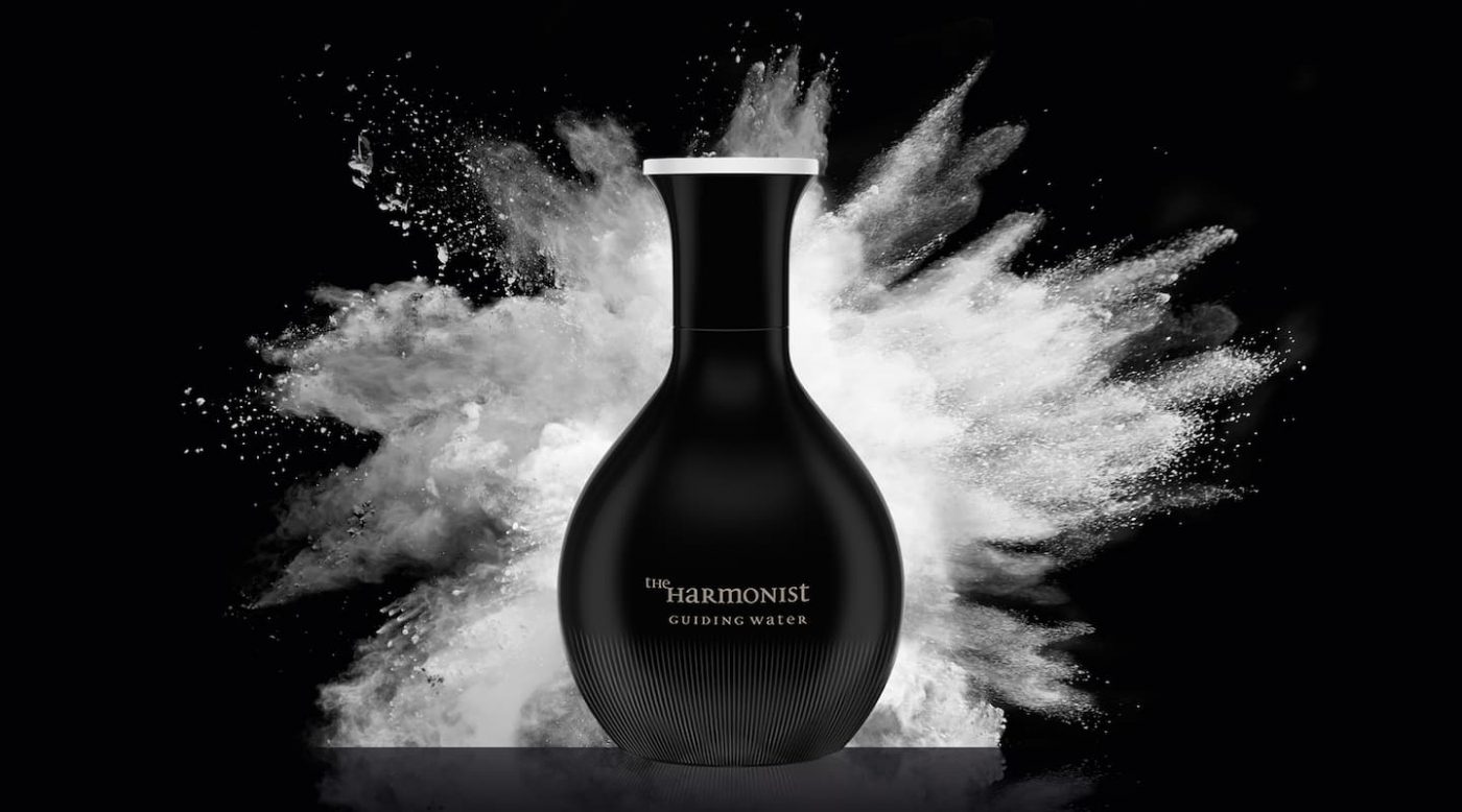
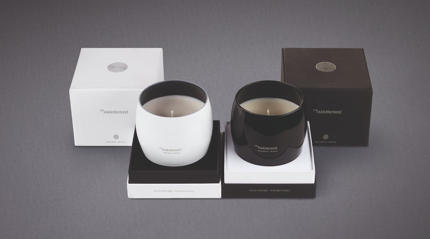
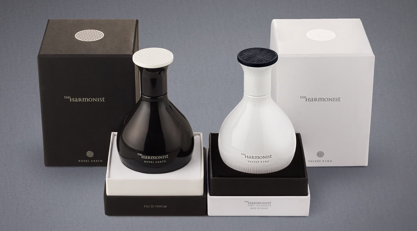
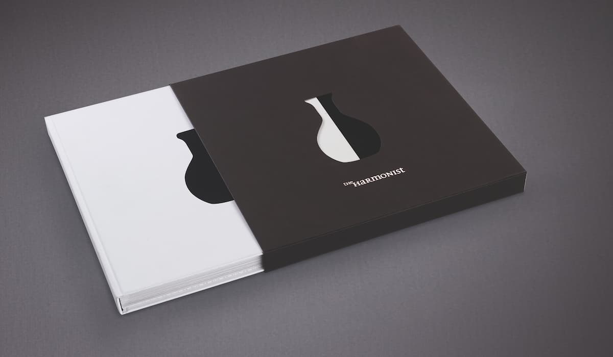
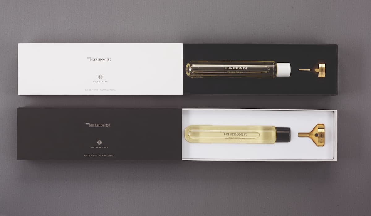
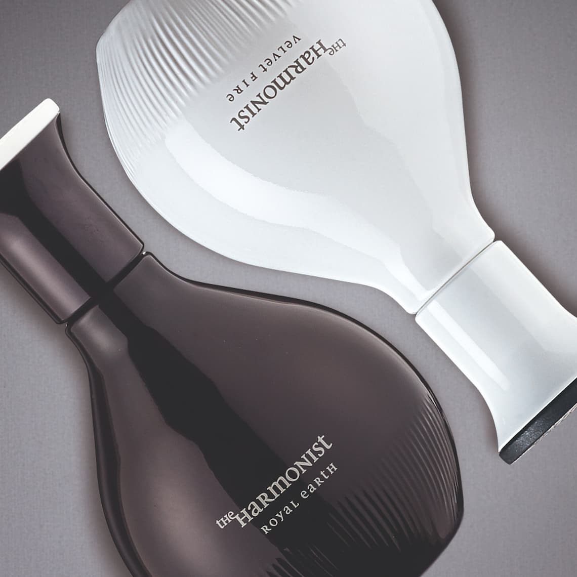
CBA started to work with the Harmonist from the very beginning, creating the brand name and its visual identity, as well as working on the design of the elixir bottles, and declining its distinctive personality on the packagings of the first perfumes and candle collections.
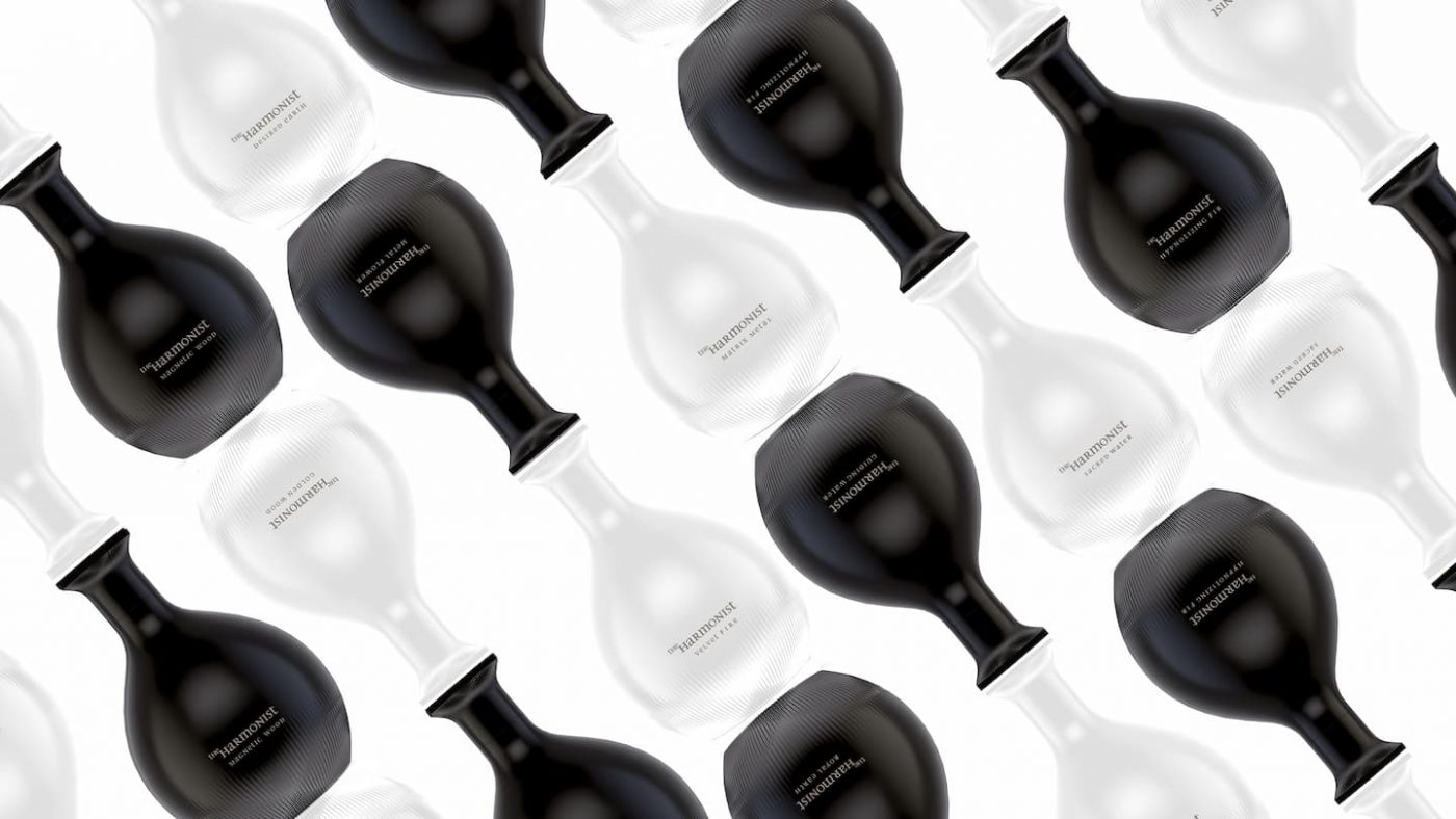
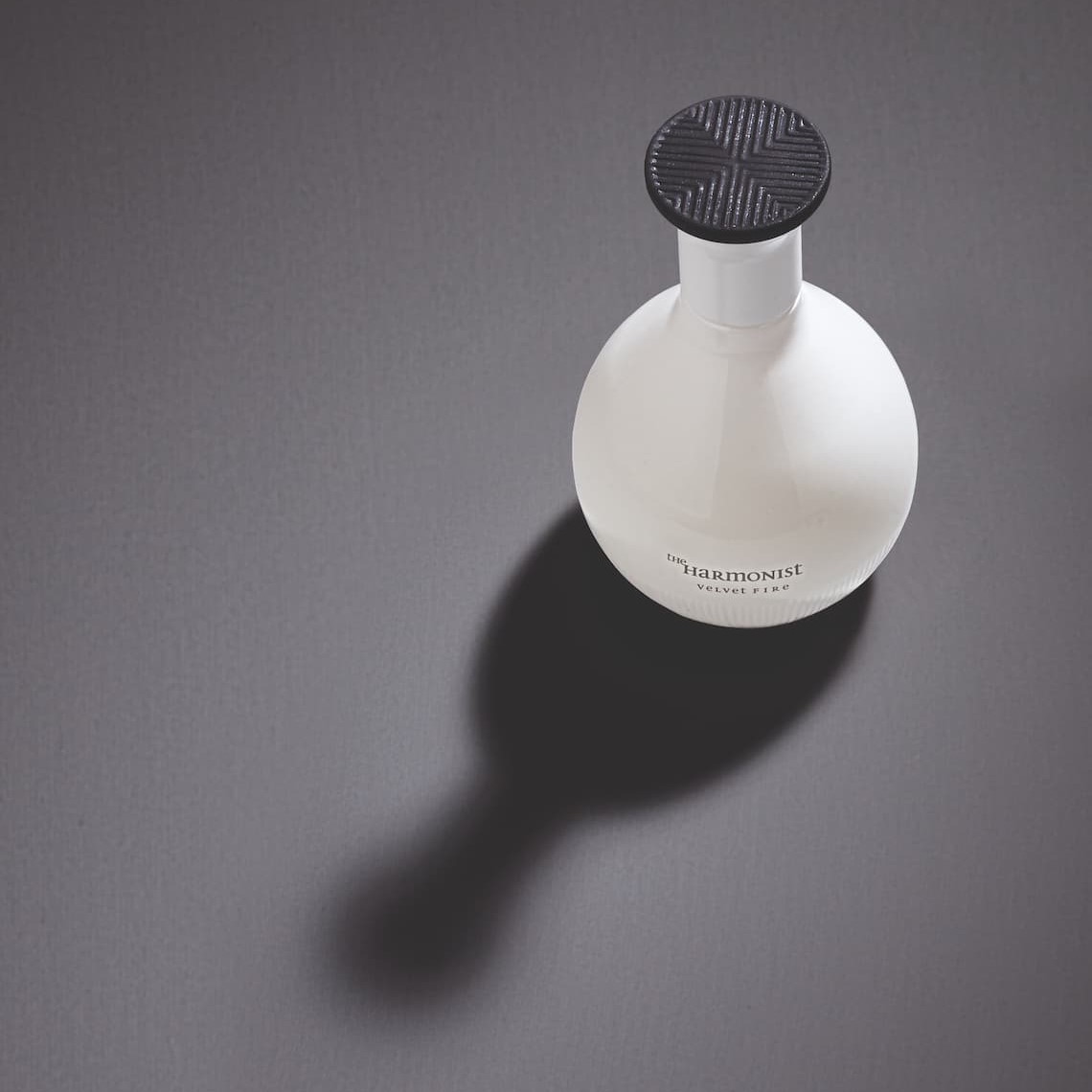
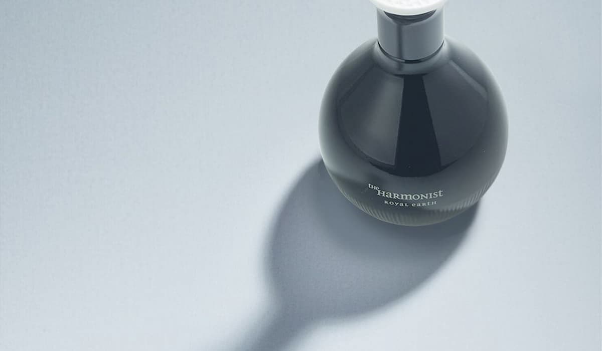
To magnify the expression of The Harmonist, CBA imagined black and white refined bottles, inspired by ancient containers of Chinese medicine, and in reference to the Yin and Yang. The use of recyclable materials in the fabrication of the perfume bottles was thought as an evidence, to ensure the harmony between Men and Nature. All of the bottles are refillable, and each is made with an opaque glass that protects the vitality of its precious perfumes.
