France
Paris
Switch to your local agency
Retour au menu
For more than 10 years, CBA has supported the Nescafé brand – the Nestlé group – on multiple brand issues.
In 2020, Nescafé once again called on the CBA teams. Indeed, for Nescafé, as a leading brand, it was important to enter the rapidly evolving capsule segment in order to complete its offer and assert its historical know-how.
Thus, Nescafé wanted to review its portfolio by launching a unique range, representative of its commitment to producers as part of its Nescafé Plan initiative.

CBA’s solution? Develop a premium offer in line with the sustainable development policy initiated by the Nestlé group -Nescafé Plan- and by demonstrating Nescafé’s historical know-how.
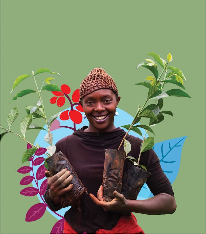
With Nescafé “Farmers Origins”, CBA has created a range of fresh and sustainable coffee capsules. An innovation possible thanks to the 10 years partnerships that the brand maintains with farmers around the world (700,000 farmers in 15 countries). The positioning of this new range is borrowed from the selection of coffee and the promotion of the know-how of the communities, both from a quality and sustainability point of view.
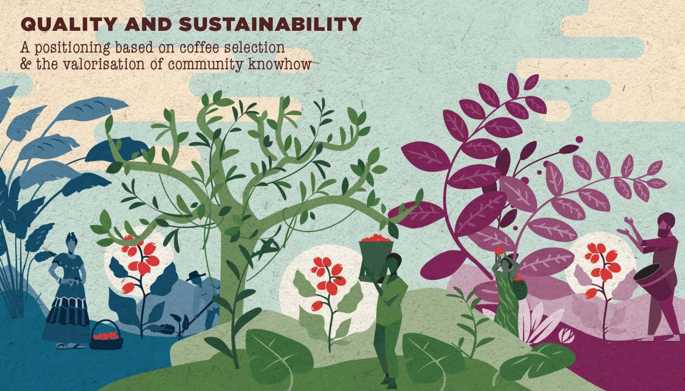

The design system developed by the agency expresses the virtuous circle of sustainability, respect for producers and fresh coffee.
CBA wanted to accentuate the consistency between the design of the packaging and the positioning of the brand by anchoring the capsule at the center of producers and coffee plans, in their places of origin.
The visual identity of the packaging is strongly marked by the Nescafé logo – developed a few years ago by the CBA teams as part of a global overhaul of the brand’s identity – with a Nescafé Farmers Origins sub-brand more discreet.
The origins of the farmers and the origin of the coffee beans are highlighted by a simple, sincere and authentic illustrative style, with the common theme of the coffee plan.
The sustainable and respectful aspect of the aluminum capsules in this range is also highlighted on each packaging via simple illustrations.
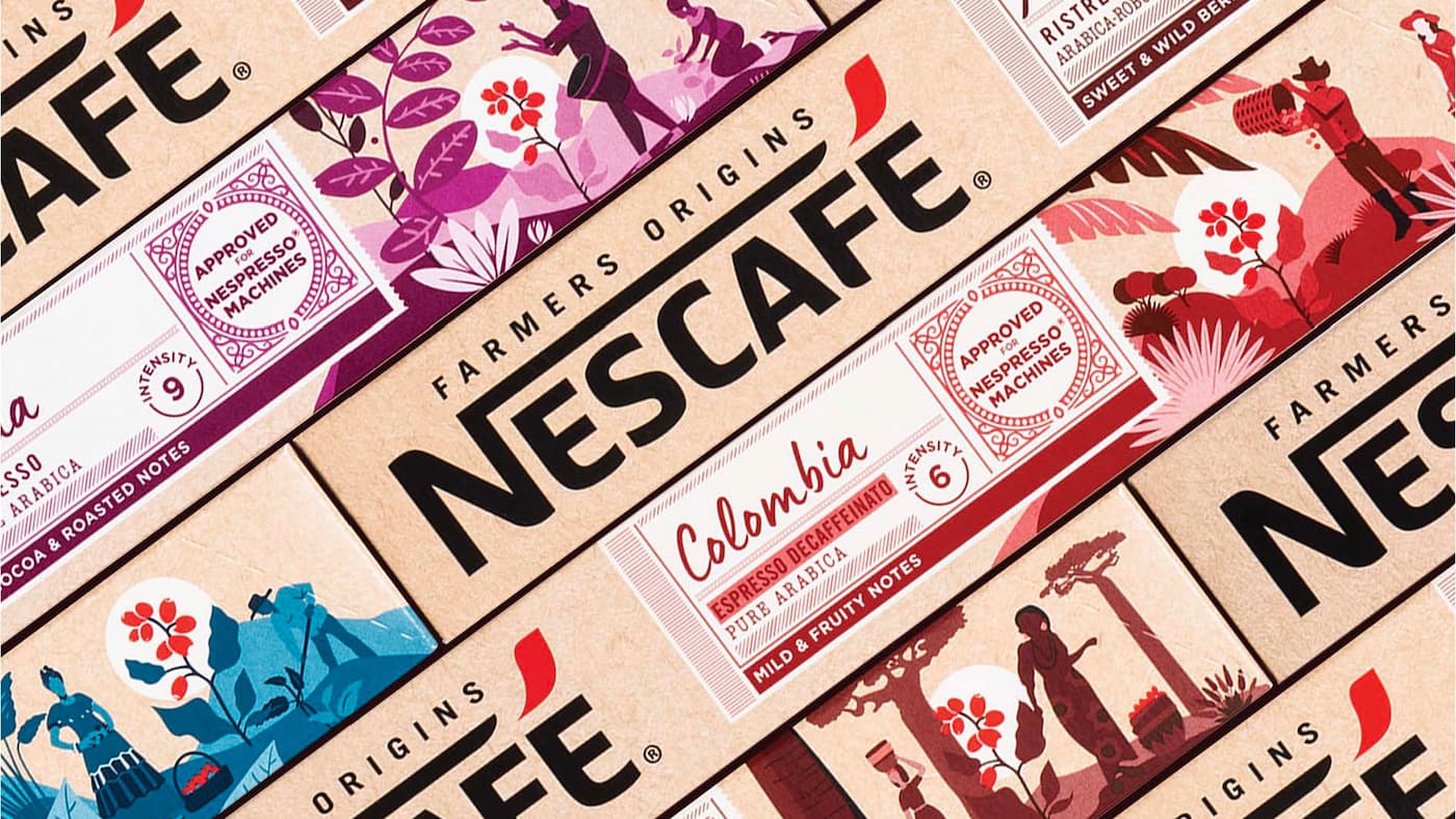


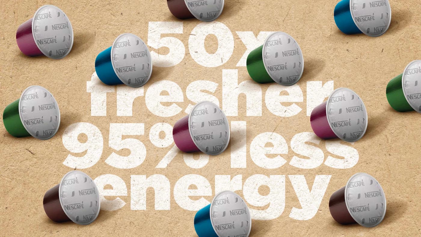
The packaging also includes a digital seal (QR code) on the back, a guarantee of authenticity and traceability. Consumers can thus scan the code to discover the origins and place of production of their coffee, the community of farmers behind the product, etc.

The CBA teams then developed the visual identity on graphic communication assets, POS elements, complementary products (cups), etc.

The range was launched in 2020 in Australia and then in the Netherlands. Spain and France have since launched this range as well.
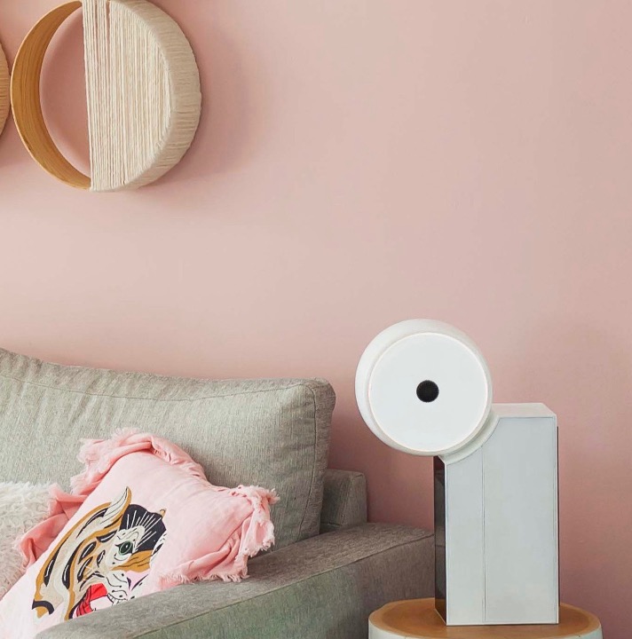
The customization of the interior is a growing trend, reinforced by the health crisis, where the home has taken on an additional dimension of shelter.
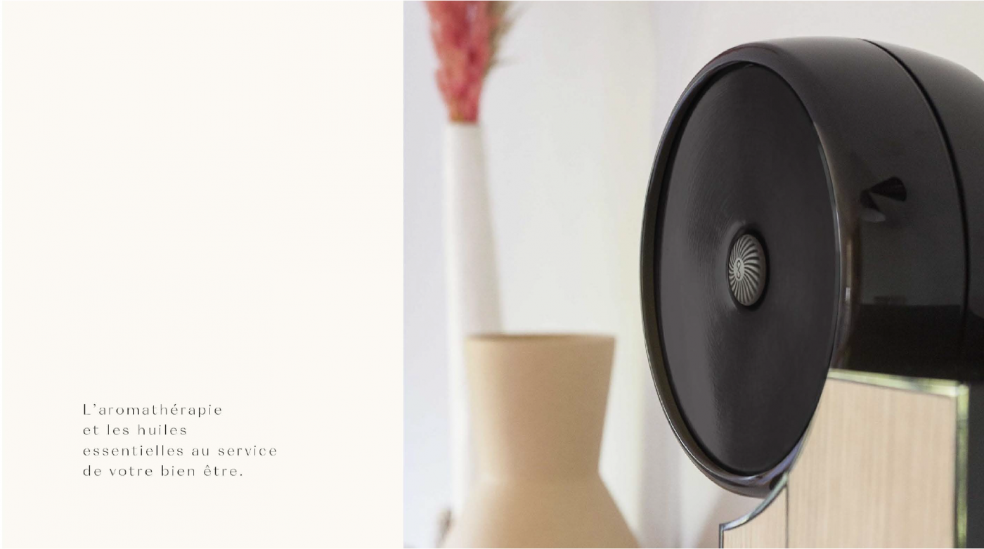
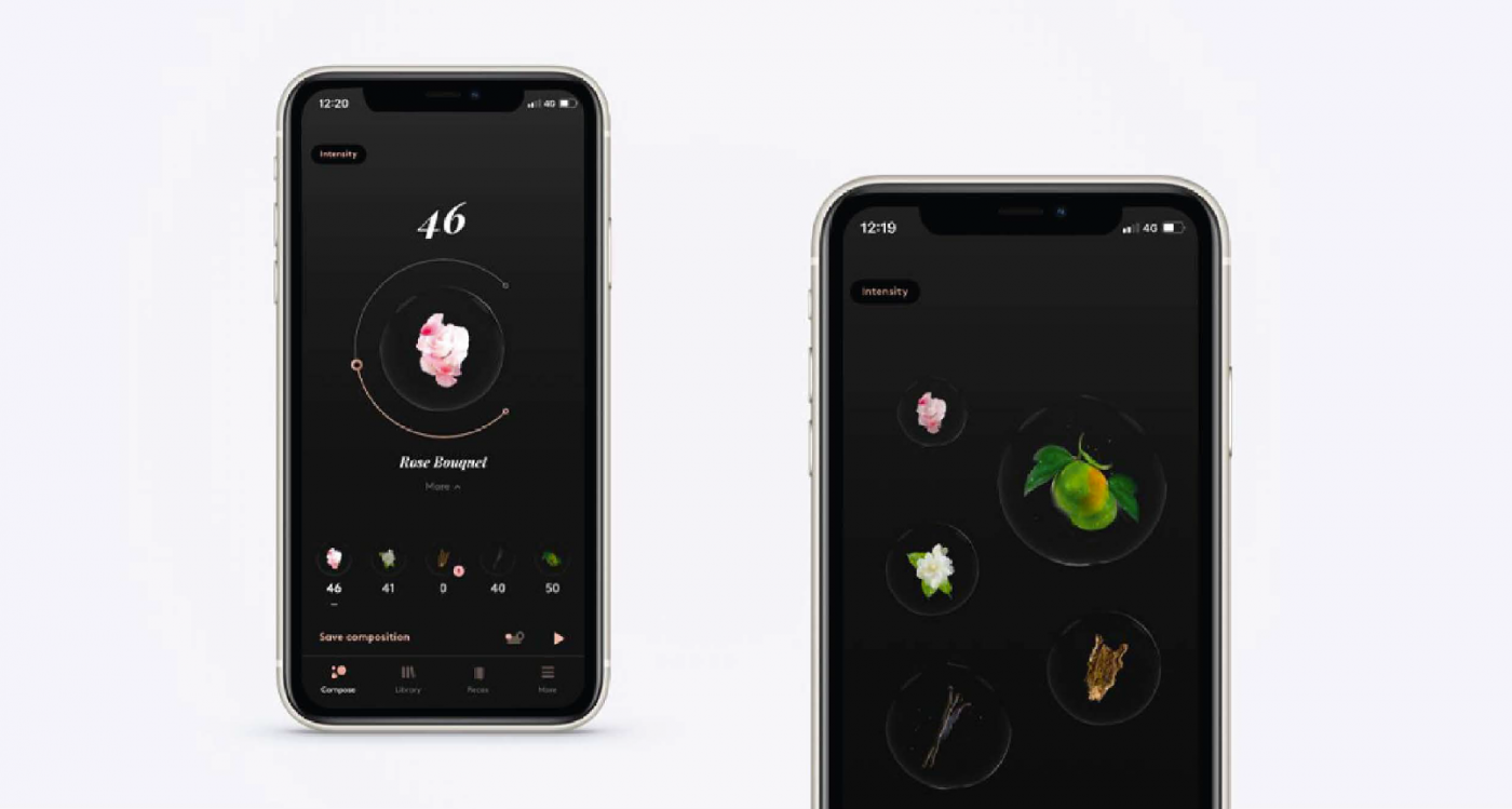
As a result, Artiris is launching a strong innovation on the market: Compoz.
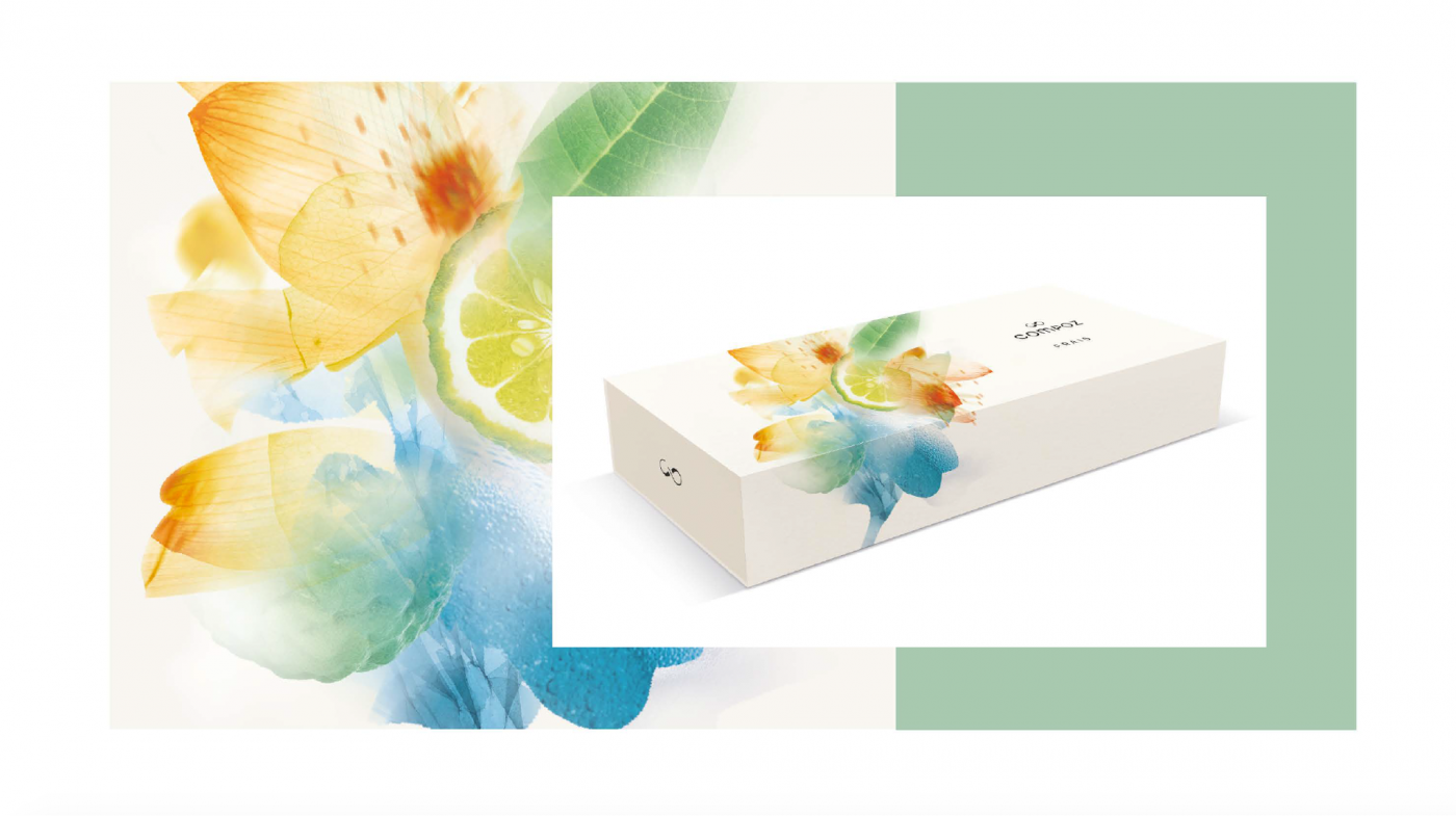
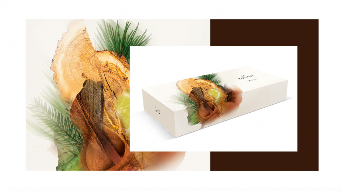
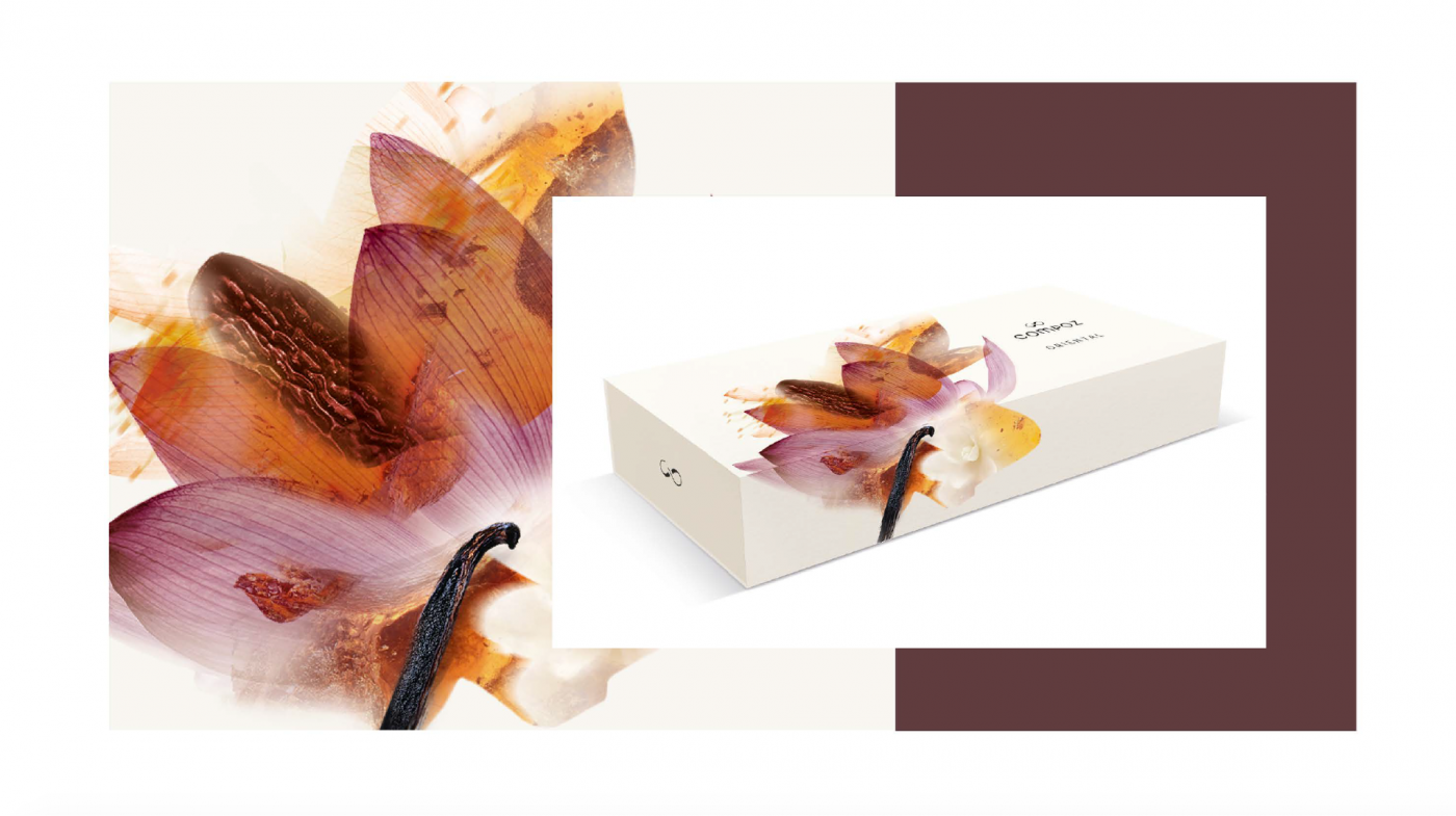
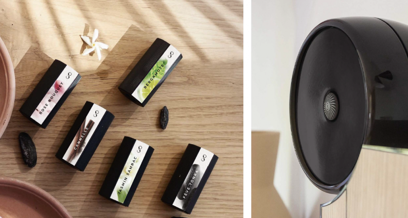
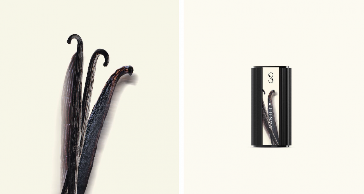
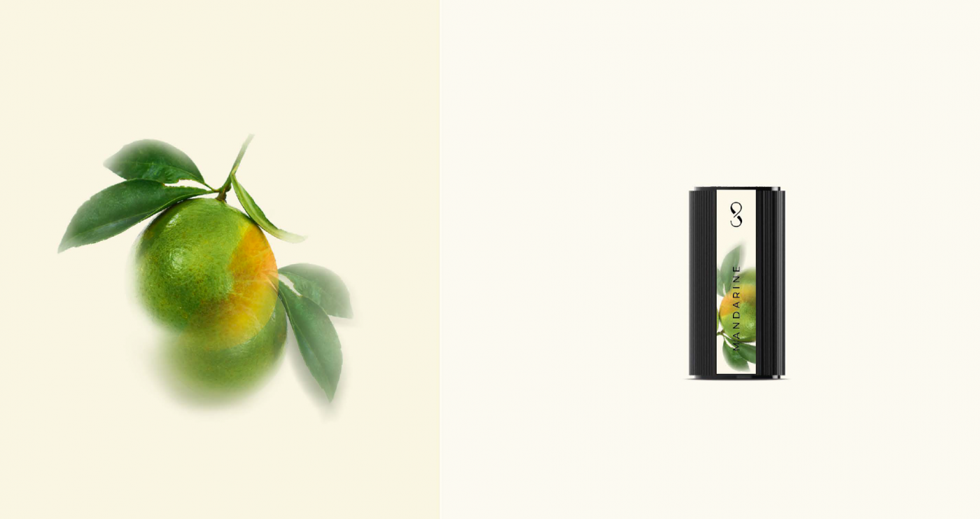
Compoz is the opportunity to diffuse at will, and according to a fully customized and controlled choice, a combination of natural fragrances, for the creation of a customized olfactory environment.
CBA Design supported Compoz, the French brand that promises to revolutionize the world of fragrance and wellness, during its market launch. The agency collaborated with the brand by activating several of its divisions (Brand Identity, Packaging Design and Retail & Architecture), with three main objectives in mind:

Faced with a food-processing industry that is walking on the head, with pesticides, additives and junk food, consumers no longer want to be driven without knowing where they are going. They need transparency, more than ever, they need to know what they are eating.
Being a committed food player since 2009, and with .nod, Biofuture offers to consumers the experience of truth by fighting against the nonsense of the food-processing industry.
For Biofuture, it is time to change direction and defend a new standard: the taste of good, without concessions, for us and our environment.
Its new brand .nod illustrates this fight by challenging what should be the new normal.
.nod
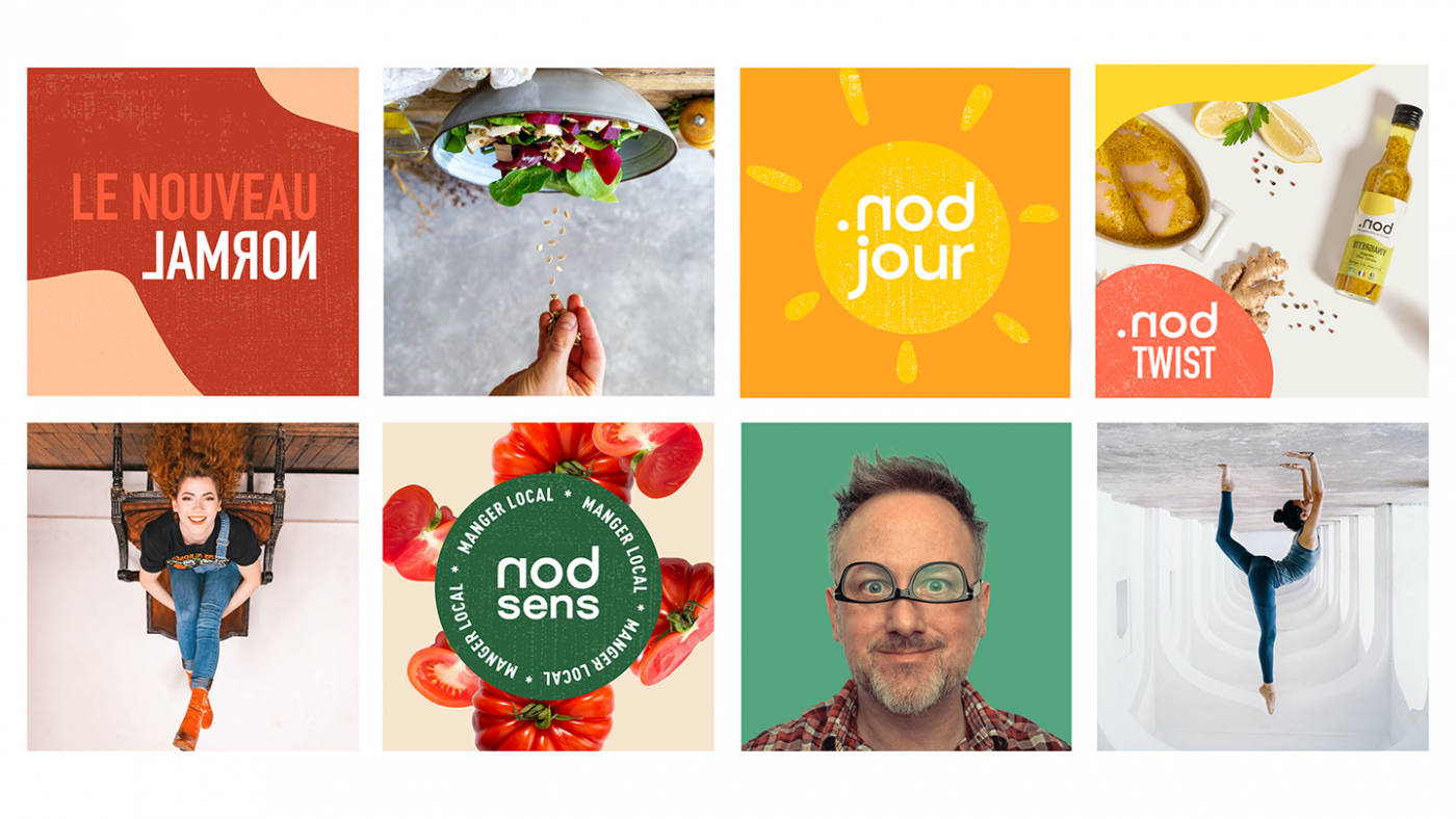
To trigger this committed, positive and gently impertinent awareness, Biofuture called on CBA to support it from the naming to the communication strategy, including the creation of the brand platform.
The main challenges for CBA were to define the strategic fundamentals of the brand in order to deploy an identity and graphic ecosystem that makes sense with 2 main ambitions:
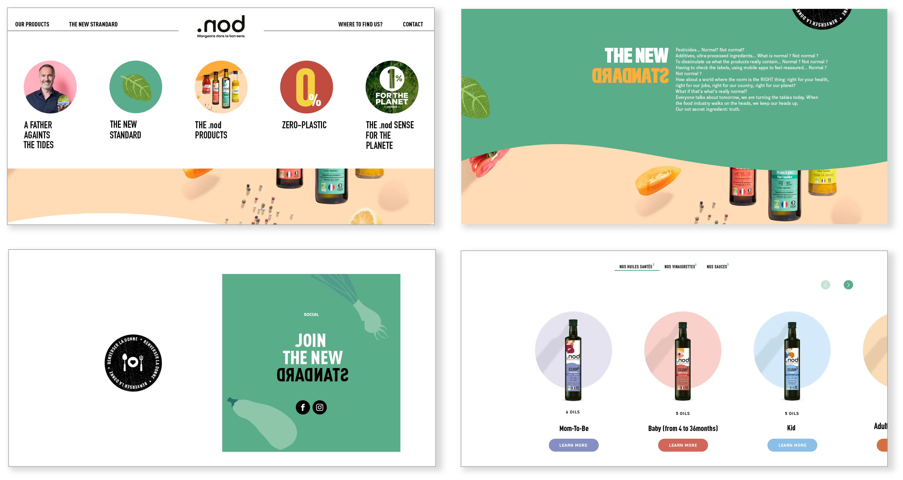
In the last 50 years, the food standard has turned upside down. The norm today is pesticides, additives, ultra-processing, opaque origins… We feed on chemistry and everyone thinks it’s normal! In a world that is walking on its head, we are convinced that the best way to go back to the right way was to go backwards! .nod (= bon which means good in French), the first brand that is spelled backwards, is an invitation to change direction and to ask ourselves if normality should not be good, “without chemistry”, raw, local…
With .nod let’s eat the right way!
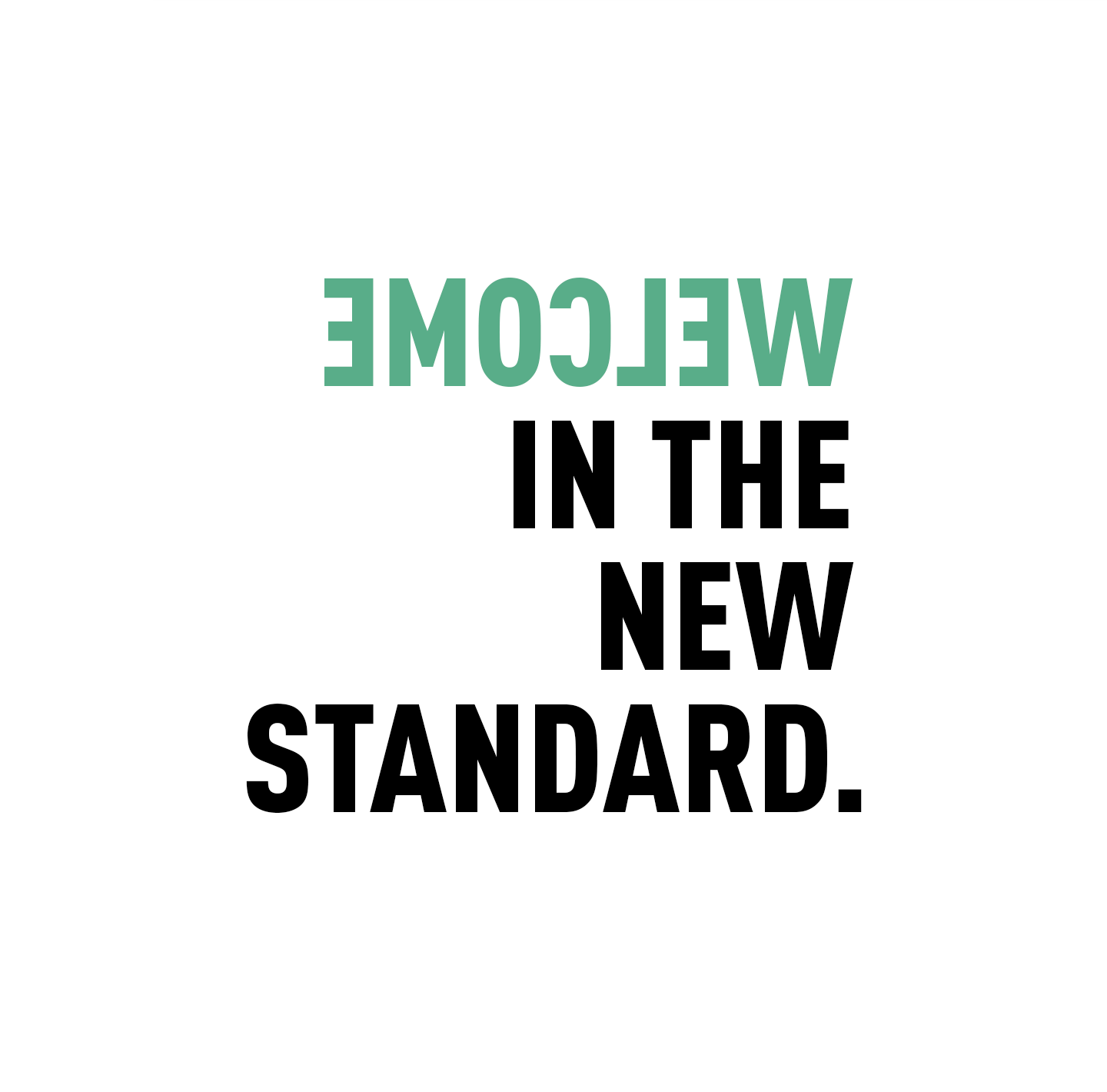
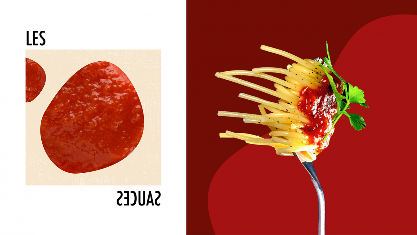
Based on this observation, the agency wanted to put the spotlight on an innovative creative concept: common sense is to change it. Therefore, CBA has developed a visual identity in line with this concept, i.e. “upside down” creations with an aesthetic that emphasizes taste. The goal of this graphic territory is to be against the tide.
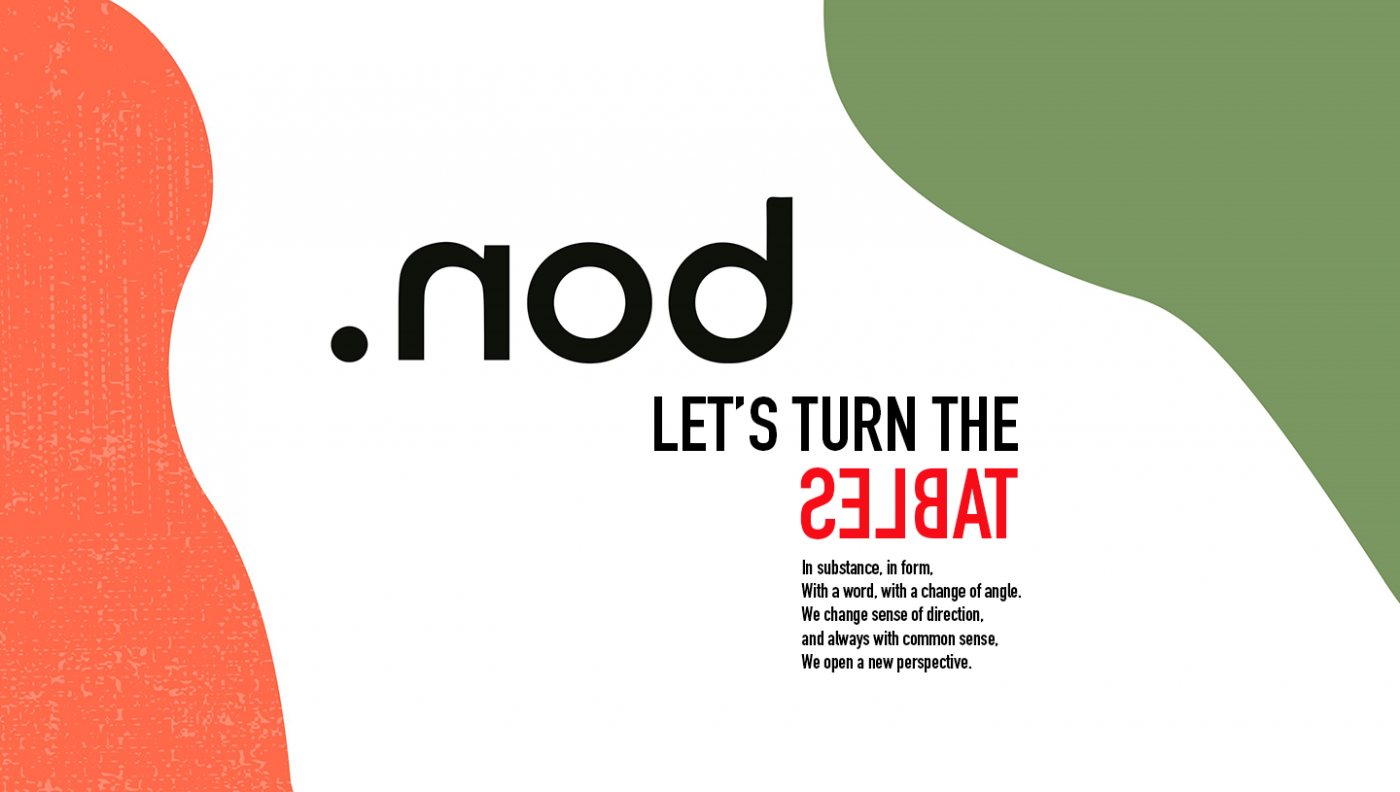
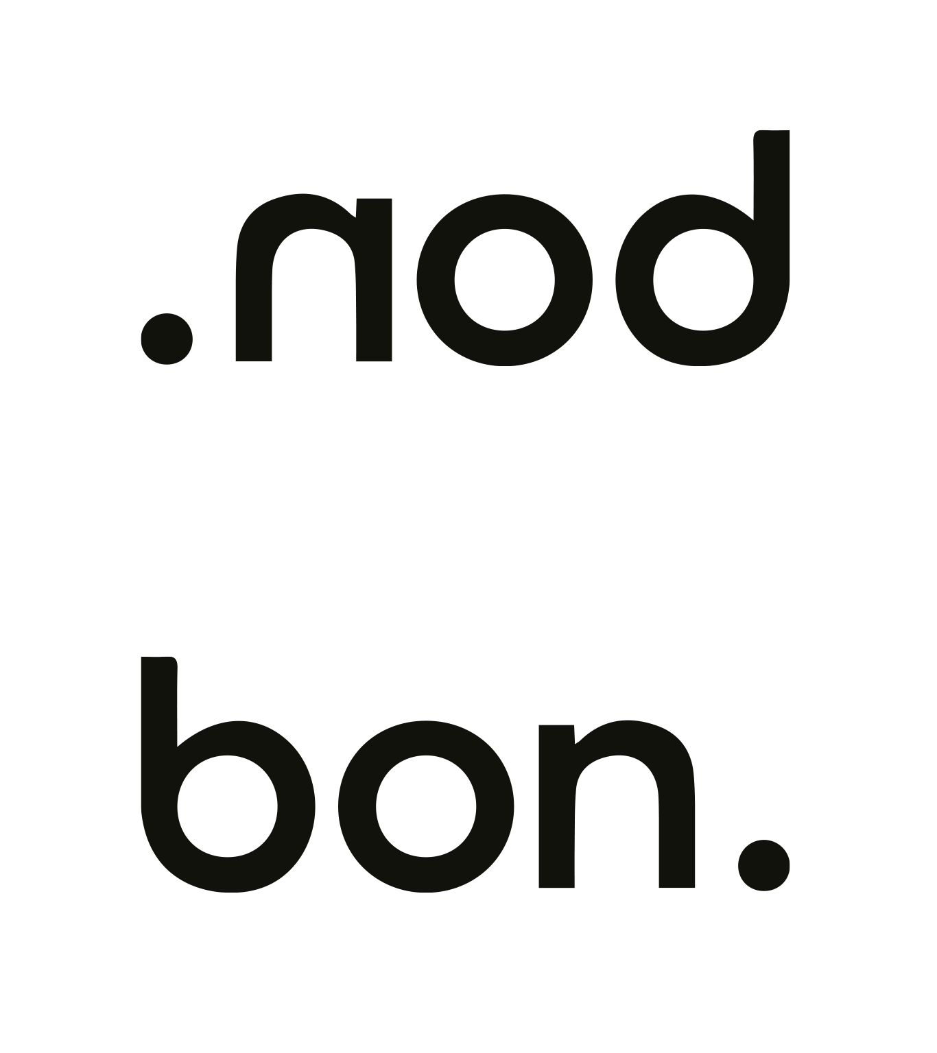
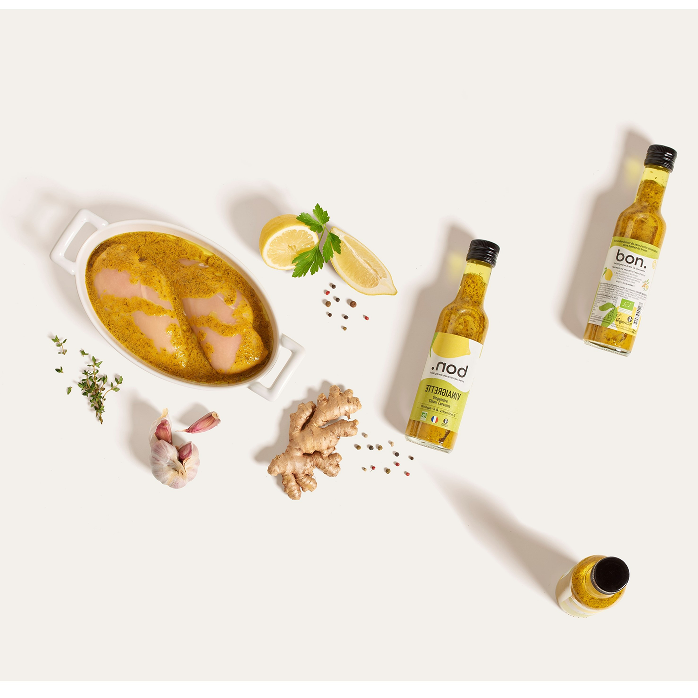
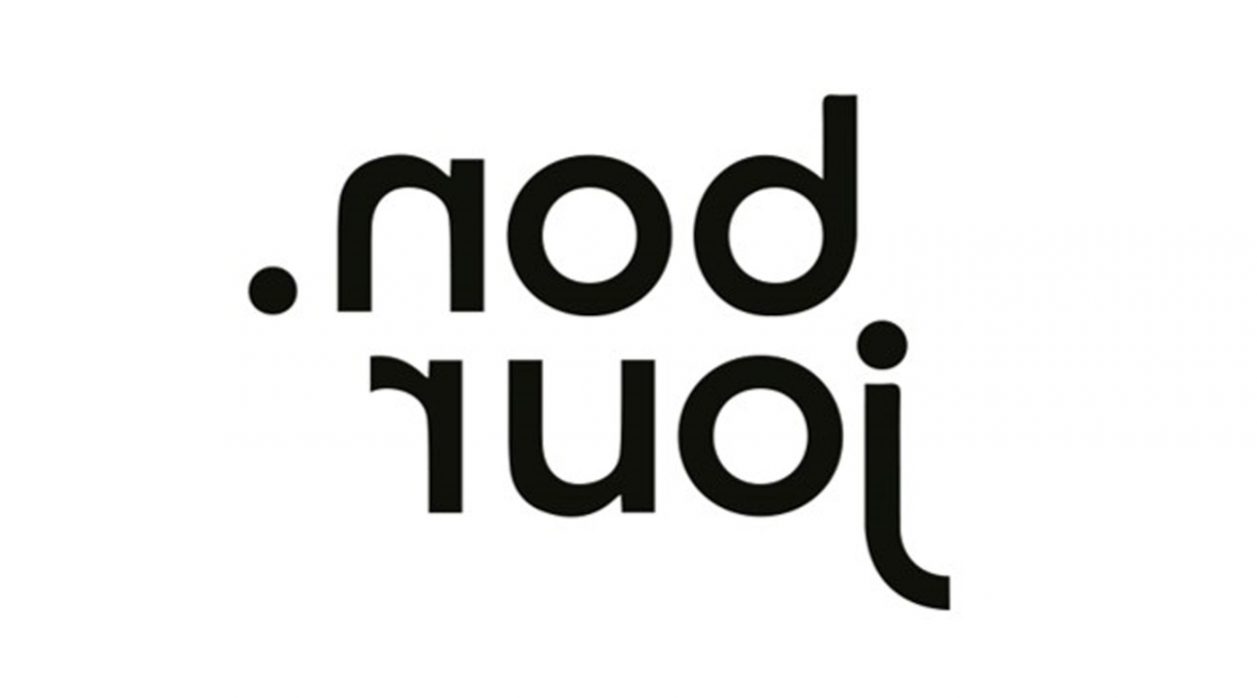
The logo has also been designed: by using the mirror effect, it allows you to read the word “bon” (“good” in French) hidden in the brand name. The dot, at the beginning of the word “nod” or at the end of “bon”, depending on which way you look at it, emphasizes the simplicity of the products; .nod products are good, and that is all!
Between typographic plays with a single word inverted and visual games through abstract and random shapes, the graphic territory reflects the impertinence and the peps side of the brand.
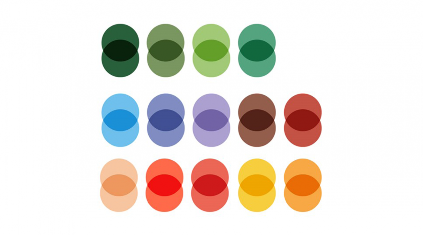
Finally, this graphic territory presents bright, fresh and vitaminized colors that reflect the products; tasty condiments that brighten up all your dishes.


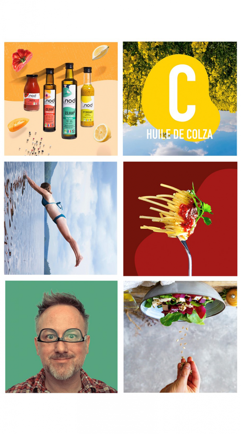
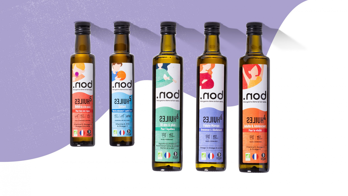
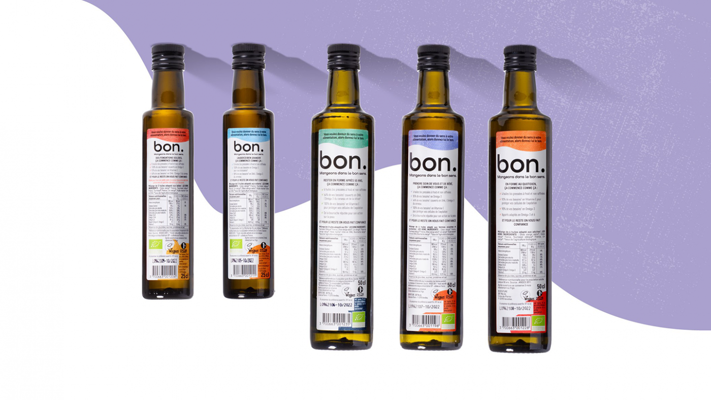
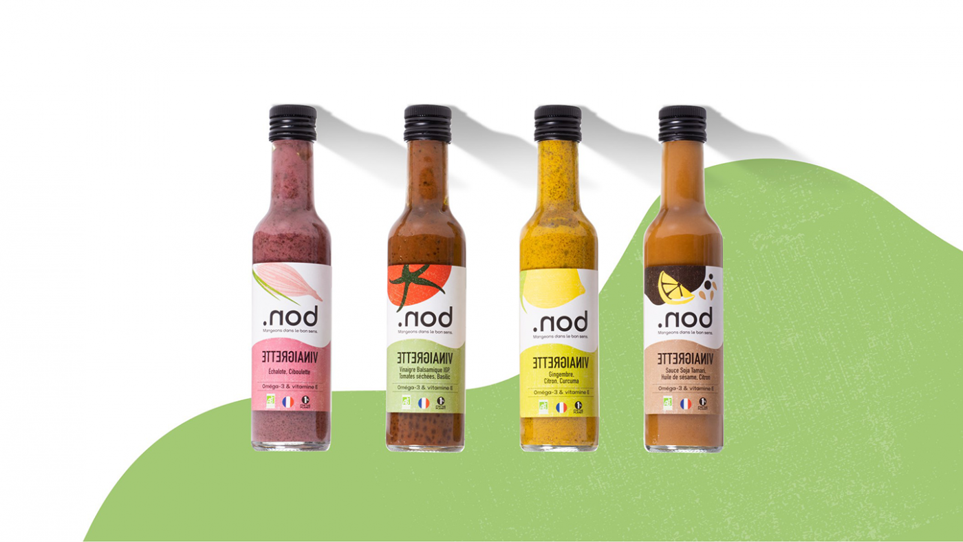
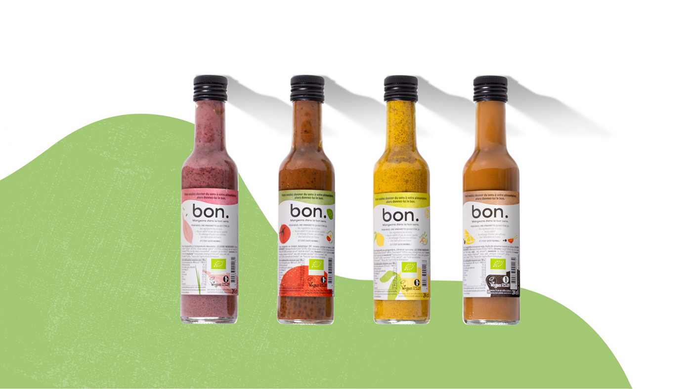
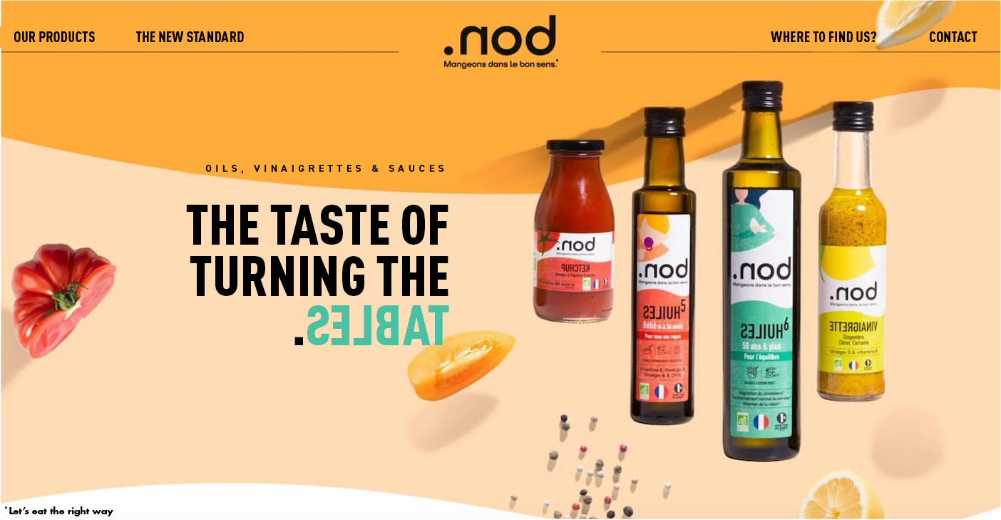
In line with the visual identity designed by our teams, the packaging also plays with the sense of the product. Whether they are placed upside down or right side up, the name remains legible. This play on the orientation of the packaging allows the brand to highlight its products, to make it unique without leaving consumers indifferent.
Finally, the packaging uses the colors of the graphic palette, allowing the products to be differentiated depending on the tastes and flavors and making it recognizable at a glance.
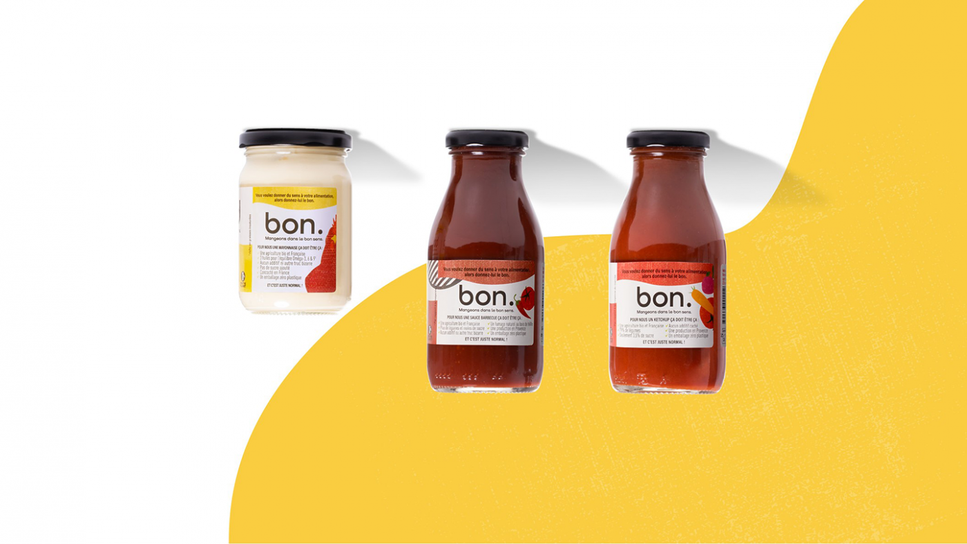
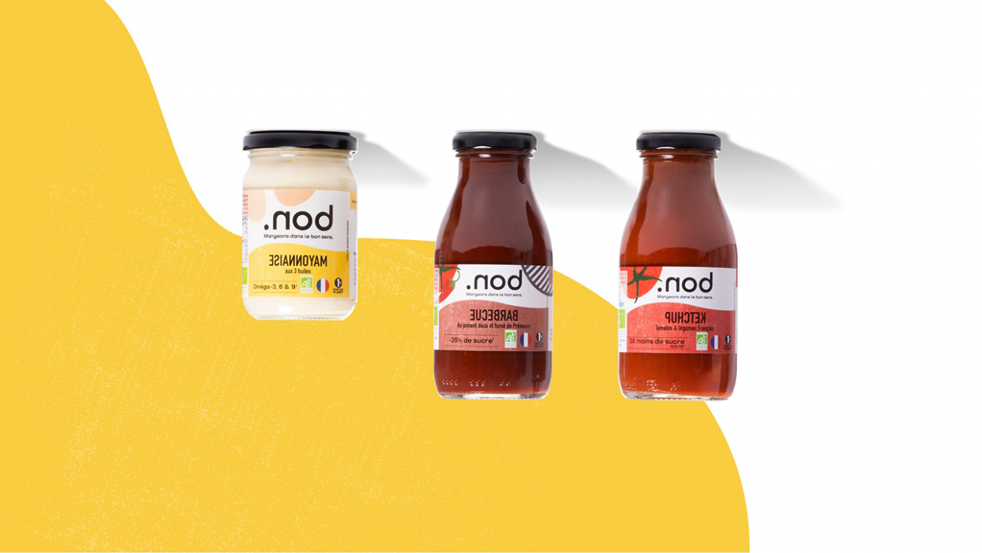
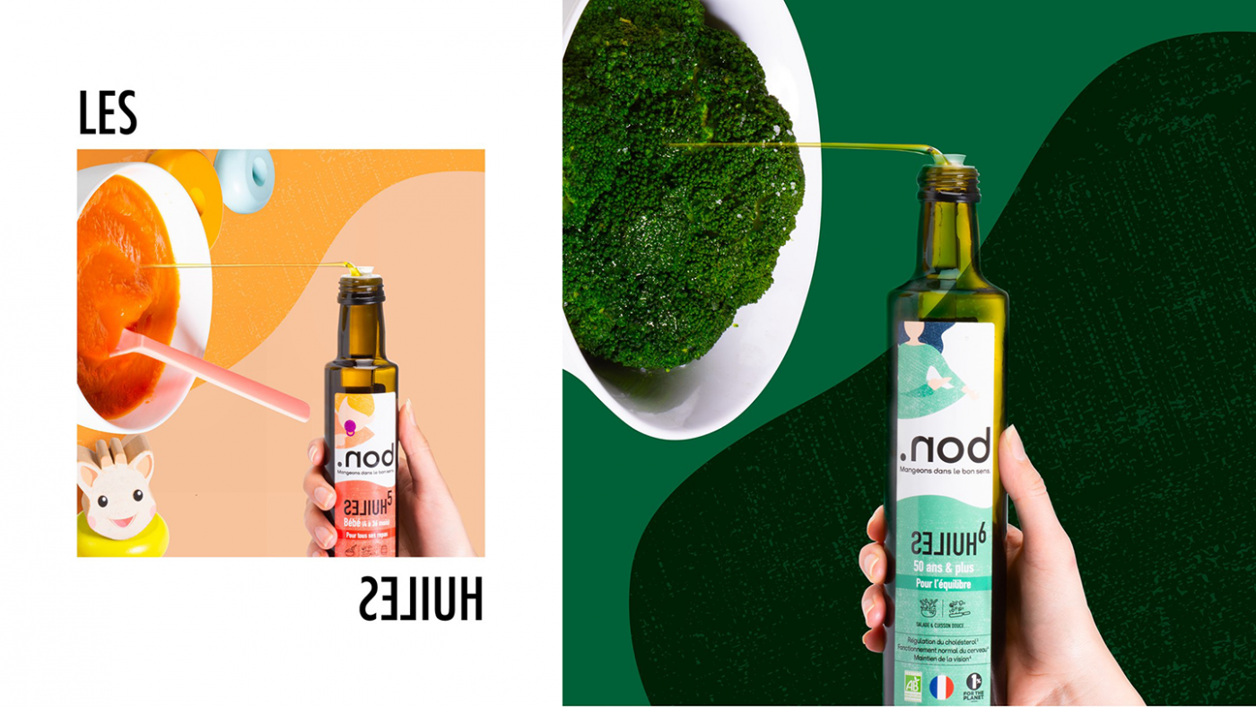
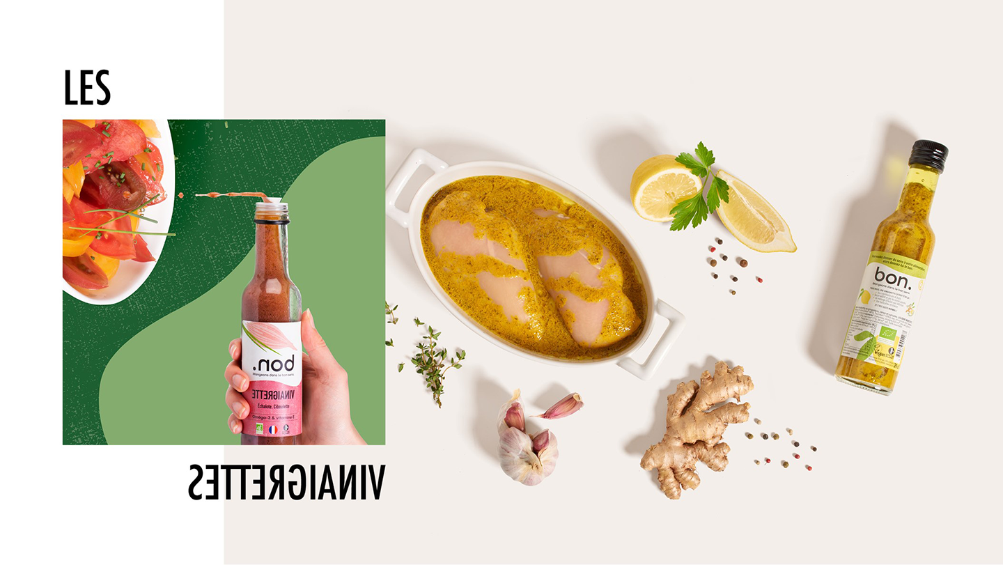
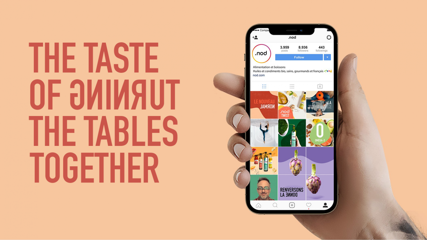
CBA also defined .nod’s social media strategy based on the brand’s message. The agency wanted to initiate a dialogue between a real brand and (increasingly) demanding consumers by launching a movement that would bring together good and common sense. Therefore, CBA has created a candid and human tone of voice, in line with the brand platform and without falling into a moralistic or alarming communication: we are not perfect, that’s okay, but we do our best and we don’t hide anything from consumers. The goal is to be aware of the impact of our consumption and to want something different.
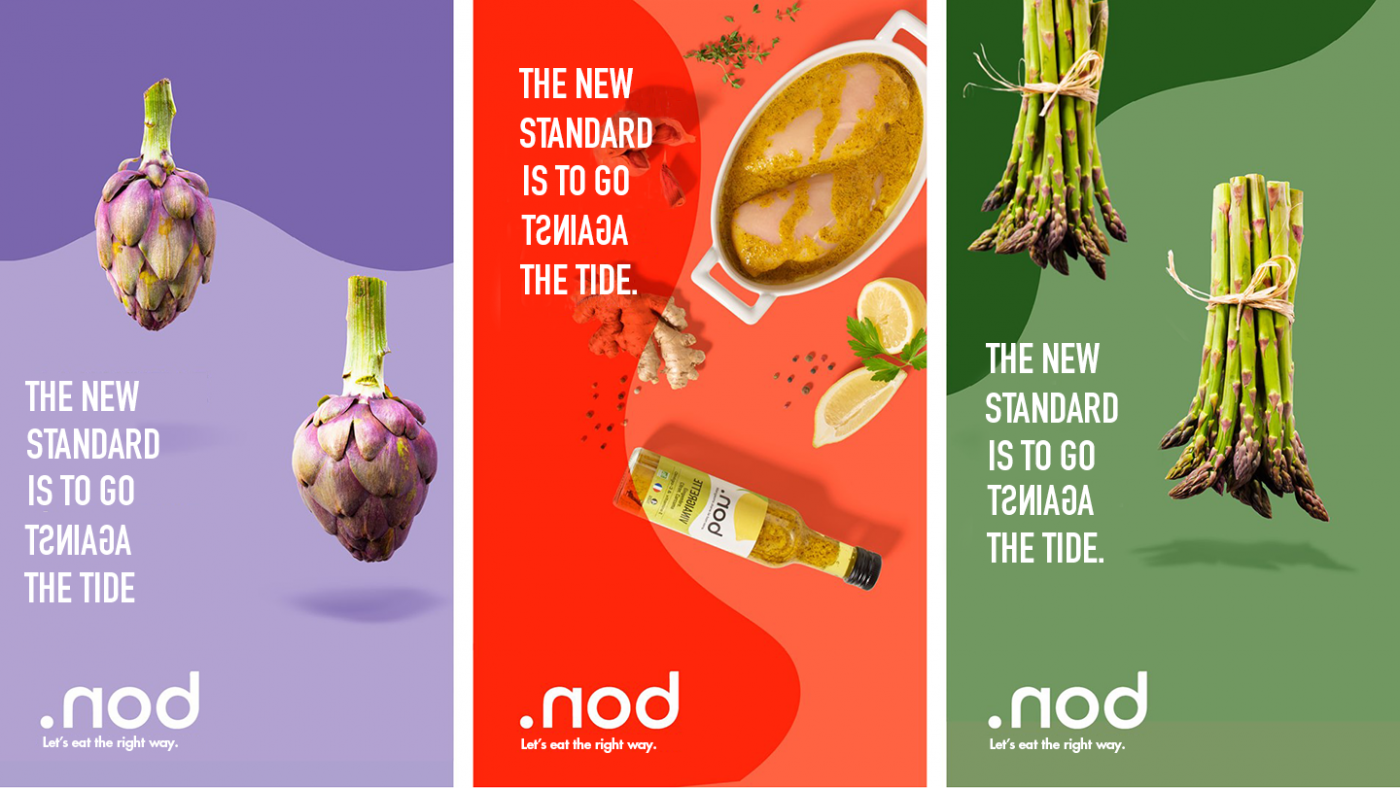
So, ready to turn the tide with .nod?
Good Goût was created in 2010 by two parents, who decided to quit their jobs to produce tasty, beautiful and organic dishes for babies, in partnership with the chef Michel Rentenauer. Their ambition was to reintroduce savour in toddlers’ plates.
Originally focussed on the main courses and on the desserts for babies, the brand offers today a complete range of dishes, desserts, snacks for the young gourmets, from the babies to the children.
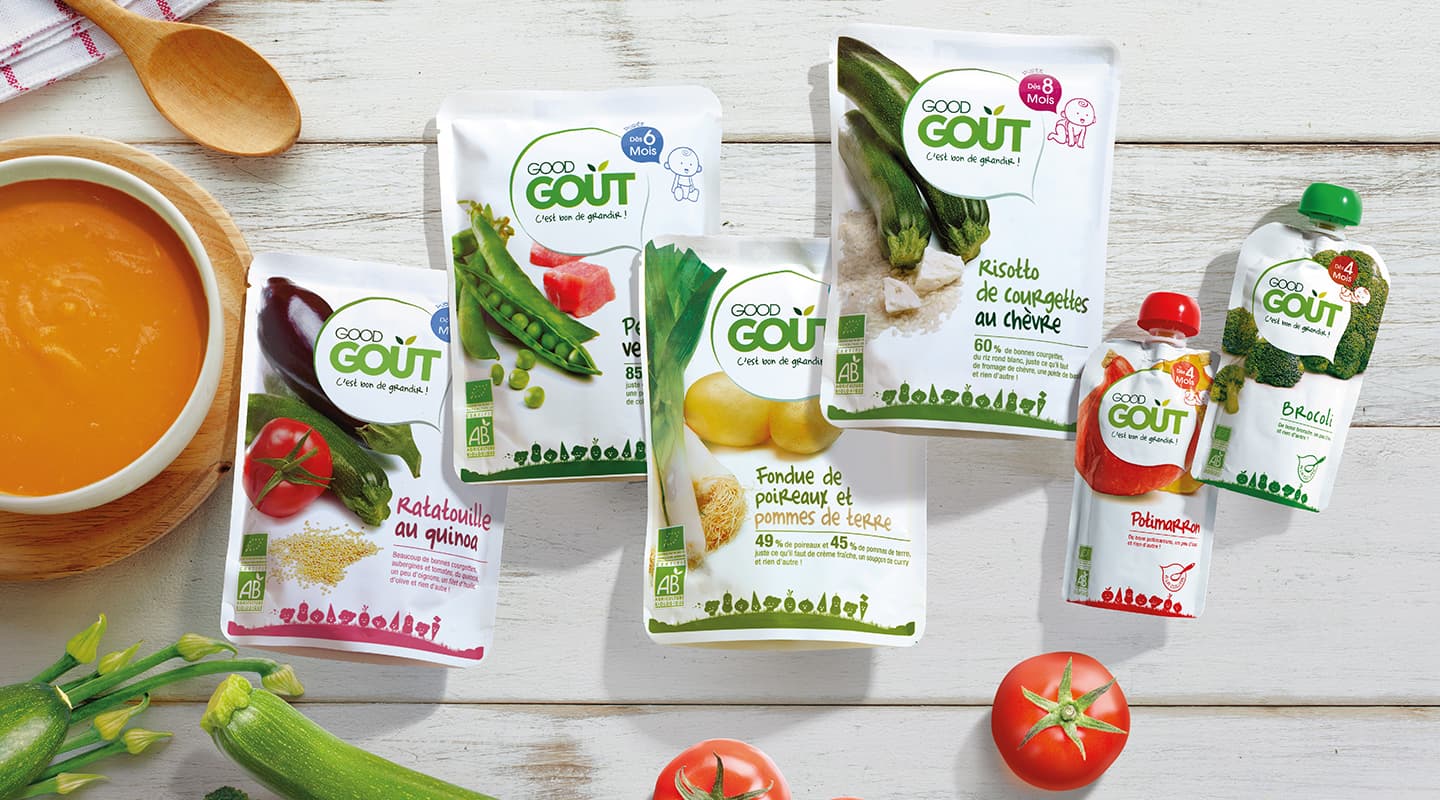
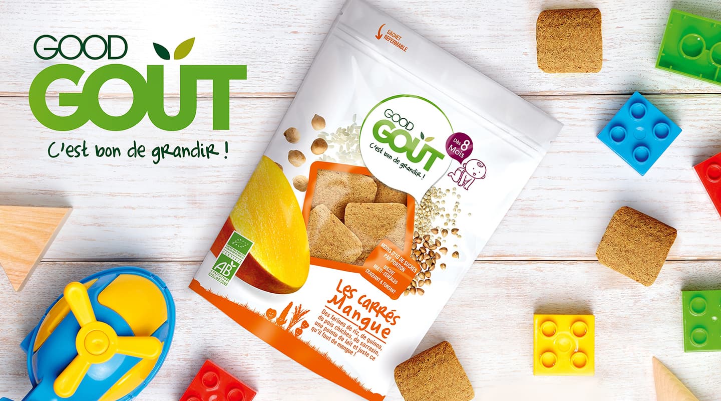
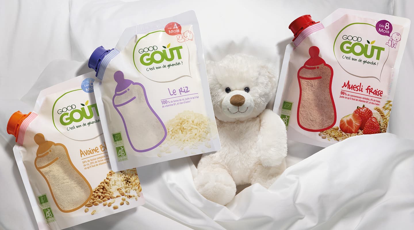
Good Goût explores the range of tastes to stimulate children’s growth and cognitive development.
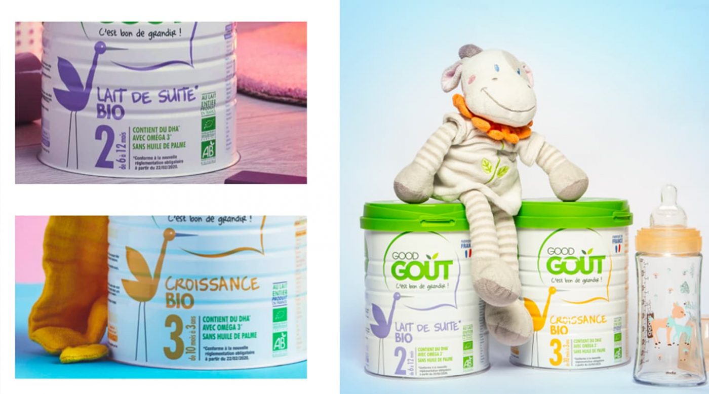
CBA the Good Goût’s design agency since 2010. To help the brand to keep on helping the brand distinguishing itself from a well-established competition, CBA has chosen to:
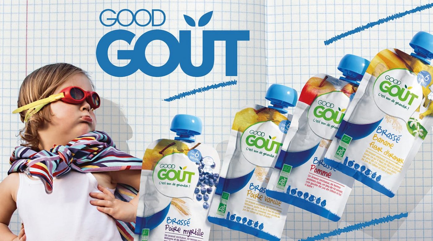
The signature is integrated in a speech bubble which relates to the existing proximity between Good Goût and its little consumers, as well as with their parents. The pictograms designed on the facing of the products, and the meaningful content in the back enhance this conversation.
A constant brand language has been deployed on the whole range: the simplicity of the speech, the transparency regarding the ingredients and a pure colour: the white.
For every new range’s creation, CBA translates the brand’s requirement on taste and nutrition with a very simple packaging.
For the childish cereals, the packaging shows the ease of use and the variety of tastes.
To anchor the brand in the children’s daily life, CBA has adapted its name, which becomes Good Goûter. A new graphic identity has been created, made of mischievous and off the wall characters.
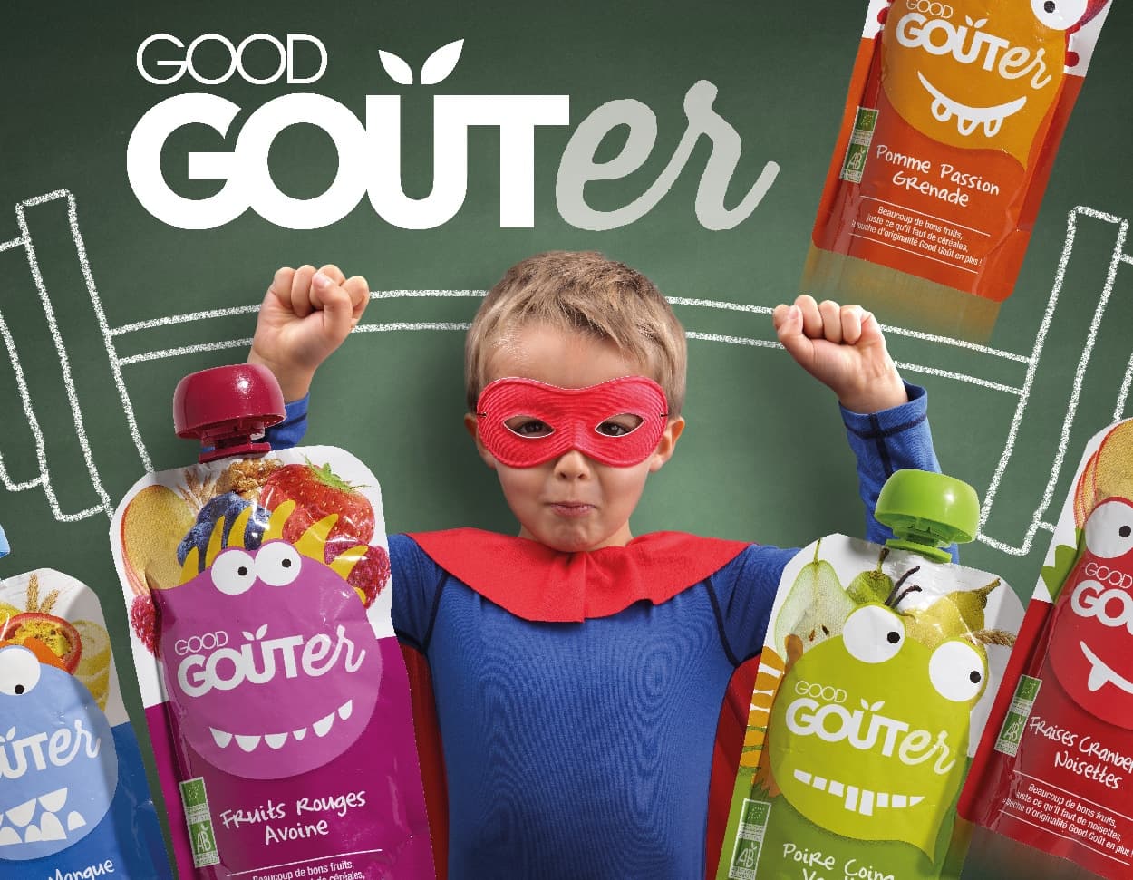
This signature fits into a bubble that evokes the proximity of GOOD GOÛT with its consumers and their parents. The graphic design has been designed to facilitate their use and enhance the quality of the ingredients thanks to the photographs, notices and pictograms. The ingredients that go into the recipes sit proudly on the packaging and the “GG” mascot is lying, sitting or standing depending on the stages of growth. CBA also participated in the enrichment of the range and in the development of new dishes adapted to each stage of growth, notably by intervening in the launch of Good Gourdes.
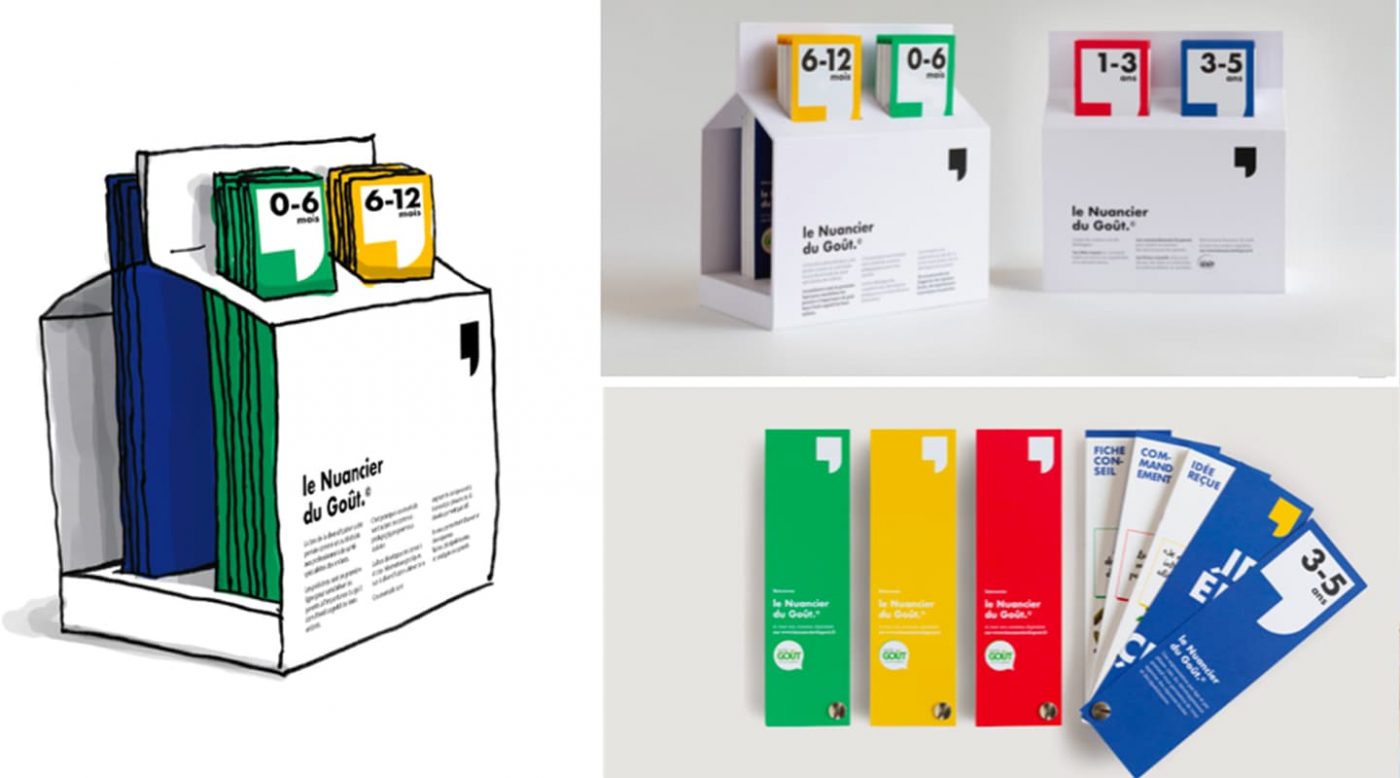
In 2016, Good Goût was sold in more than 7500 shops in France.
The purpose of Né d’une seule ferme is to make the remuneration of dairy farmers fairer by enabling them to expand their product range with fresh yoghurts, manufactured locally, in a process that is quick and easy.
The project intends to reinject some common sense into the food supply chain by placing traceable products which undergo minimal processing in front of consumers, at the same time guaranteeing fair pay for producers.
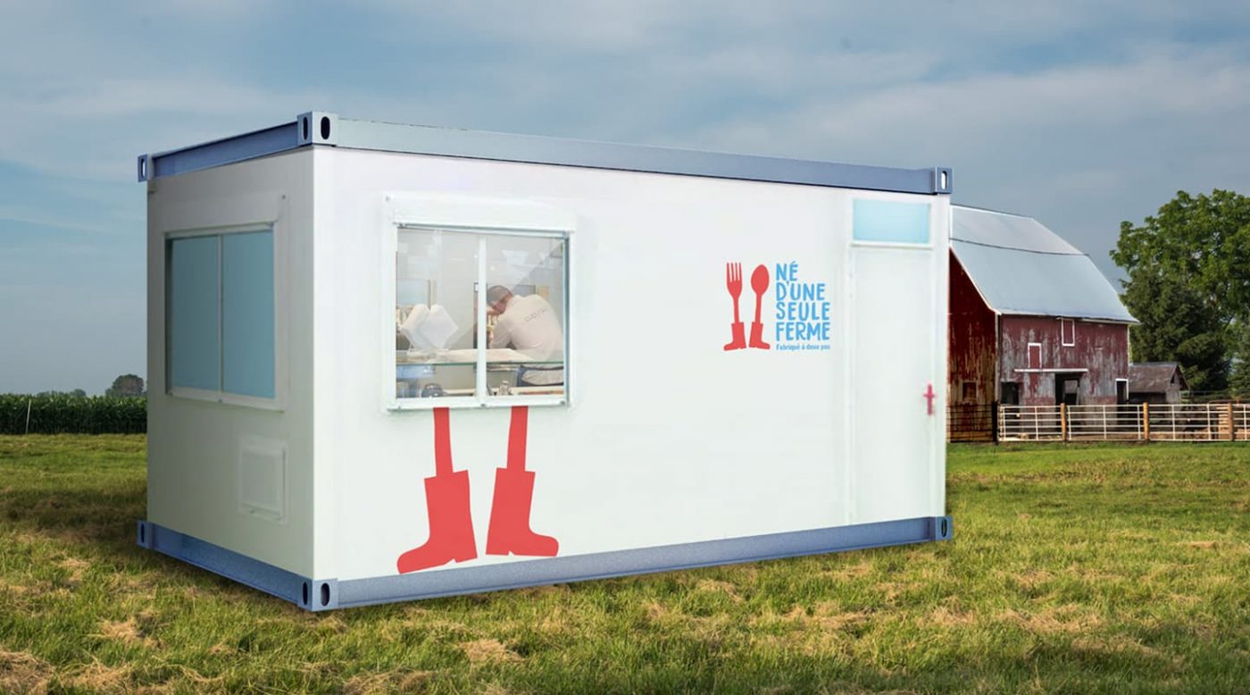
All the work undertaken for the brand Né d’Une Seule Fermeu is concentrated in a commercial launch to consumers and B2C intermediaries in order to develop their new communication strategy, which is Fabriqué à deux pas (made nearby).
All the communication materials promote the simplicity of the approach and the commitment to sustainability, which underlies the project to enhance the status of producers and their work by giving shape to the from farm to plate concept.
Unpretentious and credible visual codes reflecting the original brand values: teamwork, honesty, modesty, conscientiousness, closeness and pride.
This new identity showcases the savoir-faire of the French dairy farmer and the origin of the ingredients.
The transfer of this identity onto the logos and the graphic environment reflects the key elements of the brand personality: caring, bold, sincere, committed and generous.
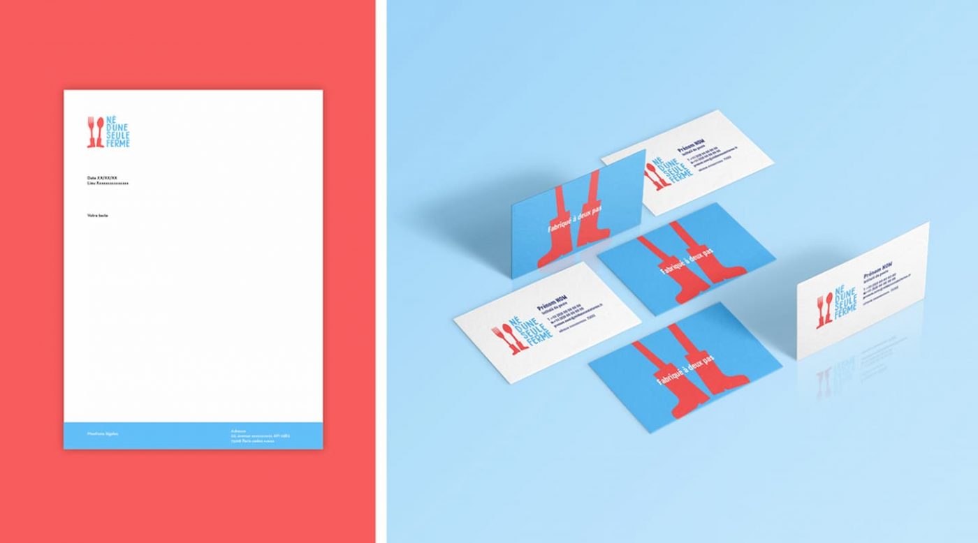
The unpretentious, simple and coloured graphic codes allow the product benefits to be highlighted:
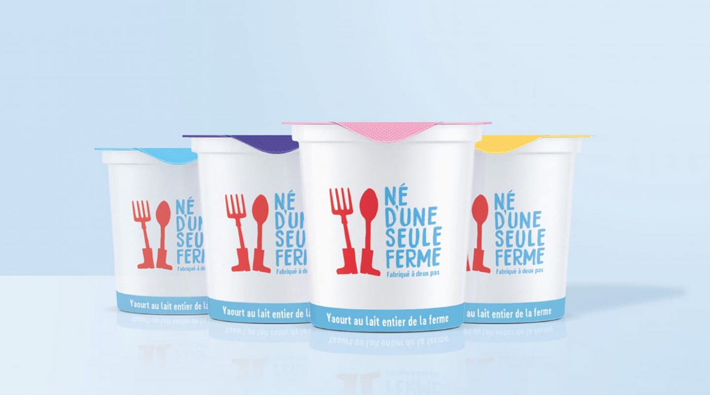
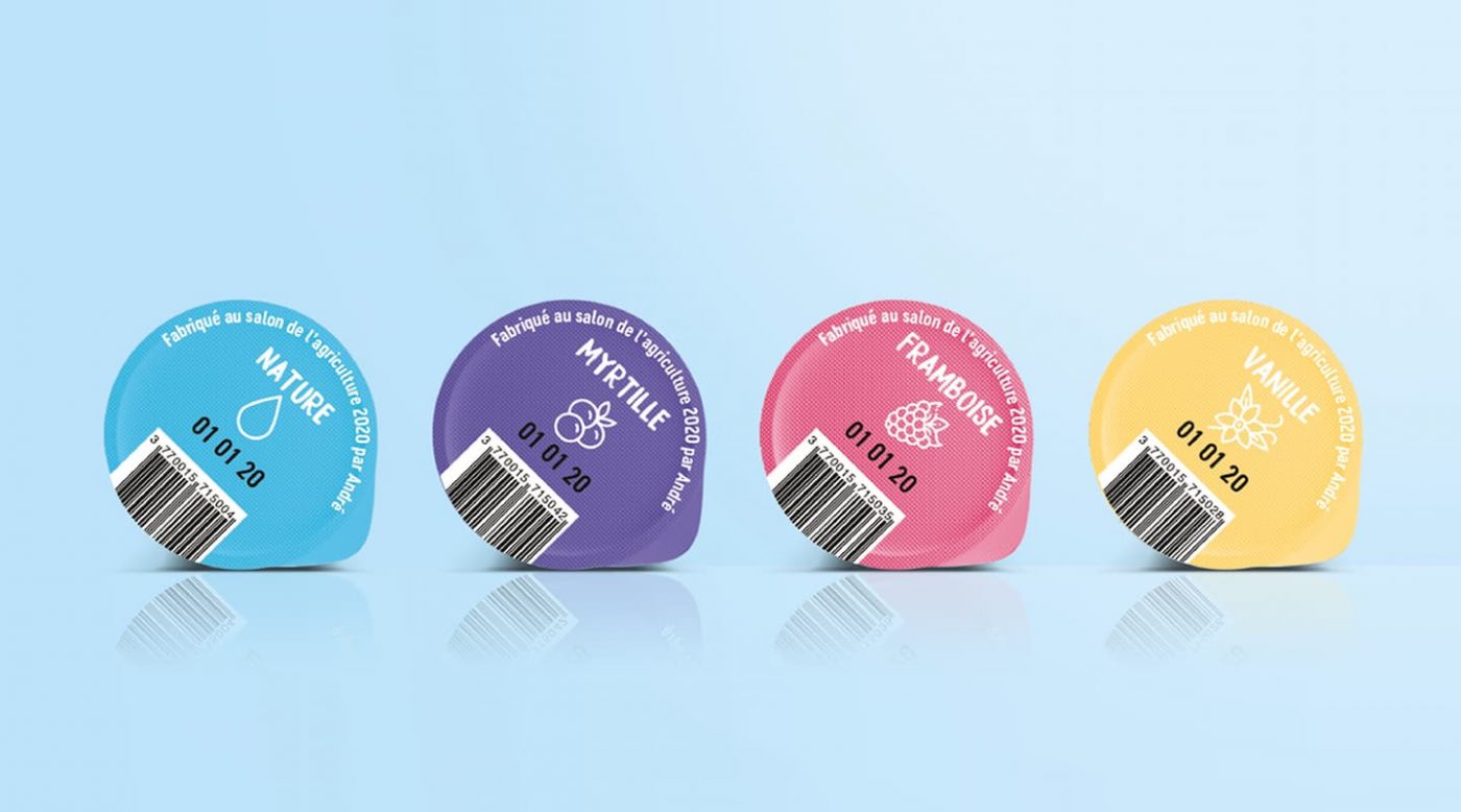
CBA also imagined the packaging design of the products. In developing the identity, the agency wanted to highlight the brand’s commitment and its message.
On each yoghurt packaging there is a unique QR code available to the consumer; QR code referring to the producer’s file of the farm responsible for the said yoghurt. It is possible to discover the history of each person involved in the production chain of this pot, their locations, their resources, etc.
In this way, thanks to the design, CBA highlights the human element behind the production of yoghurt, a value dear to the brand, while at the same time providing concrete and clear proof of the product’s origin.
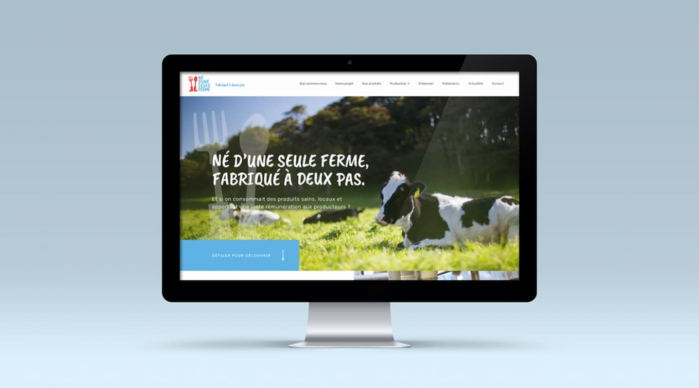
Our guidance for the brand extended to redesigning the website to ensure a consistent visual identity.
The website is revitalised to reflect the graphic codes originating in the brand environment.
The site’s objective is to present the project, its products and producers and at the same time provide a variety of contact and support methods for the major user groups which were identified.
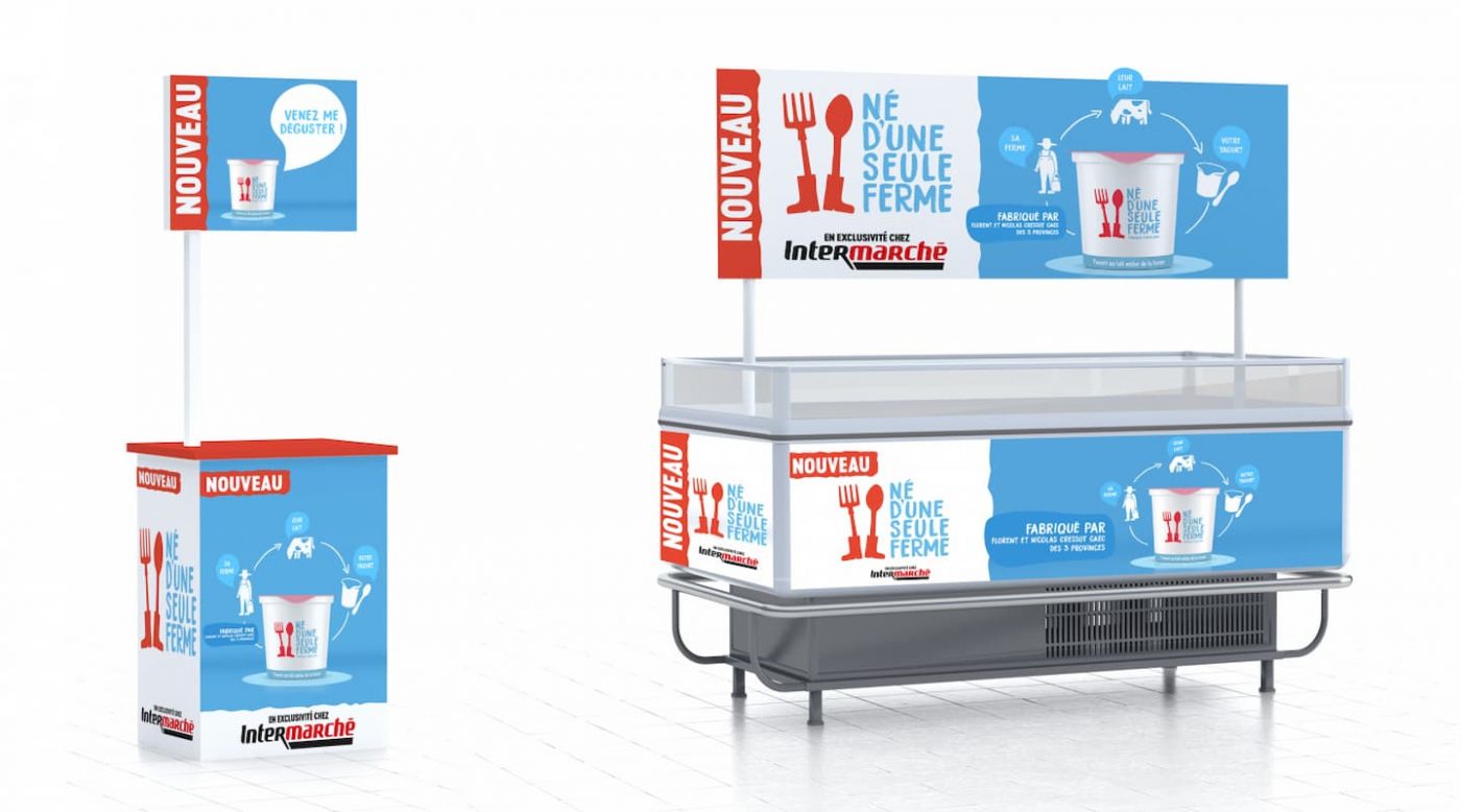
CBA a conçu et mis au point une campagne d’activation pour présenter et mettre en avant les produits de la marque en GMS. Les consommateurs pourront ainsi retrouver cette campagne en exclusivité dans les magasins Intermarché dans le courant de l’année.
A savoir que CBA avait également développé la campagne d’activation pour le reveal des produits Né d’une seule ferme au Salon de l’agriculture (SIA 2020).
One week after the launch of their website the brand had already achieved results which were beyond interesting:
Since then, this project for Né d’une seule ferme developed by CBA has won the TopCom Consumers 2020: Gold award in the Global Brand Design category.
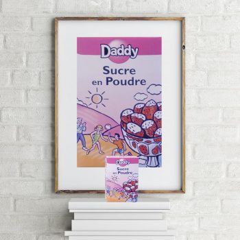
Daddy and CBA have been working together for more than 15 years to position the sugar out of the wall by reinventing it in everyday life.
Daddy has never stopped trying to make its image of « product of convenience » evolve. Challenge completed, thanks to a differentiation strategy driven by a packaging redesign, innovation and activation. Today, Daddy has become the Number 1 sugar brand in France.
In 2010, the iconic brand chose CBA to rethink its entire visual identity. The objective? To proudly claim its optimism and its non-conformism personnality to prove that sugar can get out of its commodity image.
To do this, the agency suggested cultivating the brand’s complicity with its consumers by using a graphic style and a tone full of humour, and thus building a quirky, slightly impertinent personality. The brand’s philosophy turns into a genuine manifesto inviting everyone to letgo, which has been applied on pack and on activation collateral materials.
The unique design fully conveys theiconoclastic spirit of Daddy. Sugar cubes become characters, and are the heroes of amusing scenes takingplace on a 100% magenta background, alongside a lively typography. Daddy’s stories live beyond packaging and support the brand’s positivity indifferent media (B2B programs, gift, …)
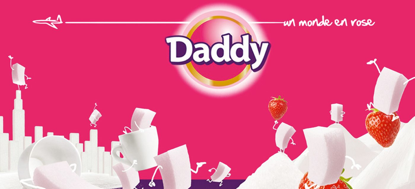
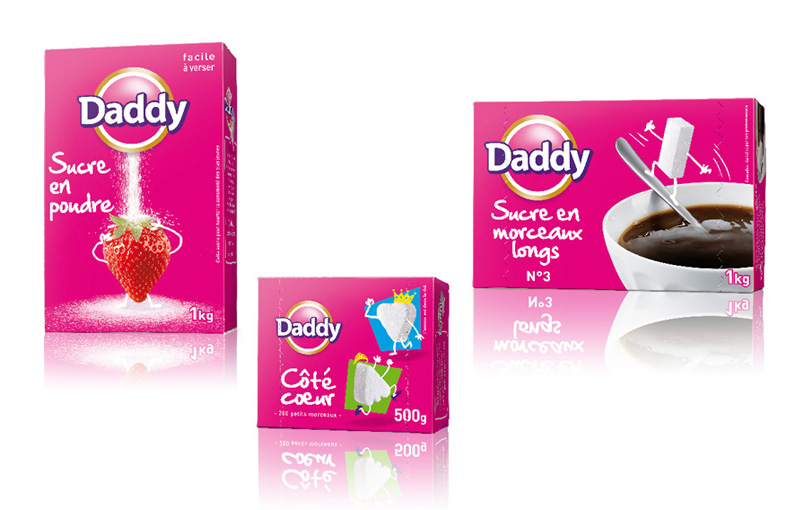
On a declining market, CBA had to find a coherent system. After a first step, until 2015, debugging a product of convenience, reinventing the offer, the use and the brand experience thanks to the design, Daddy has to be couragous again today, in order to grow even more and to behave as a leader.
Anticipating the renewal, innovating before its competitors… This was the new challenge, successfully completed by Daddy.
Daddy now stands on two feet “emotion » & « pragmatism” and the new stake for 2016/2017 becomes “how to go from a “preferential” brand to a “referencial ” one without denying its spirit and values?
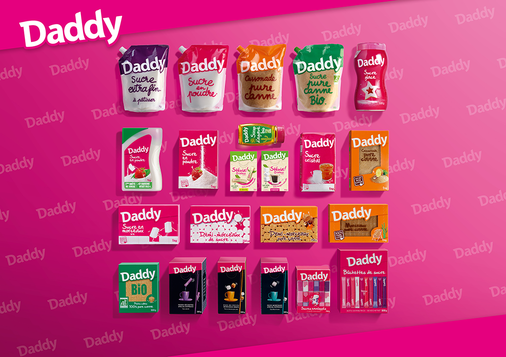
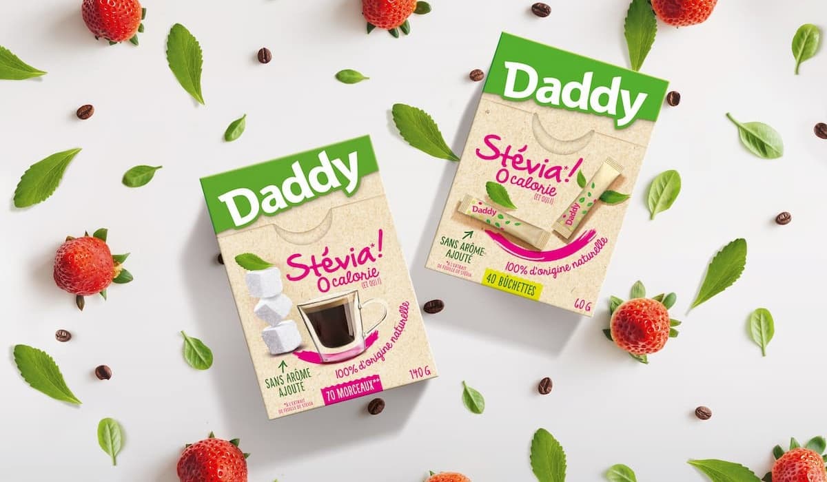
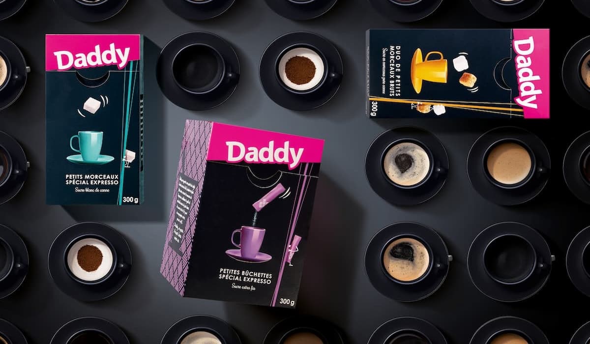
Daddy reinvents the sugar section with a design created for the shoppers, to bring them visual landmarks. It’s repositioning takes life in a new color combination and a landmark system, more remarkable and visible on shelves than before.
The offer has been simplified, the enlarged logo has become the major component of all the packs.
Daddy remains positive & out of the wall and has a new baseline “un grain d’esprit dans votre vie”. It’s a strong and structuring evolution!
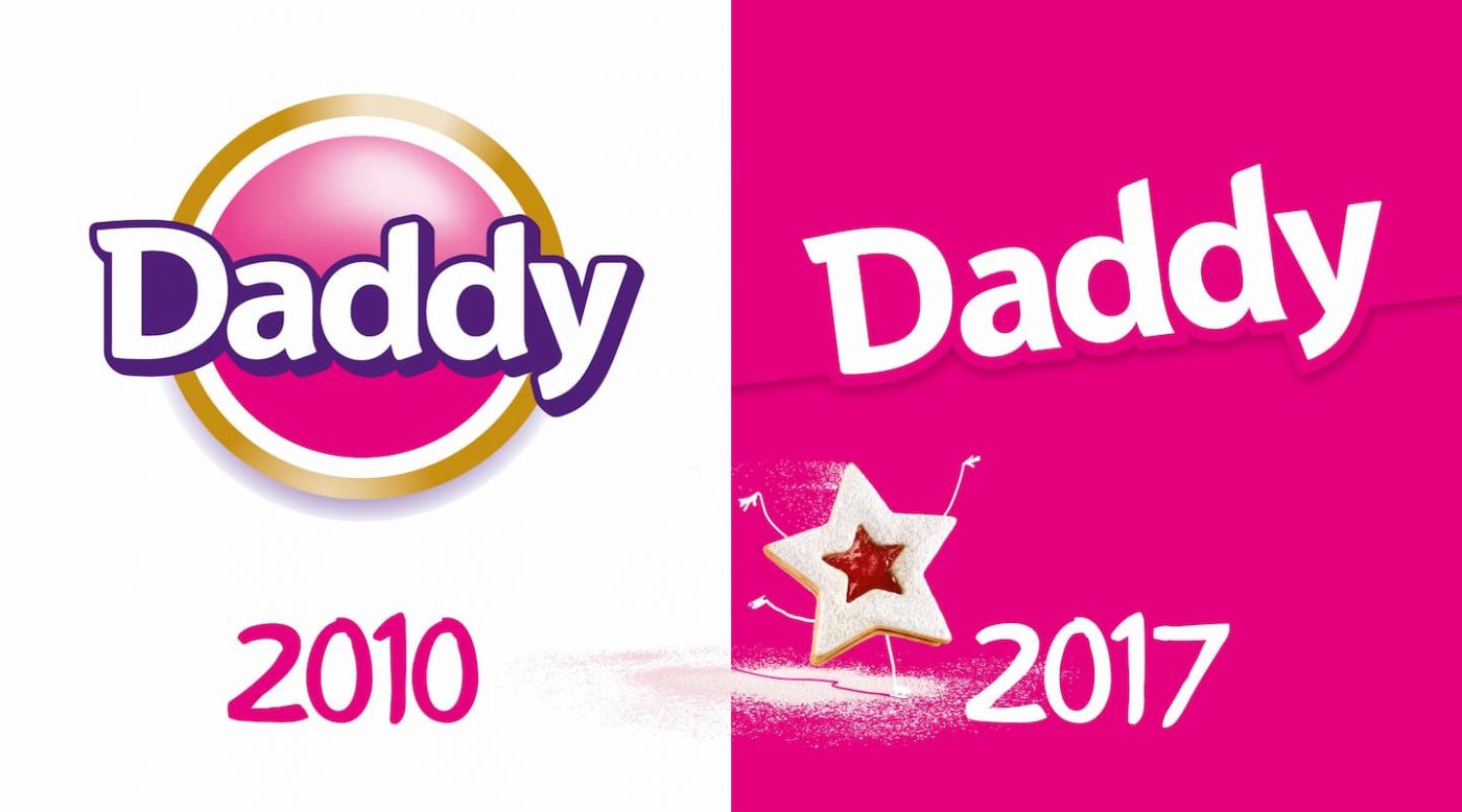
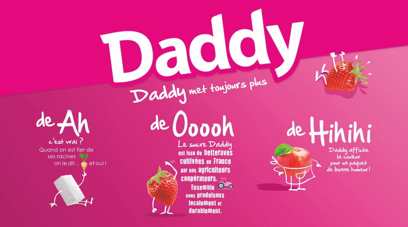
After a background work on the customers & shoppers, 2016 became a new step in Daddy’s history, to go from the “crazy teenager” to the “iconoclast adulthood” keeping its brand values and its DNA: surprising, creative, curious out of the wall, trendy, emphatic, plural, accomplice.
This master project is a real “massive structuration weapon” with a new design. Innovation is in the heart of all concerns, and totally changes the consumption habits. With 23.4% of market shares, the brand consolidates even more its capt’ain category position.
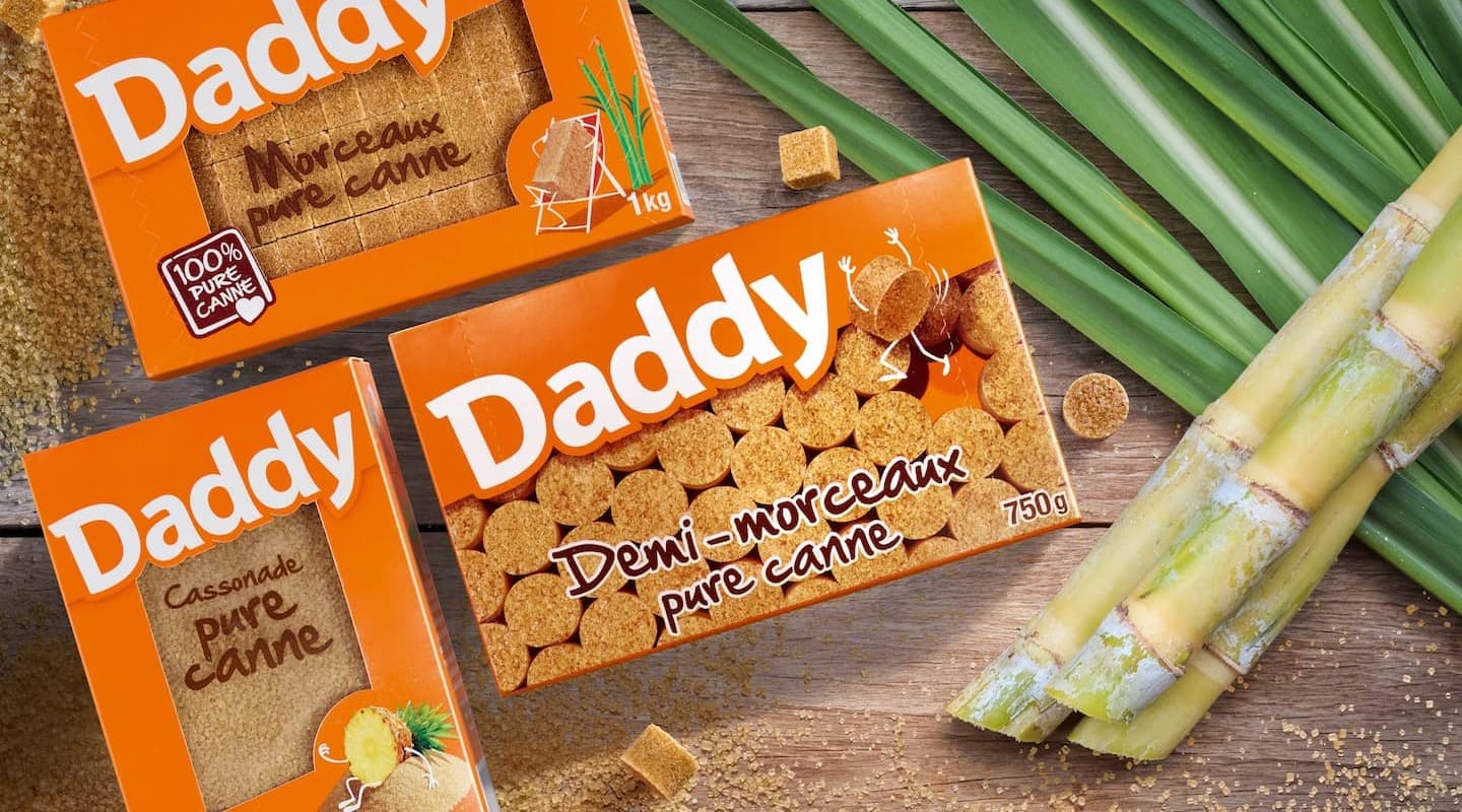
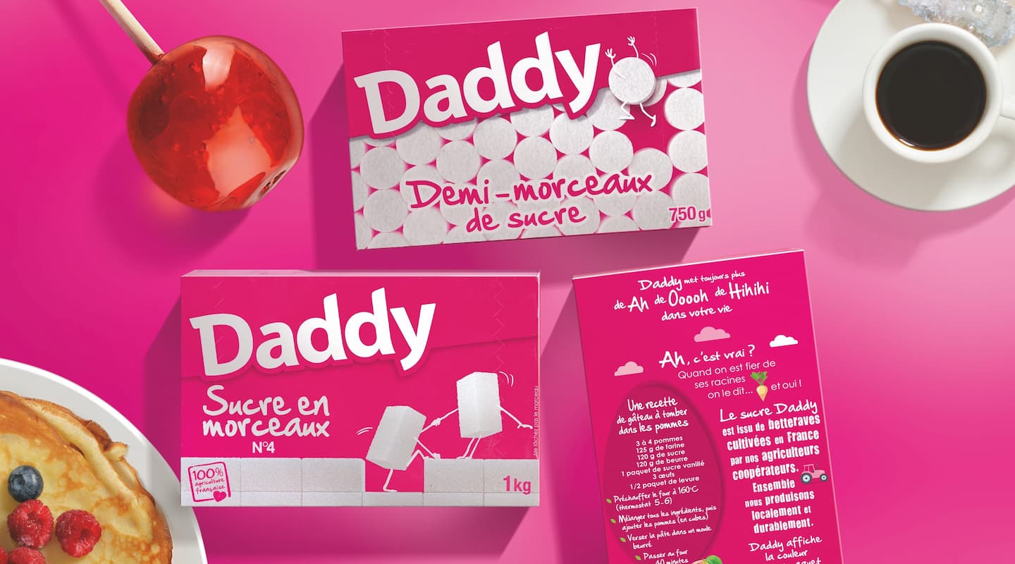
A collaboration that has lasted 15 years: the success story explained by Isabelle Segalla, Customer Director.
The CBA work for Daddy had excellent results as it won:
And the Daddy x CBA adventure didn’t stop there, since in 2020, the agency signed the big switch to kraft packaging for the brand.
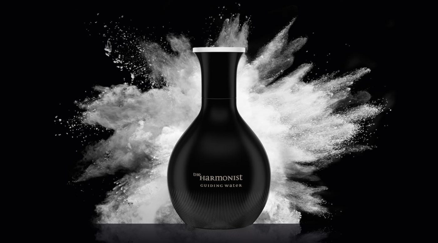
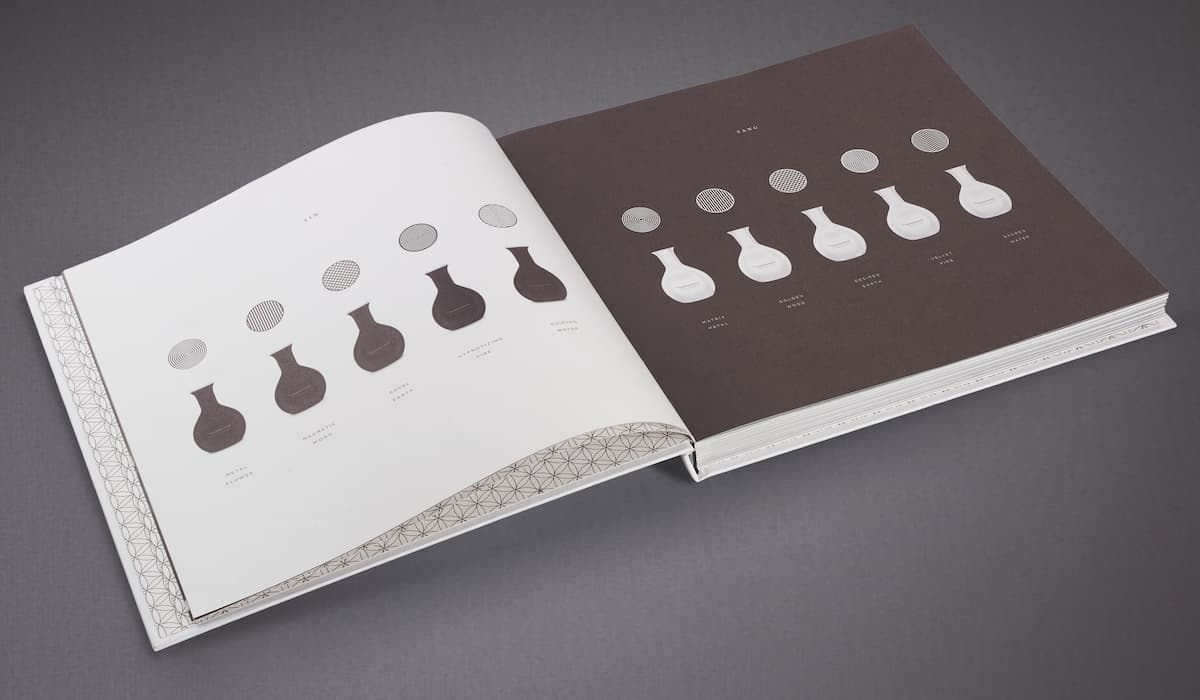
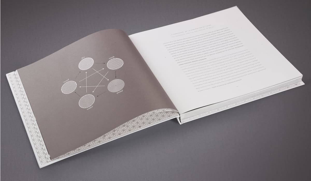
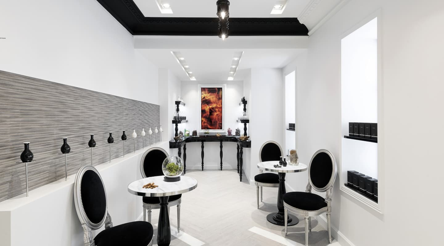
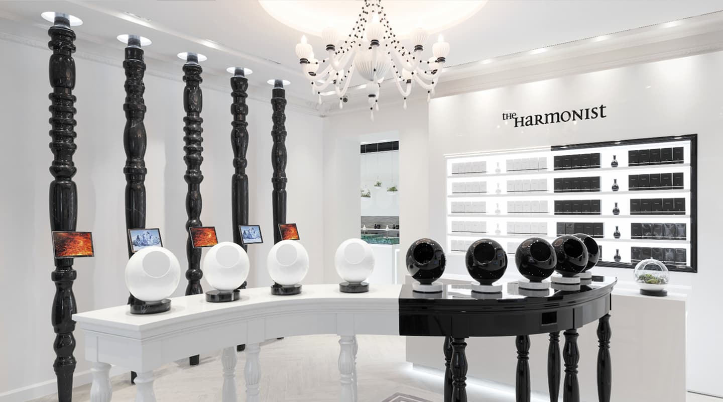
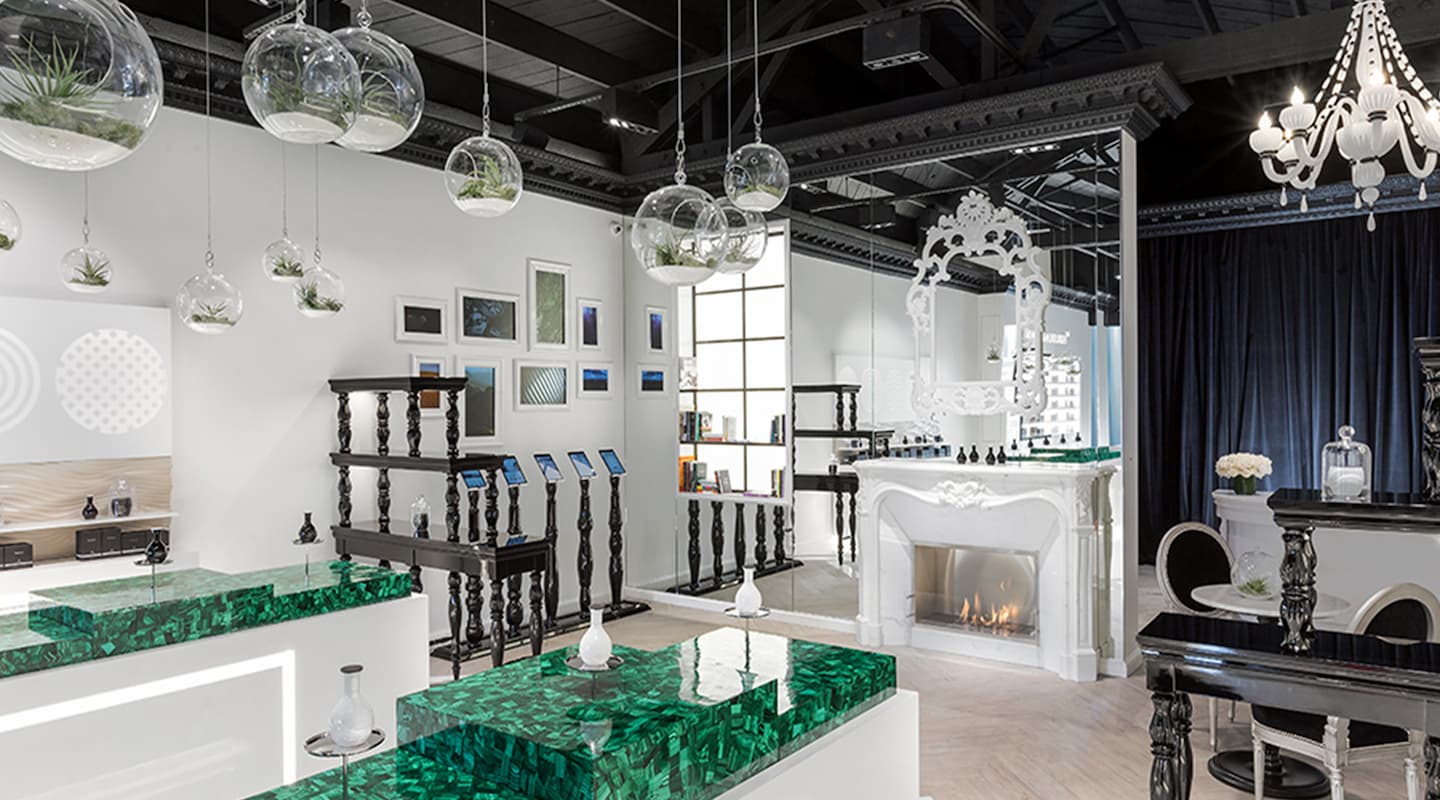
Water, wood, earth, fire and metal are the five fundamental elements of Yin and Yang, from which The Harmonist, a new fragrance house that opened its doors in 2016 in Paris and Los Angeles, got inspired. Feng Shui, an ancestral Chinese art that consists of choosing objects, colors and elements to create a space full of positive energies, now takes the shape of a perfume.
The idea of this first collection imagined by The Harmonist is to take advantage of the fragrant powers of the 5 Earth elements to “stimulate harmony as a real source of beauty.”
As well as the olfactory experience of these precious nectars, it is also the possibility to find a perfume “adapted to your Yin or Yang element, and in phase with your ambitions” that constitutes the fundamental originality of this new perfumer. “For each fragrance, a power of Harmony”.
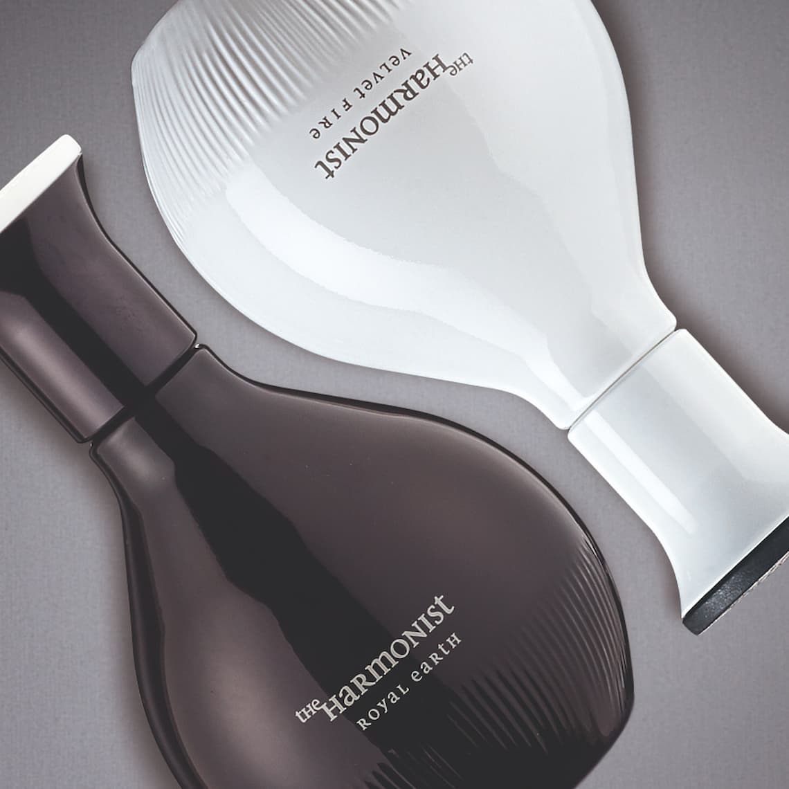
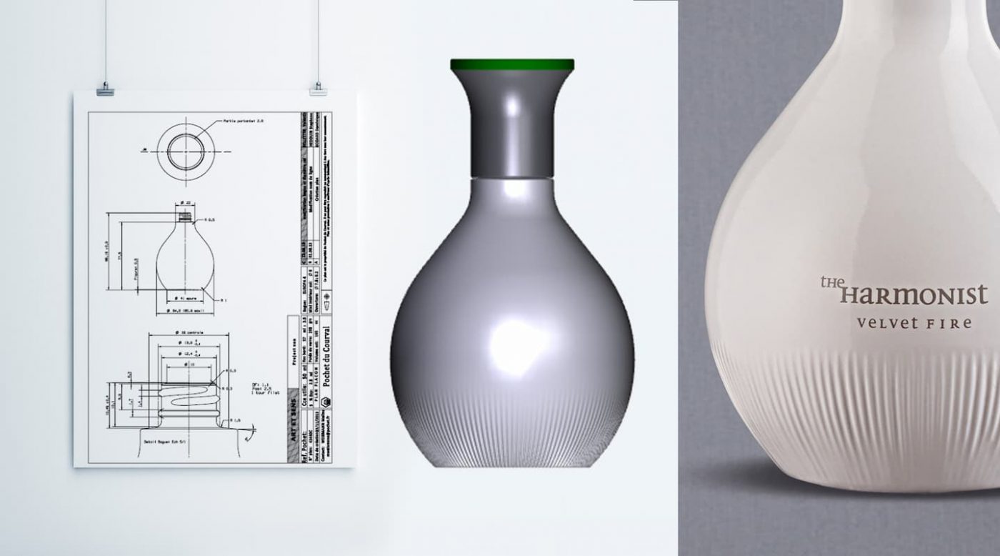
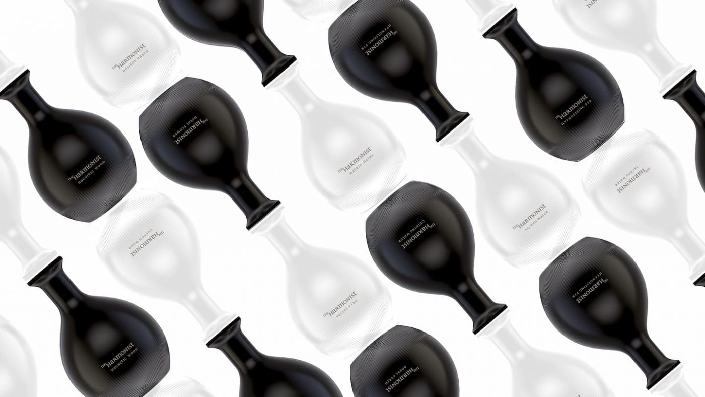
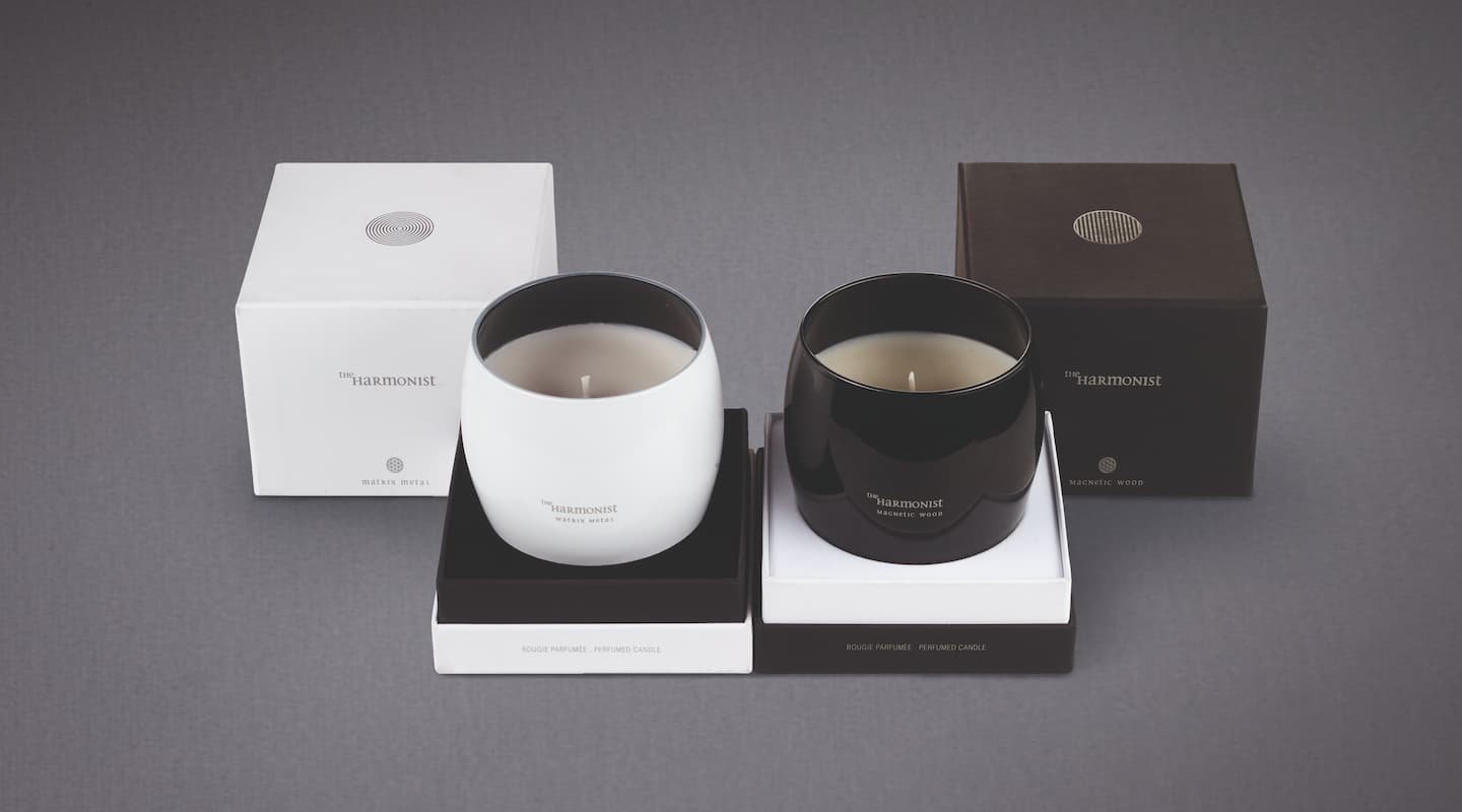
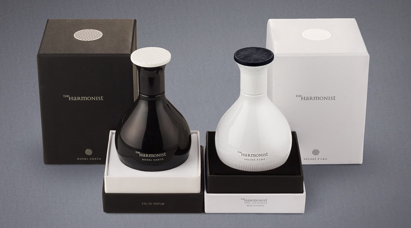
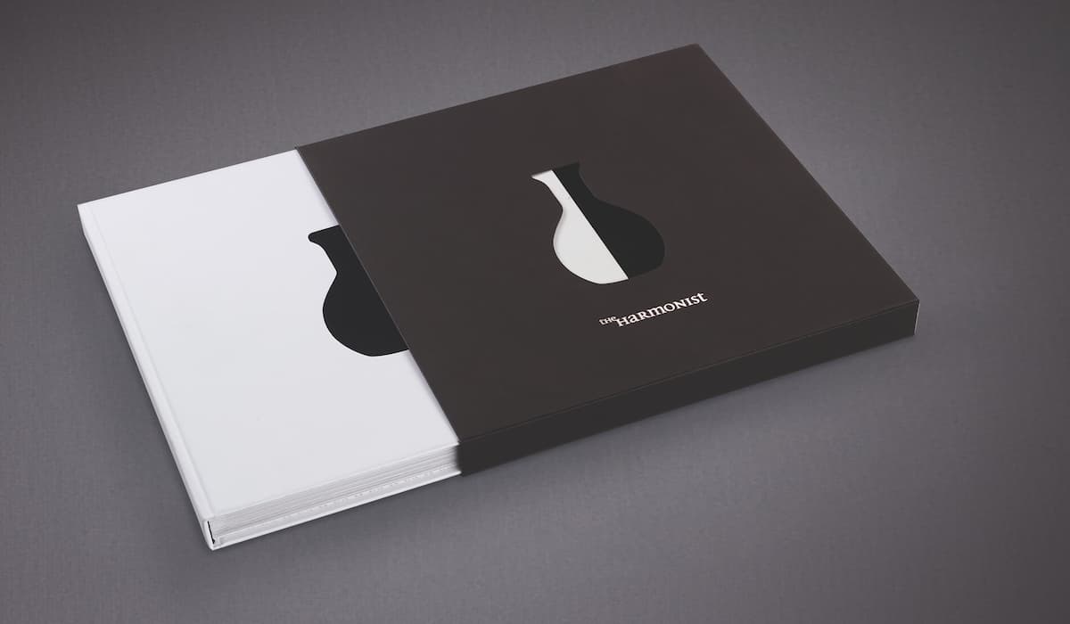
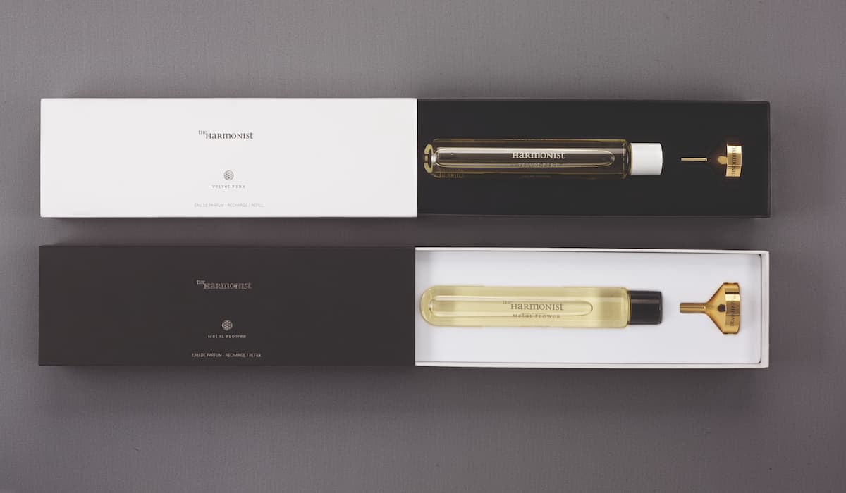
CBA started to work with the Harmonist from the very beginning, creating the brand name and its visual identity, as well as working on the design of the elixir bottles, and declining its distinctive personality on the packagings of the first perfumes and candle collections.
To magnify the expression of The Harmonist, CBA imagined black and white refined bottles, inspired by ancient containers of Chinese medicine, and in reference to the Yin and Yang. The use of recyclable materials in the fabrication of the perfume bottles was thought as an evidence, to ensure the harmony between Men and Nature. All of the bottles are refillable, and each is made with an opaque glass that protects the vitality of its precious perfumes.


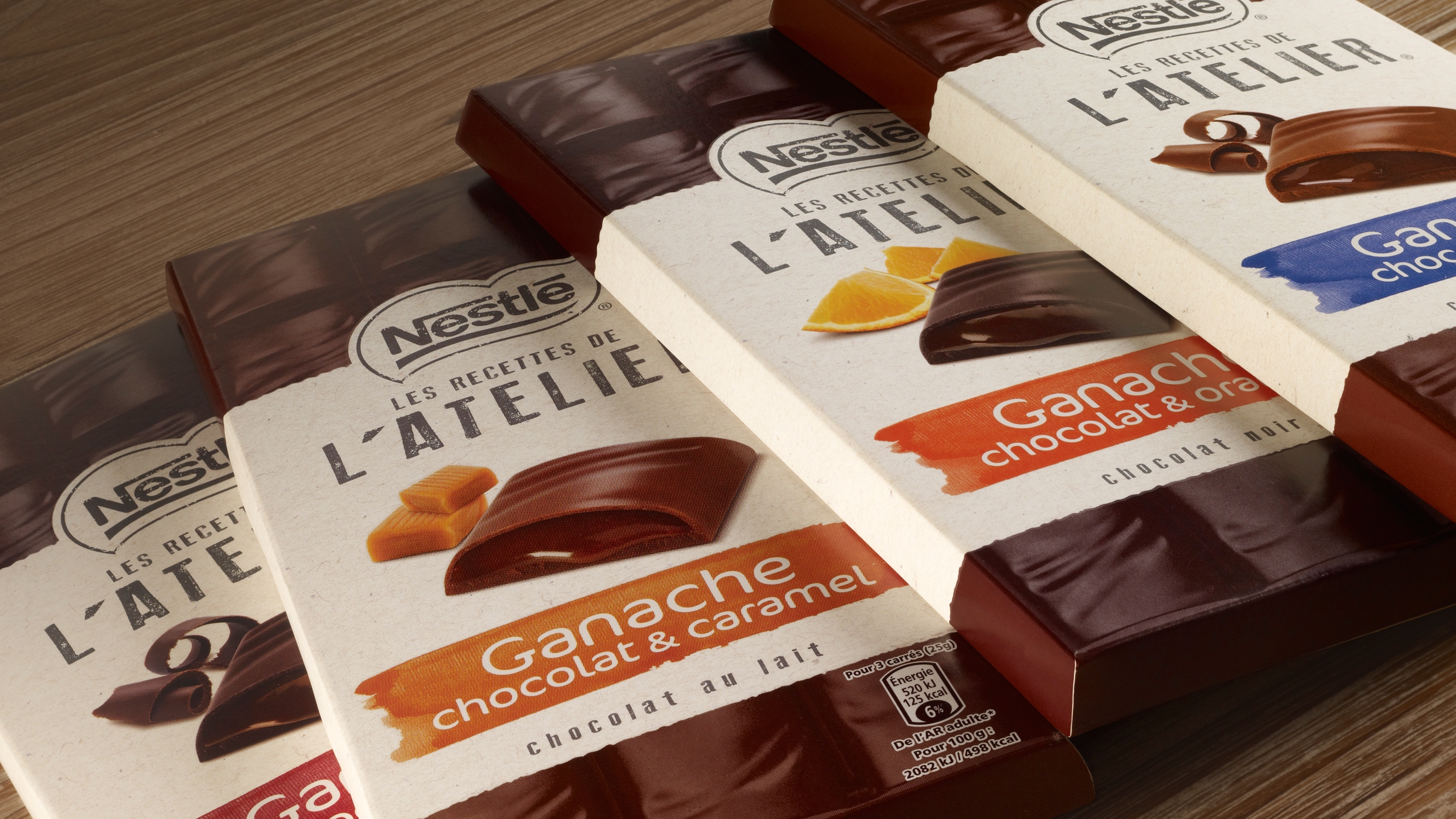
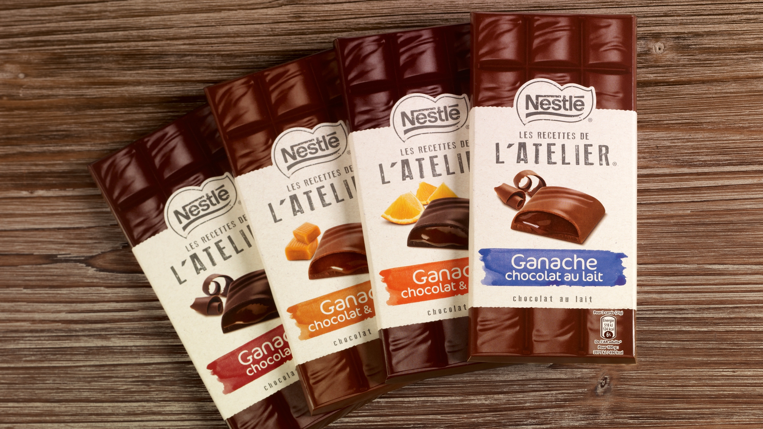
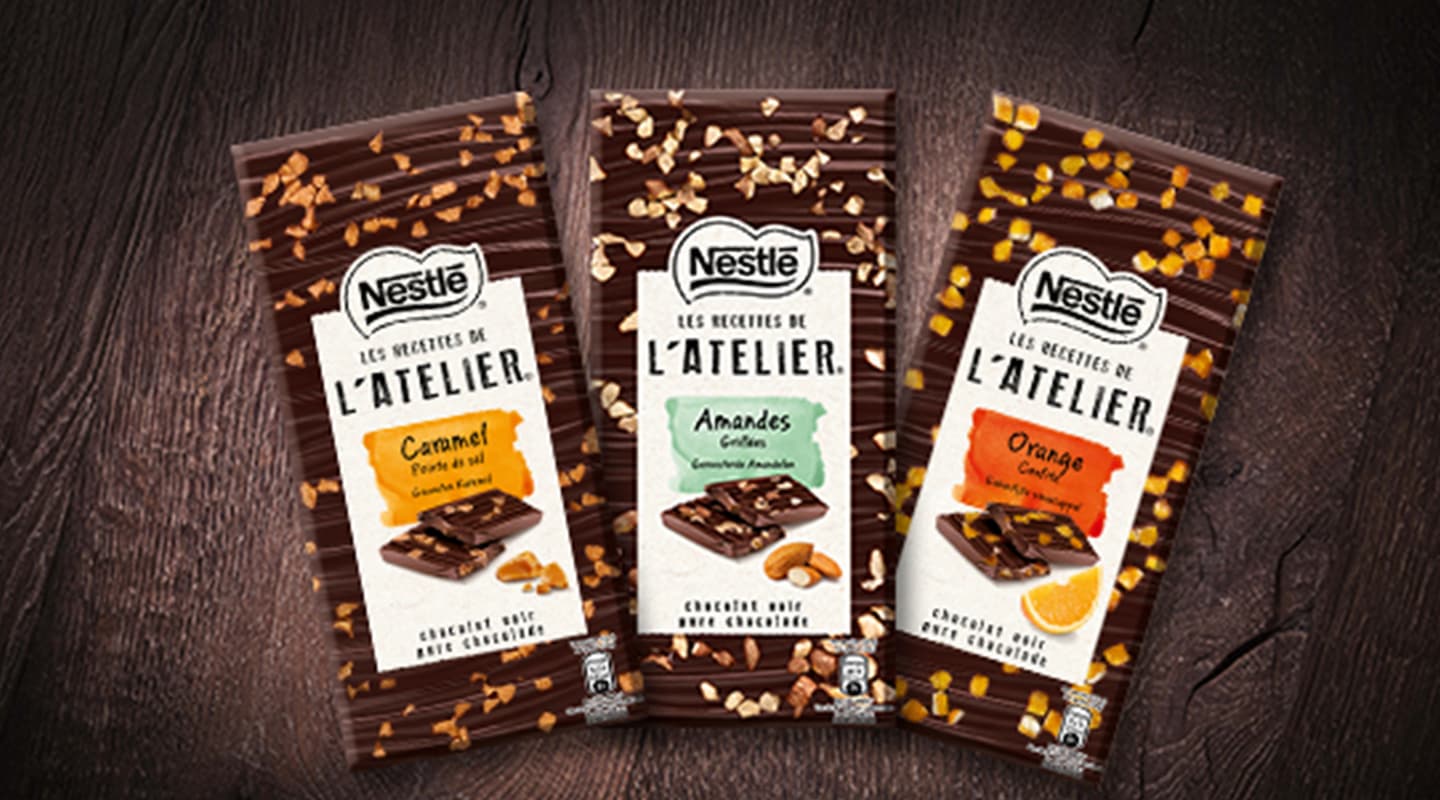
Nestlé innovateson the chocolate segment, with a new tablet conceptt – with a topping of wholenuts and dried fruits – recalling the traditional t“Mendiants” you can find atsweetshops. Nestlé becomes the first brand to bring the “chocolate artisan”world into supermarkets.t
This range,positioned as an t“everyday premium” treat is to be launched in several marketsunder the different local brands – starting with Nestlé in France.
“Les recettes de l’atelier” (“Recipes from theartisan shop”)t conciliates artisan flair and supermarket retail rules : thet“perfect imperfection” of products is disclosed in order to stimulate allsenses and to invite to a new chocolate experience.
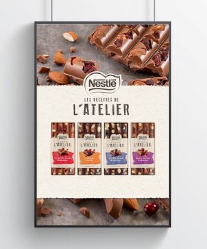
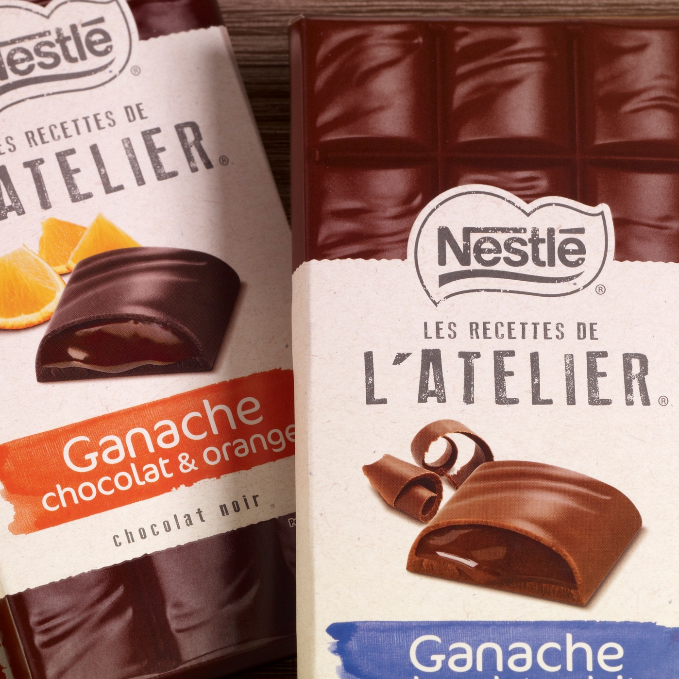
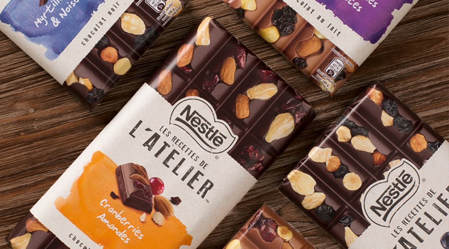
The visualinnovation is definitely eye-catching : realistic photoshoots of the tabletsand their ingredients are used as trompe-l’oeil on all the packaging. Thesimplicity and obviousness of details – ttextures paper band, watercolor traces,handwritten “font”, patina effectt – take consumers straight to the artisanworld, where traditional gestures are precise, creative and passionate.t
The differentrecipes are clearly identifiable thanks to the watercolor hues, and compose anoriginal indulgent palette in the chocolate aisle.
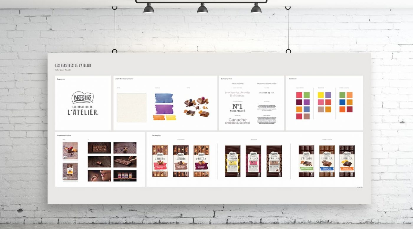
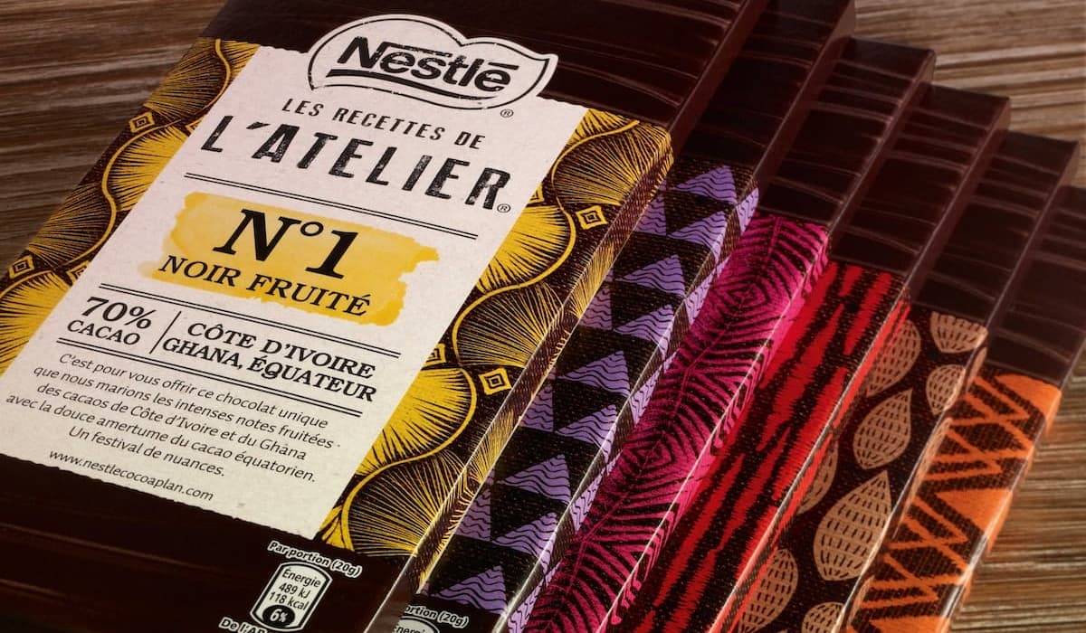
In 2016, two new offers were launched to complete the range: the Degustation and the Ganache.
The first one offers to rediscover dark chocolate through 6 different aromatic profiles, which vary according to the terroir the cocoa comes from. CBA reveals the cocoa expertise of this range thanks to the shaping of the bars that reminds the gesture of the master chocolatier, and thanks to the packaging, and its different color and number for each product of the collection.
The Ganache bars promise the perfect match between the crunchiness of the chocolate and the unctuosity of the Ganache. The generosity of the bar is expressed through the gourmet visual of every square, and a round typography, reminding the unctuosity of the product.
