The story of four generations of friendly fish experts.
Acme Smoked Fish Company, a longstanding family business rooted in Brooklyn, is specialized in the production of smoked fish and deeply committed to guaranteeing the highest quality products.
The story of four generations of friendly fish experts.
Acme Smoked Fish Company, a longstanding family business rooted in Brooklyn, is specialized in the production of smoked fish and deeply committed to guaranteeing the highest quality products.
The brand enlisted CBA to redesign a new identity and address their packaging portfolio, which lacked cohesion, impact and a relatable brand story. The product portfolio presented challenges, requiring clearer segmentation to communicate fish species, flavor and usage occasion. Furthermore, there was a desire to connect with a younger demographic by presenting the brand in a more contemporary and exciting way.
The brand enlisted CBA to redesign a new identity and address their packaging portfolio, which lacked cohesion, impact and a relatable brand story. The product portfolio presented challenges, requiring clearer segmentation to communicate fish species, flavor and usage occasion. Furthermore, there was a desire to connect with a younger demographic by presenting the brand in a more contemporary and exciting way.
The team at CBA undertook a process of simplification and modernization, creating a clear portfolio architecture and establishing a distinct style for Smoked Fish, Salads & Dips, Pickled Fish, Meal Solutions and Snacks.
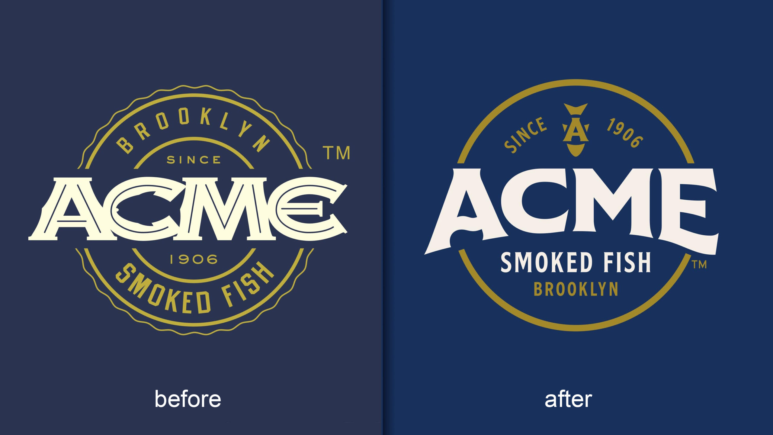
We began by uplifting the identity to better connect Acme to its fish expertise by adding ‘Smoked Fish Co’ into the logo, enhancing readability, and hinting at the sea through a graphic ‘wave’. The resulting ‘stamp’ icon delivers an impactful brand lock up, and helps to communicate heritage and excellence to support the premium brand positioning.
Cold Smoked Fish
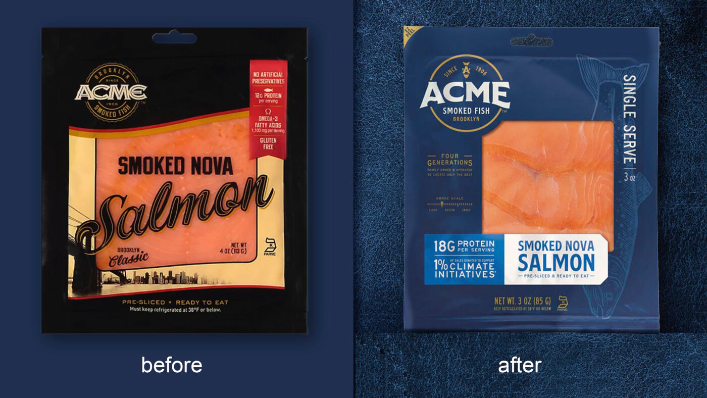
As a leading supplier of Cold Smoked Fish for both B2C and B2B audiences, it was crucial to assert the brand as a modern player in both verticals, with deep experience and a continually evolving portfolio that reflected today’s taste trends. The move from their previous black packaging to a warm rich blue evolves the premium stand out. A complementary palette of bright accent colors to differentiate between flavors and fish varieties further allows the brand to express range with modernity and exceptional shelf presence.
Salads & Dips
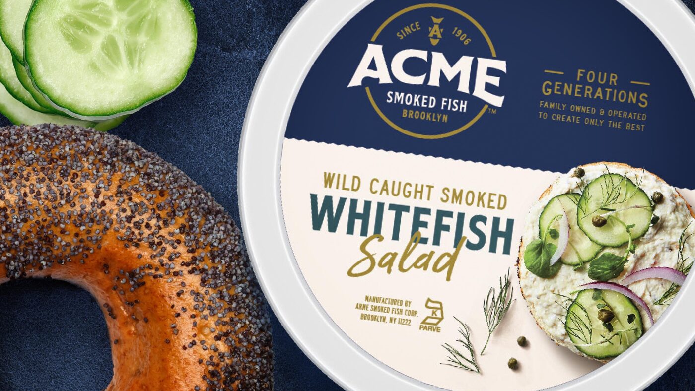
Acme’s Salads and Dips have a large loyal following. However, to extend their reach to new consumers, we needed to create taste appeal and illustrate usage occasions and serving suggestions. Simplifying the design and developing new product photography was key, aligning this range with creative aesthetics typically found in the dips category. A lighter, more subtle color palette was used, allowing the photography to shine.
Snacks
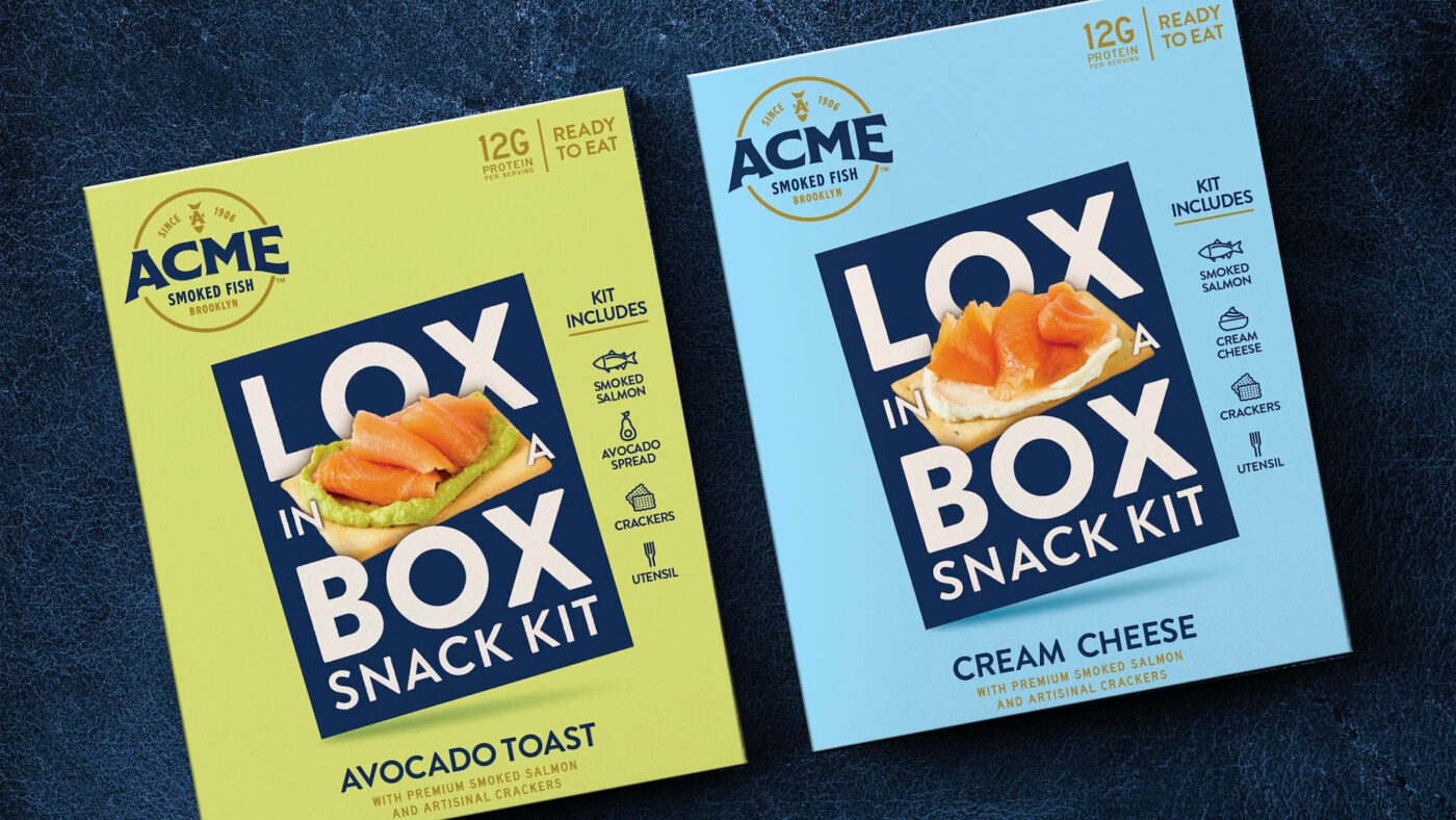
Lox in a Box is an exciting new product offering that builds upon Acme’s friendly, spirited personality. Aimed at targeting a younger audience, this playful expression stands out in the refrigerated section and straddles the line beautifully between on-the-go convenience and a premium snacking experience. Lox in a Box brings a youthfulness and fun sense of innovation to the category, firmly positioning smoked fish as a snack.
CBA’s work on the redesign brings a fresh perspective to the brand, while honoring and paying tribute to the brand’s rich heritage. Concurrently, the introduction of innovative products caters to a younger demographic seeking quality, new flavor experiences and culinary inspiration.
CBA’s work on the redesign brings a fresh perspective to the brand, while honoring and paying tribute to the brand’s rich heritage. Concurrently, the introduction of innovative products caters to a younger demographic seeking quality, new flavor experiences and culinary inspiration.
