Cheerios
Simply Good!
A daily beacon of joy.
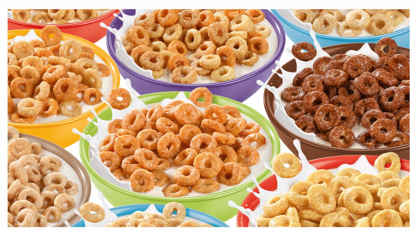
A beloved classic losing its glow: how to re-energize an iconic brand for a new generation.
For years, Cheerios has been a cherished household name, synonymous with nutritious cereals for the whole family across global markets. Its legacy as a “love brand” was undeniable, built on a foundation of wholesome goodness.
However, despite its strong heritage, Cheerios faced a critical challenge: a diminishing point of difference in an increasingly crowded breakfast aisle. The brand’s existing visual identity lacked distinctiveness, struggling to convey the vibrant, positive energy it embodied. Furthermore, there was a significant absence of clear differentiation between its diverse flavours and product sub-ranges, making it difficult for consumers to navigate and appreciate the breadth of the Cheerios portfolio. The brand risked becoming a quiet presence, failing to connect its intrinsic value with a modern visual language that could resonate with today’s families.
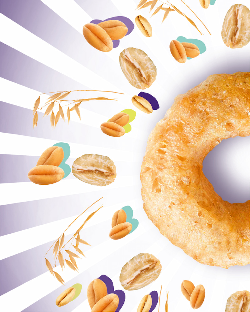
Illuminating intrinsic goodness: a chance to visibly radiate Cheerios’ core promise.
We identified a powerful opportunity to transcend Cheerios’ established image and make its inherent goodness visibly impactful. Modern families seek more than just nutrition; they crave brands that deliver positive energy, well-being, and a sense of cheerful vitality to their daily routines. The core “little O” of Cheerios, a universally recognised symbol, held untapped potential. It wasn’t just a cereal shape; it was a metaphor for wholeness, warmth, and connection.
By transforming this iconic element into a dynamic visual asset, we could position Cheerios not merely as a healthy breakfast option, but as a source of invigorating, wholesome joy. The opportunity lay in crafting a brand identity that truly conveyed cheerfulness, positive energy, and holistic goodness, reasserting its leadership and emotional resonance in the global cereal market.
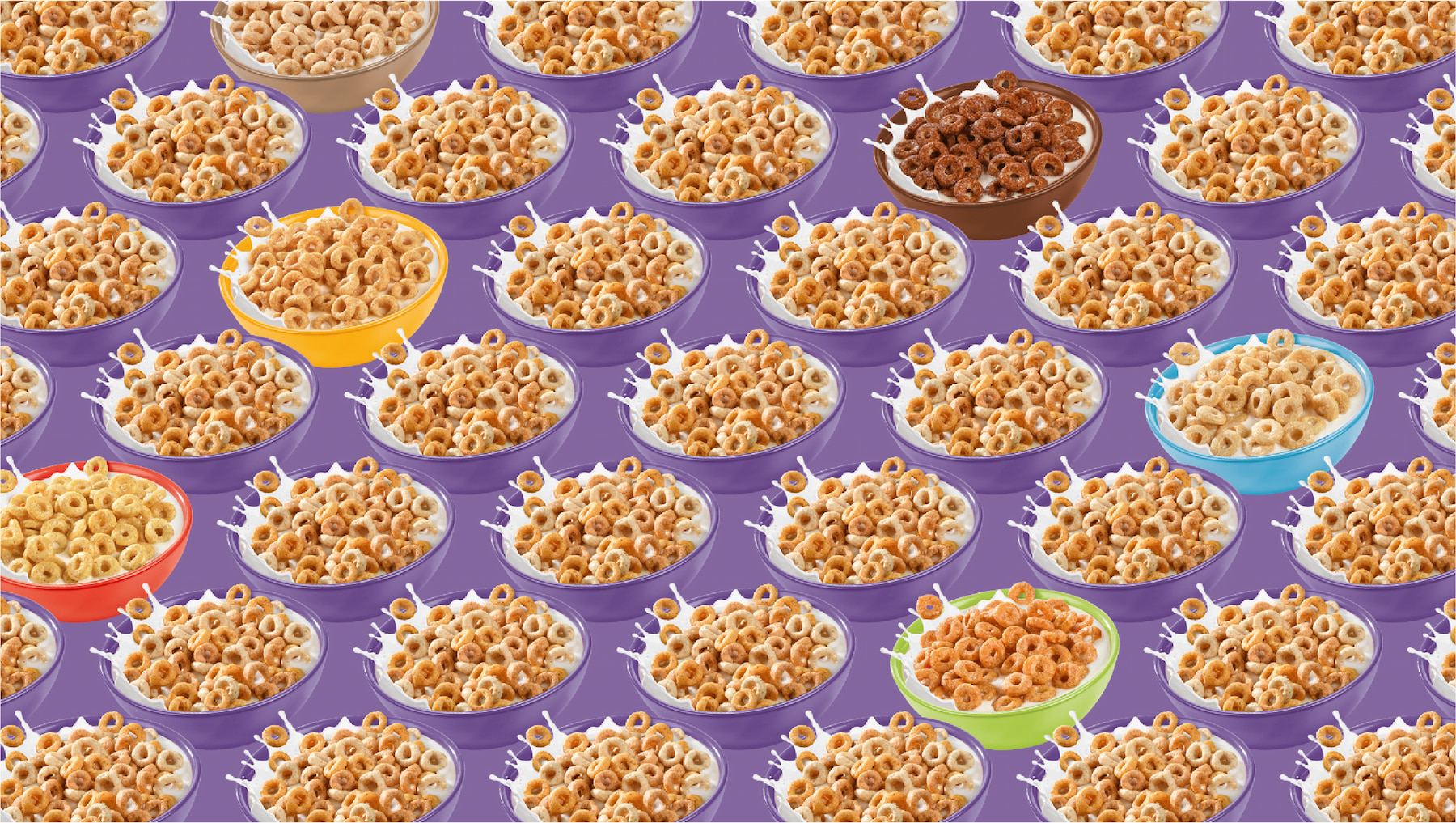
Elevating every breakfast moment to a celebration of wholesome vitality.
It transcends simple redesign; it’s a bold declaration of Cheerios’ true purpose. It’s about transforming its goodness into visible, radiating positive energy. We elevated the iconic “little O” from a static shape into a dynamic symbol, a guiding light that illuminates the start of every day. This idea resonates deeply with consumers seeking authentic, uplifting experiences, positioning Cheerios beyond a nutritious cereal to a tangible source of everyday well-being and happiness. It’s an invitation to experience the warmth, vitality, and genuine delight that comes from wholesome beginnings, making Cheerios an unmistakable source of positive energy and connection in every bowl.
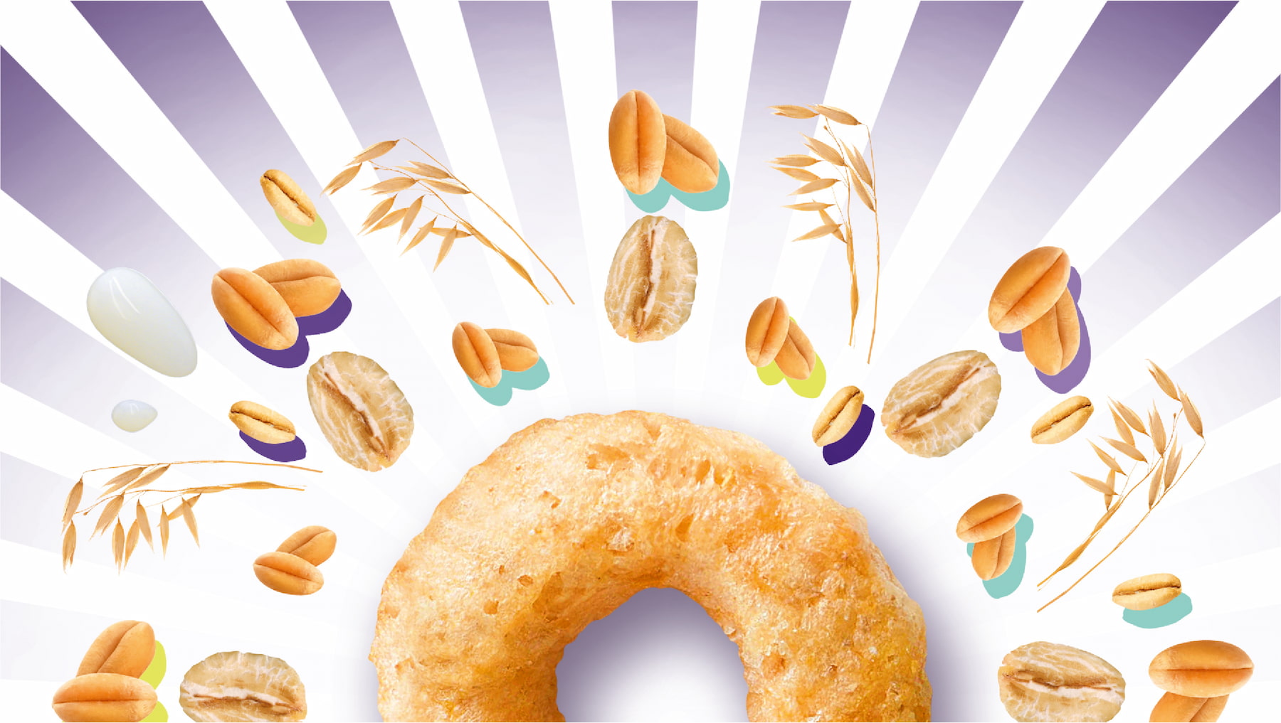
Harnessing the power of the "O" to radiate positivity.
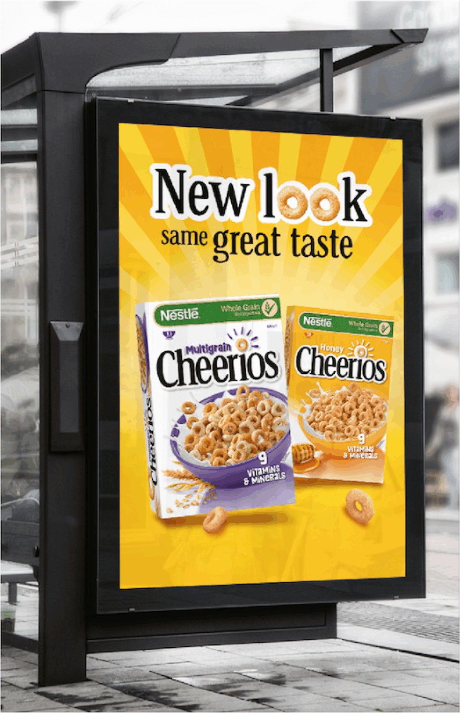
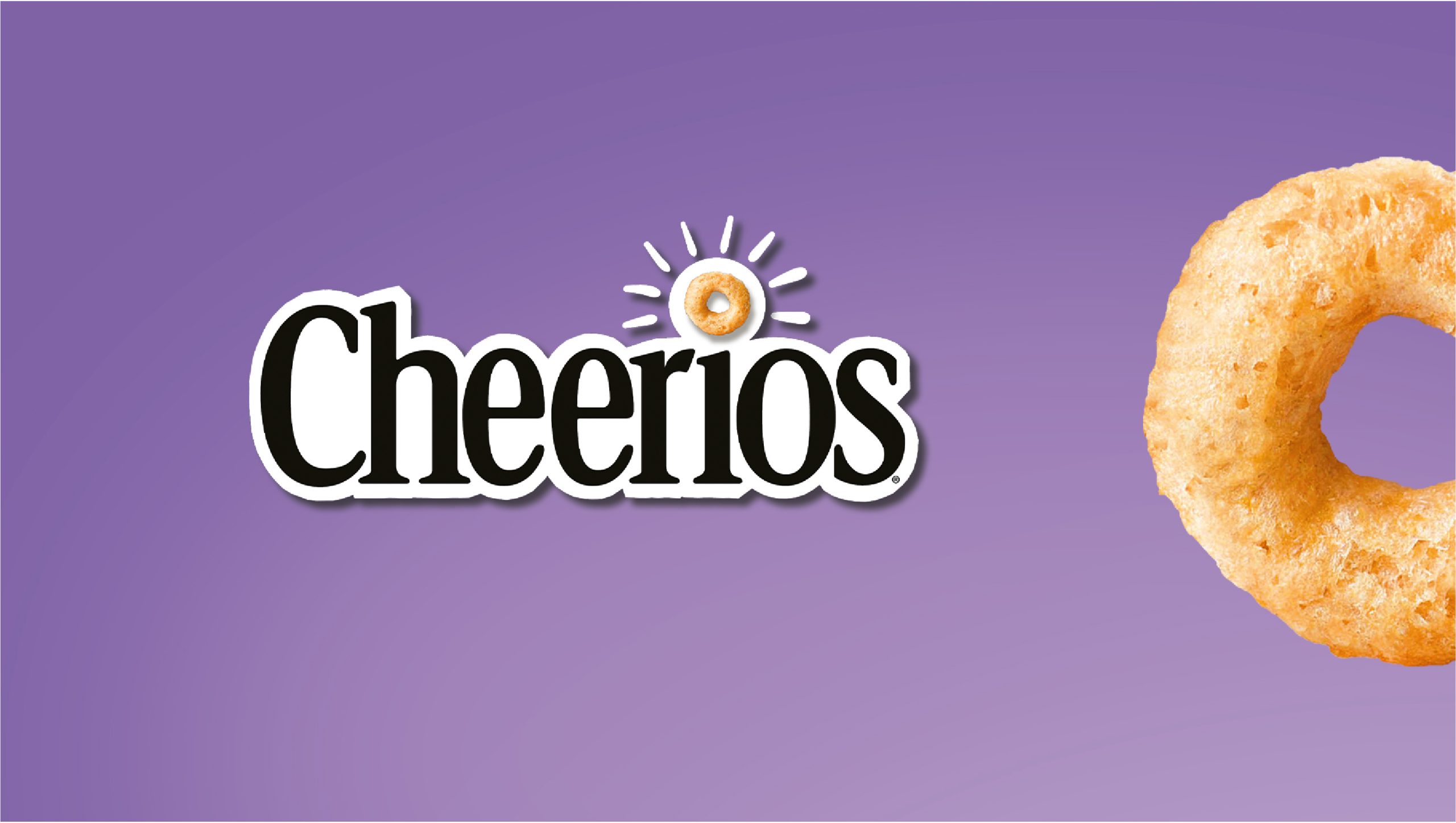
To embody “The O: a daily beacon of joy,” we developed a comprehensive, global visual identity that is both bold and refreshingly uncluttered. Our creative solution placed the product –the beloved “little O”– at the very heart of the brand’s visual language, imbuing it with newfound meaning, vitality, and personality.
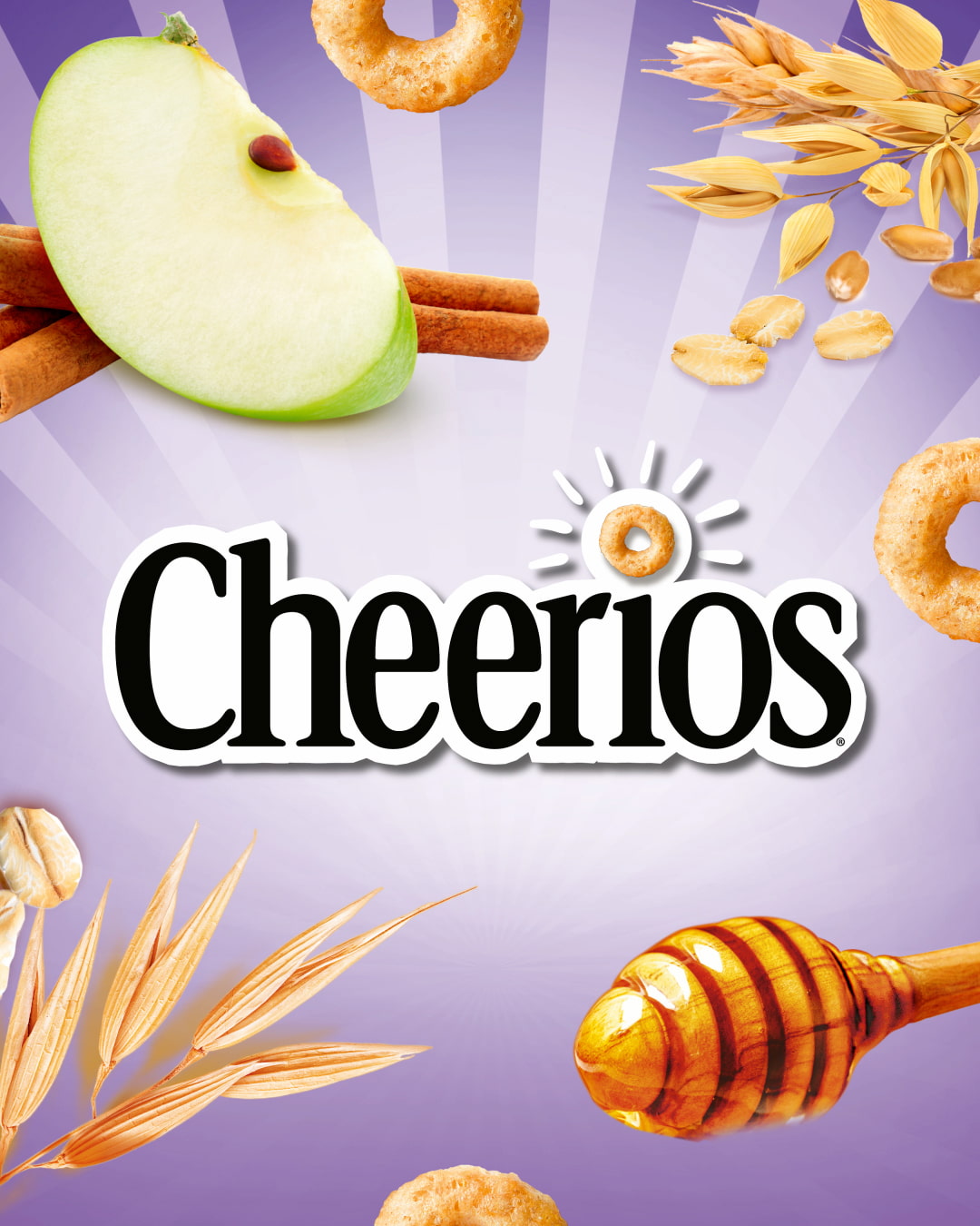
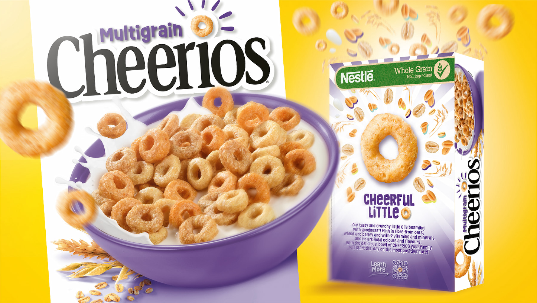
- Reimagined O:The iconic “O” was reinterpreted as a dynamic, luminous element. This isn’t just a shape; it’s a source, radiating positive energy outward.
- The “beaming effect”:A signature visual device, the “beaming effect,” was introduced. This design element dynamically spreads outwards from the product, symbolising the positive energy, warmth, well-being, and health benefits of Cheerios, much like the invigorating rays of the sun.
- Product-centric design:By putting the actual Cheerios at the centre of the packaging and key visuals, we highlighted their natural appeal and wholesome texture, inviting an indulgent touch.
- Modern & dynamic aesthetic:The overall design is bold, modern, and clean, cutting through category clutter while maintaining a cheerful and inviting personality.
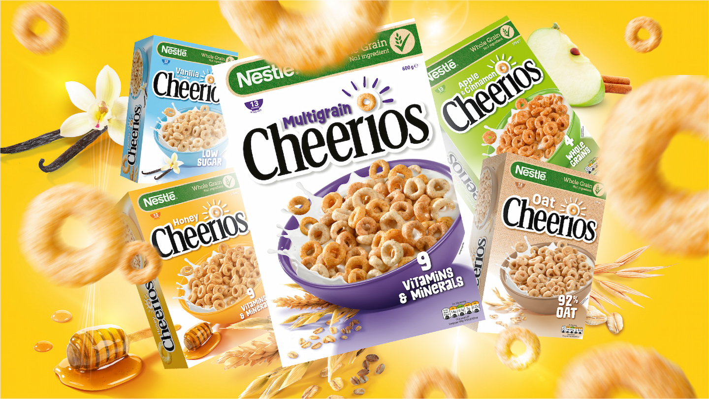
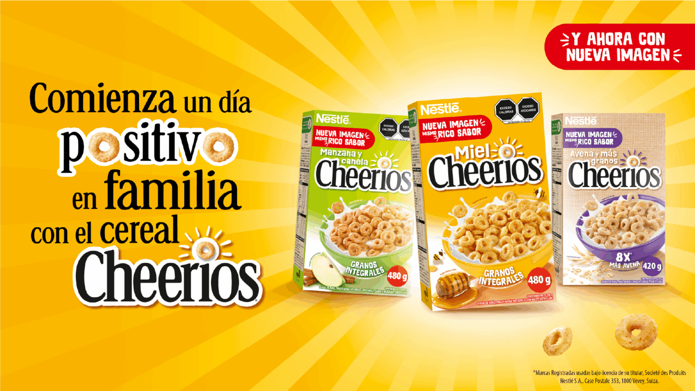
- Clear differentiation:The visual system was designed with versatility in mind, allowing for clear and intuitive differentiation across various flavours and product sub-ranges while maintaining a cohesive brand family.
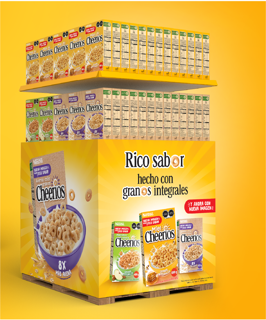
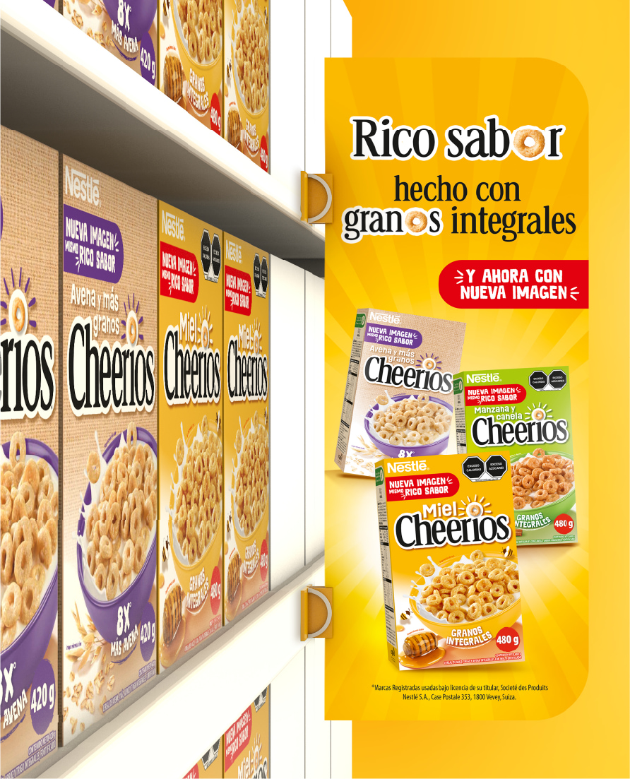
- Global guidelines:We created robust brand identity guidelines, shopper key visuals, and packaging designs, ensuring a consistent and impactful global rollout across diverse markets.
This creative solution transforms Cheerios into a dynamic, engaging, and instantly recognisable brand that visibly communicates its inherent goodness and positive impact.

Re-energizing an icon: positioning Cheerios for renewed growth and enhanced market appeal.
The strategic global rebranding of Cheerios has successfully repositioned the brand, reasserting its legacy for a new generation and strengthening its market presence.
- Enhanced brand distinctiveness:The bold and uncluttered visual identity, centered on the dynamic “O” and its “beaming effect,” has dramatically improved brand distinctiveness, allowing Cheerios to stand out vibrantly in a competitive category.
- Clear portfolio navigation:The new design system provides clear differentiation across flavours and sub-ranges, making the Cheerios portfolio easier and more appealing for consumers to explore.
- Increased emotional connection:By visibly radiating positive energy, warmth, and well-being, the brand fosters a deeper emotional connection with families, reinforcing its role as a source of wholesome joy.
- Modern appeal & relevance:The transformation into a modern, dynamic brand resonates strongly with contemporary consumer values, attracting new audiences while invigorating existing loyalty.
- Global consistency:The comprehensive visual identity and guidelines ensure a consistent brand experience across diverse global markets, strengthening brand equity on an international scale.
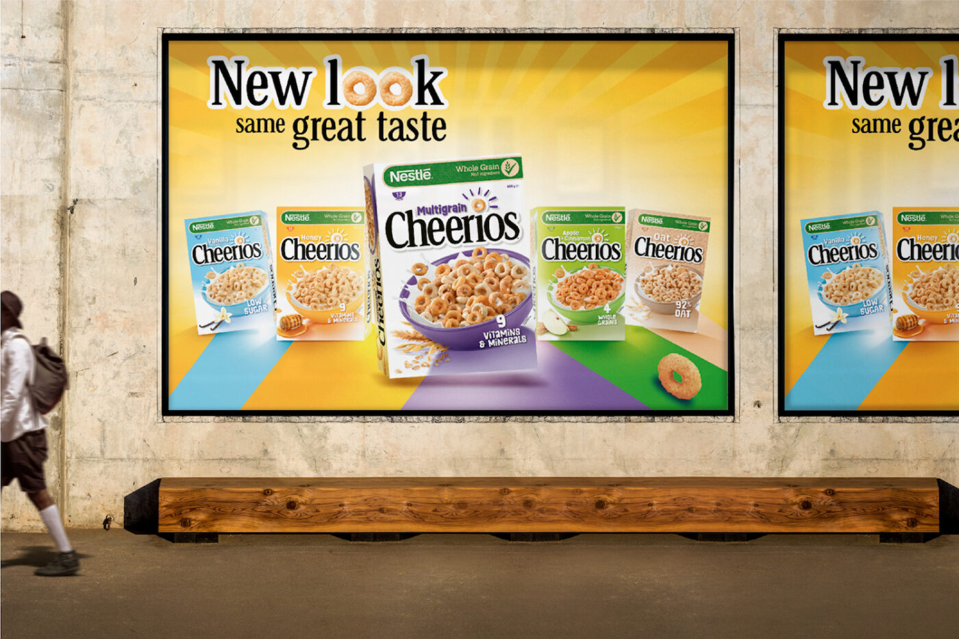
Cheerios has successfully transformed from a beloved classic into a modern icon that visibly radiates its core promise, ensuring its continued relevance and appeal for years to come.
SERVICES
- Identity, Packaging, Branding
INDUSTRY
- Food & Beverage
BUSINESS NEED
- Relevance
