Following the acquisition of Altido, ChezNestor, and Open, DoveVivo decided to unify the different operators under the same brand: Joivy. This transition brought about several changes that made it necessary to reevaluate the main strategic assets of the new brand and fully leverage the potential of this opportunity. These changes included the shift from student co-living to comprehensive 360° living solutions for a broader target audience with specific needs, an expansion from 3 to 6 countries, and the need to involve an increasing number of employees.
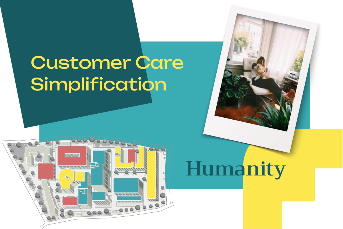
The strategic thinking began with the need to deeply understand all internal and external stakeholders. The insights we gathered allowed us to give deep meaning to the narrative, capable of guiding and engaging employees on the one hand, and appealing to various targets on the other.
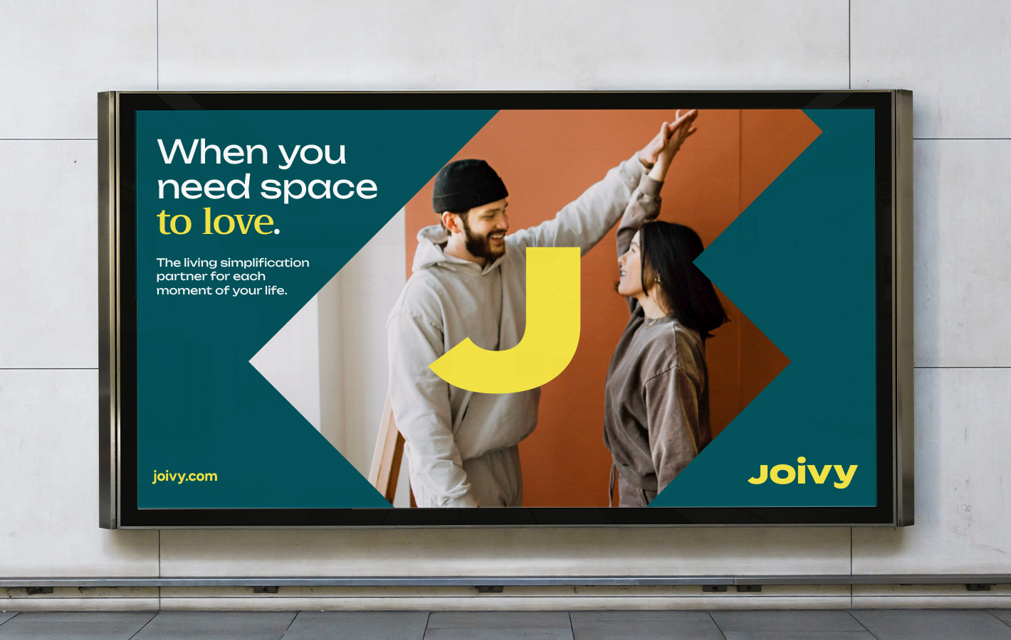
When you need space.
During the interviews, a significant correspondence was found between internal and external perceptions, highlighting the nature of the brand: simplification, humanity, and customer focus. These pillars were our starting point to define an “edge” that gave life to a new positioning, brand manifesto, and brand identity. In particular, the tagline “When You Need Space” emphasizes the concept of simplification, focusing on solving the ever-evolving needs of our users.



The new brand communicates in a friendly, positive, and empathetic yet credible language. The logo encapsulates all the values that Joivy expresses: specially designed bold lowercase typography, soft yet reassuring, with the “i” succinctly suggesting placing people “at the center,” and the final “y” eliciting a smile. A logo capable of conveying the emotional yet digital-native nature of the brand.
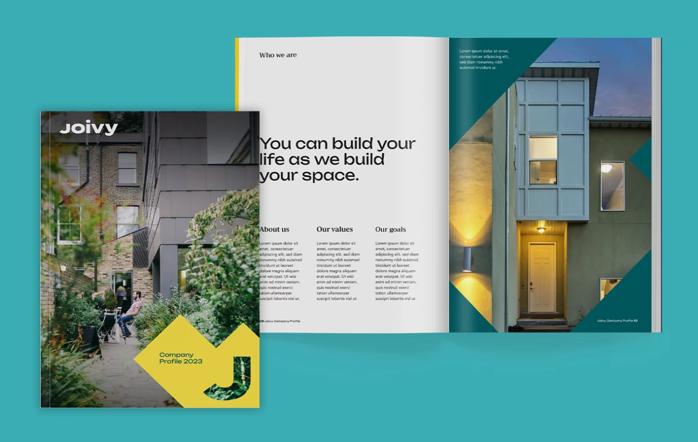
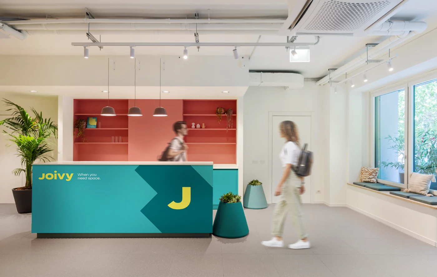
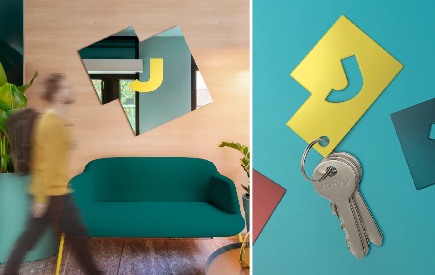
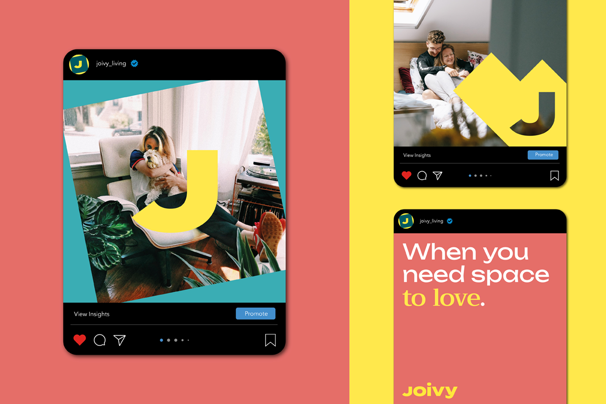
The visual language is based on the idea that Joivy can offer everyone a tailored space for their needs on every occasion. Around the J, a strong and synthetic monogram, various shapes rotate, which are nothing but floor plans of different types of homes.
These forms, which abstractly summarize the offer, become masks for images and colorful shapes that create a recognizable system across all touchpoints.
The main sans-serif typography, fresh and modern, is paired with a serif font, an expression of the human touch, emphasizing the platform’s ultimate goal: finding the right space to collect memories. The color palette is a tribute to the brand name: a joyful and fresh yellow paired with a welcoming and reassuring green.


We are happy to have collaborated with CBA for the birth of our brand: a new soul that could embrace an international group like ours. It was a great team effort: from the interviews to the identification of values, without forgetting the construction of the brand identity.
Digitalization
After developing the strategy and visual identity, we also took care of implementing the website for a B2B audience of landlords and investors. Both User Experience (UX) and User Interface (UI) were designed to offer the user a functional and immersive experience within the brand, facilitating the understanding of Joivy’s offerings and the complex ecosystem.
Joivy is the only platform in the residential landscape that manages, in more than 40 destinations in Europe, a wide range of housing solutions such as co-living rooms, private studios, student campuses, apartments, and villas for short, medium, and long-term stays. Over the years, it has acquired other international entities such as Altido, ChezNestor, and Open.
