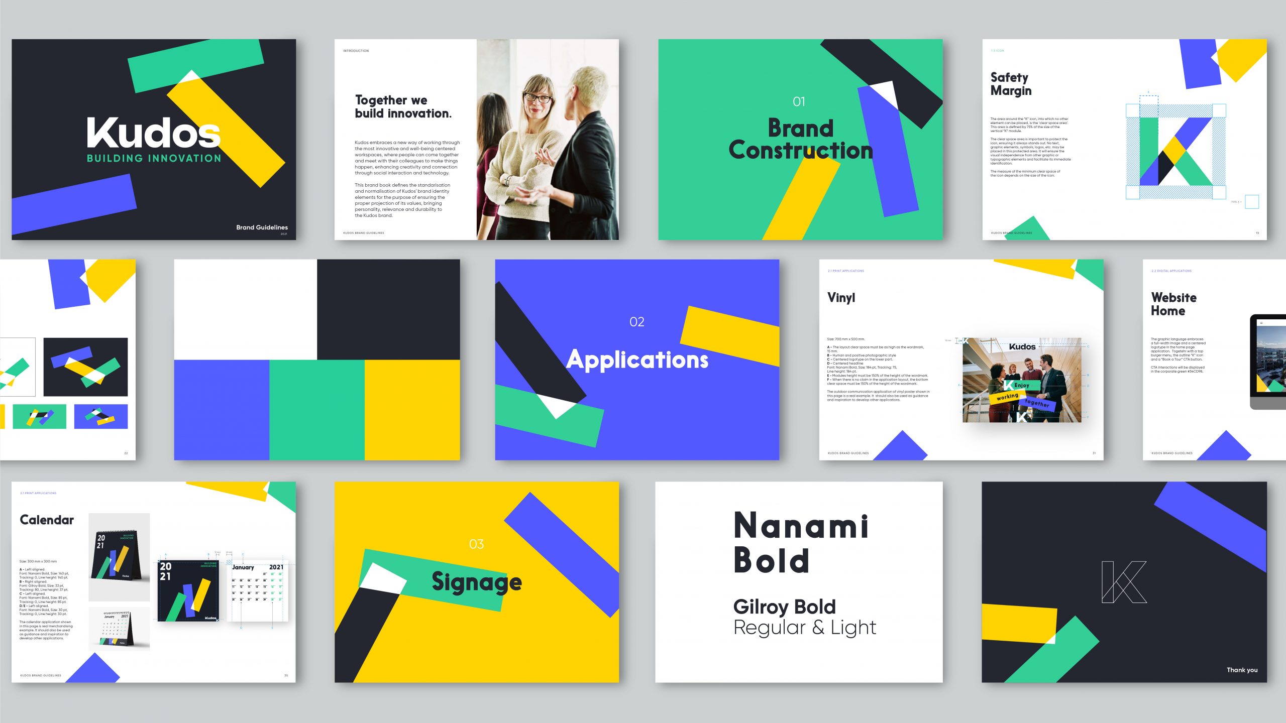
Redefining the role of the workplace as a space for interaction, connection and innovation.
The implementation of improvements in the assets portfolio, including the definition of customized services, activities and a new way of management focused on improving the user experience, have been the starting point of this project, which aims to unify the identity of eight buildings located in Madrid and Barcelona under a single brand able to represent them consistently.
The pandemic has precipitated a major change in the way we relate to our environment. An environment that demands more flexibility, more dynamism and more empathy. The ideal moment to emerge in this new paradigm with a relevant concept and a more emotional speech that provides safety and well-being to both companies and people.

The first step has been establishing a solid brand strategy to identify a distinctive territory of expression. To this end, we have worked on the conceptualization of a clear positioning that reflects the brand’s values and personality, shaping an ownable narrative.
A work of immersion, reflection and analysis that sought to answer the following question: What is the new role of the workplace? “The place to meet”. This has been the impulse to build the new creative territory. A space understood as the meeting point that encourages interaction, dialogue, connection, collaboration, innovation and relationships that generate progress. A community that should feel identified by a visual imaginary that represents it.
That is how Kudos came to life. The name capable of synthesizing the essence of the project in a memorable way.
It is a positive, rewarding and conversational message used to congratulate and recognize the achievements of a professional team and its members. It represents a dialogue between people and positive communication among colleagues. From this new naming, two sub-brands are defined to differentiate the assets portfolio: on one hand, the Innovation Campuses, groups of buildings located on the outskirts of cities and, on the other, Urban Buildings, present in urban centers and business hubs. As such, Kudos establishes itself as an encouraging and motivating workplace where people can support each other, feeling proud to belong to a community.
To that end, a solid brand of timeless codes has been built, where the "K" emerges as the main protagonist.
An architectural icon from which the entire graphic system is born, composed of three dynamic modules that symbolize connection, interaction and collaboration. A composition in constant movement that explores the different brand expressions with a human, authentic and emotional tone.

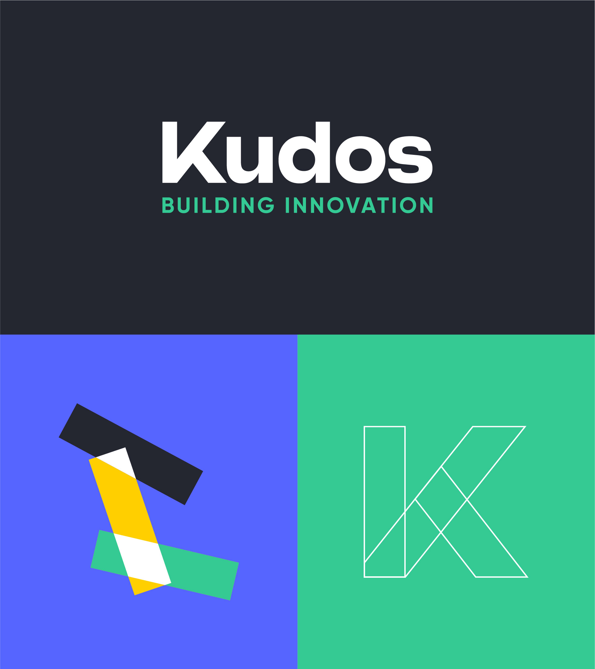
This visual emotion is expanded through the vibration of a luminous color palette, where green refers to the commitment towards sustainability, blue refers to innovation and yellow represents warmth. A new graphic language that seeks to generate experience and convey the main benefits of its value proposition in a relevant way.
An identity that simplifies messages to generate visual impact and empathy between the brand and its users, easily communicating its main purpose: the encounter.
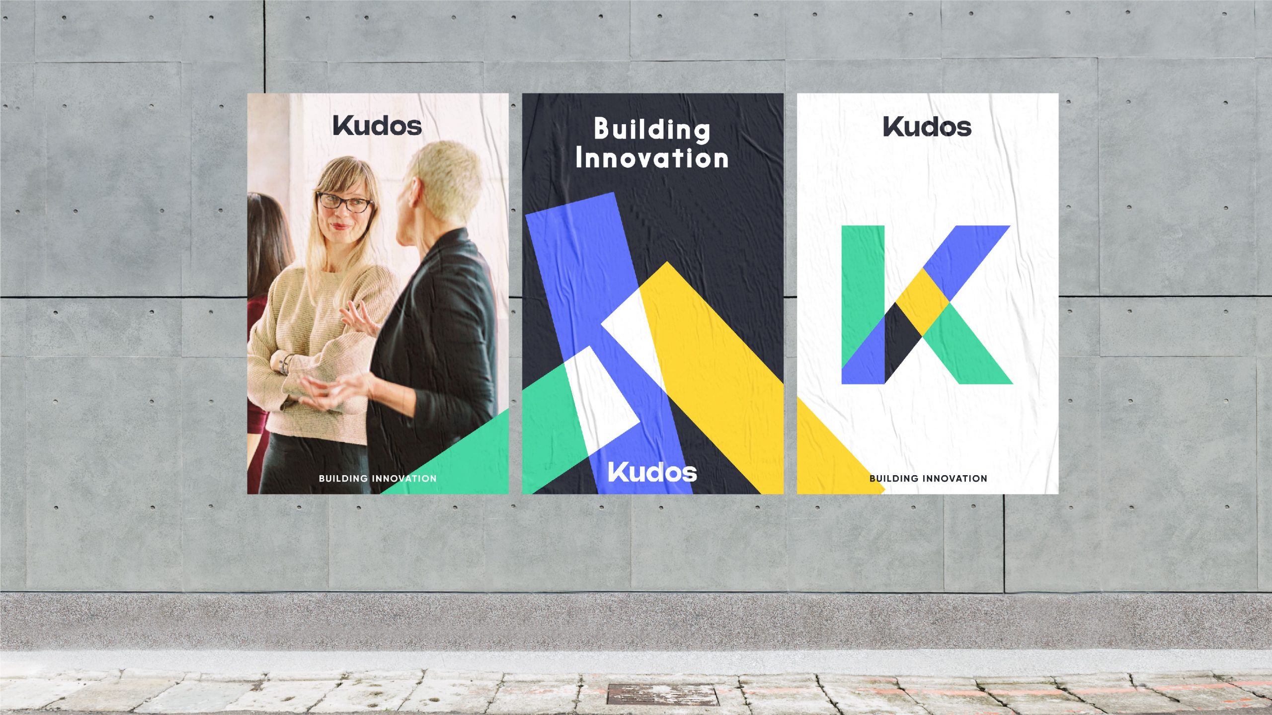
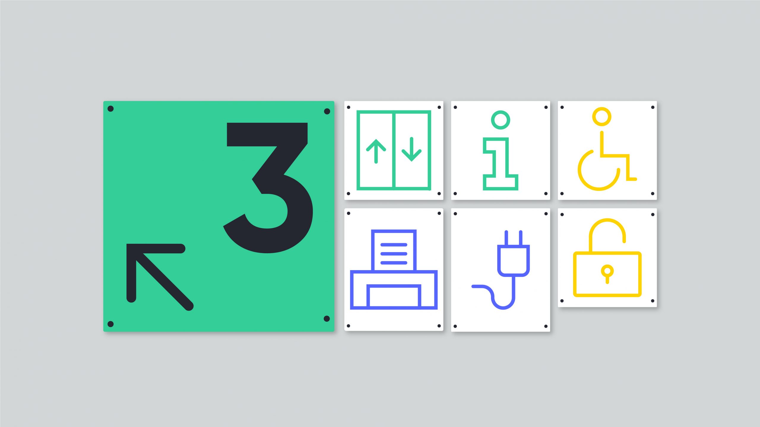
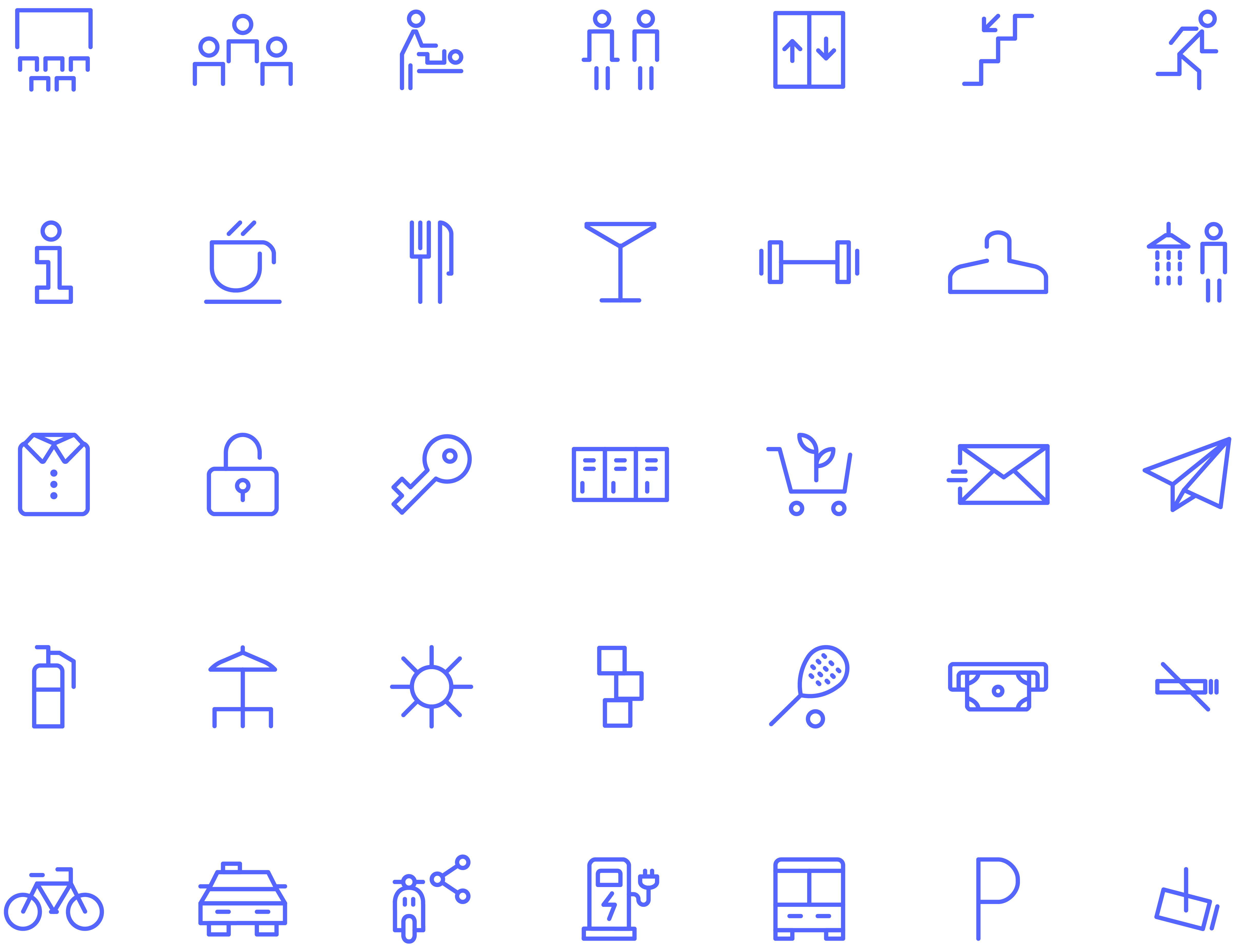
The photographic style is a fundamental piece in the configuration of this new imaginary. A sustainable balance between the luminosity of the buildings and the natural presence of its users who celebrate encounters. A relationship whose pulse must be kept alive at any point of contact, which implies the development of its own iconographic language that allows the implementation of an efficient signage.
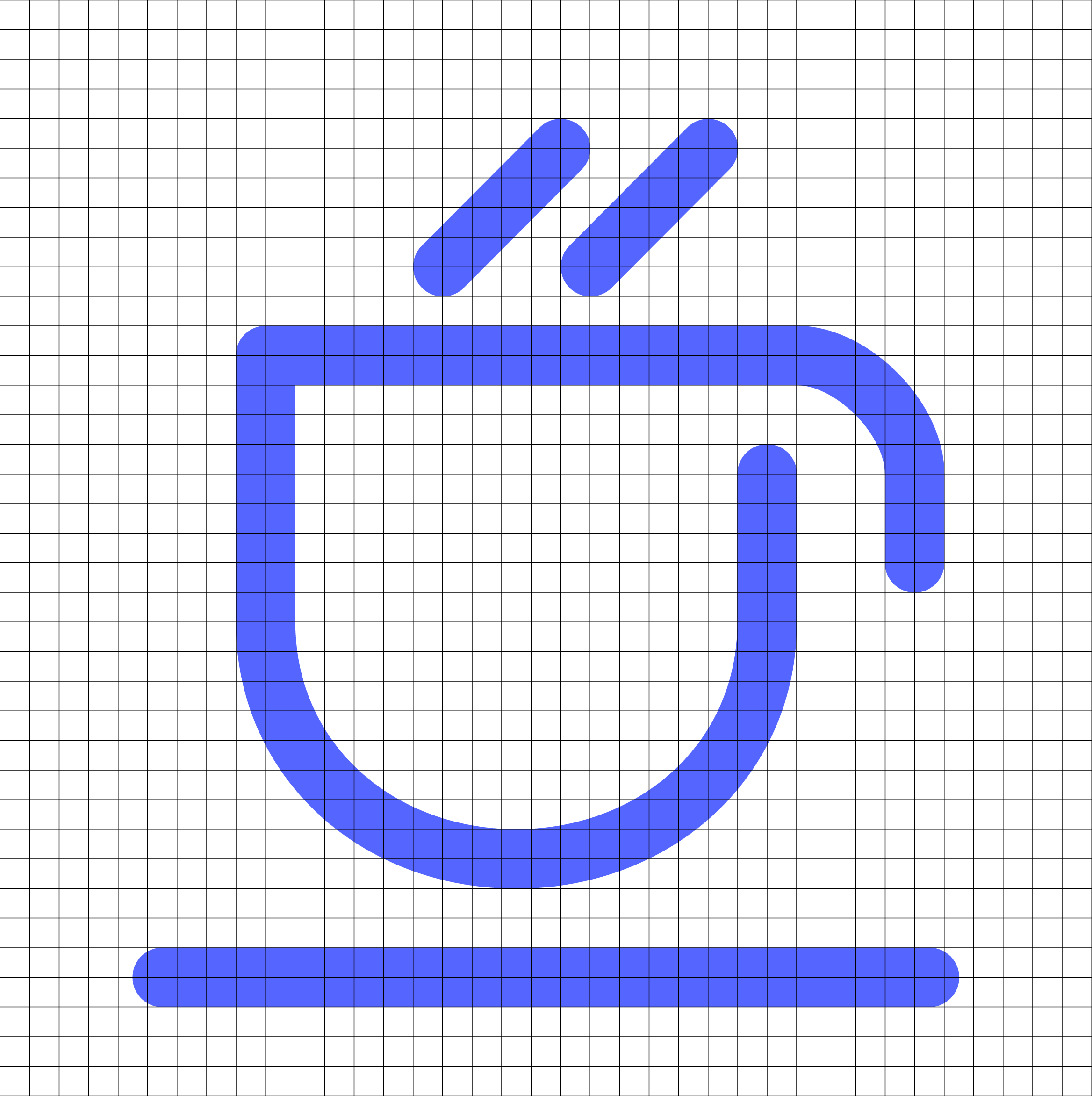
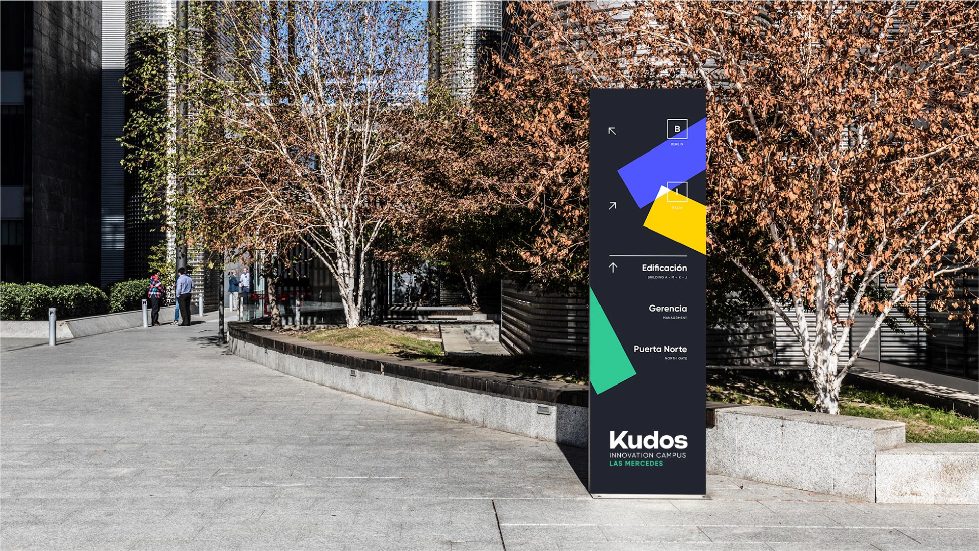
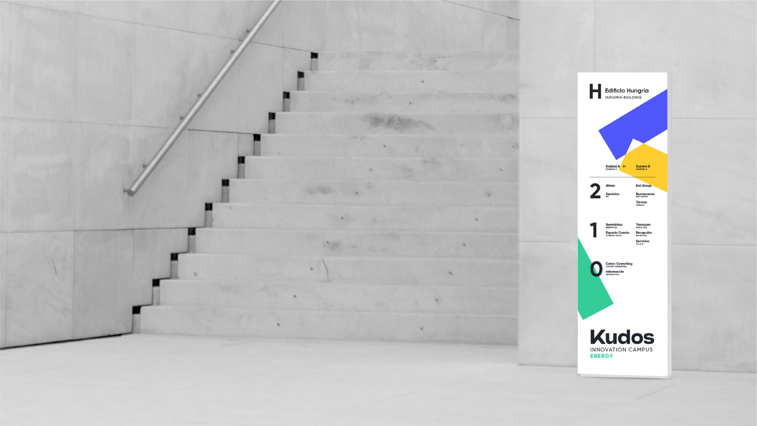
The line becomes the constructive element for the creation of the iconography, linking the icons to the “K”, the main component of the brand, and giving Kudos a unique and positive personality in all its spaces. At the same time, the use of modules is expanded in the development of signage to achieve recognition in each environmental application and bring light and life to the facilities through the bold use of color.
This visual efficiency must also extend to its digital environment, with a clear premise: to generate a simple and accessible experience. A modular design that facilitates access to information and its adaptation to different devices. Intuitive, flexible, and able to optimize content for a user-friendly navigation.
A dynamic and flexible visual identity, able to position Kudos as a reference in the new role of the workplace.
The new way of relating to workspaces, focused on people and the unique environments where they meet to enhance social interaction, establishing real synergies, building community and quality experiences.
