Accessibility
Leocare, mastering with fingertips tomorrow to live serenely today.
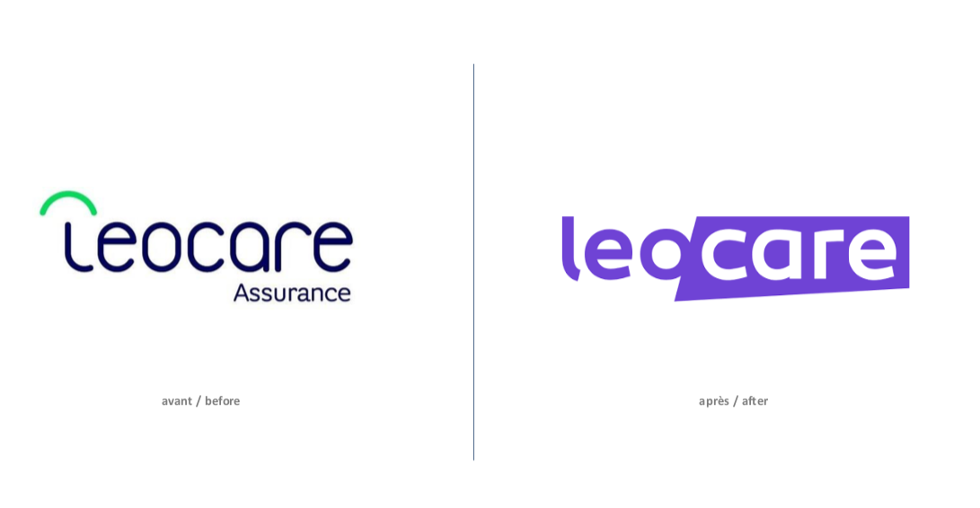
CBA has created an identity that completely disrupts market norms for this innovative insurance product.
Following an analysis of Leocare insurance and the competition, CBA decided to base the brand’s new identity on the idea of a coach—someone who is caring, encouraging and gives guidance. The graphic design, tone of voice and identity were all designed around this idea. Leocare guides you and finally makes the world of insurance seem transparent. We opted for a simple, effective, and resolutely avant-garde design.
Feeling reassured?

Positioning: a different kind of insurance
Disruption is not just a communication strategy for launching a product. It’s a strategy that should work for consumers—it should make their lives easier and give them the freedom to achieve their goals.
Creative concept: a coach who guides and advises
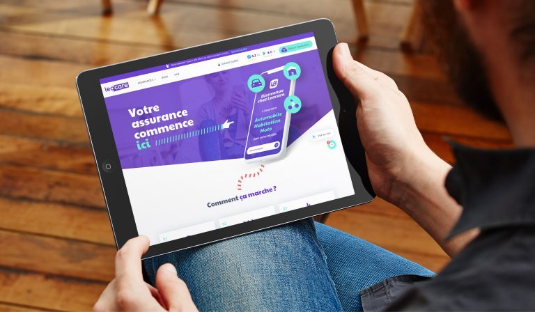
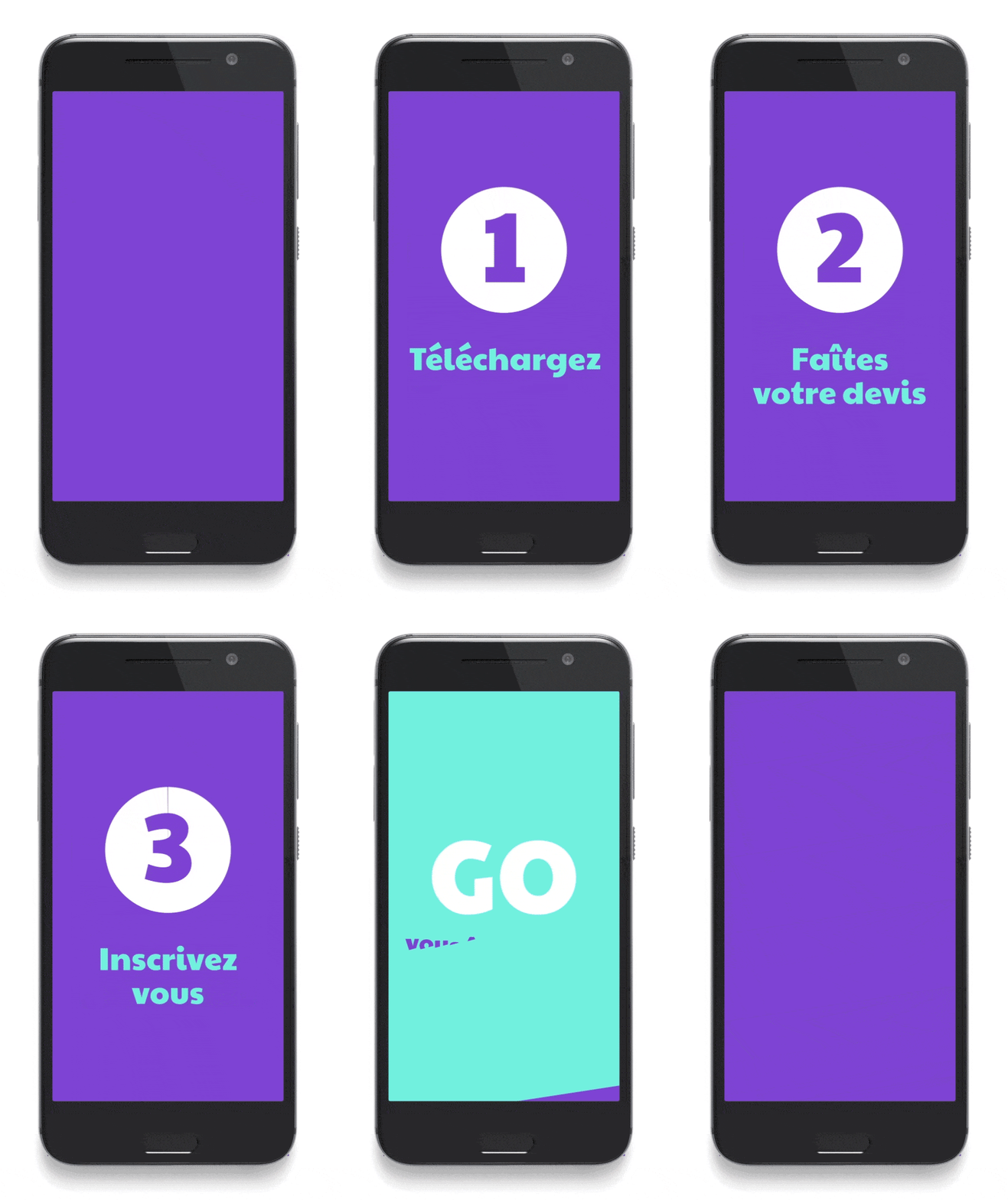
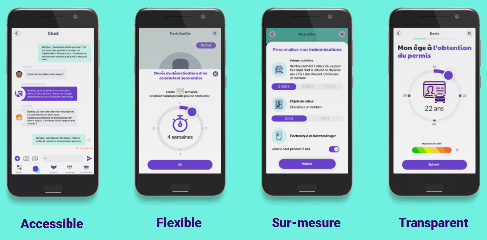
Leocare is app-only insurance that banks on simplicity. Take out, adjust or cancel insurance in just a few taps. Leocare offers bespoke insurance to each of its customers, and offers day-to-day support through its app. The interface is 100% digital, but Leocare understands the importance of the human touch, so its advisers are on hand for all customers, and can survey any damage by video call.
Leocare’s core values:
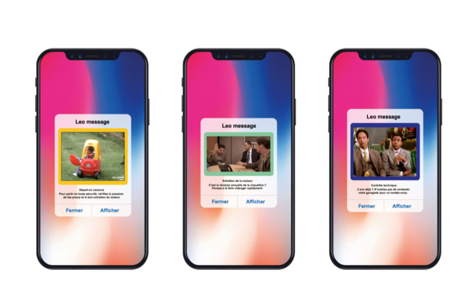
Tone of voice: bold, caring, energetic
A bold tone is welcomed by Leocare’s connected, urban audience. Being approachable and building a horizontal relationship with consumers should be a goal, not a concern.
Guiding and Informing
Iconographic univers
Leocare’s iconography is spontaneous—images are taken on the fly and appropriated by the brand, through integration with geometric shapes from the brand territory.
Cinematographers also help to shape the brand’s graphics, capturing the peace of mind provided by Leocare.
Pictographic universe
To remain unrelentingly unique, Leocare icons use the brand’s two key colours and borrow the curves and angles that make up its logo.

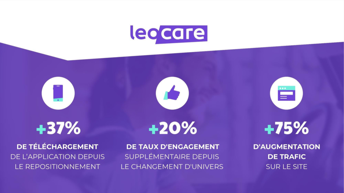
Results
