The brand that turns the tide
Faced with a food-processing industry that is walking on the head, with pesticides, additives and junk food, consumers no longer want to be driven without knowing where they are going. They need transparency, more than ever, they need to know what they are eating.
Being a committed food player since 2009, and with .nod, Biofuture offers to consumers the experience of truth by fighting against the nonsense of the food-processing industry.
For Biofuture, it is time to change direction and defend a new standard: the taste of good, without concessions, for us and our environment.
Its new brand .nod illustrates this fight by challenging what should be the new normal.
.nod
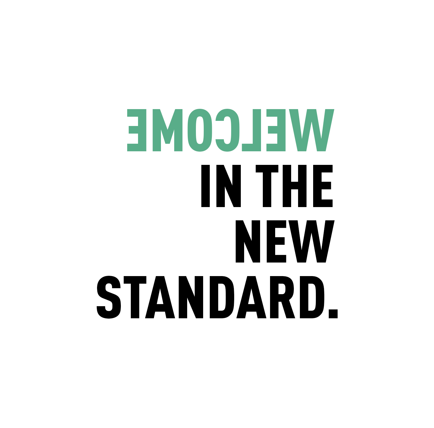
"Promise, with no compromise, this is the new standard that will turn the tables"
To trigger this committed, positive and gently impertinent awareness, Biofuture called on CBA to support it from the naming to the communication strategy, including the creation of the brand platform.
The main challenges for CBA were to define the strategic fundamentals of the brand in order to deploy an identity and graphic ecosystem that makes sense with 2 main ambitions:
- To appeal in order to change mentalities
- And make .nod the normal food for demanding epicureans
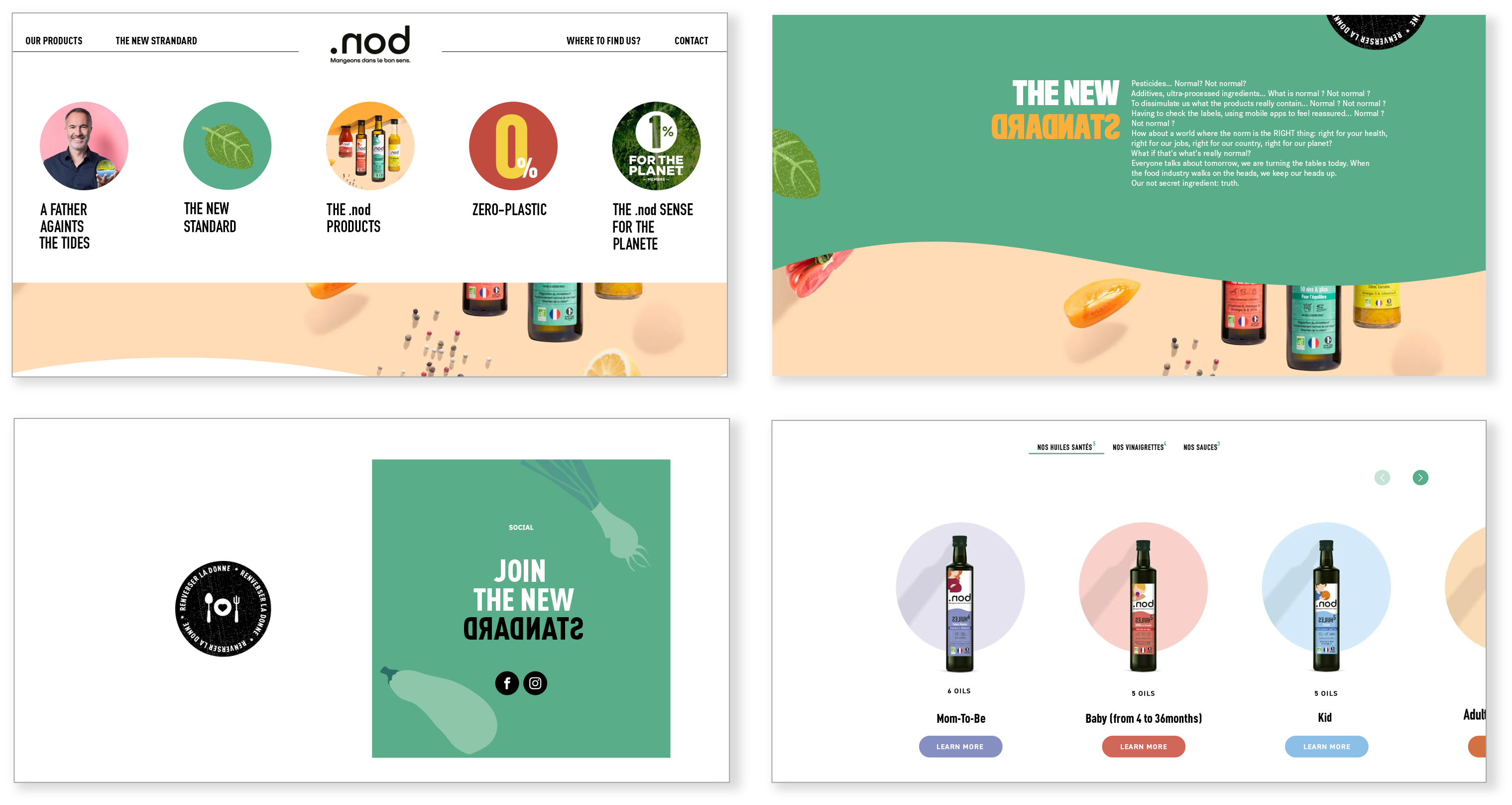
In the last 50 years, the food standard has turned upside down. The norm today is pesticides, additives, ultra-processing, opaque origins… We feed on chemistry and everyone thinks it’s normal! In a world that is walking on its head, we are convinced that the best way to go back to the right way was to go backwards! .nod (= bon which means good in French), the first brand that is spelled backwards, is an invitation to change direction and to ask ourselves if normality should not be good, “without chemistry”, raw, local…
With .nod let’s eat the right way!
The good way is to change it
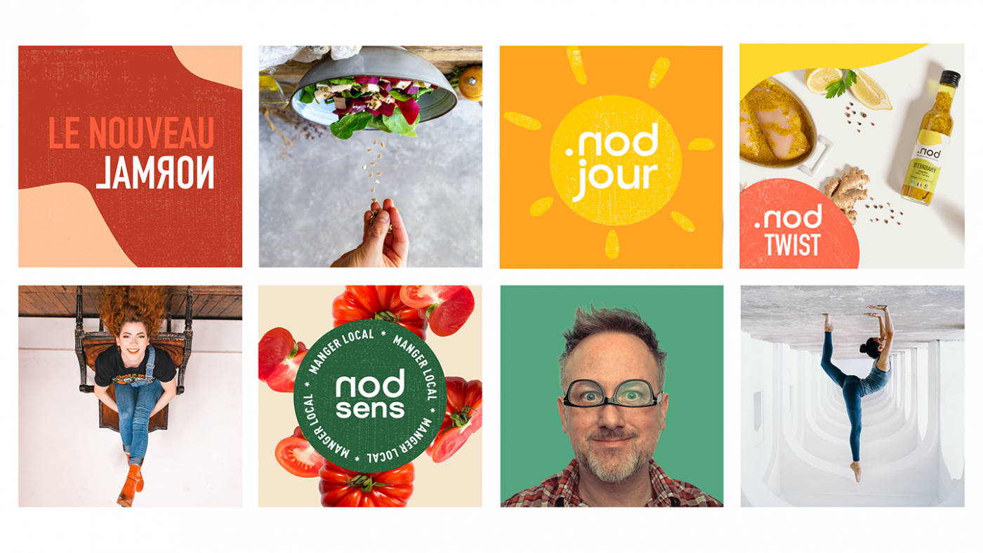
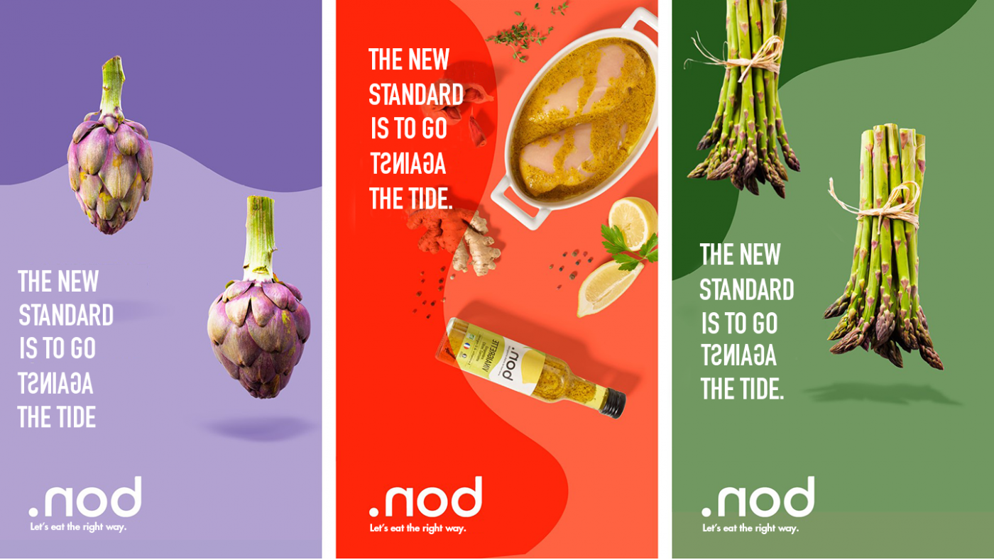
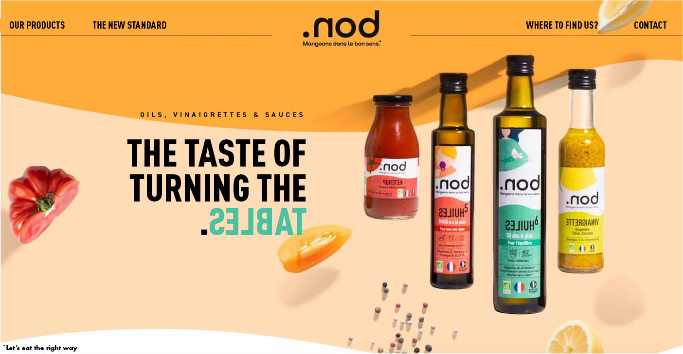
Based on this observation, the agency wanted to put the spotlight on an innovative creative concept: common sense is to change it. Therefore, CBA has developed a visual identity in line with this concept, i.e. “upside down” creations with an aesthetic that emphasizes taste. The goal of this graphic territory is to be against the tide.
By turning us upside down with his ideals, this entrepreneur turned us right side up. We decided to create a brand that puts food back on the right way. Here, there is no room for compromise, from strategy to design including the naming, each ingredient of .nod appeals, questions and leaves no one indifferent.
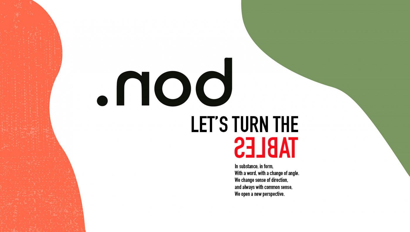
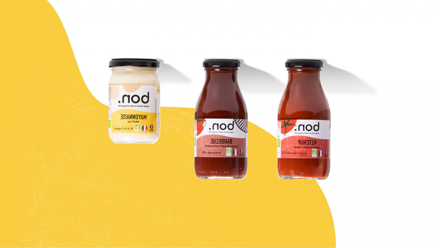
The logo has also been designed: by using the mirror effect, it allows you to read the word “bon” (“good” in French) hidden in the brand name. The dot, at the beginning of the word “nod” or at the end of “bon”, depending on which way you look at it, emphasizes the simplicity of the products; .nod products are good, and that is all!
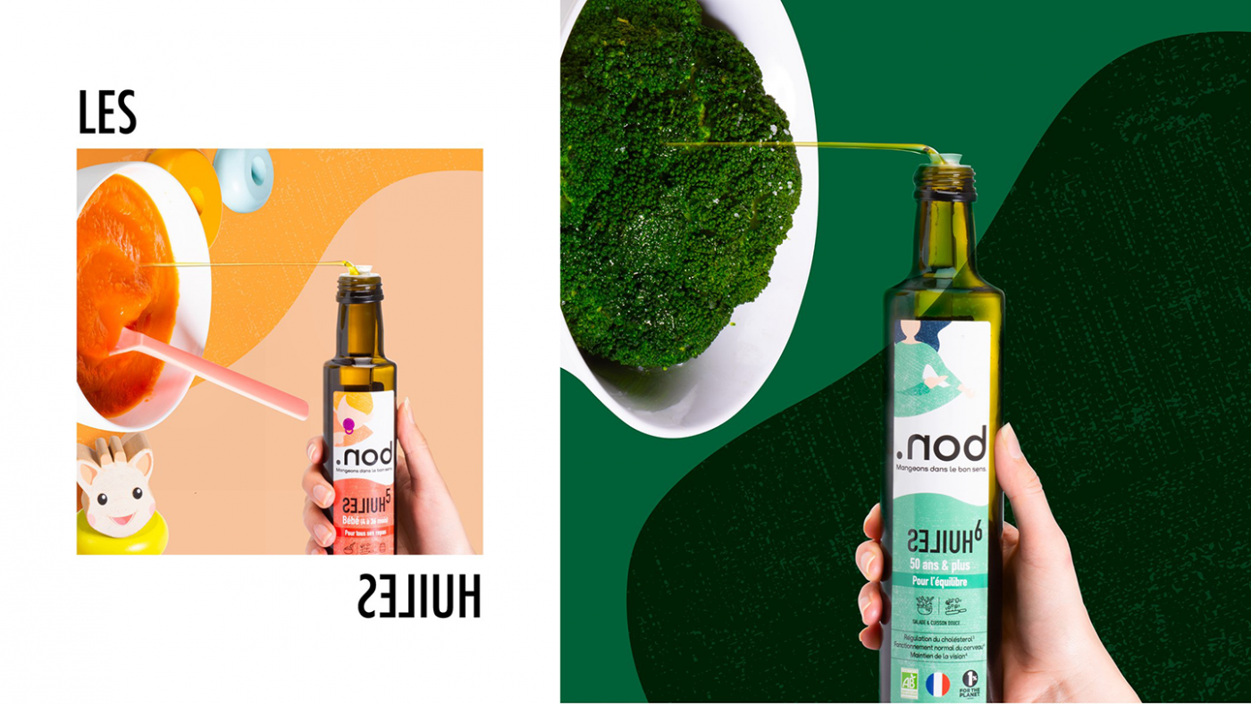
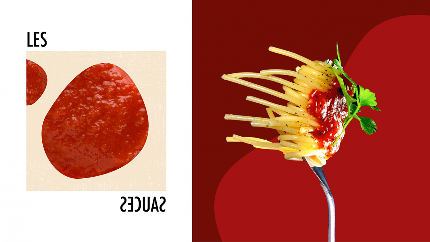
Between typographic plays with a single word inverted and visual games through abstract and random shapes, the graphic territory reflects the impertinence and the peps side of the brand.
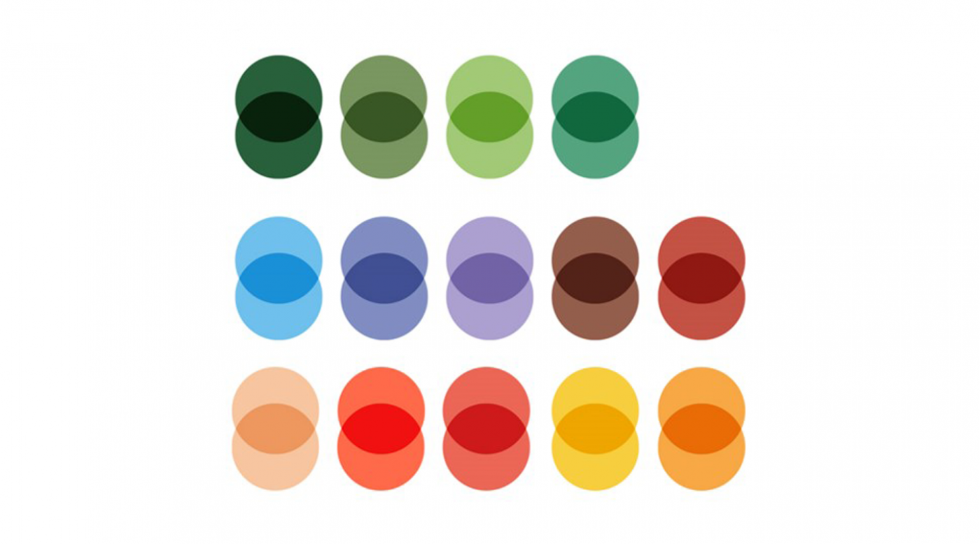
Finally, this graphic territory presents bright, fresh and vitaminized colors that reflect the products; tasty condiments that brighten up all your dishes.

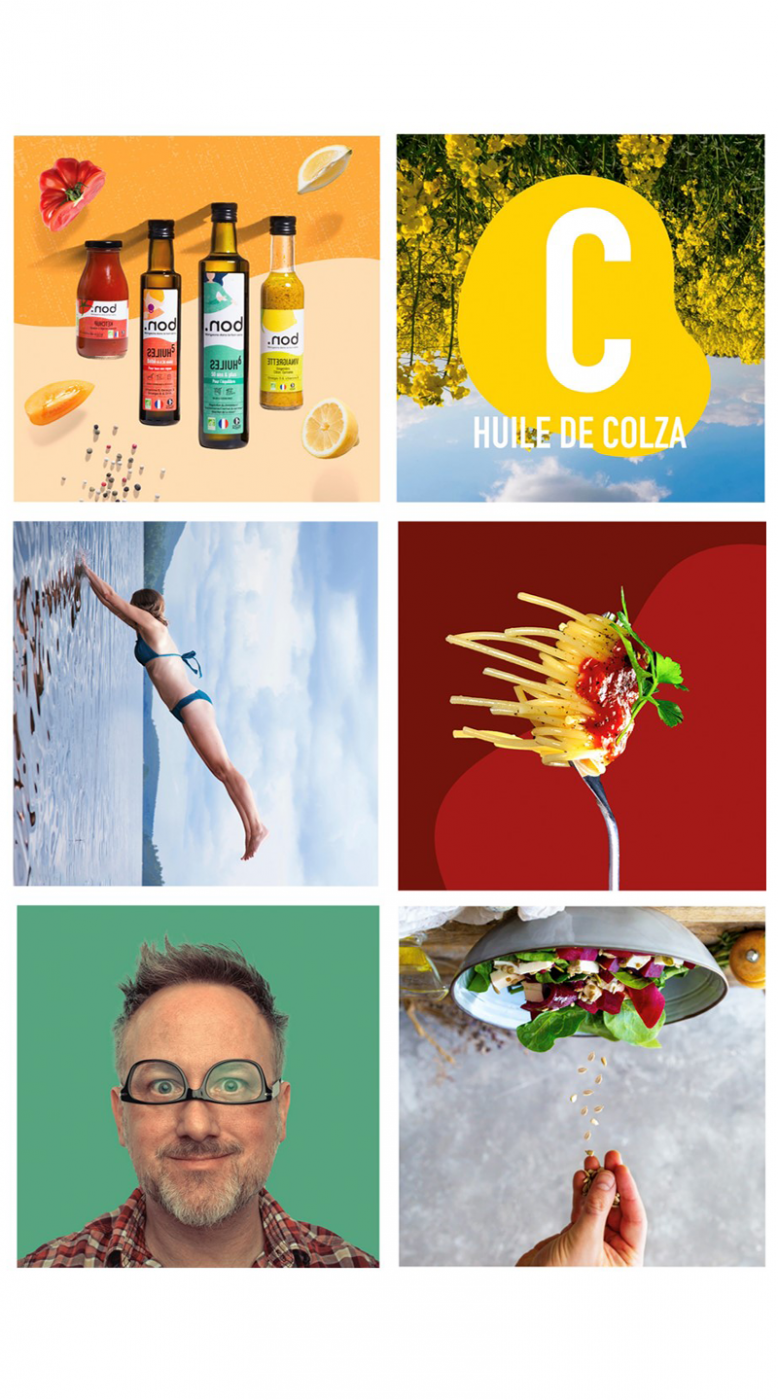
Products that don't leave you indifferent
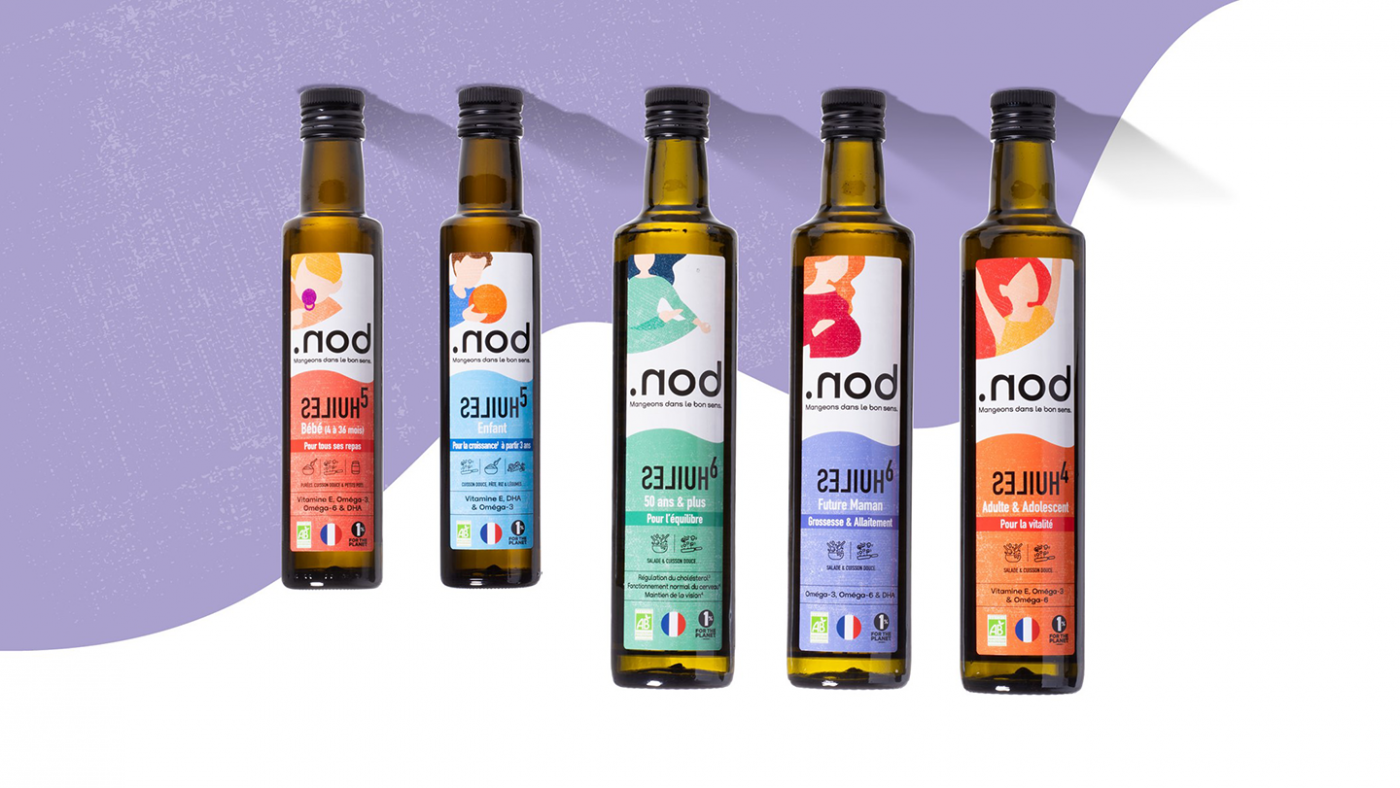
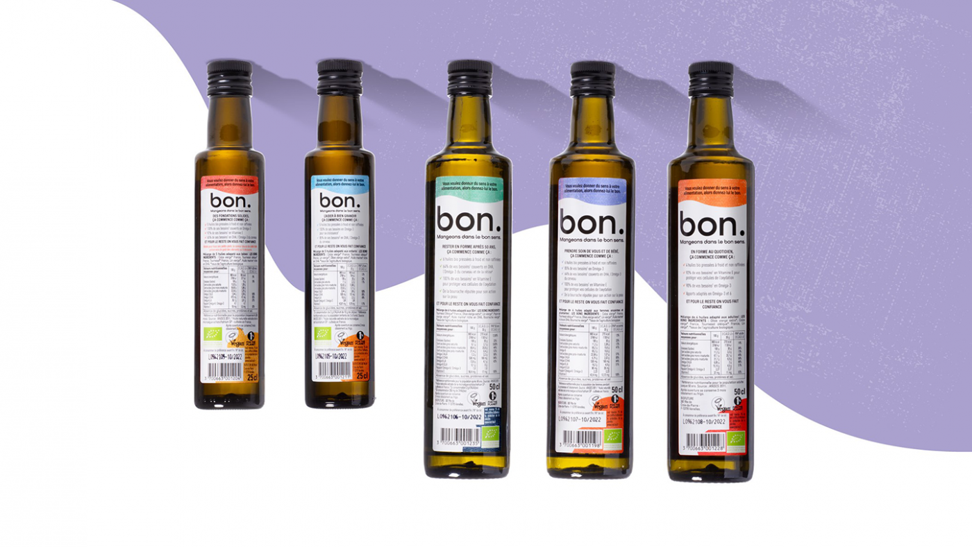
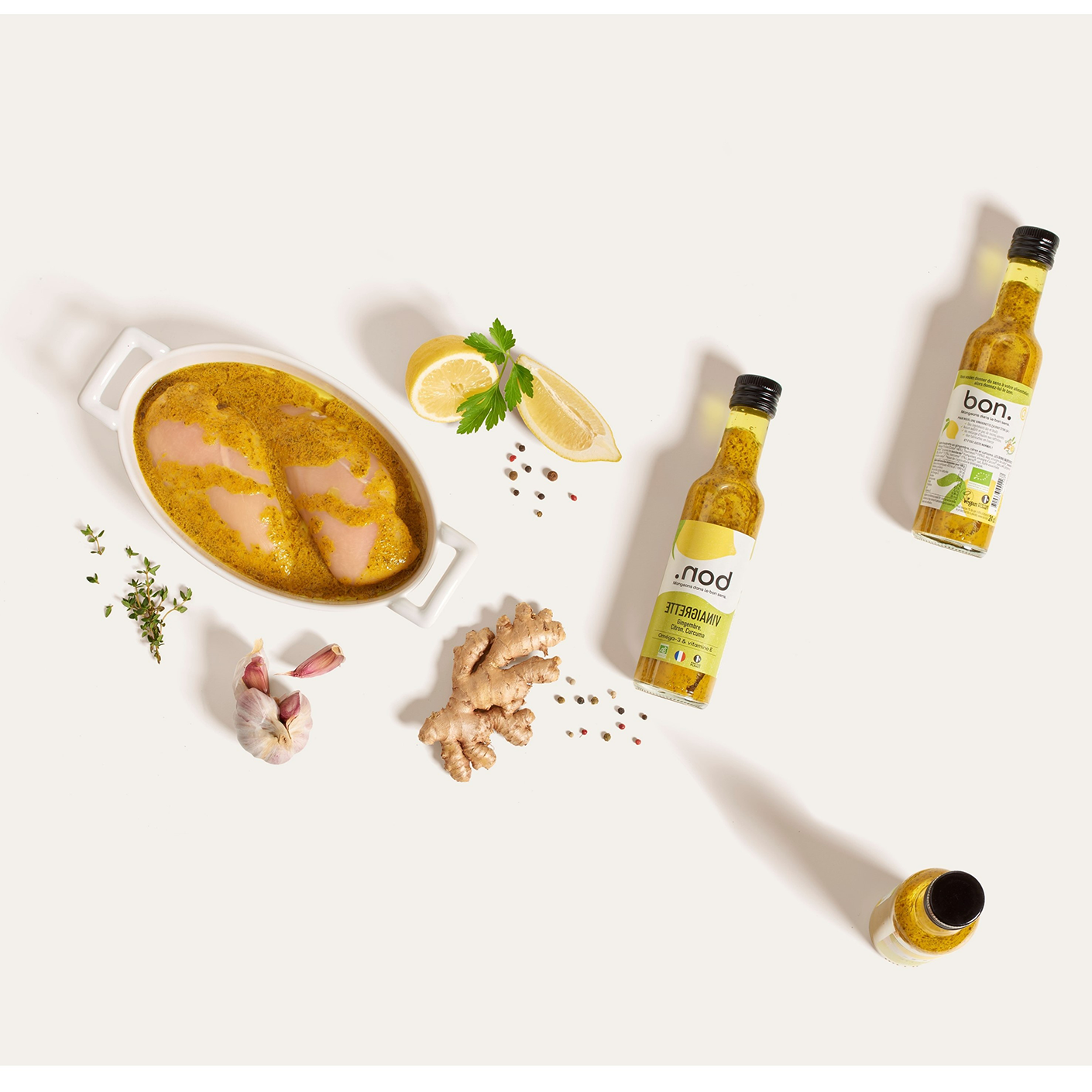
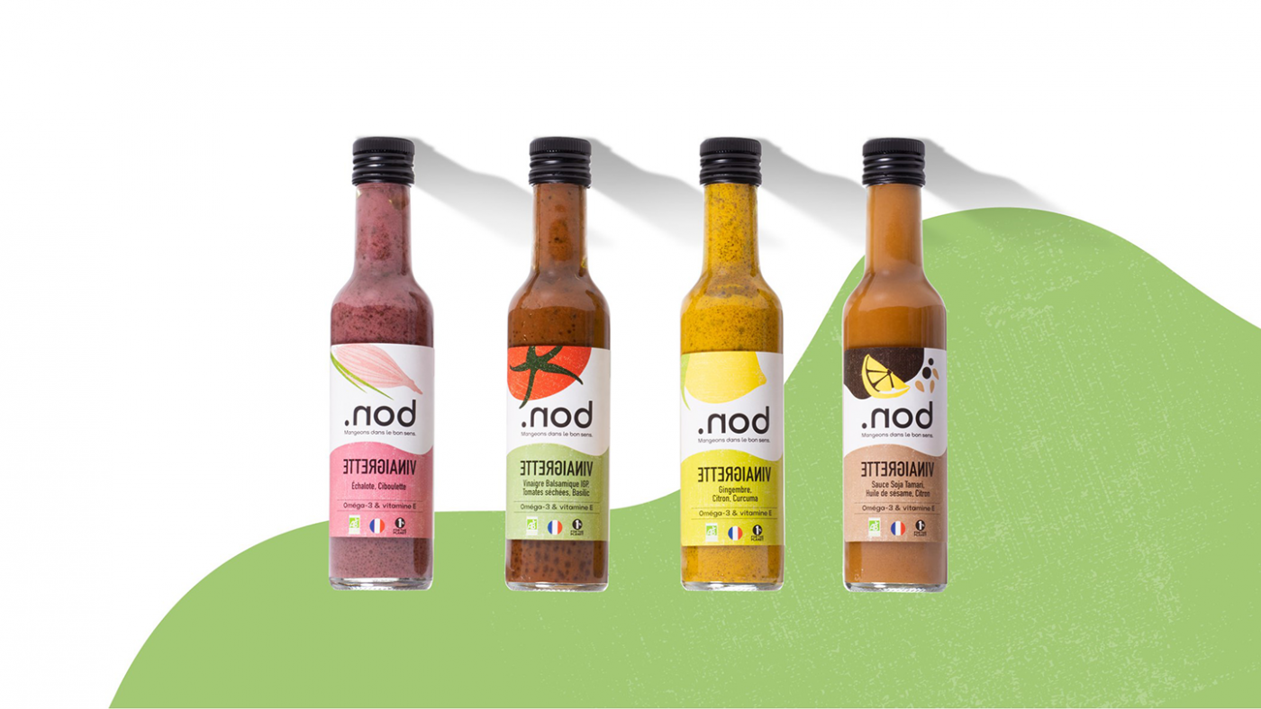
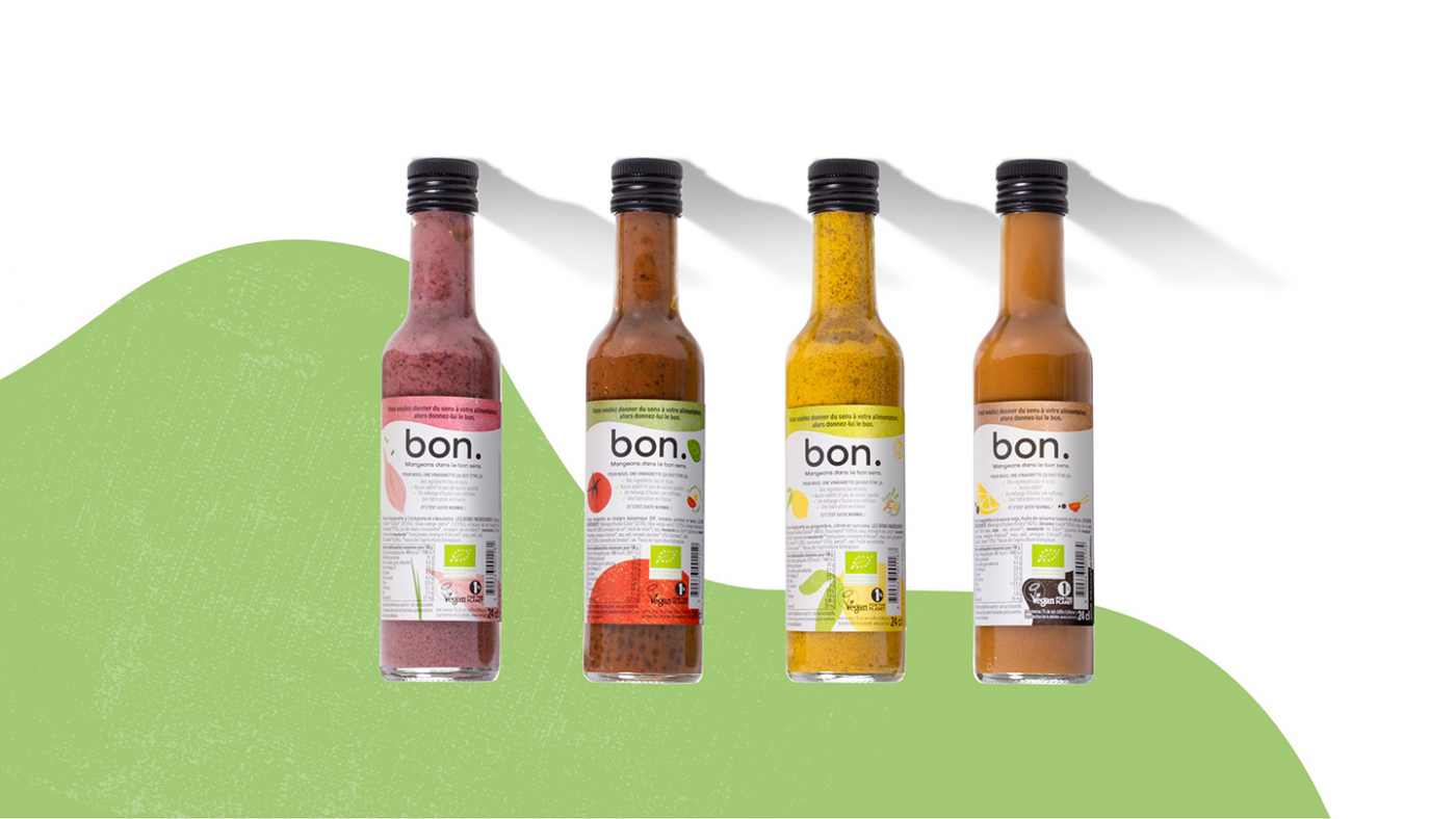
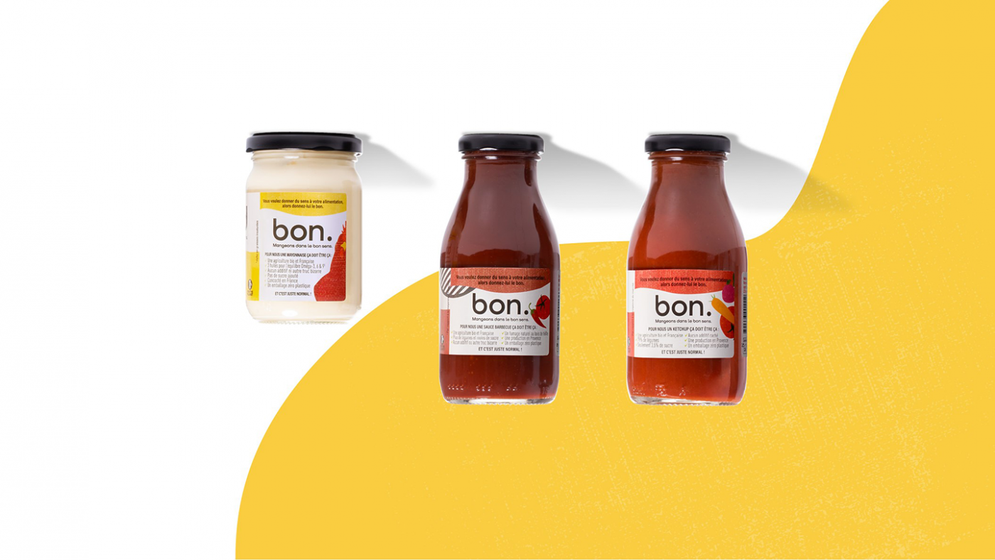
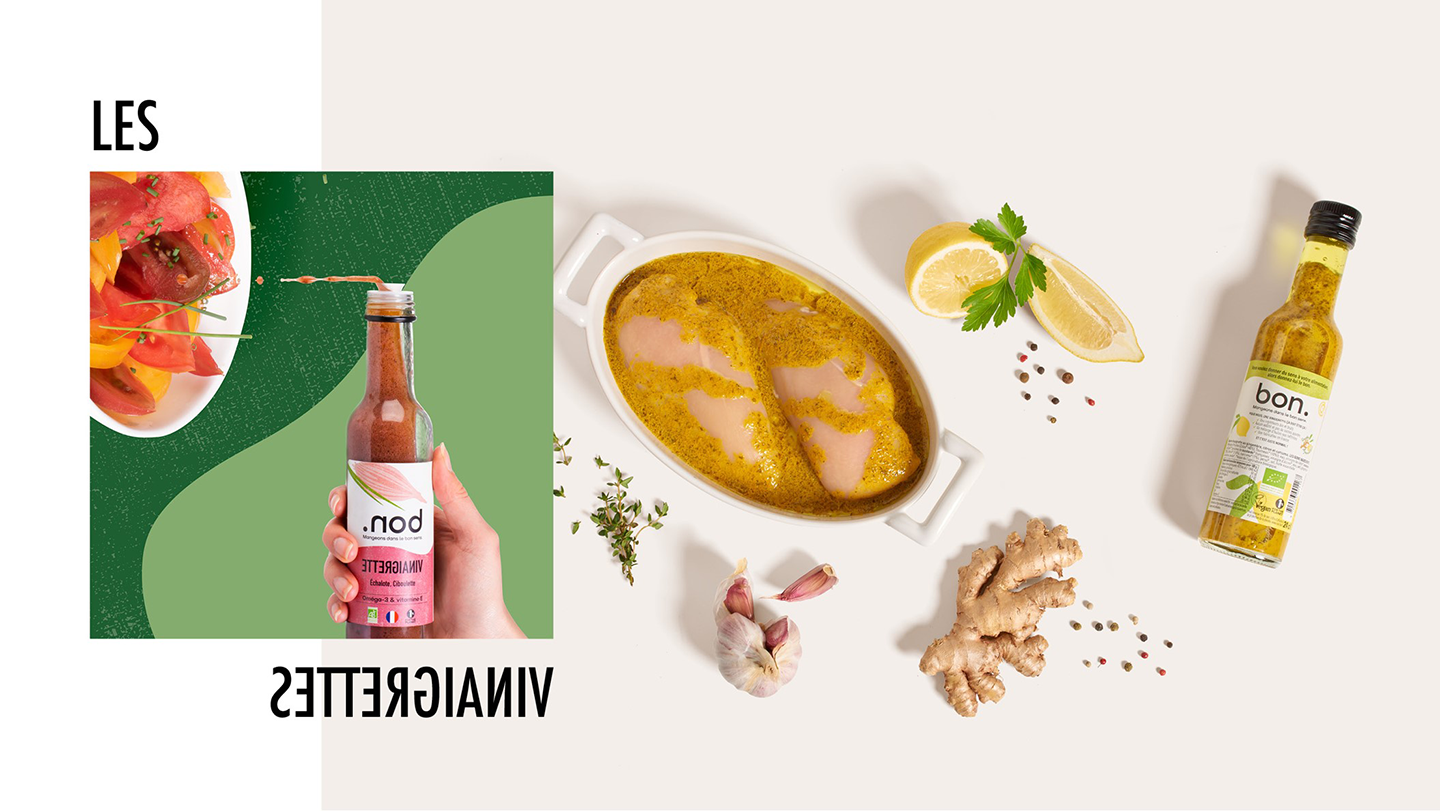
In line with the visual identity designed by our teams, the packaging also plays with the sense of the product. Whether they are placed upside down or right side up, the name remains legible. This play on the orientation of the packaging allows the brand to highlight its products, to make it unique without leaving consumers indifferent.
Finally, the packaging uses the colors of the graphic palette, allowing the products to be differentiated depending on the tastes and flavors and making it recognizable at a glance.
Launching a unifying movement of good and common sense
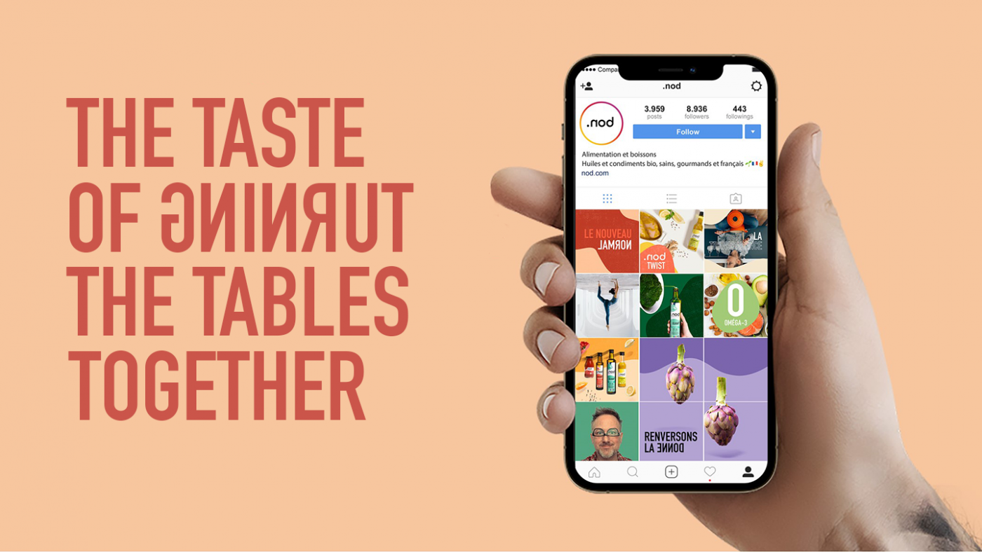
CBA also defined .nod’s social media strategy based on the brand’s message. The agency wanted to initiate a dialogue between a real brand and (increasingly) demanding consumers by launching a movement that would bring together good and common sense. Therefore, CBA has created a candid and human tone of voice, in line with the brand platform and without falling into a moralistic or alarming communication: we are not perfect, that’s okay, but we do our best and we don’t hide anything from consumers. The goal is to be aware of the impact of our consumption and to want something different.
So, ready to turn the tide with .nod?
