Participating in the renewal of European finance
Over the past three years, the ODDO Group has made real progress, thanks to three successive acquisitions: Seydler Bank in January 2015, Meriten Investment Management GmbH in July 2015, and BHF-Bank in March 2016.
The acquisition of BHF-Bank was a deal that enabled Philippe Oddo, the group’s CEO, to double the size of his family business, and create the largest privately-owned bank in the eurozone.
The new ODDO BHF Group is staying in line with family tradition while it looks towards a common future as part of the revival of European finance.


The creation of the new ODDO BHF Group is rooted in a Franco-German dynamic. It was important to mark this major step by developing the name, logo and slogan of the group, both in France and Germany, while remaining faithful to the character and history of each of the companies, which were founded more than 150 years ago.
Following more than 40 interviews carried out both internally and with several French and German clients, the design agency CBA, who were chosen to help with this change, first of all outlined the new group character traits: passion, elegance, inventiveness, reliability, plurality.
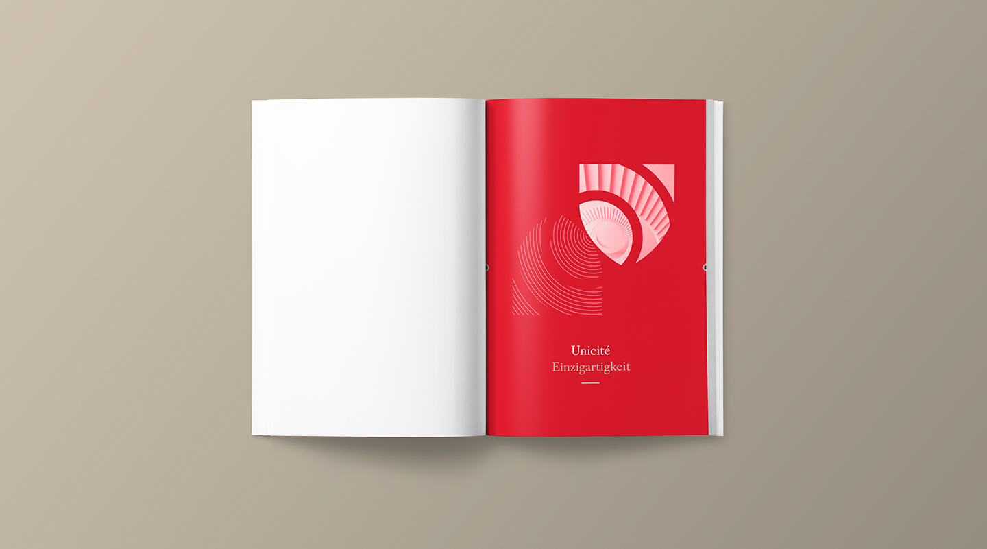
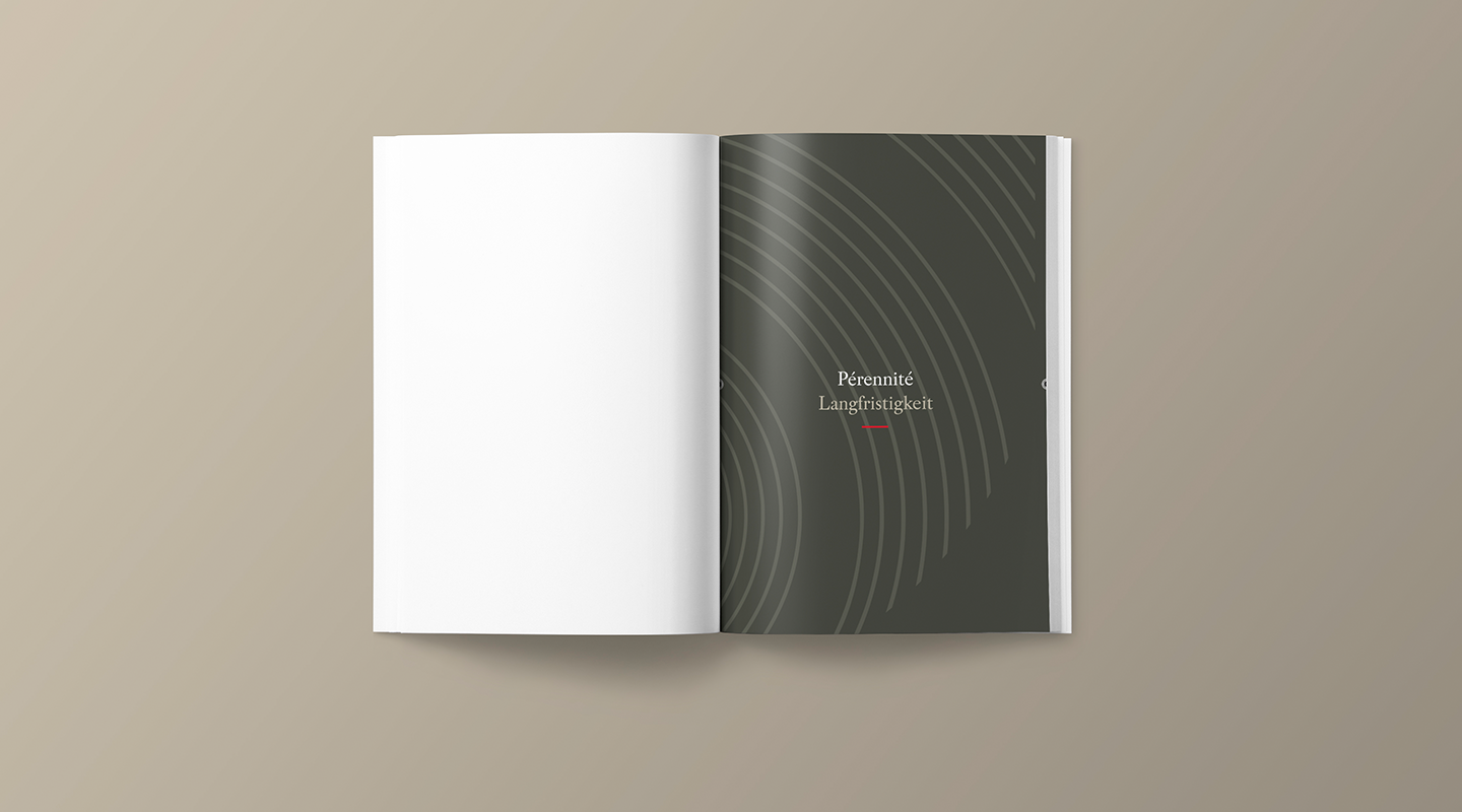
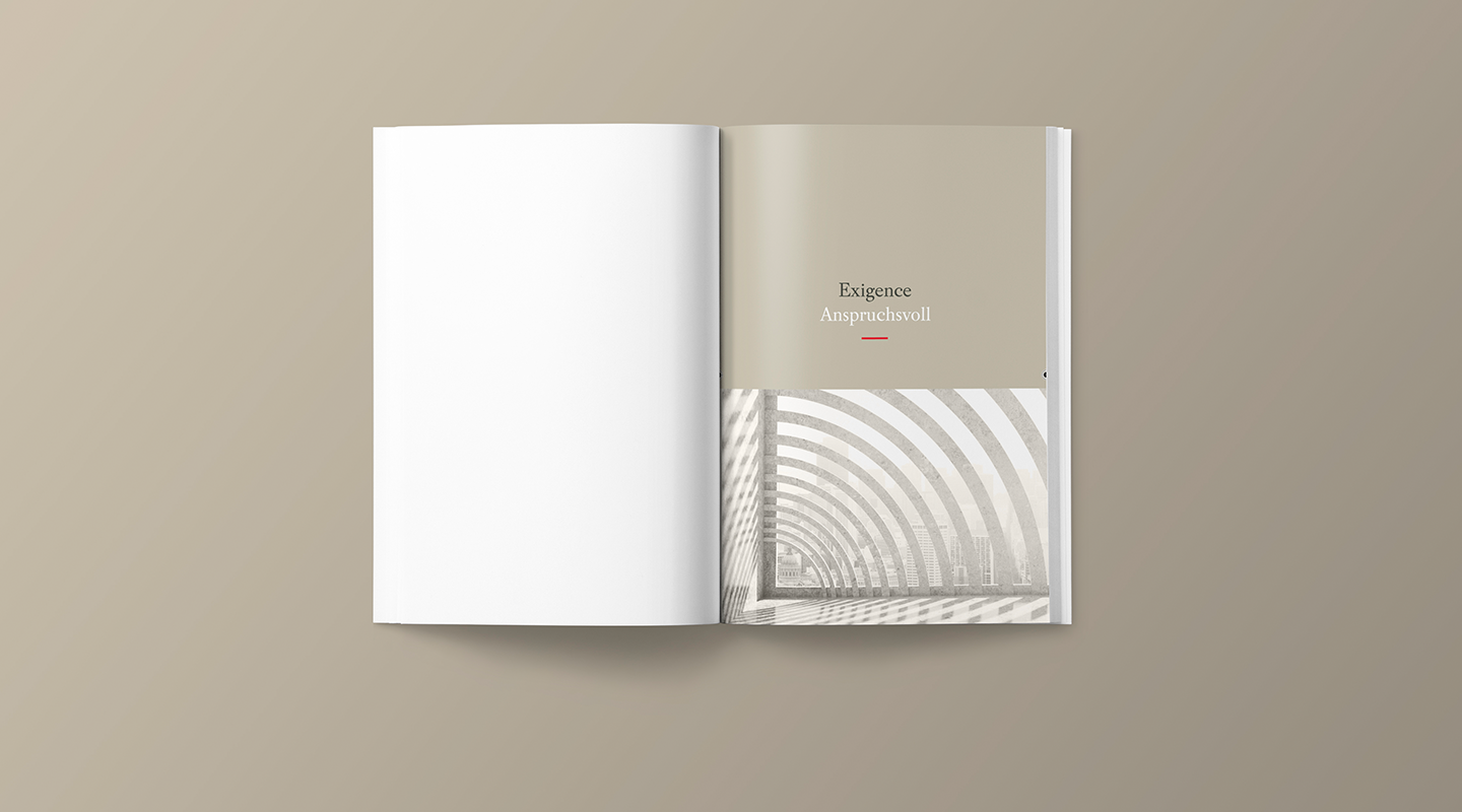
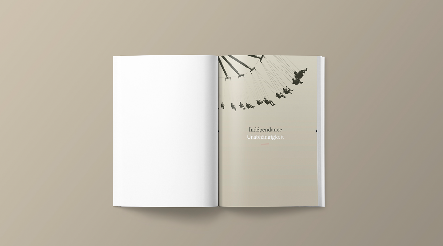
The joining of their two names was a foregone conclusion, as was the expression of common values, in order to demonstrate the group’s singularity: entrepreneurship, independence, longevity, uniqueness, demand.
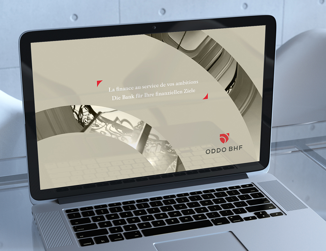
The passion and inventiveness of each brand helped to create the new French slogan proposed by the design agency: La finance au service de vos ambitions (Finance to serve your ambitions).
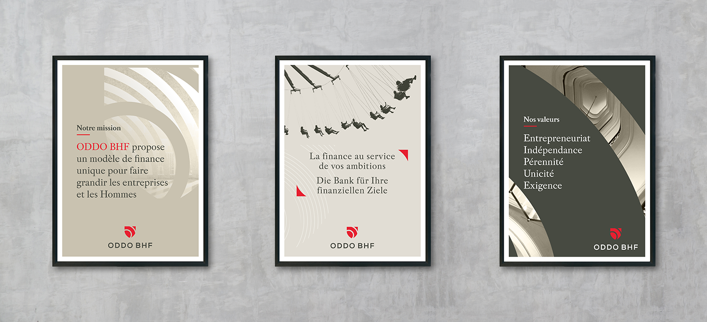
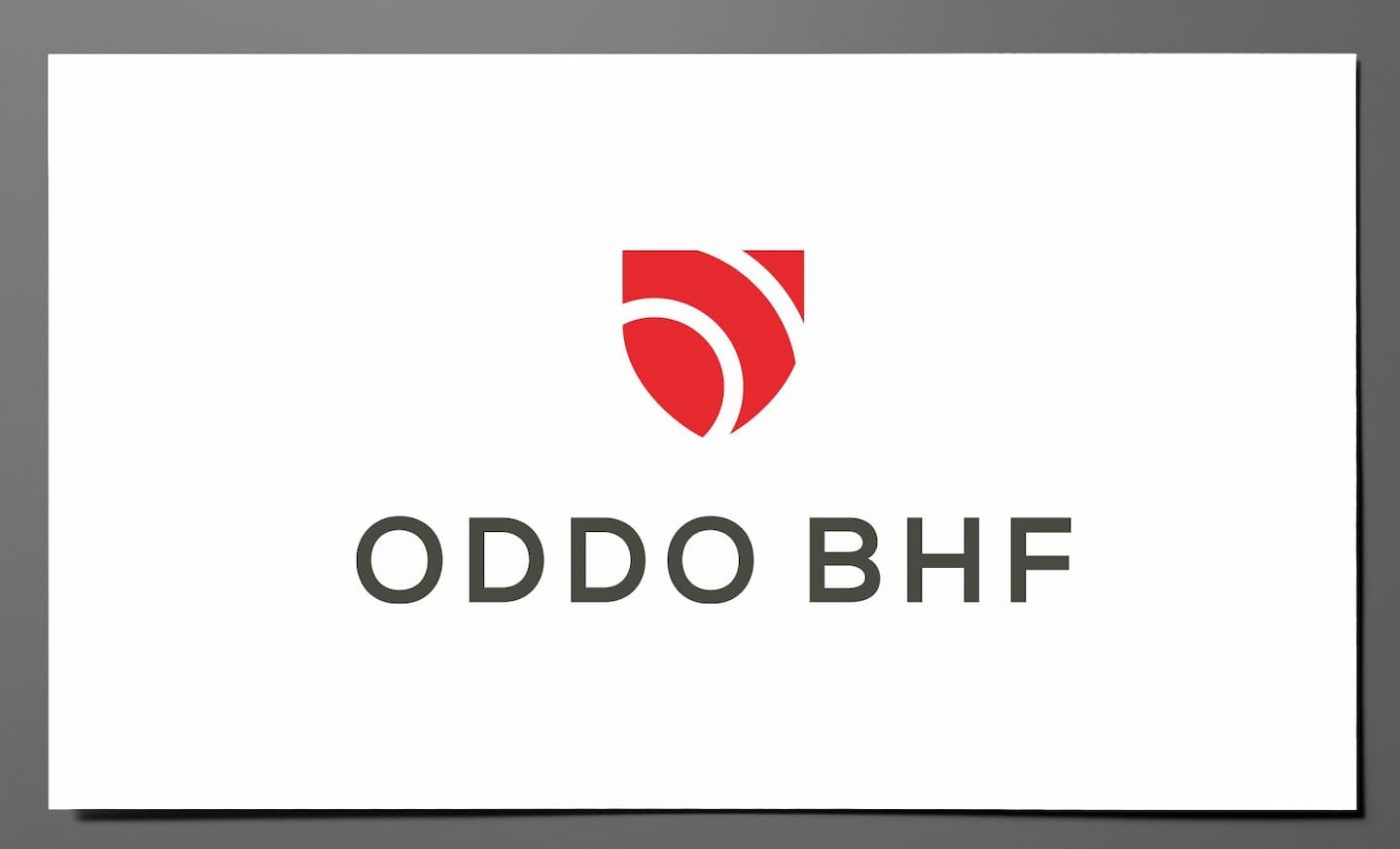
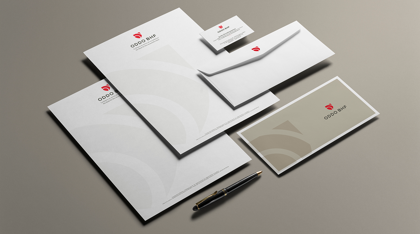
The ODDO BHF Group then entrusted CBA with redesigning their new visual identity to match their new position, starting with a logo. The creative teams worked around the ideas of the union between the companies, their prospects and pathways, as well as tradition and the future in order to design a logo and the corporate style guide that accompanies it.
The shield seemed to be the best solution: it is a universal symbol of protection and, historically, was also the emblem of the cities of Paris and Frankfurt. The idea to have two circles inside the shield, representing the letters O and B, re-injected some dynamism, and the arrow echoes BHF-BANK’s previous logo. The logo also has a sense of forward movement to it, from the bottom upwards, as it looks towards the future.
Colours that symbolise modernity, safety and elegance
The red colour is derived from the former ODDO&CIE and BHF-BANK logos, and is also the only colour the two national flags have in common. The new red logo embodies modernity and demonstrates ODDO BHF’s energy, strength and passion.
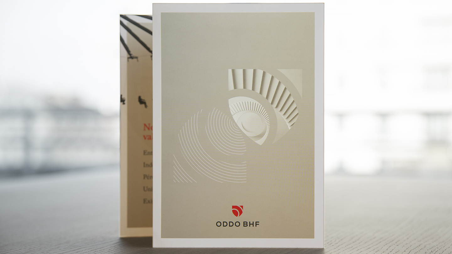
As for the other colours in the corporate style guide, the dark grey brings status and contrast to the ODDO BHF logo. More subtle than black, this colour conveys the bank’s high-quality image, while the beige is a simple and elegant colour, somewhere in-between the warmth of brown and the purity of white. The neutrality of this colour enhances the red shield of ODDO BHF.
Results
In order to rally all of the employees in the new group, Philippe Oddo thought it vital to commission the design agency to start appropriating the new image and the values it implies. Therefore, the teams at CBA were enlisted to train future brand ambassadors, in order to guide them through this change.
