The light on agroecology
Raízes do Campo’s partners came to CBA B+G describing their intent to generate and distribute value more fairly along the entire production chain, under the agroecology model. The branding project our team in Latin America built from there was entirely designed to tell the beliefs and purpose of the newly launched project – an innovative, inclusive and therefore inspiring business.

To build the strategy and positioning of Raízes do Campo, we first had to take a step back to understand the concept of Agroecology:
AGROECOLOGY
. . .
Agriculture model that goes beyond planting and harvesting food; it includes a broader performance. It means following ecological principles, being socially just, ethically correct, inclusive, economically viable, and valuing the families of farmers.
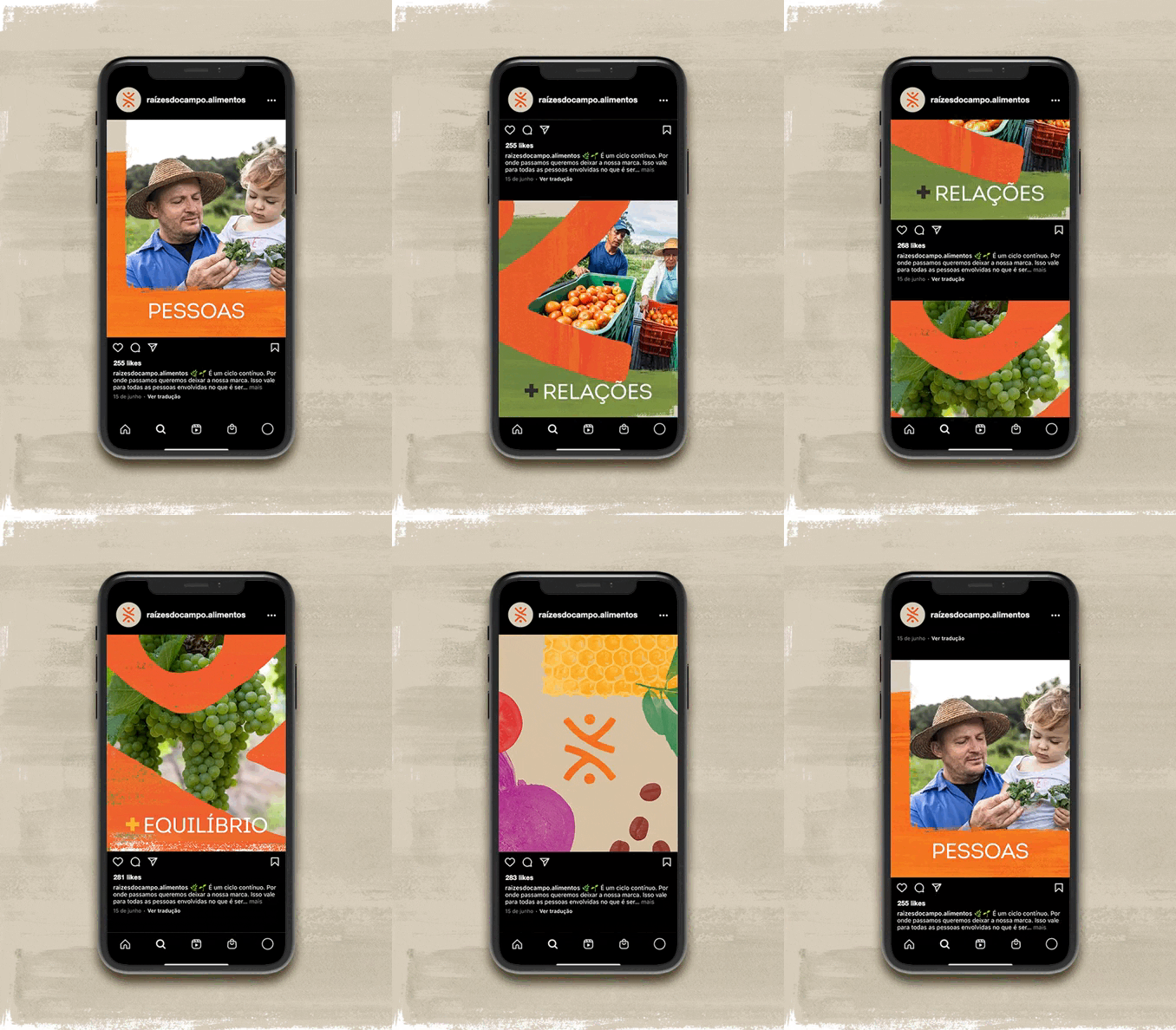
Raízes do Campo’s business has a bold proposal: to offer healthy food by bridging the gap between those who produce and those who consume, in order to be an agent of value creation for a fairer, sustainable and healthy production chain.
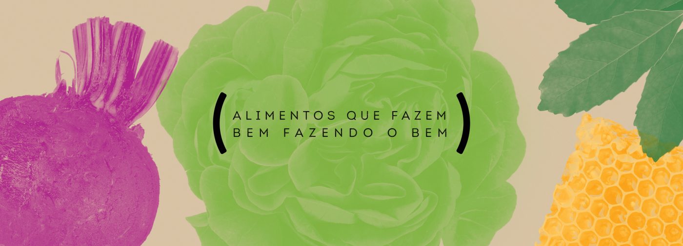
"Healthy interactions that nourish the world"
Based on the definition of the key brand values – agroecology as a principle, vision of a more sustainable world, fairness throughout the chain, and valuing of people – we have developed together the purpose, values, personality and essence of Raízes do Campo brand mark.
For the verbal identity, we have created the brand voice, with tone of voice, manifesto and brand storytelling. It was a great challenge to create the brand purpose statement for the different links of the chain, in order to cover the diversity of stakeholders (producers, cooperatives, retail, end-consumer, as well as employees and investors), with a key message and well-defined communication objectives.
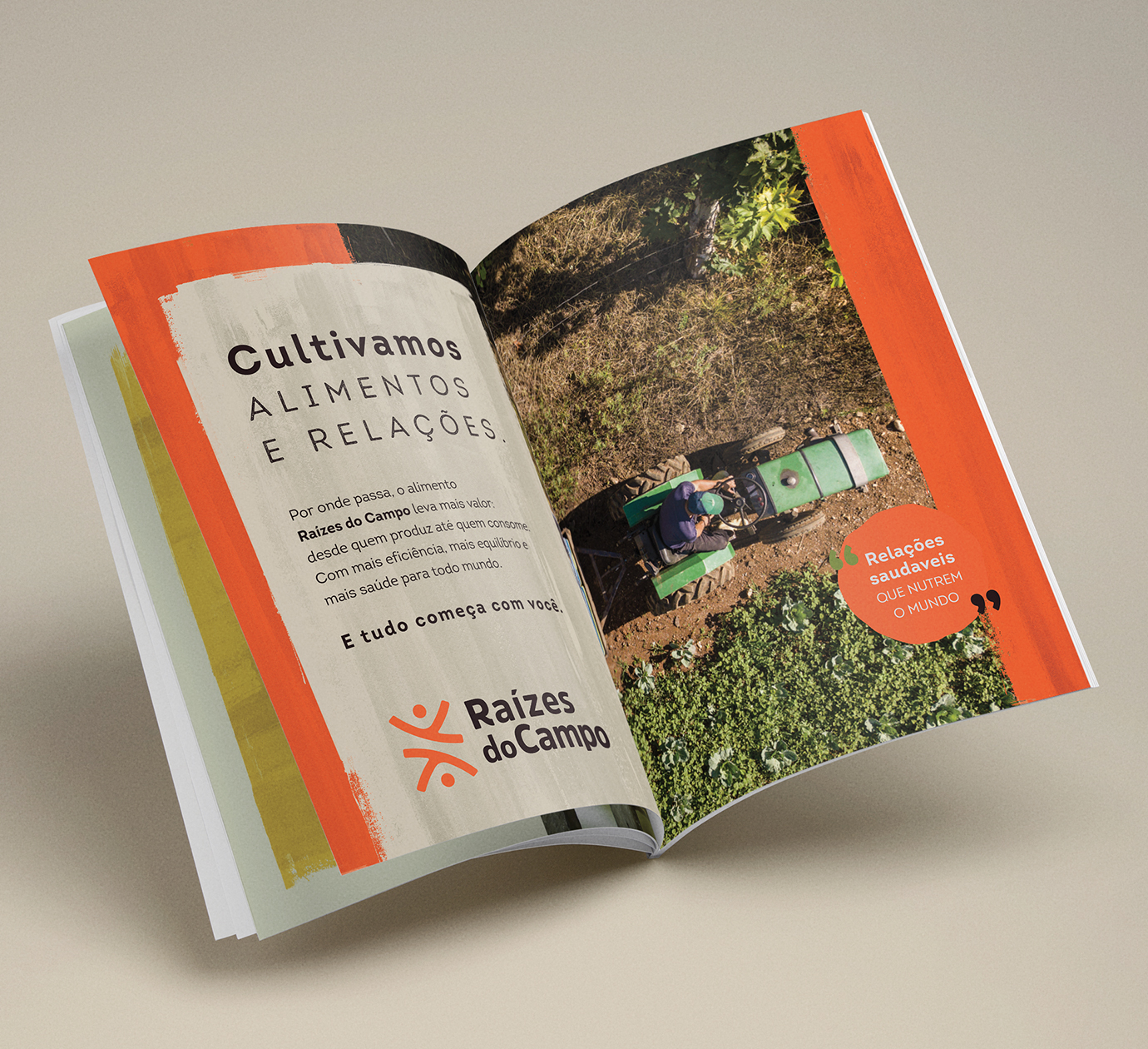

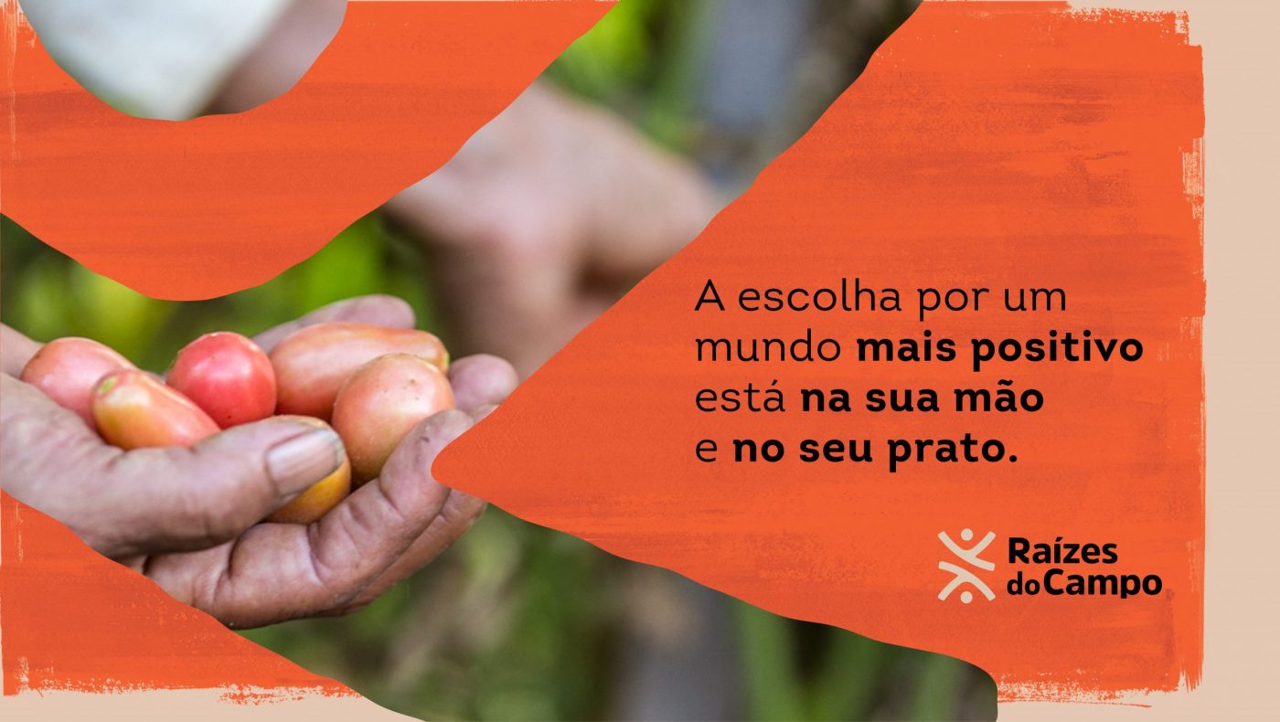
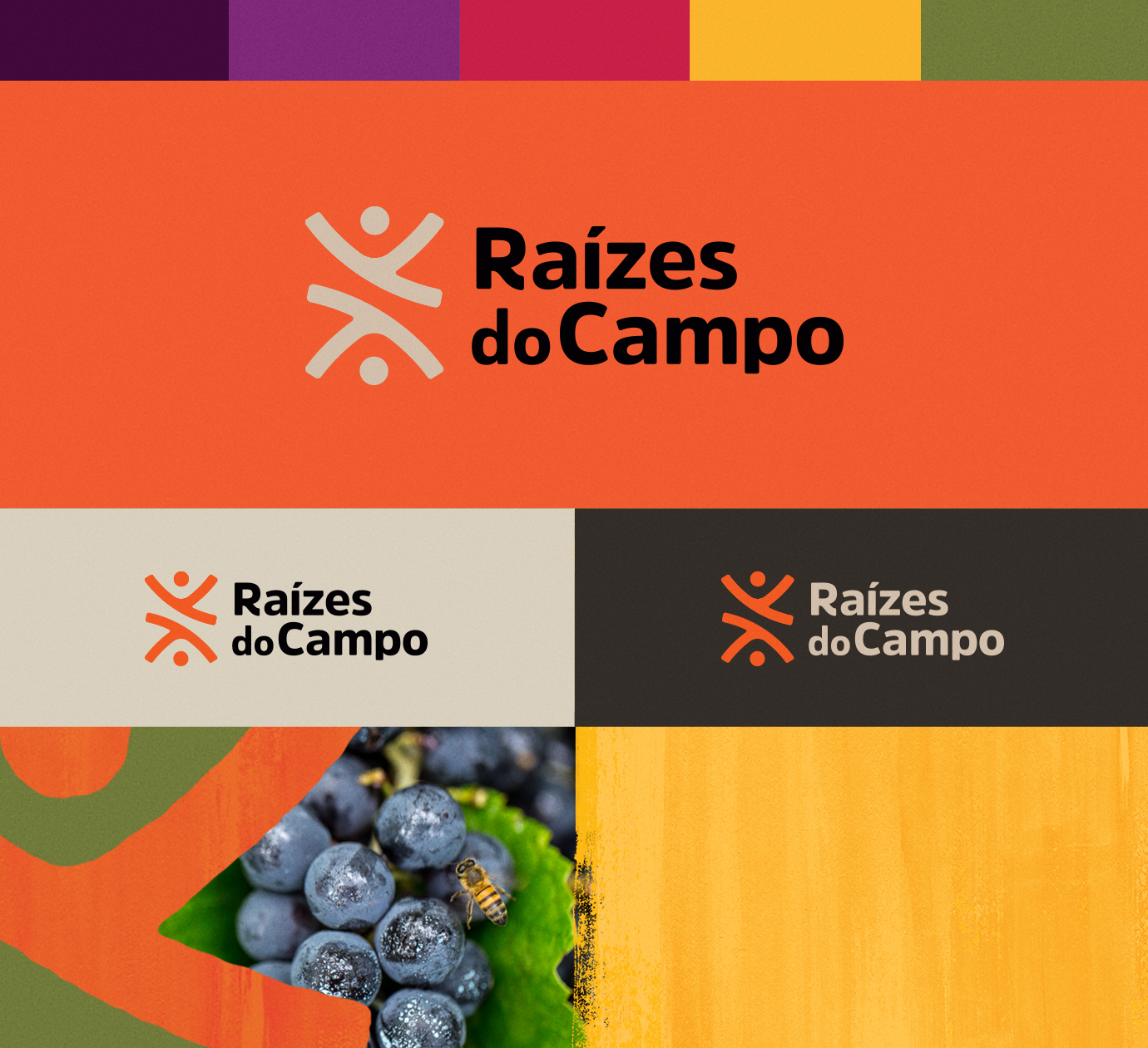
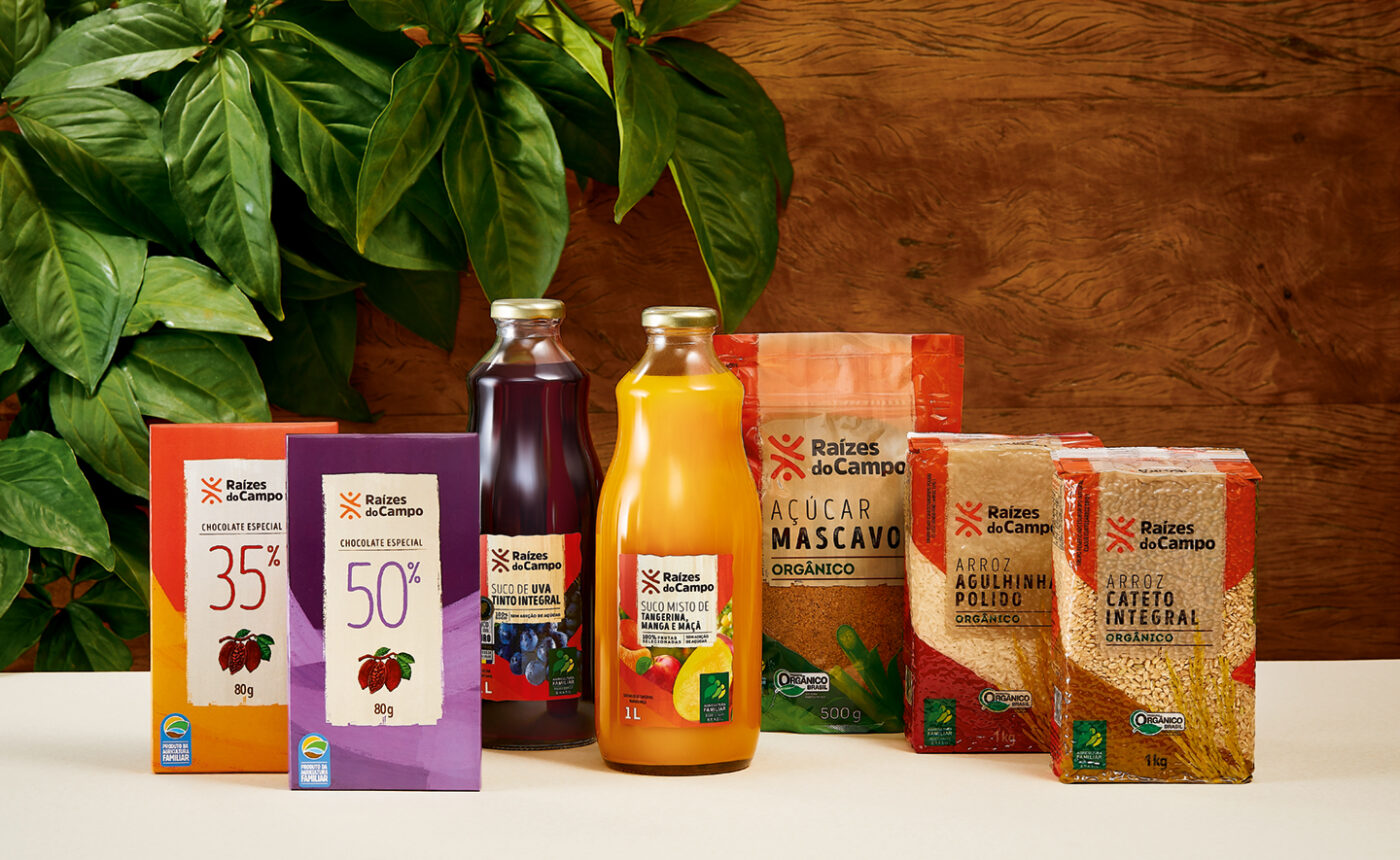
As for the visual identity, balance was the guiding thread, aligned with the concept of a continuous cycle of regeneration of the planet through healthy food and fairer production relations. The logo features elements that represent the people involved in the chain and their interactions. The gestures and color palette enhance the energy, with vivid colors and textures inspired by nature and by what comes from the earth.
In addition to connecting farmers ‘and peasants’ cooperatives to traditional retail, Raízes do Campo acts as a consultant in structuring production chains and agroecological businesses and is preparing for more.
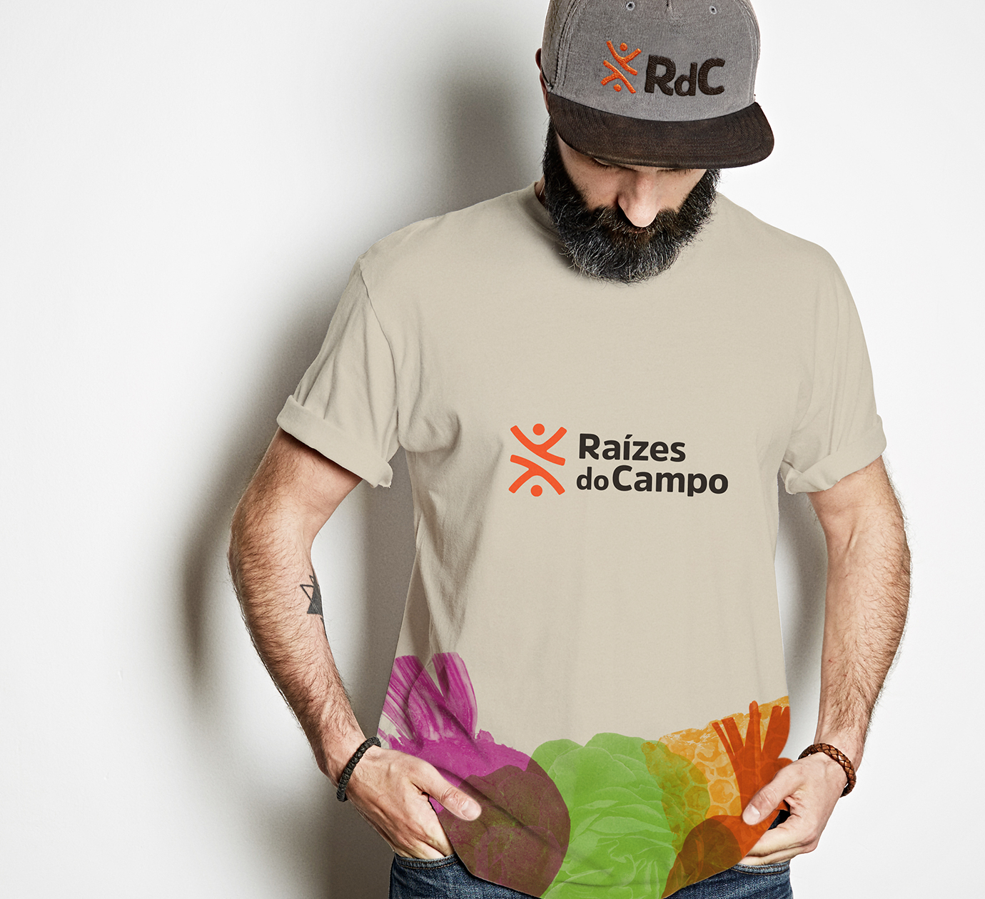
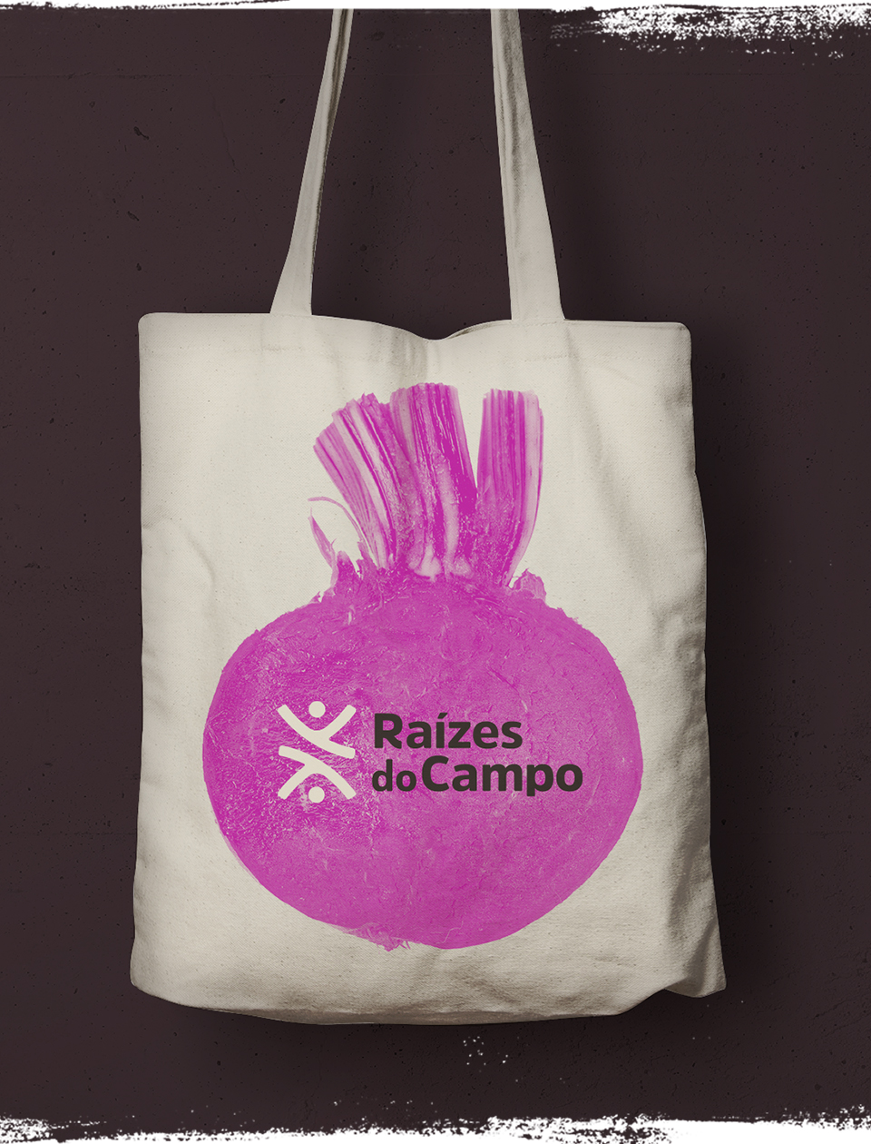
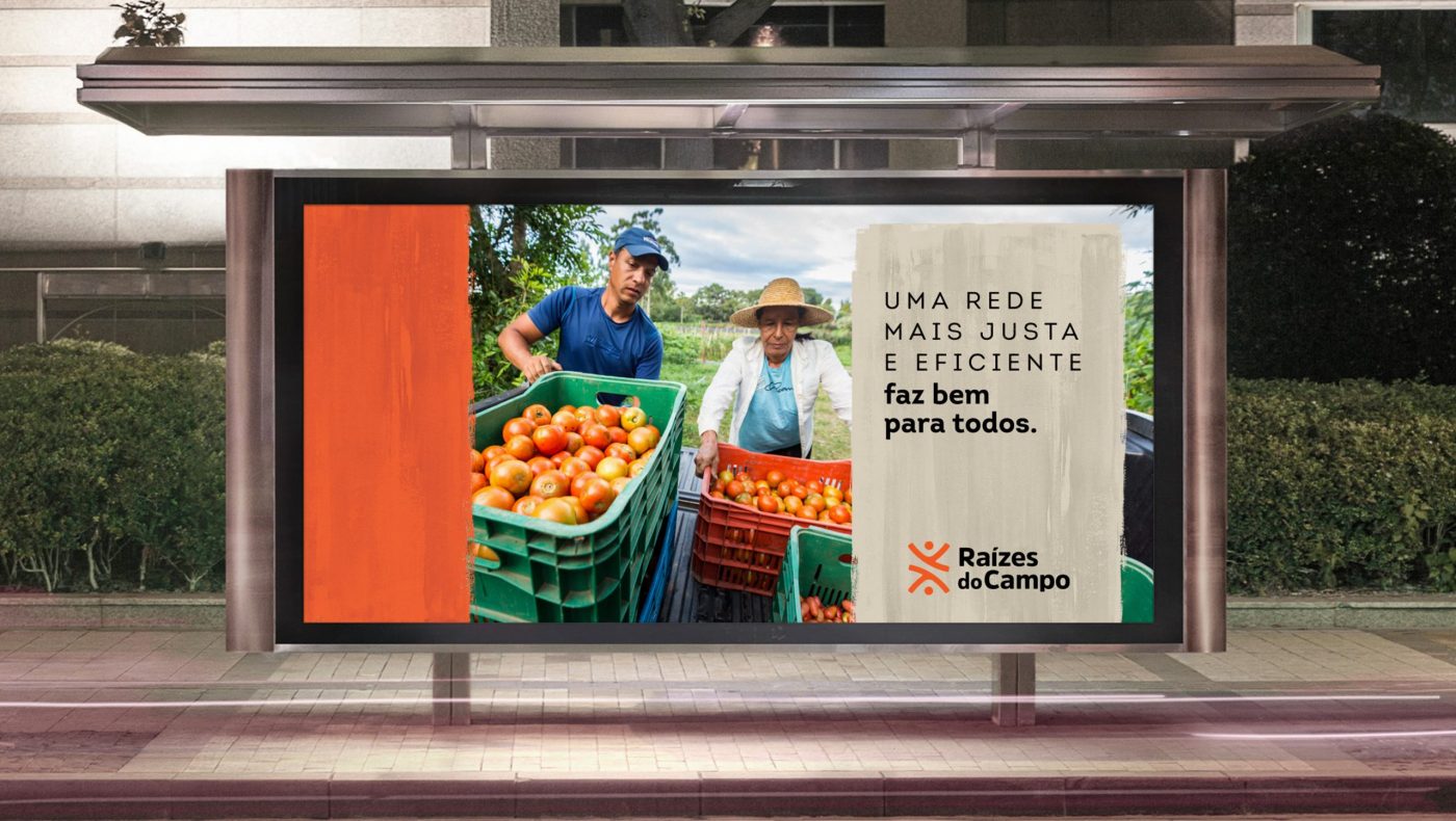
As part of this extensive collaboration, during which CBA B+G supported the brand from start to finish on branding and identity topics, Raízes Do Campo launched in June 2022 its original product line. Products that are produced from a completely healthy and agro-ecological food chain.
For Raízes do Campo it will always be very rewarding to rely on the competence of CBA B+G. The dedication of the entire team to translate, with perfection, the essence of our company in all the materials produced fills us with pride. CBA B+G surely is one of our most important collaborators.
————– Carla GUINDANI, Managing Director at Raízes do Campo
