Tigre is a historic Swiss cheese brand. Since 2006, it has been part of the Emmi Dessert Italia Group, a leader in the cheese, fresh dairy products, and dessert sector.
A staple on the tables of Italians for at least four generations.
A staple on the tables of Italians for at least four generations.
Tigre is a brand that evokes a well-defined imagery in minds. The yellow color, the iconic animal and its immediately recognizable geometric shapes, on the table as well as on supermarket shelves or in the pantry at home. The triangular slices inside the classic round pack, the square slices.
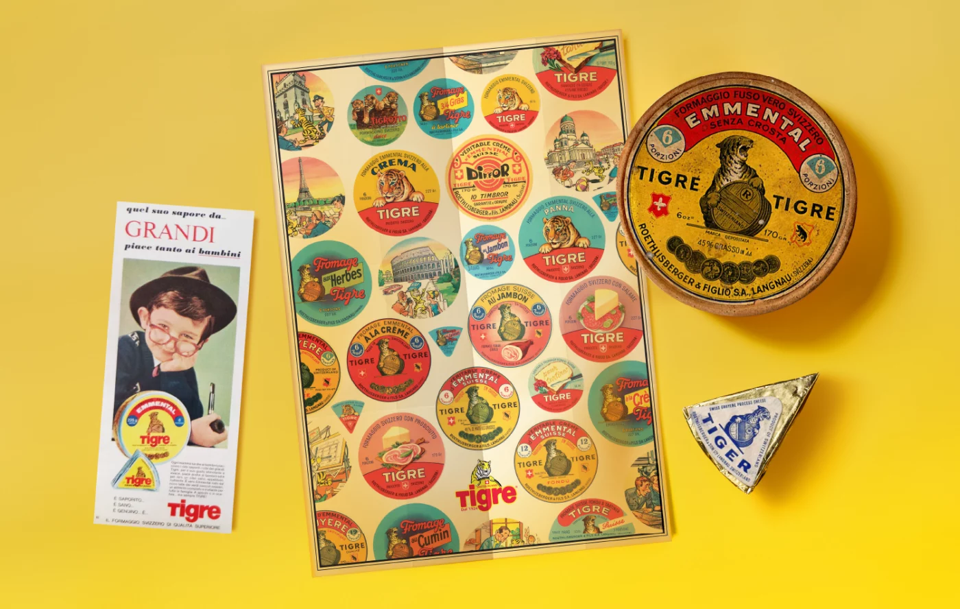
As a starting point, Tigre provided our studio in Milan with its archive and vast visual heritage. It would have been easy to choose and propose a historical pack (perhaps involving consumers) in a graphic refresh that leaned into nostalgia.
Instead, CBA Design realized that it was necessary to reinterpret the richness of the past in a modern way, creating a bridge between yesterday and tomorrow. This resulted in a limited edition, which not only has a celebratory purpose but offers Tigre and Emmi an opportunity for change, with the aim of involving a wider audience and gaining even more relevance in the current context.
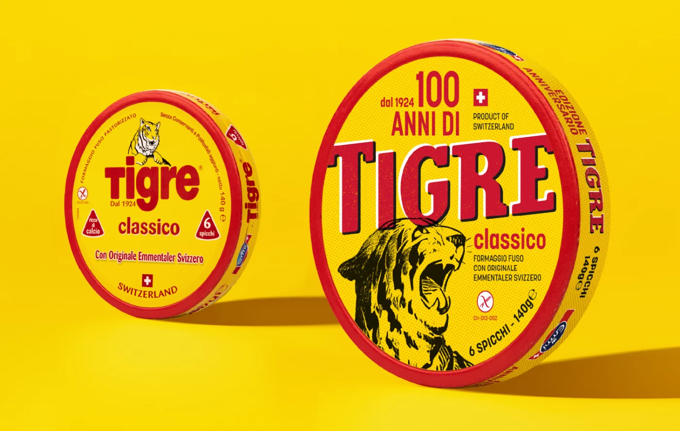
The brand design maintained the distinctive colors of yellow and red, reintegrating the iconic image of the tiger as a symbol of the company’s evolution.
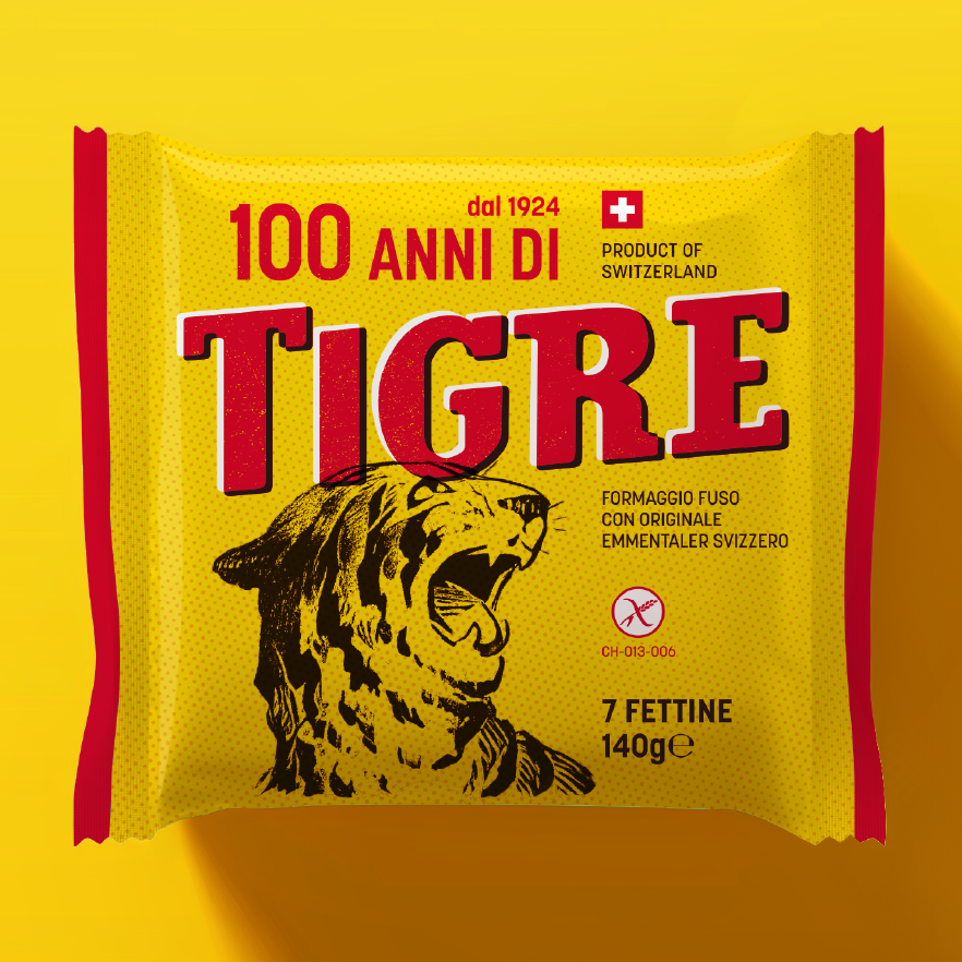
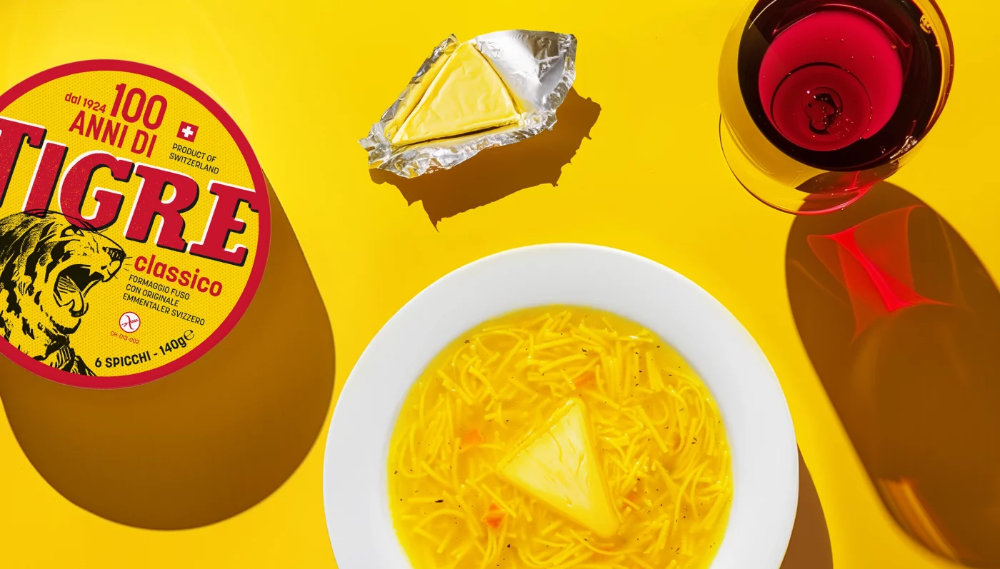
Traditional printing techniques were reinterpreted with a contemporary twist, used as graphics and patterns to be applied across different touchpoints, including t-shirts, scarves, posters, and stickers.
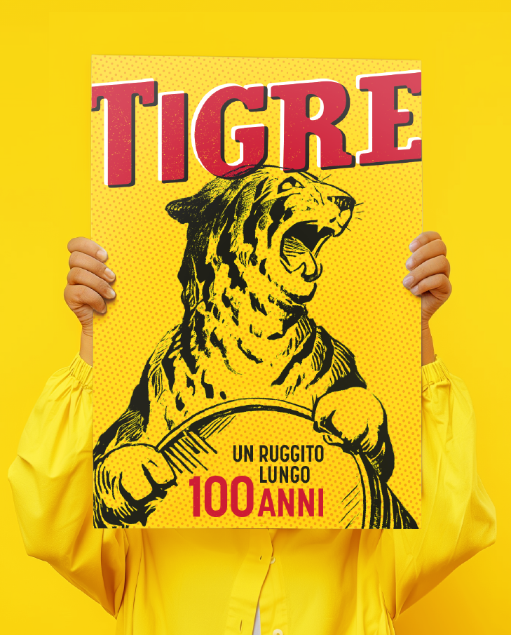
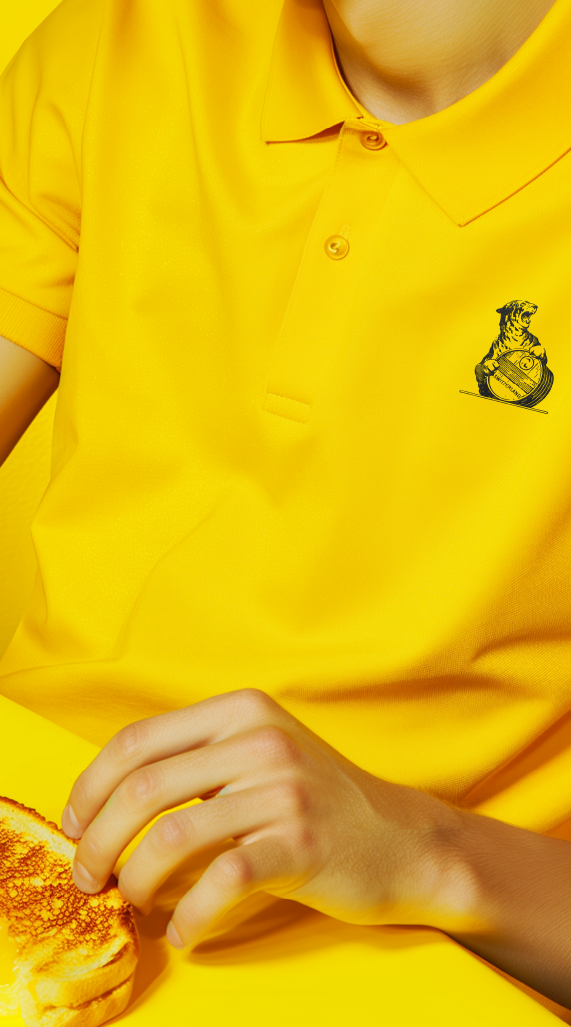
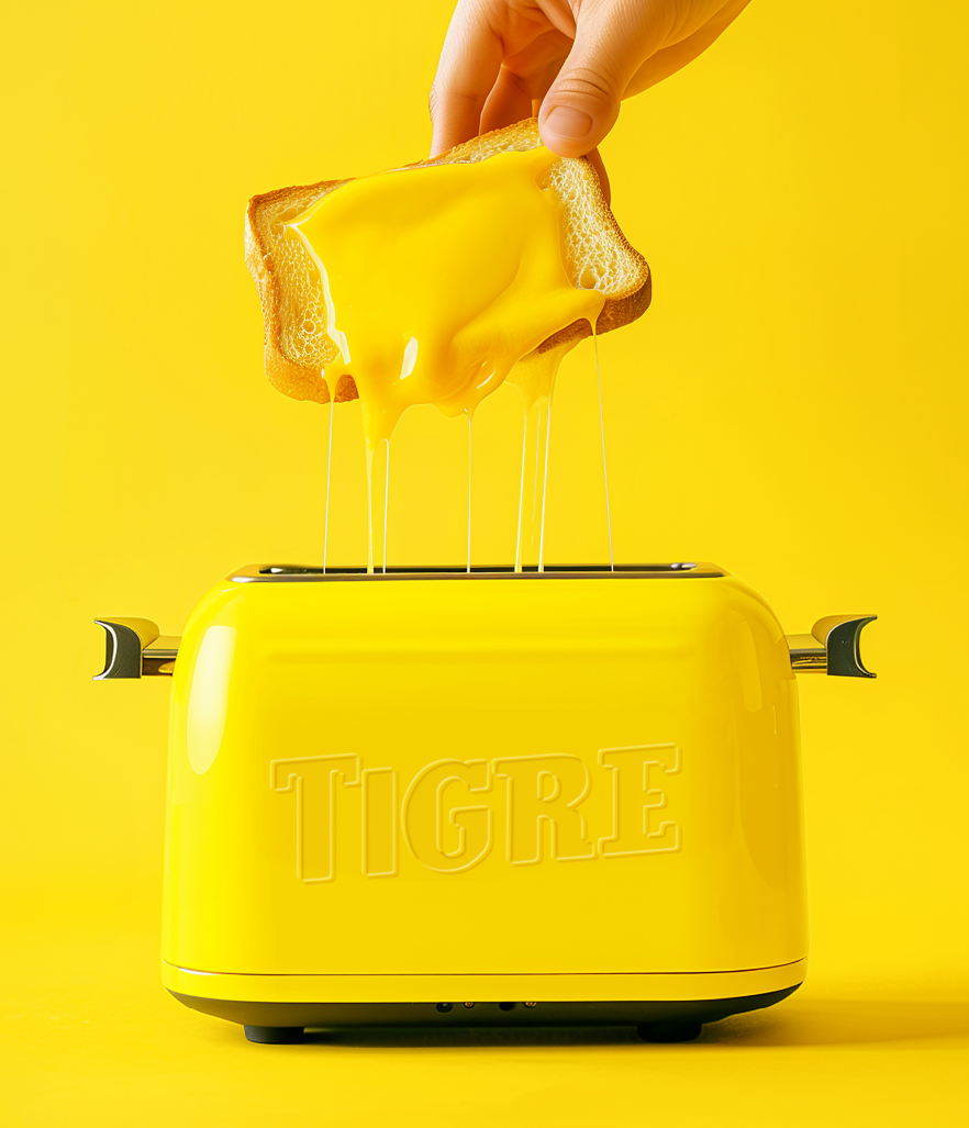
To engage the community and position the brand as modern while respecting its roots, our team in Milan created an editorial strategy for social channels, telling the story, innovations, and values of Tigre.
