Yoox. Luxury rewritten

Business needs

Industry

tag

2026

YOOX was founded to unlock the doors of luxury, turning fashion and design into an experience of discovery that is accessible, free, and unexpected. In a world saturated with exclusivity, this rebranding reignites what makes a brand truly desirable: a clearer, more inclusive, and contemporary vision that bypasses gatekeeping to create new forms of participation.

Beyond the deal. Into the feeling.

YOOX re-ignites as an emotional platform. Not a place to shop: a community to belong to.

The switch: from the product, to the person who chooses it.


The living gallery.

In a world where exclusivity is everywhere, the real differentiator becomes taste, curation, and the ability to make fashion feel personal and possible.

YOOX becomes a living gallery. A space that shifts with those who inhabit it, where every visit redraws the exhibition: a point of view in constant evolution, that listens, adapts, surprises.


Bold by choice.

In defining the visual identity, the guiding principle is clear: remove what is arbitrary, keep what is necessary.

The wordmark has been refined without being reinvented: precise interventions on symmetry, curves and proportions that restore the logo to the sharpness it deserves.

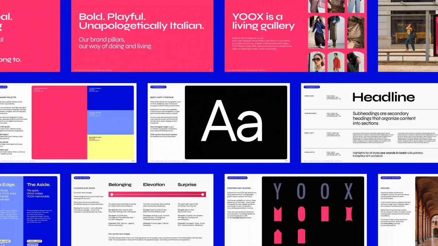
The colour palette breaks with the dusty aesthetics of conventional luxury, introducing vibrant, saturated tones designed to re-ignite emotional impact in a primarily digital environment.

The primary typeface is Syne, a contemporary grotesque with a character of its own. Fustat as secondary, chosen with an explicit eye towards accessibility.

last updated brand manual2


Less authority, more attitude.

YOOX doesn’t speak the language of urgency. It speaks with taste, attitude and a spark of the unexpected. The brand voice is built on three overlapping layers:

The Edit: discipline; every word earns its place.

The Edge: point of view; the Italian irreverence that sets YOOX apart from everyone else.

The Aside: the spark; the unexpected detail that stays with you after.

There is only one brand voice. What changes, channel by channel, is the dosage: how much room to give discipline, how much to attitude, how much to the spark.


The system

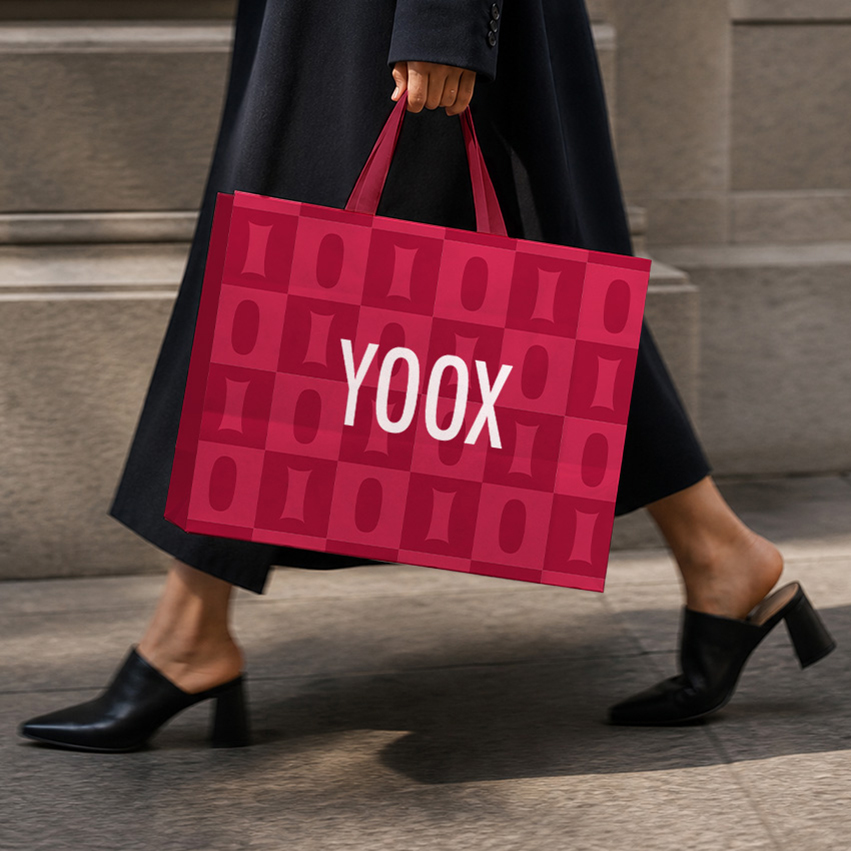
The proprietary shape system draws directly from the logo letterforms, Italian architecture, the digital gesture of saving, the reflective surface of a mirror: everything points back to the living gallery concept and functions as a curation system. Each shape has a precise role: to isolate, frame, direct the eye.

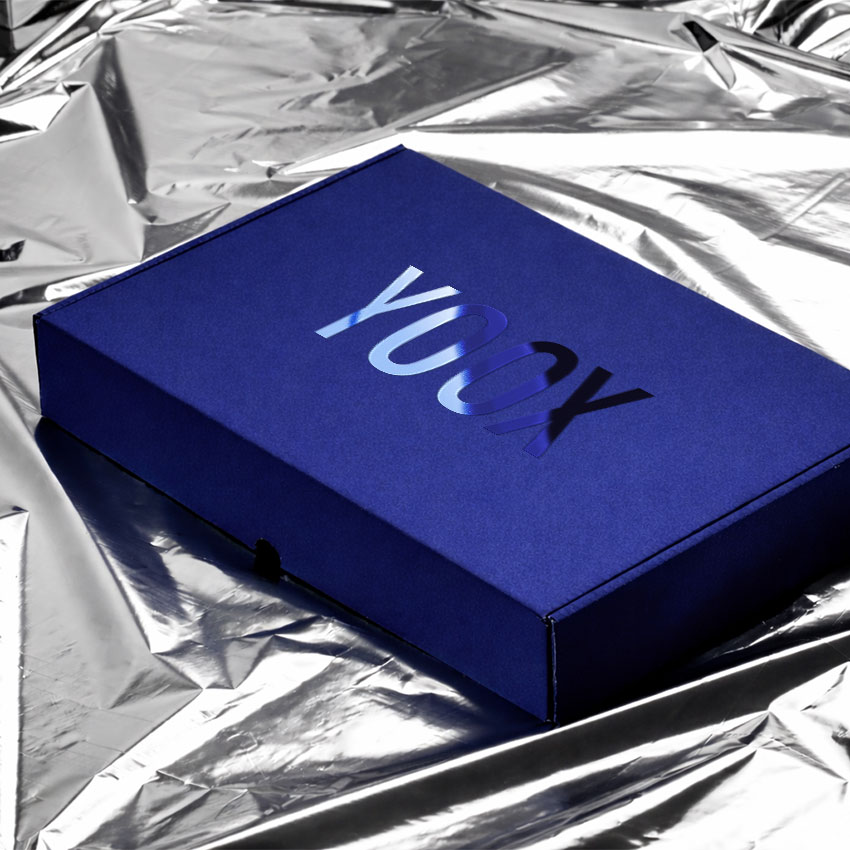
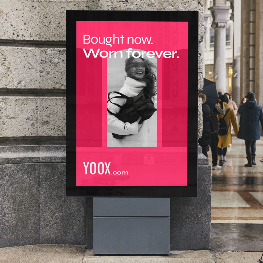
A modular system that ensures visual consistency across any format: from outdoor advertising to a social post, without ever losing identity or recognisability.

YOOX. Bold. Playful. Unapologetically Italian.

NEW2 Square 01
NEW2 Square 02
NEW2 Square 03

YOOX is the multi-brand digital platform for long-lasting fashion, design and art. It offers a curated edit of past-season collections from leading brands, alongside unique and hard-to-find pieces. Since 2000, YOOX has built a global community of style-conscious customers, making luxury more accessible beyond seasonal cycles. Its model combines value, extended product lifecycle and a broad assortment across womenswear, menswear, kidswear and lifestyle. Through creative brand collaborations and cultural initiatives, the platform connects product with self-expression, enabling more personal and meaningful ways to experience fashion. YOOX is part of LuxExperience, the leading digital, multi-brand luxury group.

Share

The

Project