Sometimes, courageous decisions have to be taken in order to stand out in increasingly crowded product categories: this is why Life, a dried fruit and nuts brand with a long, all-Italian history, has chosen a new identity very different to the rest.
A company with a youthful spirit that turned to us in order to develop a structured reflection on its values and potential, and that, by means of this approach, has achieved a radical renewal in its spirit and language.
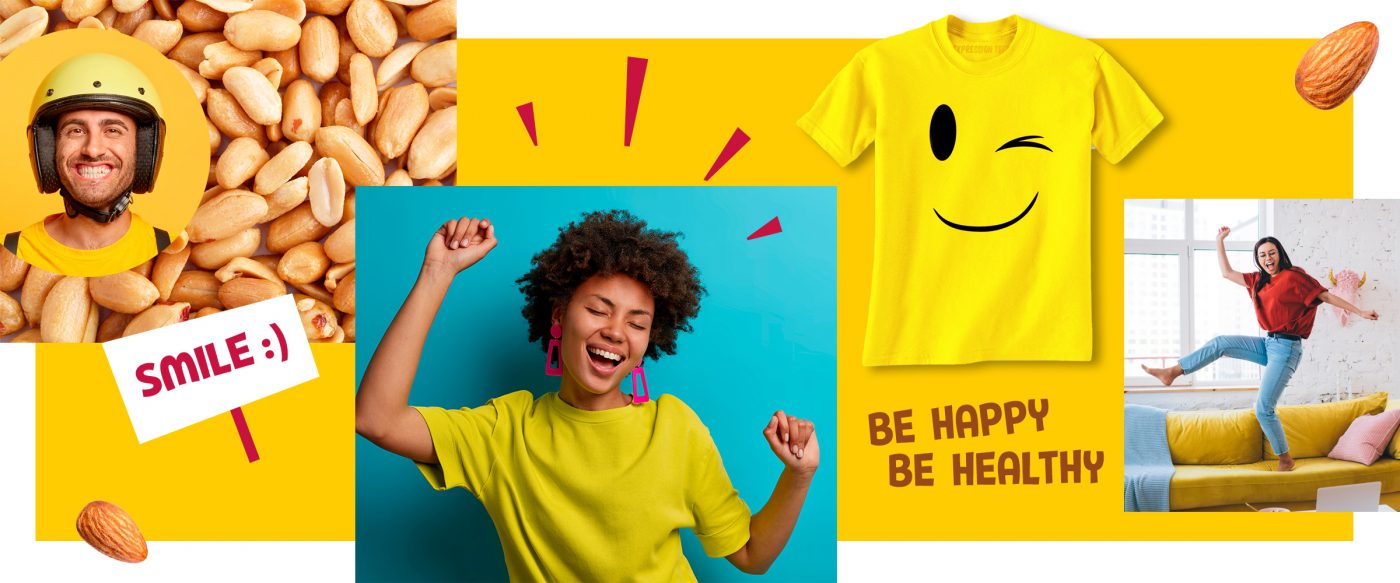
The new brand positioning that we have identified focuses on “goodness”, Life’s capability of bringing taste and joy to everyday living, because feeling good doesn’t just mean being in good shape, but also being in harmony with oneself and with others.
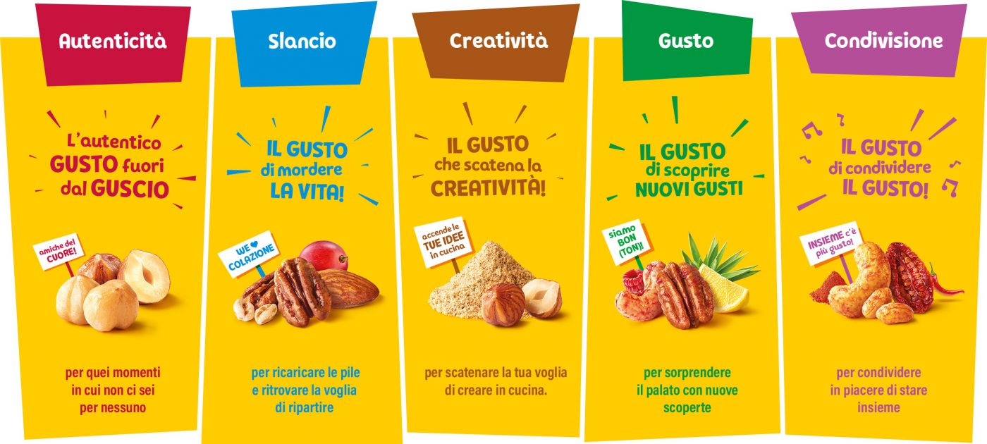
We have therefore identified the different ways in which Life responds to consumers’ need to feel good: five areas emerged, hallmarked by the meeting between different taste experiences and the ways of interpreting physical and mental wellness.
These territories have guided the reorganisation of the product portfolio’s architecture, and have also marked the launch of innovations in products and formats in order to provide the answers to the areas of opportunity identified during the process.
A UNIQUE SMILE FOR EVERYONE
Life’s promise of goodness thus takes shape in a product range that offers different accents of vitality to the consumers’ day:
Authenticity: enjoying moments dedicated to you and you alone.
Energy: recharging the batteries and rediscovering the desire to start out afresh.
Creativity: unleashing your creative desires in the kitchen.
Taste: surprising your palate with new discoveries.
Sharing: sharing the pleasure of time spent together.
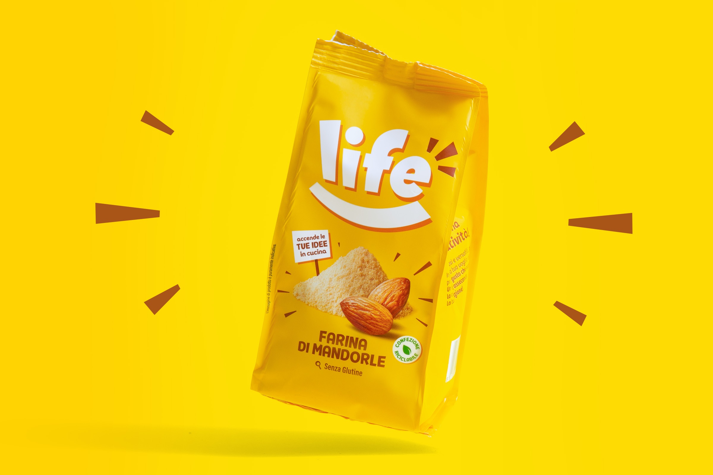
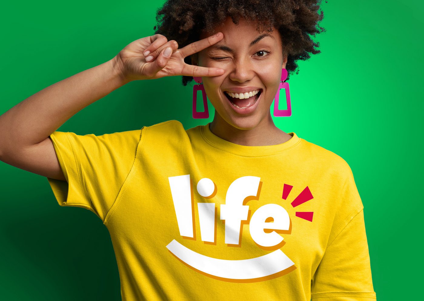
The same approach guided the design of the new visual identity. Life thus becomes a means of bringing wellness and joy, an authentic brand whose freshness and spontaneity is capable of evoking a smile. And it is in fact a smile, the most direct and spontaneous expression of feeling good, that determines the appearance of the new logo, in a simple yet strongly expressive and impactful way.
A smile that plays an important role in a consistent, monolithic visual identity, devised for a signal appearance, recognisable in all its forms. An identity that, at the same time, is hallmarked by a language rich in elements and shades, devised to be presented in many different ways, with a coherent modulation across all touchpoints.
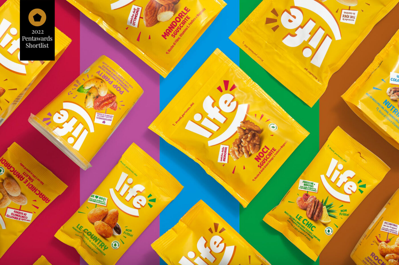
PACKAGING THAT STANDS OUT ON THE SHELF
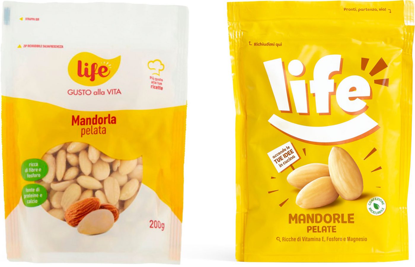
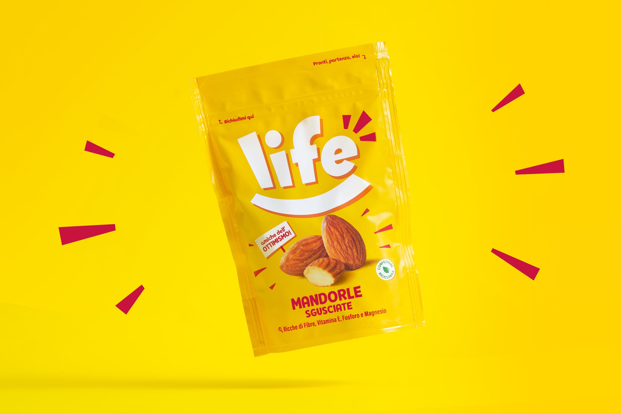
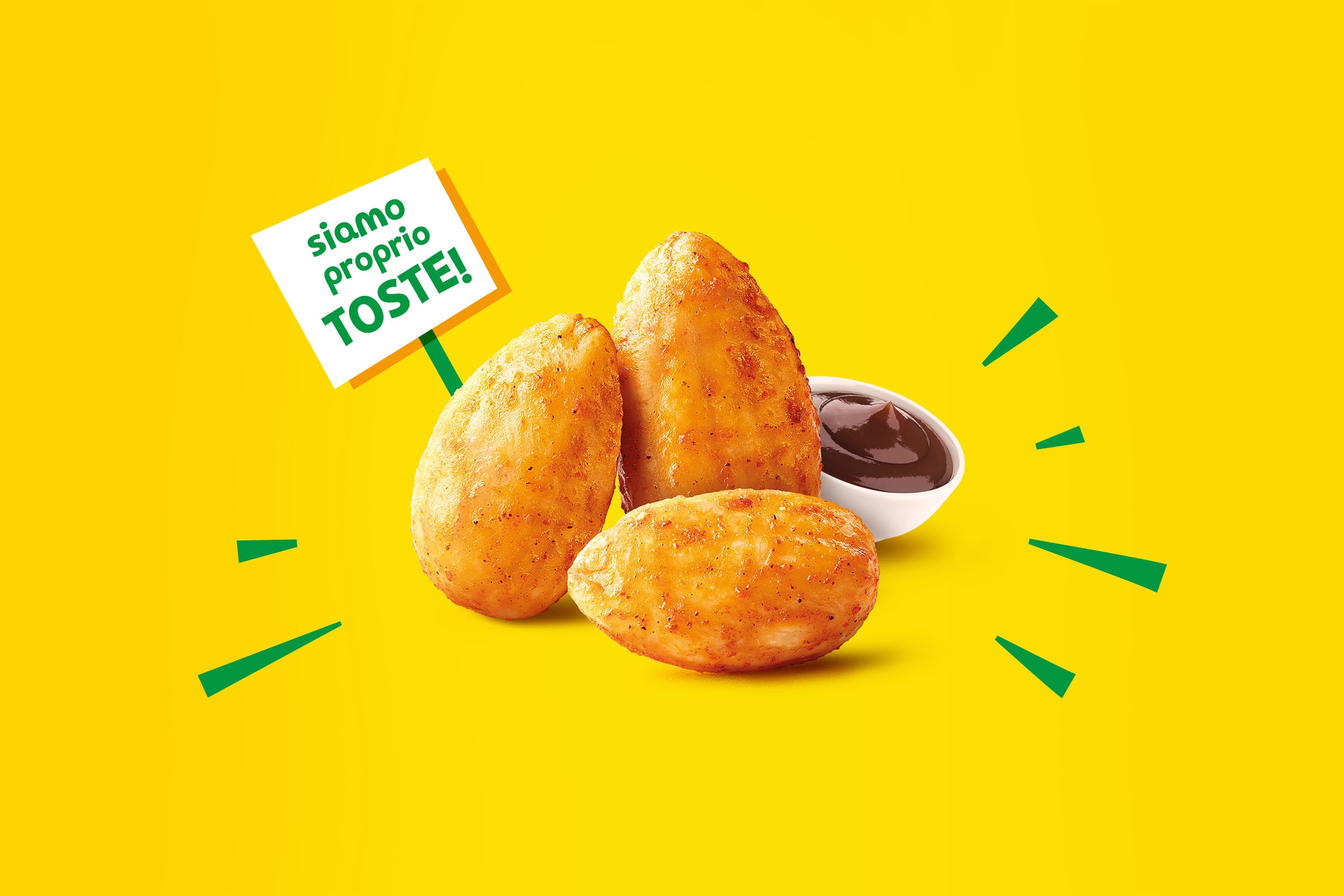
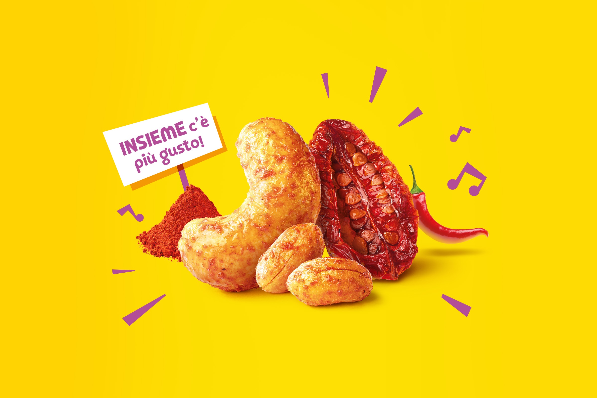
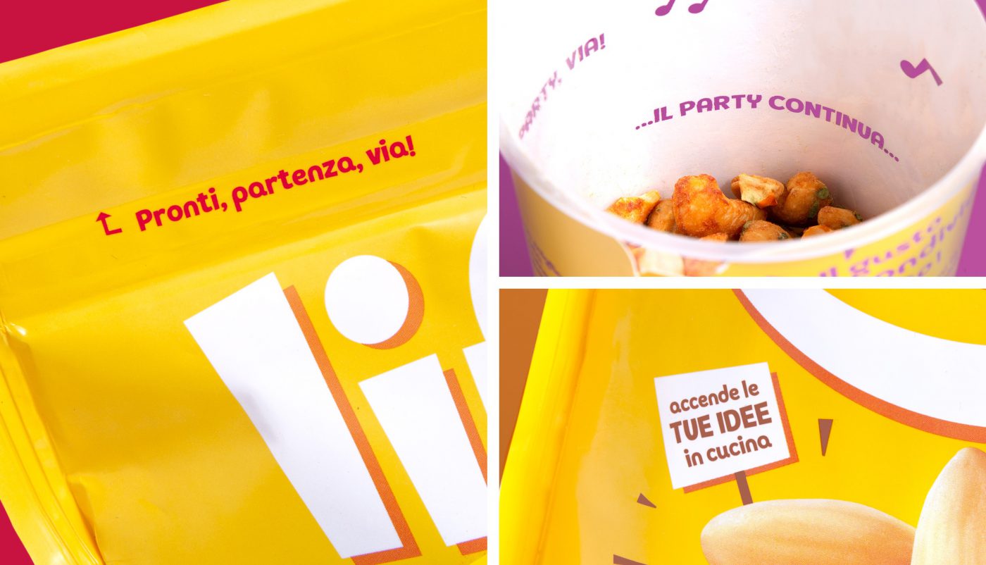
The packaging identity completely reflects the brand’s vivacity: bright and colourful with its intense yellow background, on which the smiling logo and a spontaneous and dynamic product visual emerge with great clarity. But it is the details, even those in the texts, that fully express the ironic, witty tone of voice: many small elements that speak to the consumer in a new and never orthodox way.
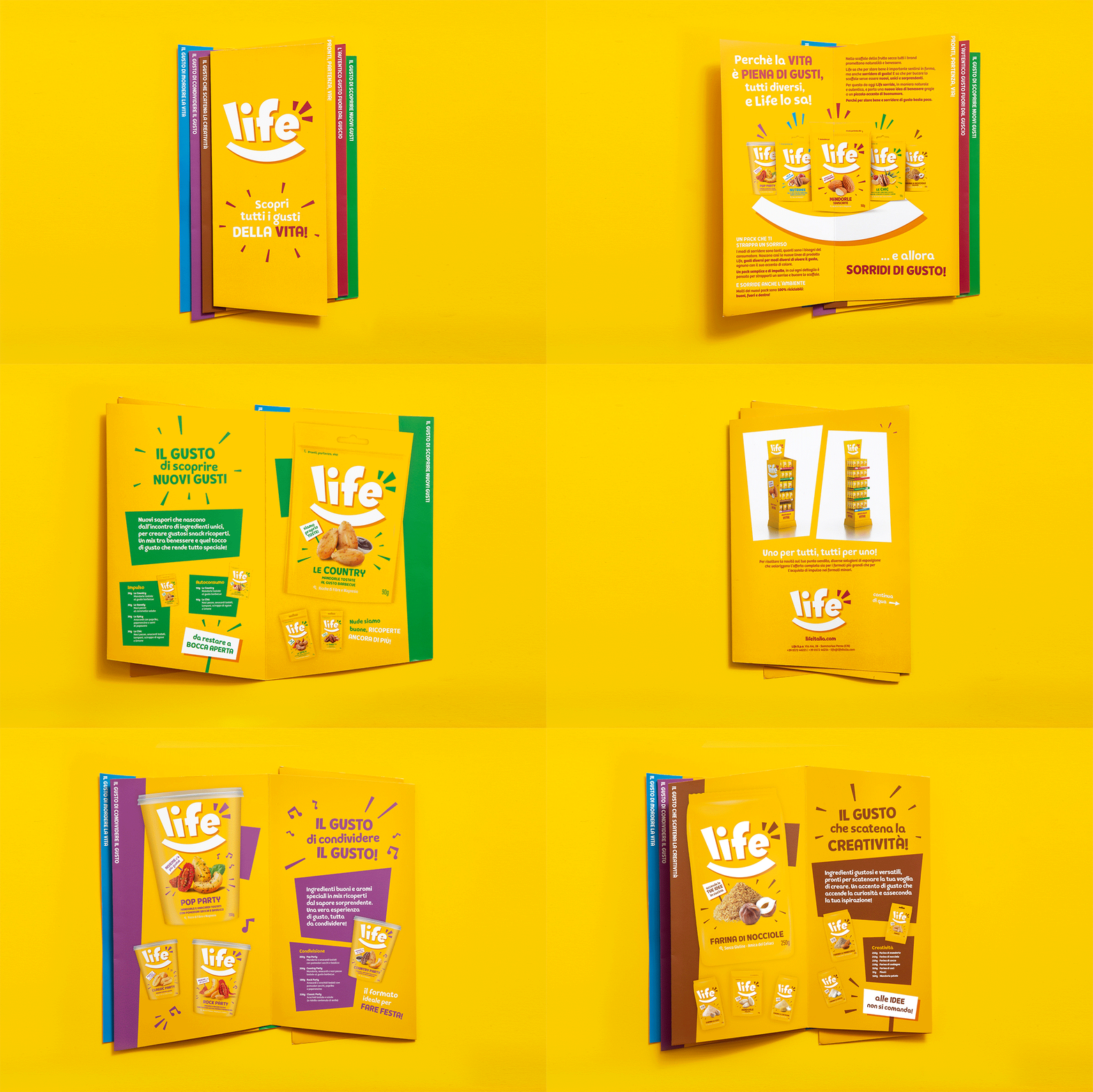
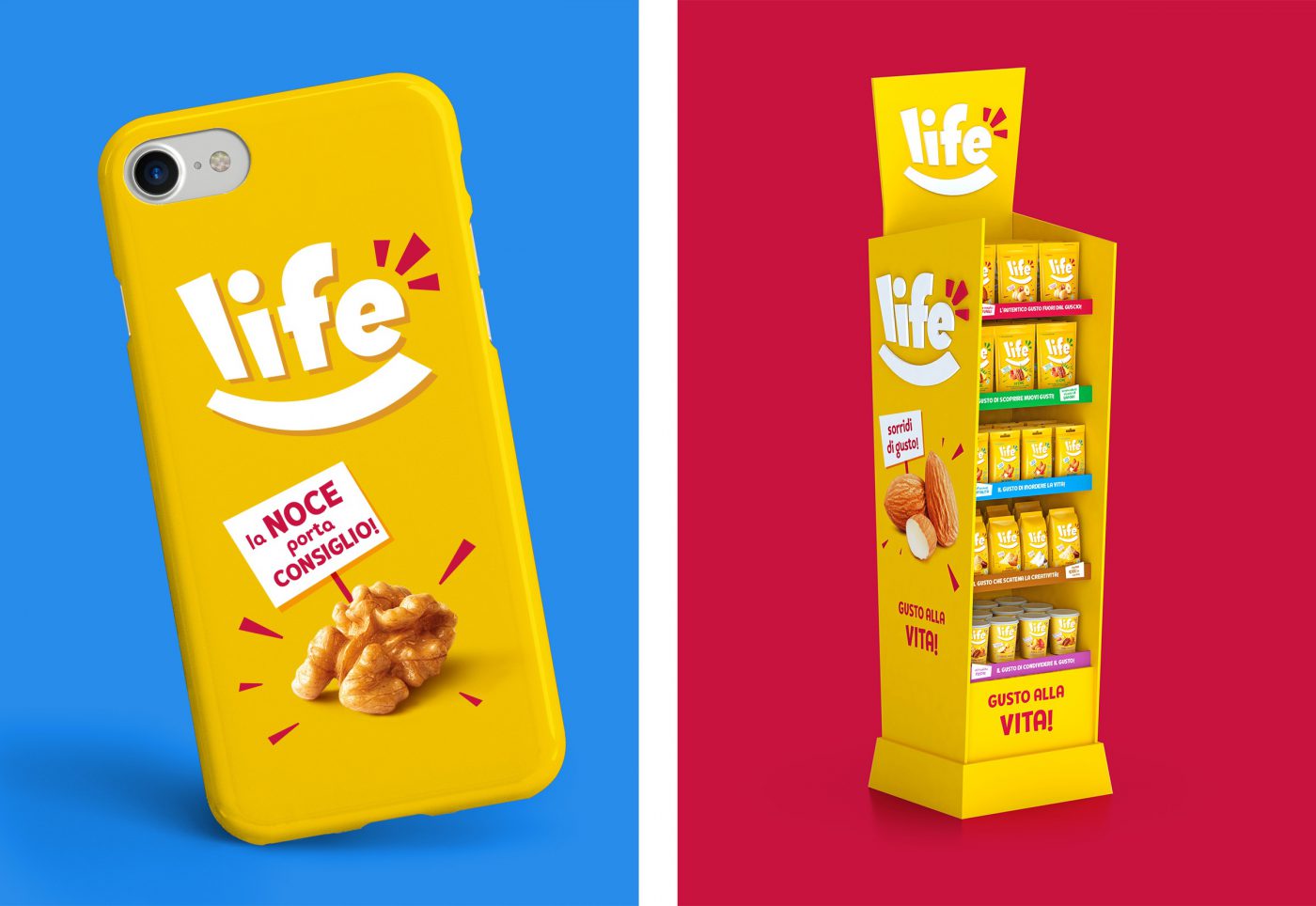
ALL FOR ONE, ONE FOR ALL
The communication tools, from presentation leaflets to point of sale displays, right through to gadgets and promotional material, follow the same happy and unconventional tone
Life, a new brand identity ready to smile and to bring a smile across all touchpoints, both present and future.
Life is an Italian food company, specialising in the dried fruit and nuts category, manufacturing and distributing its products on the local and international markets.

