France
Paris
Switch to your local agency
Retour au menu
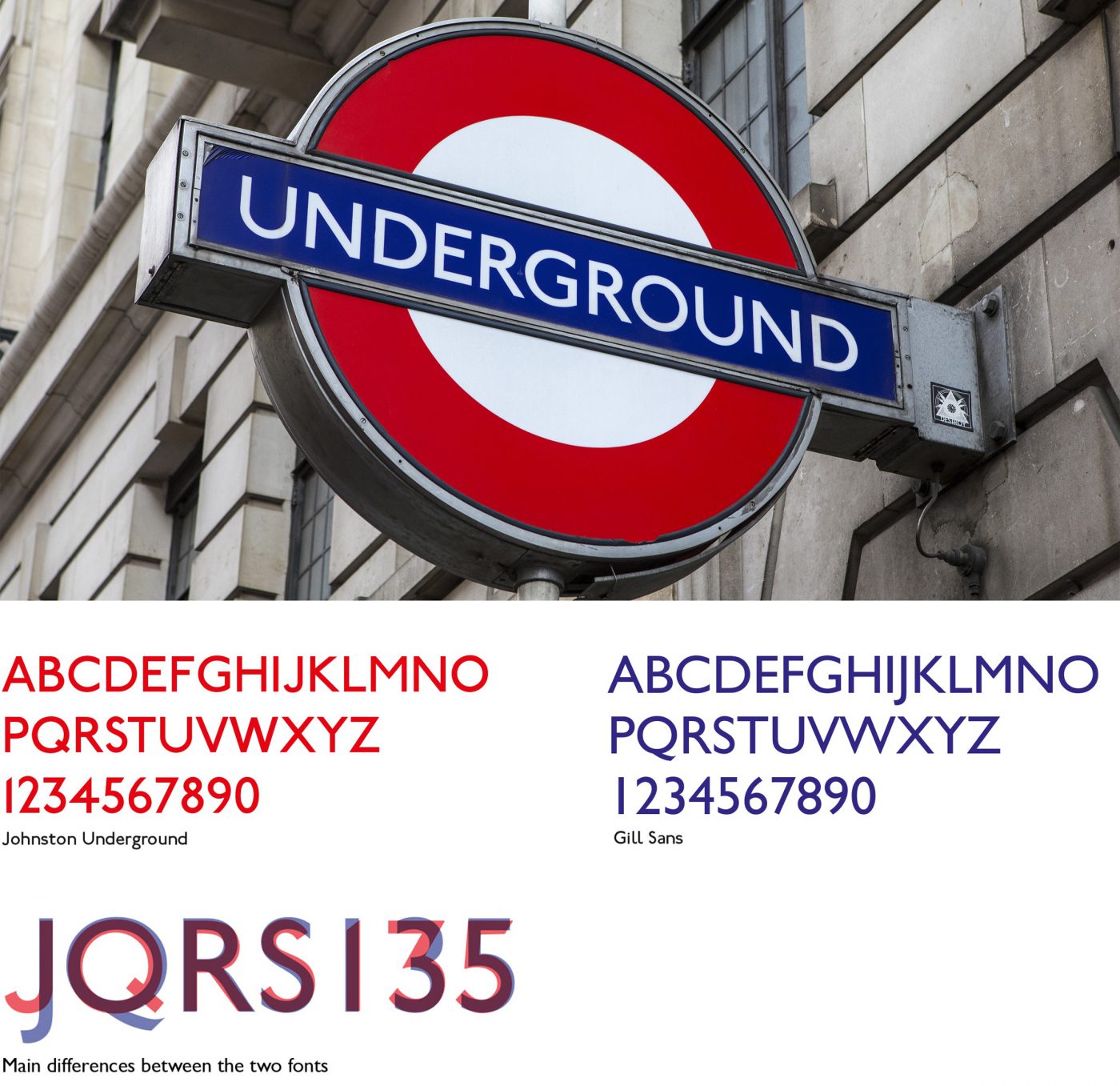
There are dishes like pizza, nachos or sushi, whose geographic origin is so well-rooted that they become an emblem of their country of origin. If we were to look for an equivalent in the typography world, we could well see Gill Sans in the same light as roast beef or fish & chips: 100% British.
It is no coincidence that its creator Eric Gill was an apprentice to Edward Johnson, the artist who designed the font for the London Underground, from which Gill Sans drew much inspiration. But while the Johnston Underground font has remained tied to the city, Gill Sans has become one of the most popular characters of the twentieth century throughout Europe.
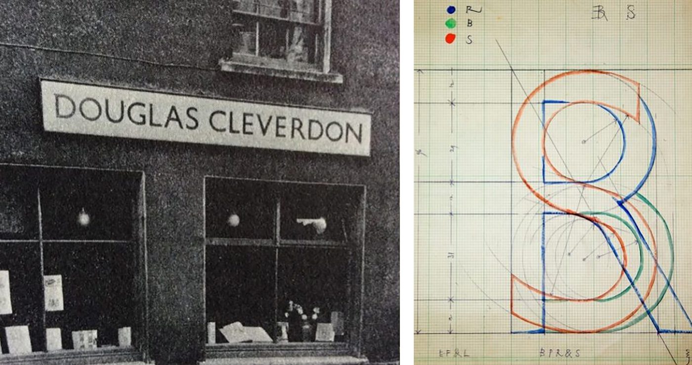
The first letters, capitals, were designed by hand for the sign for a bookshop in Bristol. Two years later the font was mass-produced by the Monotype type-foundry. The year was 1928. It was an immediate success.
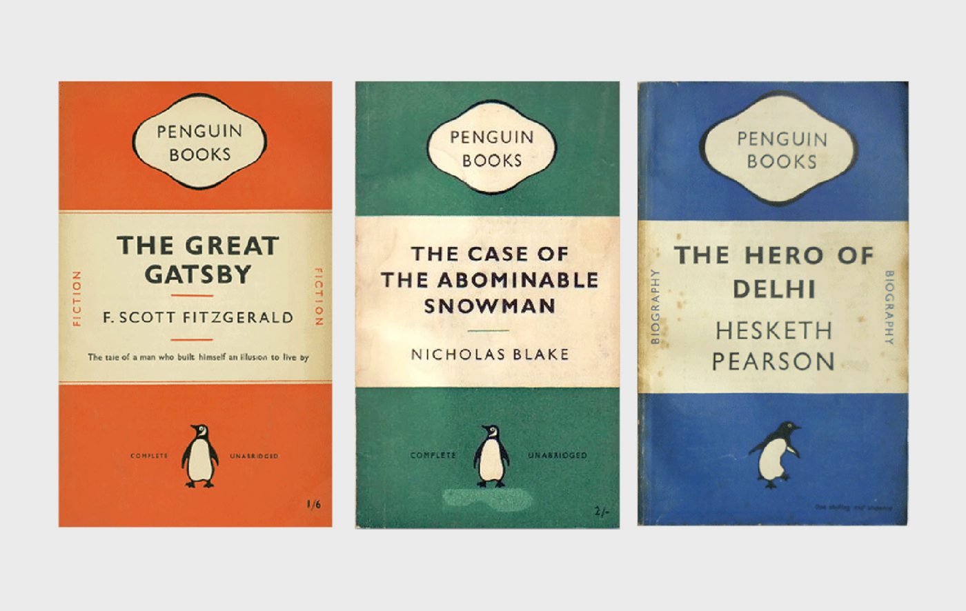
Just like the font from which it drew inspiration, Gill Sans was used extensively in the railway sector, firstly by LNER (London and North Easter Railways), and then by British Railways. It later became the standard typeface for the Penguin Books publishing house and the Church of England.
But why was it so successful? The main characteristic of Gill Sans is that it is a modern font, without serifs (from the French sans= without), but with a human touch, inspired by classic Roman letters. This particularity earned it the definition of a humanistic character, a definition that from that moment on described a specific category in character classification, and one that is still in use. Despite being a rational and balanced font, it maintained that warmth that the other linear fonts of the same period lacked, being of purely geometric origin. In addition to this was the enormous range of weights developed by Monotype, which rendered the typeface extremely versatile.
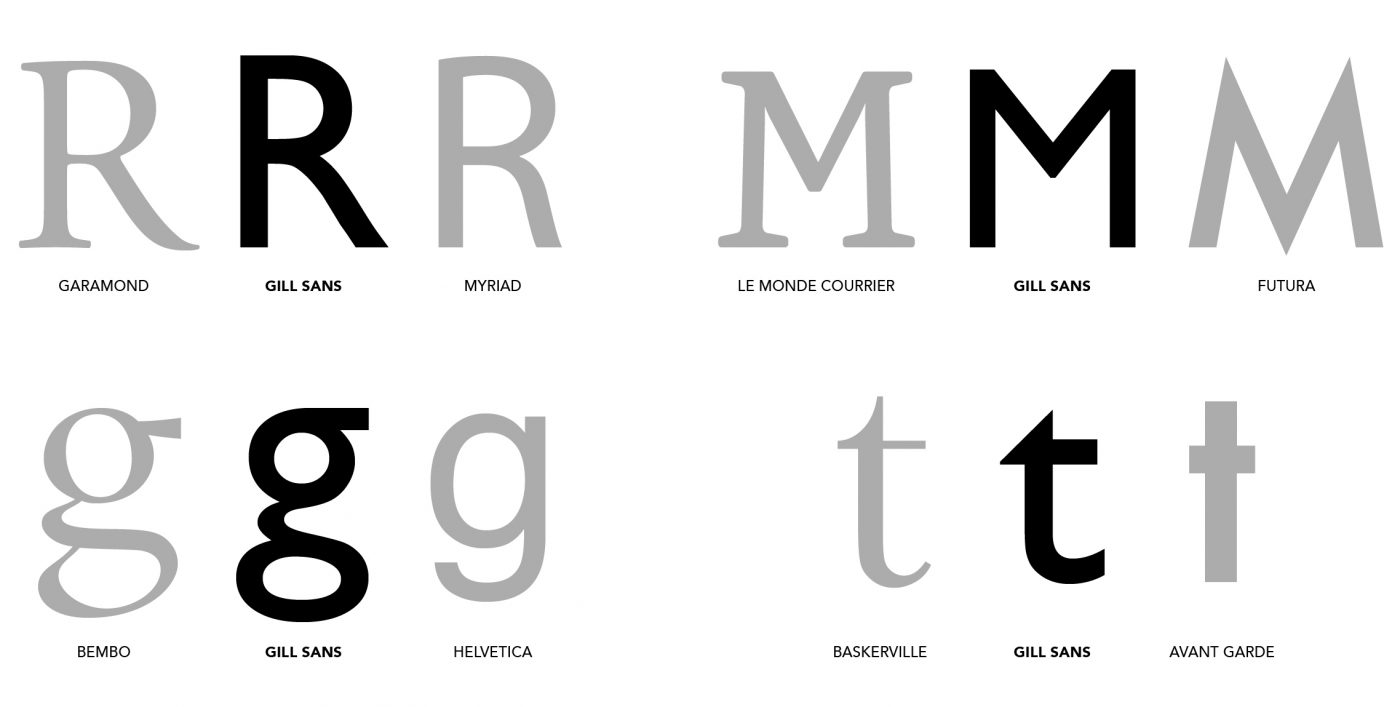
The most significant characteristics of the upper-case alphabet include the slight downward curve of the R, the half-height cross sections of the M and the ample opening of the C, with lines perpendicular to the base. The lower case is closer to the typical serifed style, above all in the t and the g, with its “eyeglass” form.
Returning to its use, Gill Sans saw an unsteady period from the 1960s onwards, when the international scene was dominated by the Swiss rationalism of Helvetica and Univers. However, thanks to its strong personality, it came back into fashion in the 1990s, when it was adopted as the official typeface of the BBC.

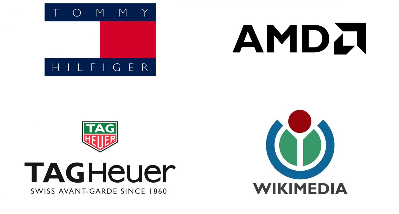
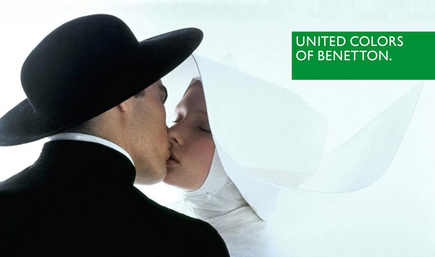
Its most famous overseas uses include the logo for Tommy Hilfiger, Tag Heuer, Wikimedia, AMD and Toy Story. It has even seen a certain level of popularity in Italy, as the font for Benetton, De Agostini and Mediaset.
In 2018 it was chosen for the rebranding of two icons of the British retail scene, John Lewis and Waitrose, demonstrating that even today, 90 years on from its publication, Gill Sans continues to be one of the best choices when speaking of pure British elegance.

Giuseppe Mascia, Visual Design Lead at CBA
Privacy Overview