France
Paris
Switch to your local agency
Retour au menu
In a world overflowing with boxes, cases and packs, what’s the role of packaging and how will it create a strong relationship between brands and customers?
While a crucial topic as reduction of packaging is (fortunately) already being well discussed and effective solutions are being developed in order to reduce its environmental impact, we decided to dig a little deeper, hoping to spark a reflection on what the future of packaging might look like, starting with the initial queries.
Think you know the answer? Spoiler: there is no single path. Still, one element seems to guide the evolution of packaging, and it’s the one that underlies every single relationship: interaction.
At CBA Italy we investigated what lies behind the packaging-customer interaction, and we came to realise that this relationship has continued evolving over the past years, going through 4 different levels. Let’s have a look at some real-life examples:
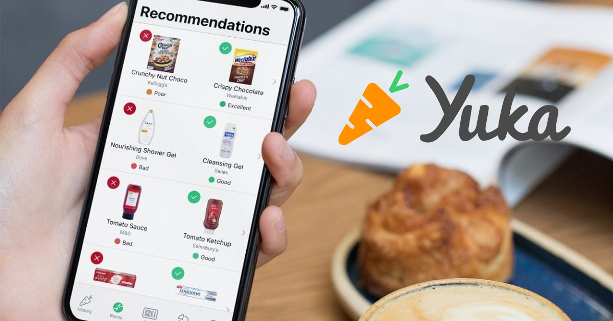
The Yuka app can decipher product labels. Through the scanning of the EAN code, the app analyzes the health impact of food products and cosmetics and gives the examined product a mark from E to A, following its nutri-score scale.
In this type of interaction, the packaging plays a passive role, waiting to get scanned. The interaction is merely functional since it doesn’t provide the user with any particular experience.
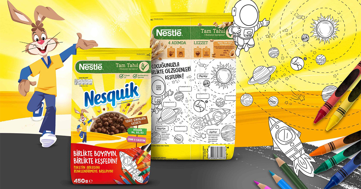
CBA Turkey partnered with Nesquik to create an interactive packaging design for their breakfast cereal. CBA created and developed a colouring area with 4 main themes: Planets, North Pole, Oceans and Our World.
This packaging allows the user to express him/herself while giving the box a second life. The interaction opens to a moment of entertainment and becomes the very first step in the relationship between the brand and its audience.
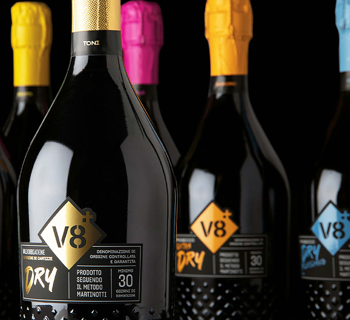
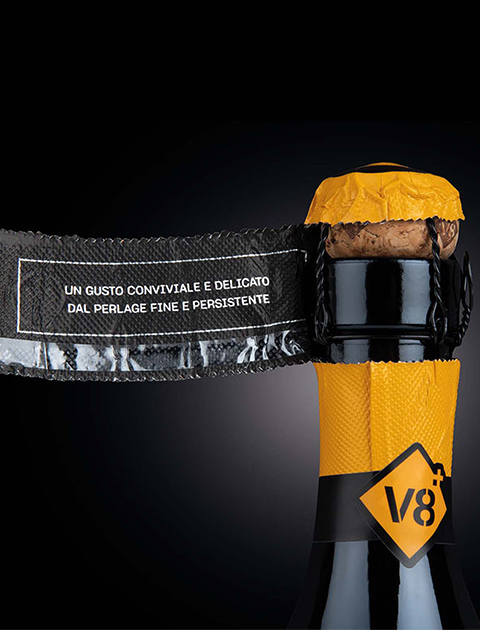
We created a project to re-launch a young Prosecco brand, revising all the brand’s graphic assets and uniting them into a consistent and unified story: the label clearly describes the wine’s characteristics, giving space to the production method; once opened, the capsule communicates the product features.
V8+’s bottles are designed to unveil the incredible story behind every product of their line: this interaction between the user and the product activates a strong bonding process between the audience and the brand while enhancing the product characteristics.
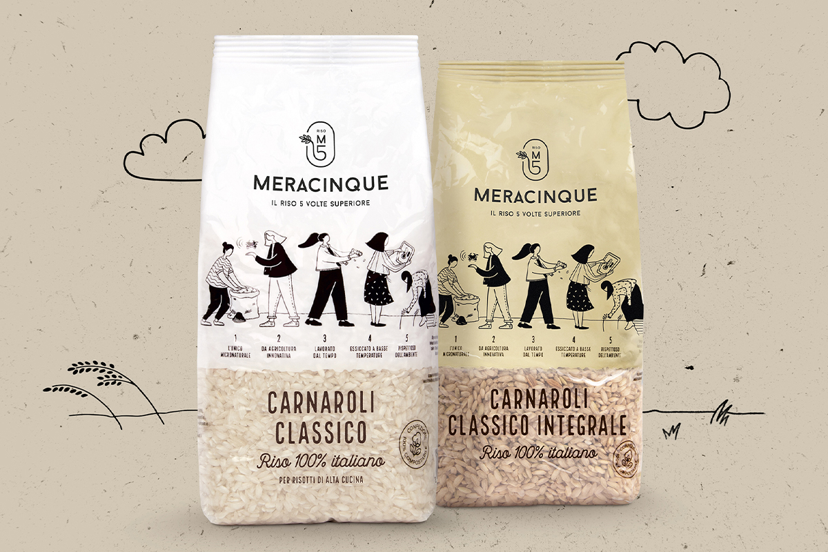
We designed the new identity of Meracinque rice, aiming at conveying the high quality of the product through an emotive and rational consumer-driven approach. The result was the creation of a new pack, where the five sisters tell their story and describe the product.
The story of the sisters and their project occupies a primary position in the pack. The pack was developed as a medium focusing on narration, taking the consumer on a journey to discover a one-of-a-kind story and an extraordinary brand.
As we set out to uncover the next level of interactive packaging, we began to wonder: are there more questions we need to address?
Short answer: yes, there’s always more to address.
Long answer: as far as packaging, we identified one more level of interaction, that we divided into two main themes. In our opinion, they will be pivotal in guiding its evolution: we are talking about inclusivity and continuity.
Kellogg’s – Rice Crispies Treats
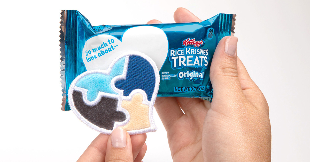
In our opinion, one of the best examples of inclusive packaging is represented by Kellogg’s Rice Crispies Love Notes. This product comes in two versions: one for autistic kids and one for kids with sight disabilities.
The one designed for kids with autism comes in a pack with four heart-shaped stickers to match the space on Rice Krispies Treats writable wrappers. The sensory stickers feature soft, smooth and bumpy textures designed for children with autism who may enjoy tactile experiences.
The one dedicated to kids with sight disabilities includes six heart-shaped stickers displaying love messages in the Braille alphabet so that kids can receive love notes from their parents even during their afternoon snack.
Mc Donald’s – Happy Goggles
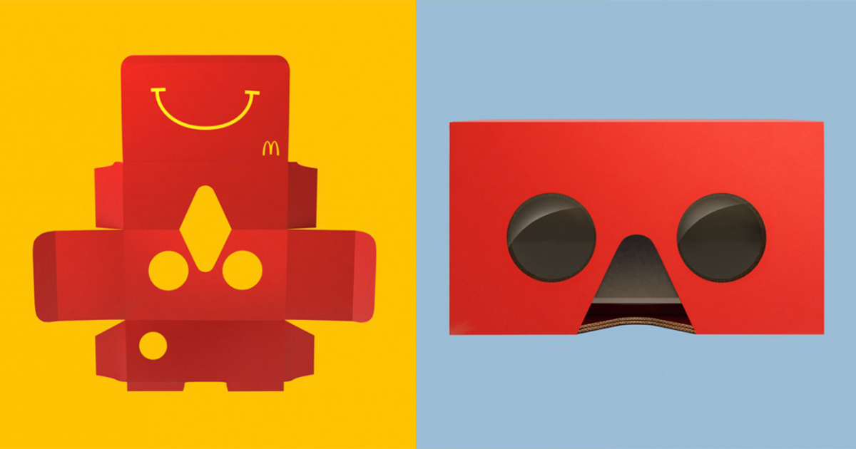
While designing the new packaging for its iconic Happy Meal, McDonald’s goal was to “ensure that the World’s most famous box will continue to be magical and relevant to families for another 30 years. Meet Happy Goggles – a unique VR viewer made from an ordinary Happy Meal box.”
McDonald’s was able to bring forth what we believe will be the future of packaging: a transformative box that enables a continuous interaction on both digital and physical levels, in order to enhance the brand experience.
In the end, we can conclude that interaction is the main element that brands are taking into account as they follow the natural evolution of packaging. How come?
The most relevant trends are showing us how the average customer is evolving, always expecting more in terms of experience and engagement from the brands they follow. In order to keep up with people’s needs, brands and packaging must continue to evolve, on the one hand by meeting the demands of their respective markets, and on the other by maintaining the ability to remain true to themselves and stand out from their competitors.
Now tell us, how do you think the packaging and its relation with the consumer will move forward in the next future?Looking forward to knowing your ideas, we at CBA Italy will keep exploring.
Giulio Vescovi, Strategic Designer at CBA Italy
Privacy Overview