Leading Italian crisps and snack company San Carlo is present in over 30 countries with a range of premium crisps in dedicated packaging, available in plain and other flavours.
After its debut with the positioning campaign “A Bite of Style”, the first strategic step with a specifically Milanese focus, the international San Carlo range needed to develop its identity and communicate its Italian DNA with a less sophisticated approach that would be more relevant and relatable for the international consumer, finding a point of contact with the more consolidated image of Italy abroad.
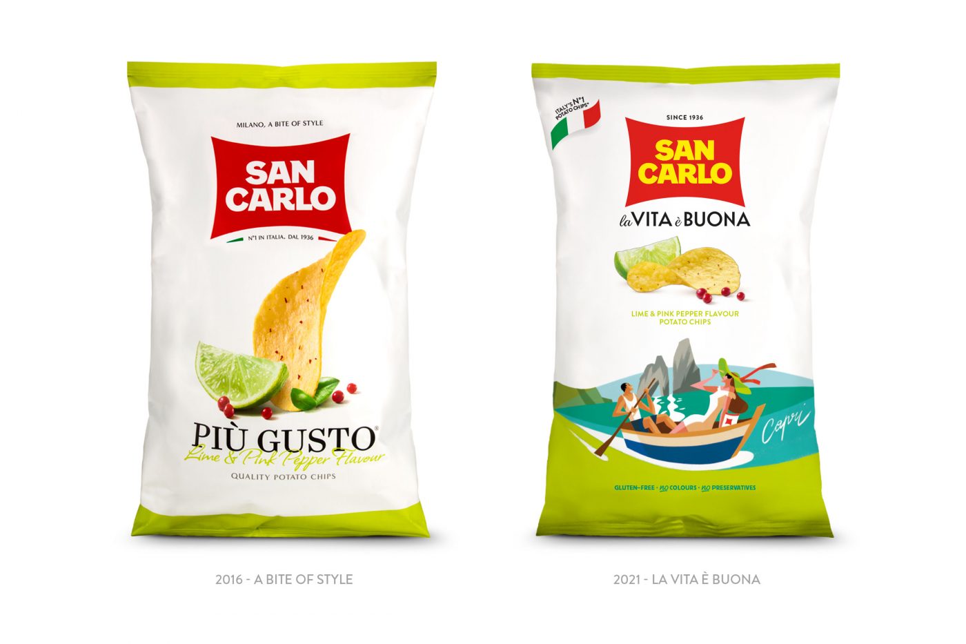
In order to achieve this, we designed a lively and colourful identity that celebrates iconic Italian destinations and our cheerful and sunny attitude to daily life.
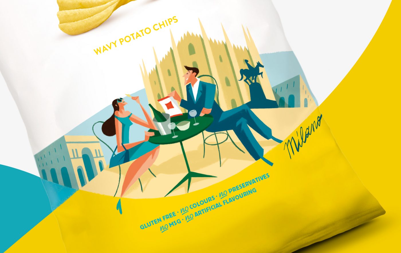
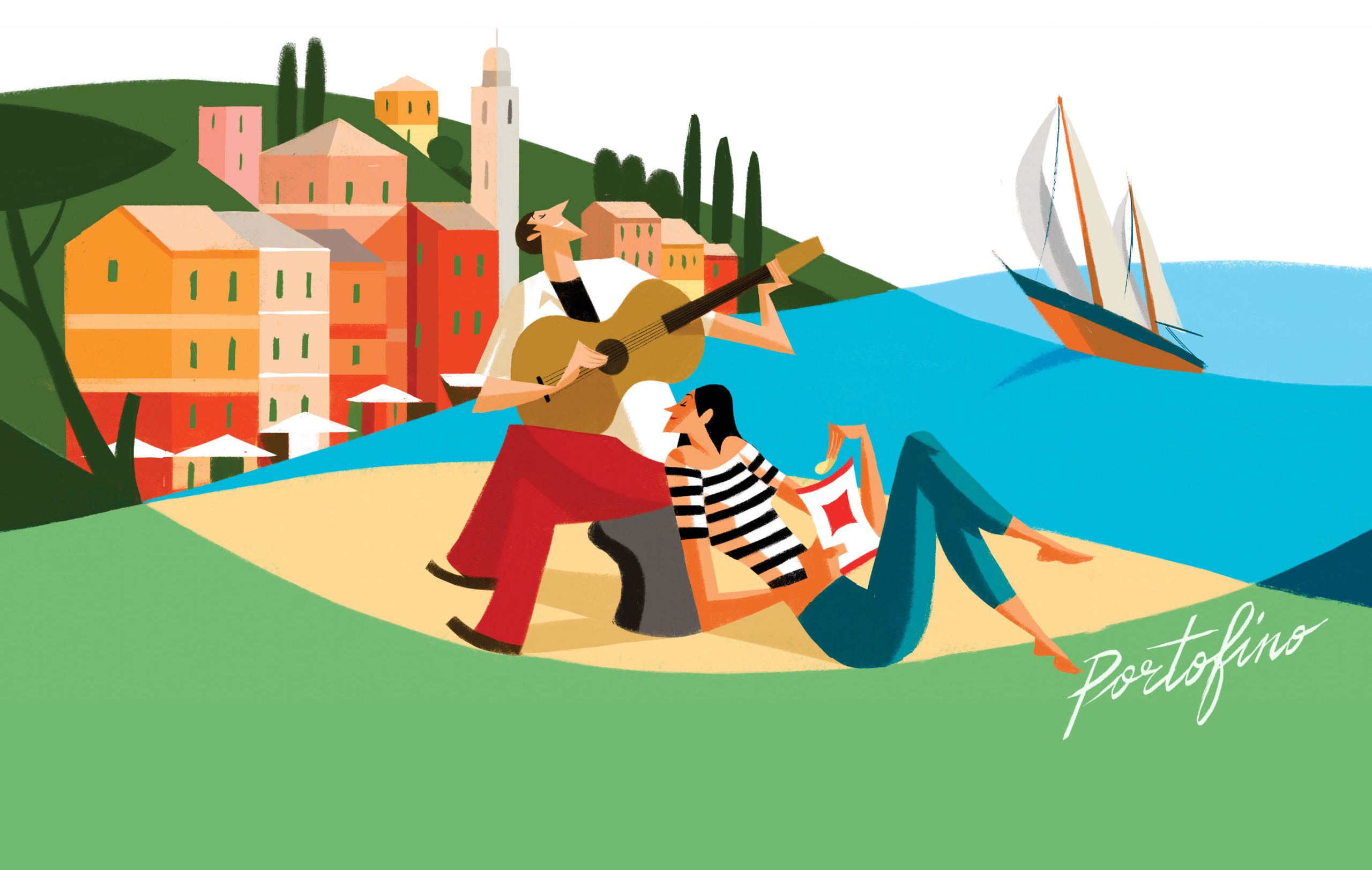
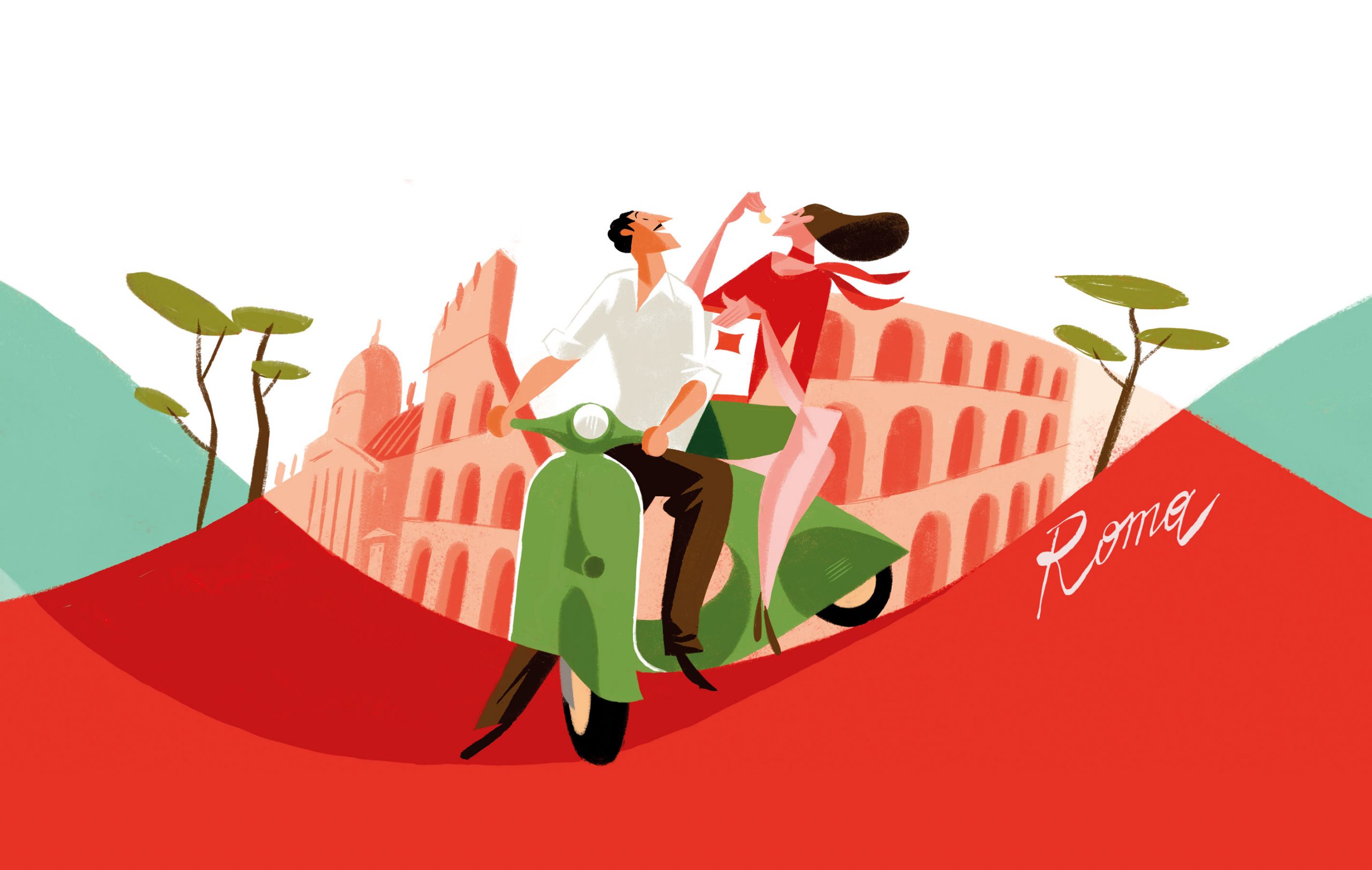
San Carlo will whisk you away to monuments steeped in history, country landscapes or the coastlines that the whole world envies.
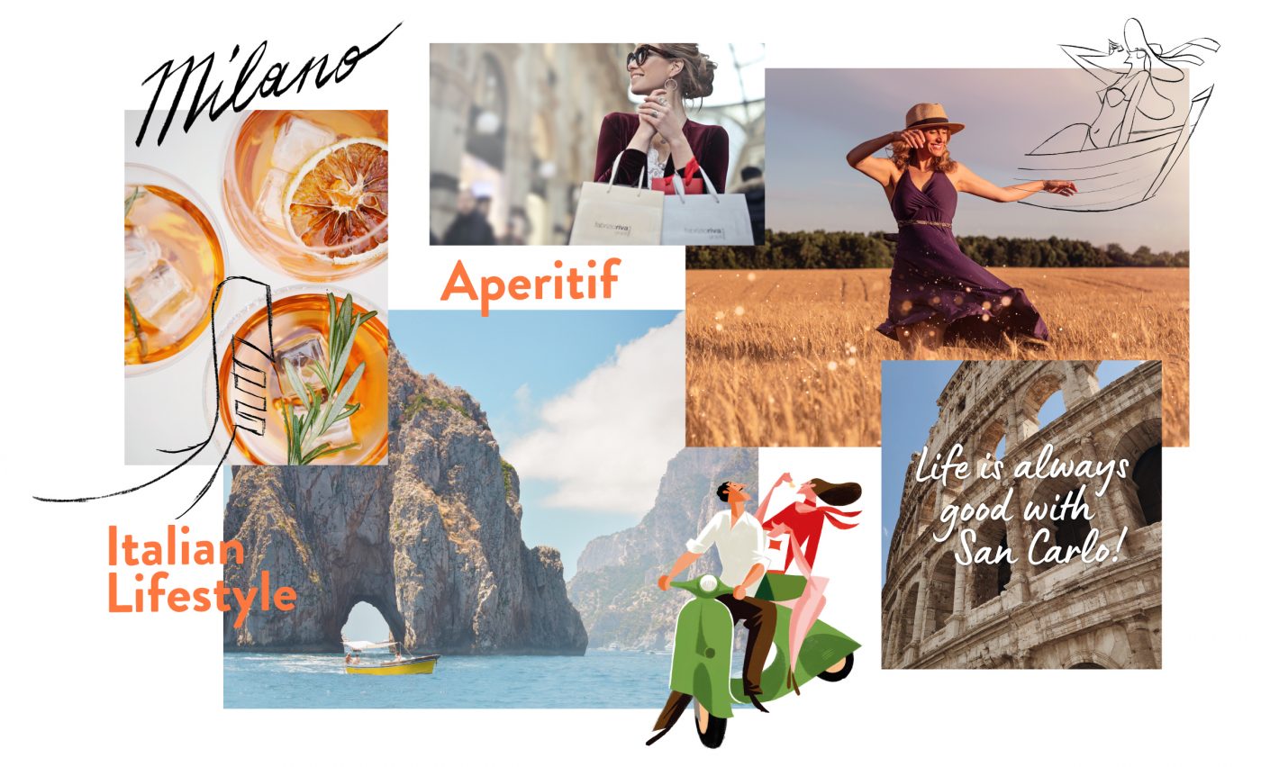
Each illustration conveys a specific moment connected to the destination, such as an aperitivo in Milan or a gondola tour in Venice, all combined with bright colours.
The characters depict consumption of the product with an ironic approach, never taking themselves too seriously, in the Italian way.
We immediately thought of Riccardo Guasco for this task because his style perfectly expresses the Italian character that we wish to communicate.
