A process of growth and internationalisation has led Innowatio to rethink its identity. Working on its corporate identity was a fundamental step in conveying its growth, staying relevant in an ever-changing market and adopting a contemporary visual language able to show off the innovativeness of the company’s services and technical capabilities.
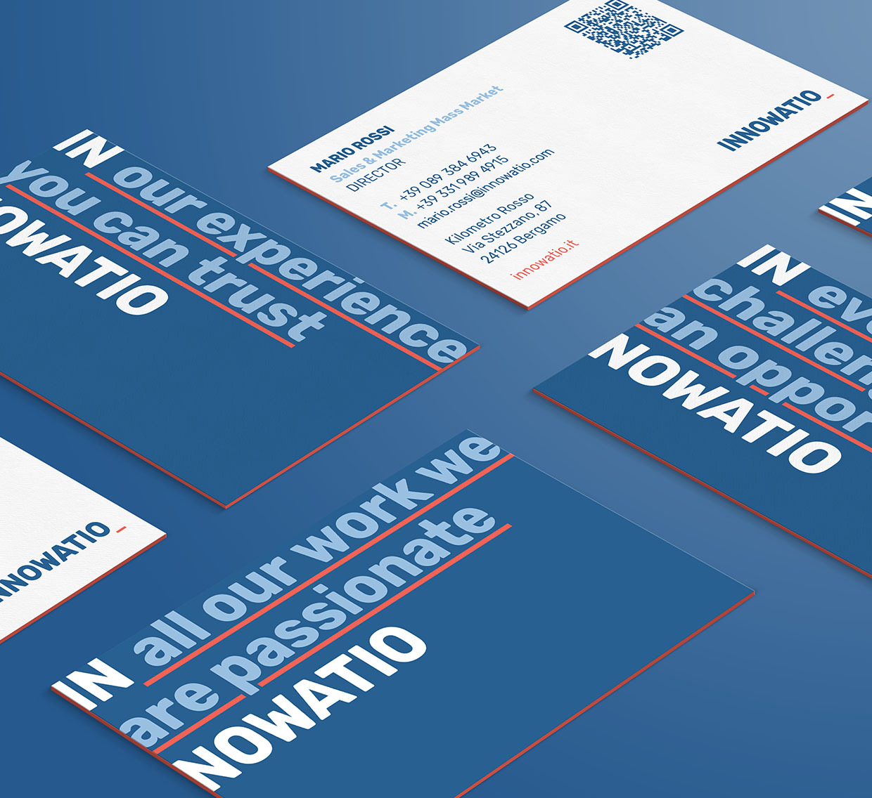
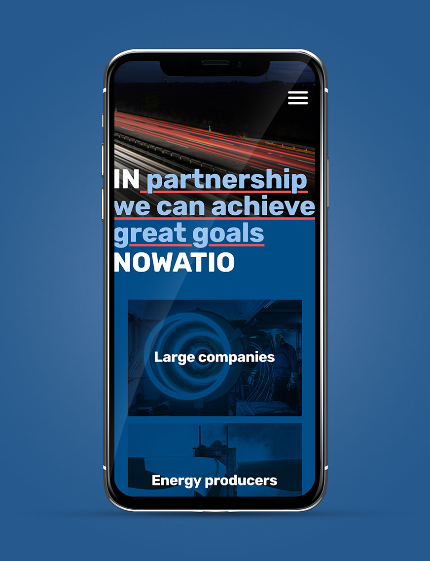
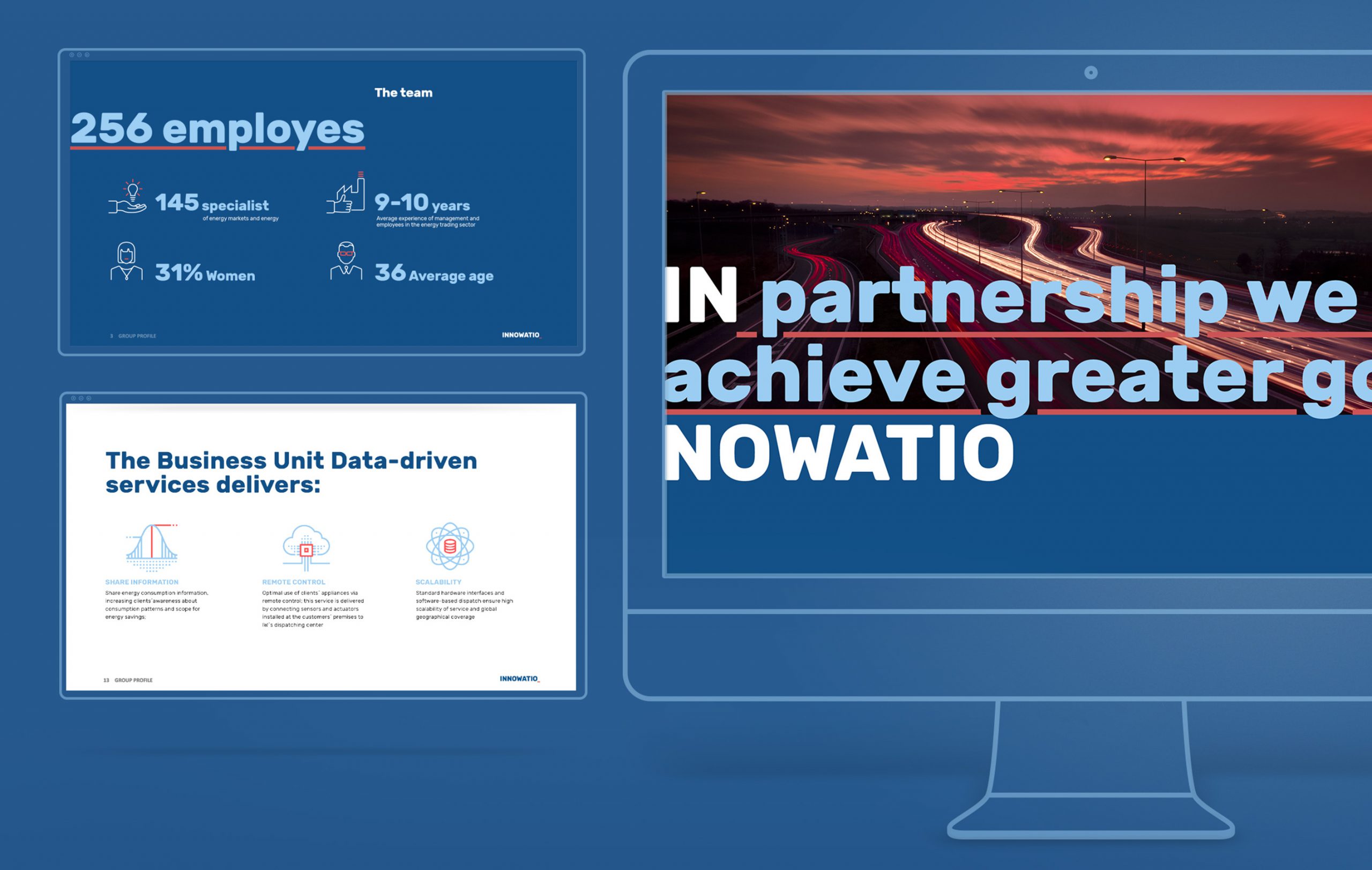
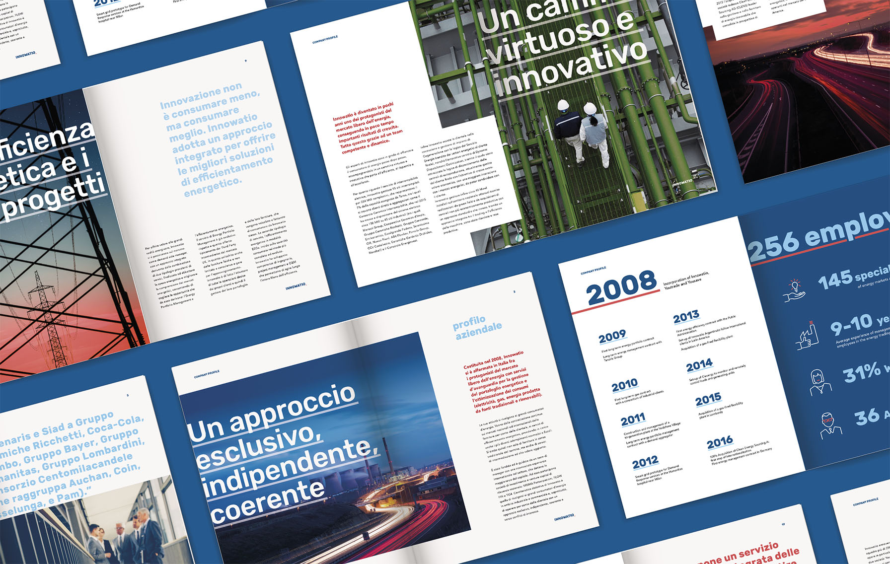
This was the basis upon which we built Innowatio’s new brand identity, making a bold design choice. A dynamic identity, which we constantly update to convey different messages, made up primarily of text rather than images.

Through a course of analysis of Innowatio’s business, the market and competitors’ communication, along with a series of dialogues and interviews with internal stakeholders, we have defined a strategic brand platform that summarises the essence of Innowatio in three values: performance, courage and trust.


The root of the name Innowatio, the preposition in, becomes the initial word in a series of sentences that clearly declare who Innowatio is. A small red rectangle is the symbol that accompanies the logo, becoming the cursor for the composition of the sentences. The identity for an innovative and courageous brand, which speaks for itself directly, with the confidence that can only come from expertise.


Innowatio assists its customers – industries, services and PA – with the aim of reducing energy expenditure through the adoption of technological and innovative solutions in order to achieve intelligent management of the portfolio and energy consumption.

