Our challenge was to reconnect the brand’s identity with its long tradition, which began in 1935 when Ermenegildo “Gildo” Rachelli started his business: a small ice-cream shop in the heart of Milan. The brand’s need was to enhance the focus on the production of its ice creams and desserts through a production methodology that fully respected of the cycles of nature.
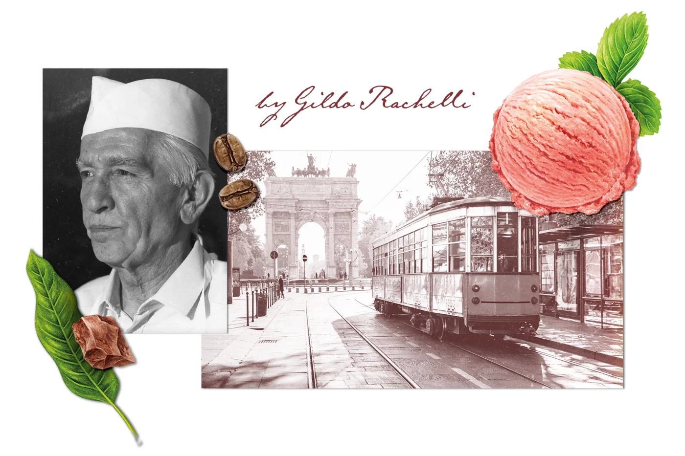
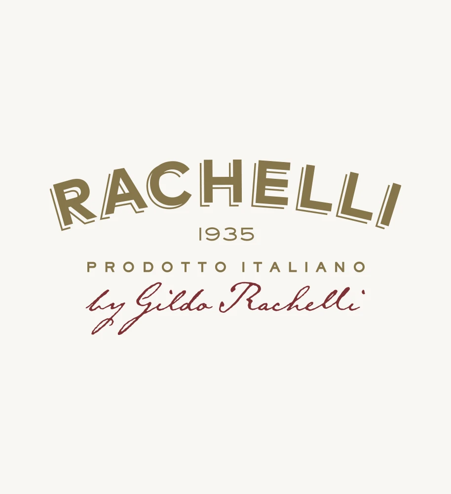
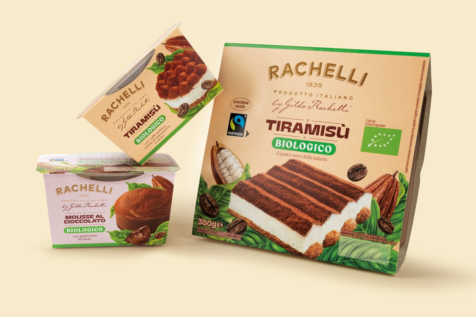
From an identity that poorly reflected the Italian personality of the brand, the high quality of the products and the precision of the production process, to a celebration of the nature through illustrations that emphasise the quality of the ingredients and a renewed brand name inspired by the old Milanese ice-cream shop sign.
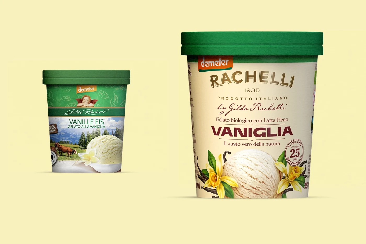
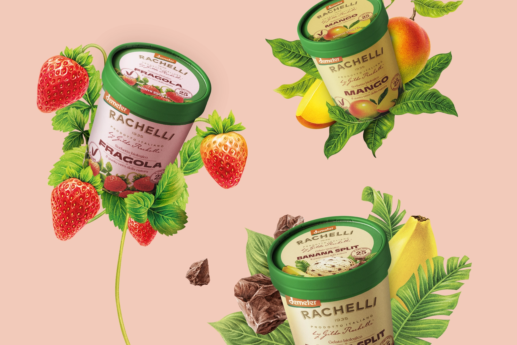
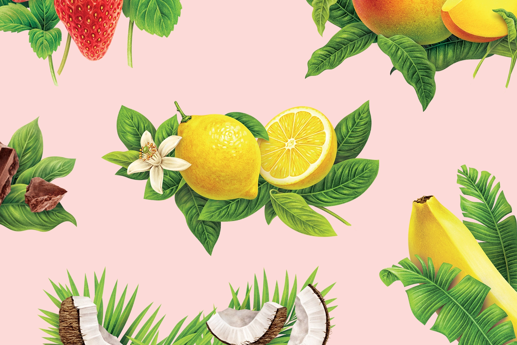
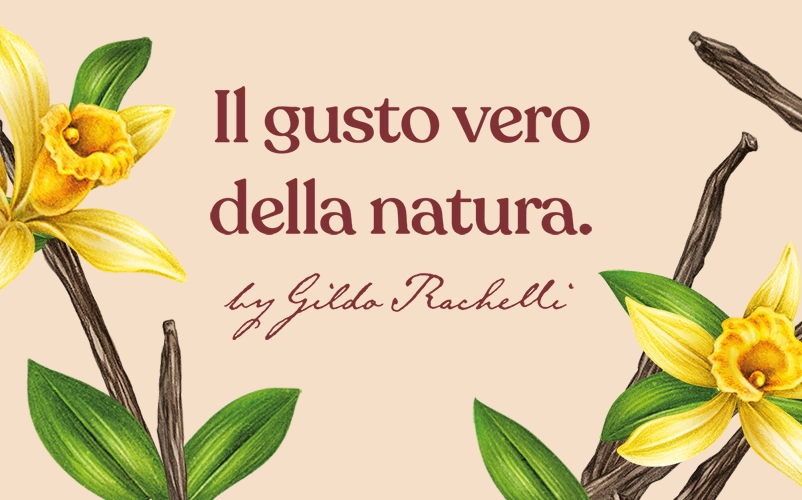
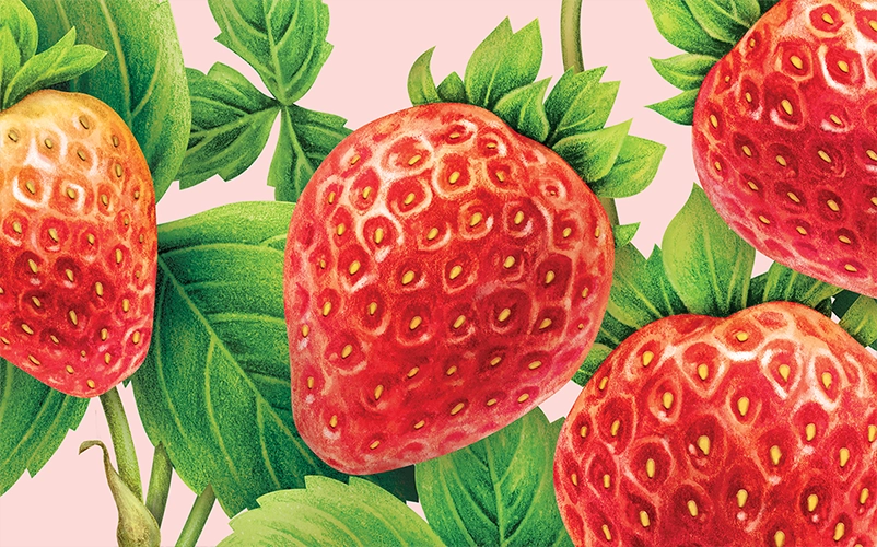
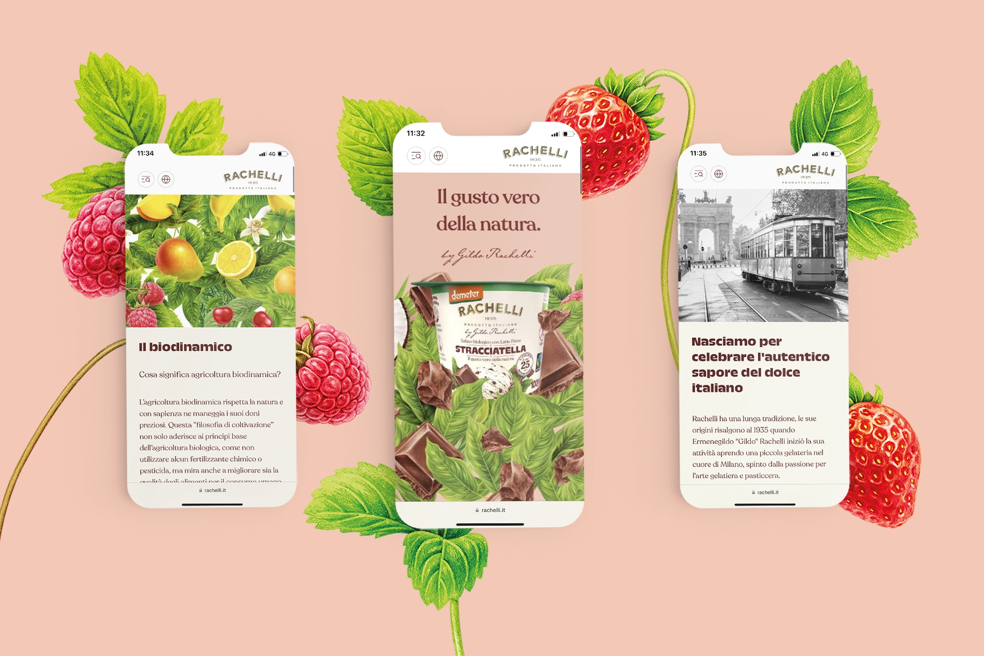
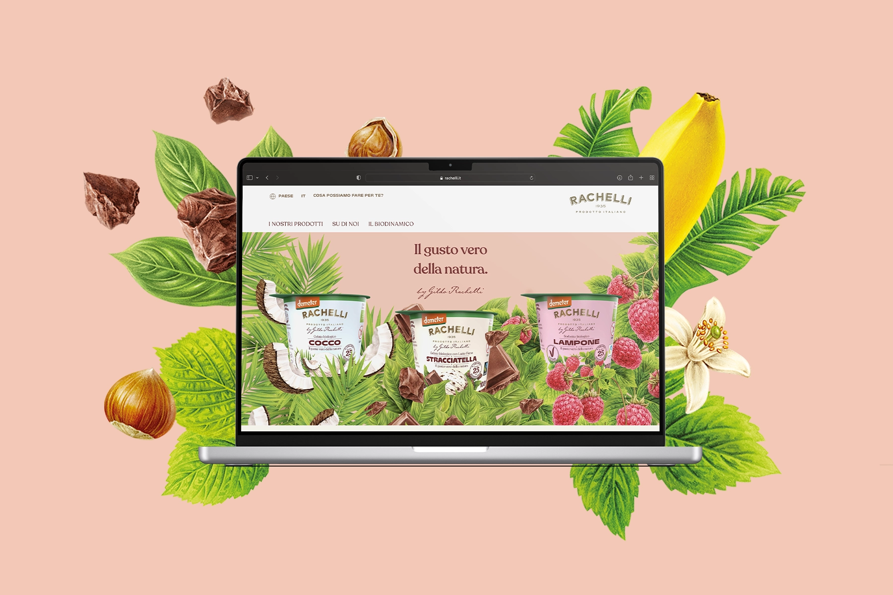
The main key-visuals of the new identity are the illustrations, designed by Irene Laschi. Each ice cream flavor has its own illustration, where the deep connection with nature is expressed through the use of not only the ingredients, but also the branches and leaves of the plants.
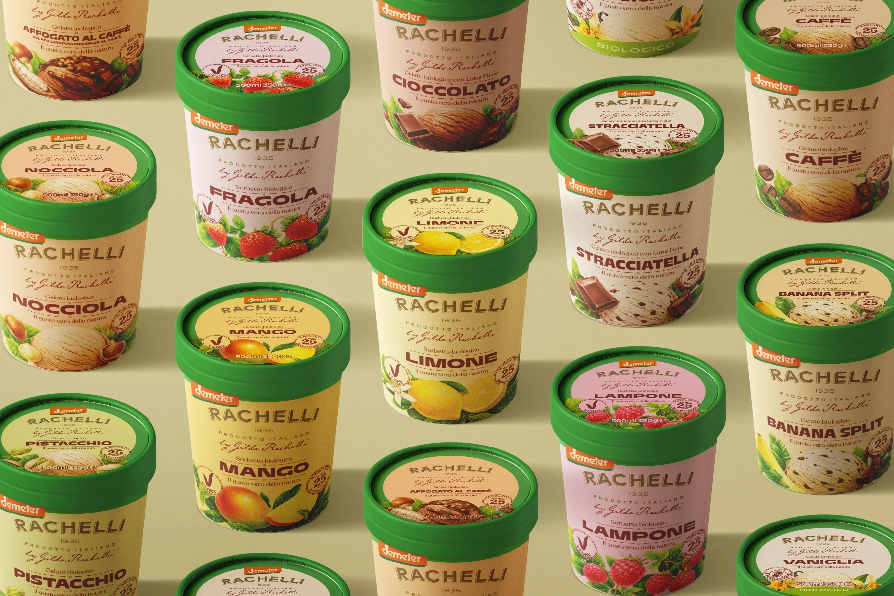
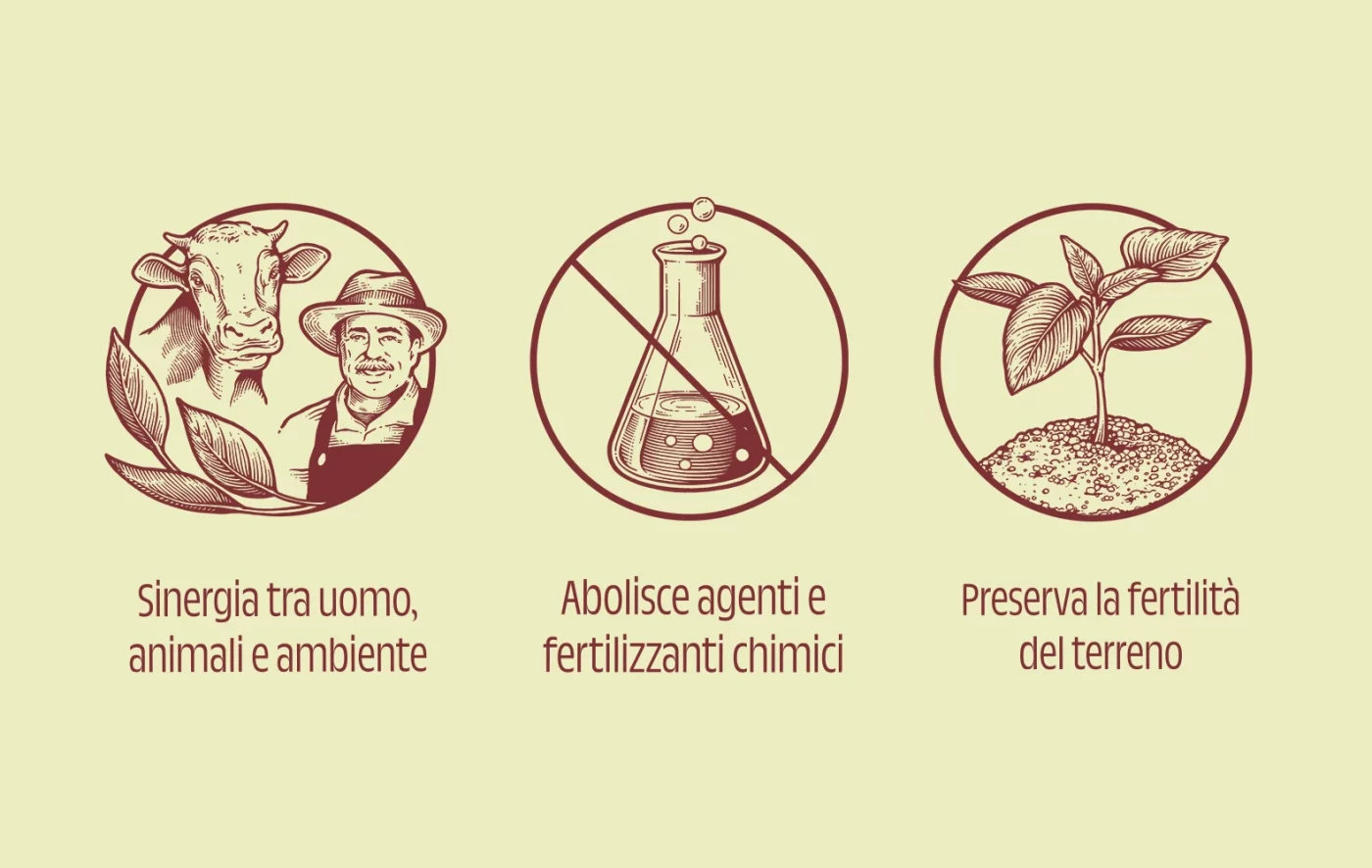
In order to emphasise the production process, we have created a series of icons that convey the 3 fundamental principles of biodynamic agriculture, which represent the synergy between man, animals and the environment, the abolition of all the chemical agents and fertilisers, and the preservation of soil fertility through the crop cycle.
For the new identity launch, together with the launch of a new flavour for the German market, we produced a commercial with the aim to explain one of the iconic desserts of the Italian tradition, the “affogato”.
Finally, we took care of the implementation of the digital touchpoints such as the website and the social editorial plan that will be launched in the coming months.
Rachelli is a brand of Emmi Dessert Italia, a company owned by the Emmi Group, specialised in fresh desserts and ice cream, producing and distributing its products in the Italian and international markets.

