San Benedetto sparkling water felt the weight of the years on its shoulders, and was no longer capable of giving off that sparking vivacity contained within its bottles. Our job was to clean up and lighten its appearance, creating a fresh and dynamic identity in line with the times, to regain relevance in the eyes of anyone looking for the ideal water to quench their thirst.
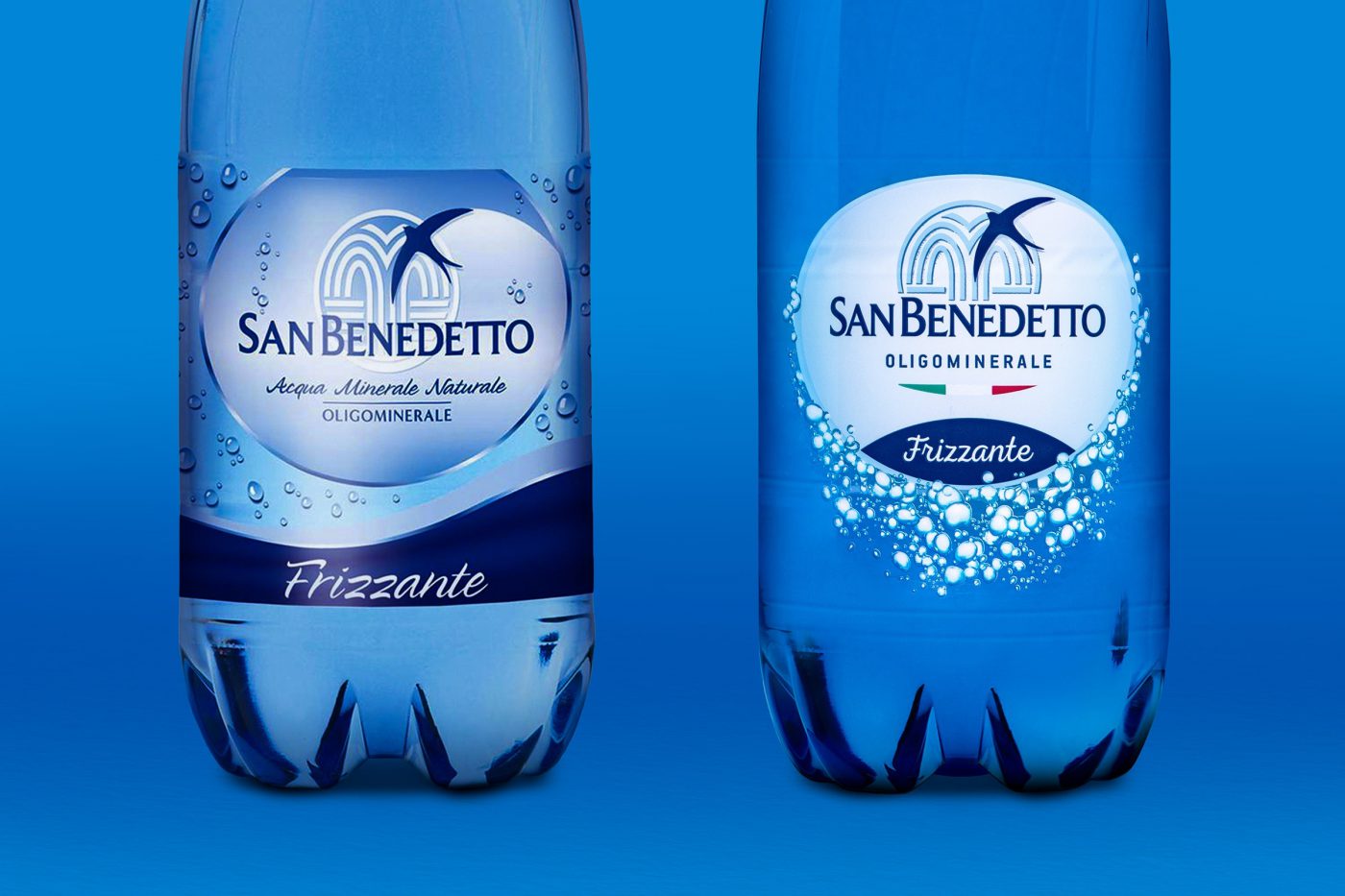
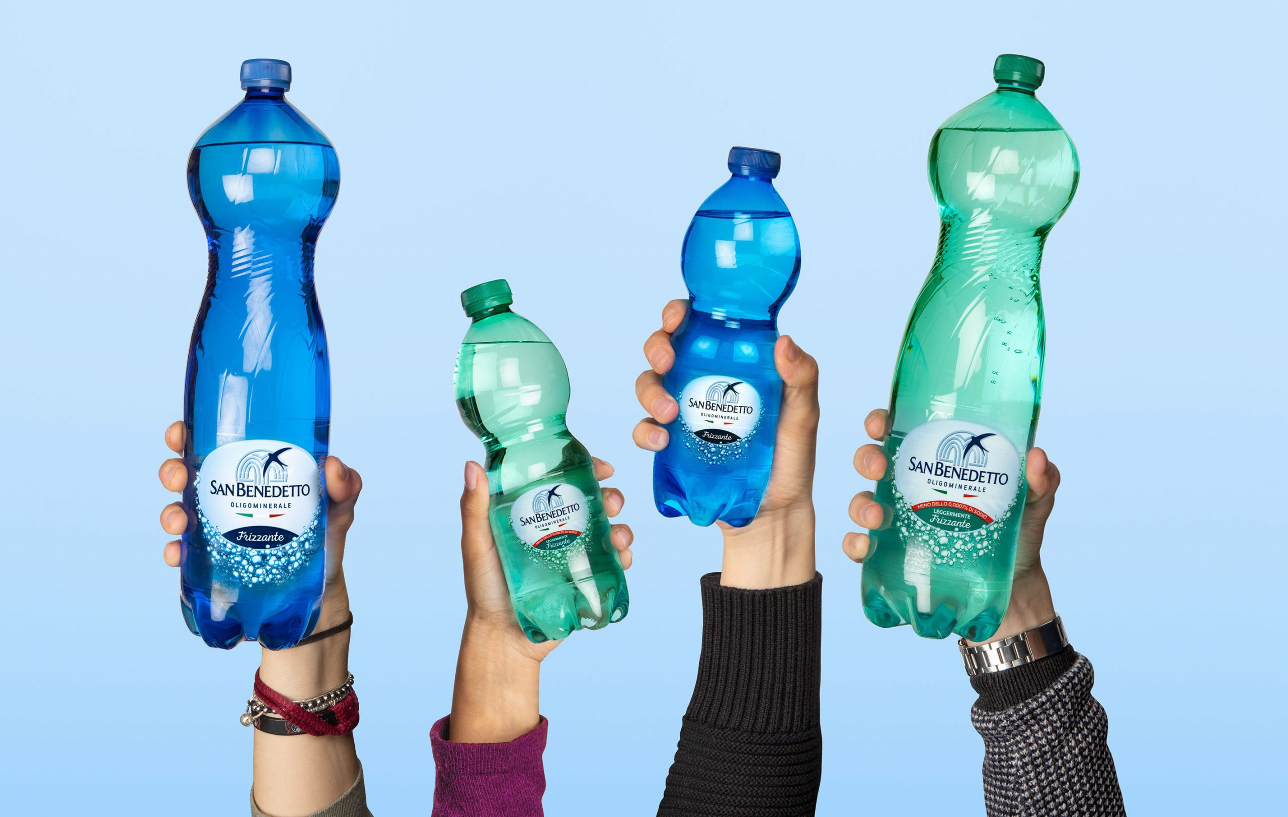
The project was developed with three aims in mind: apply the new San Benedetto branding, already present on the still water; differentiate the appearance of the sparkling water from its still sister, seeing as they are two distinct products with different target consumers, without entirely overhauling the previous identity; emerge boldly in a sales environment which is often very chaotic, strengthening the general visibility, and in particular, that of the 6-bottle pack.
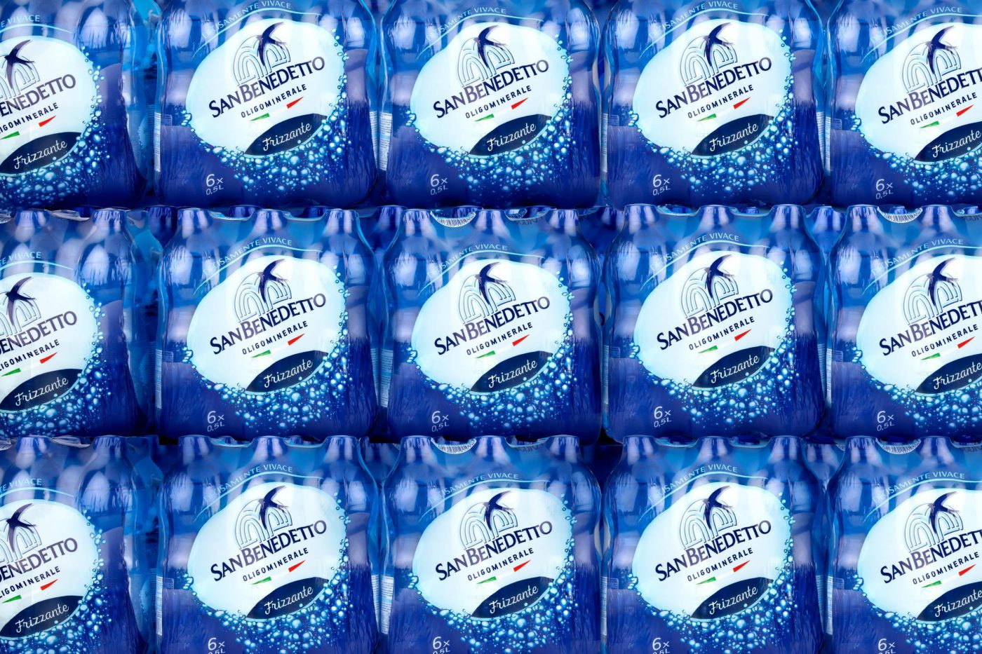
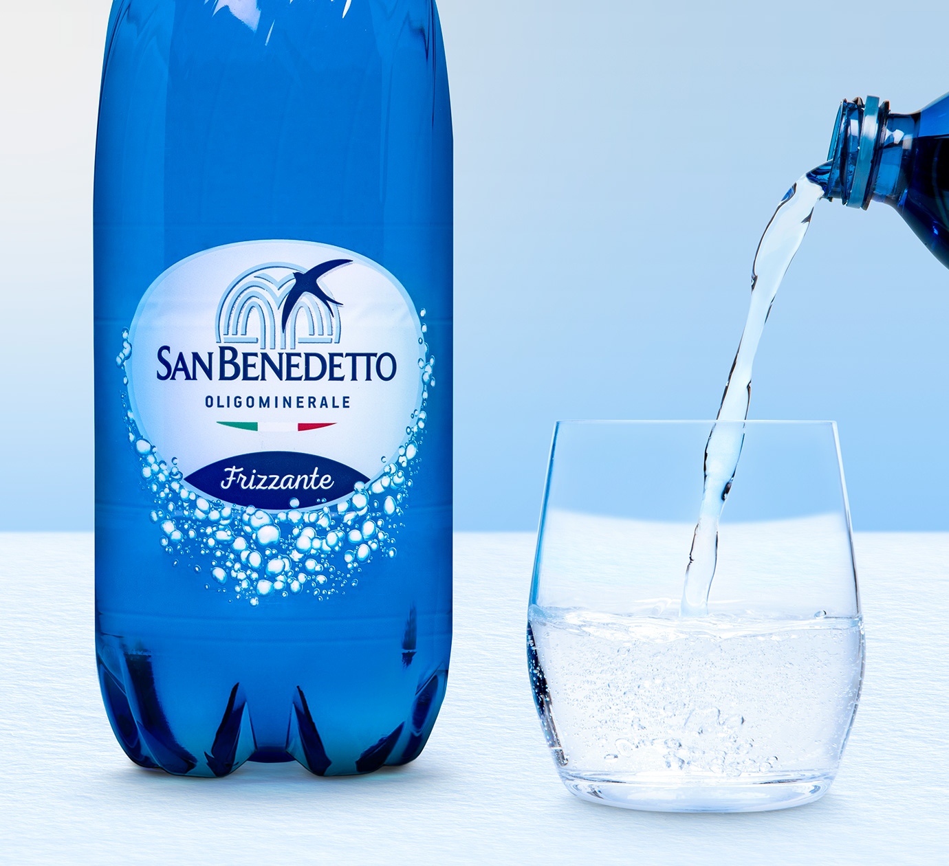
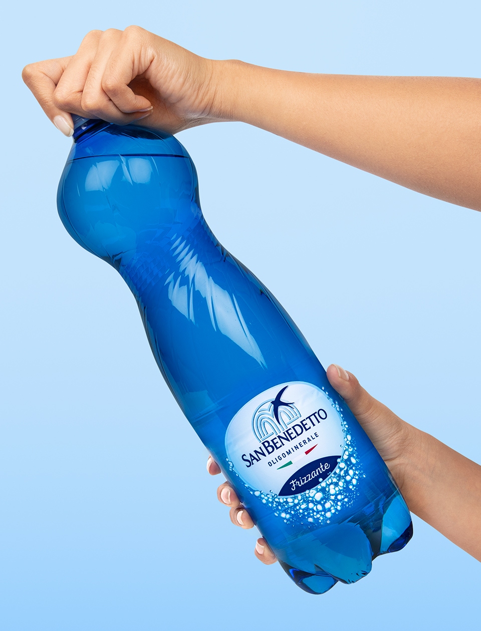
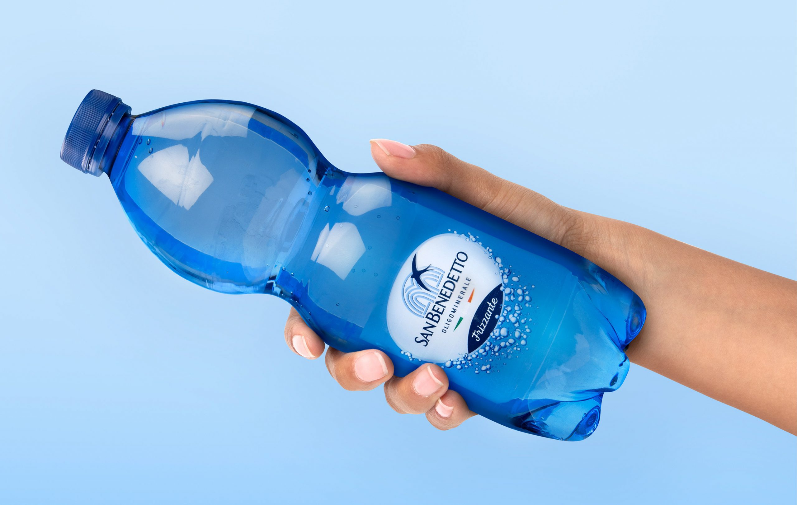
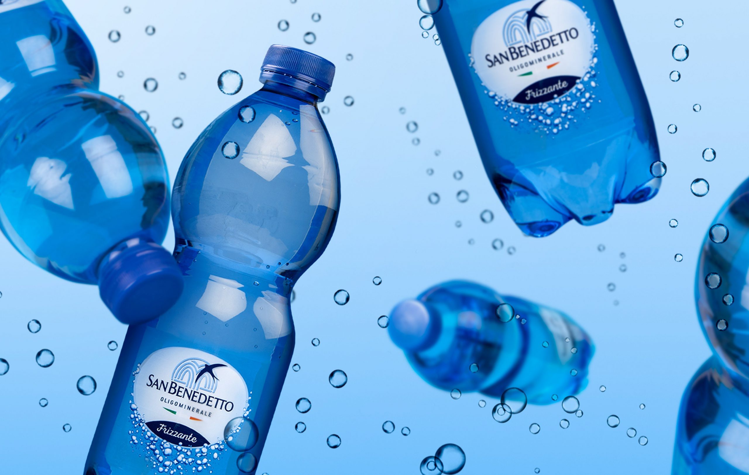
The new label makes a better use of transparency to convey a greater sense of lightness, making the large bubble which contains the branding and product information float atop a column of smaller bubbles which seem to move. The colour of the bottle has been darkened to enhance the brightness of the bubbles, and to increase the visibility of the logo, which seems to emerge from deep, fresh waters.
The project proved to be refreshing from all points of view, managing to gain an iconic and very recognisable strength.
Acqua Minerale San Benedetto is the first ever Italian Total Beverage Company. Over its 60 years of history, it has become a national market leader for water and iced tea. The original spring in Scorzè is now part of a network of Italian springs. Since the 1980s the company has been one of the most committed companies in terms of reducing the environmental impact of production.

