Spreafico is one of the major Italian players in the fruit and vegetable sector, among the few capable of overseeing and managing the entire supply chain, from cultivation to distribution. However, in a category where 41% of consumers cannot name even one brand, the challenge for Spreafico is to be noticed and remembered.
To respond to this challenge, we had only one way: to immerse ourselves in the world of Spreafico. The dawn spent at the fruit and vegetable market in Milan taught us that in the main B2B touchpoint, brand visibility is minimal, while mystery interviews with consumers at the supermarket shelf led us to the main need in the category: the necessity to be reassured about the quality and taste of the products, and to be guided in the choice of fruit.
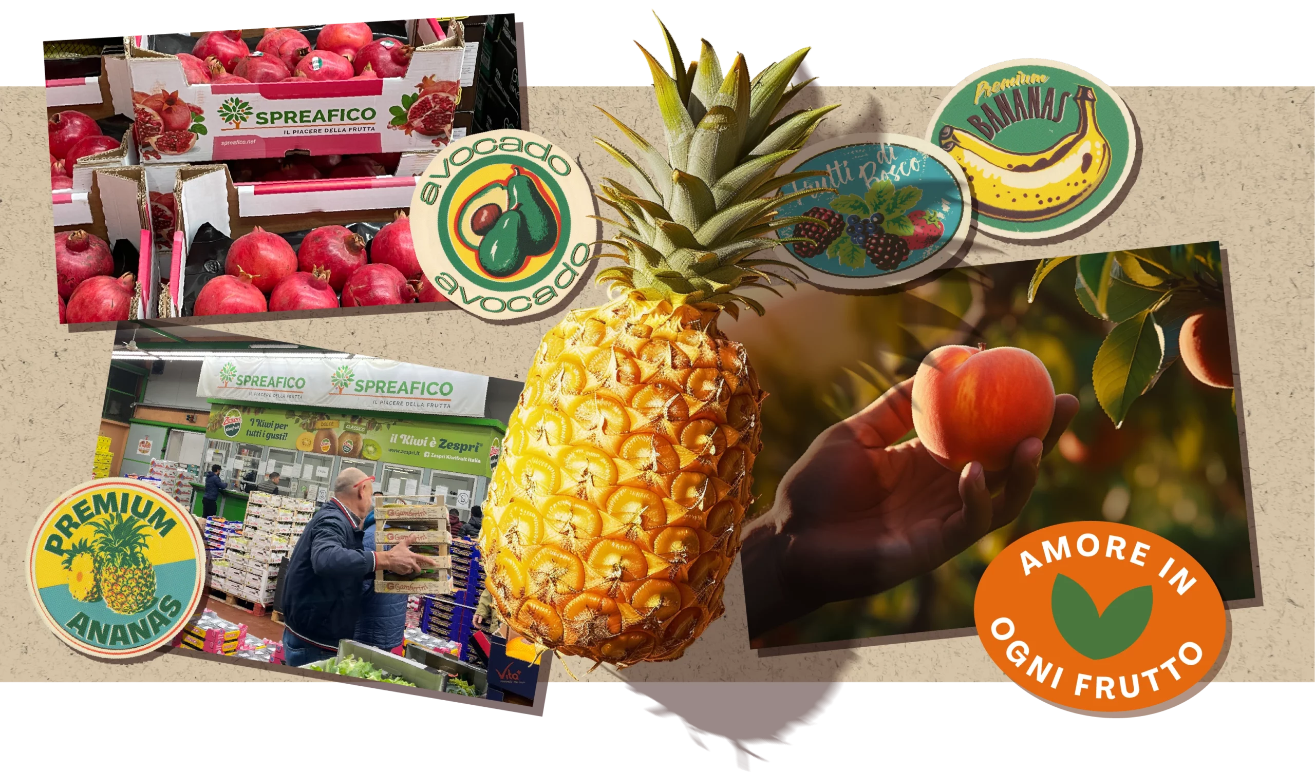
These insights, combined with Spreafico’s proprietary assets, were the starting point for defining the new positioning, which was founded on three key elements: the ability to govern the entire supply chain, the drive for innovation and experimentation, and above all, the dedication to guaranteeing the highest quality of fruit, seen as a gesture of love towards people.
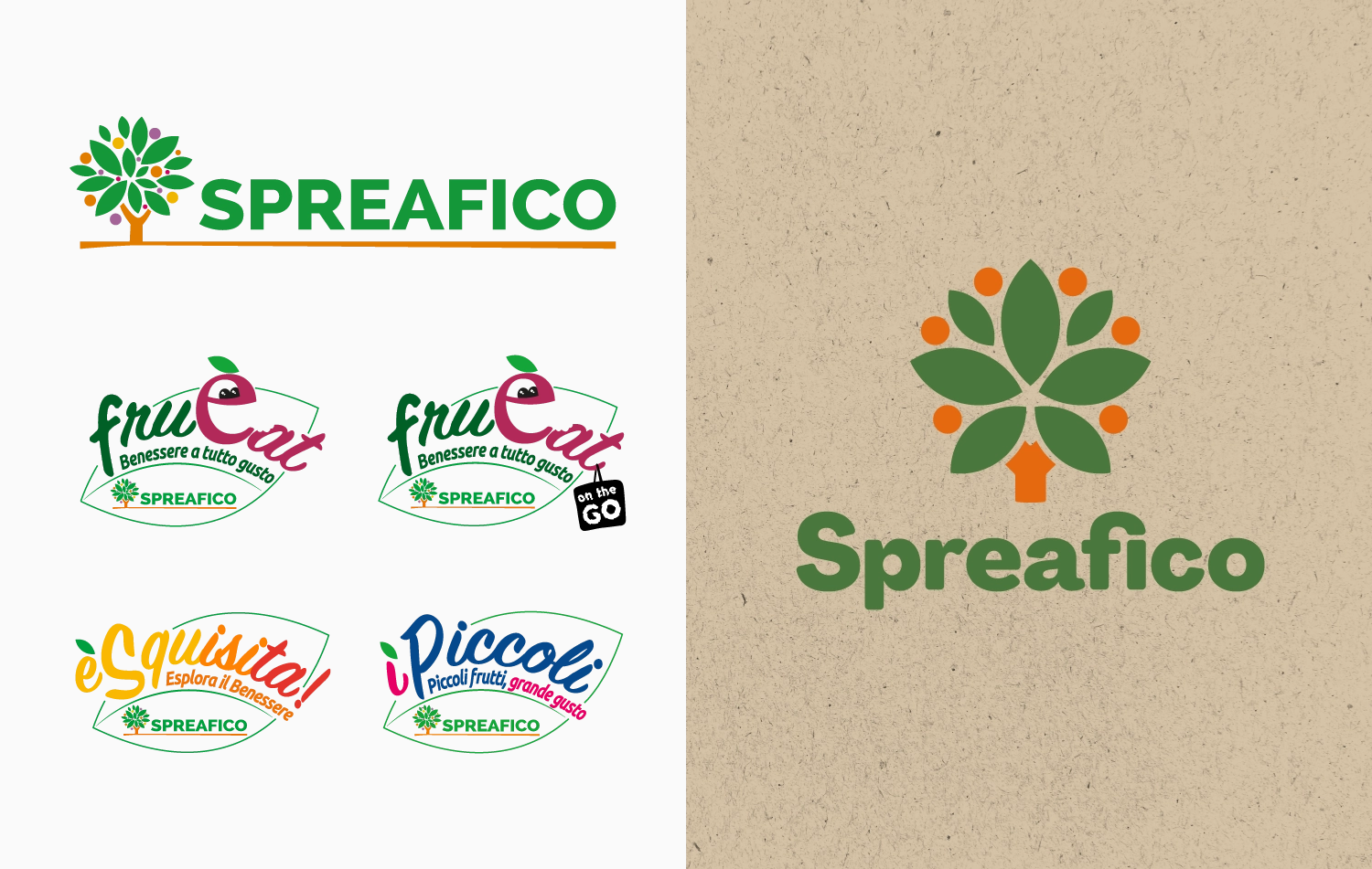
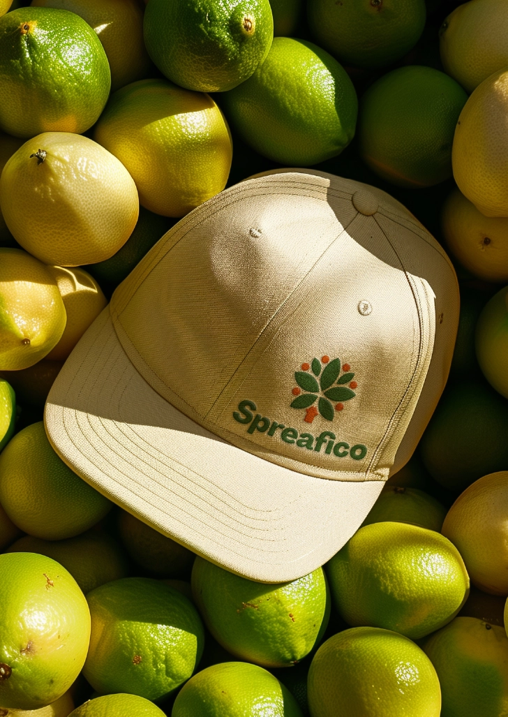
Thanks to the definition of the new positioning, we renewed the brand, simplifying the compositional elements of the icon, making it more iconic and easier to use on digital media and in contexts where the brand struggles to express itself. We designed the new logotype through a unique custom typeface with the intention of conveying more warmth and closeness, abandoning the rigid structure of the past, and finally, we simplified the brand architecture, amplifying the brand’s presence on all touchpoints.
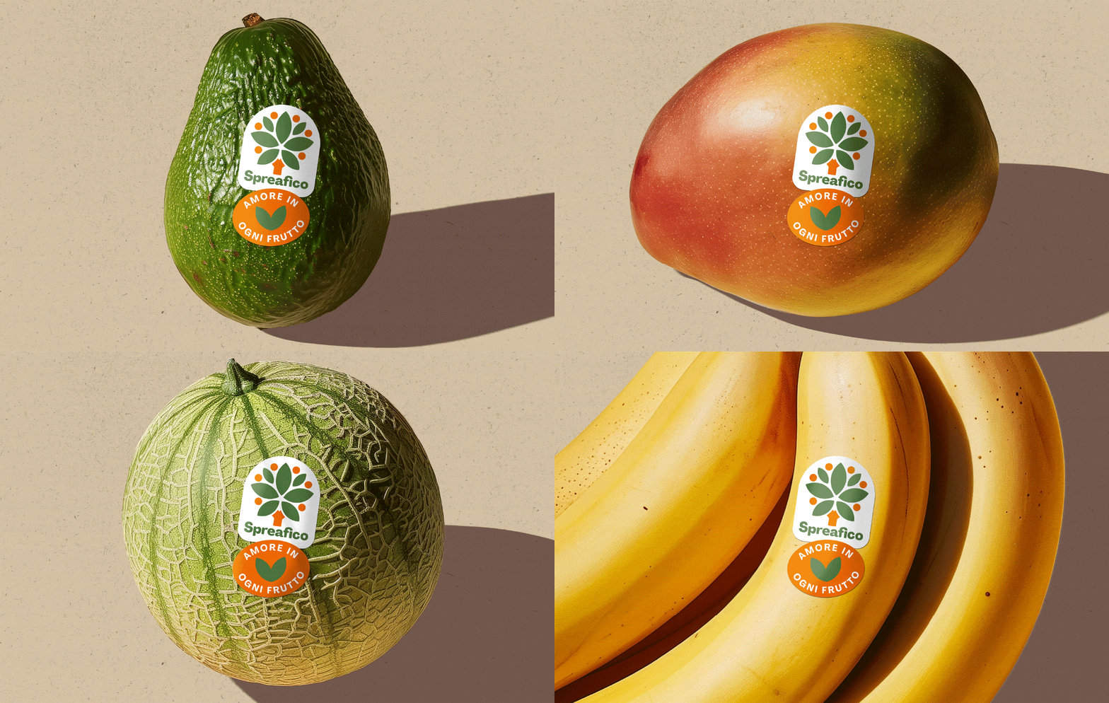
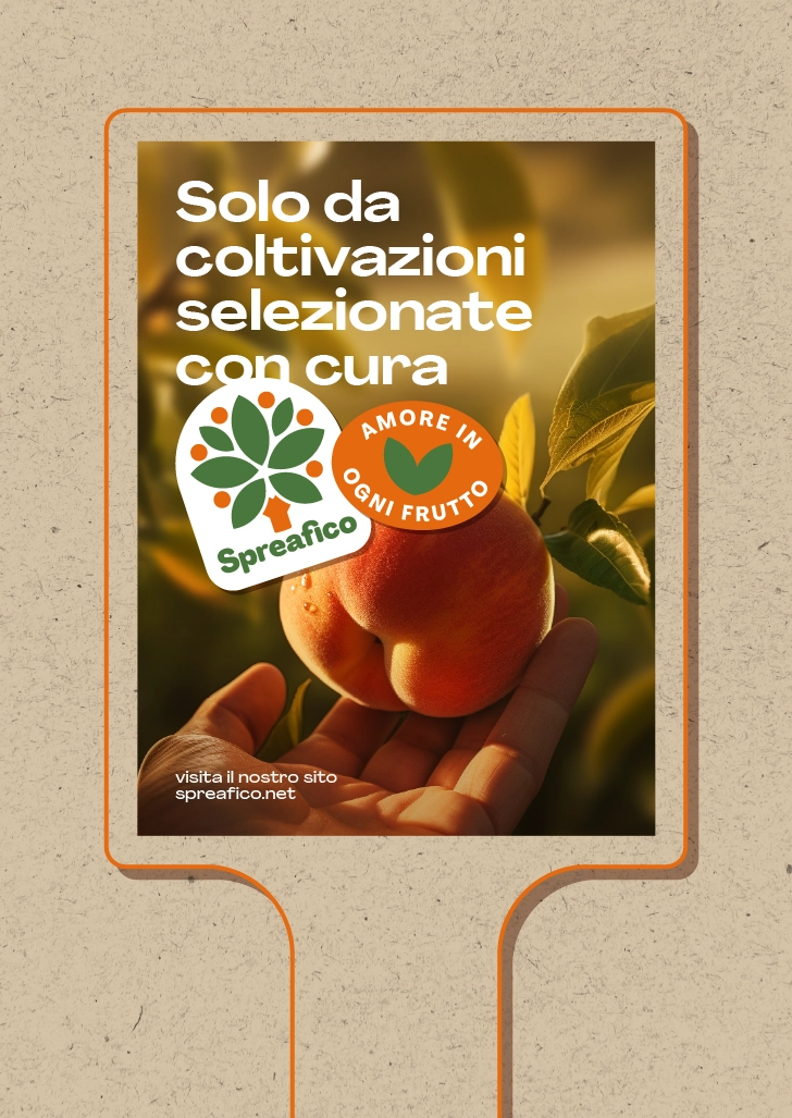
The new tagline “Amore in ogni frutto” embodies the dedication to the land and the careful selection aimed at obtaining the best possible fruit, thus encapsulating Spreafico’s love for its products and consumers. A passion that is a guarantee of the fruit’s quality itself.
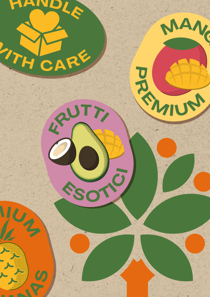
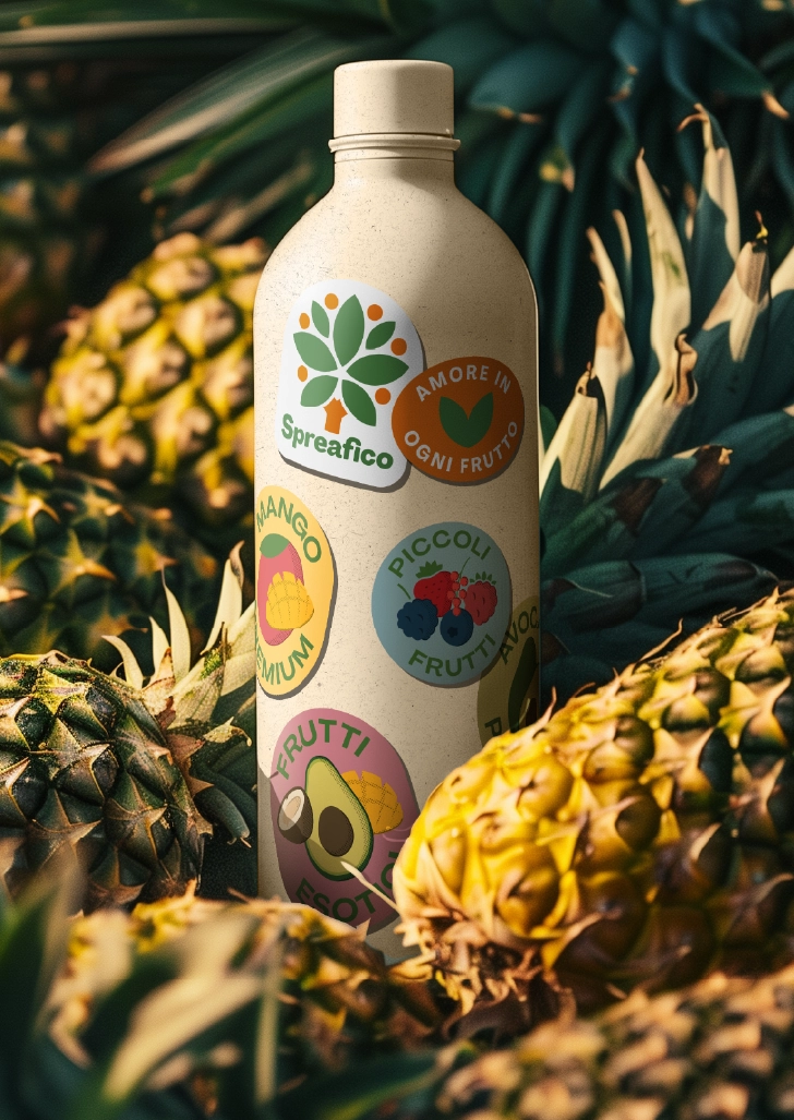
The new identity is fundamentally based on the concept of “guarantee.” Spreafico conveys its commitment to supply chain control through the metaphor of the “certificate,” taking ownership of the element par excellence of its industry’s identity – the stamp – and using it as an asset to convey brand messages.
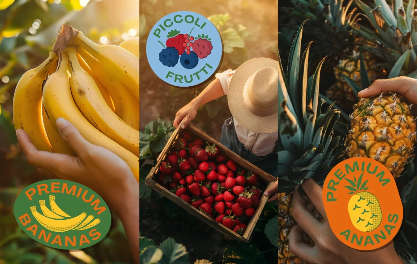
This visual metaphor is used to tell the story of Spreafico’s offering across different product categories. From exotic fruits to berries, covering single pillars like pineapple or bananas, to new products in the category increasingly demanded like avocado or mango.
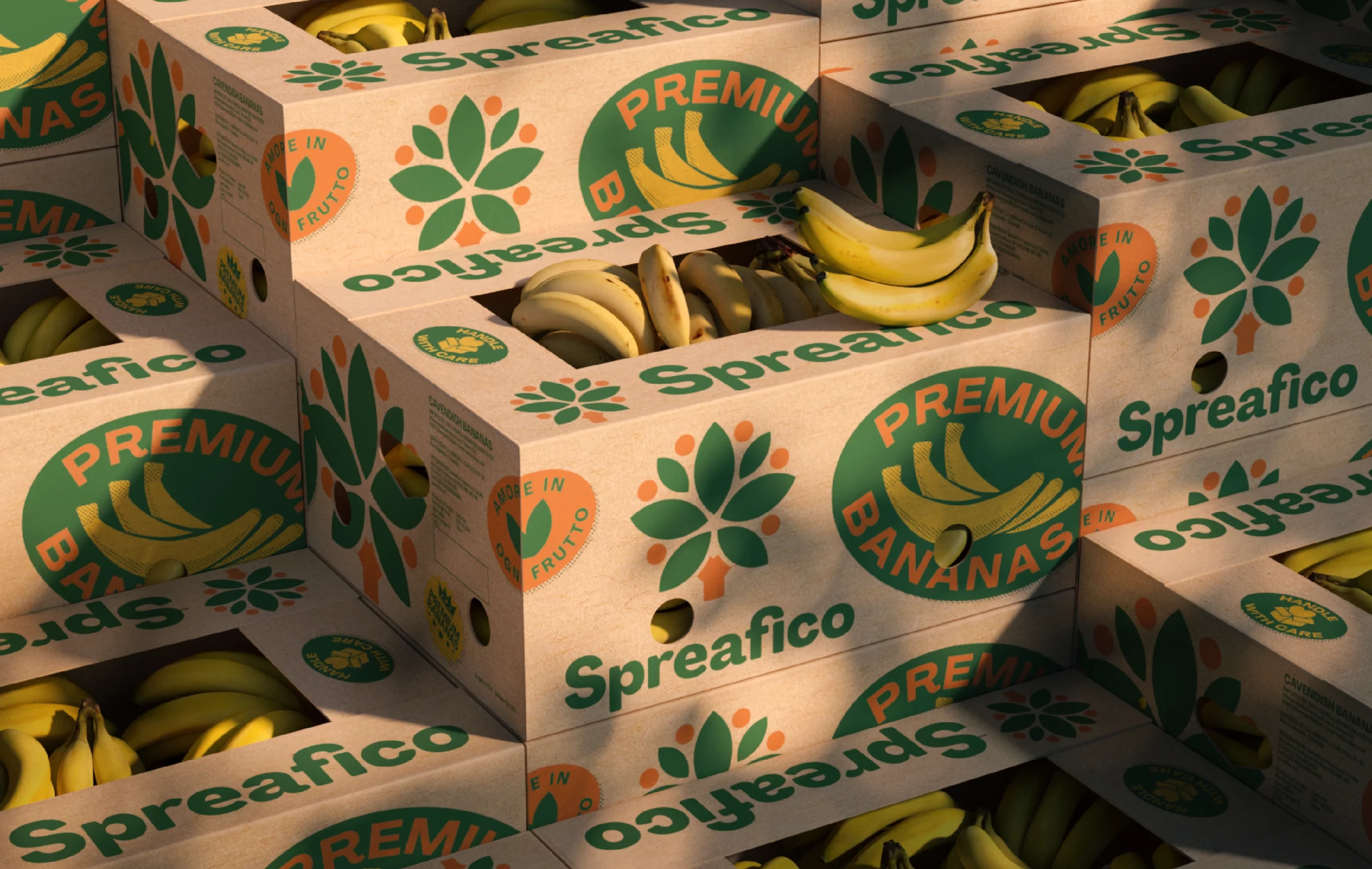
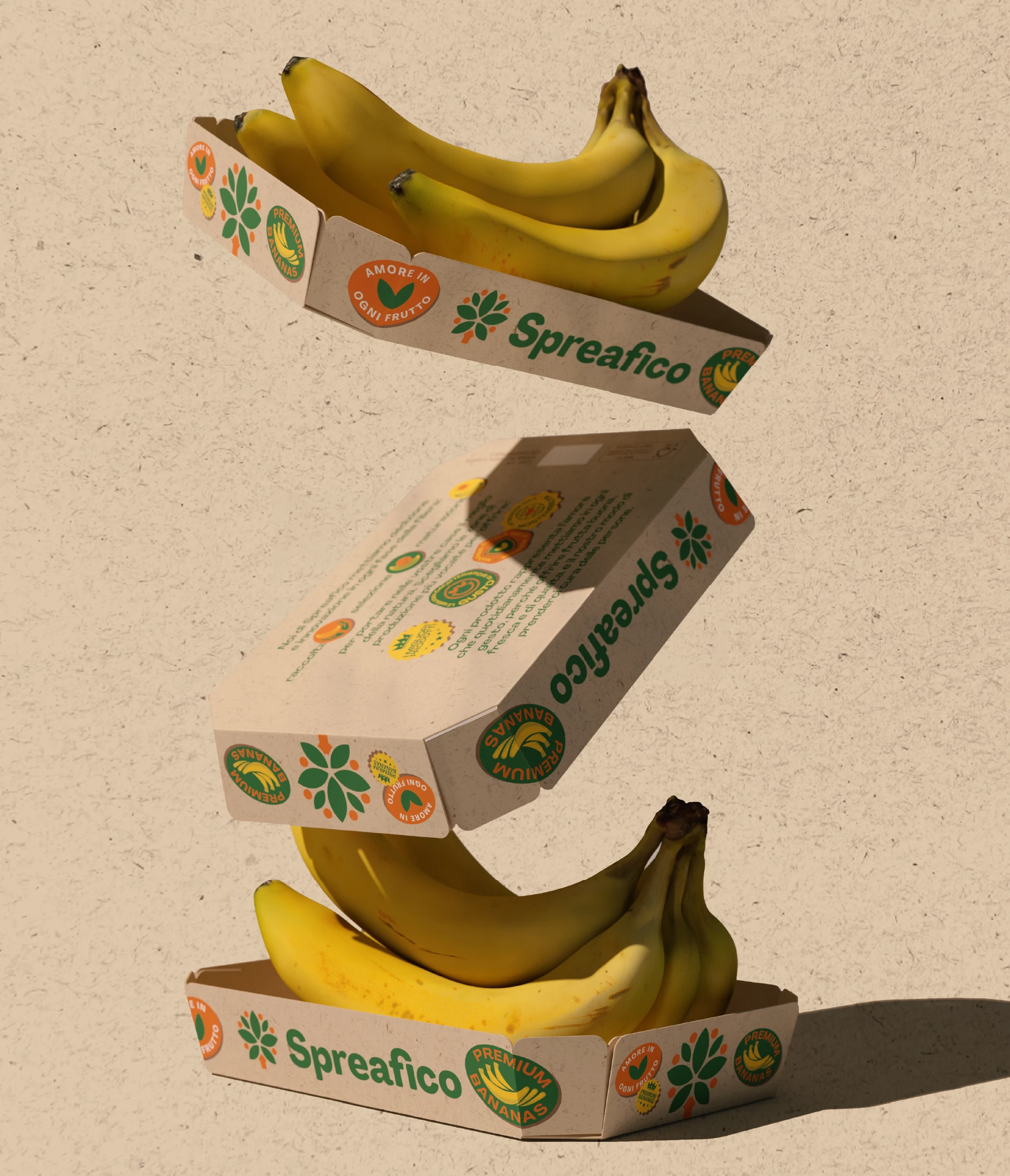
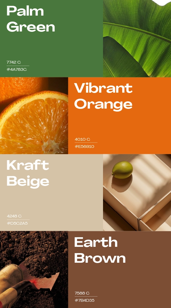
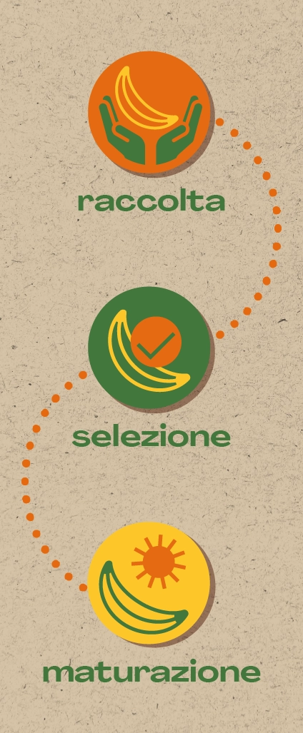
The language is fresh and contemporary thanks to the use of an ecosystem of stamps with different colors and icons, but also warm and natural thanks to the texture inspired by fruit transport crates, allowing the brand to face new categories of consumers in search of brands that can communicate reliability, control, and quality, in a new and engaging way.


Spreafico is a major Italian player in the fruit and vegetable sector that has been producing and distributing more than 300,000 tons of fruit every year for over 65 years, with production sites in Italy and abroad.

