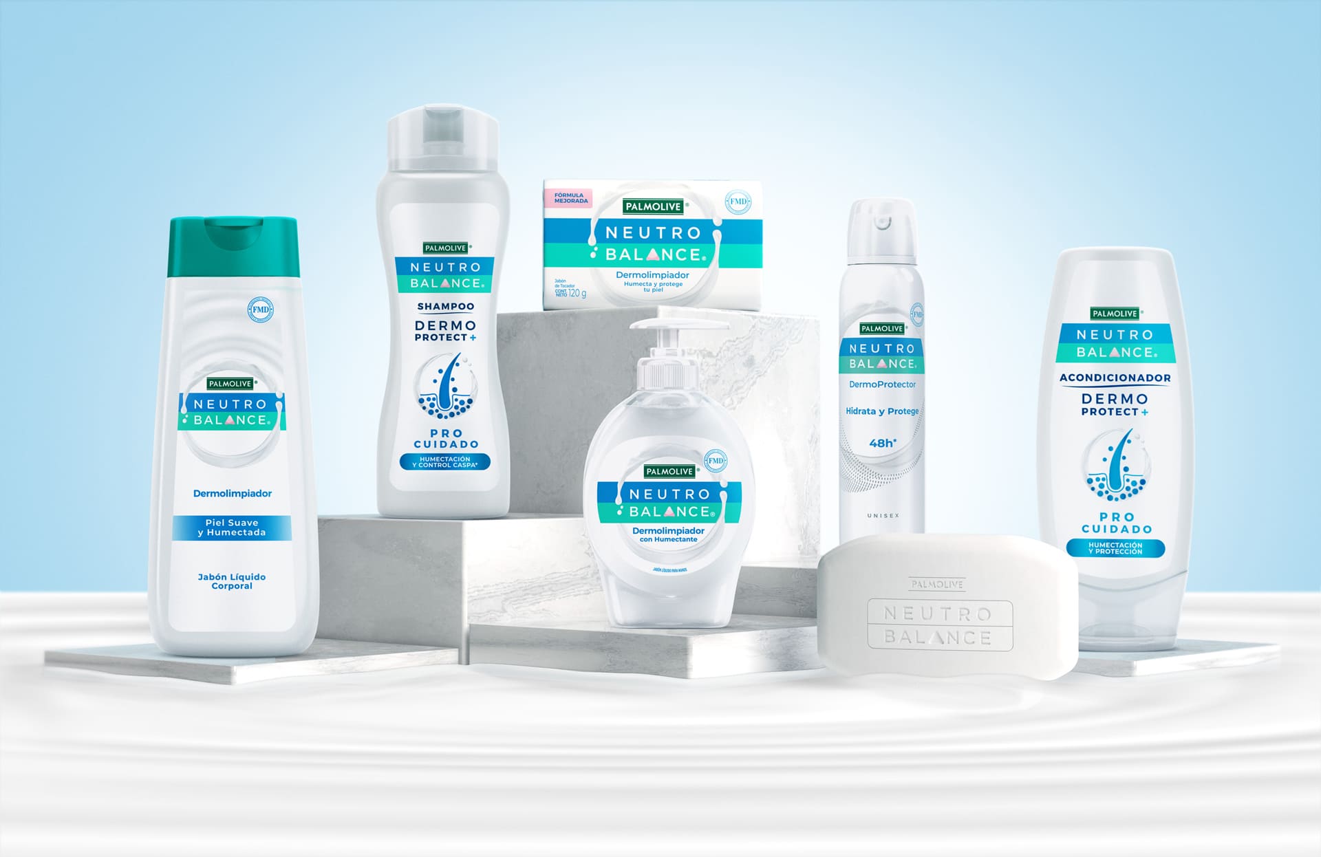
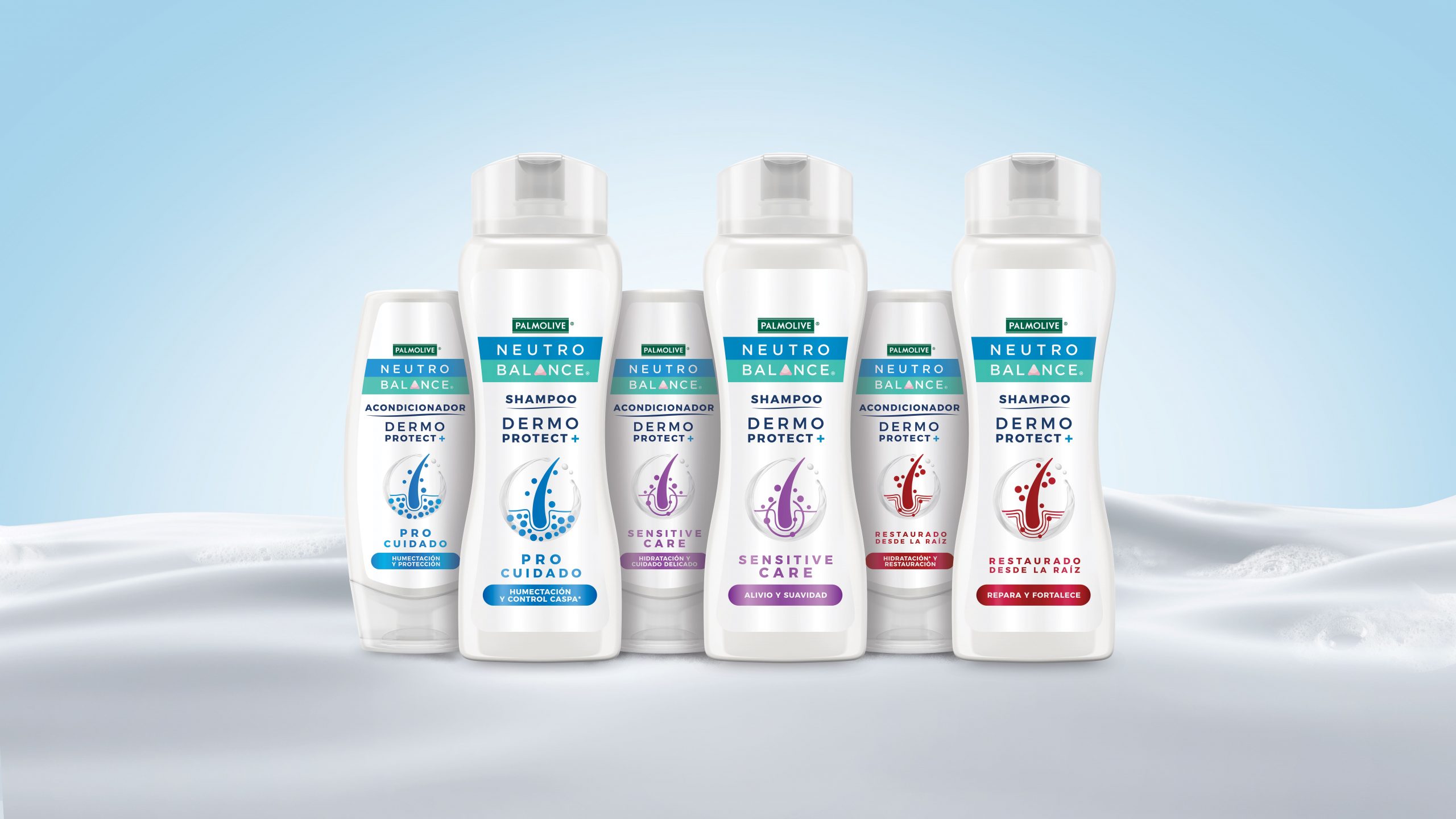
Neutro Balance is an established personal care brand known for its gentle, effective products, part of the Colgate Mexico portfolio. However, its visual identity had become outdated, struggling to stand out in the growing market competition. The existing packaging, while functional, lacked emotional appeal and did not effectively communicate the brand’s core values. Moreover, Neutro Balance’s diverse product range, including liquid soaps, bar soaps, deodorants, and hair care products, lacked a cohesive visual identity system that could highlight individual product attributes while maintaining a strong, unified brand presence.
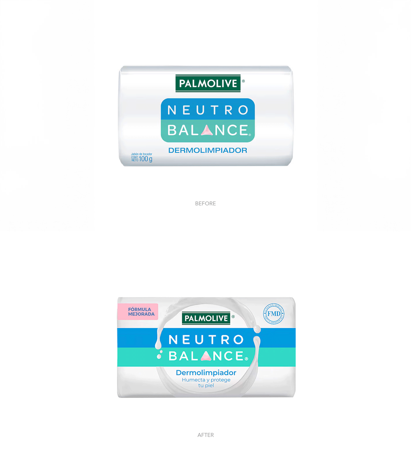


The aim of the Neutro Balance revitalization was to establish a more modern, premium and unique identity, expanding the concept of skin balance across the entire product portfolio. The new approach sought to clearly communicate the benefits of the products, one of the main ones being the moisturizing attribute, while unifying the brand’s visual identity across its diverse range of offerings through a flexible design system.
Our team then developed an innovative concept centered on the “Circle of Balance” – a powerful visual element that encapsulates the essence of the brand and serves as the cornerstone of its renewed identity. This circular element is divided into two parts: the upper part remains constant across all products, serving as a unifying brand identifier, while the lower part is dynamic and adaptable, reflecting the specific attributes of each product.
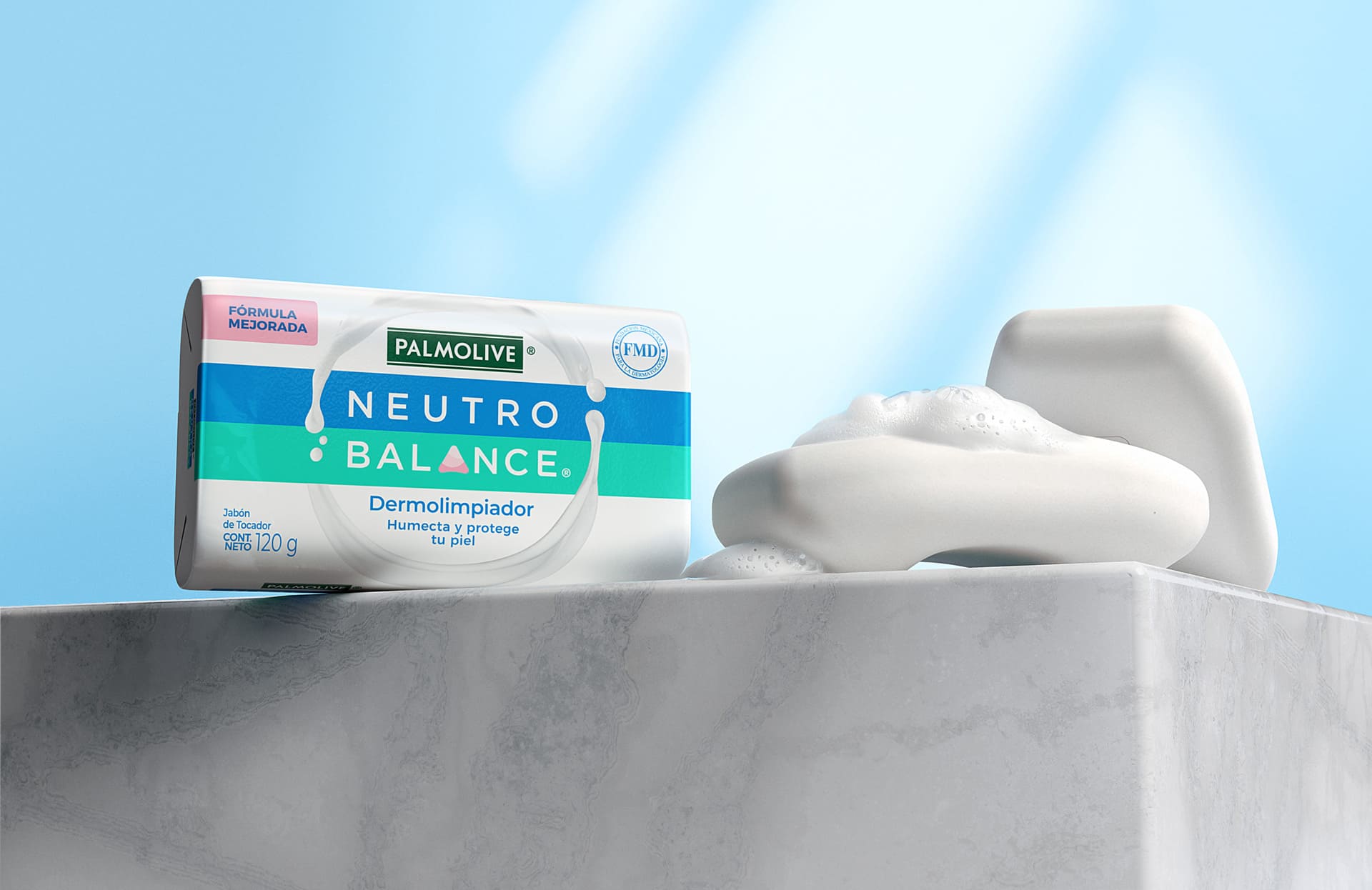
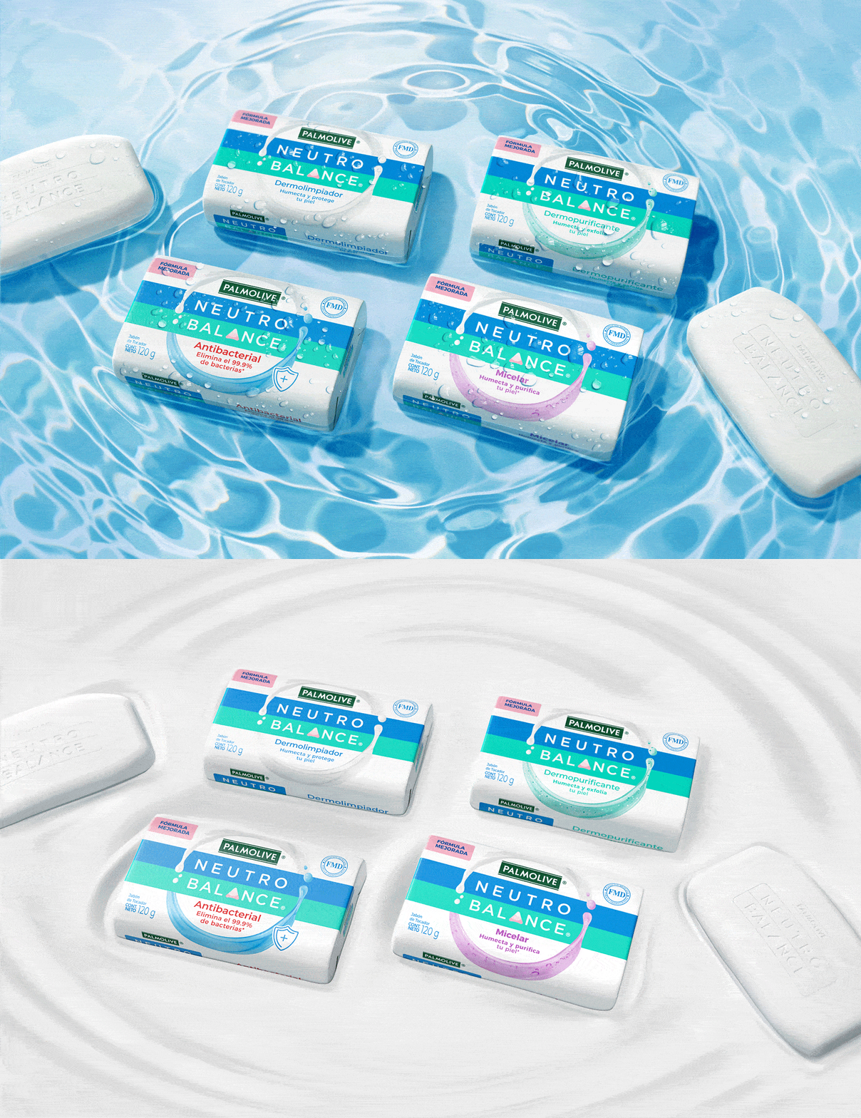
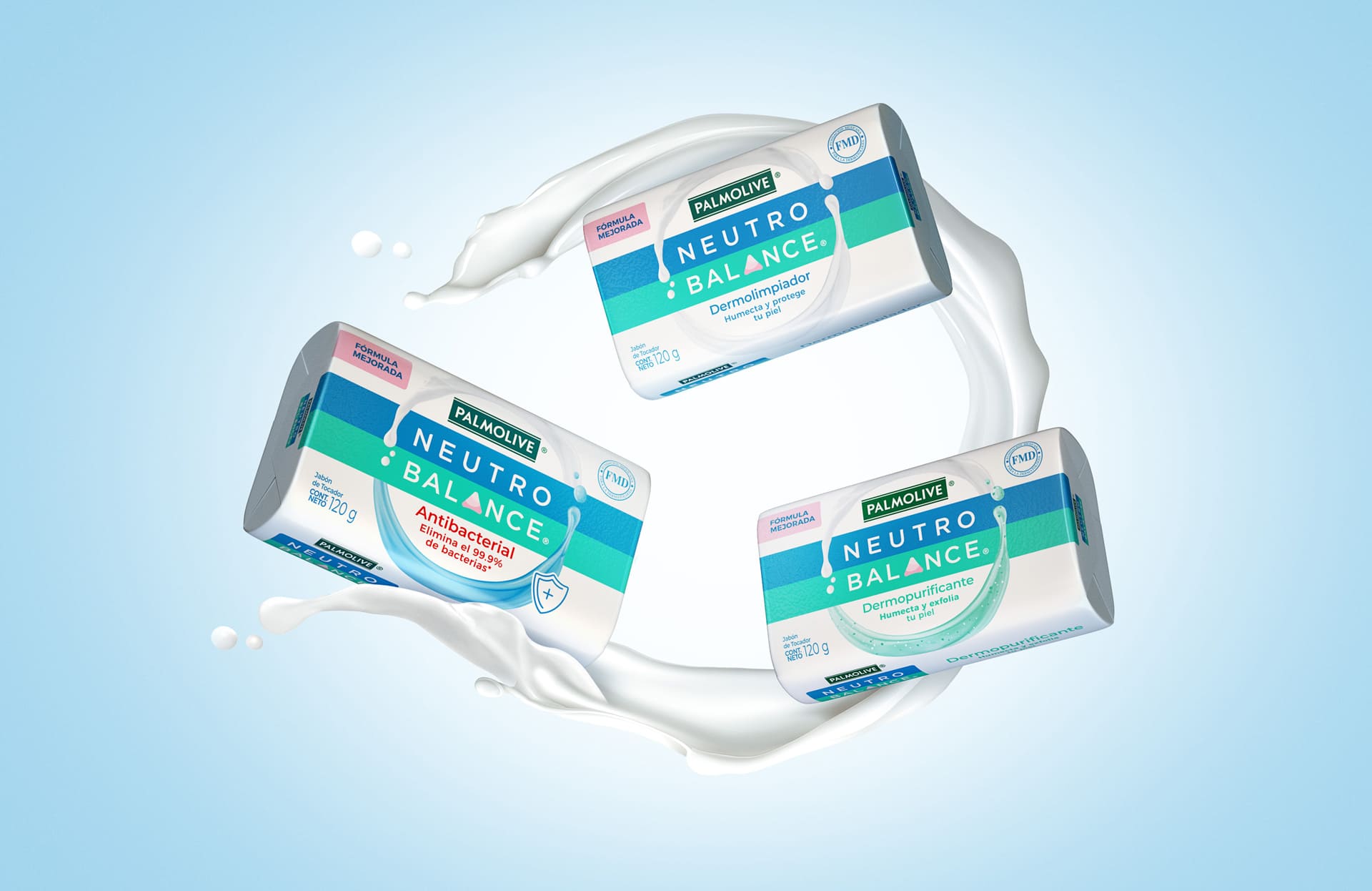
The implementation of this new design concept involved a comprehensive refinement of every packaging aspect. The Neutro Balance logo was repositioned within the Circle of Balance, establishing instant brand recognition. Typography was updated to a more modern and sophisticated style, enhancing readability and adding elegance. The color palette was expanded with soft, soothing hues, evoking a sense of purity and gentle care. Each product variant received a unique color combination, facilitating easy identification and reinforcing specific benefits.
Texture became a key design element, with visual representations of liquid and foam incorporated into the lower portion of the Circle of Balance. These textures vary by product type – such as fluid for liquid soaps and cream for bar soaps – creating an immediate sensory connection. The information hierarchy was restructured to enhance clarity and facilitate quick decision-making, with the Circle of Balance as the primary focal point, followed by clearly presented product names and key benefits.
