Malher is a traditional Guatemalan culinary brand, loved by its consumers. However, the company realized that, although the brand held a highly positive perception, the brand identity could evolve by enhancing its properties and creating a new story and brand expression.
Our team was honored to rework a genuinely Guatemalan brand and accepted the challenge of rethinking Malher in a broader branding and design perspective.
Colors, aroma, rhythm
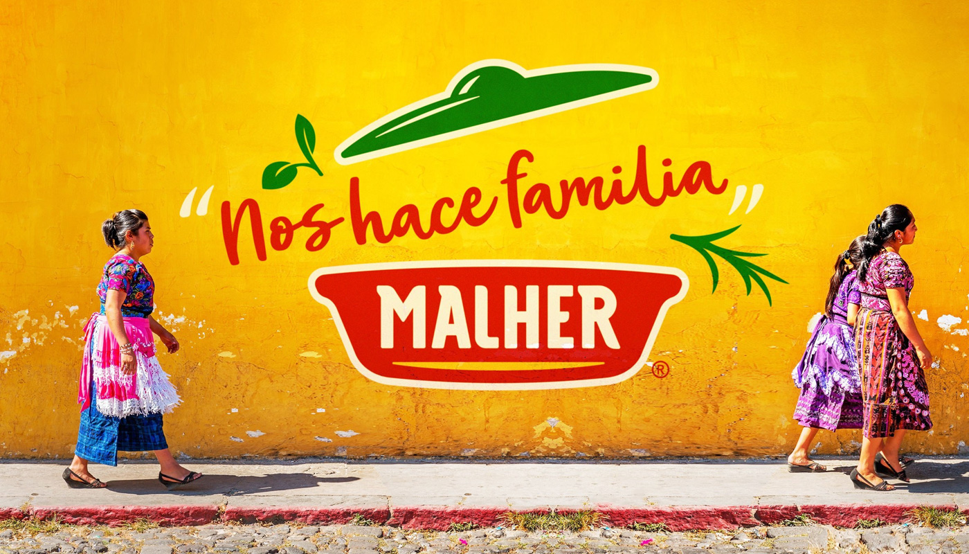
First, we tried to understand the Guatemalan market. To that end, professionals from our team went to the country to interview important stakeholders – CEO, marketing team and members of the advertising agency – as well as to visit stores, local markets and fairs, in a deep immersion to understand the Guatemalan culture nuances.
Armed with these insights and guided by the brand purpose – that defines Malher as a complete and modern culinary brand, addressing all publics – a brand that embraces the flavors of life – we have suggested the creation of an extremely structured design system to rework the brand identity, covering all touchpoints and strengthening the portfolio strategy.
The next step was to develop the Brand Senses, a methodology that explores the brand’s five senses and helps to set the principles that will guide the development of its identity: the multiplicity of colors, the family touch, the kitchen warmth – a living place full of aromas.
A living and open brand
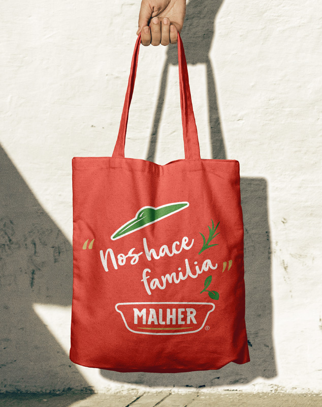
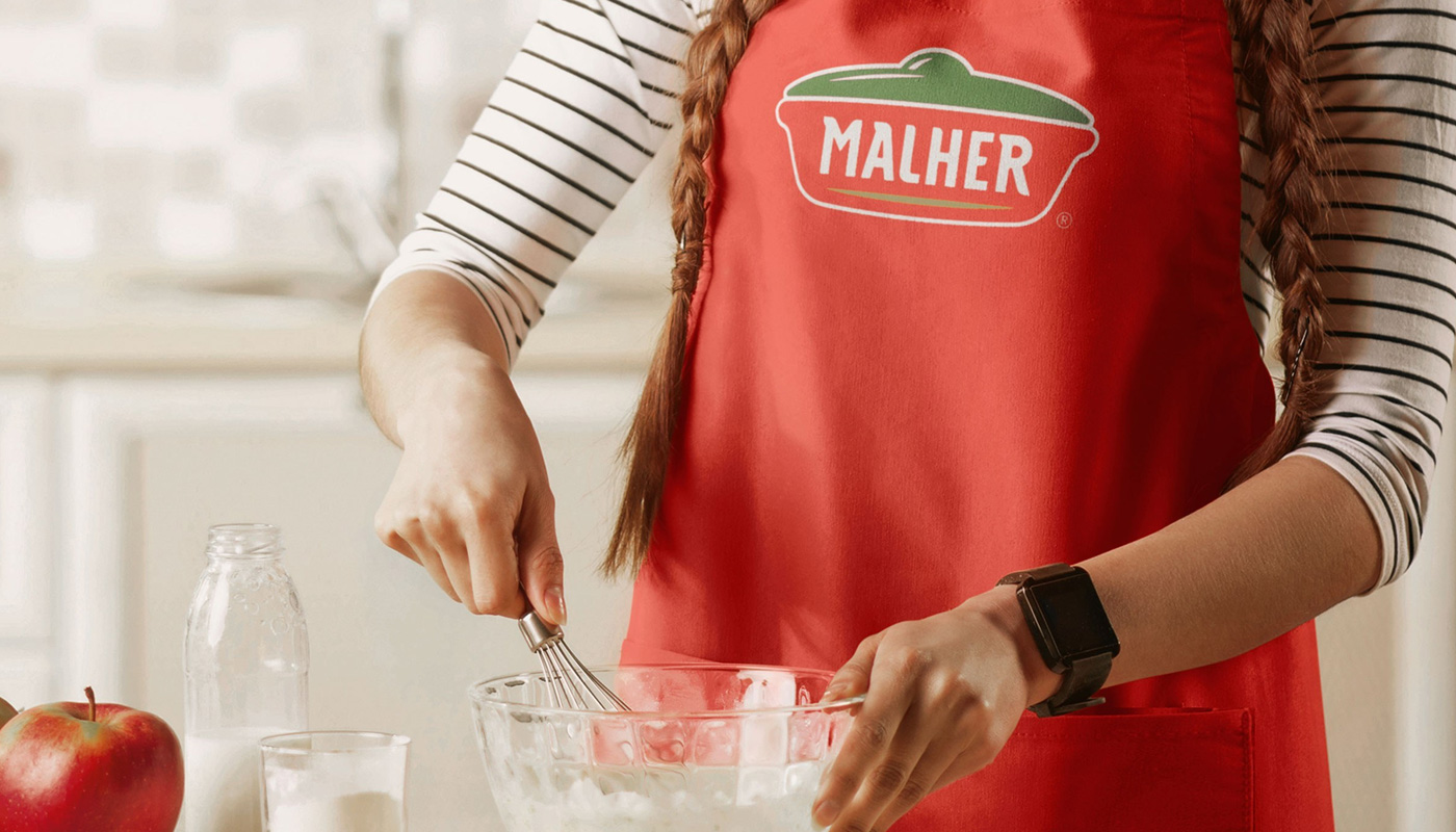
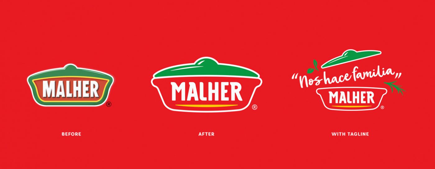
The new brand identity kept the brand’s iconic elements, but evolved its main asset: the traditional Guatemalan cooking pot. The element was modernized without loss of recognition and, most importantly, was redesigned as a living part, where the culinary magic happens. The cooking pot has also inspired the other graphic elements, that enhance the round shapes of the bowls, clay pots and the Guatemalan ‘comal’, a flat griddle used to cook the typical tortillas, whose preparation follow a particular rhythm.
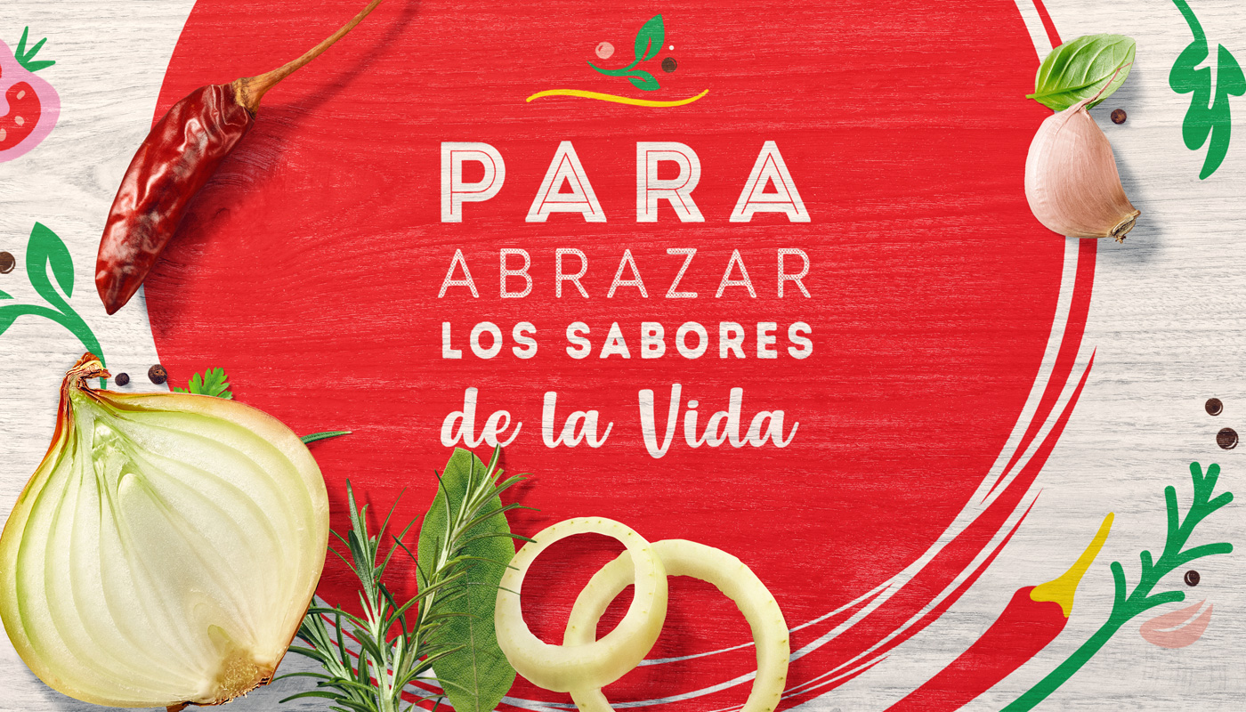
The color palette and typography were adjusted and the photographic style was rethought to convey a more natural and fresh look. We have developed a graphic system for the packaging using simple and easily identified codes, which helped to reorganize the brand’s portfolio of products and which provide effective identification on points of sale – a feature that is very much appreciated by the owners of the traditional ‘tiendas’, the popular small neighborhood markets of the country.
Based on the new look & feel, we have created the usage and application guide (brand book) to direct the implementation of the new visual identity on the packaging and all brand communication.
