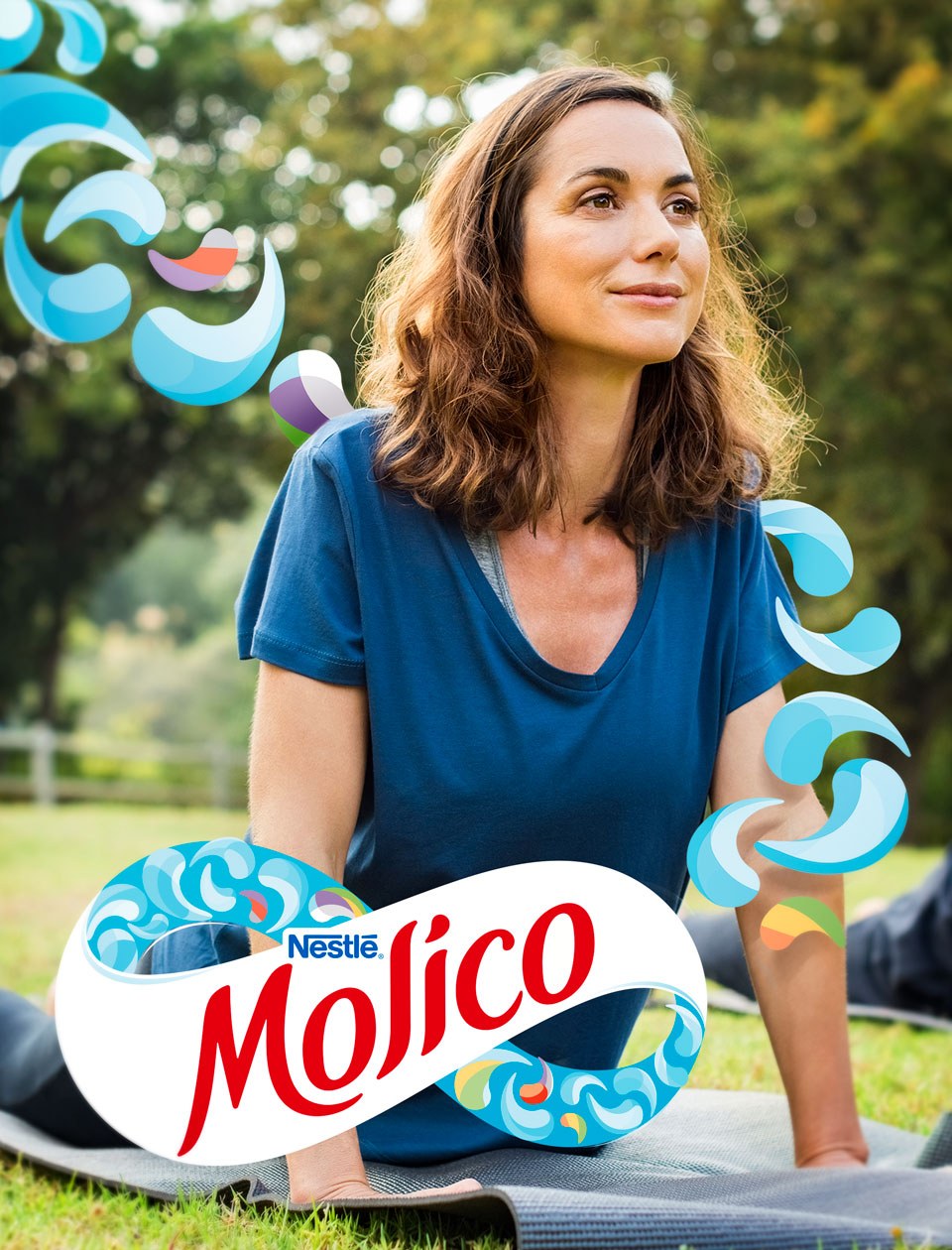
‘Feeling good about yourself’ is a topic that has always been present in Molico’s DNA. However, nowadays well-being is gaining new forms, different from what it used to be. Currently it is about being well physically, emotionally, and spiritually, without being hard on yourself, with no sacrifice or privations.
In tune with the needs and evolution of its public, Molico has recently modernized its positioning, linking it to the concept of daily nutrient restoring, an idea that goes beyond specialized nutrition.

Developing essential nutrients
Based on Molico’s new positioning, that had been developed with the participation of CBA B+G’s team, we have joined Nestlé team again to translate the new concept into a visual identity.
Besides communicating the brand strategic repositioning – that encourages people to restore themselves physically and mentally every day – Molico has seen the change as an opportunity to attract new consumers, communicating the product’s function of developing essential nutrients that adults lose every day.
We have translated the restoring concept into different creative paths and have checked which was the most suitable. We have conducted a 3-day Squad survey with the brand consumers, and, through a co-creation work, we have decided on a winning concept. After that, using the Brand Senses methodology – which explores the brand five senses – we have established its properties and set off to redefine its visual identity.
Restoring movement
Inspired by life’s movement, Molico’s new identity represents our daily journey, with a beginning and an end, in a constant flow. A cycle that demands, at the end, a retreat to restore energy and recover one’s best form.
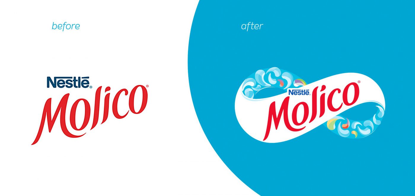
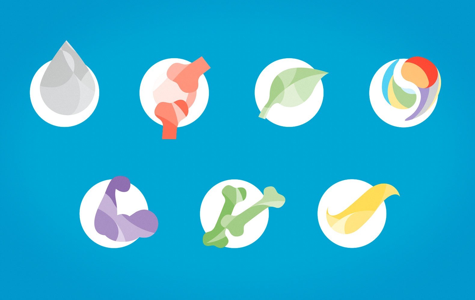
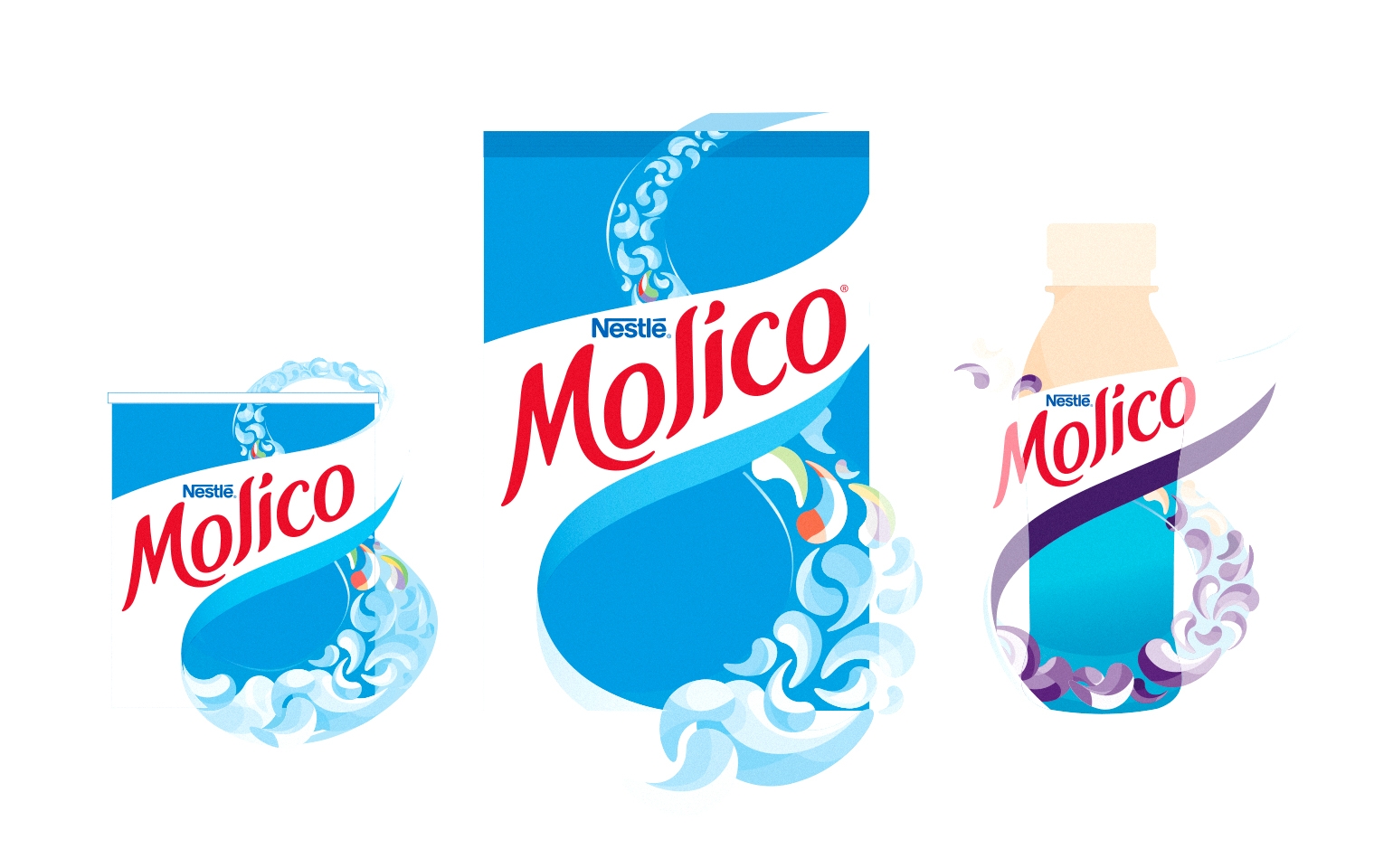
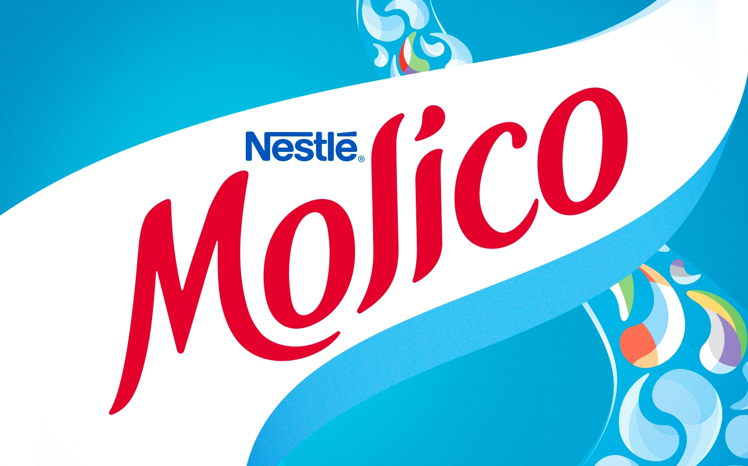
The infinity symbol present on the brand mark conveys this restoring movement, showing elements that represent the nutrients and vitamins that need to be replaced during the day. The lettering was updated, enhancing softness, flow, and movement. Visual elements were also included, evoking Fibonacci sequence, which inspired by the golden ratio, represent the nutrients that are replaced by the product.
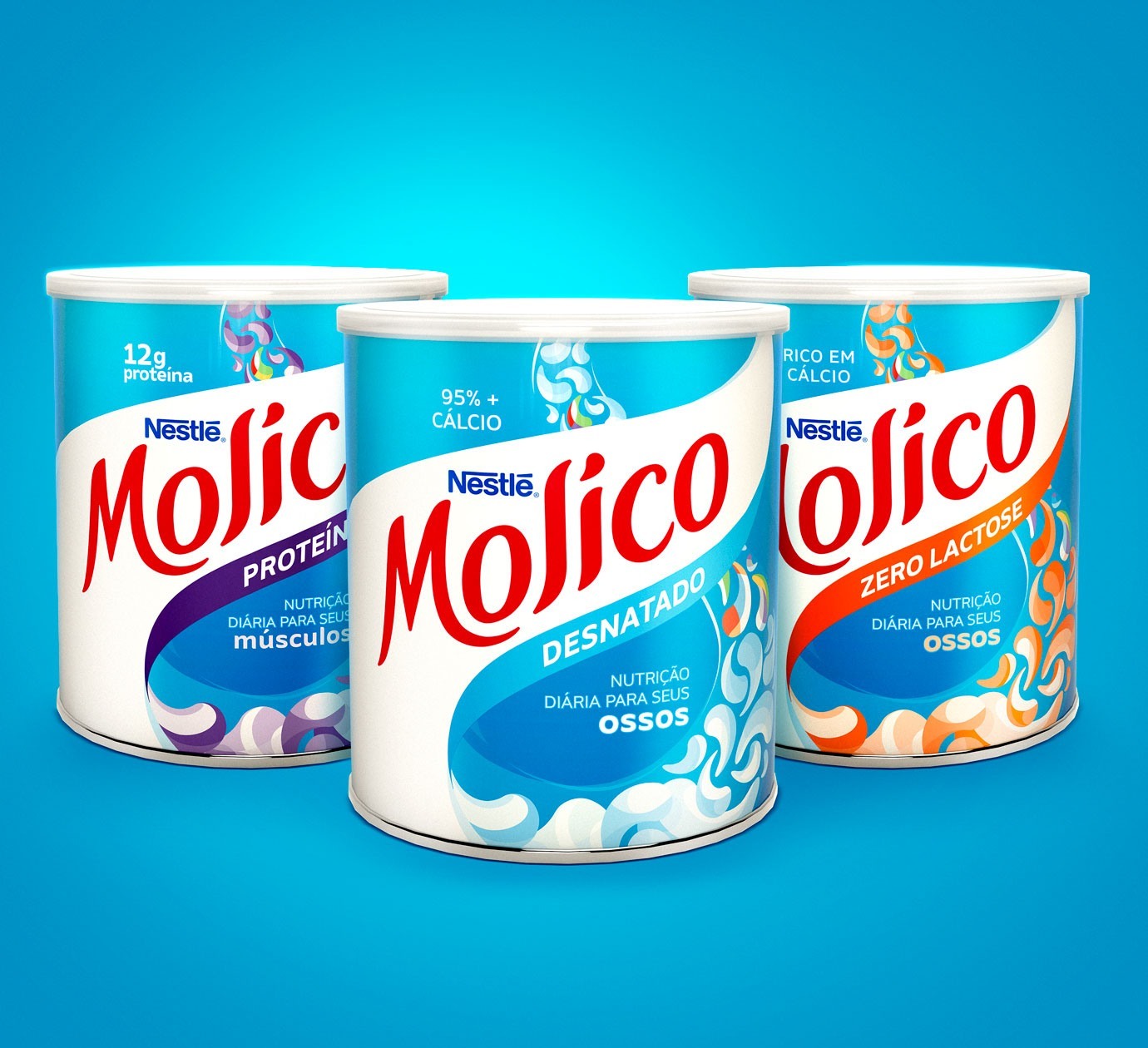
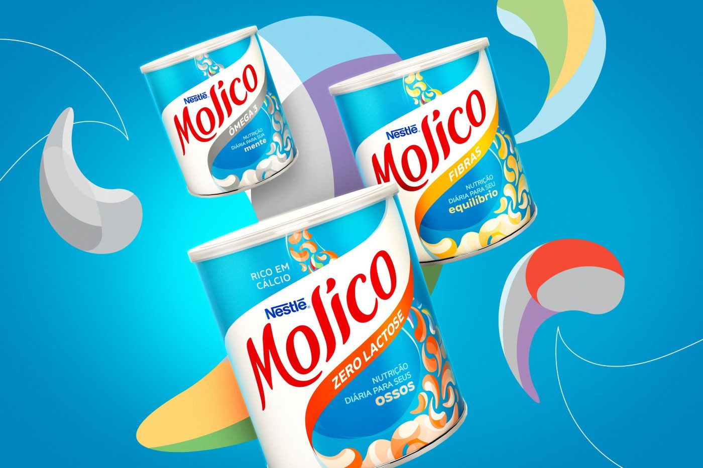
The new visual identity was applied to the whole line of packaging. Based on Molico’s new look & feel we have developed the brand guidelines, which drive all the applications for communication materials – on and offline – now lighter and more fluid than ever and tuned with the needs of the target audience.
