Nazca believes that beauty is a reflection of self-confidence – an attitude that allows women to unleash their full potential. Owner of an extensive line of products, Nazca felt the need to redefine its brand strategy completely.
To carry out its repositioning, client segmentation and new portfolio architecture, Nazca counted with the support of our dedicated team of strategists and designers – adding another partnership to a successful history of working together.
Operating territory
To build a new strategy, the first step was to investigate in depth what consumers want. Through interviews and market analysis, we were able to understand which needs are most relevant to them when it comes to beauty and, from this understanding, we mapped the brand’s macro-territories.
The mapping identified three high-potential territories for the construction of Nazca’s positioning. Inner trust was the territory chosen because, in addition to presenting high viability and relevance, it is also the one that better complies with the brand values.
Positioning of sub-brands
To create the positioning of Nazca sub-brands we set out on an in-depth journey, taking into account the needs of consumers, the assessment of competitors and the characteristics of each brand.
Nazca is viewed as a quality and trusted brand by its consumer audience and all its sub-brands anchor themselves in these attributes, creating a strong link with the parent brand and among each other.
The combination of the specific attributes and the parent brand credentials resulted in distinguished brand pulses for Origem, Sfera, Acqua Kids, and Now – a new brand that was born during the portfolio repositioning process.
Portfolio architecture and customer sgmentation
Once each sub-brand positioning was established, the next step was to rethink Nazca’s portfolio architecture based on its strategic pillars. To target the offers of the reorganized portfolio, we performed a customer segmentation process, considering both the business and brand perspective. Based on five variables assessed with 70 customers we were able to identify a new group of customers, leveraging resource allocation and efforts.
The result is a broad and complete branding project – developing a brand strategy where all lines have defined roles to build brand equity – and encompassing design – since the repositioning demanded the creation of new concepts and visual identity for the Origem brand.
Nazca Origem
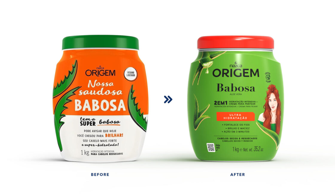
Your origin is your beauty. The brand essence and consumer research analysis led us to powerful insights about self-care, the value of simple and authentic messages, preference for natural ingredients, among others. Based on these findings, we developed the visual identity for Nazca’s highest-selling sub-brand, in order to reflect its new positioning.


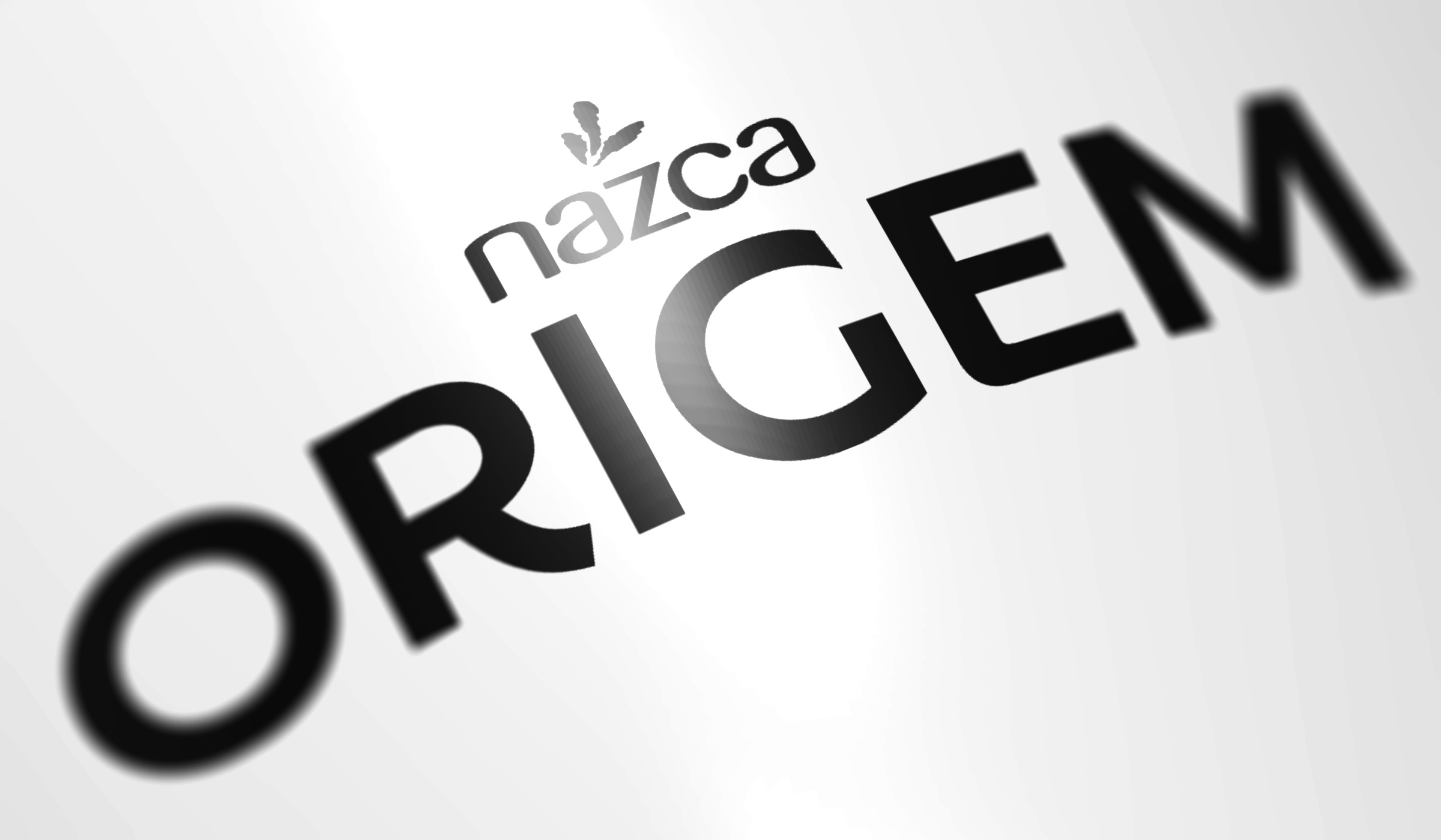
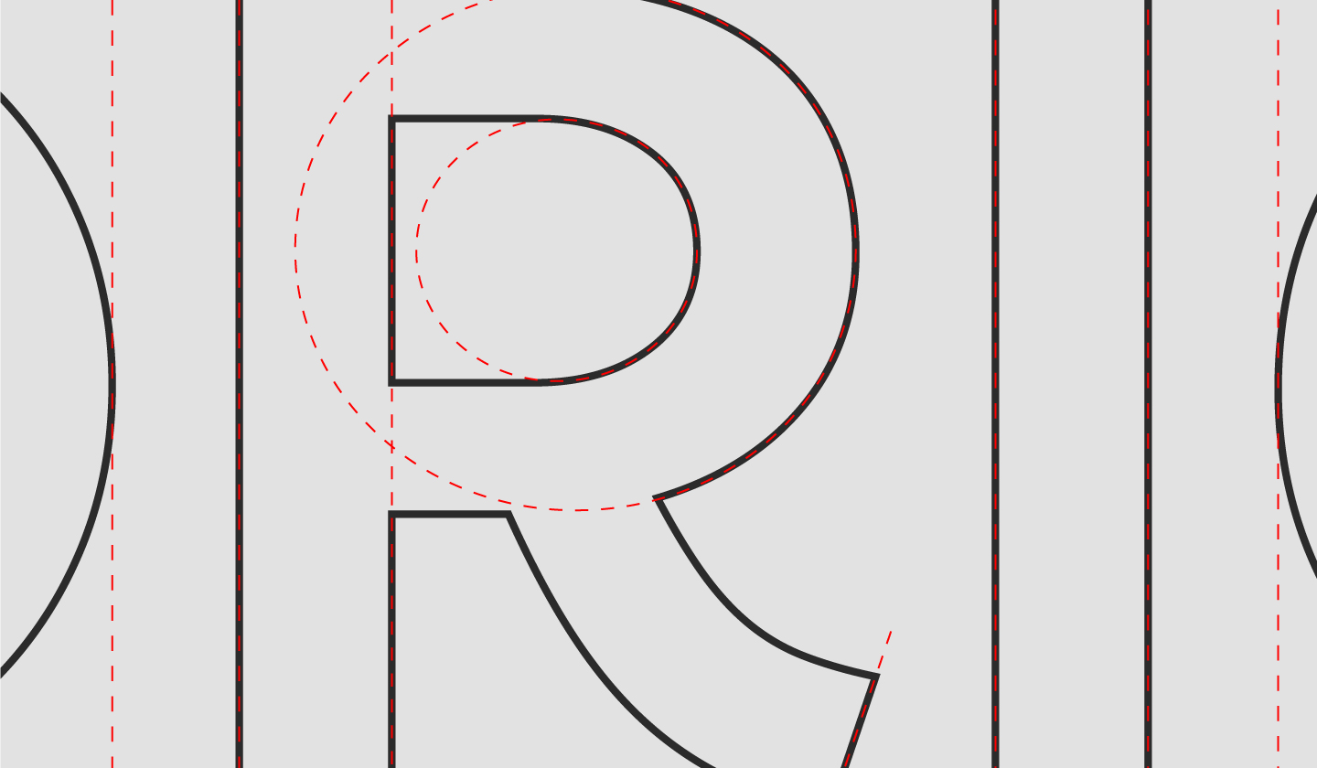
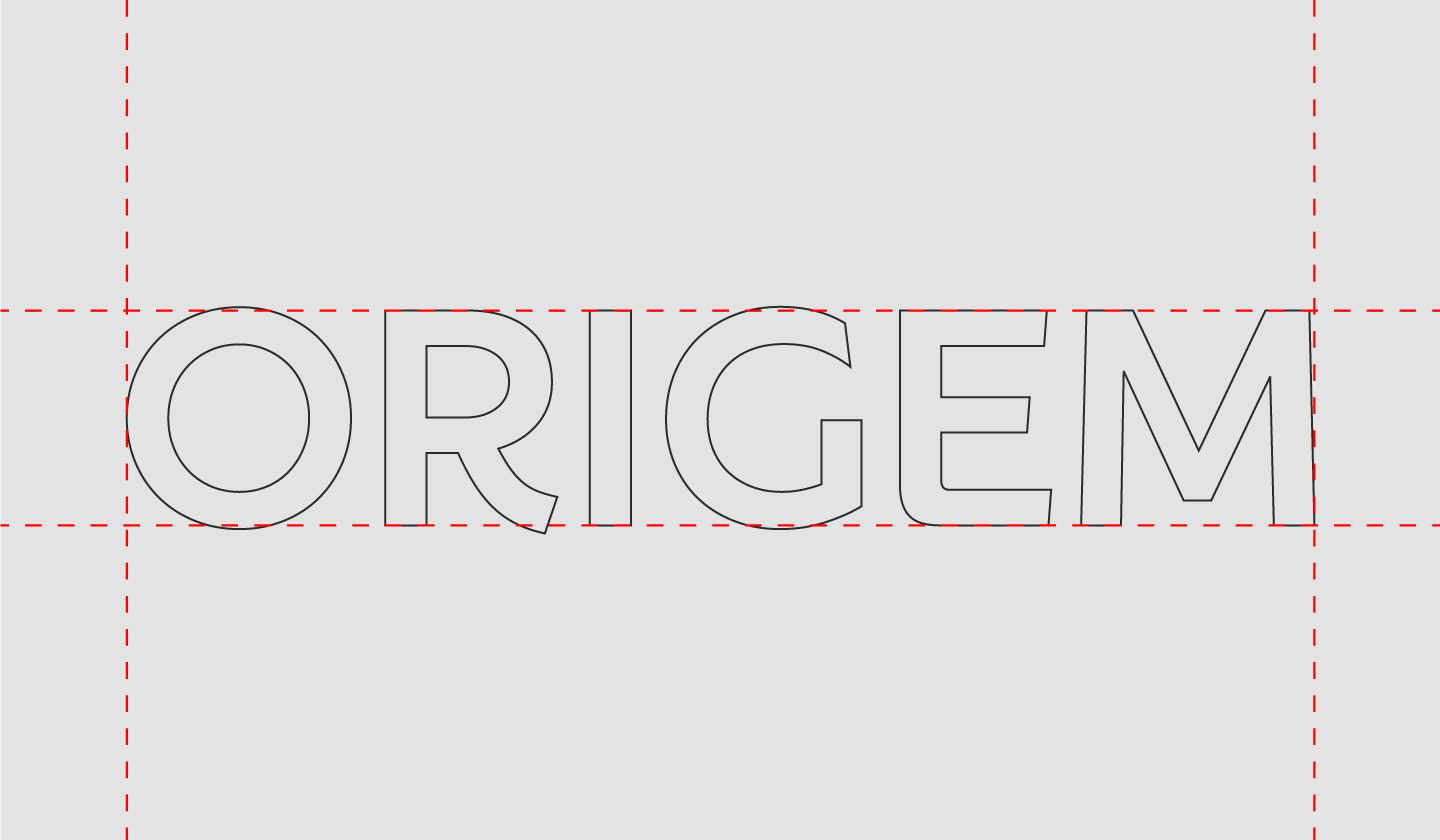
As the original logo was already well-known, we chose a formal evolution over a rupture, to follow the portfolio movement. The ‘cheer life’ packaging concept – with a mix of lively and intense colors, textures, and images – is an invitation to celebrate one’s own origin, praising joy and pride. We opted for clear hierarchies, focusing on information, as this is a crucial asset to help navigation on the shelf. Each sub-line highlights attributes of the products, such as the main ingredient, the technology or just fun names.
Almost 50 SKUs were created in various 400g or 1Kg packages of repair treatments, styling creams, gelatins, and capillary schedules.


