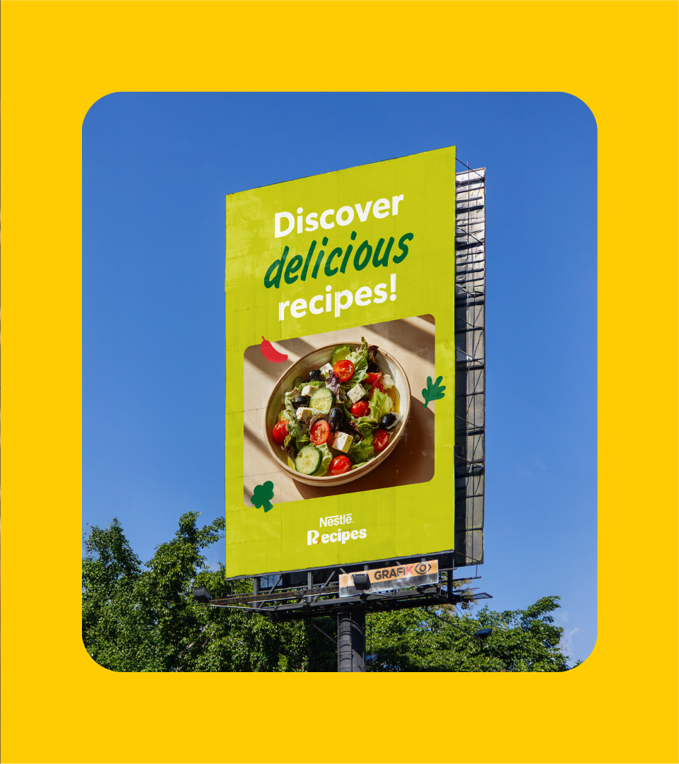
One platform, multiple countries, one single brand universe
Nestlé has taken an important step toward integrating its presence in Latin America with the unification of the Nestlé Recipes brand. The project involved migrating all local Latin American websites—from Mexico to Argentina, including the Caribbean, Brazil, and Central America—into a single omnichannel ecosystem that lives both online and offline, in 3 languages (Spanish, Portuguese, English). The renewed platform now lives as a cohesive space with its own visual identity and shared value proposition, designed to make life easier for those who cook daily, run culinary businesses, or operate in the food retail sector.
CBA B+G was responsible for developing the branding strategy and the brand’s new identity, in partnership with Publicis and Digitas, Nestlé’s digital communication agencies.
From a recipe website to an experience platform
More than just a visual redesign, the project marks the evolution of Nestlé Recipes into a service platform. The goal was to create a digital environment that not only offers recipes but also accompanies consumers in their everyday cooking routines. All content is curated by Nestlé itself, reinforcing its credentials as an authority in the field.
In addition to recipes, the platform provides sustainable tips, menu suggestions, and solves practical dilemmas such as “What should I cook today?”. The focus is on showcasing practical uses of Nestlé products in a useful and accessible way for diverse audiences: end consumers, food entrepreneurs, and retail partners, with a strategic presence at the point of sale.


An identity with a human touch and local flavor
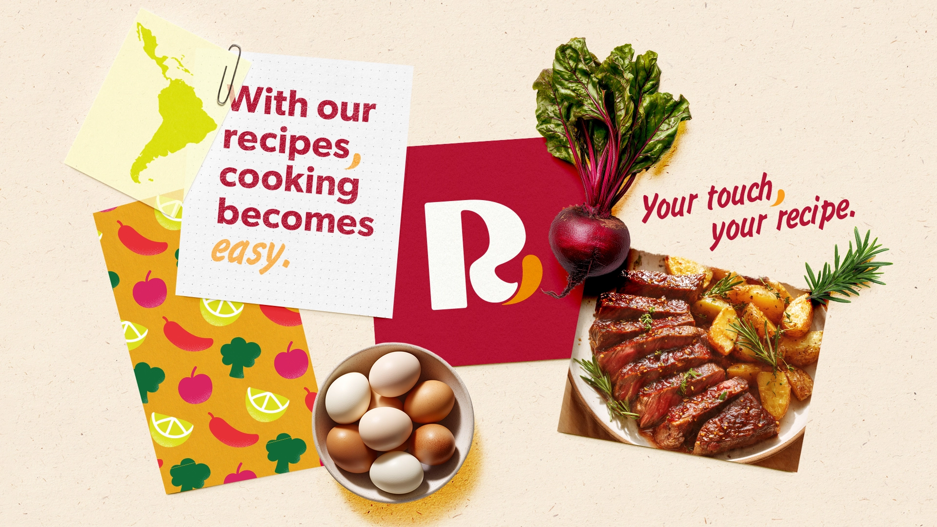
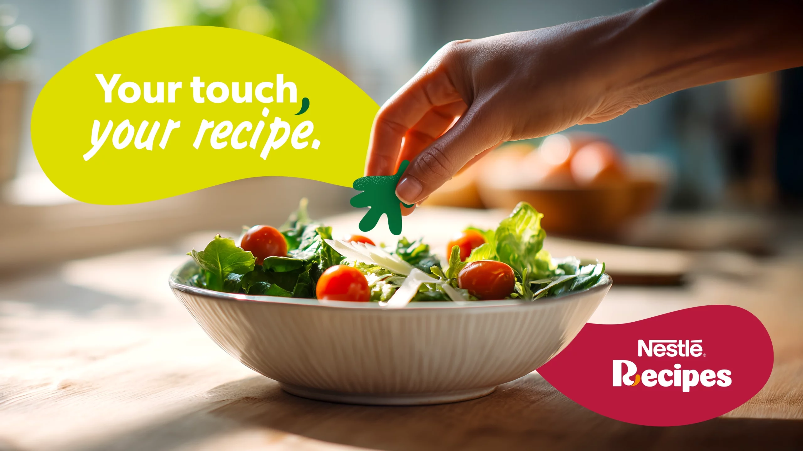
For the first time, Nestlé Recipes has been given its own visual identity, aligned with the parent brand but featuring unique traits. The central concept of the identity revolves around the idea of “touch”: the touch of flavor, the human touch, the gesture that transforms preparing a recipe into an emotional experience.
This concept guided the development of a complete brand book with visual, verbal, and accessibility guidelines. The cherry tone was approved as the brand’s main color after contrast and readability tests, also ensuring the necessary neutrality to connect with different audience profiles without feminizing the brand.
The identity was designed to be both applicable and adaptable to various contexts. This includes a co-branding system that allows the brand to operate alongside other Nestlé portfolio icons, such as Maggi, Leite Moça, La Lechera, and Carnation. Specific guidelines were also created for applying the identity to partner and client materials.


A sensory and accessible language for the entire region
The creation process was guided by in-depth research. We mapped the languages and visuals used on Nestlé recipe platforms across participating countries, analyzed competitors, conducted interviews with global and local stakeholders, and ran consumer approval tests.
The identity was designed to evoke the five senses, highlighting the sounds of the kitchen, visual stimuli, and tactile, taste, and smell references. The goal was to build a brand that could be recognized not only for its quality but also for its sensory experience.
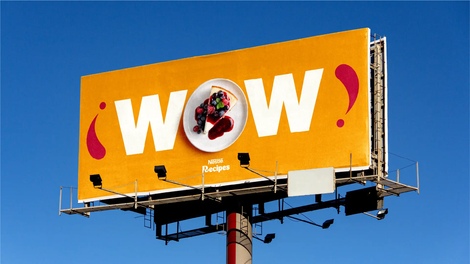
From digital to shelf: A brand living across multiple channels
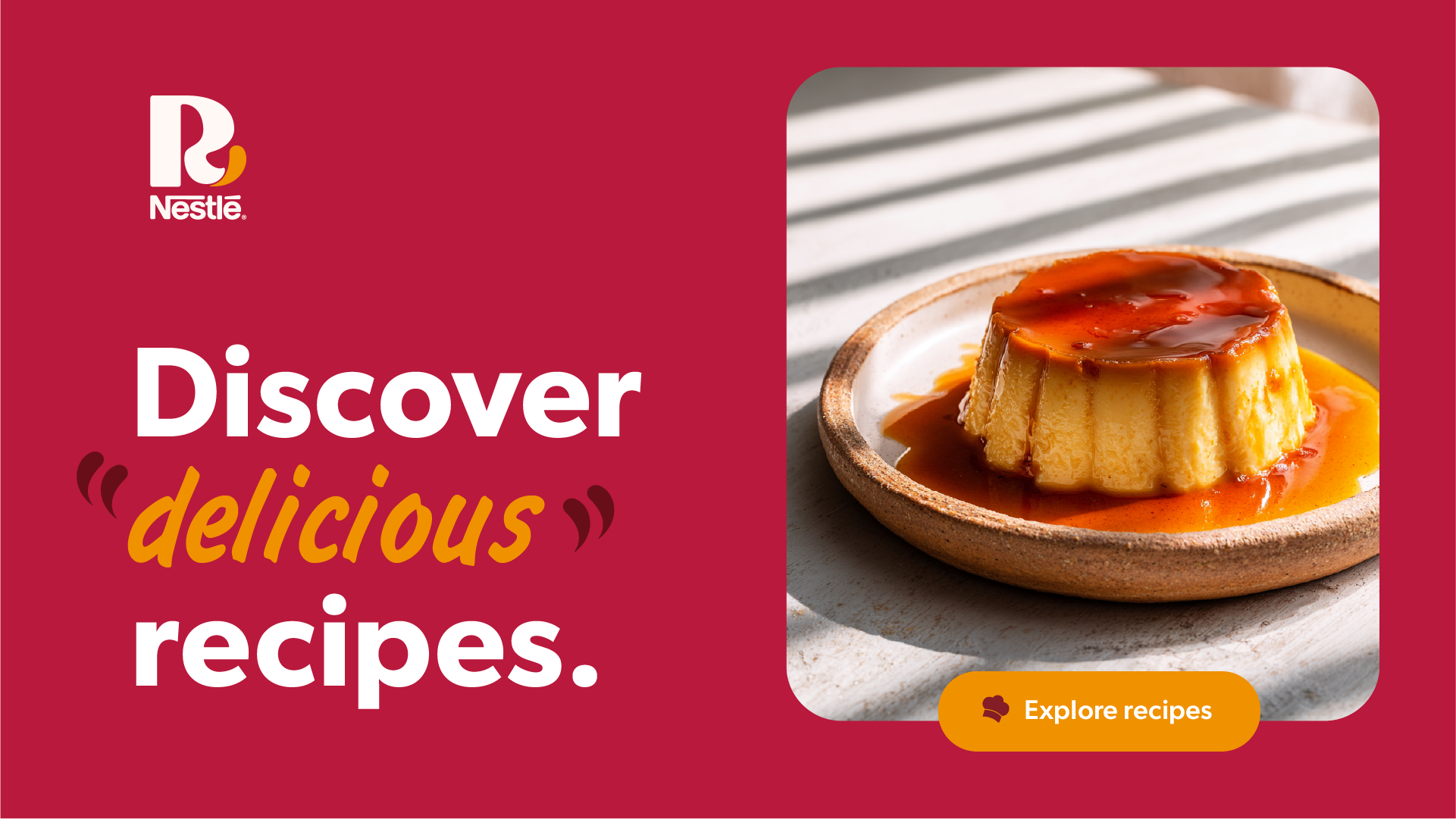
The launch of the new identity came with a broad and connected activation strategy. With a focus on building long-term relationships with consumers, the 360° communication plan ranges from connected packaging initiatives to personalized content delivered via WhatsApp. Packaging also takes on a bigger role, featuring direct links to recipes and practical cooking tips, creating a seamless bridge between product and culinary experience.
The result is a unique brand that connects different audiences around an essential habit—cooking—with flavor, practicality, and consistency across Latin America.

