Qore was created as a product within BCP’s proprietary loyalty program—the largest financial services institution in Peru — with the challenge of positioning itself as both aspirational and close to everyday people.
The project required the creation of a new brand—one with its own identity, coherent with the bank’s ecosystem, yet distinctive enough to stand on its own as an independent value proposition. The challenge was clear: to develop a brand that feels relevant in users’ daily lives, highlights both emotional and functional benefits, and builds a tangible perception of value.


Relevance built into everyday life
The proposition needed to be clear: a brand that is present in daily life, offering accessible benefits, tangible value, and constant relevance. Qore was designed to recognize different life journeys and add meaning to each of them—delivering experiences that fit naturally into routines and don’t require extra effort to access.
Our challenge was to translate the product’s commercial objectives into a strong brand with a distinctive design, capable of standing out in a highly competitive national landscape.
The brand strategy began with an understanding of how existing loyalty programs are perceived. Many consumers don’t feel truly valued by them; offers often feel disconnected from what people actually want. Added to this is frequent frustration with complex mechanics and benefits that don’t adapt to real routines or lifestyles.
Through a Brand House workshop—CBA B+G’s proprietary methodology—conducted with the project’s key stakeholders, we defined Qore’s purpose, vision, pillars, personality, target audience and positioning.
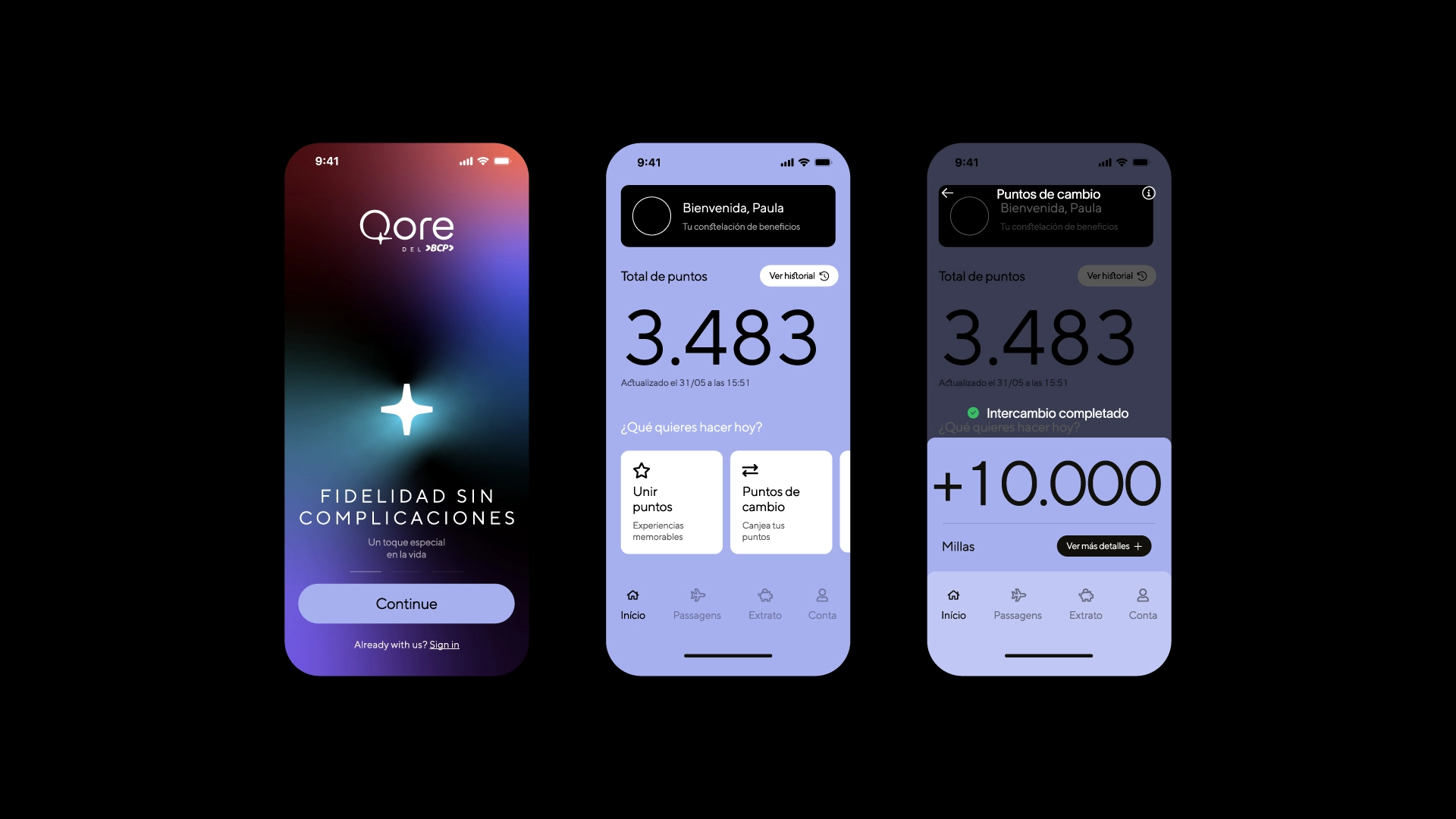
Within this context, an opportunity emerged to propose a new strategic approach—less focused on rules and expectations, and more centered on real human experience. Qore was designed to simplify access to benefits, make interactions more intuitive, and deliver value continuously.


Turning the ordinary into the extraordinary
From the outset, Qore was built around the idea of highlighting the value of what already exists in people’s lives.
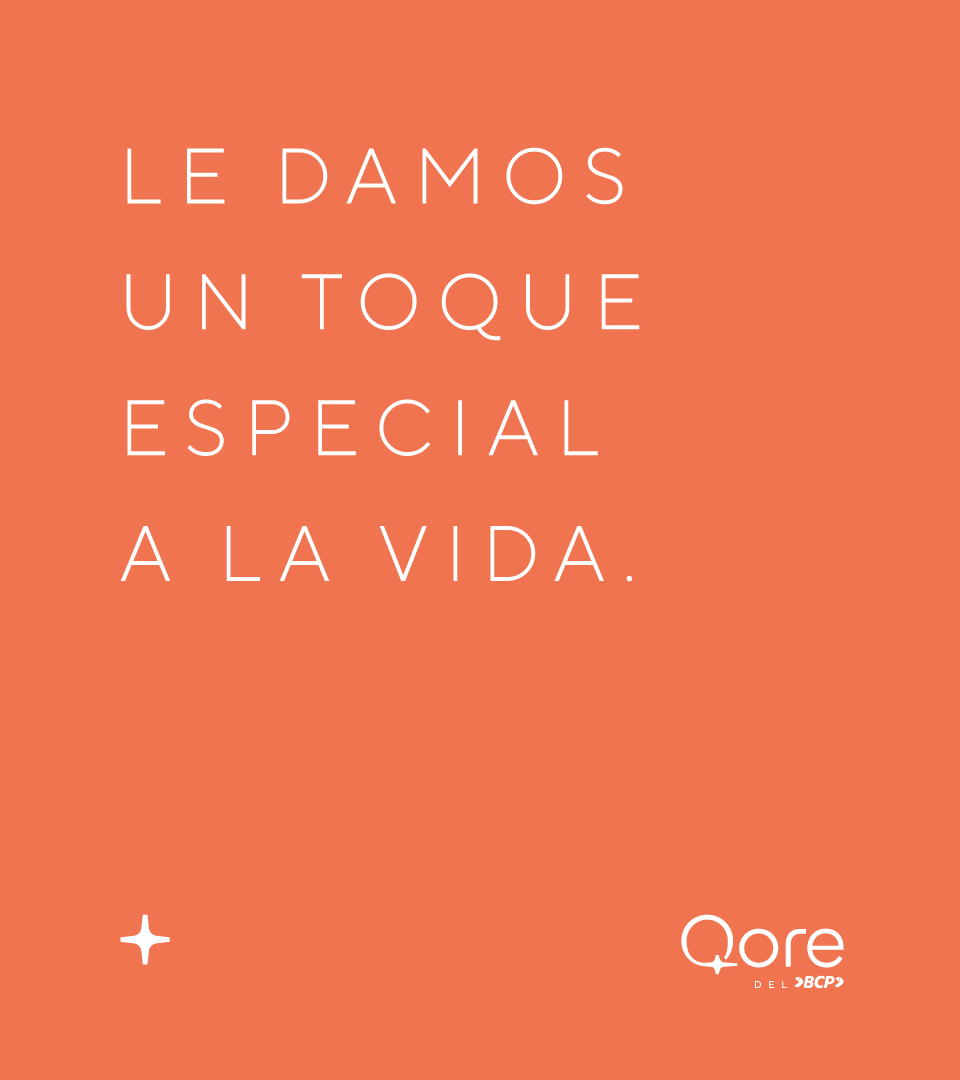
Turning the ordinary into the extraordinary is the principle that sustains the brand across all its expressions—strategic, visual and verbal. Rather than promising radical transformation, Qore recognizes the power of small achievements, offering rewards and experiences that make everyday life feel lighter, more interesting and more appreciated.
This positioning brings loyalty back to its human dimension: continuous recognition that doesn’t rely on massive accumulation, but on a relationship built with consistency and clarity.

Name, form and language that express intent
The naming reinforces the concept. Inspired by the word core—meaning nucleus or center—it conveys the idea of something essential and constant, something that belongs to everyday life. It’s a name designed to occupy a central role in the customer journey, moving alongside users and responding to their choices by adapting to their needs.
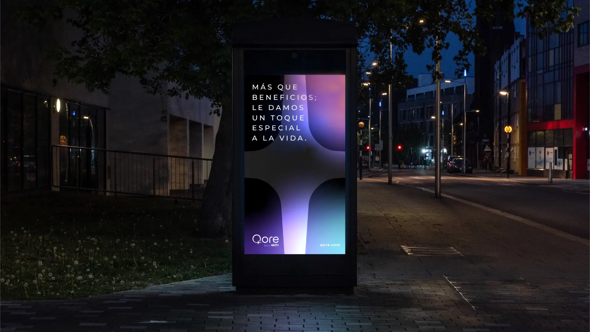
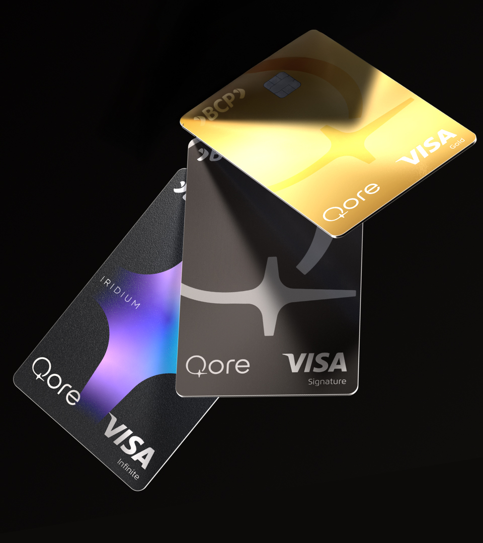
Visually, this idea takes shape through the star symbol, which represents brightness and becomes the central graphic element of the identity. The star works as a metaphor for moments of recognition—when an everyday choice or simple action gains new value through attention and acknowledgment.
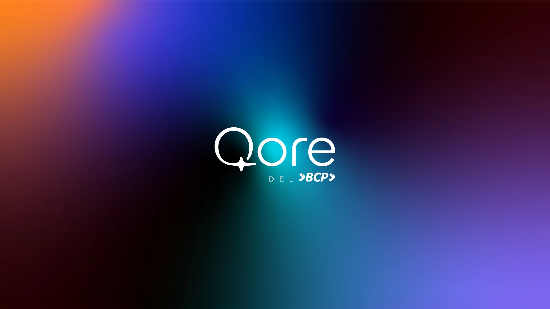
This sense of brightness extends across the entire identity system. It appears in the light gradients that flow through layouts, in organic shapes that suggest fluidity, and in vibrant colors that highlight content and organize information. The color palette combines dark tones with vivid accents, reinforcing sophistication without sacrificing energy or dynamism.
A key detail in the identity is the letter Q itself. Its distinctive design expresses continuity and closeness—a fluid stroke that symbolizes moving alongside the user. The curve of the letter visually connects with the star symbol, creating subtle integration and reinforcing the brand’s presence as a constant companion in everyday life.
Typography and iconography follow a simple geometric language aligned with the symbol’s design, ensuring cohesion across all touchpoints. The program’s tier system is visually represented through variations of the star, evolving as customers progress along their journey.

Verbal identity: value through simplicity and flexibility
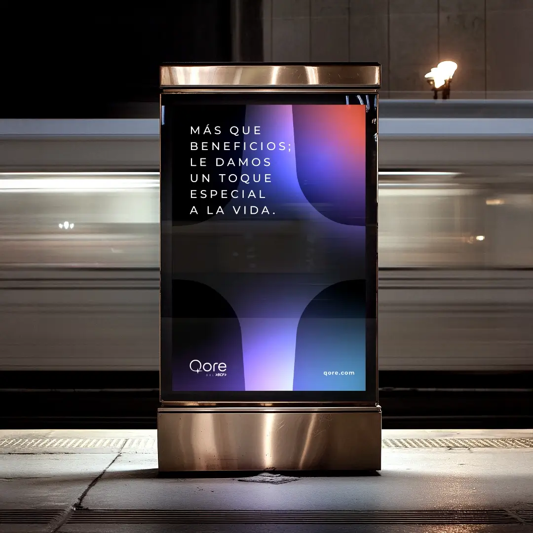
Qore’s verbal language follows the same principles as its visual identity: clarity, fluidity and approachability. The tone is direct, with short sentences and accessible vocabulary. Qore chooses to invite rather than persuade, using language that is flexible, consistent and light.
Across all touchpoints—app, cards, digital materials and promotional communications—Qore adapts to different contexts and usage profiles. Its verbal identity was designed to allow flexibility and personalization without losing cohesion.
This flexibility is central to the brand’s proposition. Qore doesn’t demand disproportionate effort to be understood or experienced. Instead, its subtle yet consistent presence reinforces its role as a facilitator—making everyday life simpler, more connected, and often more meaningful.
