How do you refresh a brand without losing its essence?
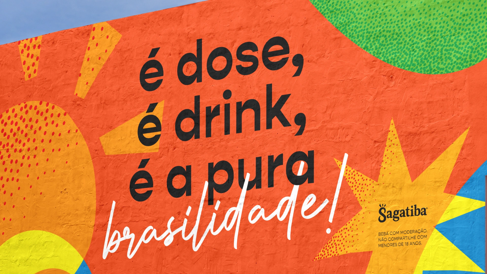
The rebranding of Sagatiba, a brand from the Campari Group, stemmed from the need to align its identity with a new strategic positioning – reinforcing its authenticity and connection with the contemporary consumer. The central goal was to highlight the brand’s “Brasilidade” (the true Brazilian spirit), translating its energy and vitality in a modern and engaging way for a new generation of cachaça lovers. To achieve this, consumer research helped define an innovative and relevant approach, avoiding clichés and exploring the richness and diversity of what it means to be Brazilian.
The project included a new visual identity, logo refresh, tone of voice, redesigned bottle, and a toolkit for points of sale – repositioning Sagatiba as a brand that honors its tradition while looking to the future with innovation and freshness. The result is an identity that evokes emotion, fosters engagement, and reinforces the brand’s presence as a reference in the premium category.
Branding that celebrates Brazil
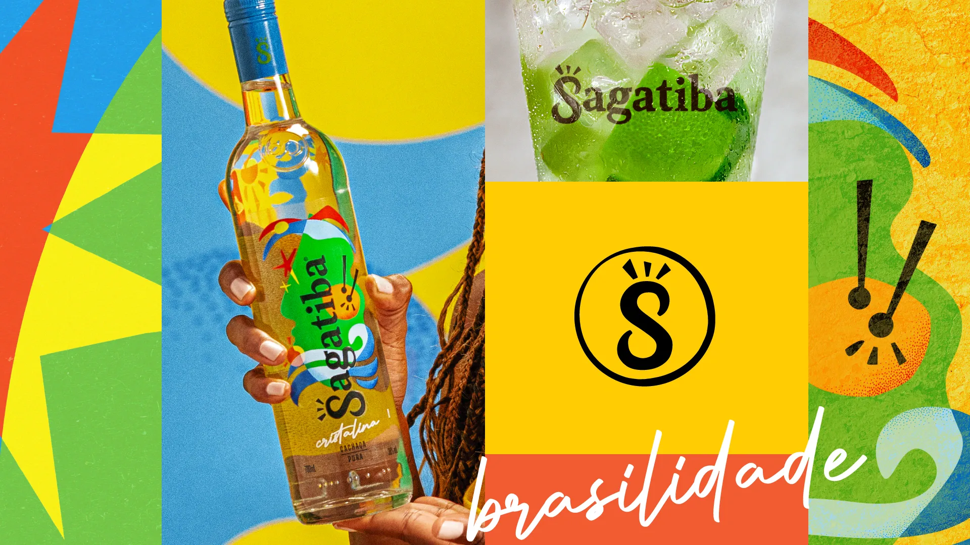
Sagatiba’s new visual and verbal identity was developed based on three key pillars:
- Movement: the expression of diversity
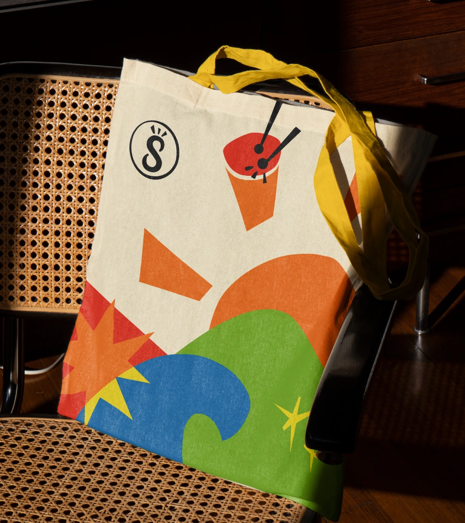
“Brasilidade” lies in the mix, and the visual identity needed to reflect that. Dynamic elements, vibrant compositions, and varied typography were used to convey the spirit of celebration. This approach represents the essence of “being Brazilian” and reinforces the brand’s innovative character. Care was taken to avoid stereotypes and visual clichés, opting instead for an authentic and sophisticated design.
- Warmth: energy and welcome in the color palette
Color plays a fundamental role in the brand’s sensory communication. The predominantly warm palette conveys the energy and welcoming nature of the Brazilian people, while secondary tones inspired by nature complement this vibrant identity, making it both versatile and contemporary.
- Refined humor: a laid-back brand
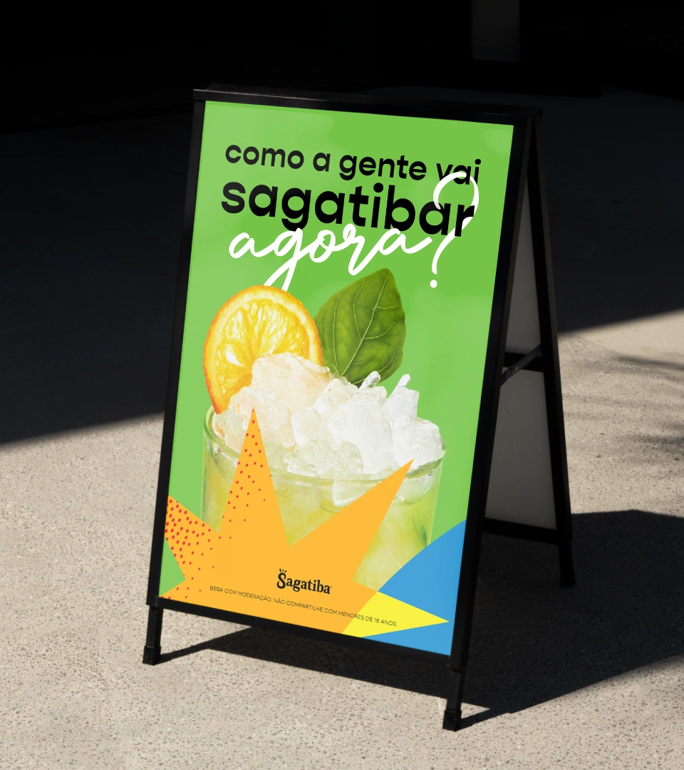
Sagatiba has always had a touch of irreverence in its tone, but it needed to evolve to better connect with today’s audience. Humor is still present, but now with intelligence and spontaneity that emphasize the brand’s uniqueness—avoiding exaggerated or caricatured approaches that could make it feel too mainstream. This wit is expressed in both verbal communication and visual identity, preserving the democratic and accessible character that has always defined Sagatiba.
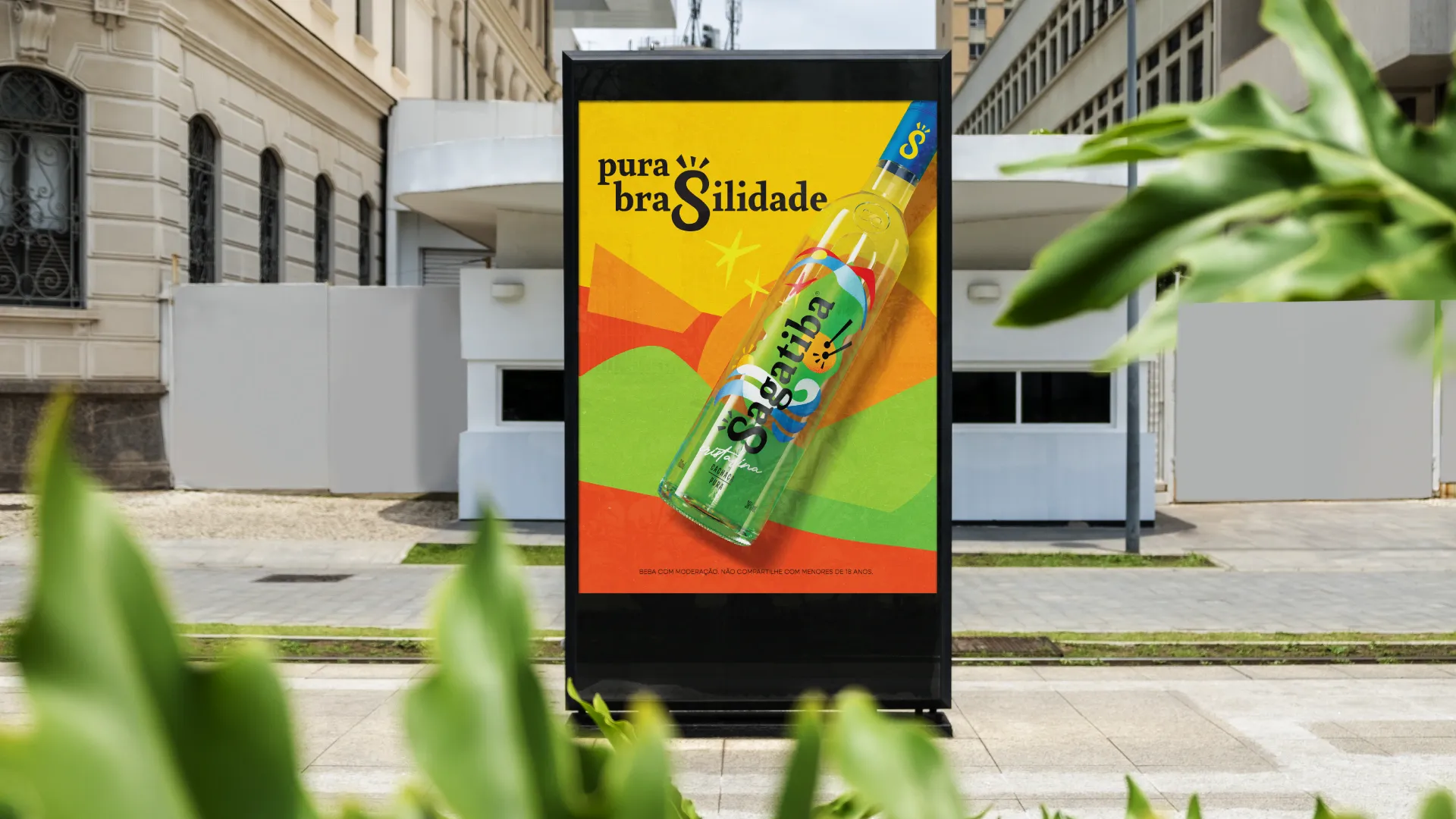
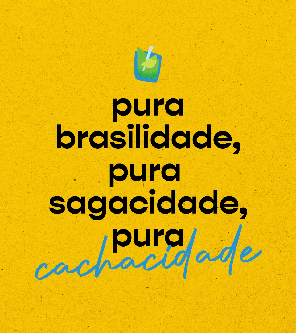
Sagatiba’s verbal identity reflects its vibrant and welcoming spirit. The tagline “Pura Brasilidade” accompanies the brand communication, used flexibly and without rigidity to reinforce its essence in various contexts.



Evoking the Brazilian essence
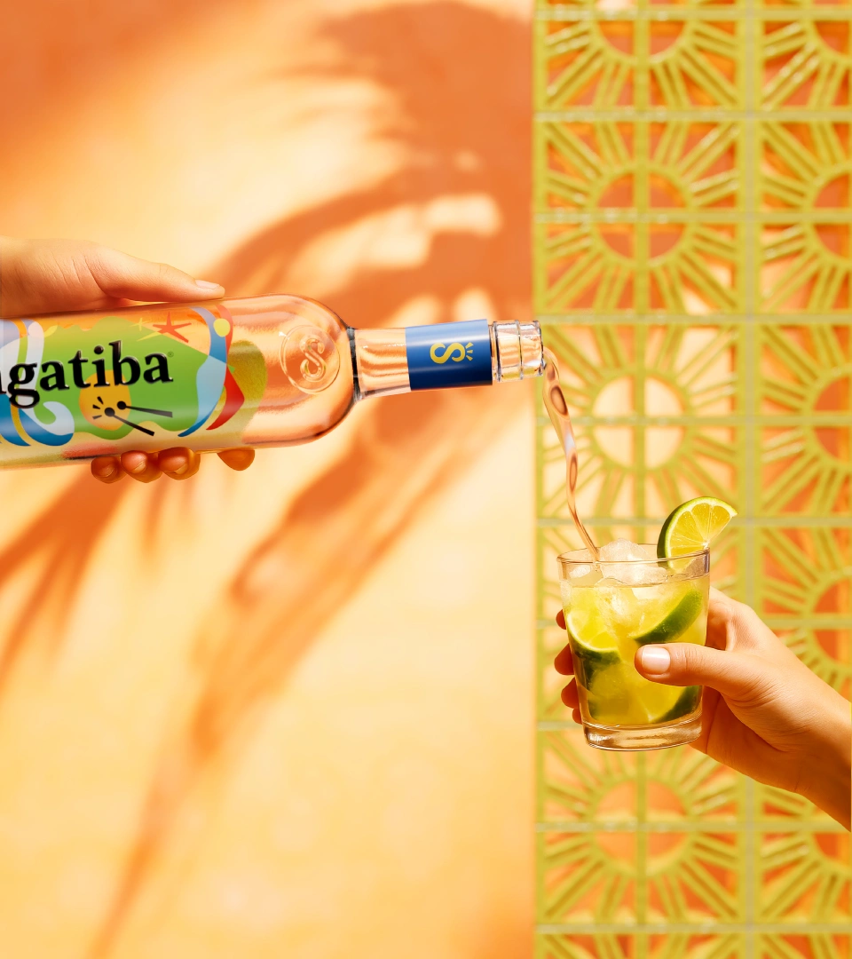
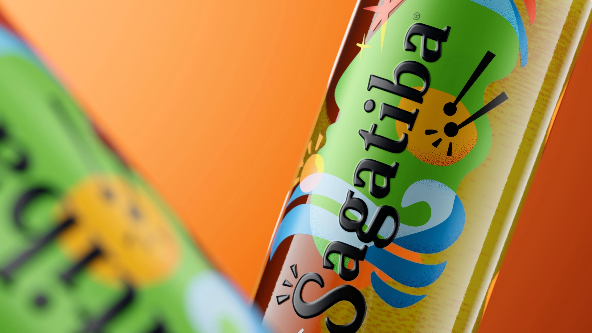
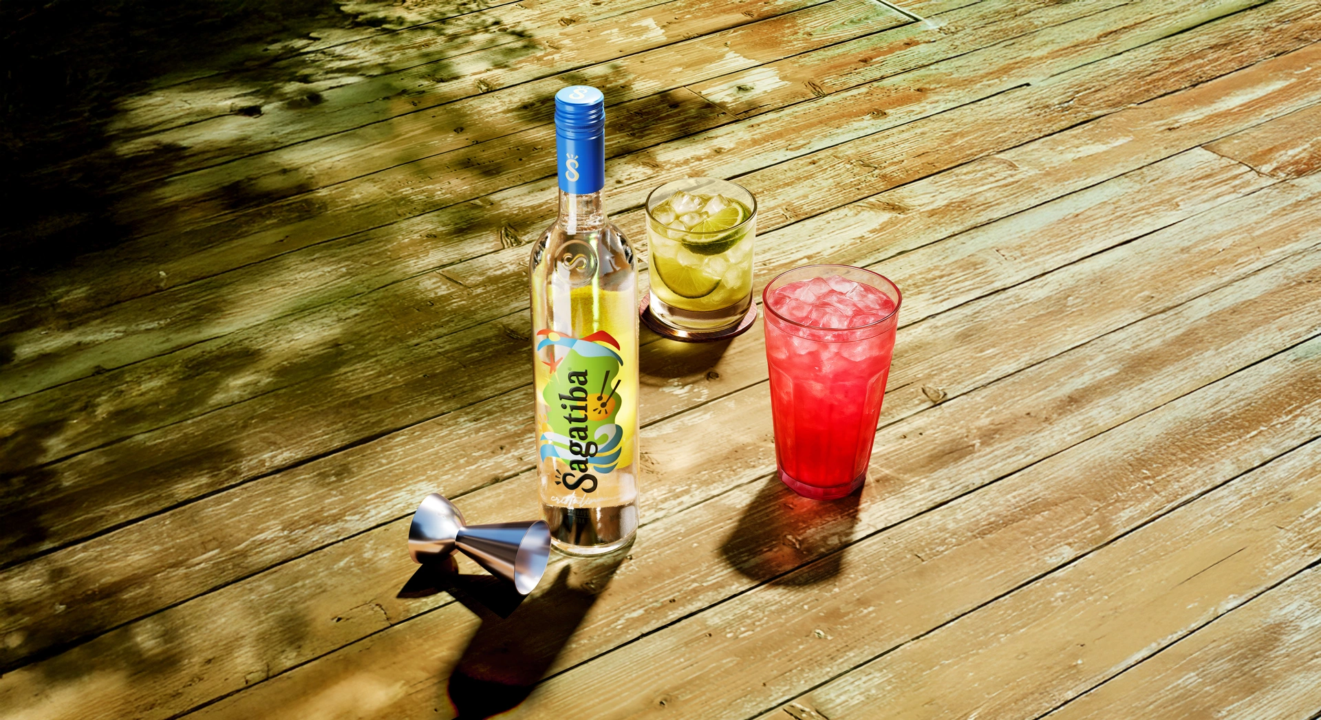
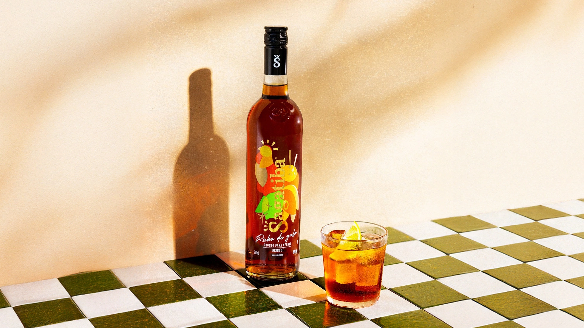
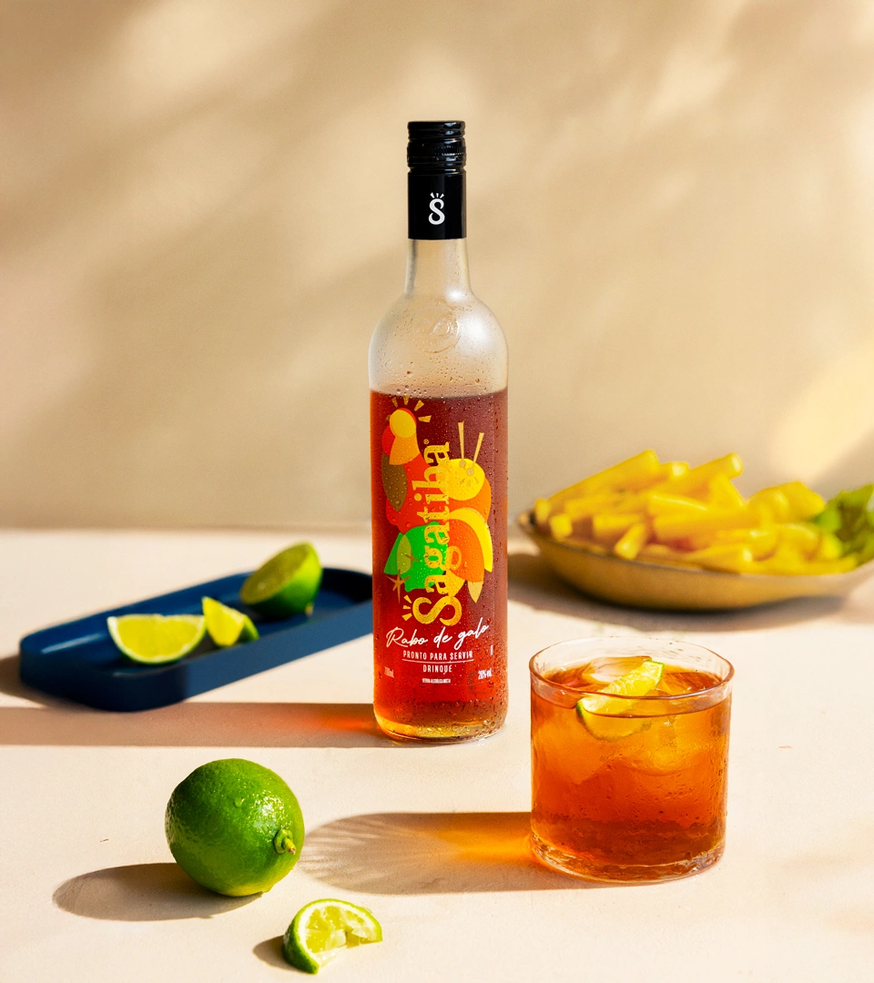
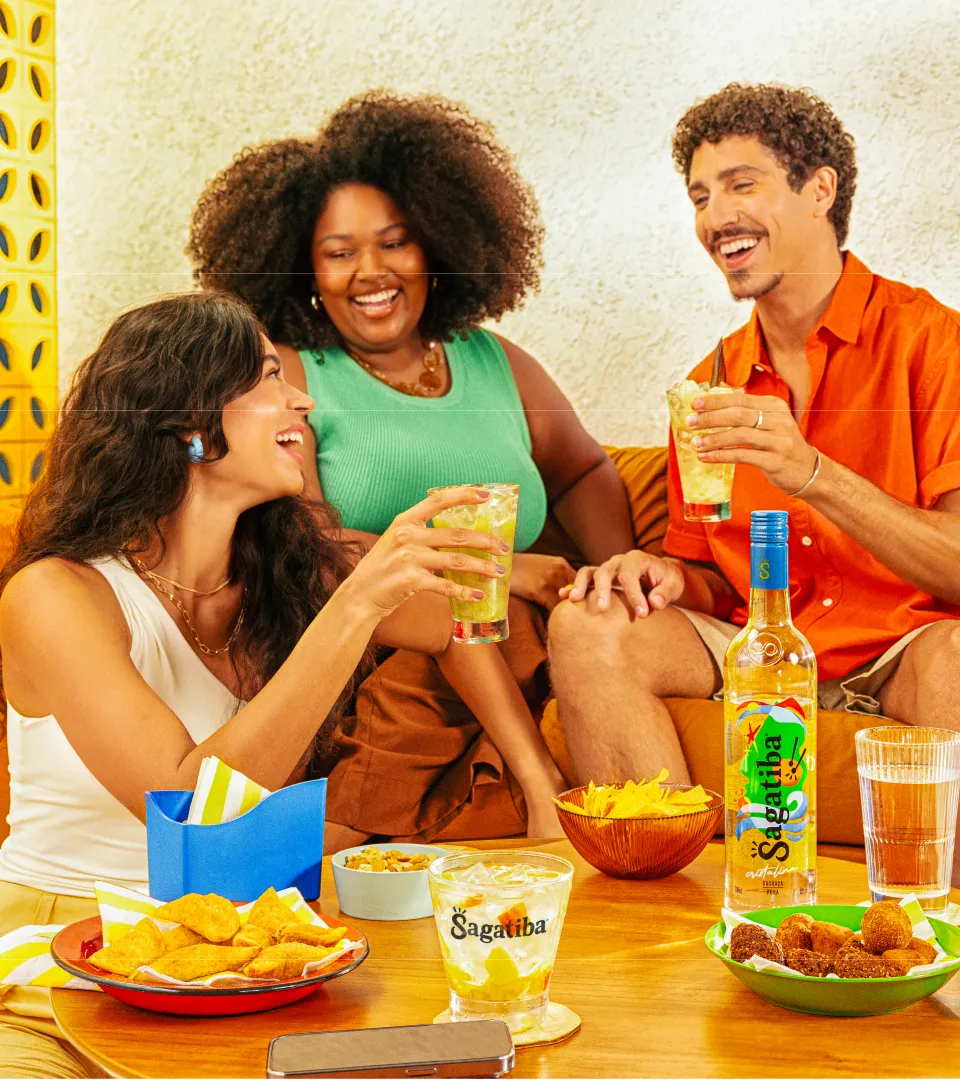
The design refresh included a complete overhaul of the visual identity, including the redesign of the Cristalina bottle label—the first variety relaunched under the new identity, with more versions currently in development. The new packaging was designed to visually express “Pura Brasilidade”, incorporating vibrant colors and symbols that evoke Brazil’s cultural diversity.
The logo was also updated to reflect the brand’s sophistication and authenticity, maintaining familiarity while adding refinement that reinforces its status as a premium, distinctive cachaça.
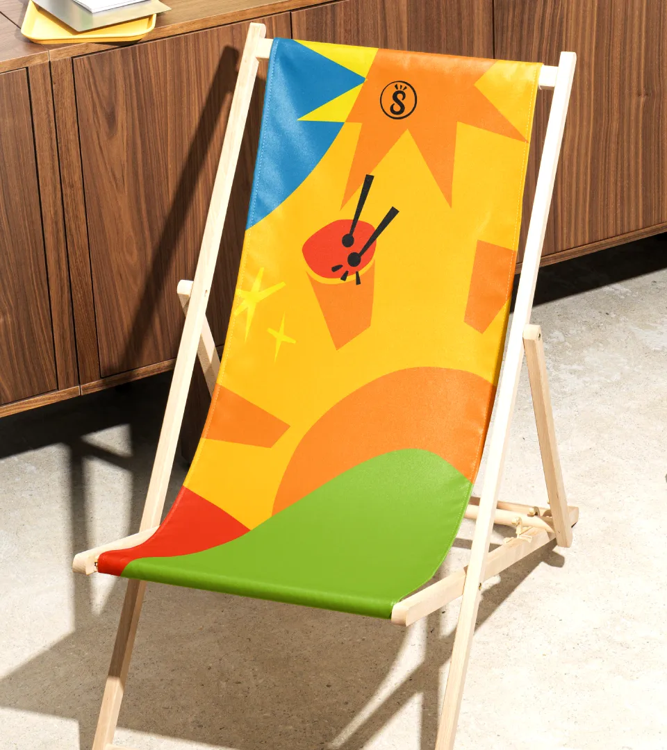
The new identity unfolded into an integrated design experience, applied across all brand touchpoints, from retail to bars, creating a consistent and immersive visual universe for consumers. The goal is to deliver a cohesive, engaging experience and to solidify the brand’s presence in the market.
