France
Paris
Switch to your local agency
Retour au menu
The first project run by our office in Mexico couldn’t be more emblematic – the creation of a fresh visual identity system for Olmeca Altos Tequila. In order to create a new global expression of the brand which is sold more than 51 countries – Mexico, United States and the UK being the lead markets – we pulled together a dedicated team of creative experts from our CBA LatAm + CBA London offices, a partnership that combines local cultural expertise and global systems vision.
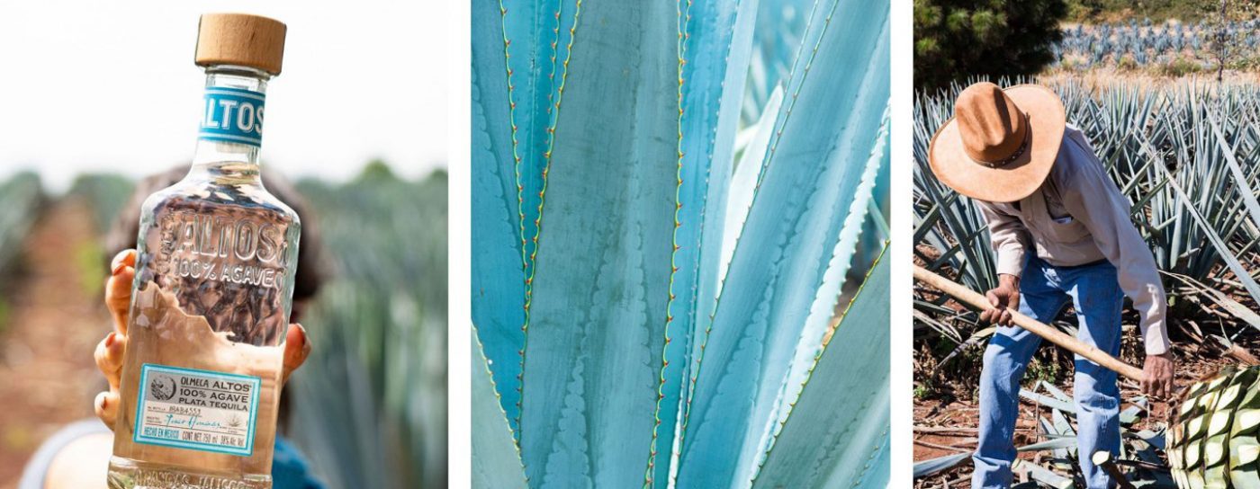
Olmeca Altos Tequila is a super-premium brand that honours the quality and tradition of true Mexican Tequila – from the planting and harvesting of the agave to the distillation and ageing process – the brand is full of features that evoke Mexico’s cultural heritage.
Our challenge was to rethink Olmeca Altos’ visual identity system to reflect the brand’s essence, highlighting its authenticity and showcasing the energy and vitality of contemporary Mexico in a fresh, engaging and iconic way.
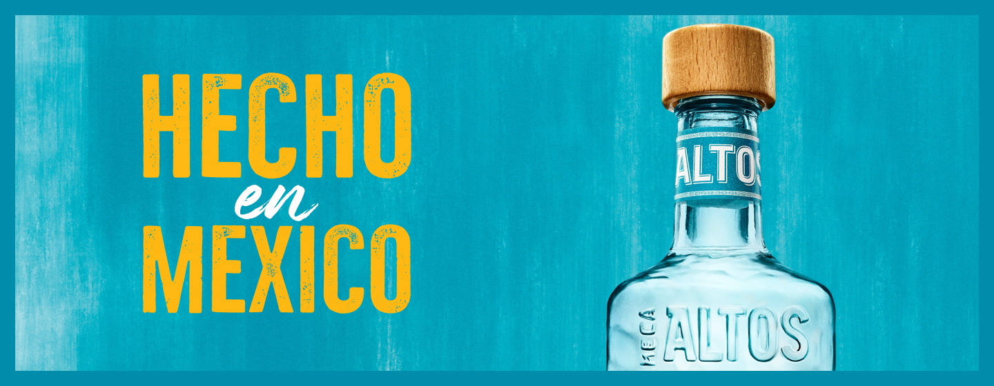
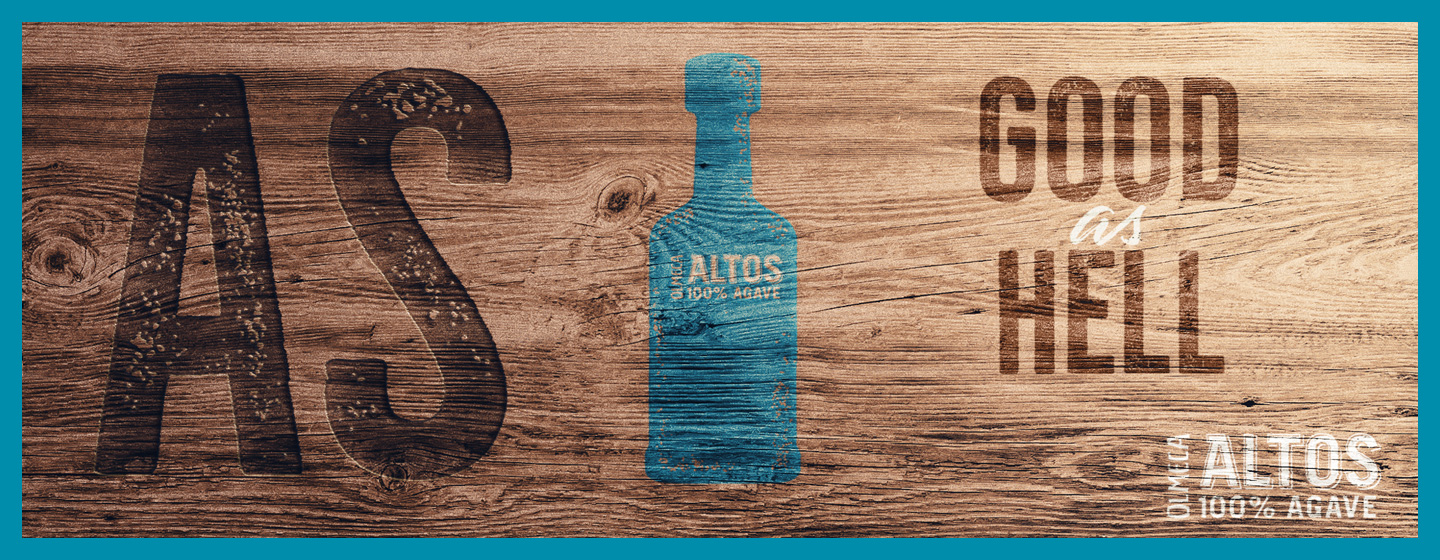
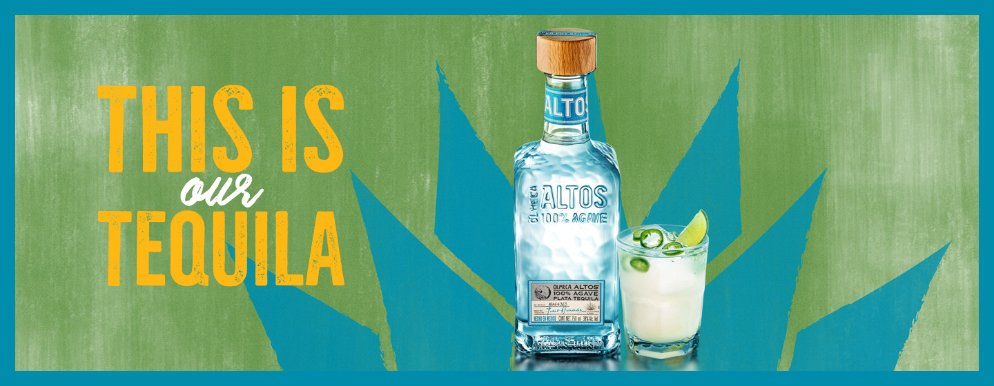
To create Olmeca Altos Tequila’s new identity, we used CBA’s Brand Senses methodology – which explores the expression of the brand through all five senses – to establish the brand principles and create the foundations to develop a flexible design system able to provide versatility and rhythm to different communication occasions.
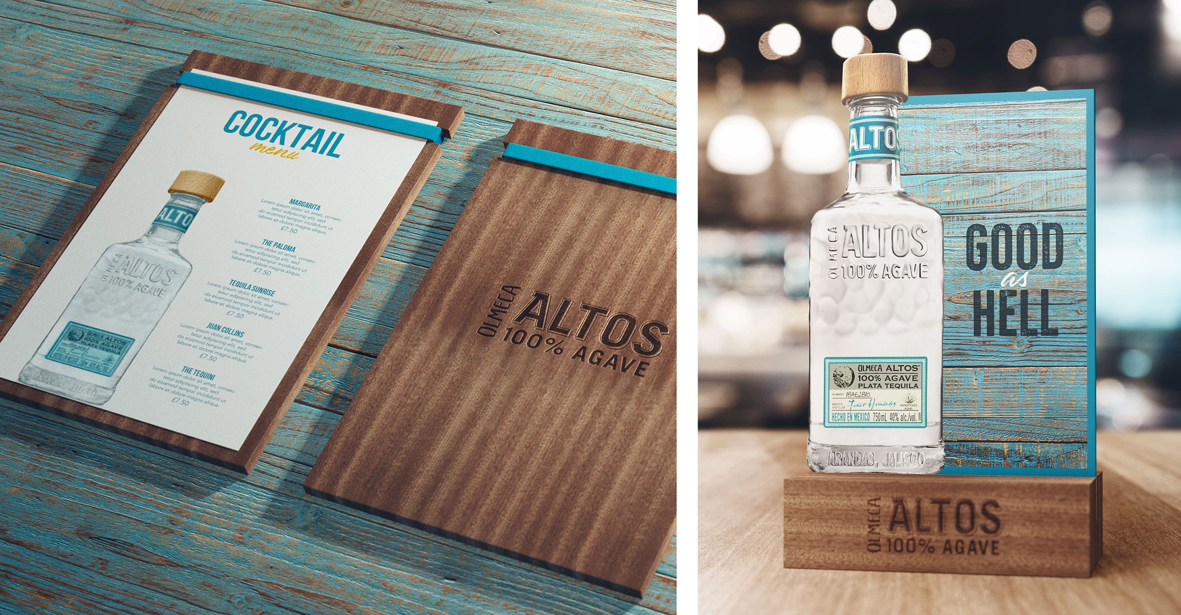
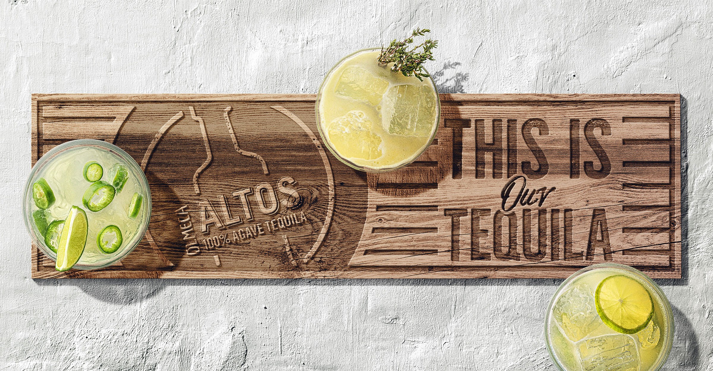
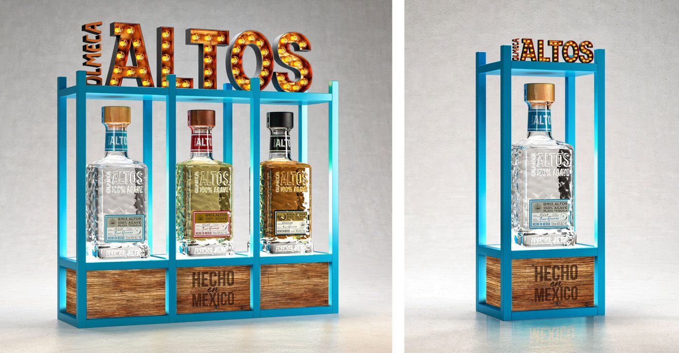
We celebrated the iconic Olmeca Altos bottle as the core element of the brand’s new visual universe, symbolising the quality and authenticity of the spirits creation, as well as the human and artisanal touch. The characteristic shape of Olmeca Altos’ hammered bottle becomes the brand signature, distinguishing it from the other tequilas.
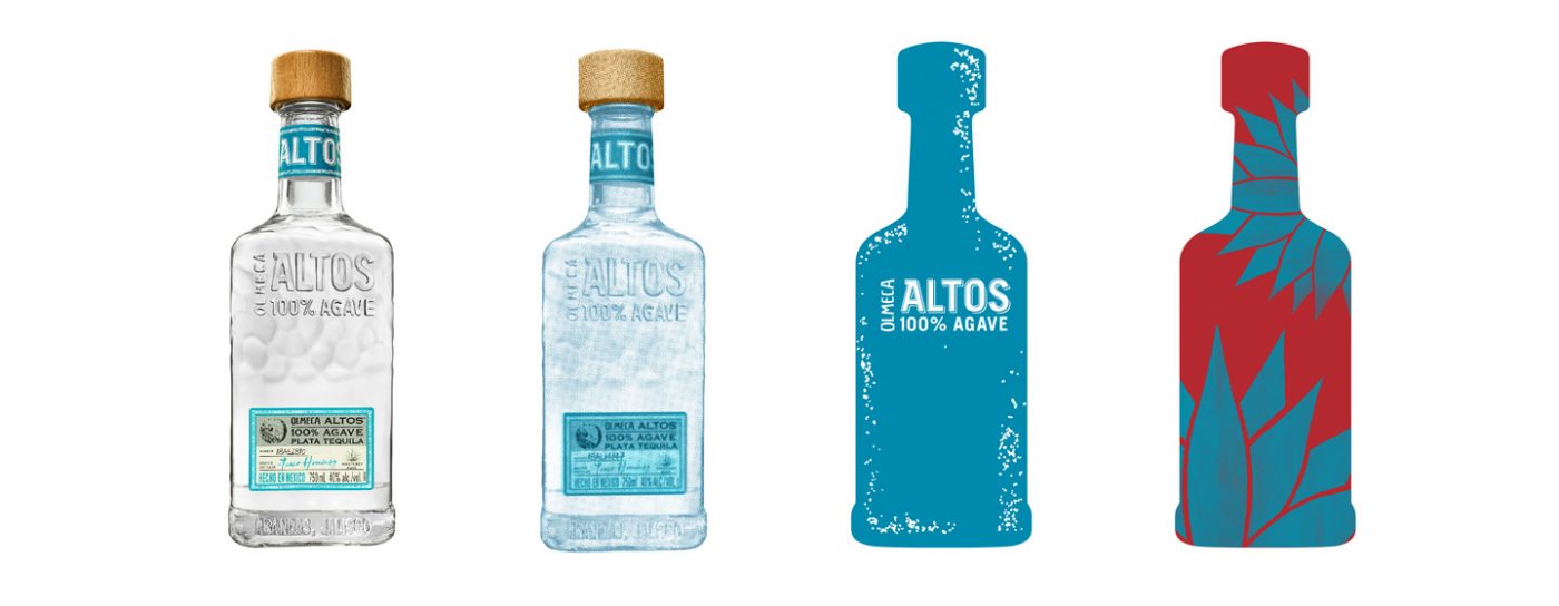
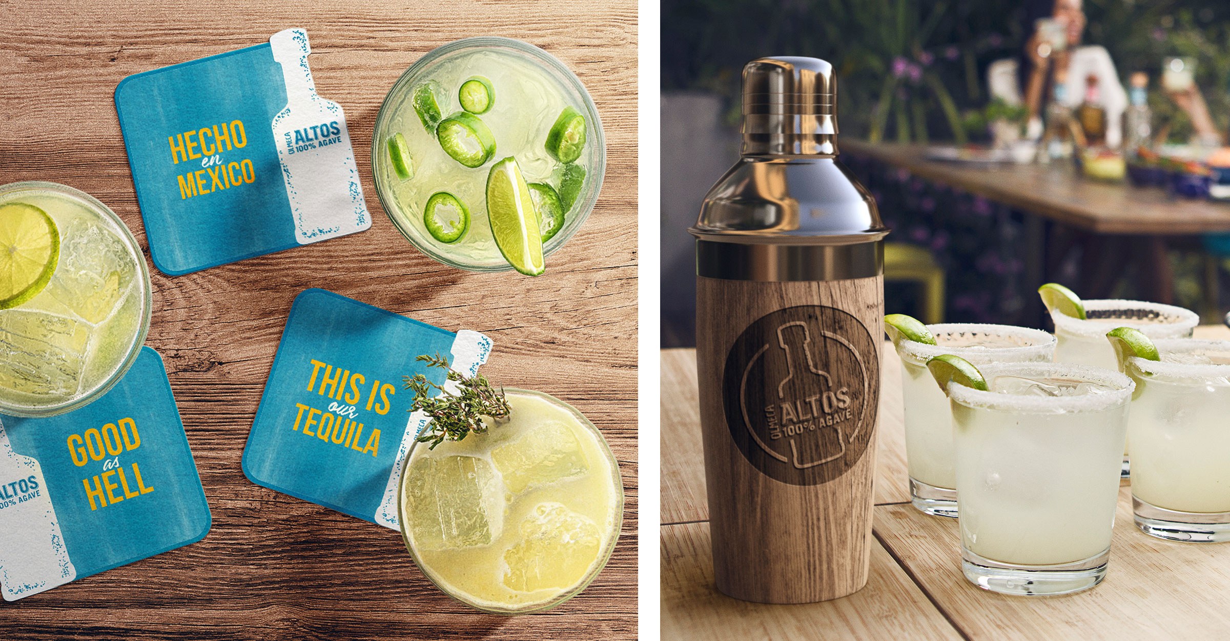
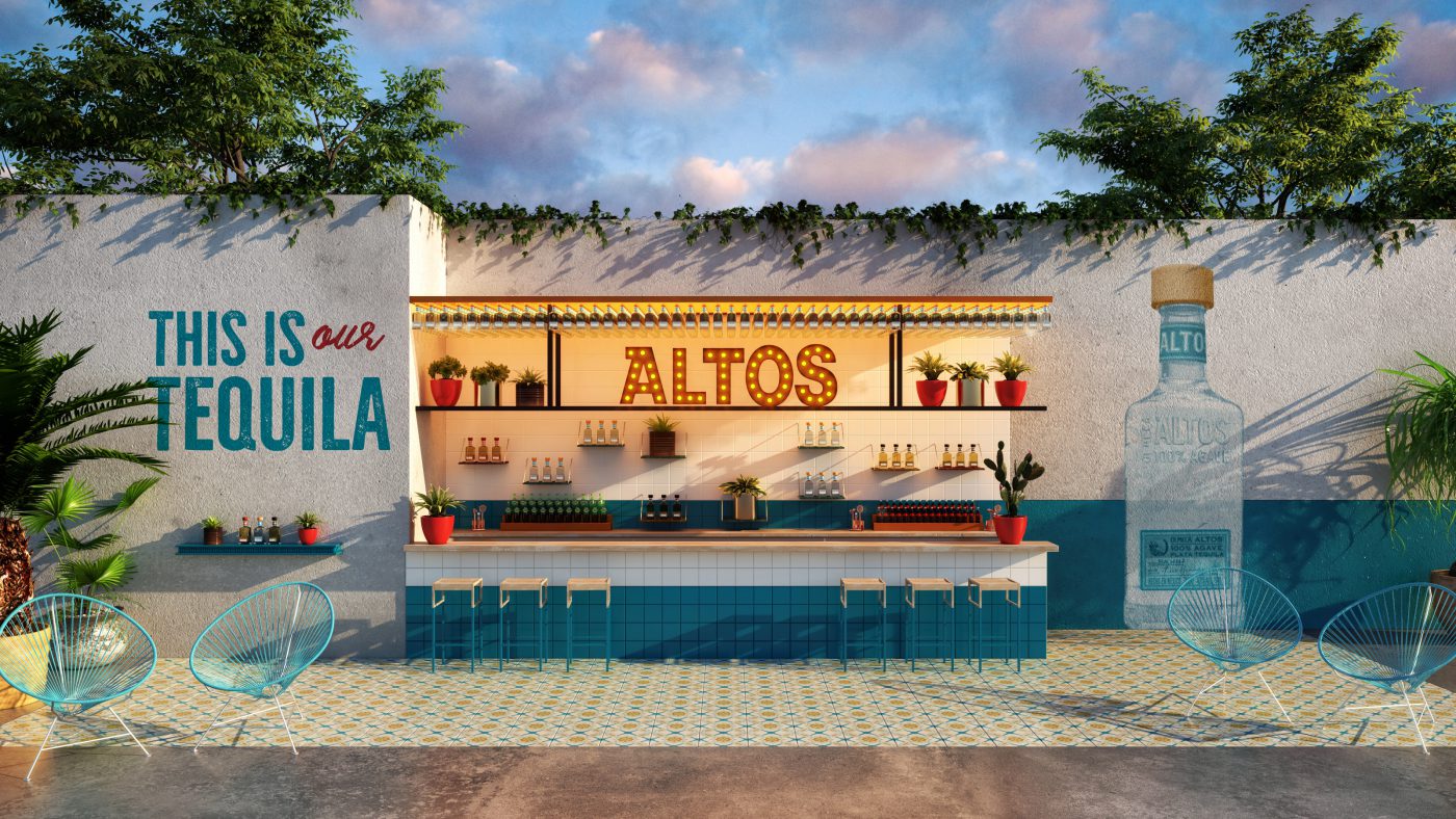
To support the iconic bottle, we built an identity system to convey the complete brand story. To demonstrate the brand’s contrasts and vivacity, we used the iconic blue as our base but built in additional tonal colours to create diversity and pace. We redefined the typography and photographic style with fresh expressions of modern Mexico; and through our authentic and sustainable materials palette we suggested on-trade and and off-trade environments that allowed our consumers to feel the Olmeca Altos experience.
In total the new design system for Olmeca Altos Tequila showcases not only the tradition of the Mexican culture but also its contemporary sophistication.
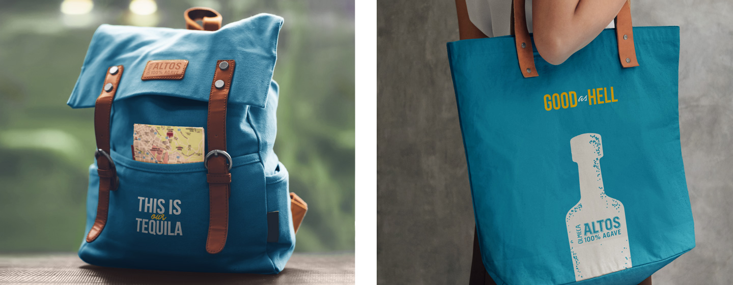
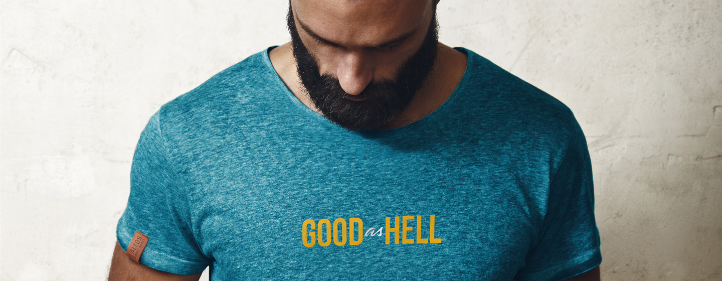
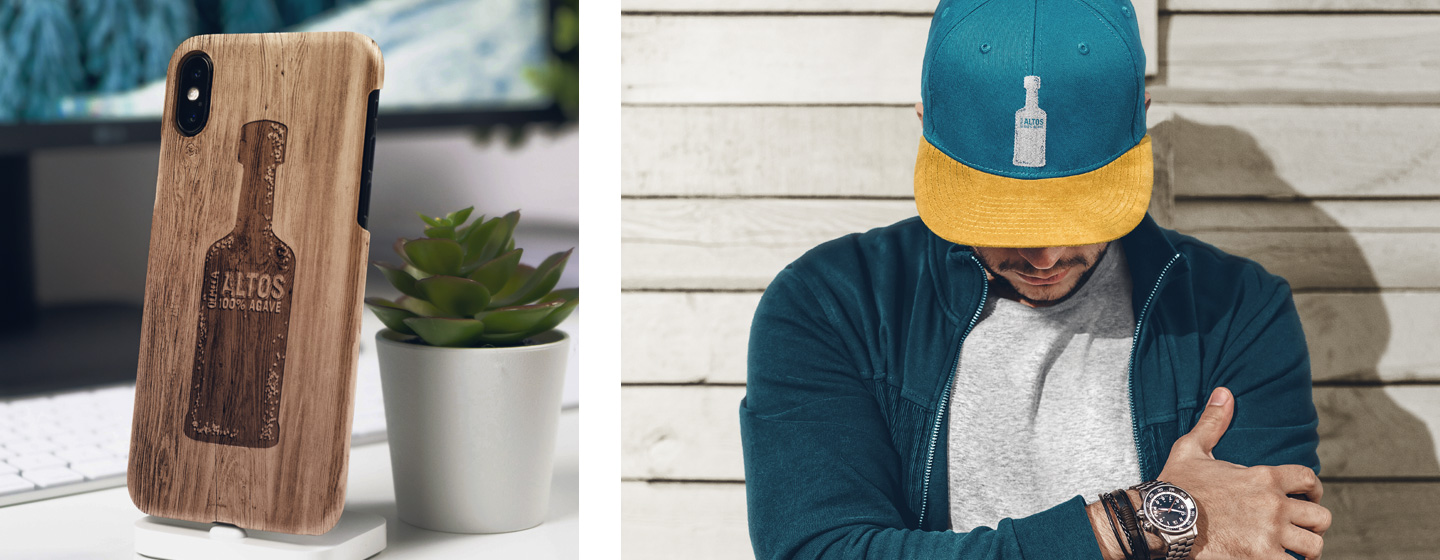
Through our final toolkit we have armed Olmeca Altos with all the necessary tools to communicate consistently and with a celebratory attitude. The outcome is a dynamic brand experience, richly representing the many authentic facets of Mexico.


A French brand holding a tradition in bakery decides to make bread for a target made of bread lovers and consumers. That was how we faced the challenge Norac brought over to us. Norac Foods Group, born 30 years ago in France is now in Brazil since 2011, with the brand Ateliê.
Ateliê produces and distributes fresh and ready-to-eat products in the sandwich and salad segments. The group decided, in the peak of its expertise in bakery and confectionery, that it should expand the business and produce larger amounts, just like the way it’s already done in its native country.
For jumping in this new opportunity, they needed a platform that was able to embrace the new business direction: a different brand in terms of range and production scale – but keeping the French baker, boulangère and bread expert essence.
The actual challenge was twofold: developing a unique value proposition for the brand, with such a motivation that it would hook people’s interest, making them consider and consume it; besides that, we would create this new brand from scratch. Actually not from scratch, considering the French core was always there to enhance it.
However, it would be necessary to shape the platform and create the brand’s strategy, identity, proprietary elements, and finally the packs.
As we use to say, ‘Art & Science’, a kind of work we love doing: combining strategic and analytic thinking with the creative and intuitive force of design.
Pushed by the brand’s pillars and its “brand pulse”, we jointly got to the conclusion that the name should be suggestive to evoke the brand’s territory, as well as sonorous, easy-to-get, reinforcing its French roots.
From that on, we set off to the defiant task of generating ideas for the name itself. It was a cheered-up, light and relaxed process, which in the end resulted in a name with the needed differentiation aspired by the brand.
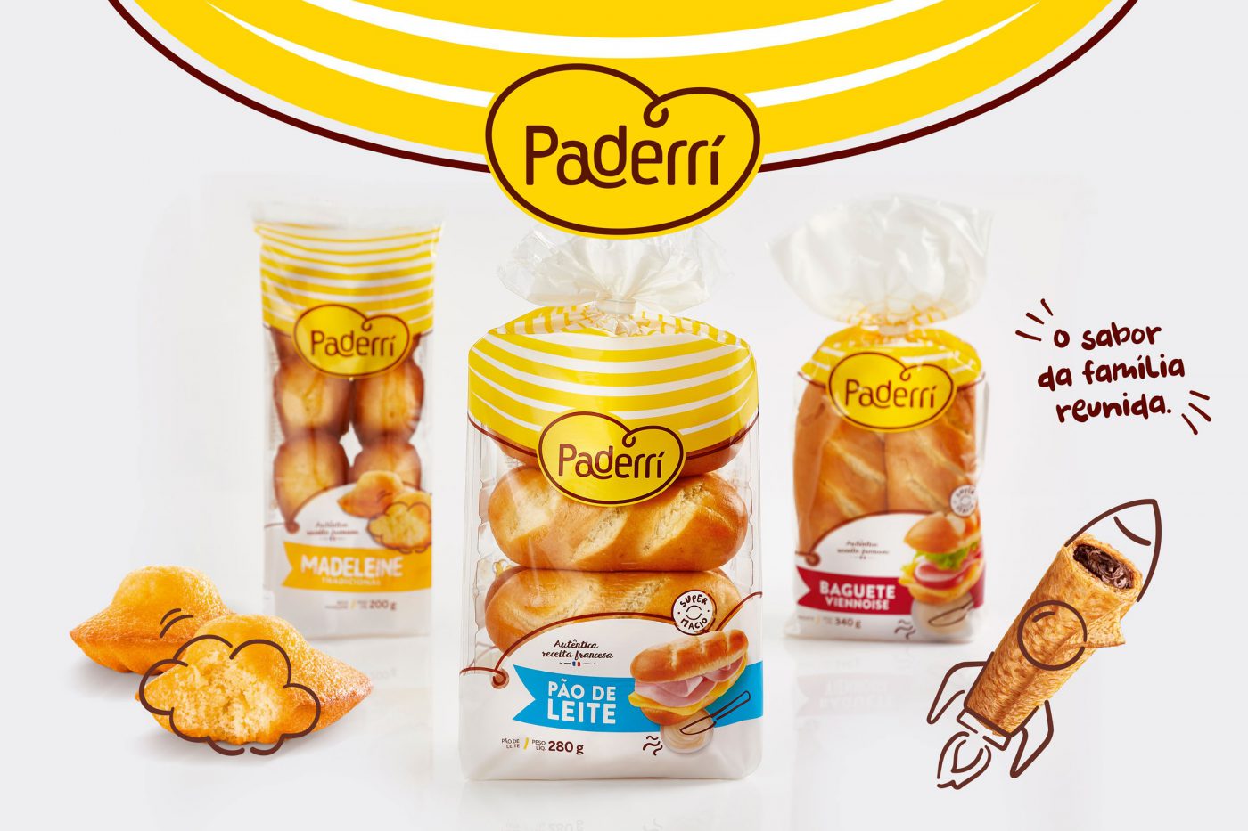
With the name set up, we set off to its identity. As of the brand’s pillars – care, handcrafted, joy & practicality – as well as a look into the category, we went in search for identifying the visual codes. If on the one hand we wanted to convey the French expertise and tradition, we were also aware about the need of balancing modernity and tradition, also bringing up the matter of family in a different and singular way – after all, the sharing of bread is a strong symbol of care and affection. So we got to the point of grasping the consumption habits of customers, so that we could build up the brand’s strategic lines.
We carried out qualitative and quantitative researches with the brand’s potential consumers in order to get genuine insights, and then started developing a “look and feel” to the new identity, with a handcraft touch, fun iconography, colors, a joyful and positive graphic and photographic style.
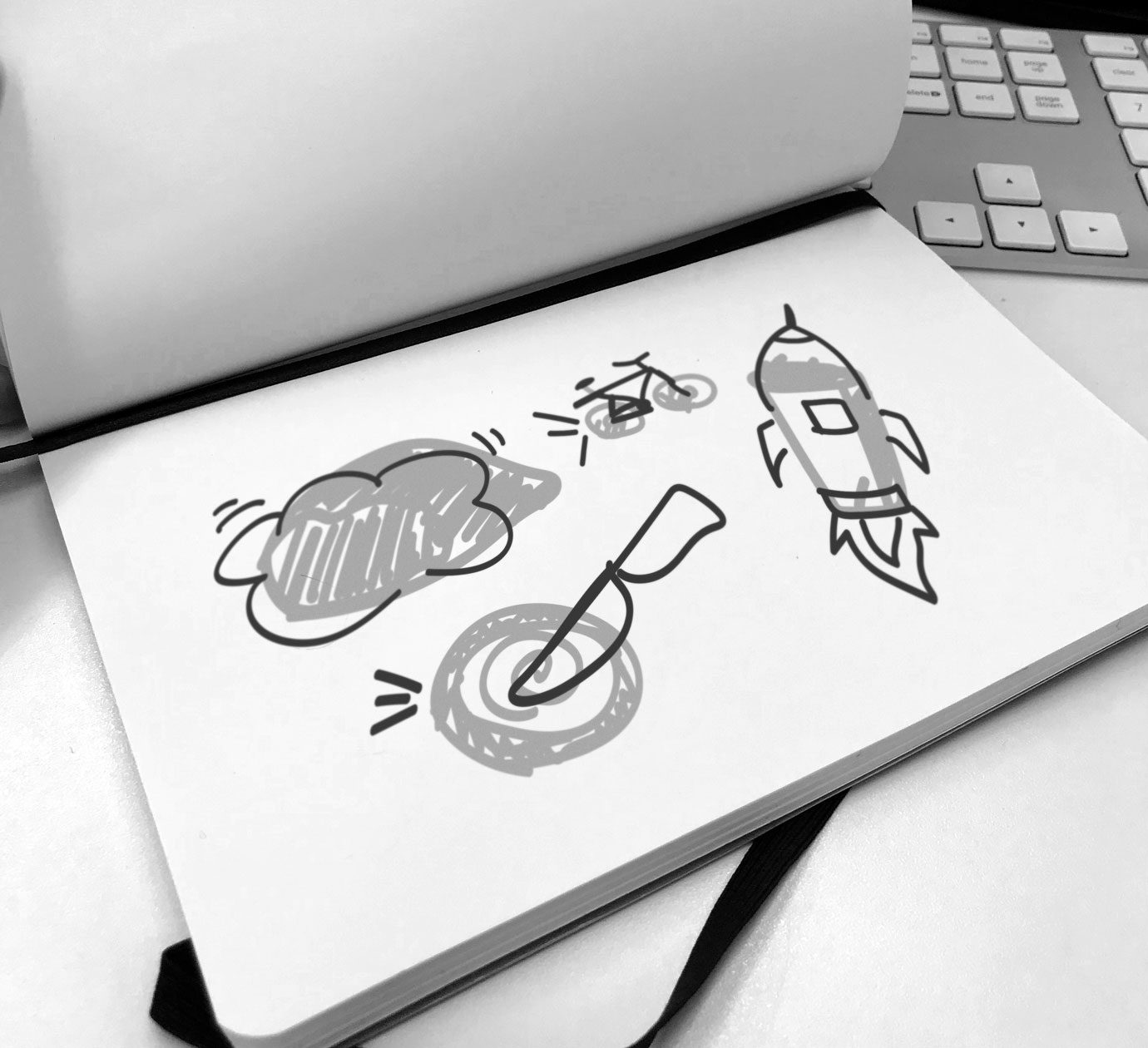
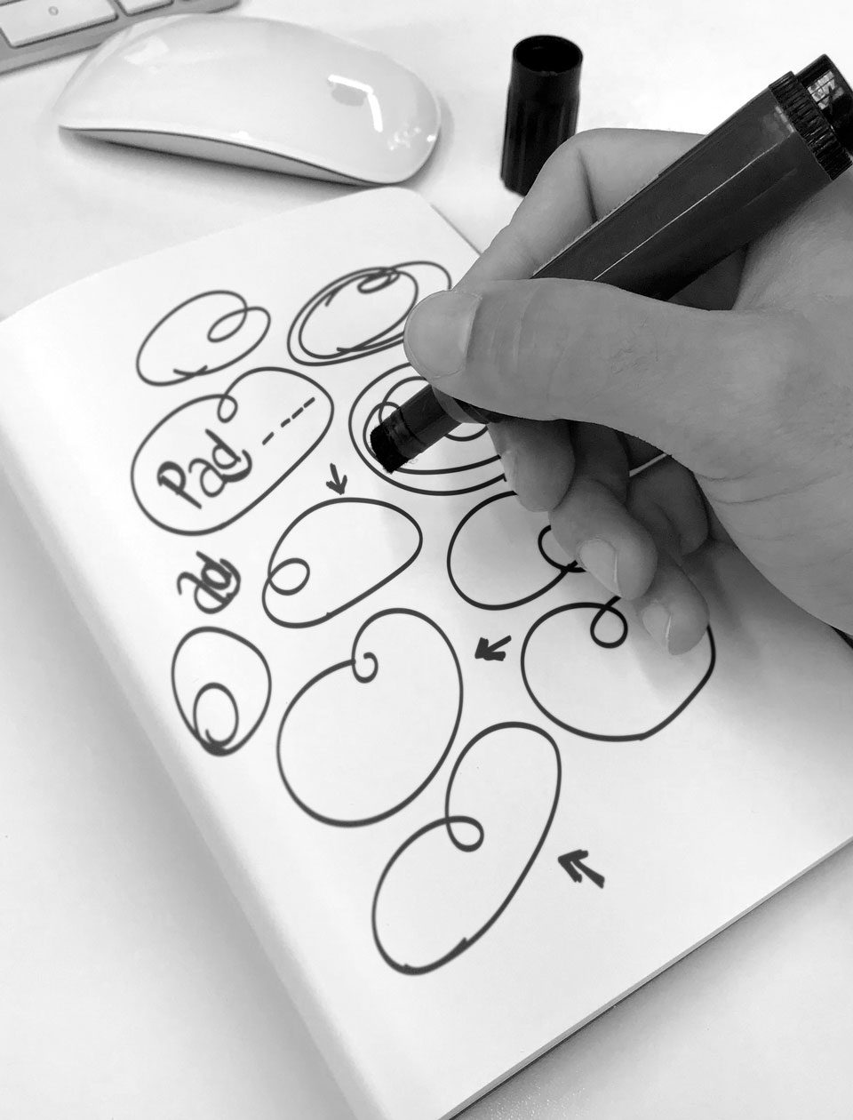
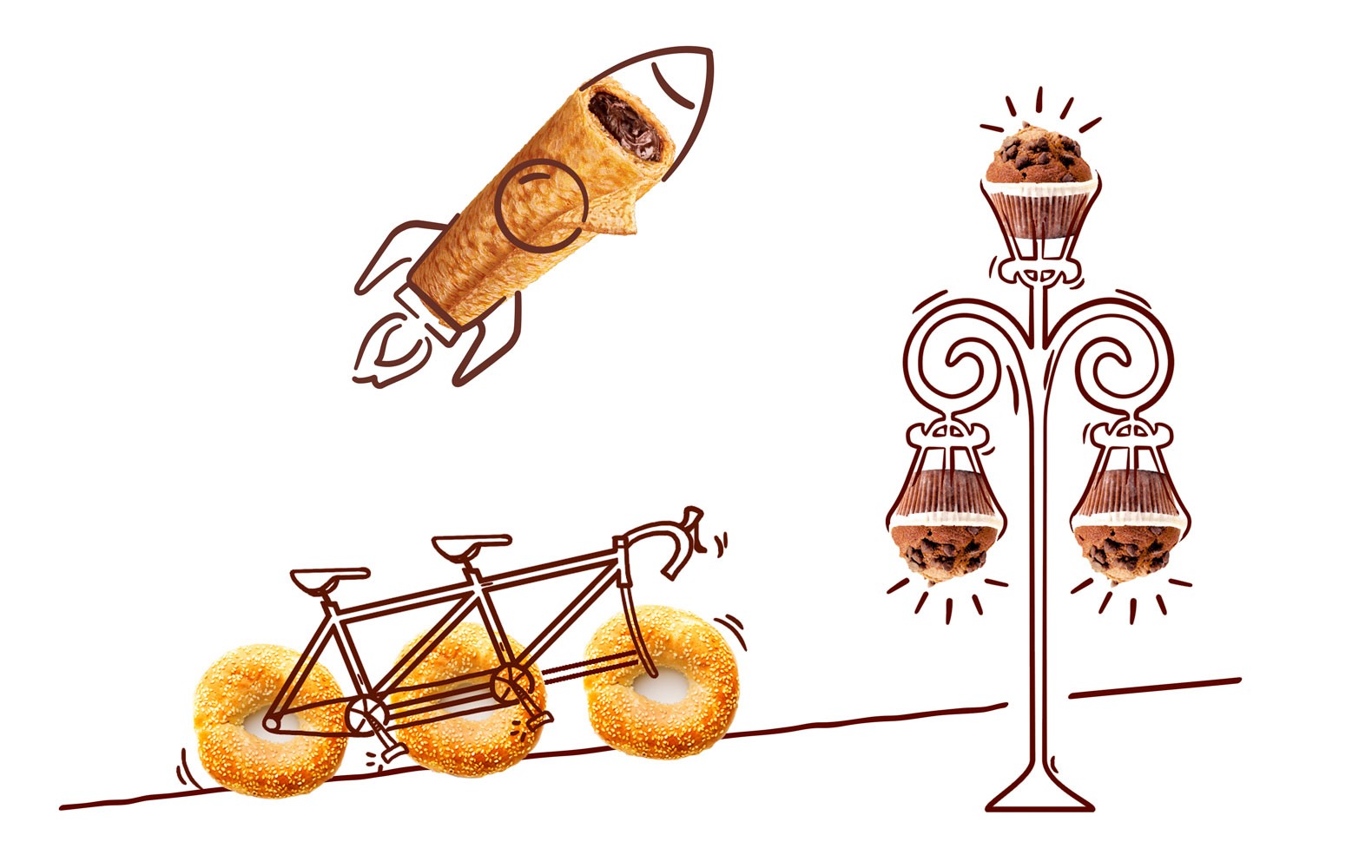
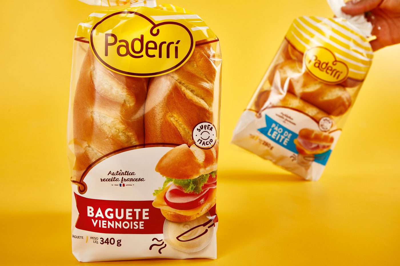
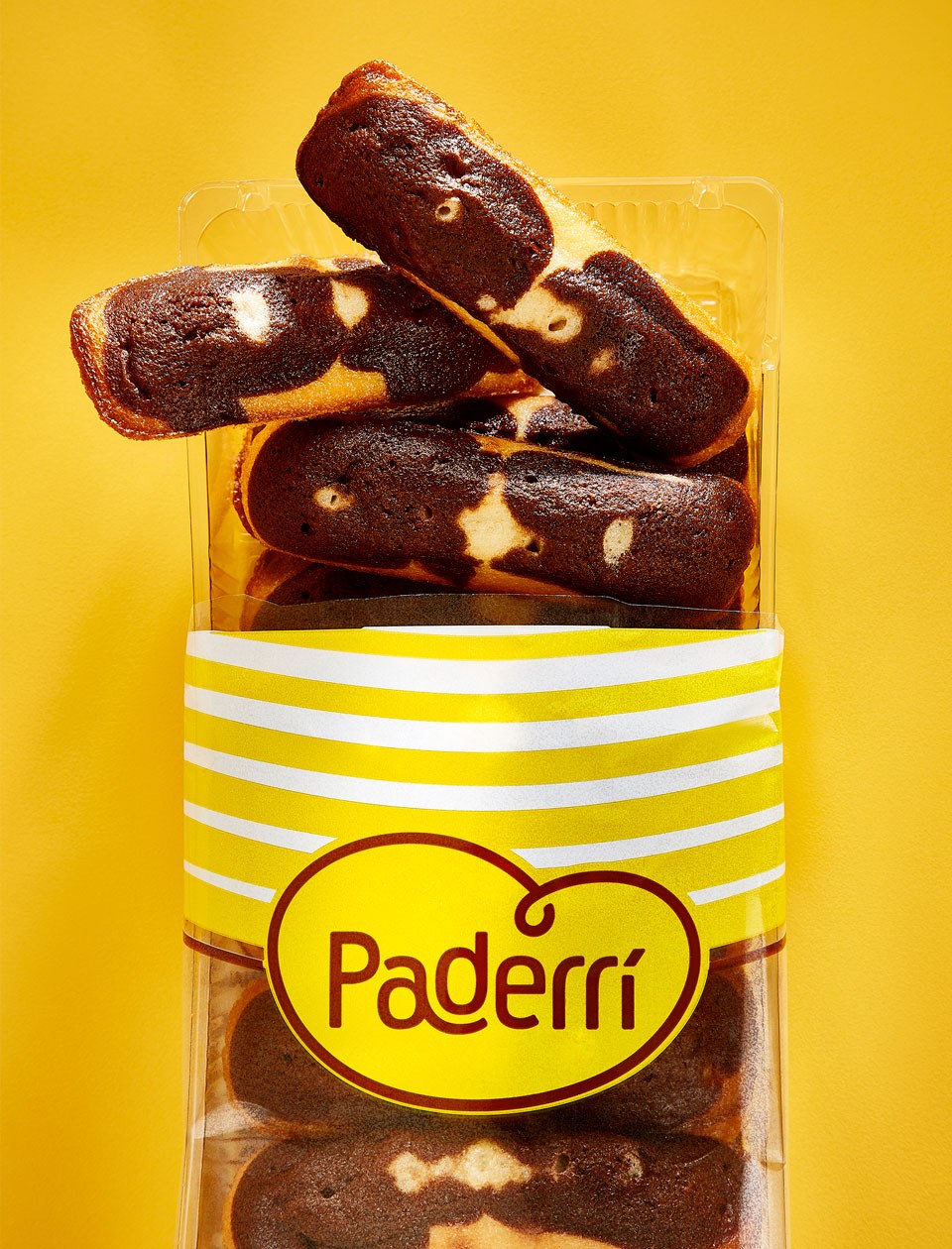
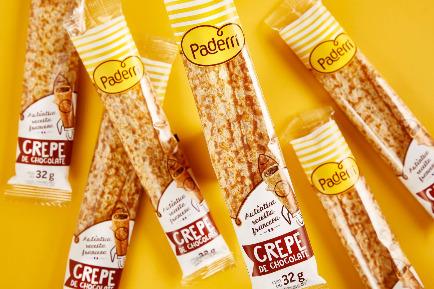
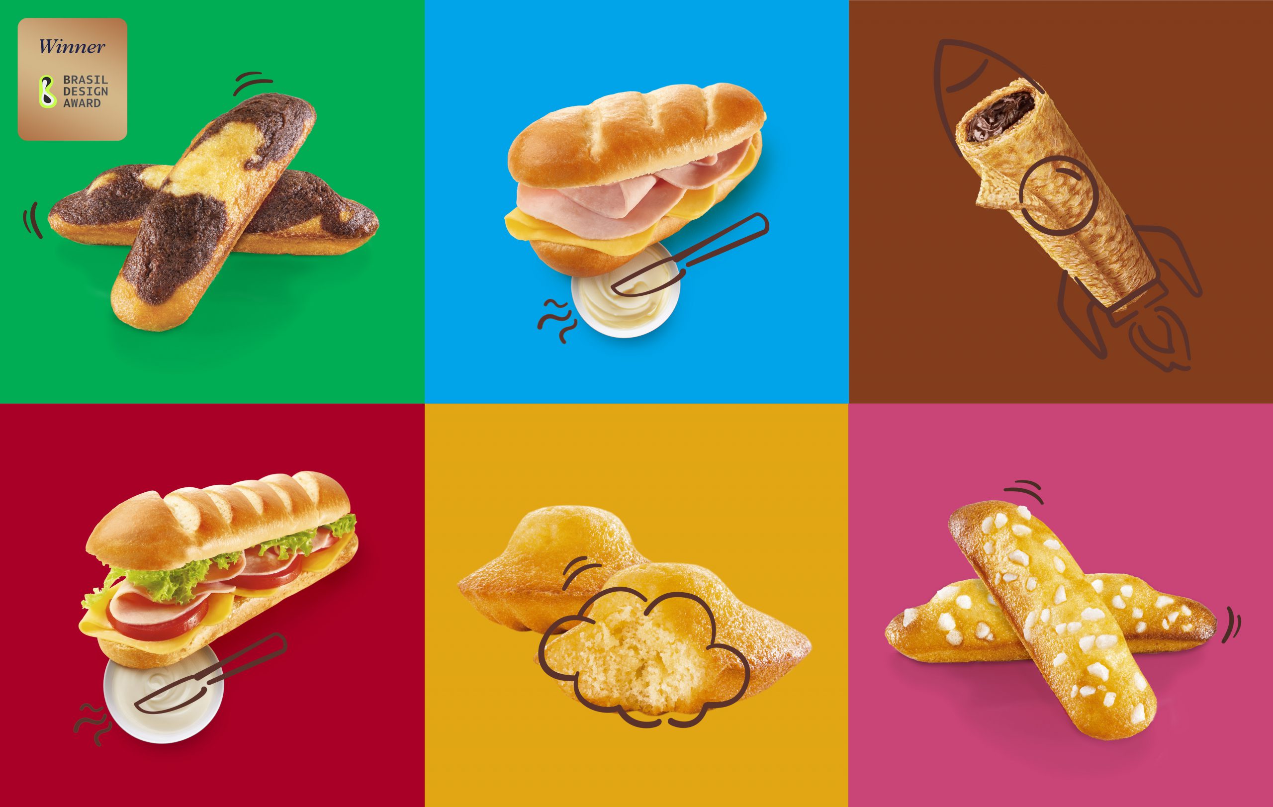
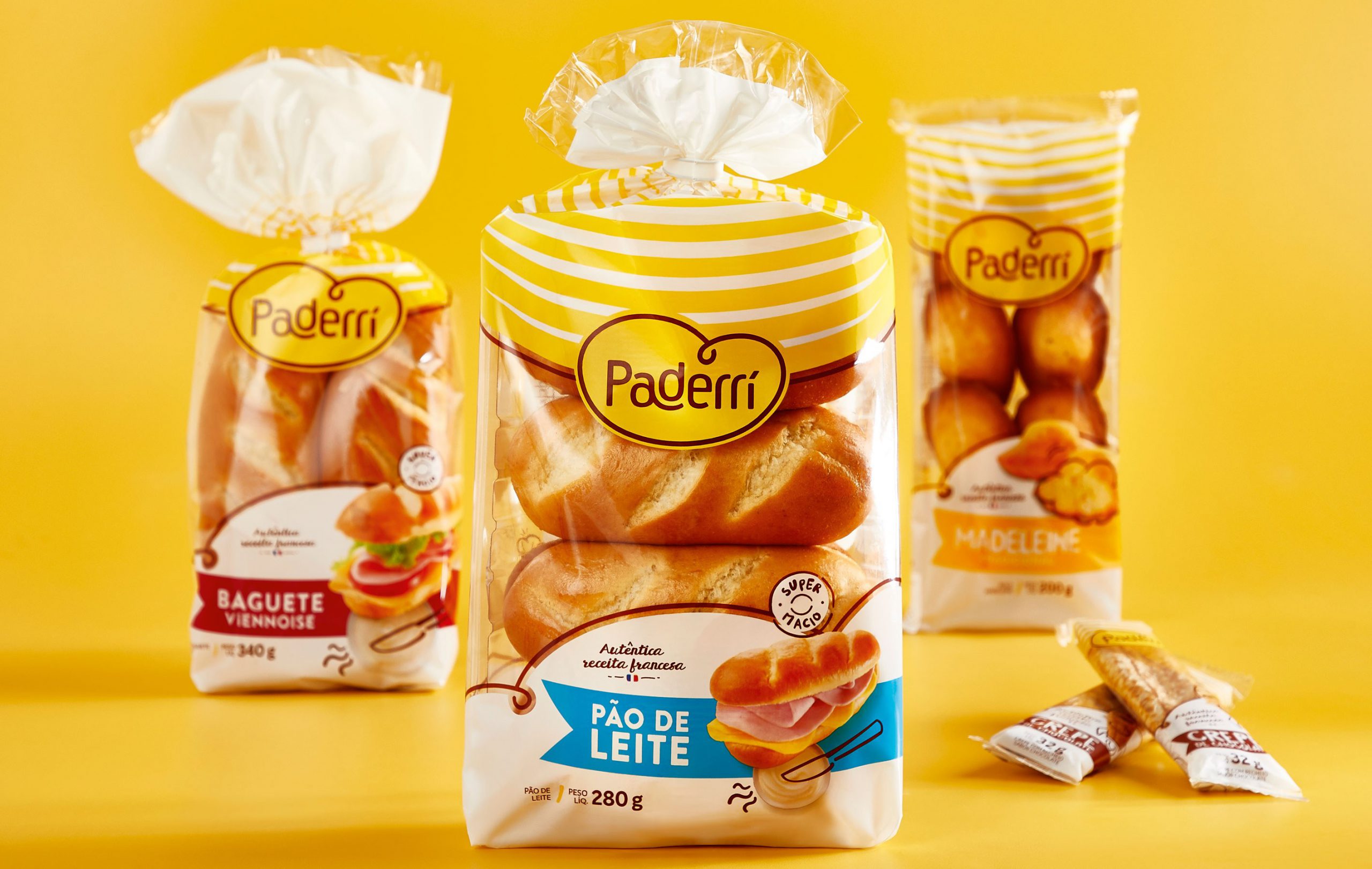
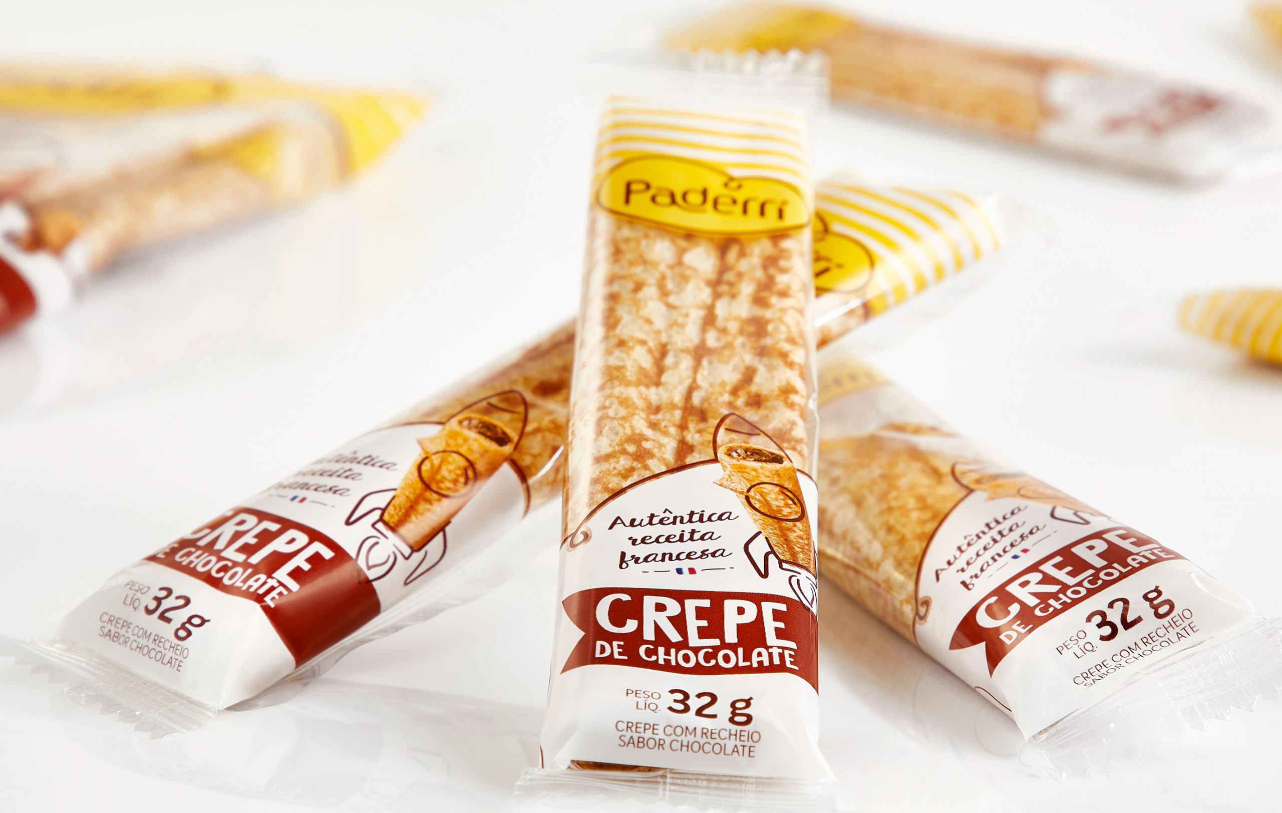
The brand’s typical relaxation enables the interaction between the illustrations and the products, creating unwonted and fun situations. The icons give the sensation of being handmade. Just like Paderrí’s baguettes, madeleines and crepes.
Fresh products, prepared out from homemade recipes with an unmistakable handcraft touch.


Imagine the responsibility of working with a product that is present in Peruvians’ lives since 1927. Sublime counts on a huge penetration in Peru and lots of meanings to its consumers: the chocolate for relaxing from everyday pressure, childhood’s taste, affection at any time.
Relevant to all those who consume it and to Nestlé Peru (the country’s second most important brand), the brand needed to revitalize its story, renew its identity and, through its iconic and proprietary features, settle its importance in the context of national market.
As a long-time partner, CBA accepted the challenge of reworking Sublime brand through an extensive branding perspective: brand architecture, visual identity, packaging, and finally a global vision integrated with all of the brand’s touch points.
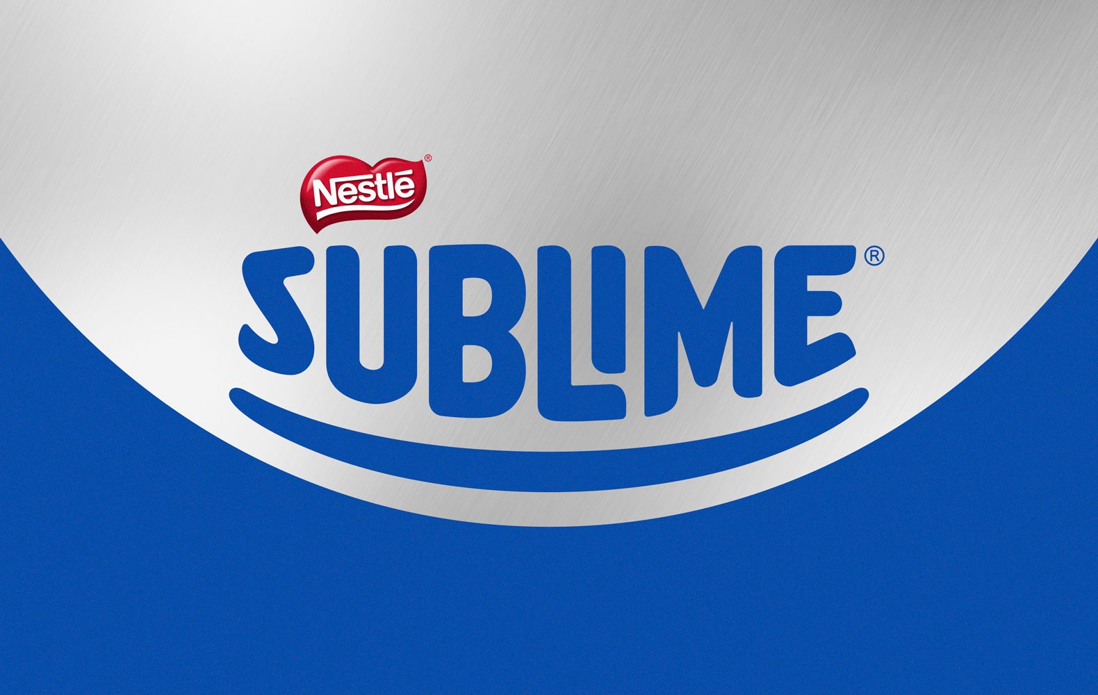
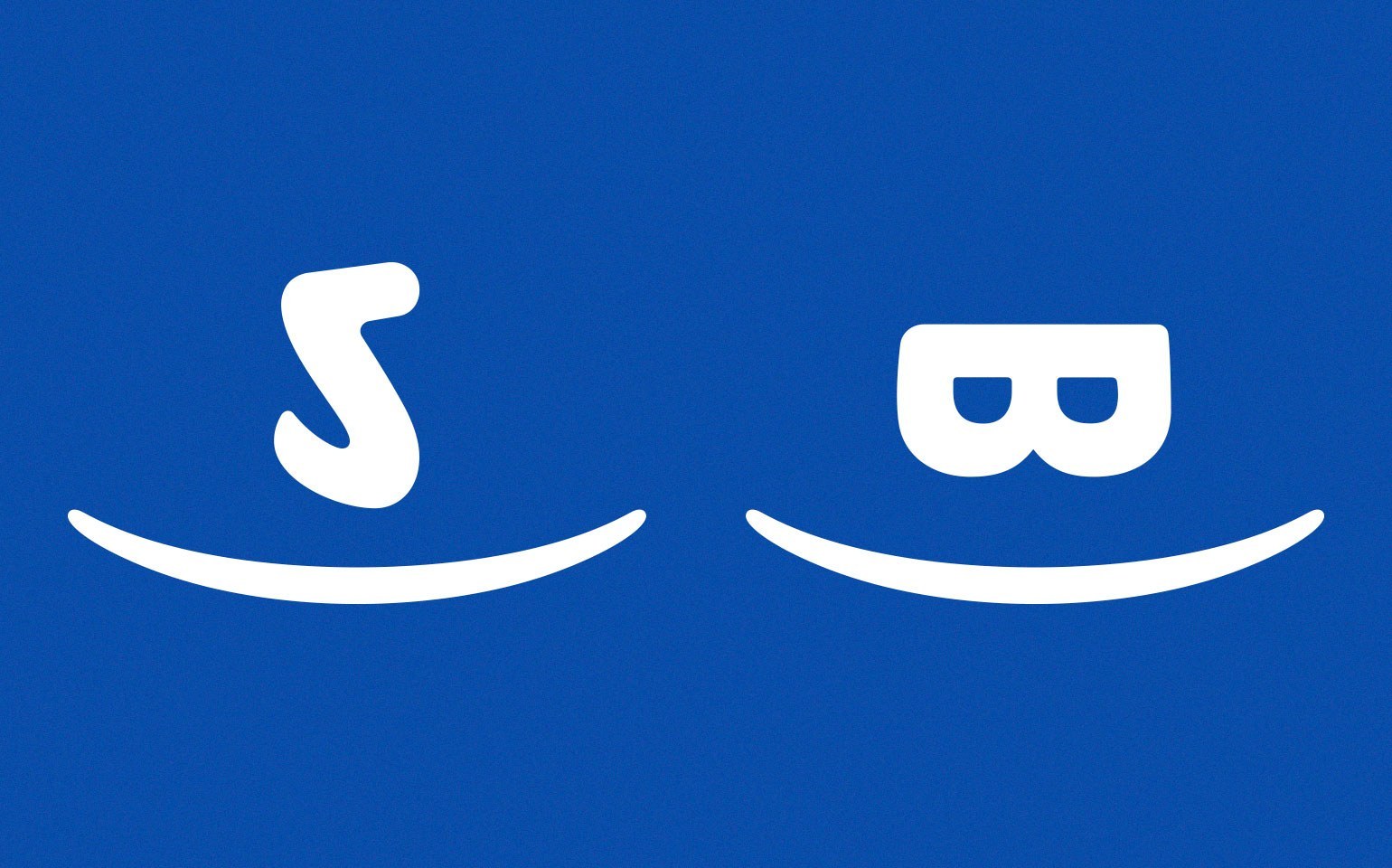

As of Sublime’s essence, “Recarga el buen ánimo”, we proposed to build an extremely structured design system to work its strong identity in a way to contemplate all touch points and reinforce the portfolio strategy.
Along with Nestlé Peru’s marketing, research and innovation teams, CBA B+G carried out an extensive workshop on Brand Senses, a methodology for exploring the brand’s five senses and helping the establishment of the guiding principles of the whole brand identity. The contrast and joy on the colors (vision), the rhythm, the smile, the laughing inspired by the brand (sound), the product’s crunchiness with those little pieces mixed to the chocolate (palate).
Working on the brand’s senses was critical to the next step: exploring different insights to the same message of the brand’s optimism, respecting its essence and its expression territory.

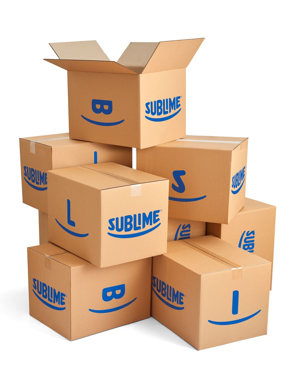
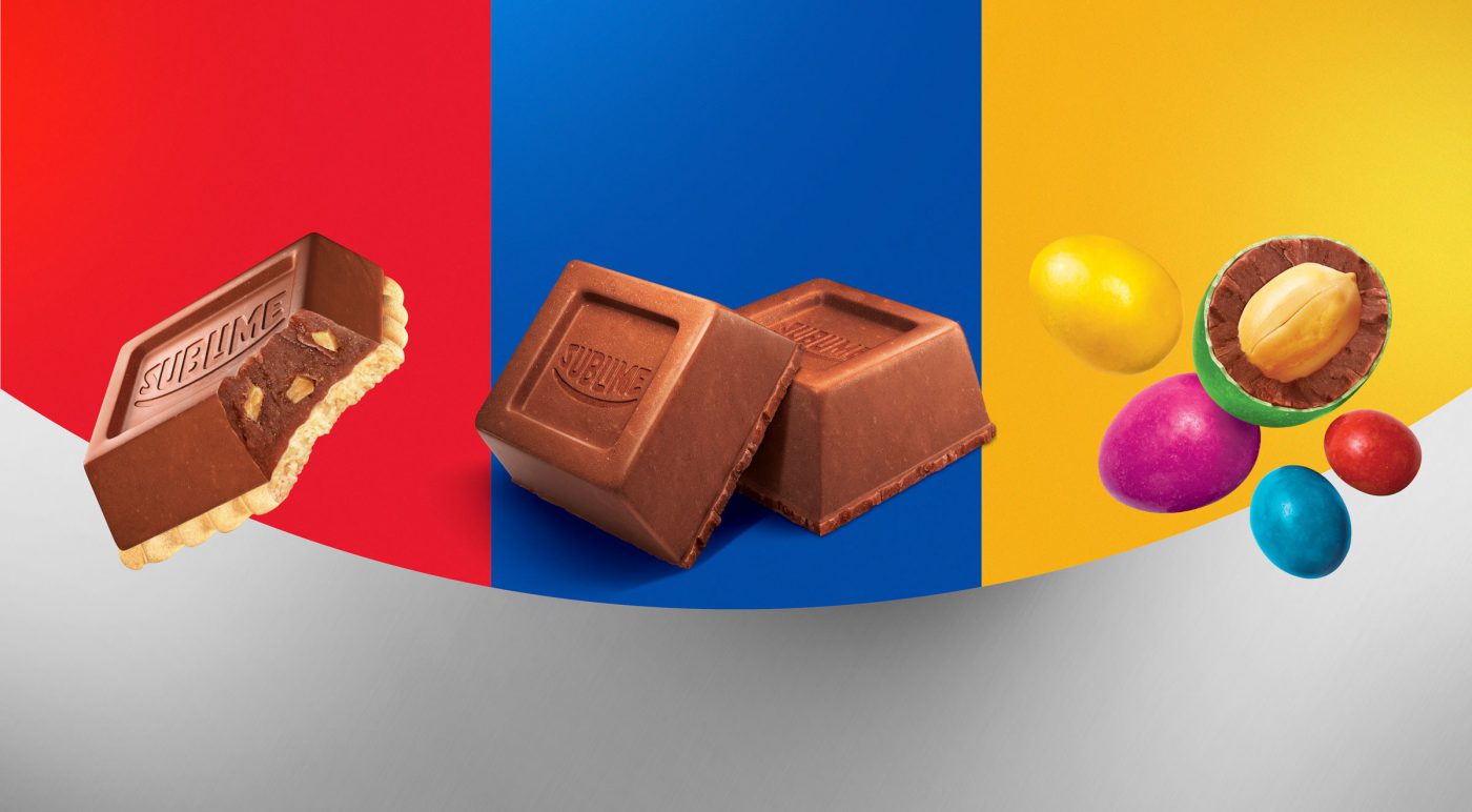
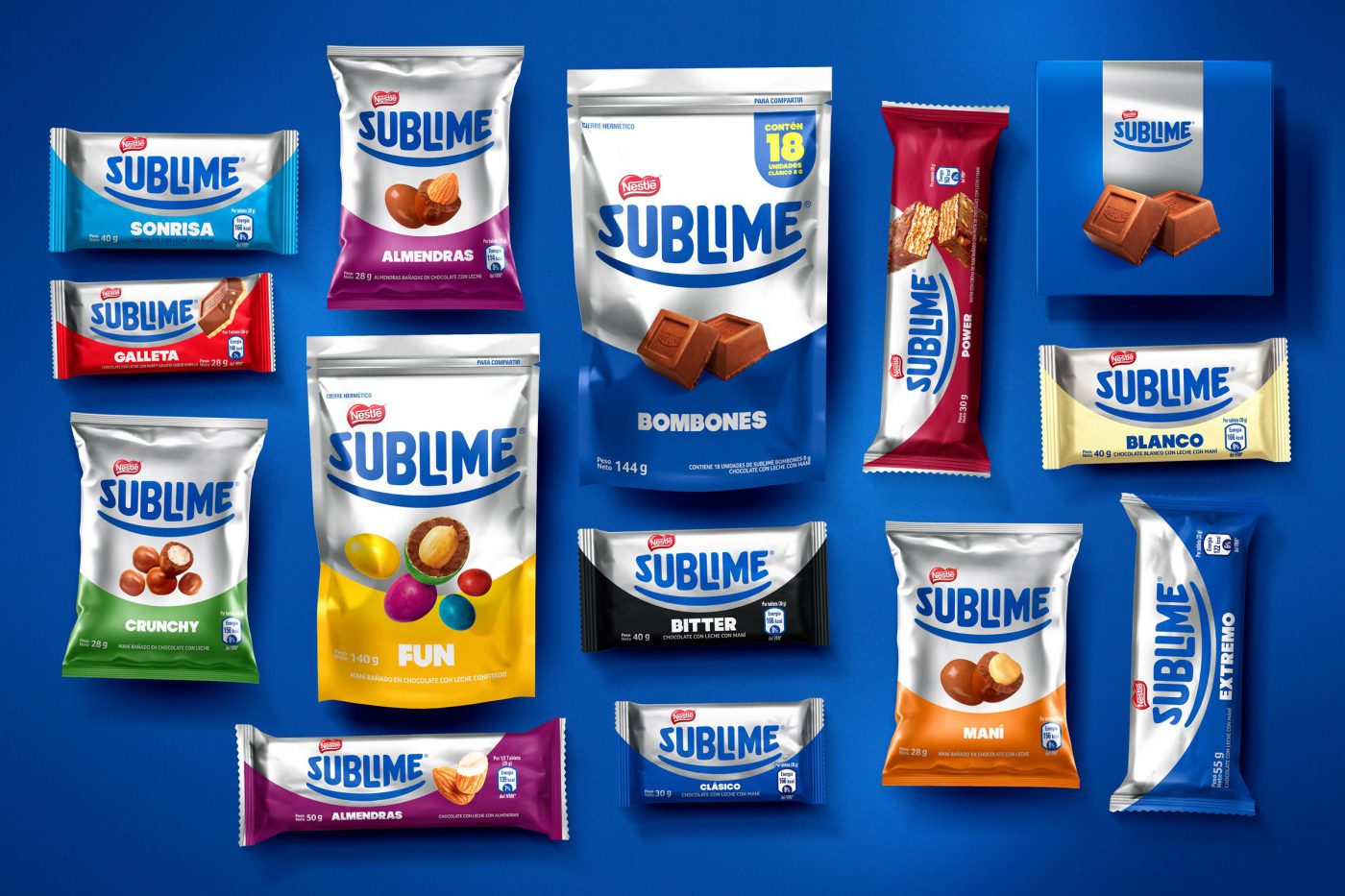
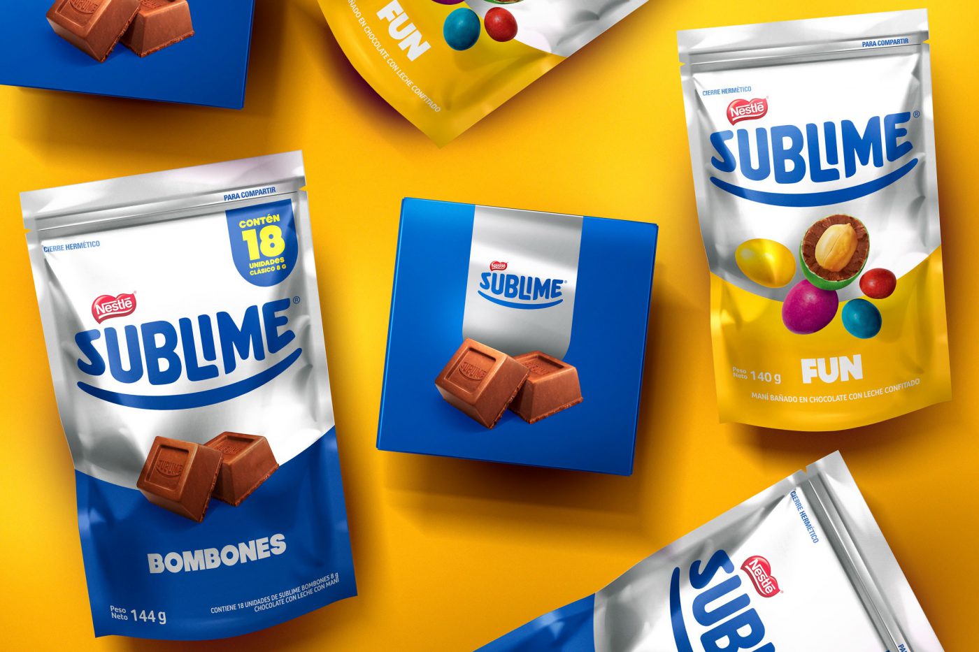
The new identity kept the brand’s proprietary elements, although they were evolved: the trace became a smile and its color system was totally redefined in a way to get closer to Sublime’s inherent senses:
A balance between the iconic blue and silver but added to a color palette full of energy.
We carried out countless material tests and colors to get to the desired contrast. We studied the application of the substrates in different materials, paperboard, laminated – and how it would react when in display racks; we highlighted the contrasts between matte, brightness and color.
Besides recreating all design system and developing a guide on the brand’s use and application (‘brand look’), the most incredible outcome was its cross impact: total integration with the brand communication. As of a consistent and collective work of renewing the identity, JWT, the agency responsible for the brand’s communication adopted a new positioning, the internal staff restructured its product portfolio, the event agency applied the brand’s new concepts as well.
A great case of commitment and integration, which is worth a relevant brand such as Sublime.
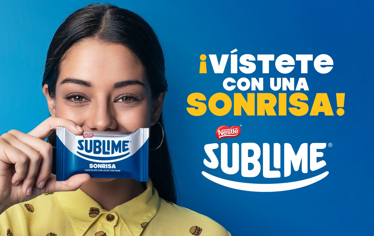
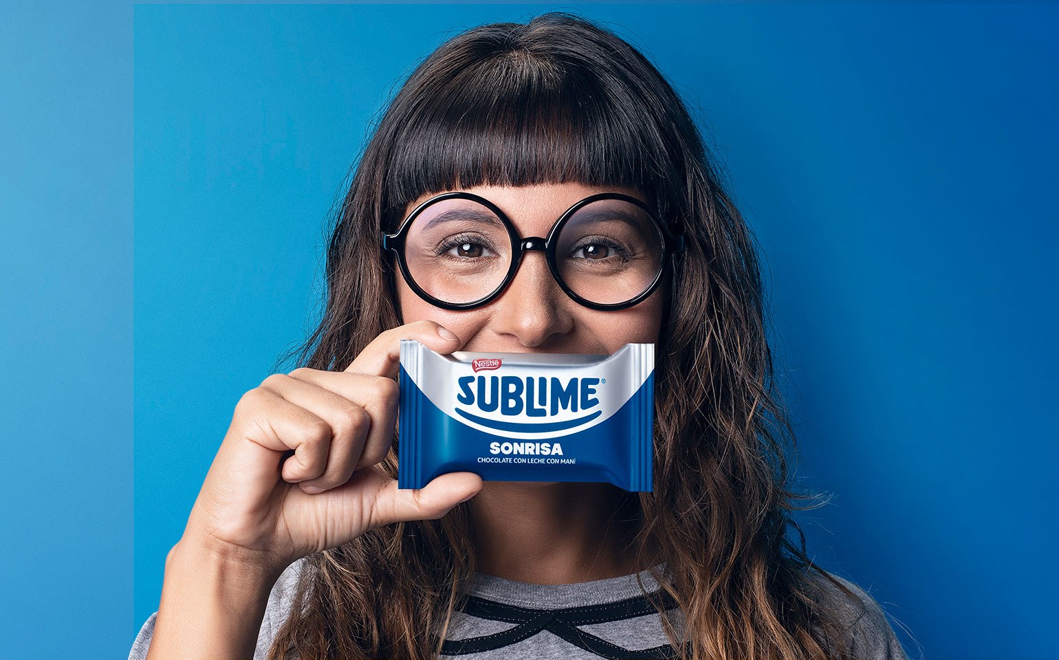
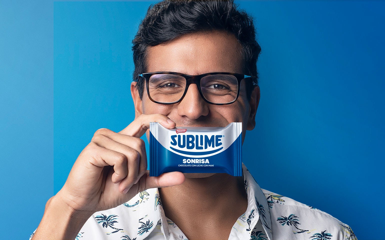
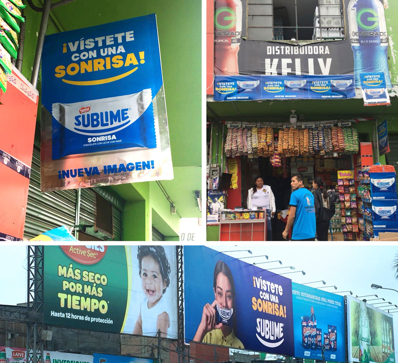
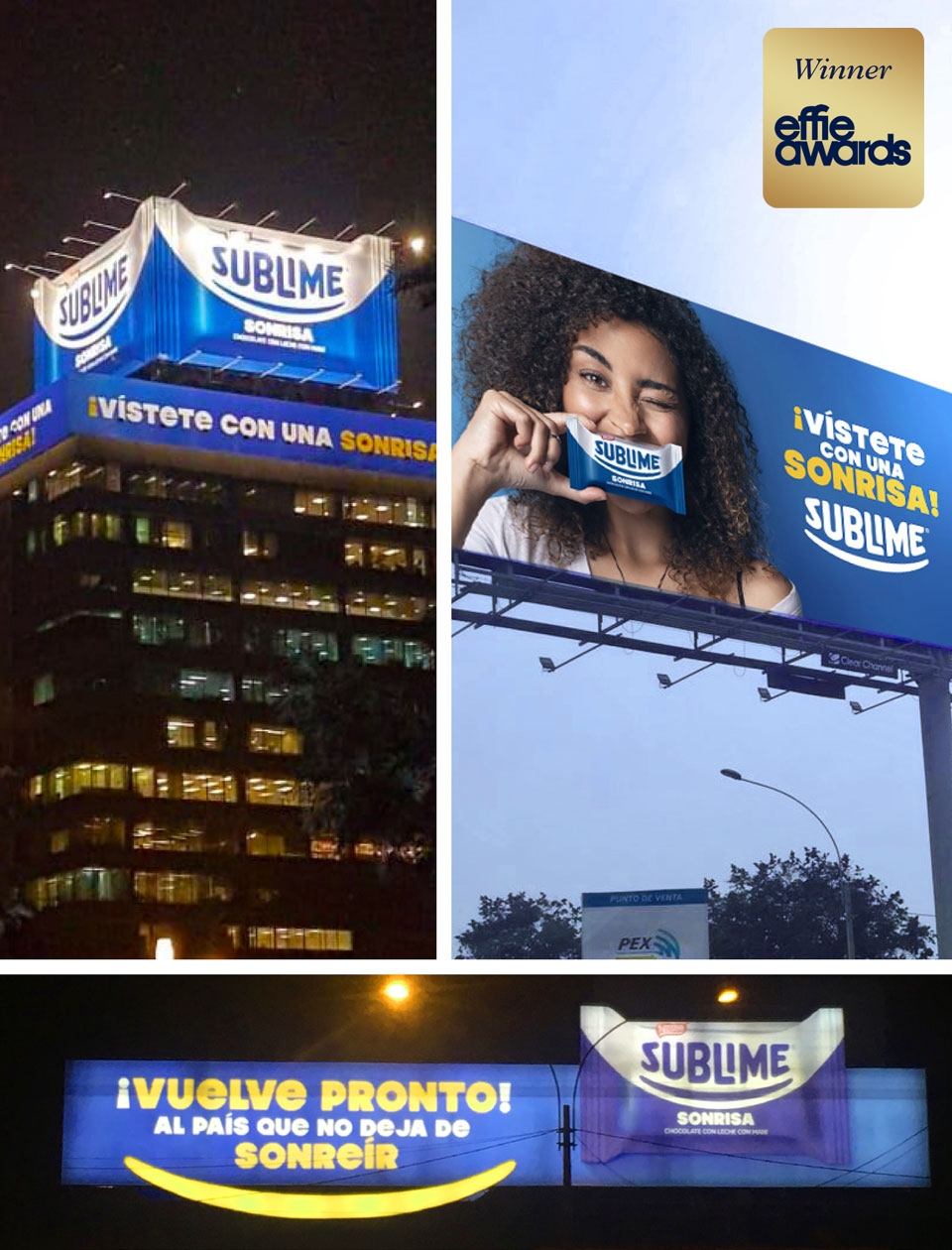
This project won one of the four awards we have earned in the Effie Awards 2019 (Peru), an internationally renowned and respected award in the marketing and communication industry. Sublime received a prize for the advertising campaign “Vístete con una Sonrisa”.
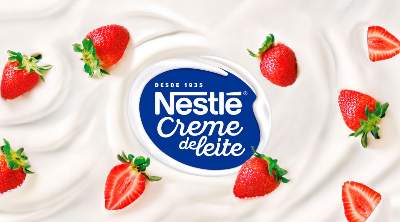
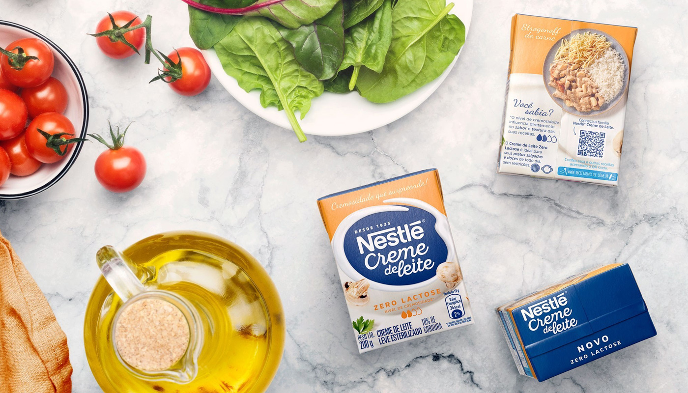
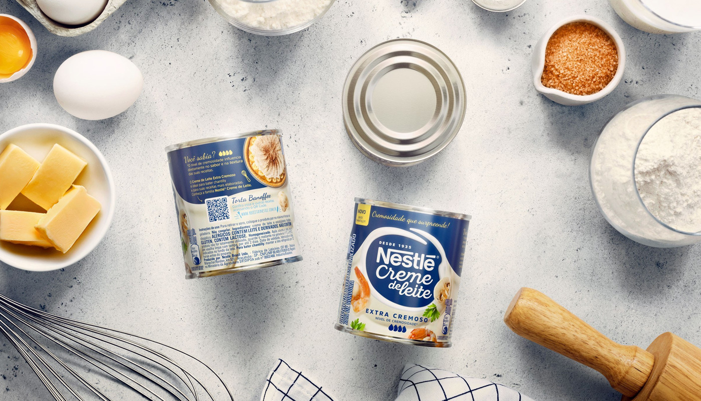
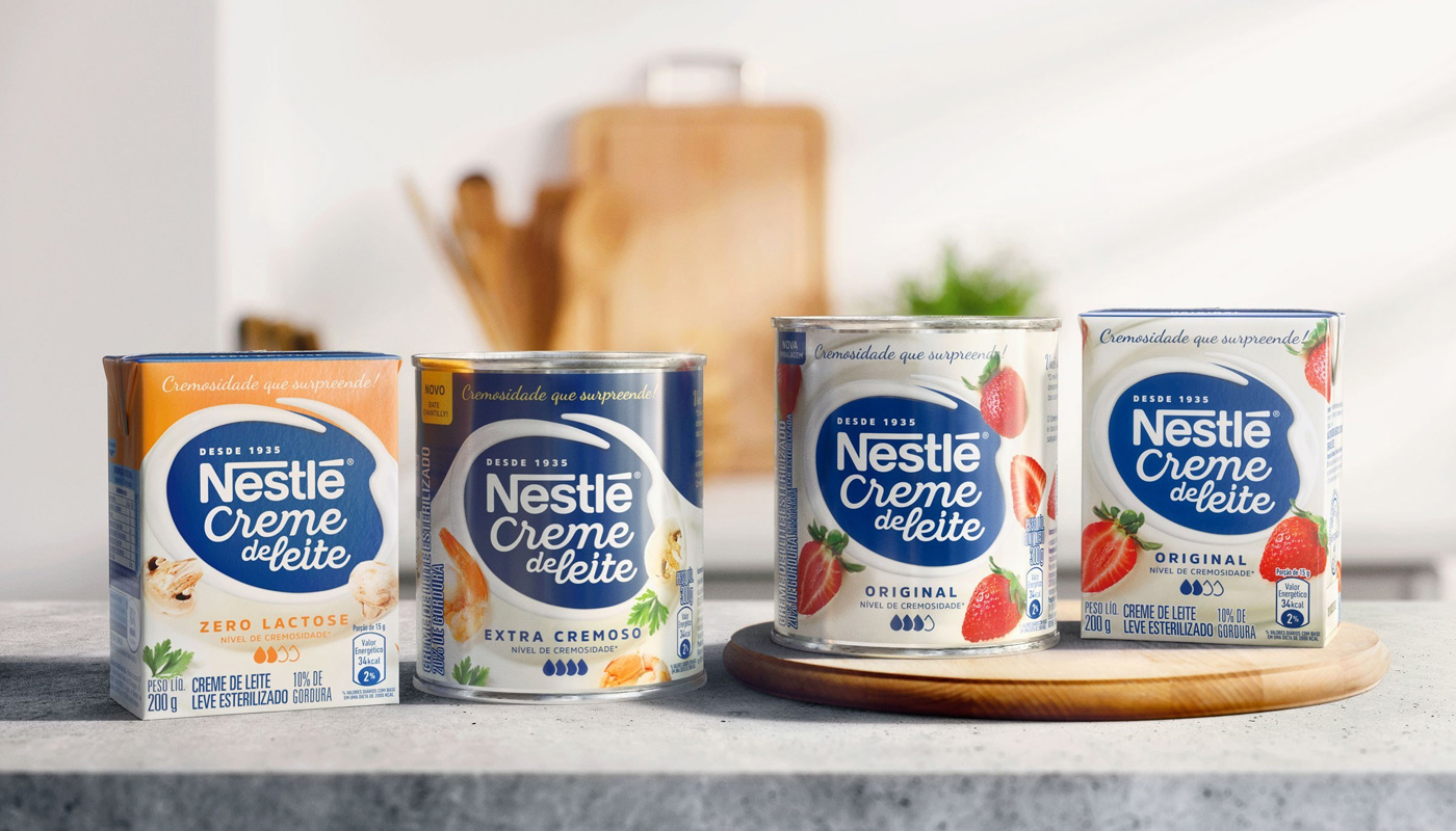
Successful in Brazil for more than 80 years, Nestlé Cooking Cream is an absolute leading product in the category. It is a frequently used ingredient in several recipes, and that is the reason why the brand has decided to invest in a complete identity renewal, aiming to help consumers choose the ideal version to pair each dish.
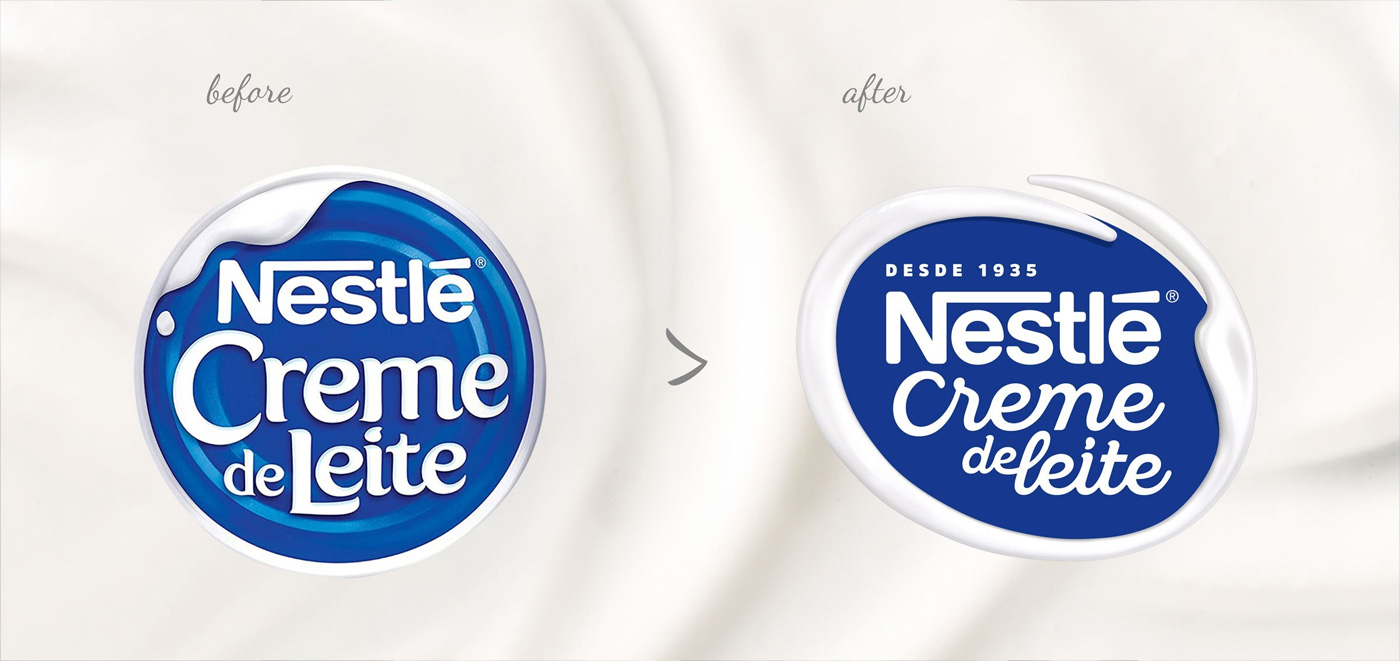
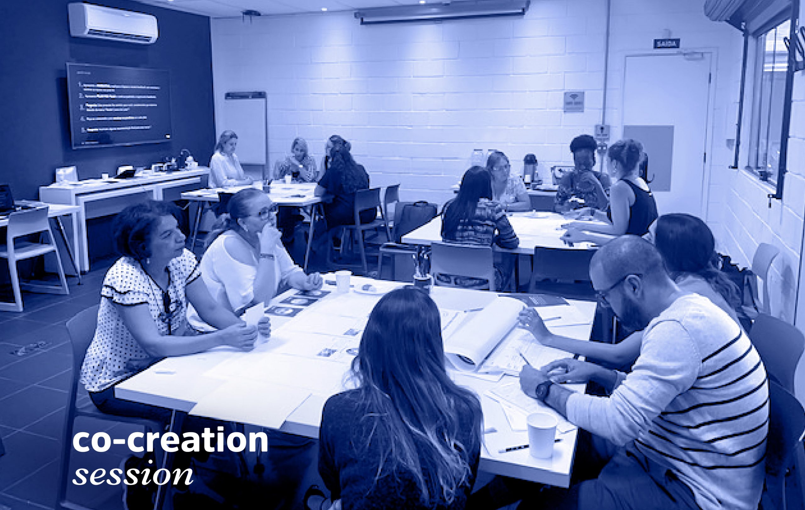
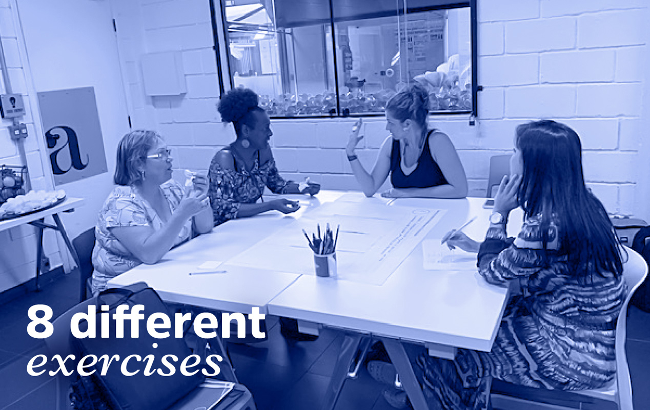
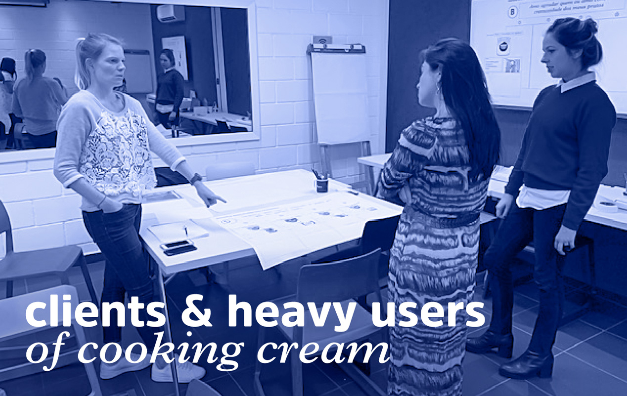
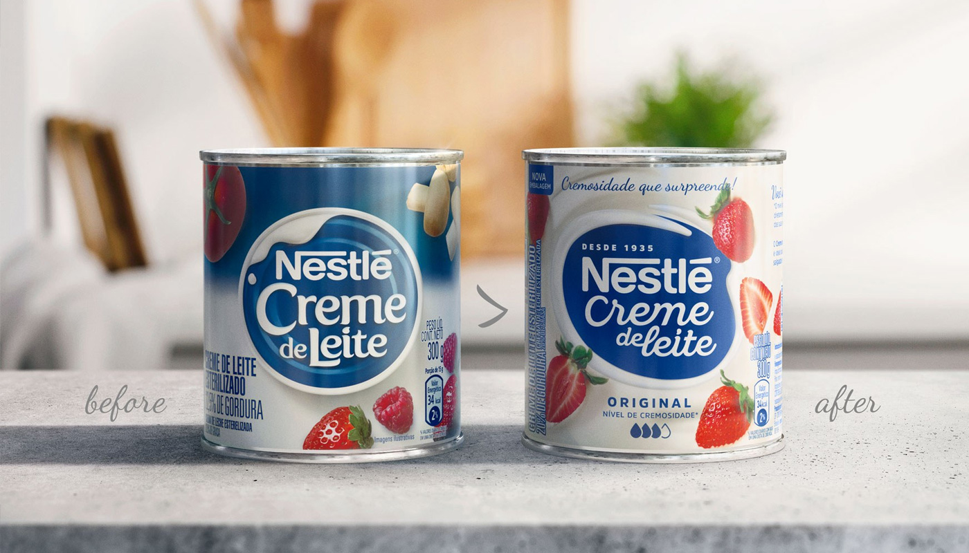
In order to make consumers’ life easier, Nestlé has decided to hear them. The surveys revealed important insights – the product’s peculiar creamy texture and versatility – that were used to build the new visual identity. The first insight was definitely the key driver of all the creation work – everything revolves around the creaminess, and all the other visual elements were created based on that feature. The solution found was to give consumers the autonomy to choose the variety that best pairs their recipe through a simple and intuitive visual system – the more drops, the creamier.

Concerning versatility, the visual path developed focused on inspiring the consumer by making him or her notice how easy it is to transform a simple, ordinary dish into something special. Thus, we have created packaging that are more connected to the needs of the person who cooks, improving the quality of the information on the label, exploring new recipes and including a QR code for those who want to learn more.
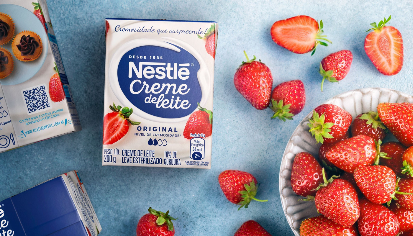
With the renewed design system, and inspired by the real needs of its consumers, Nestle Cooking Cream was back to the media with the campaign “As creamy as it can get!”, a landmark for the brand, which had not launched a communication campaign for 19 years. All the branding work, starting from the visual identity to the subsequent packaging application has also served to rethink the product’s portfolio and the brand’s future steps.
As a result of a workshop on Brand Portfolio Optimization, brand marks and layouts for new lines and varieties of the product were developed, representing a breakthrough innovation, not only in the brand’s portfolio, but in the category as a whole. The Cooking Cream line of sweet and savory pâtés was created! As new (and tasty) as it can get!
Braskem’s renewably sourced polyethylene – a result of the combination of innovation, technology and sustainable development – was conceived to promote a better impact to the environment.
In line with the company’s commitment to Circular Economy, the I’m green™ bio-based plastic resin, produced from a renewable raw-material – sugar cane –, is now considered a business opportunity, due to the product’s contribution in reducing carbon footprint.
To start the brand repositioning, our team’s first move was to explore. We studied the category in-depth, analyzed the brand history up to the present moment and – a particularly important step – we interviewed several of the brand stakeholders – from Braskem’s employees, clients, to recycling companies.
During this phase of study, we dived deep into the company’s portfolio of circular economy related products with renewable and recycled source solutions, and a point got very clear: why not join these resins in a single portfolio, combining the quality of their deliveries?
This idea stood as a key point in the next phase of the project when we in fact started to build the brand’s new strategic positioning. Based on the fact that I’m green™ is already a recognized brand in the market, acknowledged by the partners that promote this chain, moreover presenting an innovative feature, why not take advantage of its own brand to expand the scope, making it represent Braskem’s portfolio of products with a Circular Economy approach?
With the survey inputs at hand, the next step of the project was to answer the question: Ok, but how are we going to make it happen? What is the best way to enlarge the portfolio and how should we handle each solution? To solve the challenge, we held a Sprint Lab workshop. For two days, we and Braskem’s team of professionals from all over the world have worked collaboratively, developing together the new portfolio architecture, with an expanded brand identity and new visual routes to be explored.
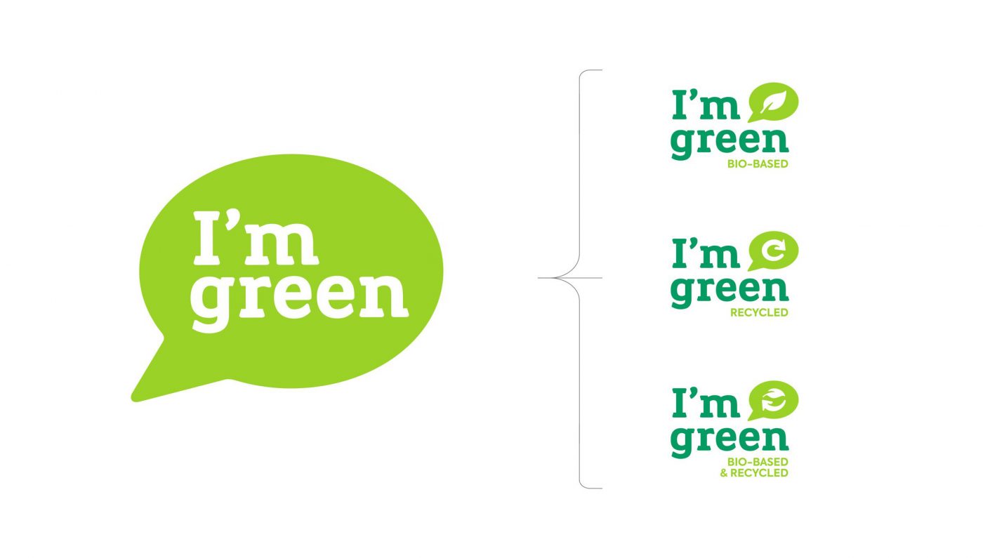
To highlight the strong points of the existing products from renewable and recyclable sources and their similar values, aligned with the Circular Economy, we have started by defining the purpose, personality, and essence of Braskem’s set of offers. At this point, our strategy and design teams worked closely together. For all to understand how to deal with the brands as a whole, we have created visual prototypes to make possible changes – as well as their impact – tangible. These prototypes were then presented in a survey conducted with clients and partners, to capture their feelings about the new organization of the brand’s portfolio, where I’m green™ featured as a Masterbrand and, under it, stood the products from bio-based and recycled sources.
In order to add force to I’m green™’s identity, a verbal language was established based on the new strategic settings. Purpose and essence were the foundation for the definition of the key messages and the brand’s tone of voice. The Masterbrand visual identity was updated, and products sub-brands were created to work together with the existing visual concept. Moreover, the look & feel was developed to design a more modern and updated portfolio. The verbal and visual work has culminated with the creation of the products’ Brand Guidelines and the Brand Book for I’m green™ Masterbrand.
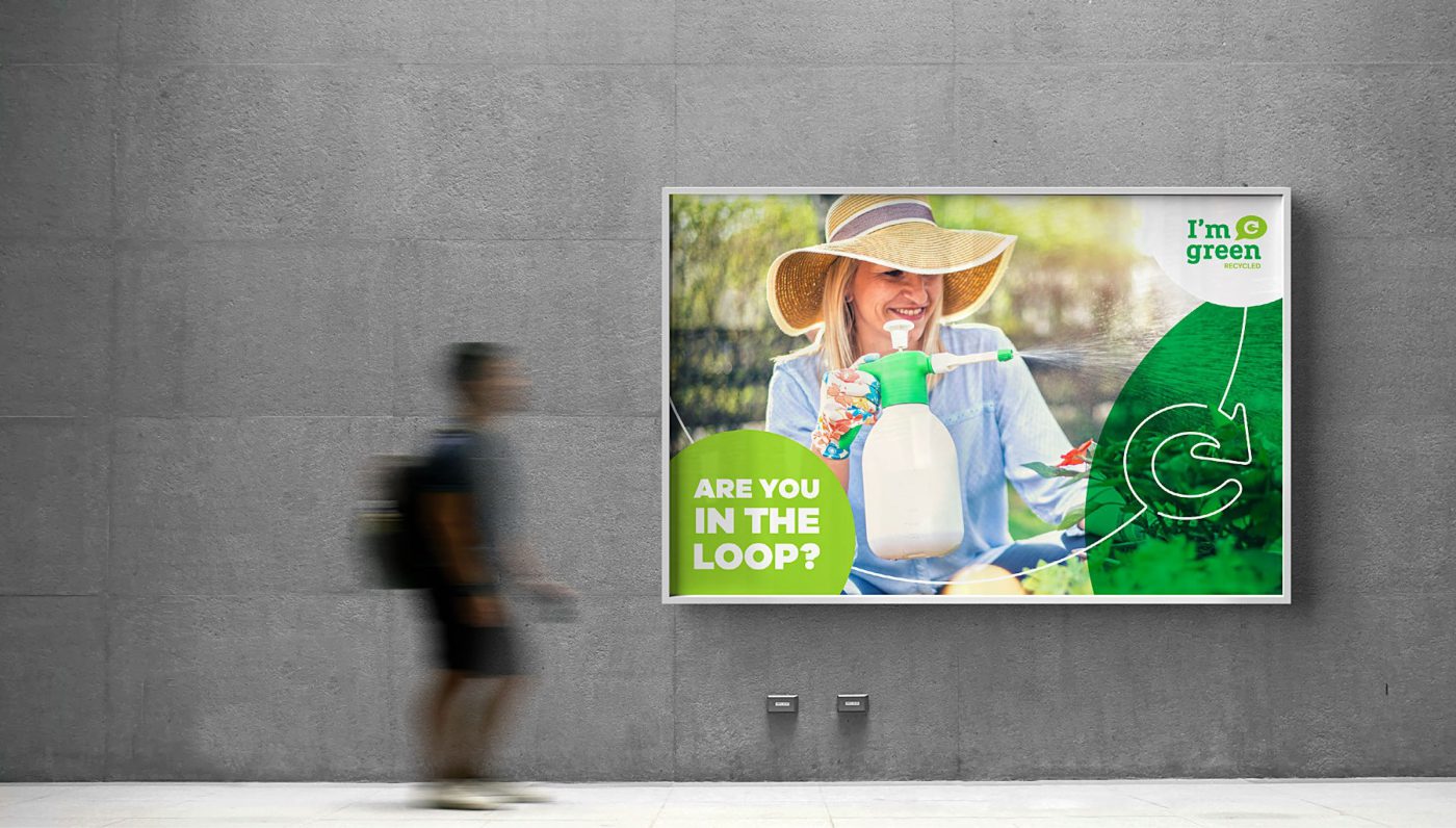
The official launch of the new Masterbrand and the products sub-brands was announced at the end of 2019, at K Trade Fair, an important fair for the plastic and rubber industry that takes place in Dusseldorf, Germany. So, with a renewed look and purpose, I’m green™ was reintroduced to the global Market, leveraging Braskem’s presence with sustainable solutions and reinforcing the company’s commitment to Circular Economy.
Note: the content of this text refers to CBA B+G case created for I’m green™.

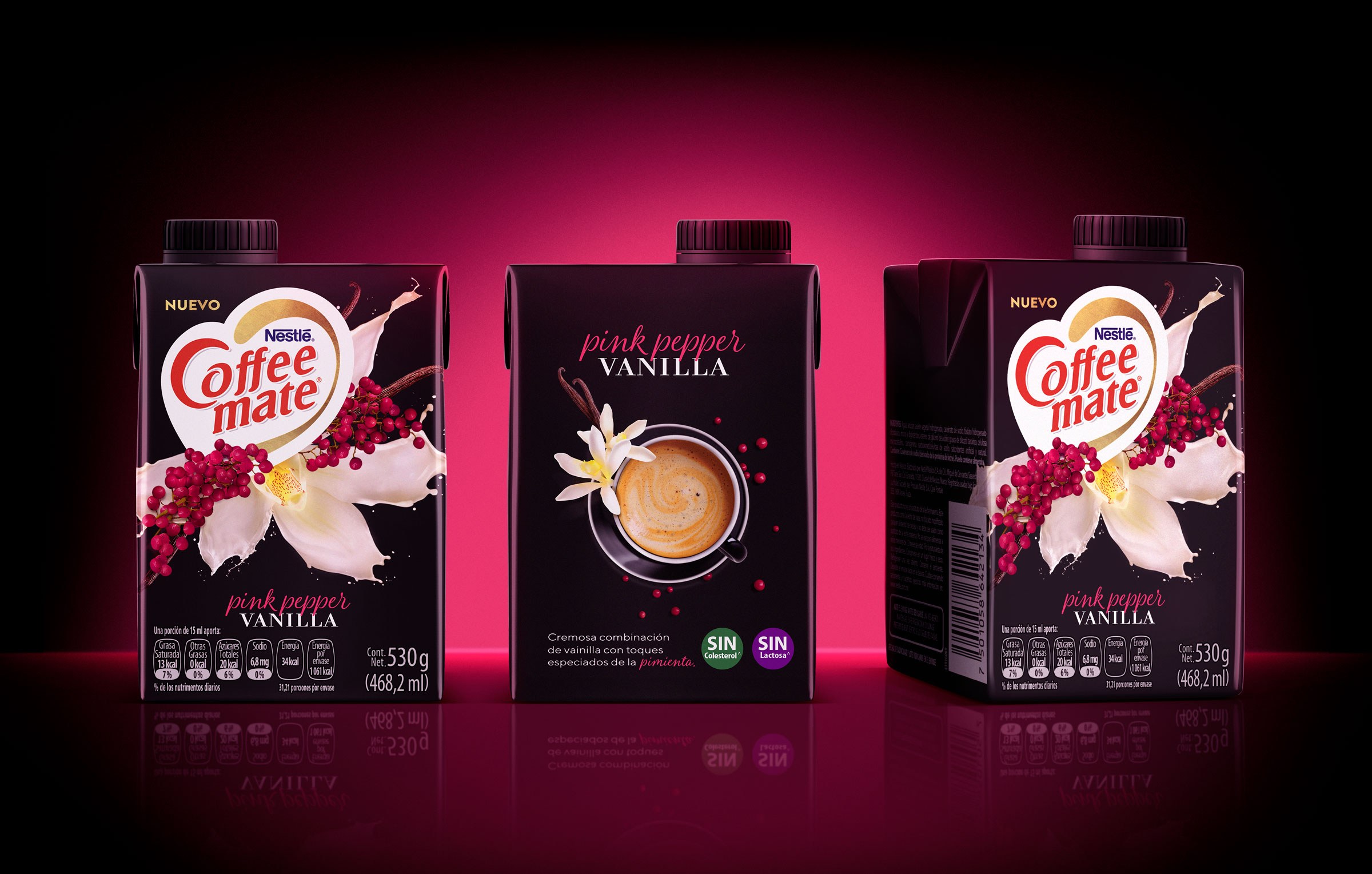
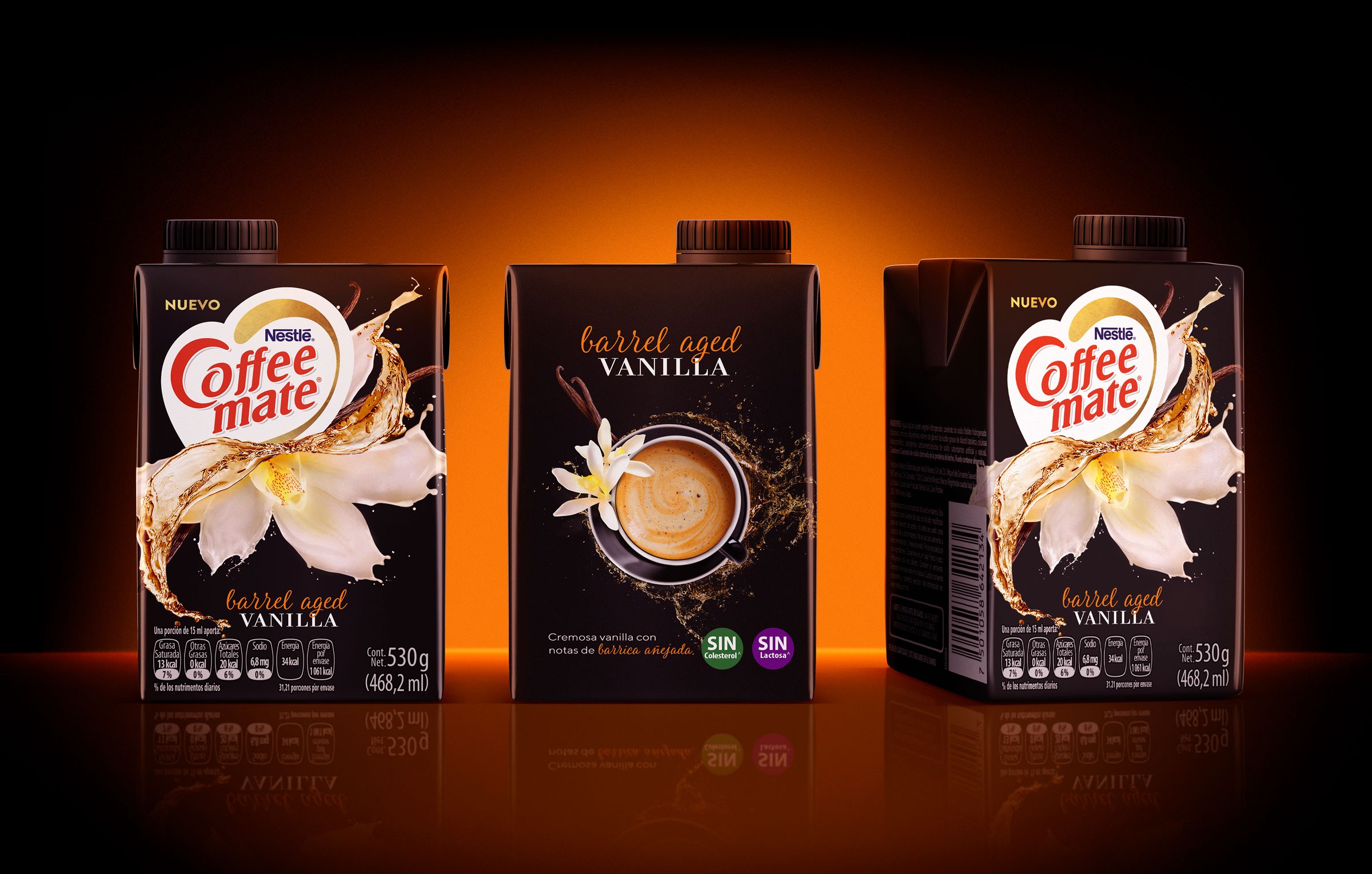
Commonly used in Mexican and North American markets, Coffee Mate is a coffee whitener, available in liquid or powdered form, which gives coffee a creamy rich flavor. Aiming to offer its key customers different consumption choices and win yet more consumers, Nestlé Mexico asked CBA B+G to develop new premium products for the brand, to seduce the taste buds of its faithful adorers.
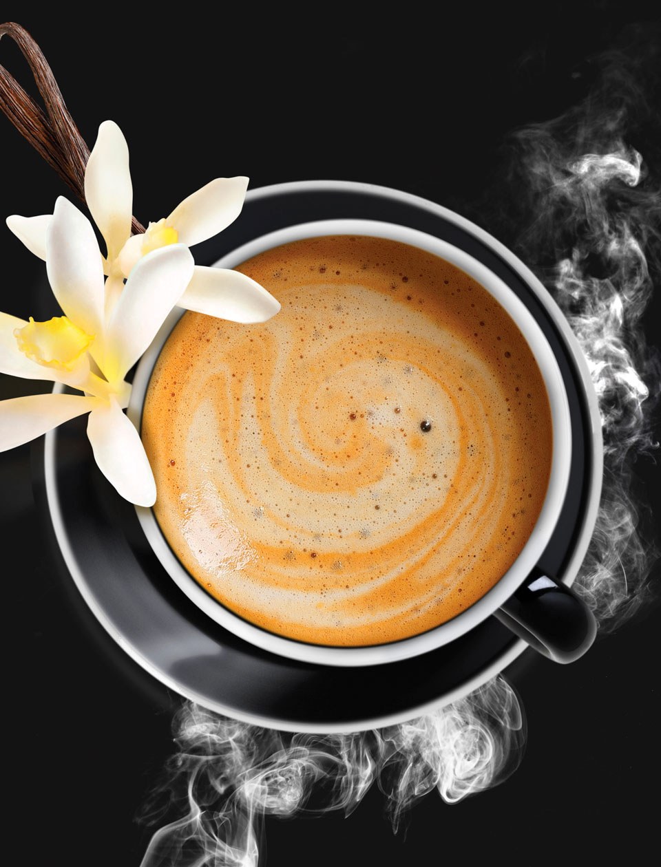
In transition from youth to adulthood, the millennials are demanding consumers, who are connected to novelties. As they are starting to develop the habit of drinking coffee, they look for options to reduce its bitter and acid taste. Along with our analysis to understand the category, the target consumer and their habits, Nestlé’s internal data appointed vanilla as a much-appreciated taste by the target, for being authentic and provoking different sensations.
The next step was to map creative territories and, from them, find visual concepts that would translate the innovation inherent to the product – enhancing texture and flavor to an ancient, traditional drink such as coffee.
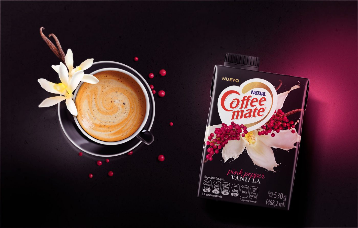
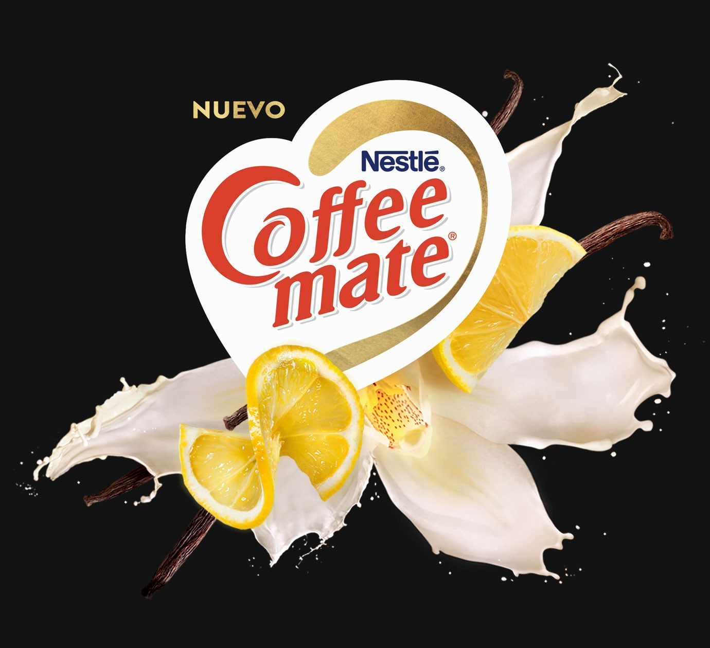
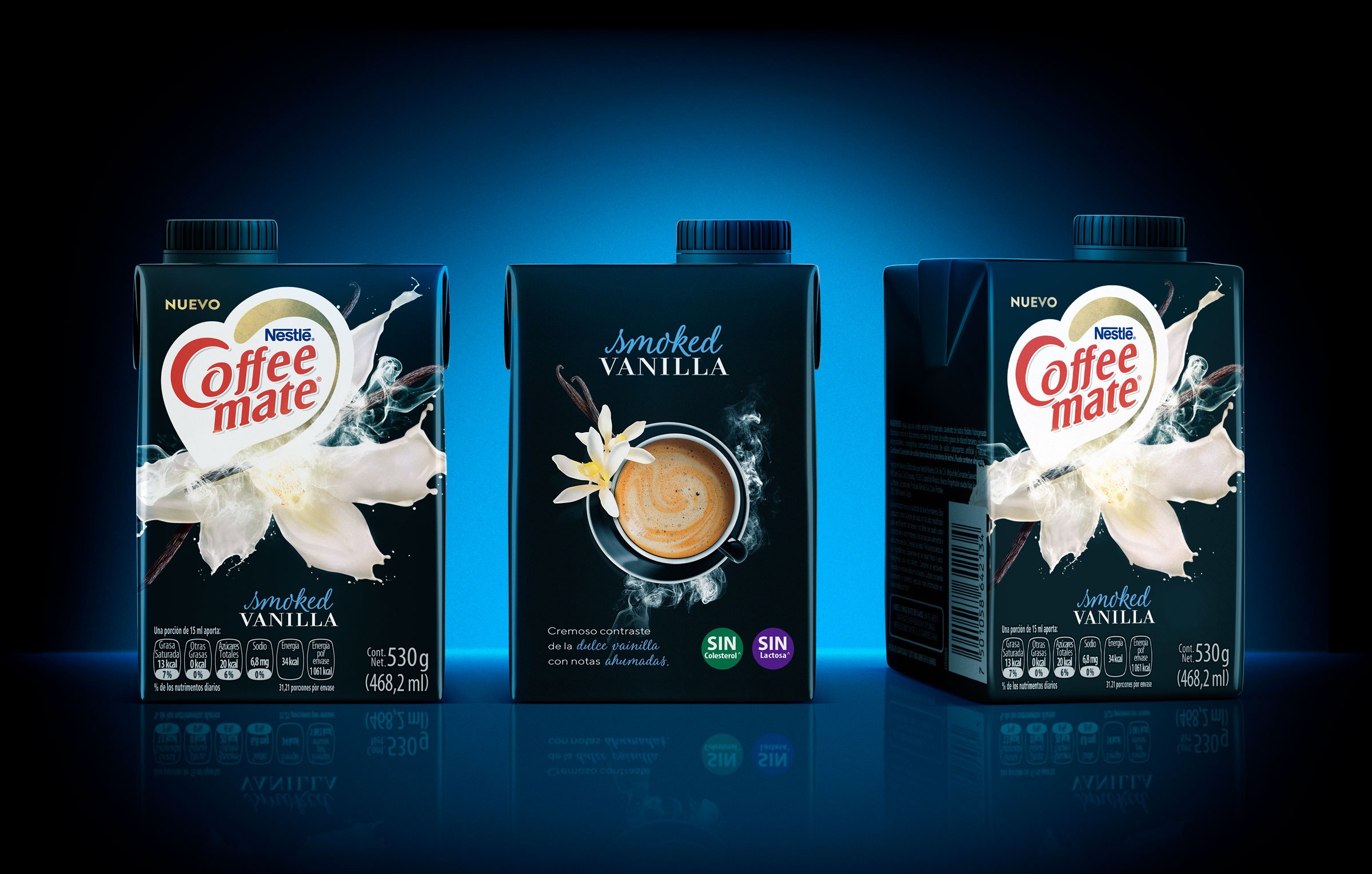
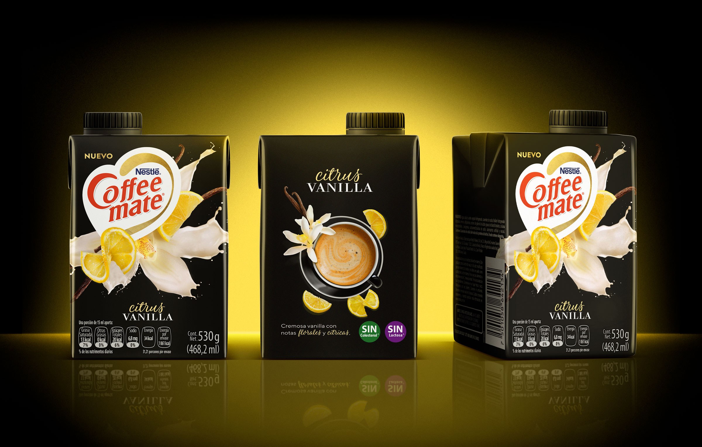
Among the creative concepts developed, the vanilla blossom turning to cream was the one chosen, a perfect metaphor of the mixture of flavor and creaminess offered by the product. The visual identity was created based on this concept and was applied to the 4 new flavors of the liquid version of Coffee Mate, all special variations of vanilla – the target consumer’s preferred flavor.
An explosion of pleasure and taste, but with the exact amount of daily indulgence searched by the young adult consumers of the brand.
To reinforce its leadership as a music expert, MTV hacked the world of music in a co-creation Project involving studies and surveys with its audience and music specialists.
The outcome was a platform that helps brands explore the music world as a way to connect to its audience – the MTV Music Hack.
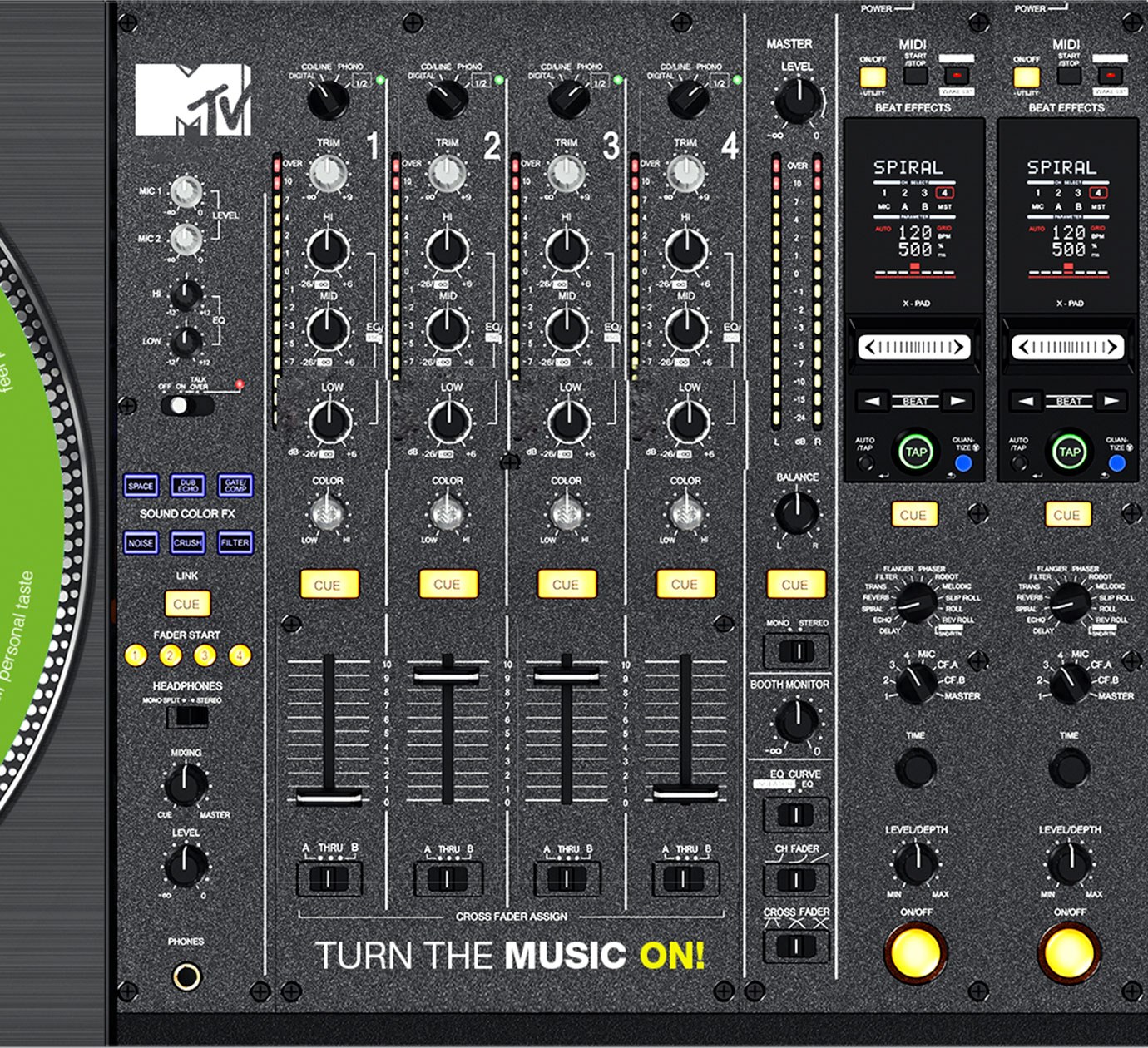
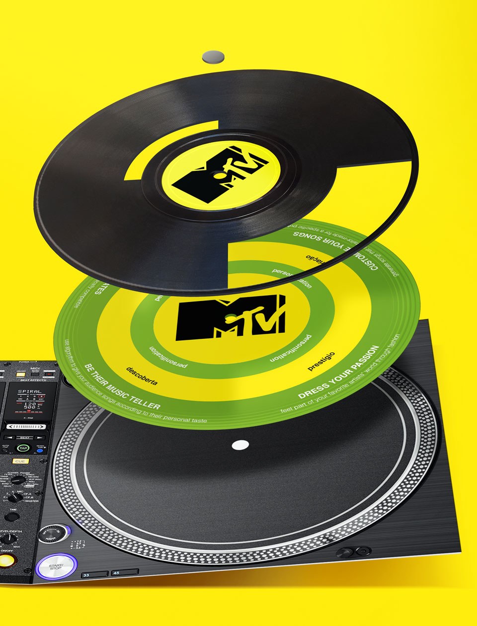
We not only helped with the extensive strategic work of developing the platform (we carried on surveys and hacklabs about music platforms with music specialists, producers and beat makers in our hubs in São Paulo), but we also created the information material – an inspirational and strategic support guide for advertisers who wish to create music projects in partnership with the company.
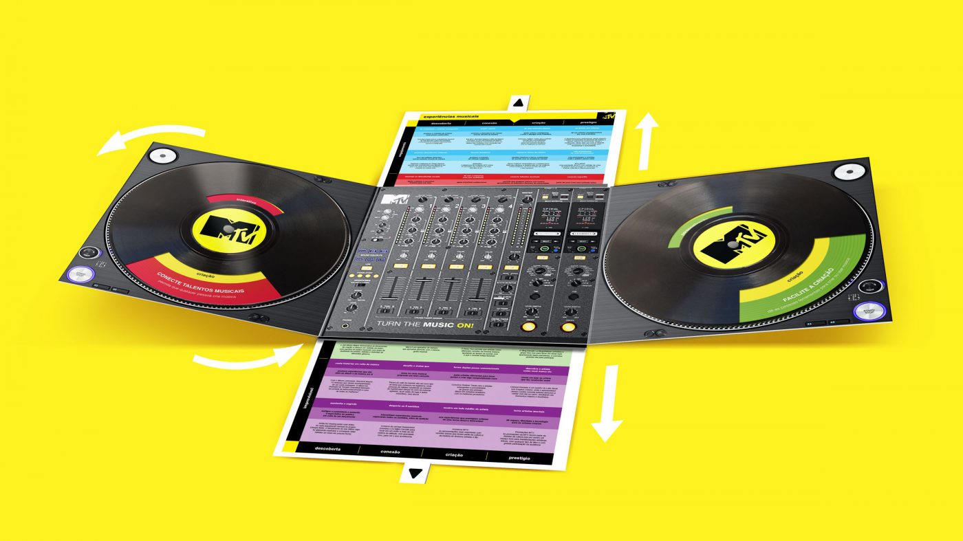
We developed the concept, content and design of the catalogue, which is totally inspired by the music world. Alluding to a DJ pick up, the material is divided into 4 discs – each one representing a trend that has been impacting the musical world (involvement, customization, interactivity and surprise) which, combined with a musical experience, works as inspiration for new actions from MTV and its partners.
MTV Music Hack is an excellent job example where strategy, studies and labs evolve into a real and valuable product for the client – and in this case, for the client’s partners as well.
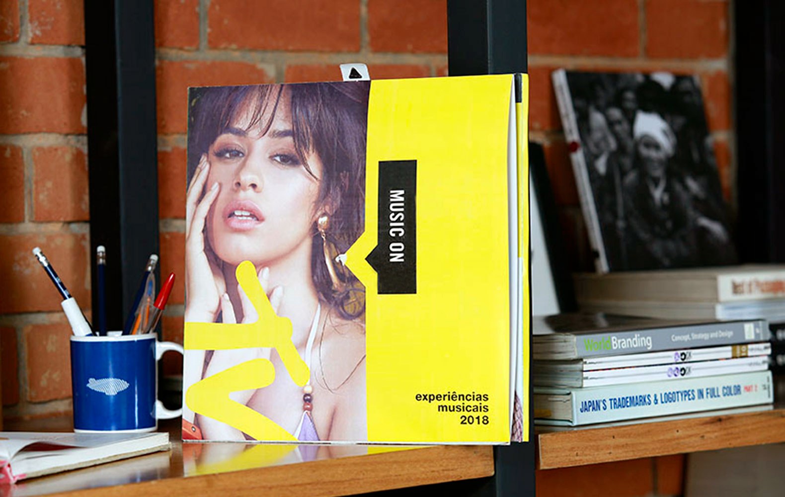
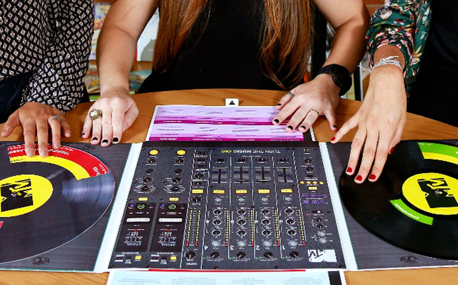
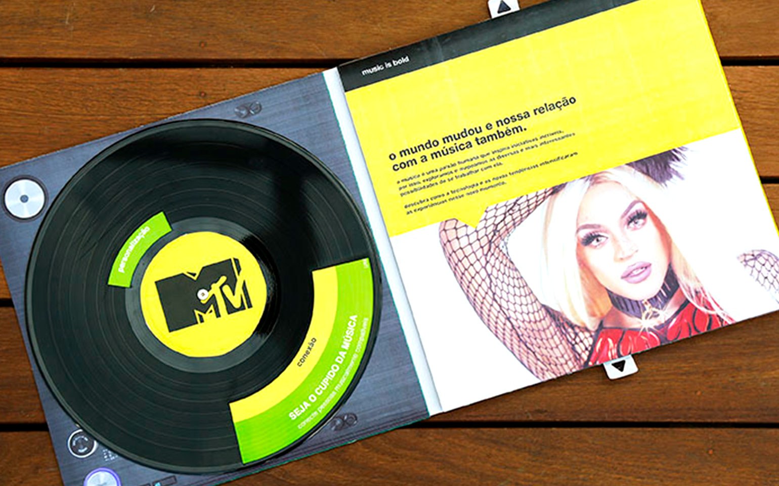
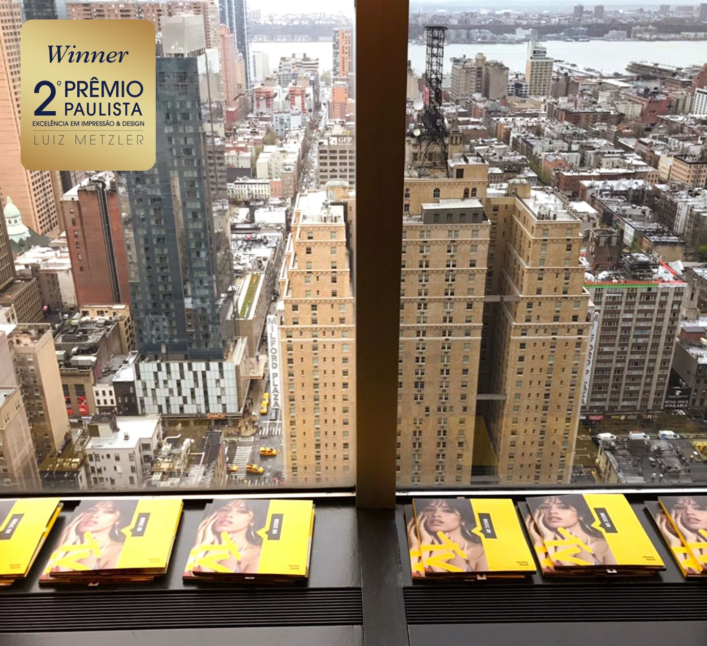
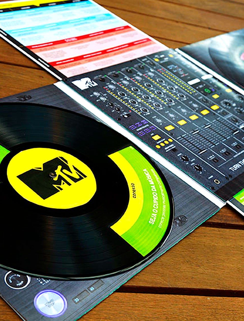
This project won the 2nd Abigraf SP Award (Brazilian Printing Industry Association), a prize we have won three times in the category of Best Design and Innovation. MTV Music Hack was awarded for the ‘Catalogue/brochure –visual concept and design of catalogue for clients’.
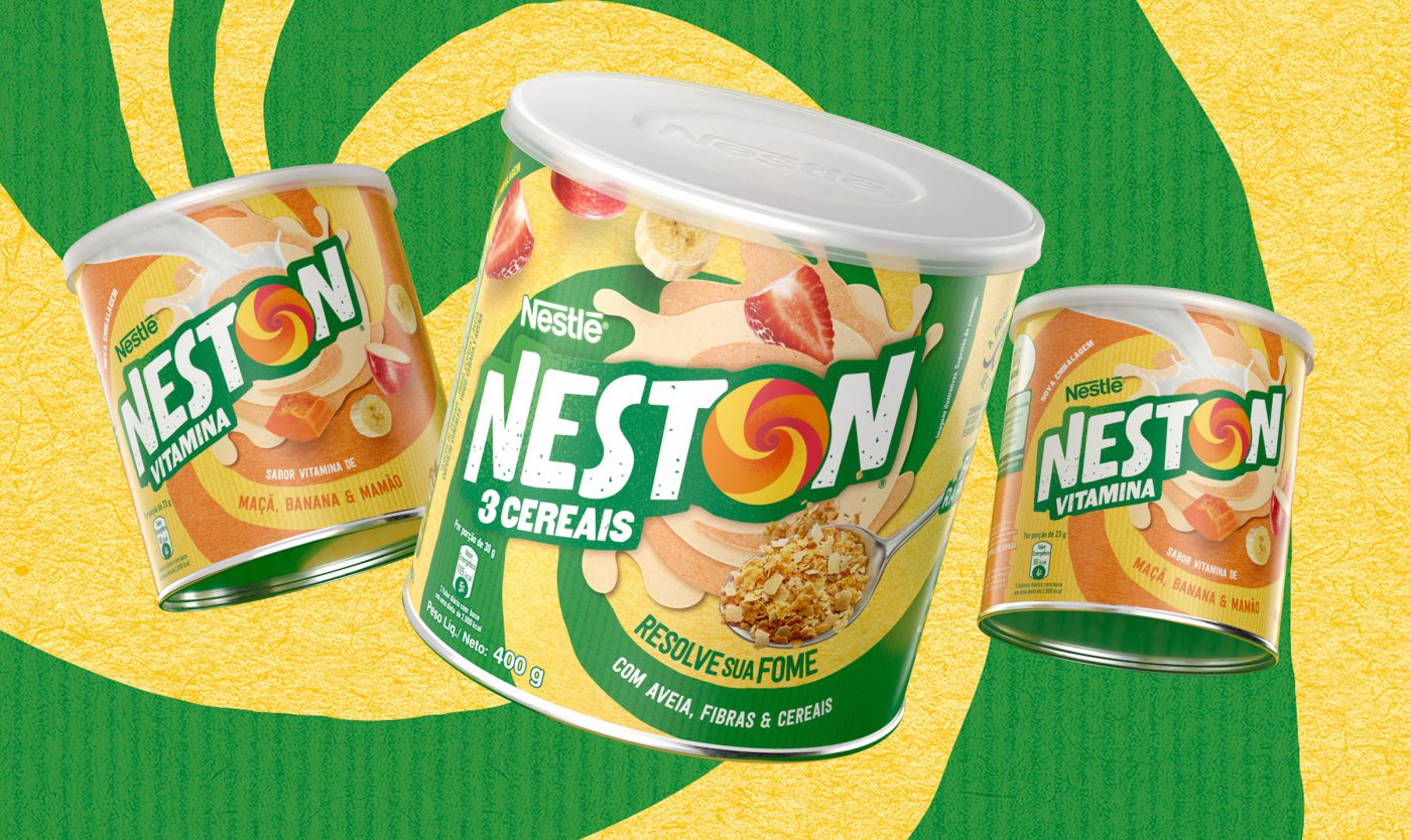
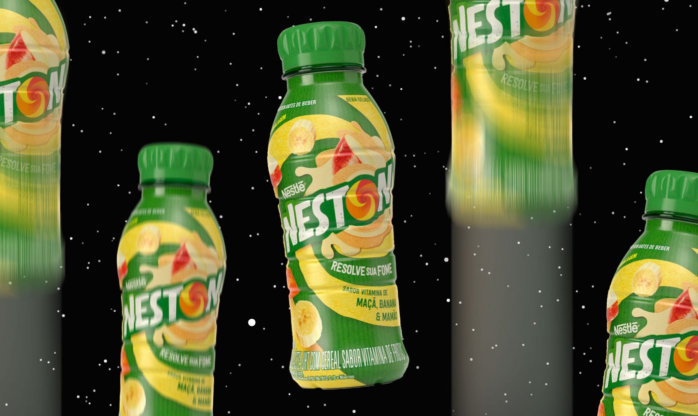
How to keep updated at the age of 60? This is Neston’s challenge, a brand that was born decades ago with the aim of contributing for a healthier and more balanced nutrition, and which is still faithful to its purpose until today. However, the world and the people have evolved a great deal since 1958, and to realign the brand communication we, from CBA B+G, were asked to reposition the brand.
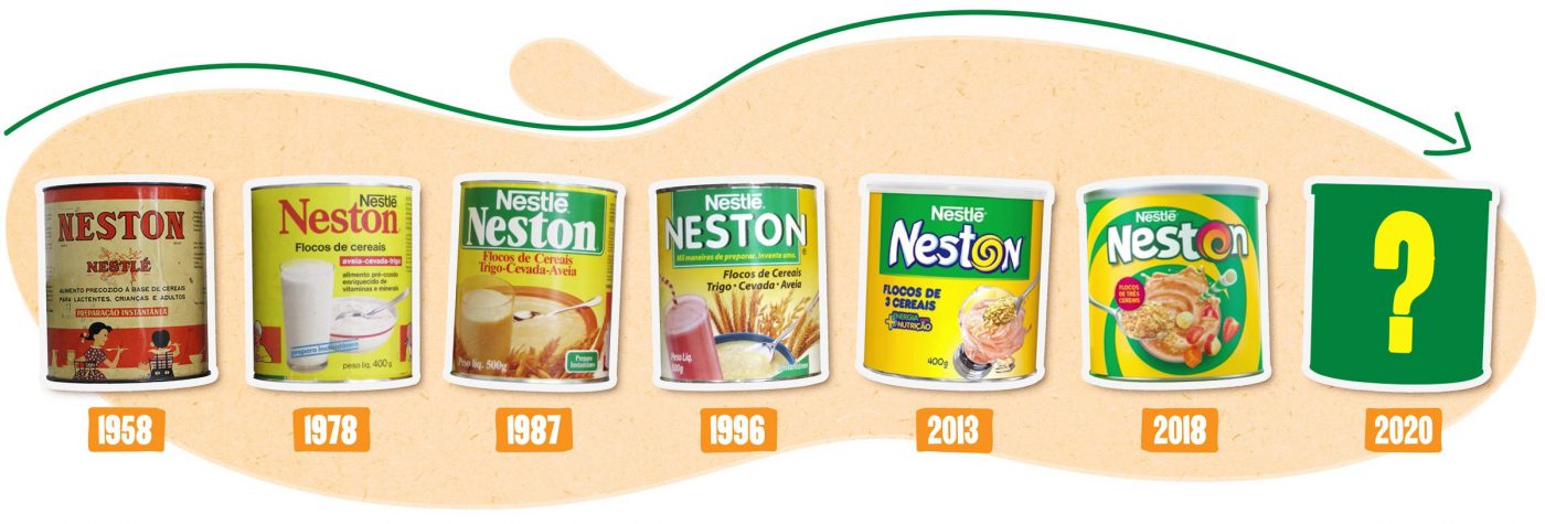
Although the company was aware of its target audience – generation Z people (born between 1995-2010), also known as centennials – Neston decided to broaden its knowledge of these youths and get to know their habits better so to connect to their needs.
To develop the new brand positioning we deeply immersed in the food routine of dozens of youths from generation Z, to understand Neston’s function.
We started this in-depth study carrying out a qualitative research with a significant sample of young consumers and potential consumers of the cereal. We used an online multimedia tool which allowed for a deep analysis – during 5 days in a row, the youths filled out an online diary with interactive activities, which enabled the identification of consumer drivers and needs of the target audience. The great differential of this tool was the possibility of obtaining more spontaneous insights, since the language used is closer to the codes used by young people to express themselves, such as apps and social media.
Based on this survey we were able to map territories where Neston could operate for an ideal brand expression.


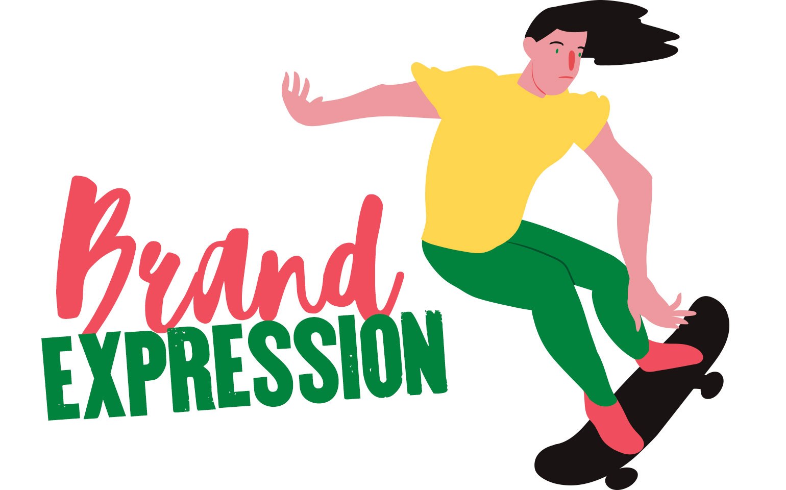
Once the brand territory was defined, the next step was to rethink the visual identity. For that purpose we used our Brand Senses methodology, that analyses the brand through the 5 senses on an approach that aims to enhance the basic features and properties of the product: satisfy hunger combining different textures – dry or wet, crispy or creamy, yet always healthy. And always in movement, constantly energetic and vibrant.
The visual identity is nearing completion and will be the outcome of this deep analysis of the target audience. Stay tuned, cause soon Neston will get a new look – connected to the youths and their needs for movement and nutrition.
The new visual identity developed translates the deep analysis conducted with the target consumer – urban youth that move and recreate their surrounding world; people who speak up, talk, recognize their flaws and continually reinvent themselves. The visual codes were inspired on their language, in a collage of styles. The movement emerging from the letter ‘O’ sweeping and twirling all around; the imperfect-textured font; the intensity and freedom represented by the natural colors. As the target audience would say: fuel up, set off and enjoy the ride. It’s excitement and nutrition. It’s Neston.

Founded almost 150 years ago, Kimberly-Clark has a strong legacy as a pioneer of innovation. The company developed the first disposable absorbent pads and is proud to say it is responsible for the creation of more than half of the eight main categories of consumer products currently in operation.
However, despite its traditional cutting-edge profile, the company noticed that the last years have been less innovative than desired. This self-criticism allowed for a project to take shape, with the active participation of CBA B+G.
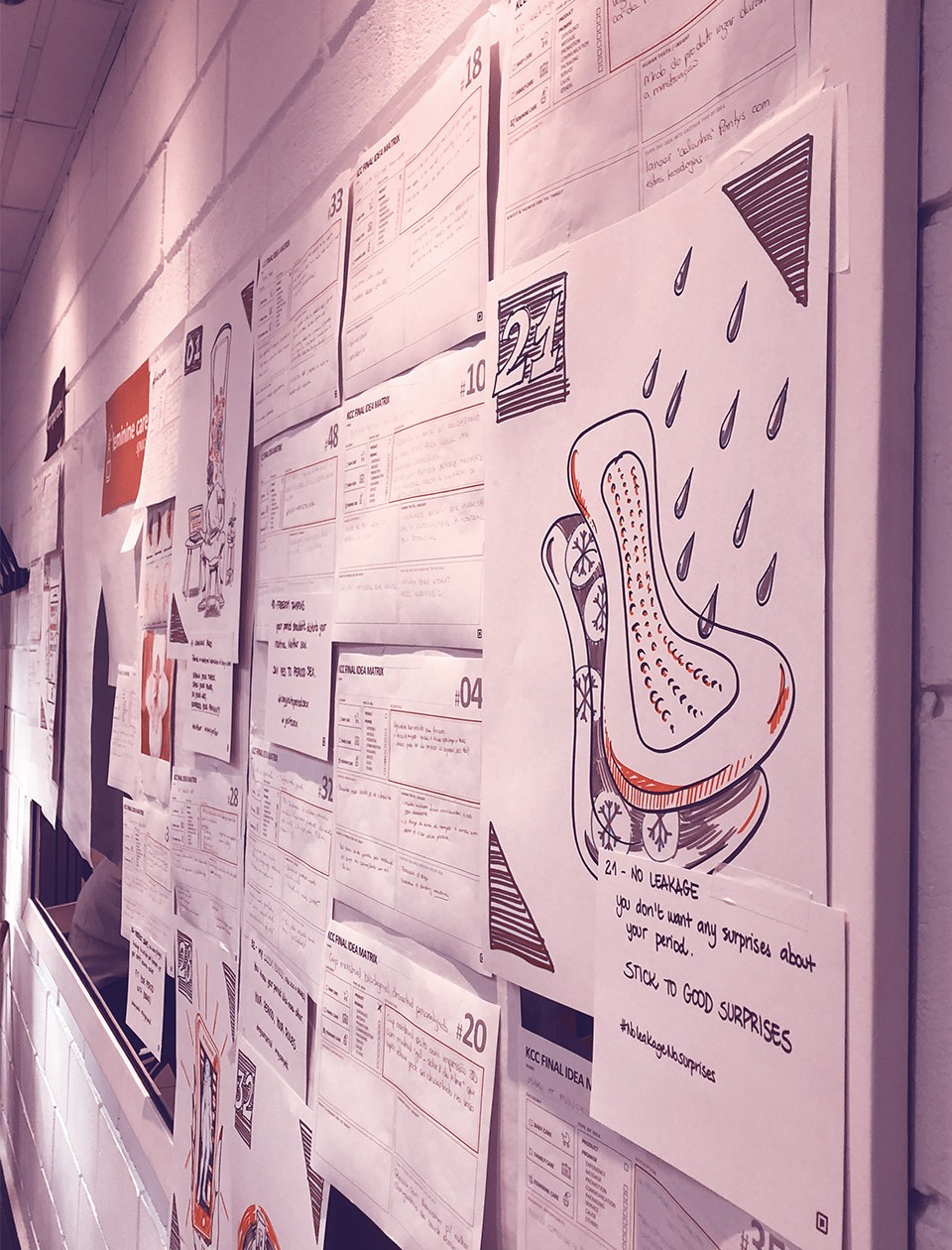
The desire was crystal clear: to accelerate the pace of change and look beyond simple products, initiating a thorough structural transformation. The new innovation proposal should account for a more agile, customer-centric organization, able to come up with better, greater and mainly, more daring solutions. A project able to change the company’s mindset in all Latin America.
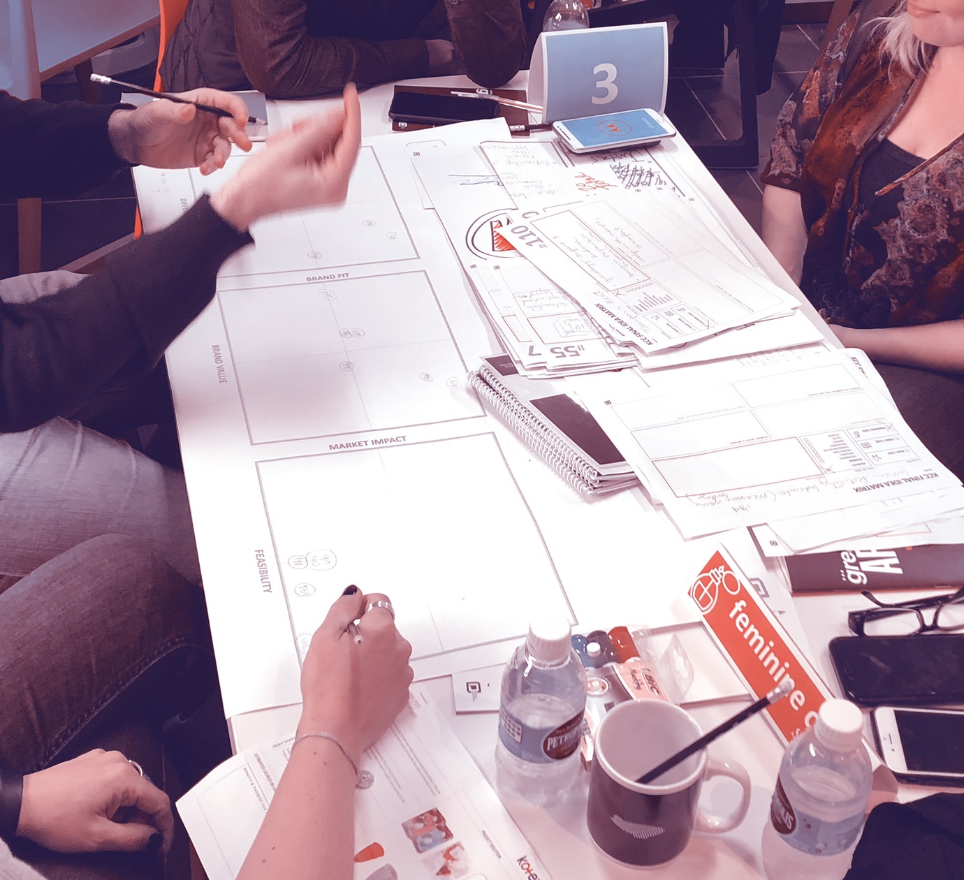
In order to understand the scenario, our strategic team held several interviews with the company managers, prepared an internal survey conducted with more than 70 employees, and analyzed the innovation best practices of more than 30 companies. Three co-creation labs (SquadLabs) were also organized whose main objective was to come up with a new concept to accelerate the innovation capacity of the company. Through an exploratory approach and analytical thinking, we developed a solution called Innovation Ecosystem. A comprehensive model which has structure (internal axis, guidelines and actions) and process (innovation methodology), to enable the Kimberly-Clark team to resume its innovation tradition and put it into practice. An ecosystem capable of mobilizing a solid structured company turning it more agile and using the power of technology to reach a transforming potential, promoting unique value to society.
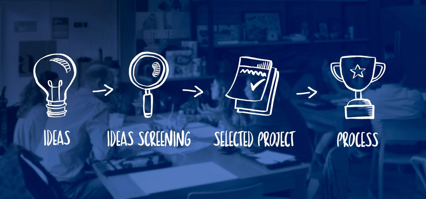
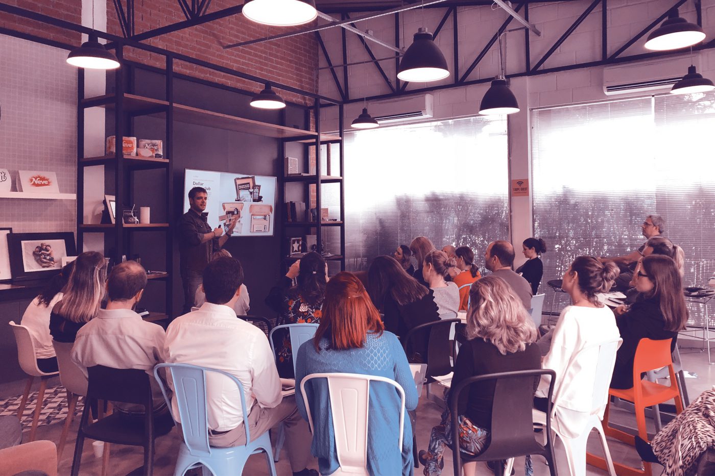
Once the ecosystem was defined, CBA helped build Kimberly’s innovation pipeline running two sprints. The 3-day-long innovation sprints – New Horizon 2018 and New Horizon 2019 – held to put the new ecosystem into practice, took place in our hub. The great differential of this project was the multidisciplinary working group, with representatives from all over Latin America. Following our human-centric approach, we invited consumers and different experts in anthroposophy, technology, biomimicry etc. This enabled us to look at the category of products from different points of view and come up with almost 500 solutions.
The ideas produced were prioritized, selected and tested with consumers to perceive, on a daily basis, what they think, say, feel and do in reaction to the solutions presented.
Key actions to carry the company beyond its traditional products were defined, including promise, channel and execution, with daring, quick and transforming propositions.
The new ecosystem was devised and put into practice with a consumer centered approach and has already been used to build a corporate innovation pipeline for the next three years.
Bottom line: true innovation is to create and capture value through successful solutions.


Privacy Overview