France
Paris
Switch to your local agency
Retour au menu
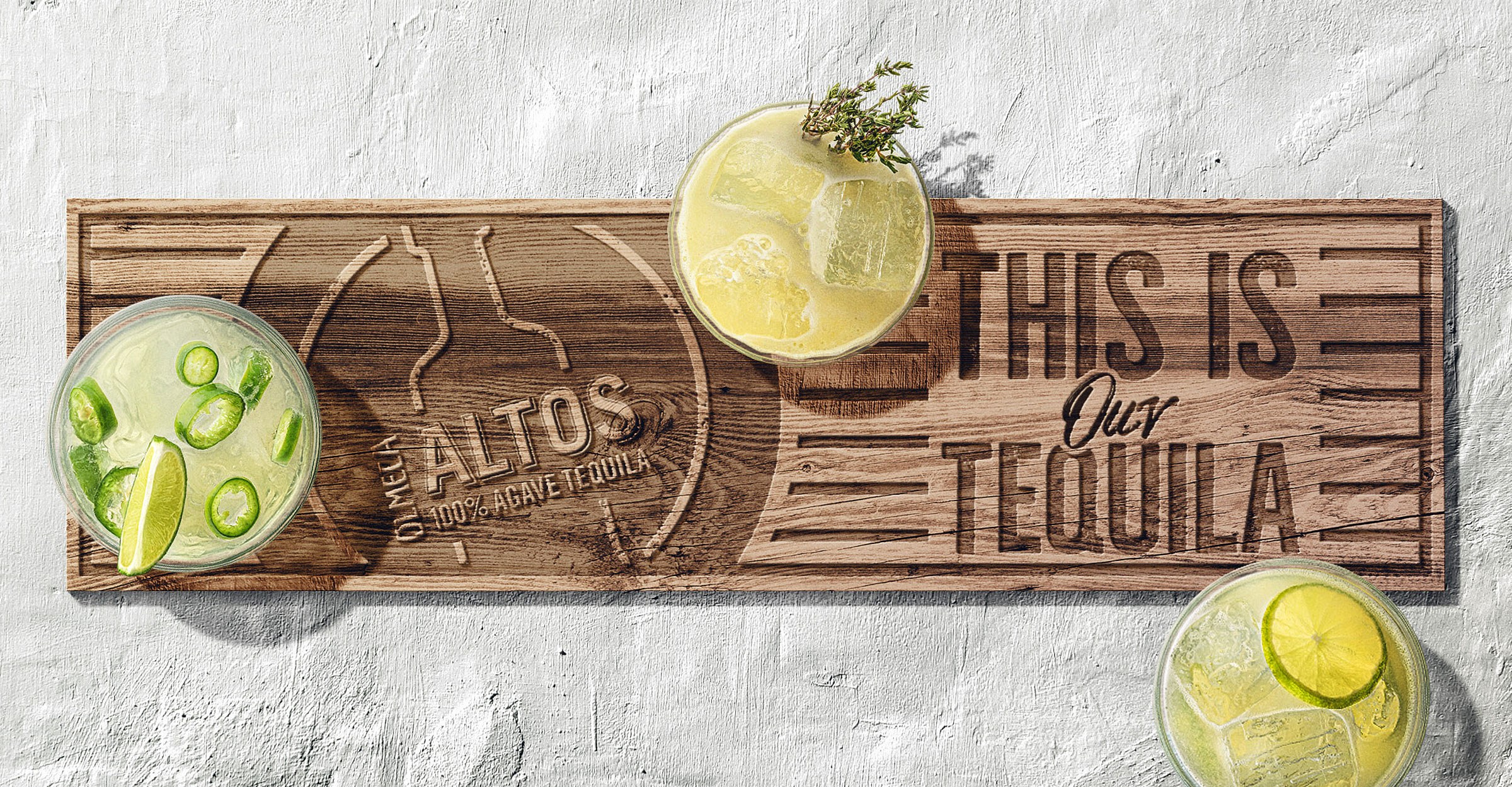
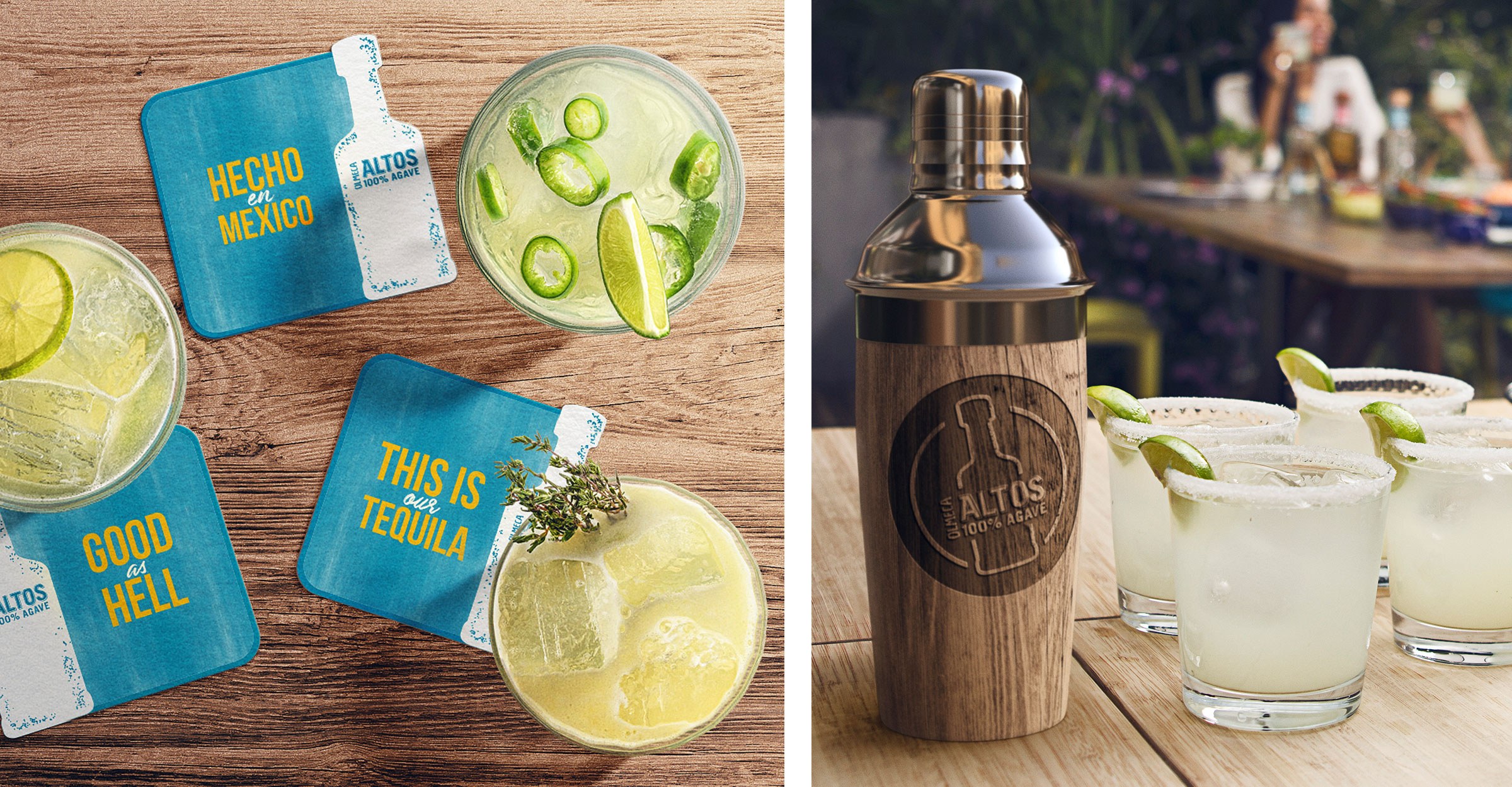
The first project run by our office in Mexico couldn’t be more emblematic – the creation of a fresh visual identity system for Olmeca Altos Tequila. In order to create a new global expression of the brand which is sold more than 51 countries – Mexico, United States and the UK being the lead markets – we pulled together a dedicated team of creative experts from our CBA LatAm + CBA London offices, a partnership that combines local cultural expertise and global systems vision.
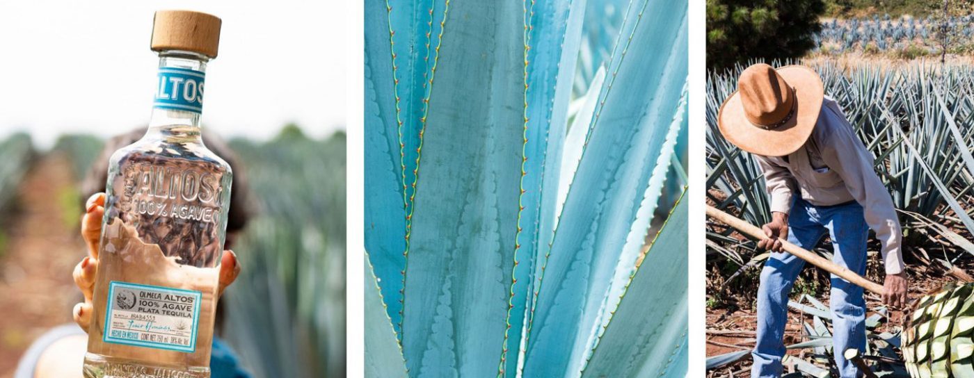
Olmeca Altos Tequila is a super-premium brand that honours the quality and tradition of true Mexican Tequila – from the planting and harvesting of the agave to the distillation and ageing process – the brand is full of features that evoke Mexico’s cultural heritage.
Our challenge was to rethink Olmeca Altos’ visual identity system to reflect the brand’s essence, highlighting its authenticity and showcasing the energy and vitality of contemporary Mexico in a fresh, engaging and iconic way.
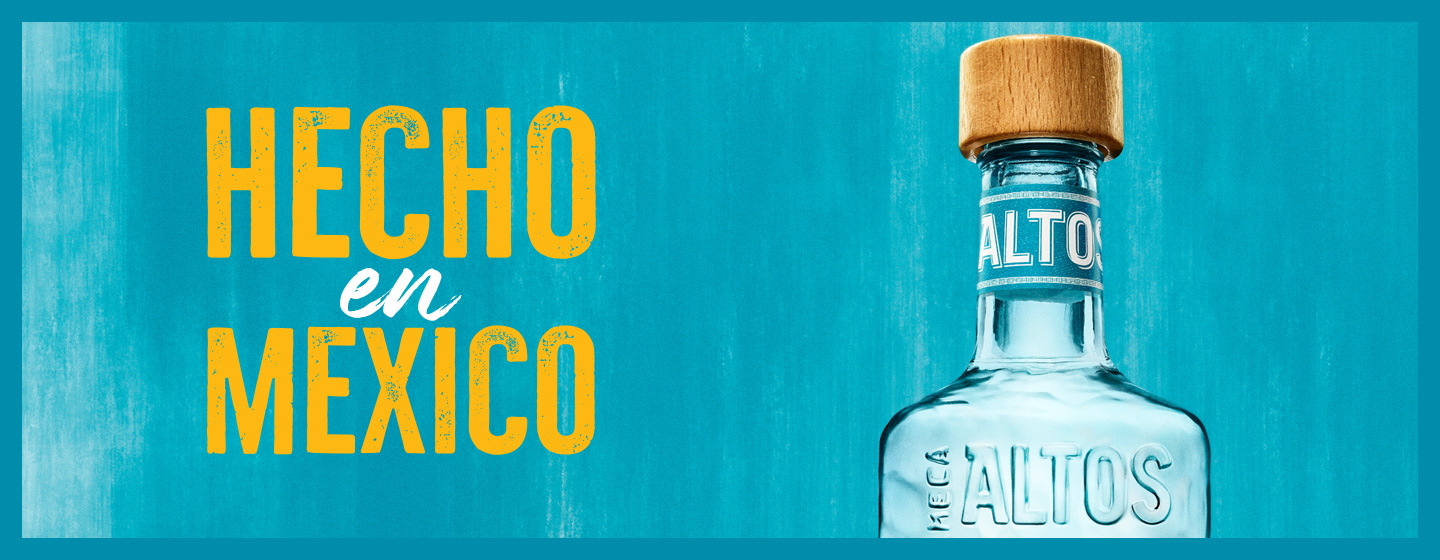
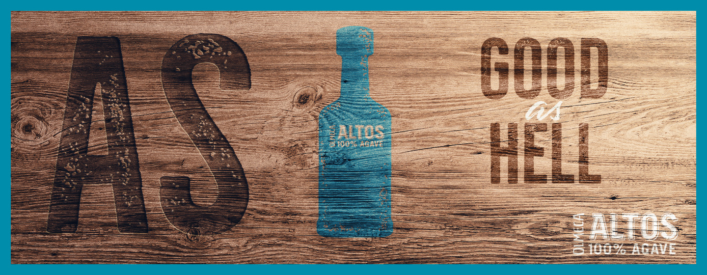
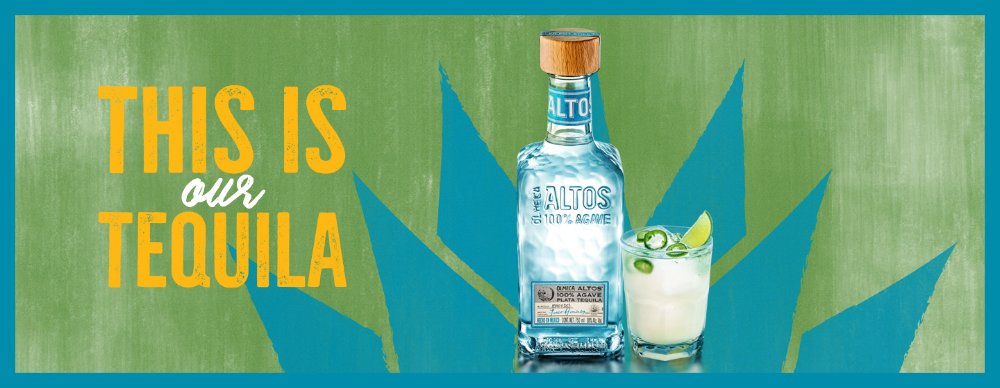
To create Olmeca Altos Tequila’s new identity, we used CBA’s Brand Senses methodology – which explores the expression of the brand through all five senses – to establish the brand principles and create the foundations to develop a flexible design system able to provide versatility and rhythm to different communication occasions.
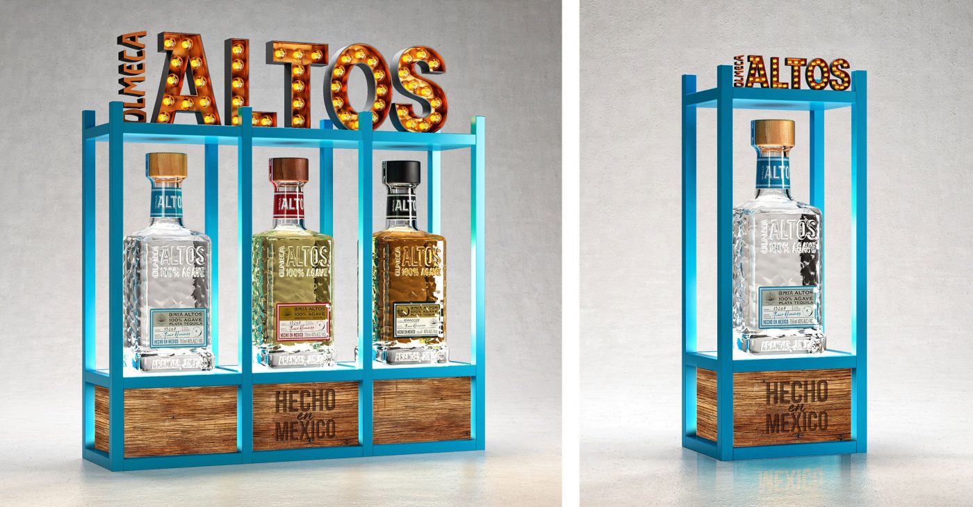
We celebrated the iconic Olmeca Altos bottle as the core element of the brand’s new visual universe, symbolising the quality and authenticity of the spirits creation, as well as the human and artisanal touch. The characteristic shape of Olmeca Altos’ hammered bottle becomes the brand signature, distinguishing it from the other tequilas.
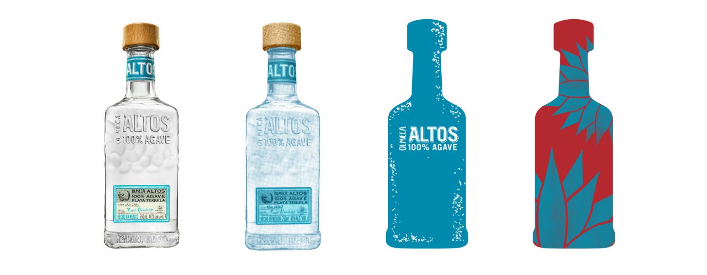
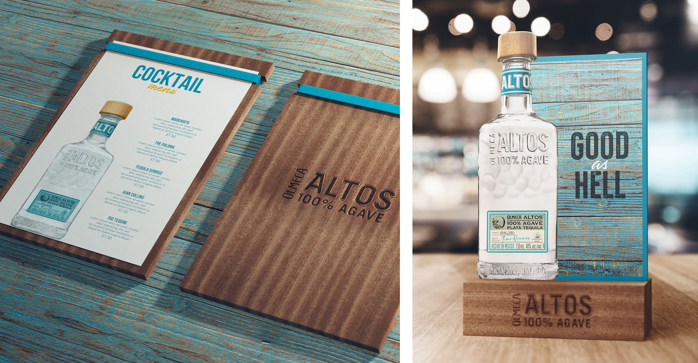
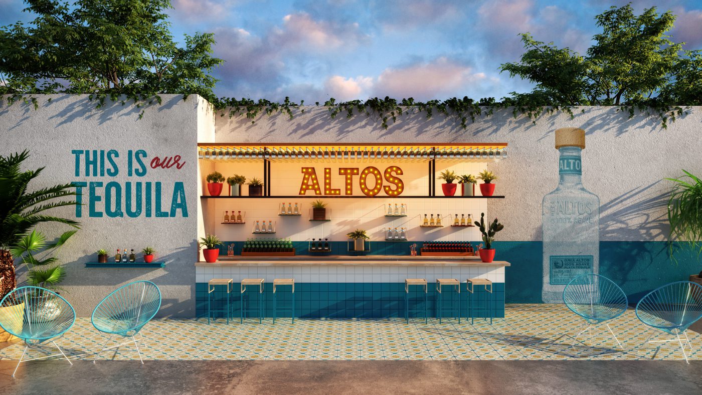
To support the iconic bottle, we built an identity system to convey the complete brand story. To demonstrate the brand’s contrasts and vivacity, we used the iconic blue as our base but built in additional tonal colours to create diversity and pace. We redefined the typography and photographic style with fresh expressions of modern Mexico; and through our authentic and sustainable materials palette we suggested on-trade and and off-trade environments that allowed our consumers to feel the Olmeca Altos experience.
In total the new design system for Olmeca Altos Tequila showcases not only the tradition of the Mexican culture but also its contemporary sophistication.
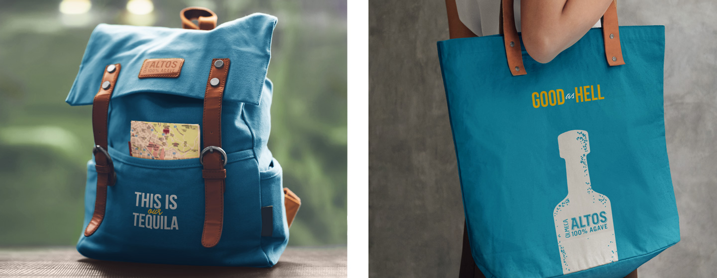

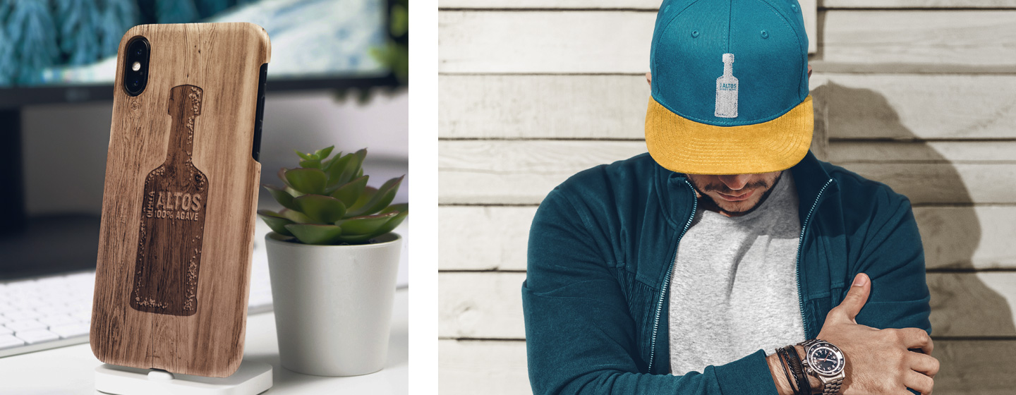
Through our final toolkit we have armed Olmeca Altos with all the necessary tools to communicate consistently and with a celebratory attitude. The outcome is a dynamic brand experience, richly representing the many authentic facets of Mexico.
In one more partnership job of CBA B+G + Heineken, the gigantic Dutch company asked us to redesign Devassa brand mark, with the challenging task of keeping its authentic approach and its original, vibrant, and creative Brazilian spirit.
Over the years, the positioning and communication of the brand – created by entrepreneurs from Rio de Janeiro in 2002 – has gone through different moments. Its recent repositioning relies on the quality of its pure malt recipe with a key differentiator – the tropical flavor, tailored to the Brazilian taste and climate. Perceiving these pillars as Devassa’s strategic differentials, we set out to the challenging job of rebranding.
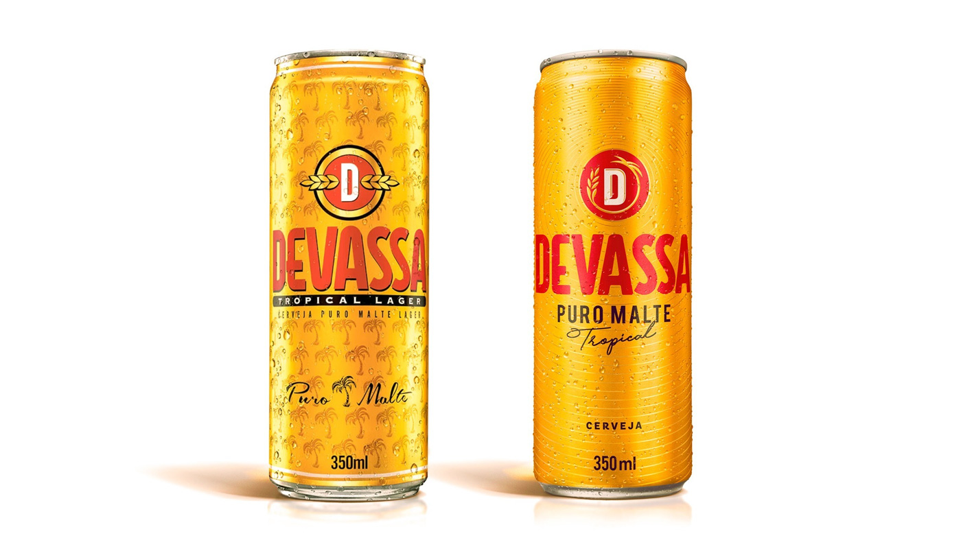
We deep dived into the brand’s strategic information and documents, tracking its history since market launch, to understand how the brand’s moves have helped to create today’s perception of value. Devassa is tropical – this is its greatest equity. It is a beer tailored to the Brazilian taste and climate. But how to turn ‘tropical’ elements into the ‘tropical of Devassa’?
Giving new meaning to ‘tropical’. Cruising contemporary Brazilian borders with the movements, and creative & transformative spirit of the brand and, based on that, develop a new graphic representation and visual identity for Devassa brand mark.
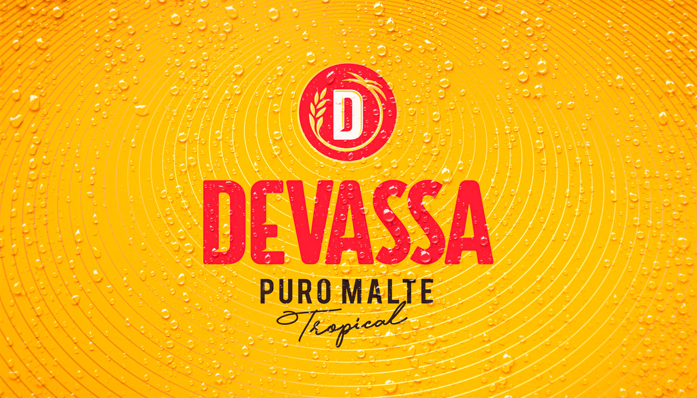
In the tropical of Devassa, the cultural expression and a creative & transformative attitude become the basis for the new identity, making room for an iconic representation of the brand’s DNA – the further-reaching tropical energy is represented by the circular element emerging from the letter ‘D’, symbol of the brand mark. This is the new graphic representation of the unique flavor of the Tropical Pure Malt beer.
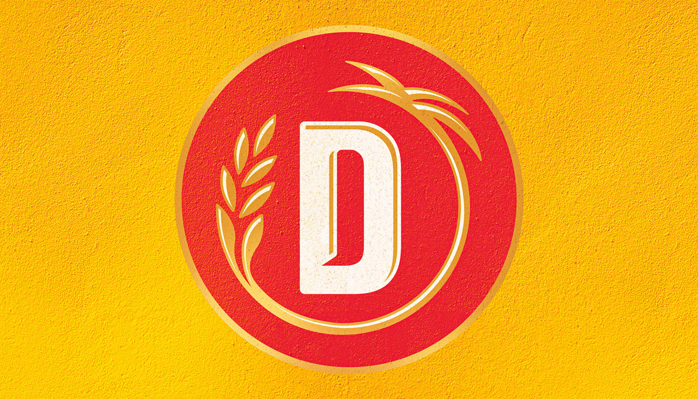


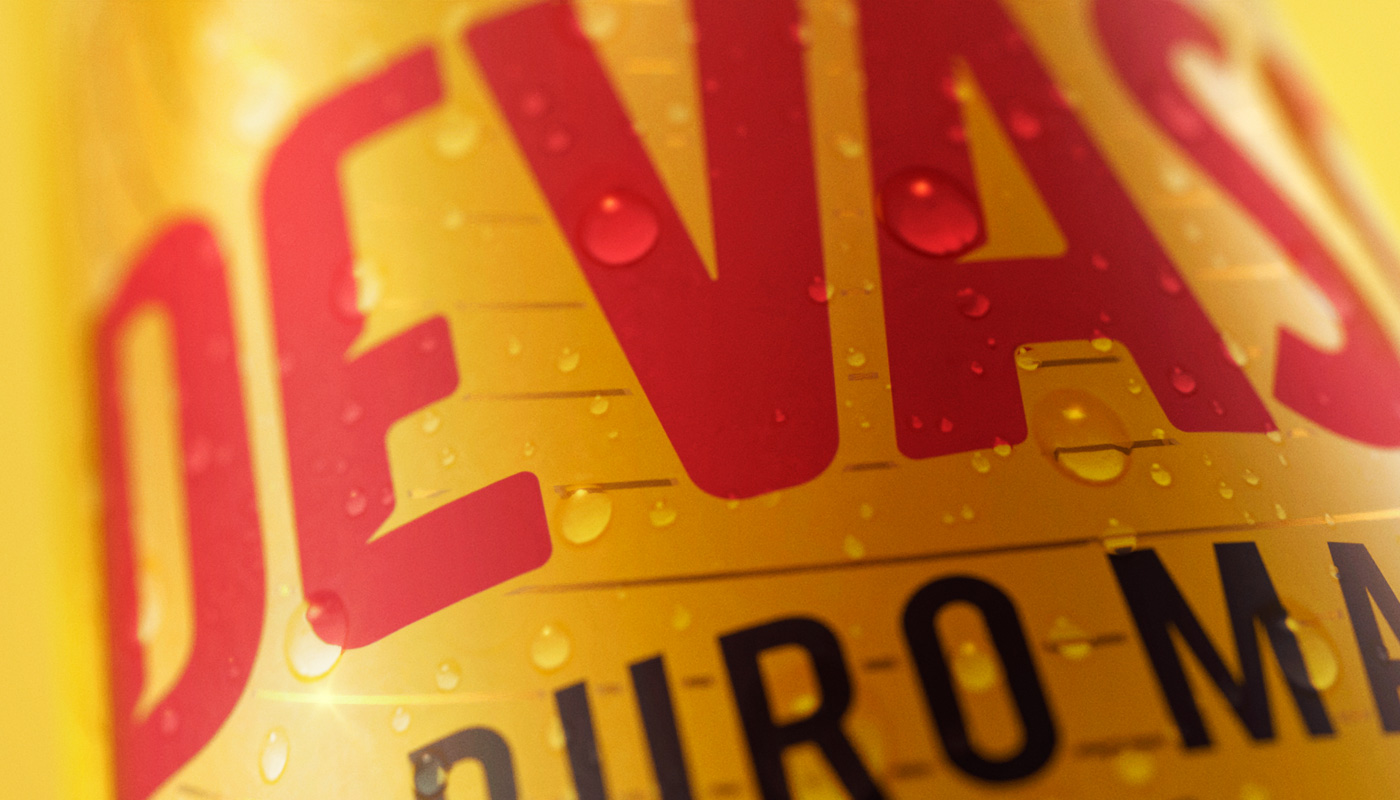
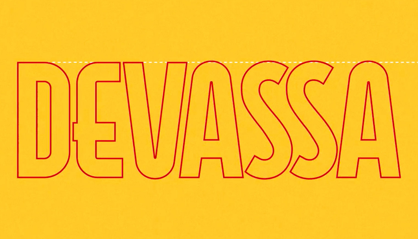

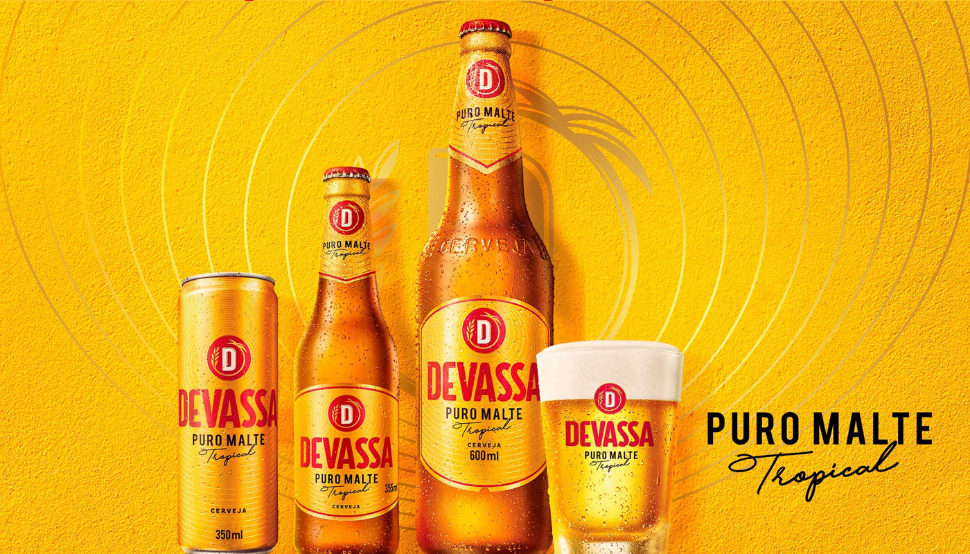
Based on the new assets, we set out for the labels, the portfolio rearrangement and, eventually, the communication key-elements. With the new look & feel ready, we developed the new brand guidelines to orchestrate each and every brand touchpoint.

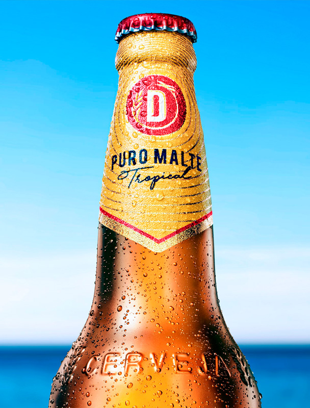
We developed the visual concept of Devassa Tropicaê, a beer flavored with tropical lemon and passion fruit flavors. The taste of beer with all the tropical fruit. Born in an innovation workshop led by us, the new product contains natural fruit juice and is available in the Northeast region of Brazil.
A branding and design work that strengthens Devassa’s new positioning, evolving and highlighting its original attributes, yet enhancing a new context of values and cultural representations.


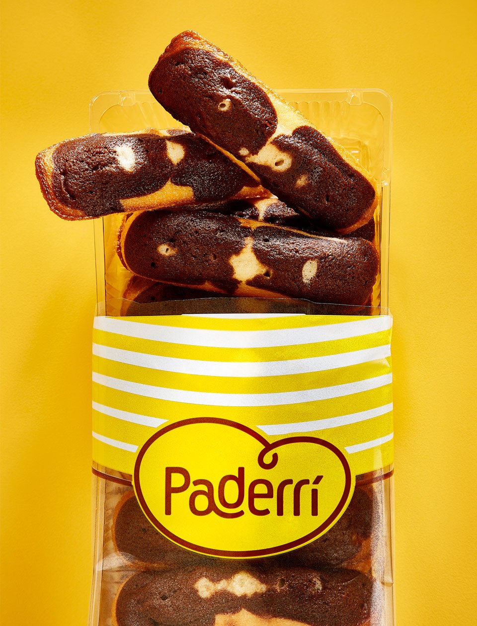
A French brand holding a tradition in bakery decides to make bread for a target made of bread lovers and consumers. That was how we faced the challenge Norac brought over to us. Norac Foods Group, born 30 years ago in France is now in Brazil since 2011, with the brand Ateliê.
Ateliê produces and distributes fresh and ready-to-eat products in the sandwich and salad segments. The group decided, in the peak of its expertise in bakery and confectionery, that it should expand the business and produce larger amounts, just like the way it’s already done in its native country.
For jumping in this new opportunity, they needed a platform that was able to embrace the new business direction: a different brand in terms of range and production scale – but keeping the French baker, boulangère and bread expert essence.
The actual challenge was twofold: developing a unique value proposition for the brand, with such a motivation that it would hook people’s interest, making them consider and consume it; besides that, we would create this new brand from scratch. Actually not from scratch, considering the French core was always there to enhance it.
However, it would be necessary to shape the platform and create the brand’s strategy, identity, proprietary elements, and finally the packs.
As we use to say, ‘Art & Science’, a kind of work we love doing: combining strategic and analytic thinking with the creative and intuitive force of design.
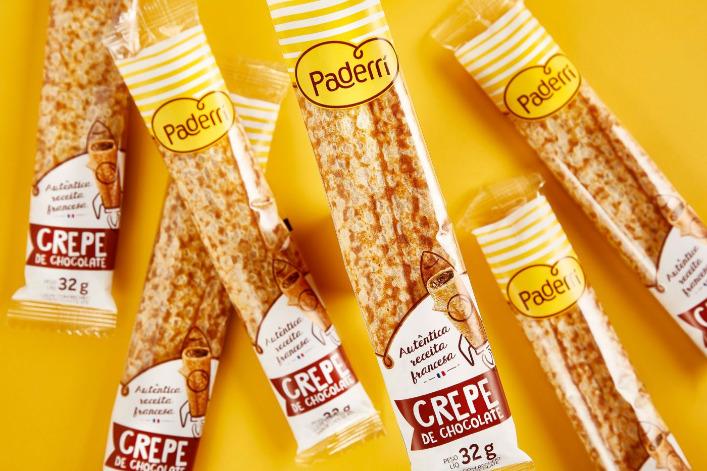
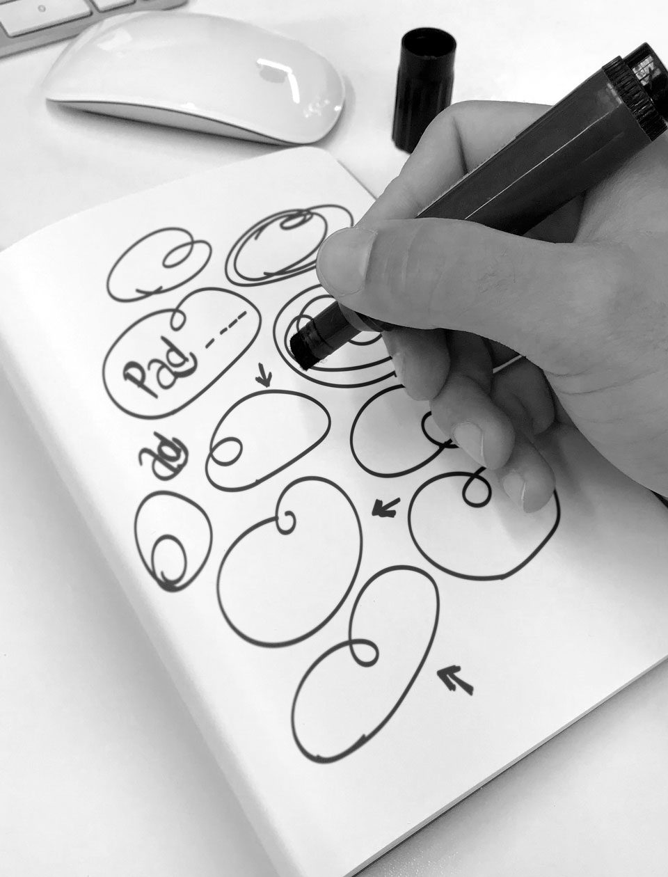
Pushed by the brand’s pillars and its “brand pulse”, we jointly got to the conclusion that the name should be suggestive to evoke the brand’s territory, as well as sonorous, easy-to-get, reinforcing its French roots.
From that on, we set off to the defiant task of generating ideas for the name itself. It was a cheered-up, light and relaxed process, which in the end resulted in a name with the needed differentiation aspired by the brand.
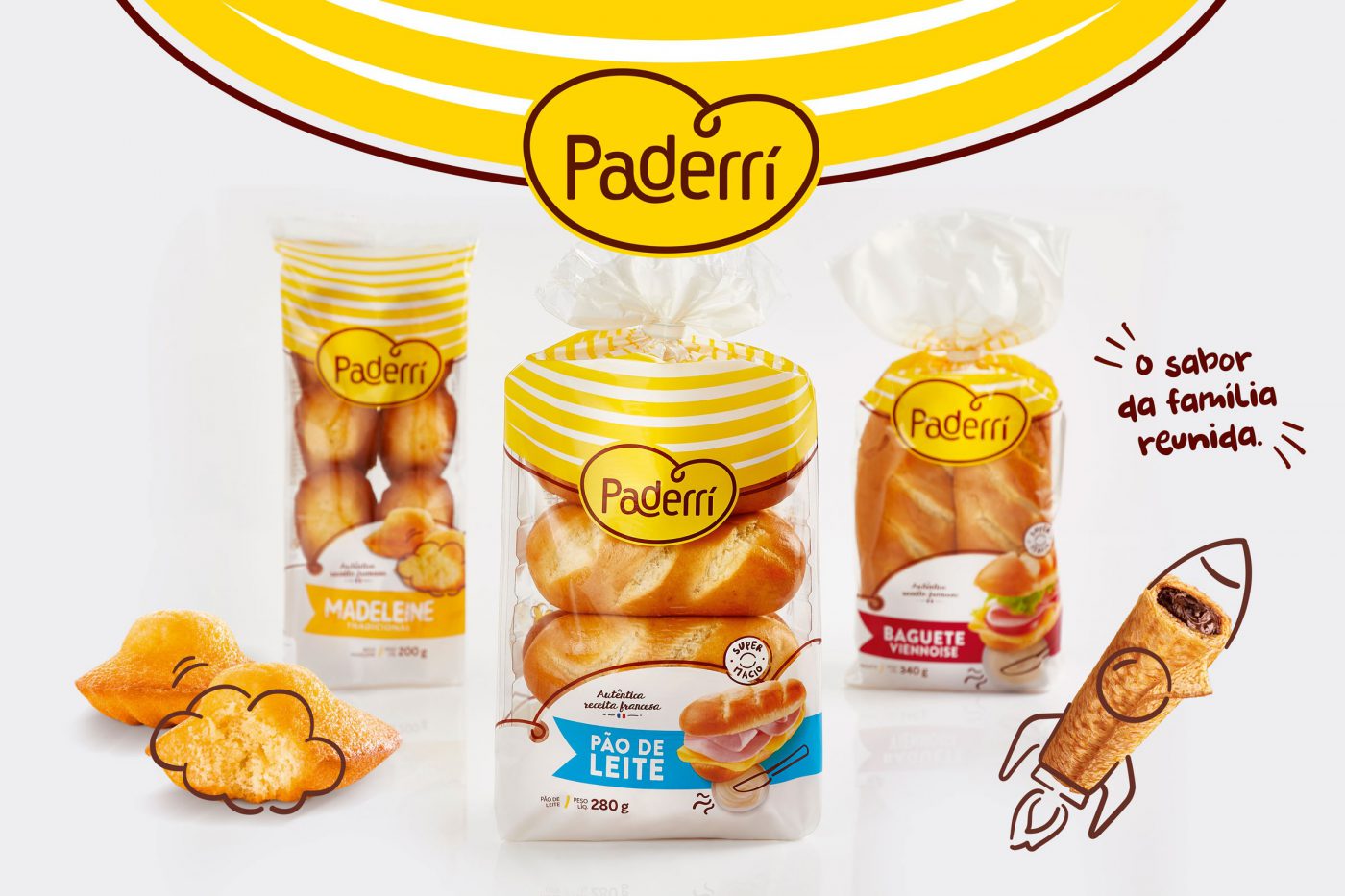
With the name set up, we set off to its identity. As of the brand’s pillars – care, handcrafted, joy & practicality – as well as a look into the category, we went in search for identifying the visual codes. If on the one hand we wanted to convey the French expertise and tradition, we were also aware about the need of balancing modernity and tradition, also bringing up the matter of family in a different and singular way – after all, the sharing of bread is a strong symbol of care and affection. So we got to the point of grasping the consumption habits of customers, so that we could build up the brand’s strategic lines.
We carried out qualitative and quantitative researches with the brand’s potential consumers in order to get genuine insights, and then started developing a “look and feel” to the new identity, with a handcraft touch, fun iconography, colors, a joyful and positive graphic and photographic style.

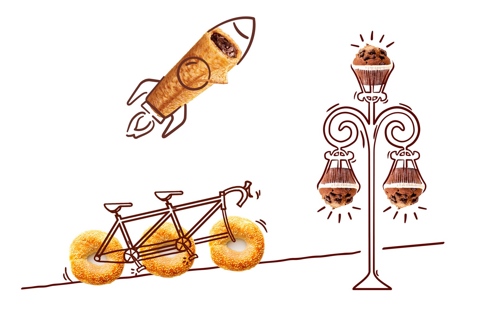

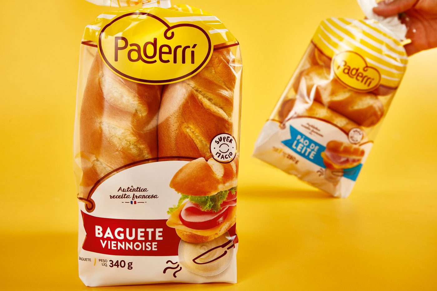
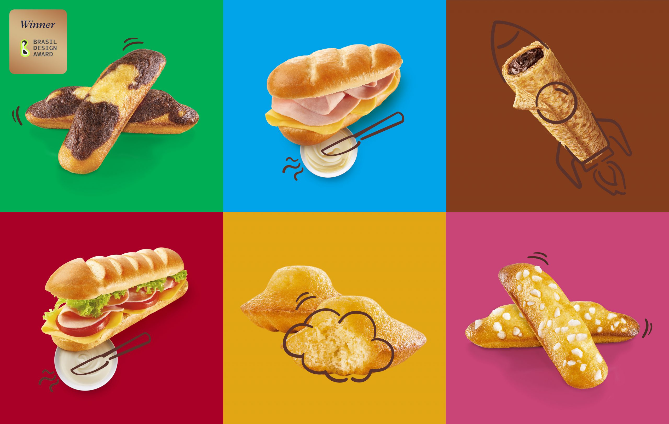
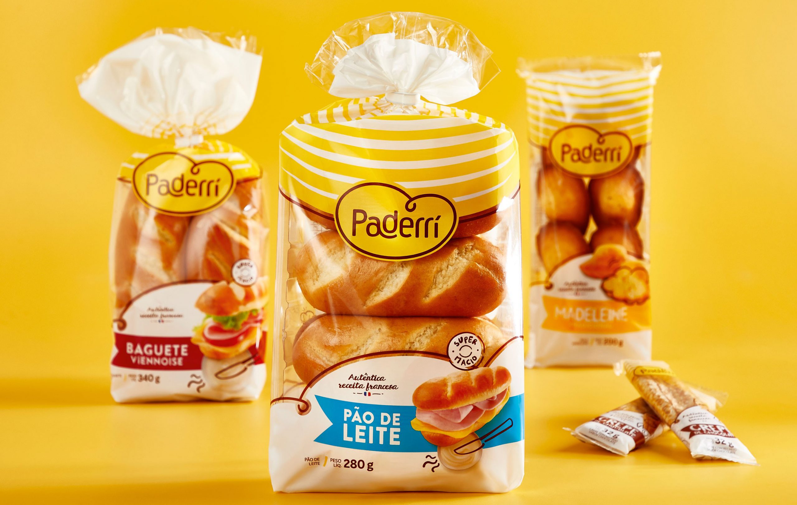
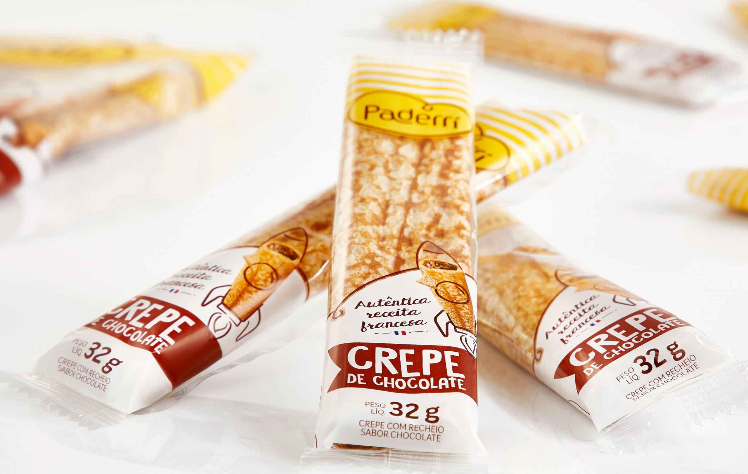
The brand’s typical relaxation enables the interaction between the illustrations and the products, creating unwonted and fun situations. The icons give the sensation of being handmade. Just like Paderrí’s baguettes, madeleines and crepes.
Fresh products, prepared out from homemade recipes with an unmistakable handcraft touch.


Imagine the responsibility of working with a product that is present in Peruvians’ lives since 1927. Sublime counts on a huge penetration in Peru and lots of meanings to its consumers: the chocolate for relaxing from everyday pressure, childhood’s taste, affection at any time.
Relevant to all those who consume it and to Nestlé Peru (the country’s second most important brand), the brand needed to revitalize its story, renew its identity and, through its iconic and proprietary features, settle its importance in the context of national market.
As a long-time partner, CBA accepted the challenge of reworking Sublime brand through an extensive branding perspective: brand architecture, visual identity, packaging, and finally a global vision integrated with all of the brand’s touch points.


As of Sublime’s essence, “Recarga el buen ánimo”, we proposed to build an extremely structured design system to work its strong identity in a way to contemplate all touch points and reinforce the portfolio strategy.
Along with Nestlé Peru’s marketing, research and innovation teams, CBA B+G carried out an extensive workshop on Brand Senses, a methodology for exploring the brand’s five senses and helping the establishment of the guiding principles of the whole brand identity. The contrast and joy on the colors (vision), the rhythm, the smile, the laughing inspired by the brand (sound), the product’s crunchiness with those little pieces mixed to the chocolate (palate).
Working on the brand’s senses was critical to the next step: exploring different insights to the same message of the brand’s optimism, respecting its essence and its expression territory.

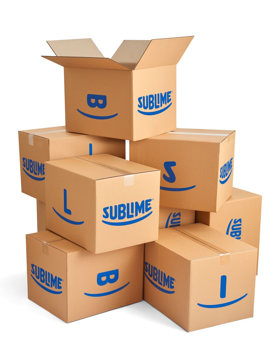
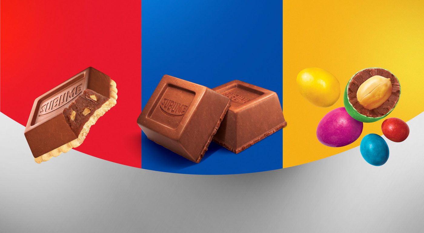
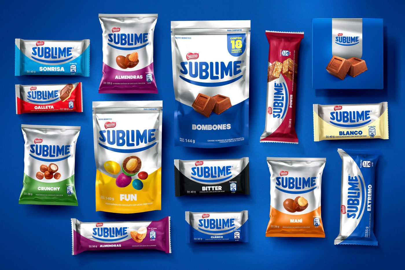
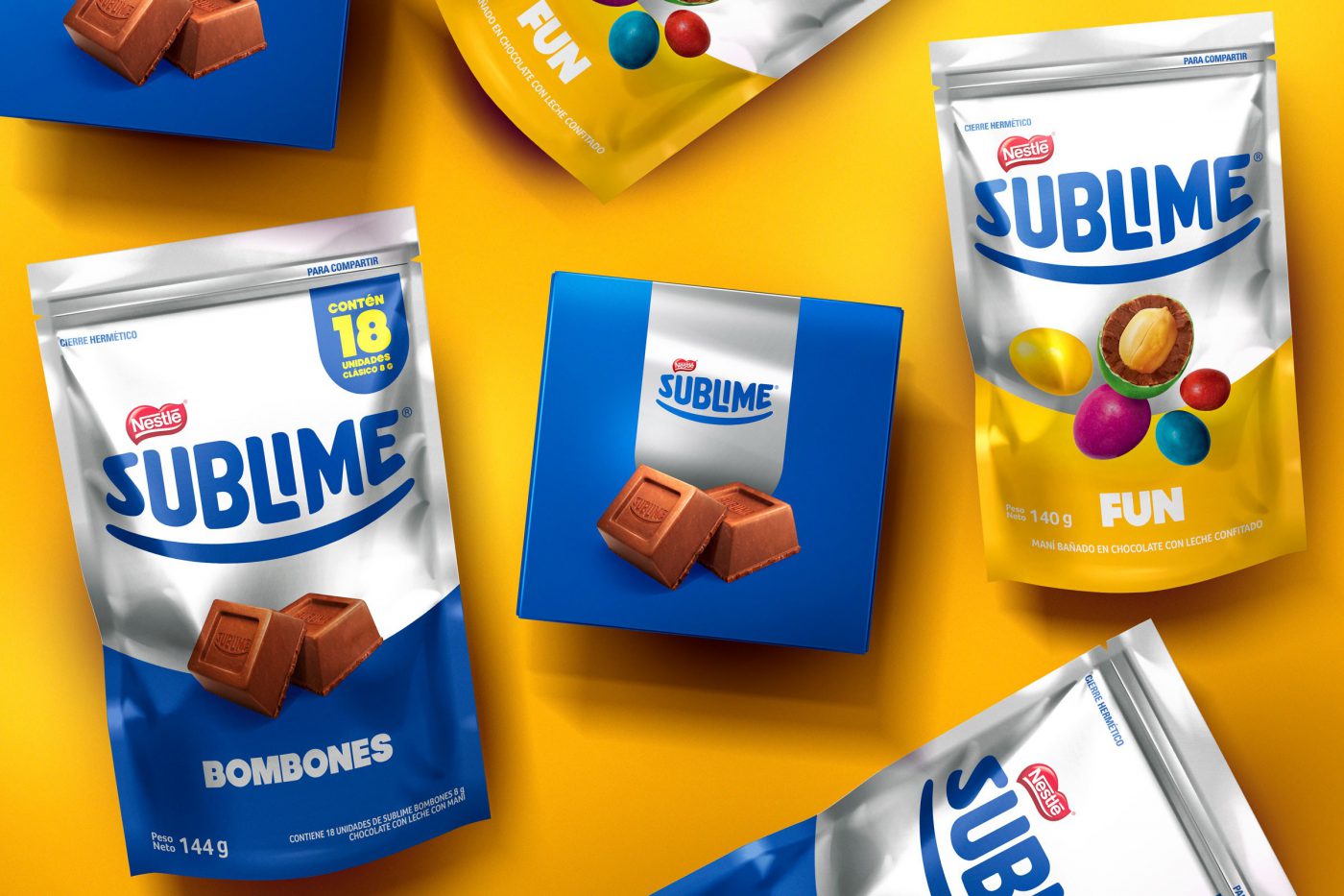
The new identity kept the brand’s proprietary elements, although they were evolved: the trace became a smile and its color system was totally redefined in a way to get closer to Sublime’s inherent senses:
A balance between the iconic blue and silver but added to a color palette full of energy.
We carried out countless material tests and colors to get to the desired contrast. We studied the application of the substrates in different materials, paperboard, laminated – and how it would react when in display racks; we highlighted the contrasts between matte, brightness and color.
Besides recreating all design system and developing a guide on the brand’s use and application (‘brand look’), the most incredible outcome was its cross impact: total integration with the brand communication. As of a consistent and collective work of renewing the identity, JWT, the agency responsible for the brand’s communication adopted a new positioning, the internal staff restructured its product portfolio, the event agency applied the brand’s new concepts as well.
A great case of commitment and integration, which is worth a relevant brand such as Sublime.
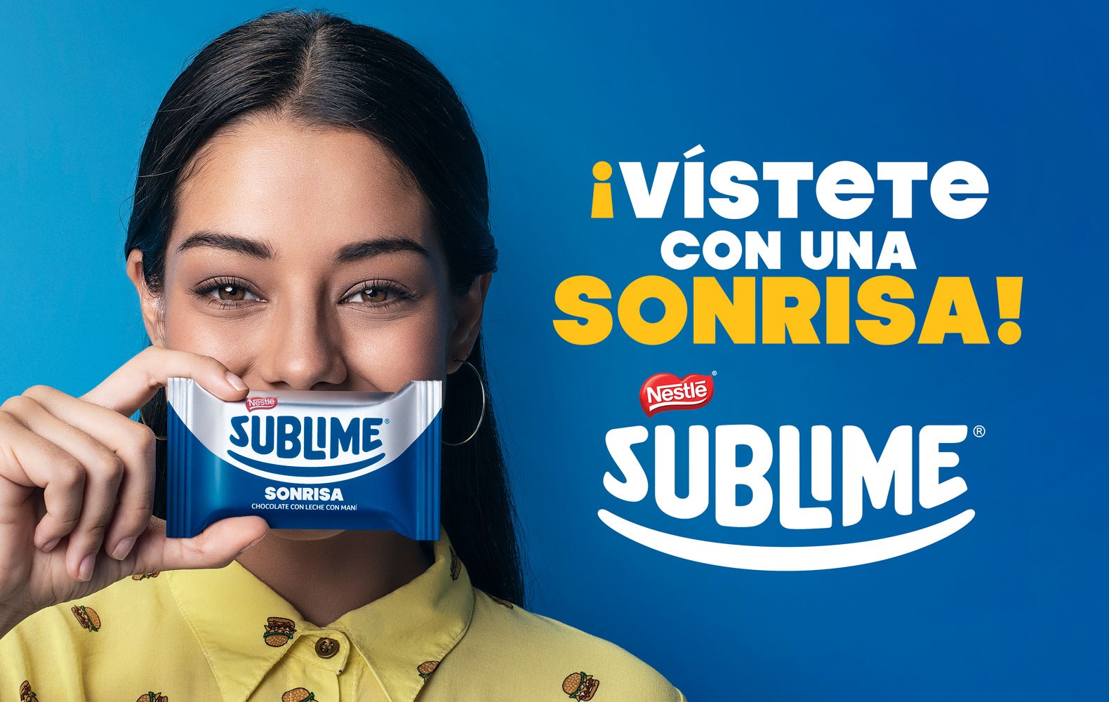
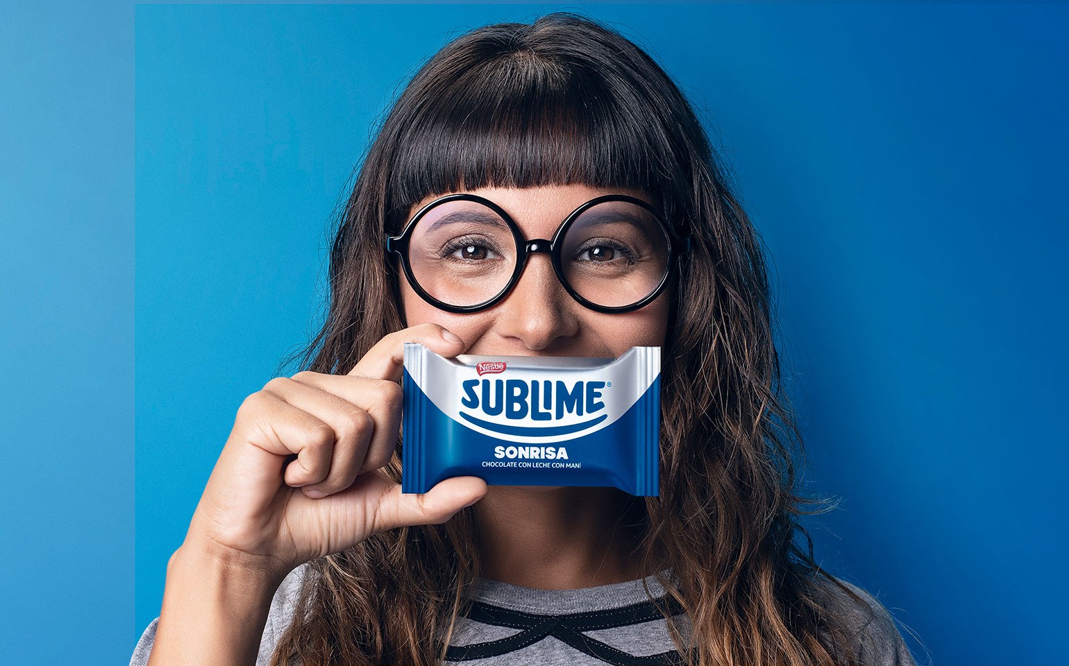
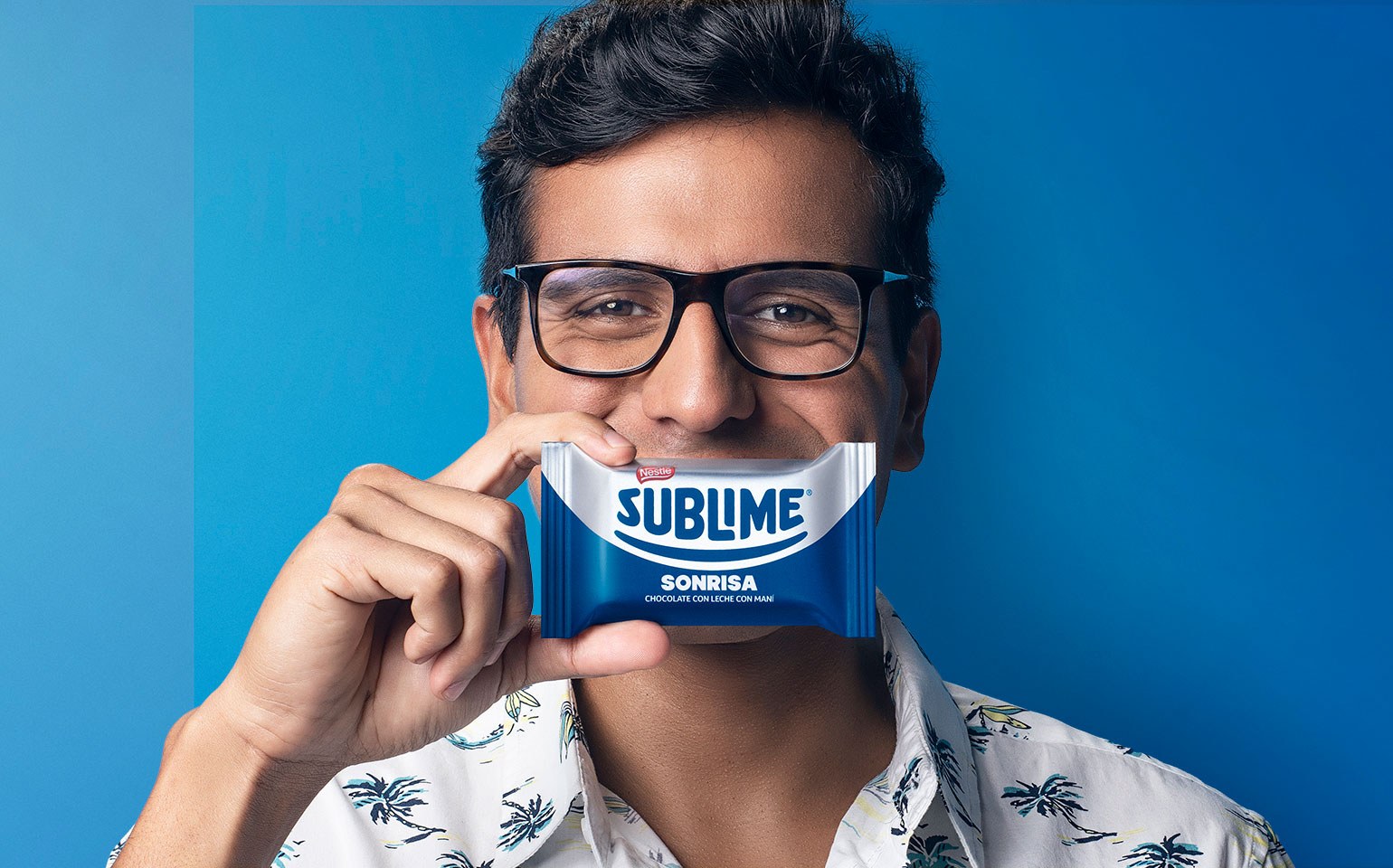
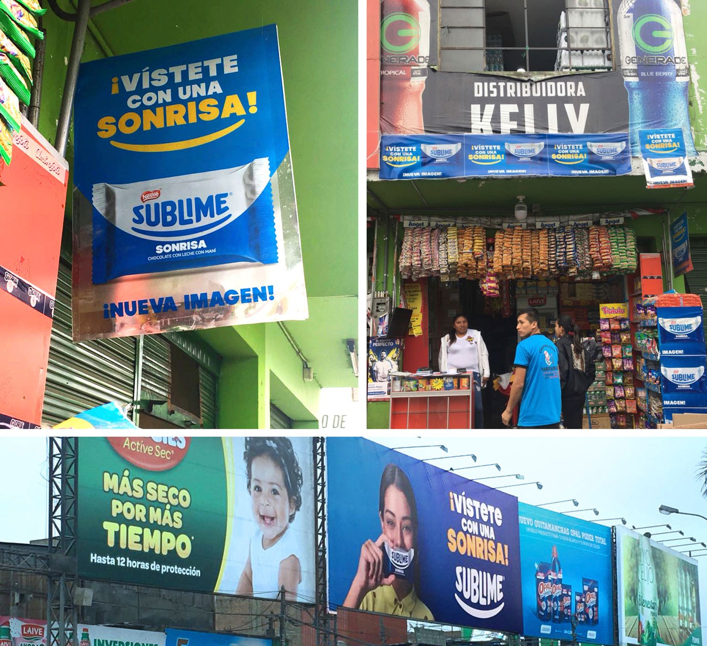
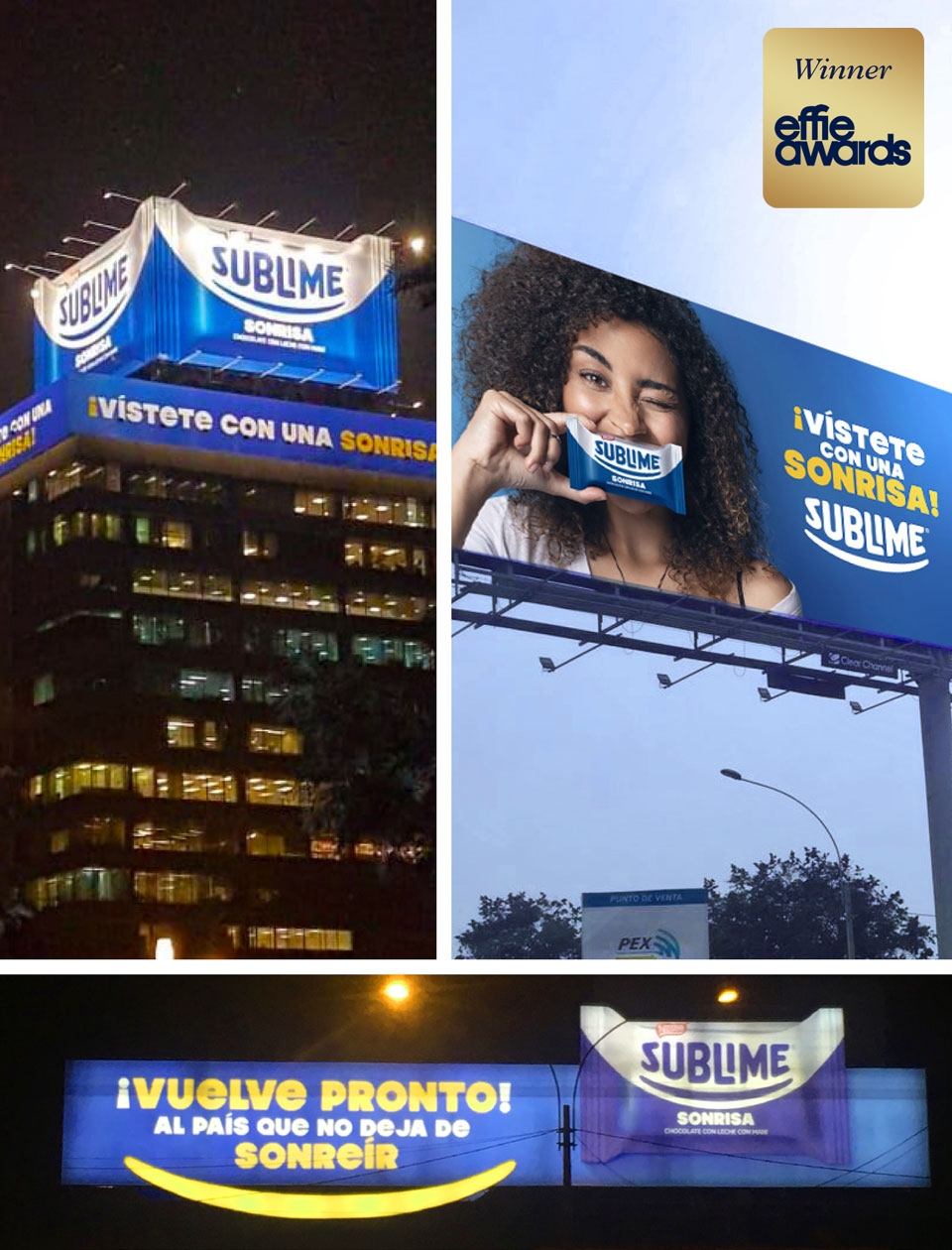
This project won one of the four awards we have earned in the Effie Awards 2019 (Peru), an internationally renowned and respected award in the marketing and communication industry. Sublime received a prize for the advertising campaign “Vístete con una Sonrisa”.
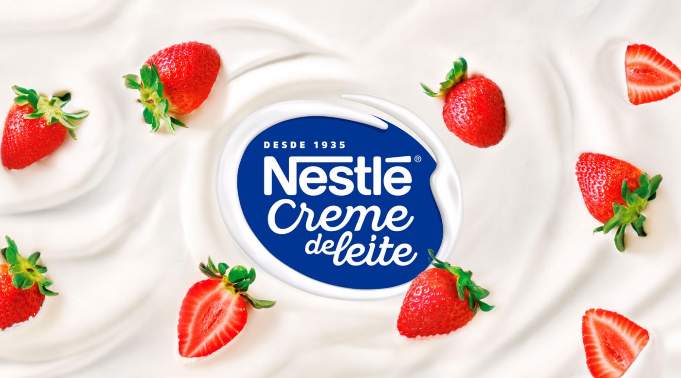
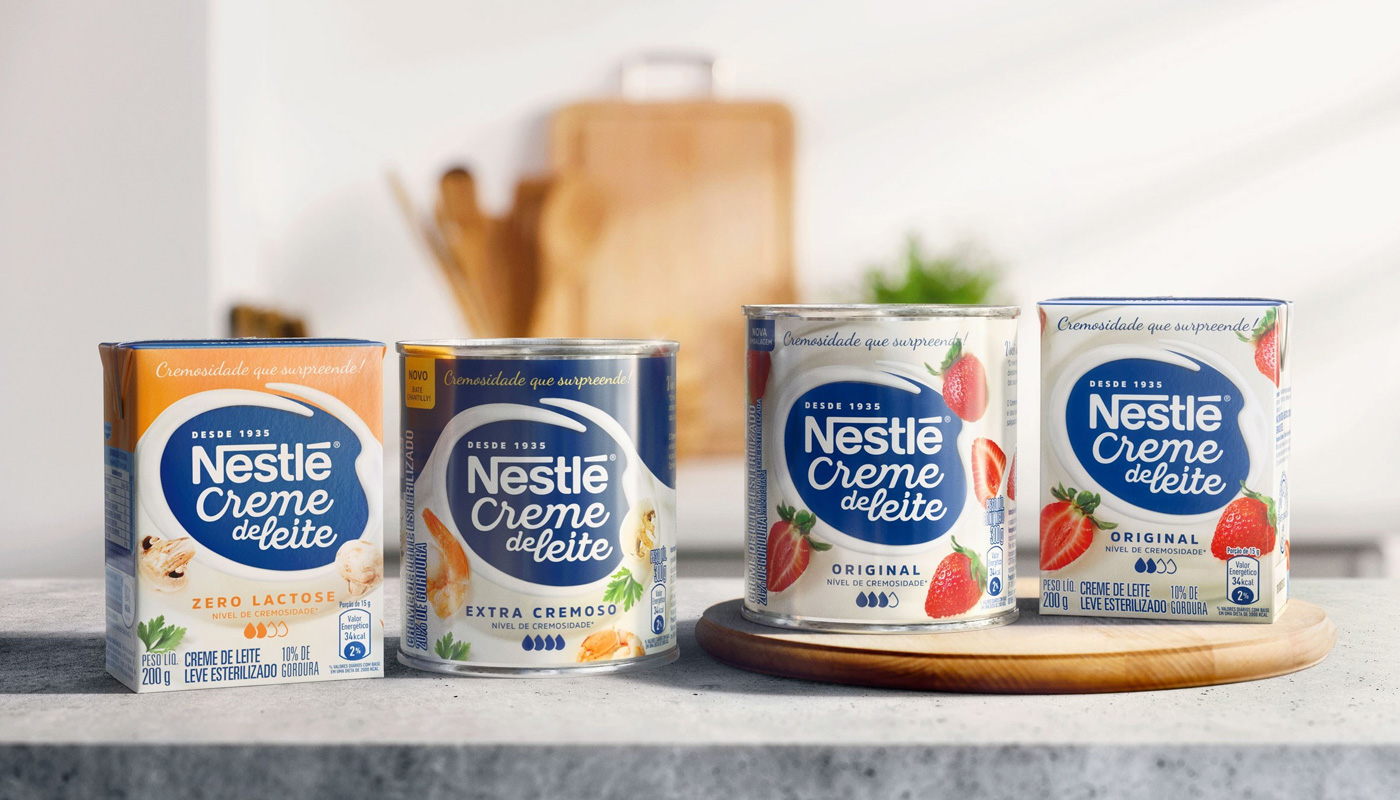
Successful in Brazil for more than 80 years, Nestlé Cooking Cream is an absolute leading product in the category. It is a frequently used ingredient in several recipes, and that is the reason why the brand has decided to invest in a complete identity renewal, aiming to help consumers choose the ideal version to pair each dish.
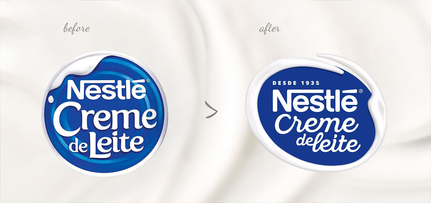
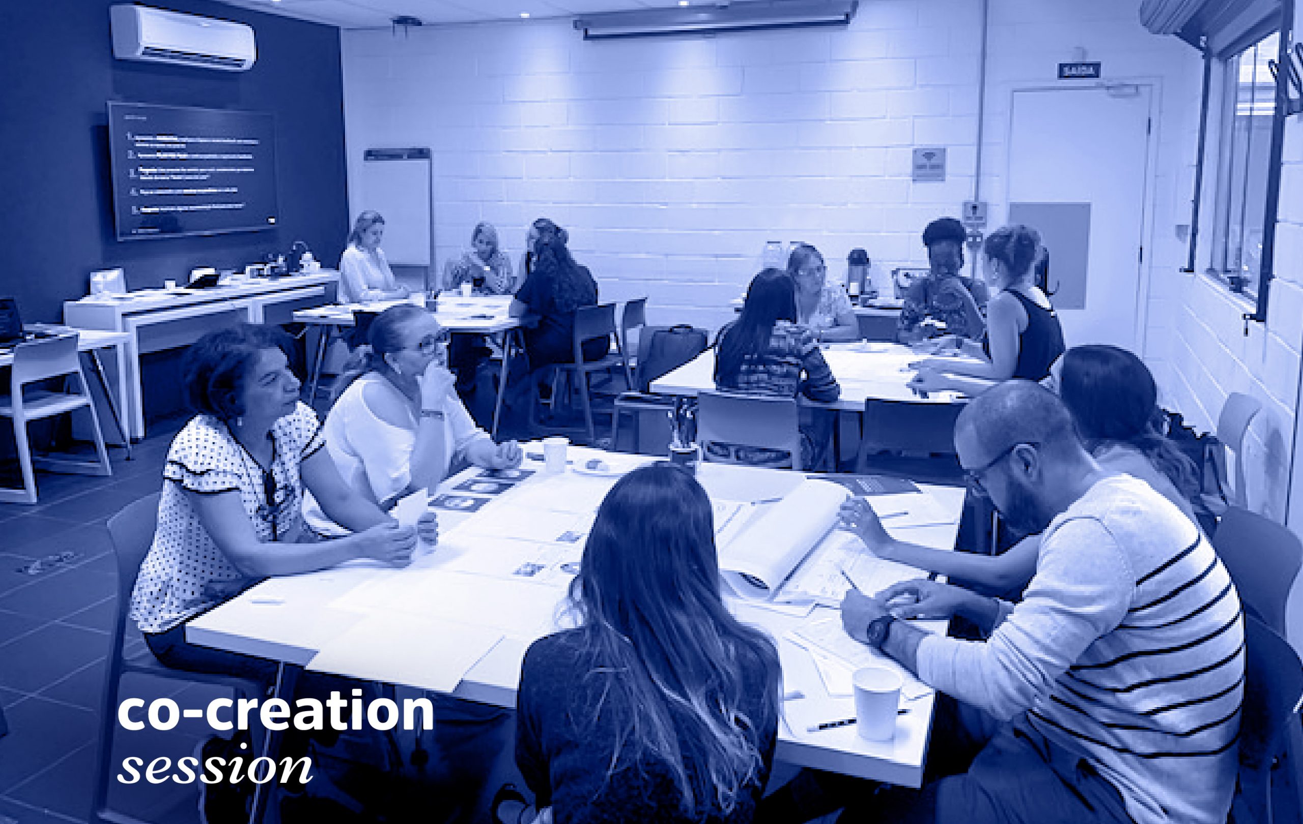

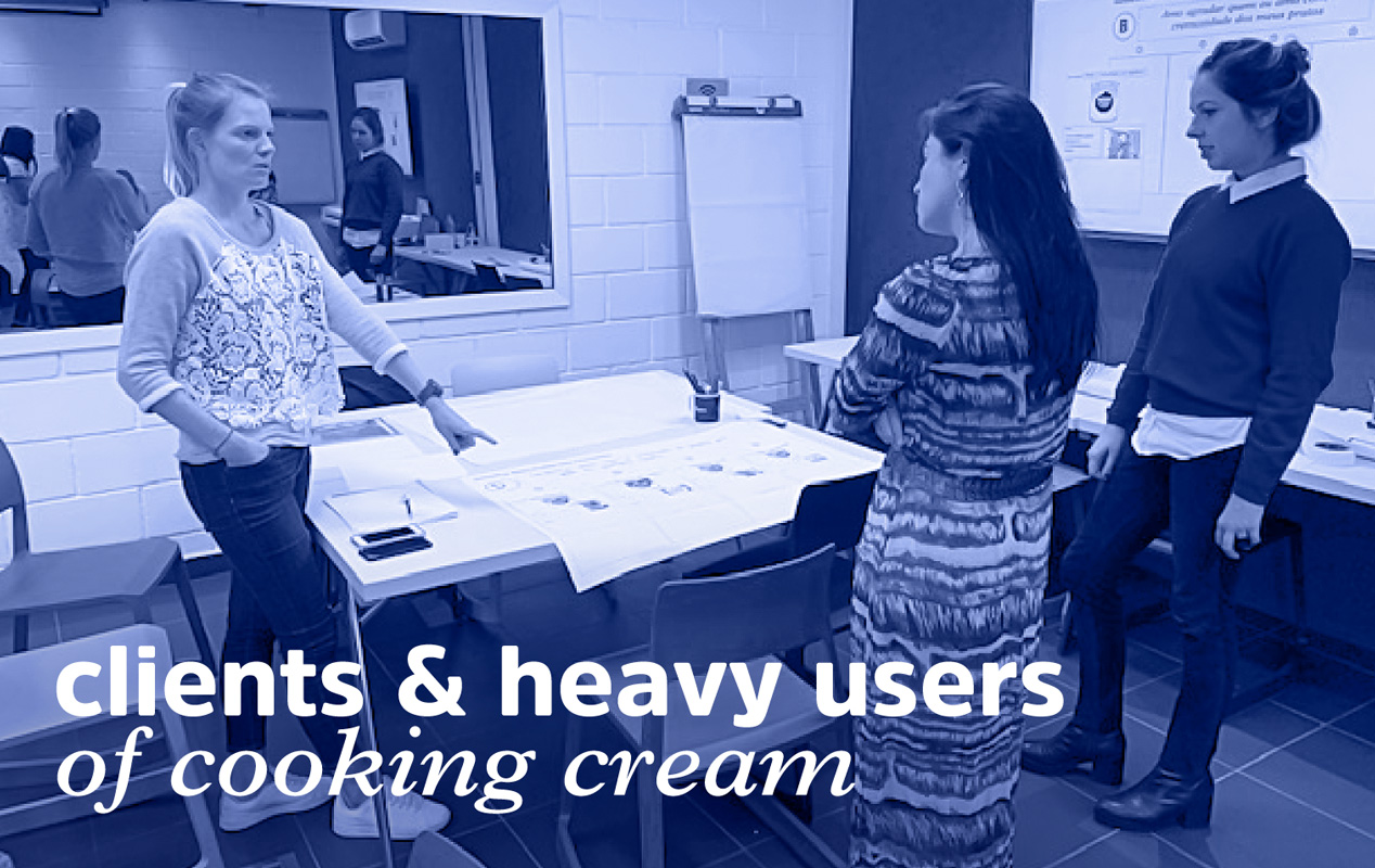
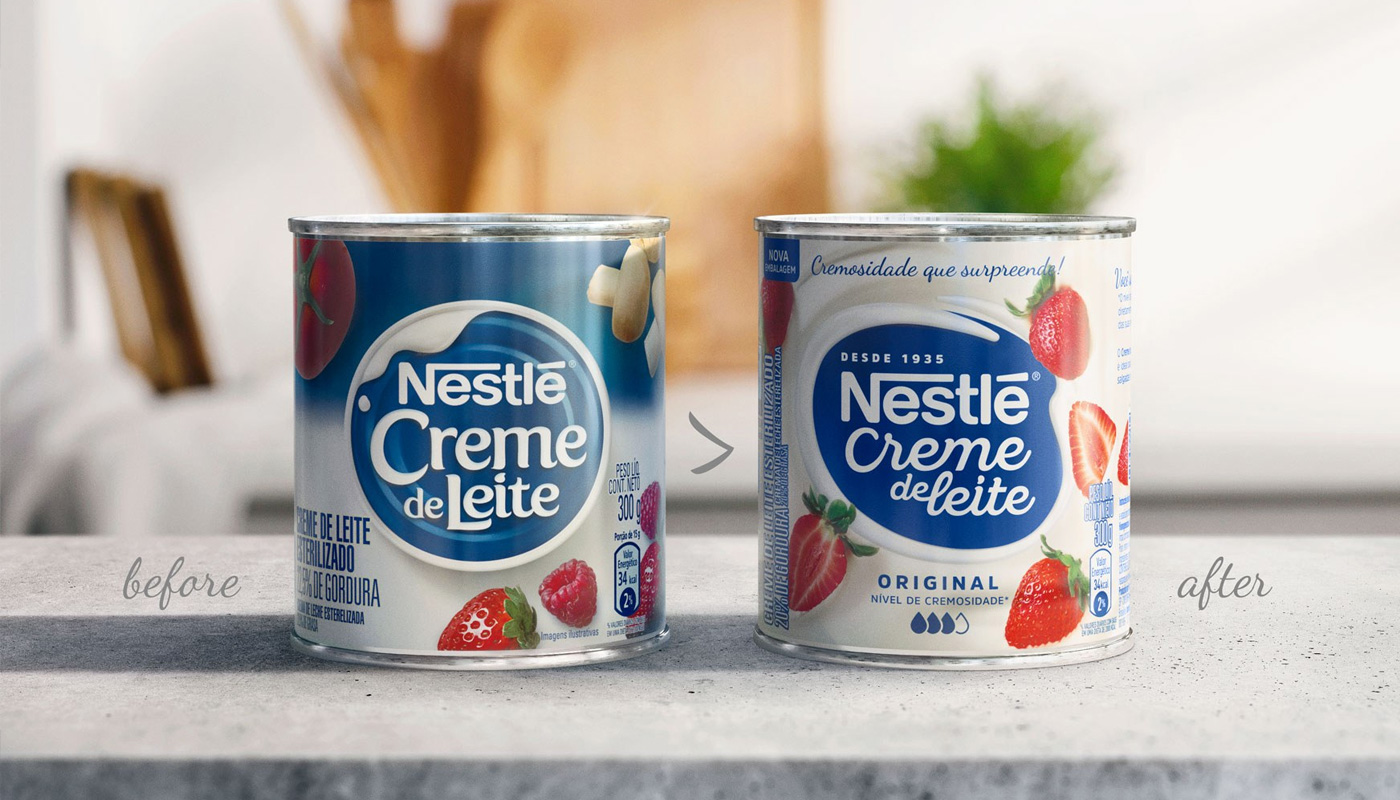
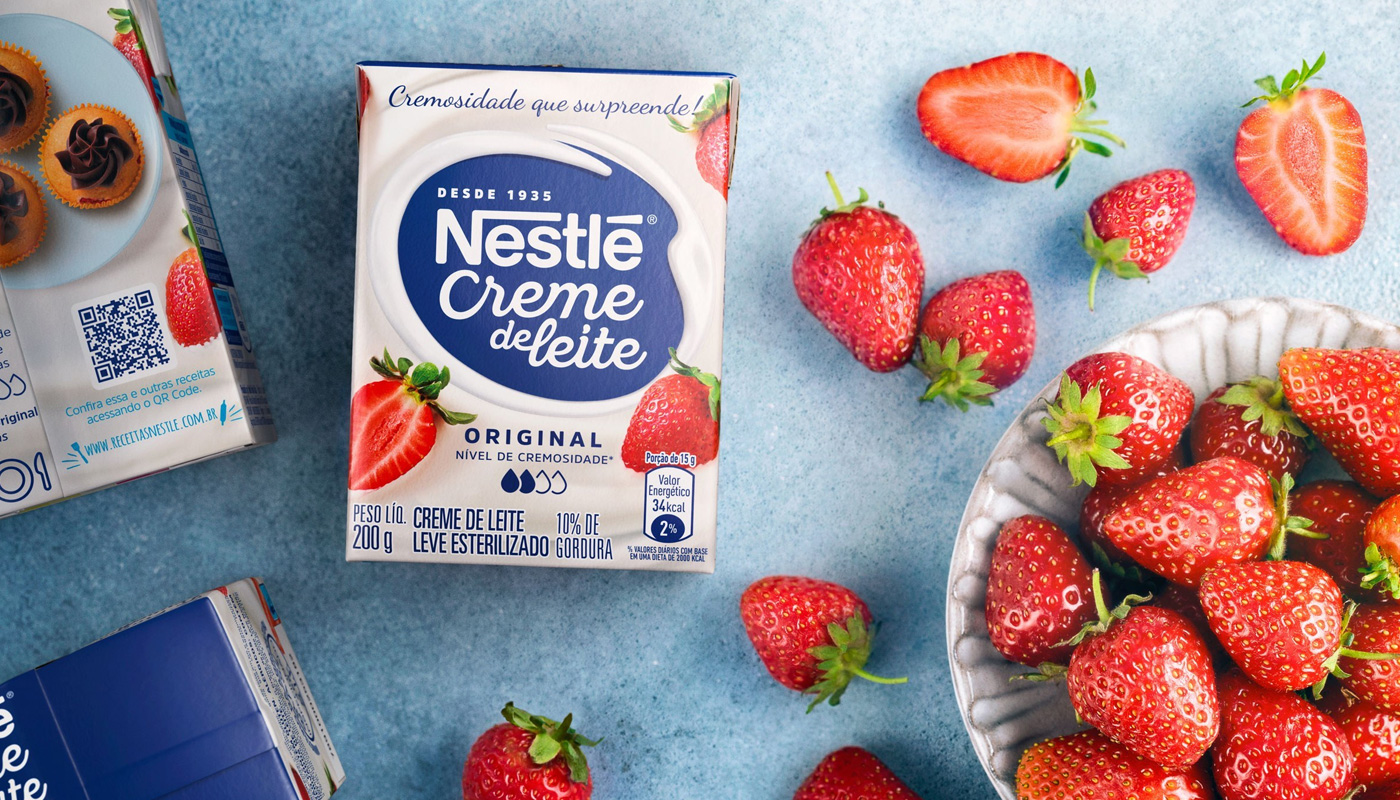
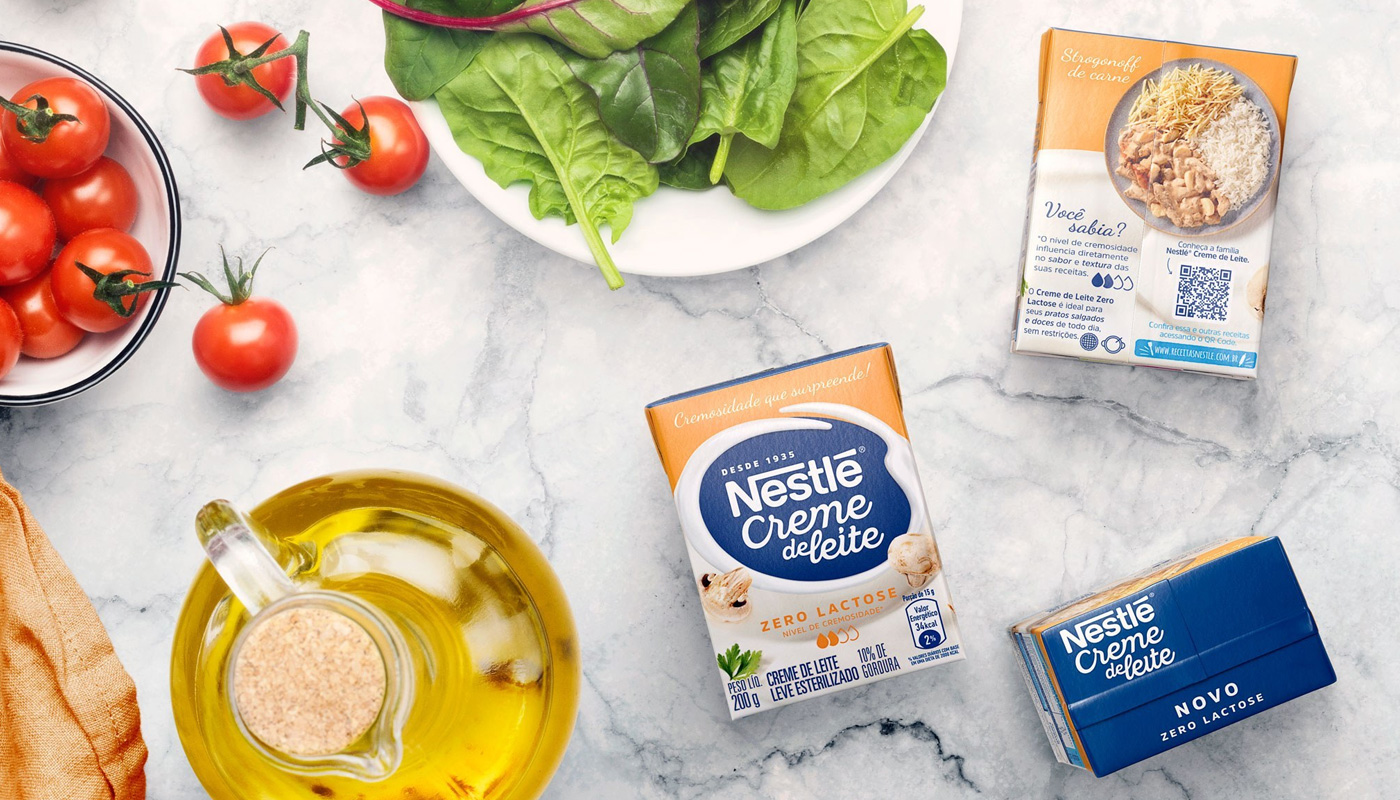
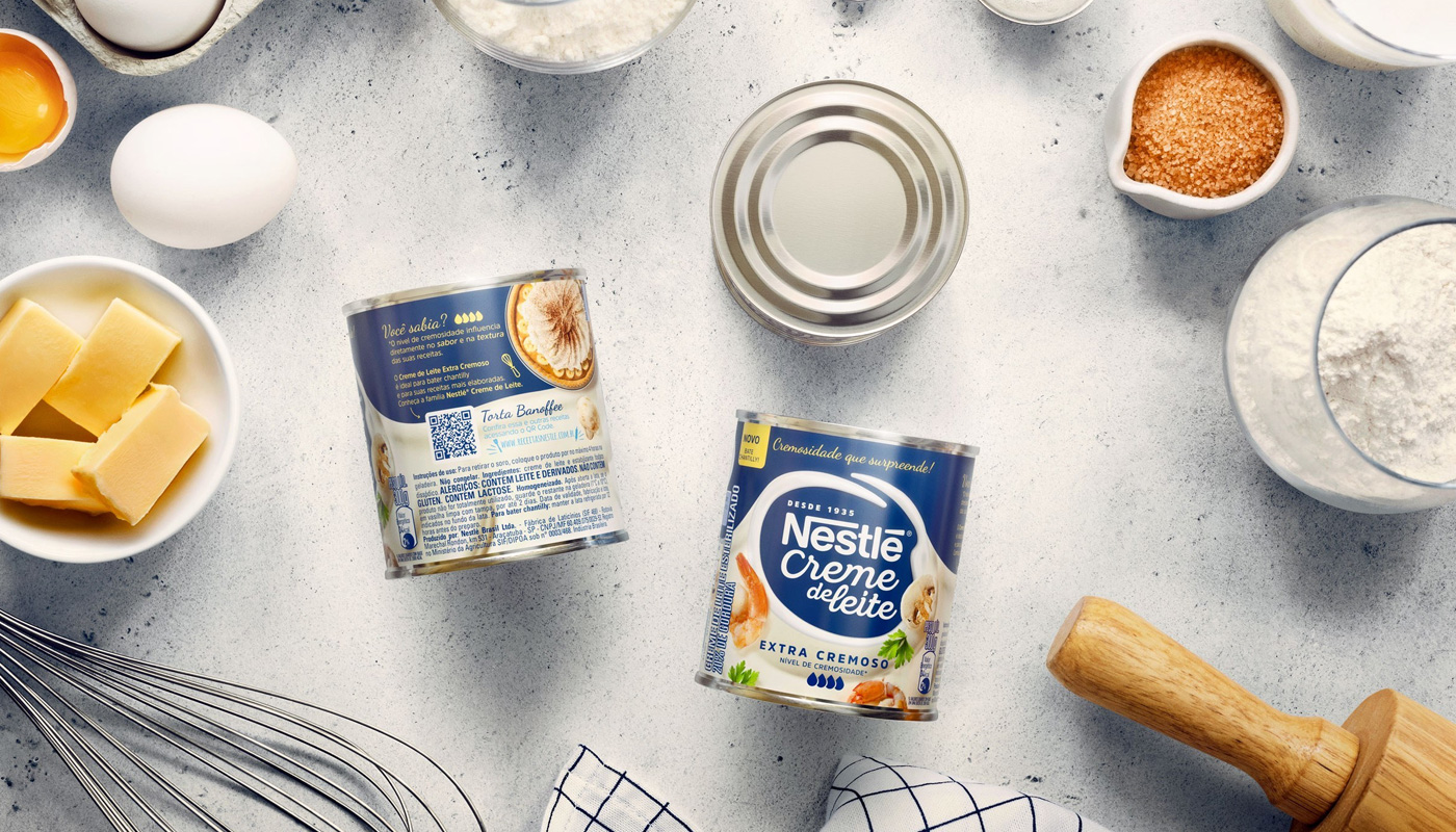
In order to make consumers’ life easier, Nestlé has decided to hear them. The surveys revealed important insights – the product’s peculiar creamy texture and versatility – that were used to build the new visual identity. The first insight was definitely the key driver of all the creation work – everything revolves around the creaminess, and all the other visual elements were created based on that feature. The solution found was to give consumers the autonomy to choose the variety that best pairs their recipe through a simple and intuitive visual system – the more drops, the creamier.

Concerning versatility, the visual path developed focused on inspiring the consumer by making him or her notice how easy it is to transform a simple, ordinary dish into something special. Thus, we have created packaging that are more connected to the needs of the person who cooks, improving the quality of the information on the label, exploring new recipes and including a QR code for those who want to learn more.
With the renewed design system, and inspired by the real needs of its consumers, Nestle Cooking Cream was back to the media with the campaign “As creamy as it can get!”, a landmark for the brand, which had not launched a communication campaign for 19 years. All the branding work, starting from the visual identity to the subsequent packaging application has also served to rethink the product’s portfolio and the brand’s future steps.
As a result of a workshop on Brand Portfolio Optimization, brand marks and layouts for new lines and varieties of the product were developed, representing a breakthrough innovation, not only in the brand’s portfolio, but in the category as a whole. The Cooking Cream line of sweet and savory pâtés was created! As new (and tasty) as it can get!


Nestlé, already a leading brand in the mainstream chocolate category in Ecuador, decided to break into the premium chocolate segment, an important category for the Ecuadorian market, still untouched by the company. It’s an emerging category, earning consumer preference and a standing-out position in points-of-sales. Due to our long working relationship with Nestlé and experience with similar projects, CBA B+G was asked to develop the concept, name and packaging of the new brand.
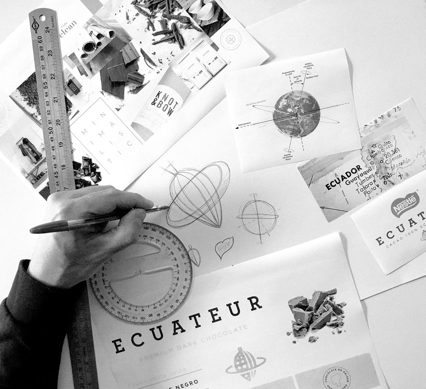
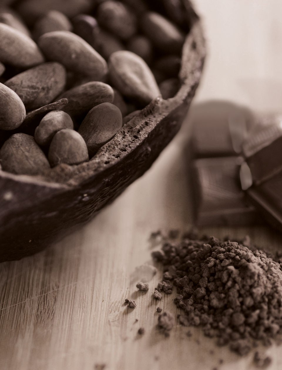
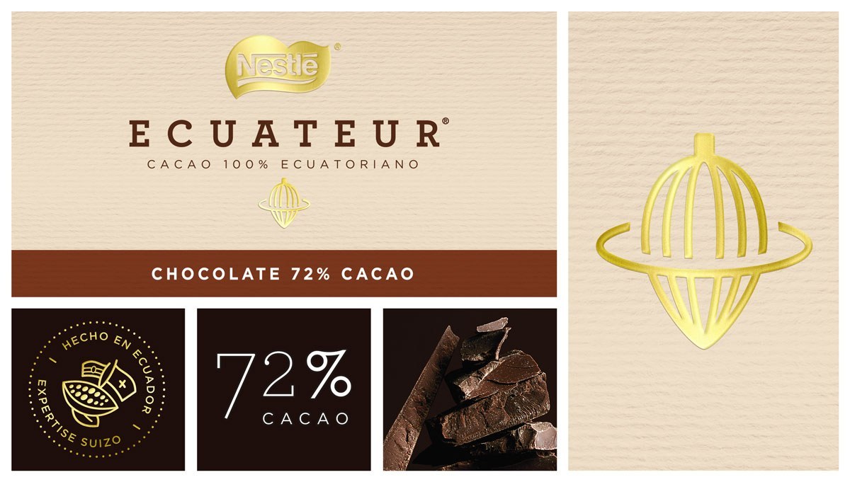
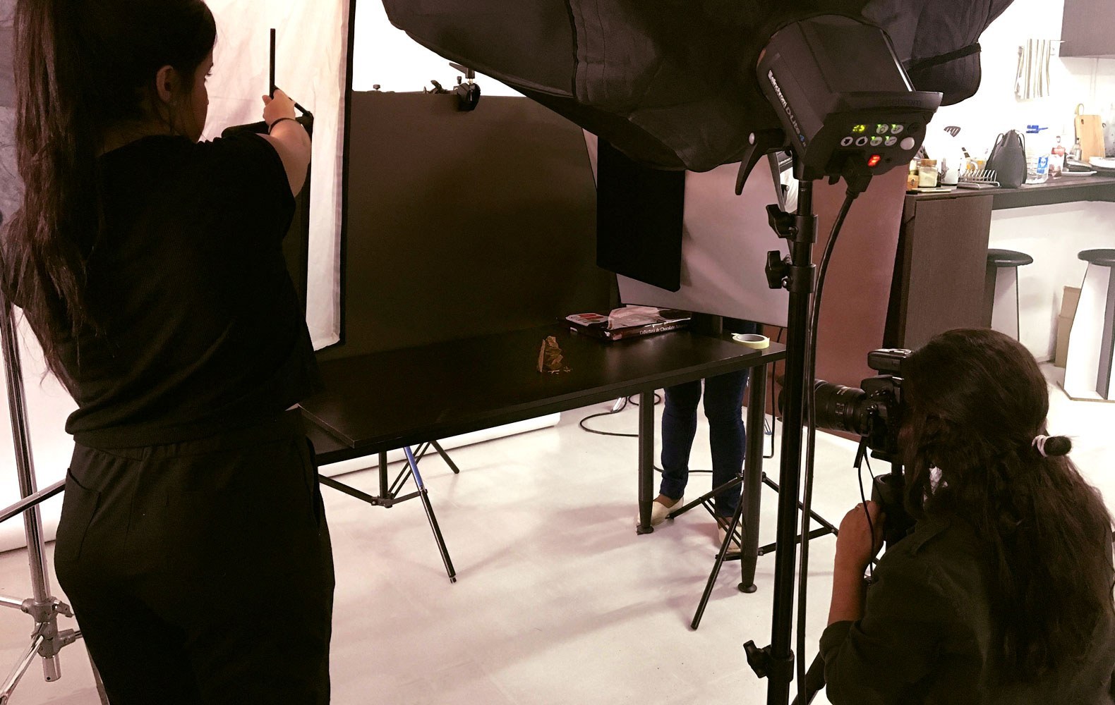
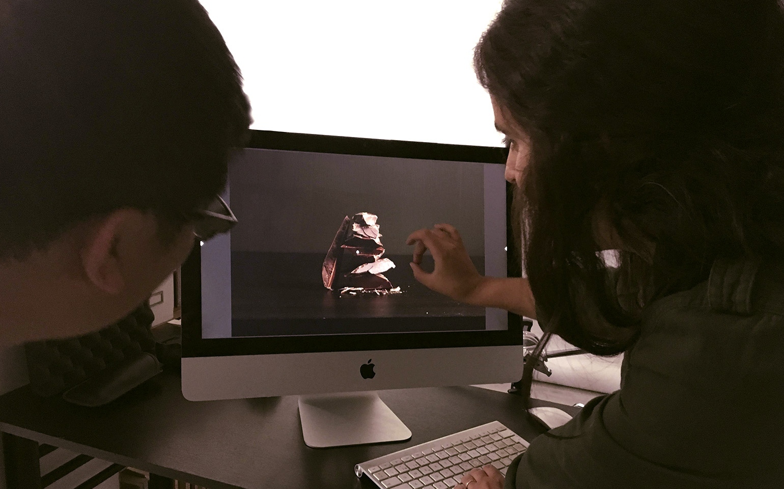
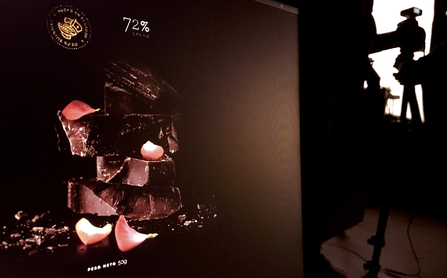
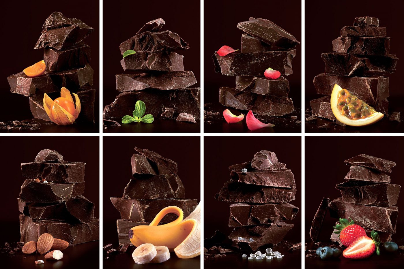
To develop the new brand concept we researched the target, the premium chocolate universe and the category within the country, to differentiate it from the already existing players and premium products known by the consumers. The studies guided the strategic path to be followed: the new line should highlight the quality of the Ecuadorian cocoa beans, one of the biggest and more renowned cocoa-producing countries in the world – together with Nestlé’s mastership, the Swiss expertise in chocolates. Two superlatives that add value to the new line of Nestlé premium chocolates in the country.
The unique combination of quality of origin and tradition brought in a superior and sophisticated chocolate line. With sober colors and textures, the 9 varieties of the new line come with the quality seal – “made in Ecuador with Swiss expertise”, also highlighting the Nestlé Cocoa Plan® commitment, a program that supports cocoa growing communities, ensuring sustainable production and protecting the environment.
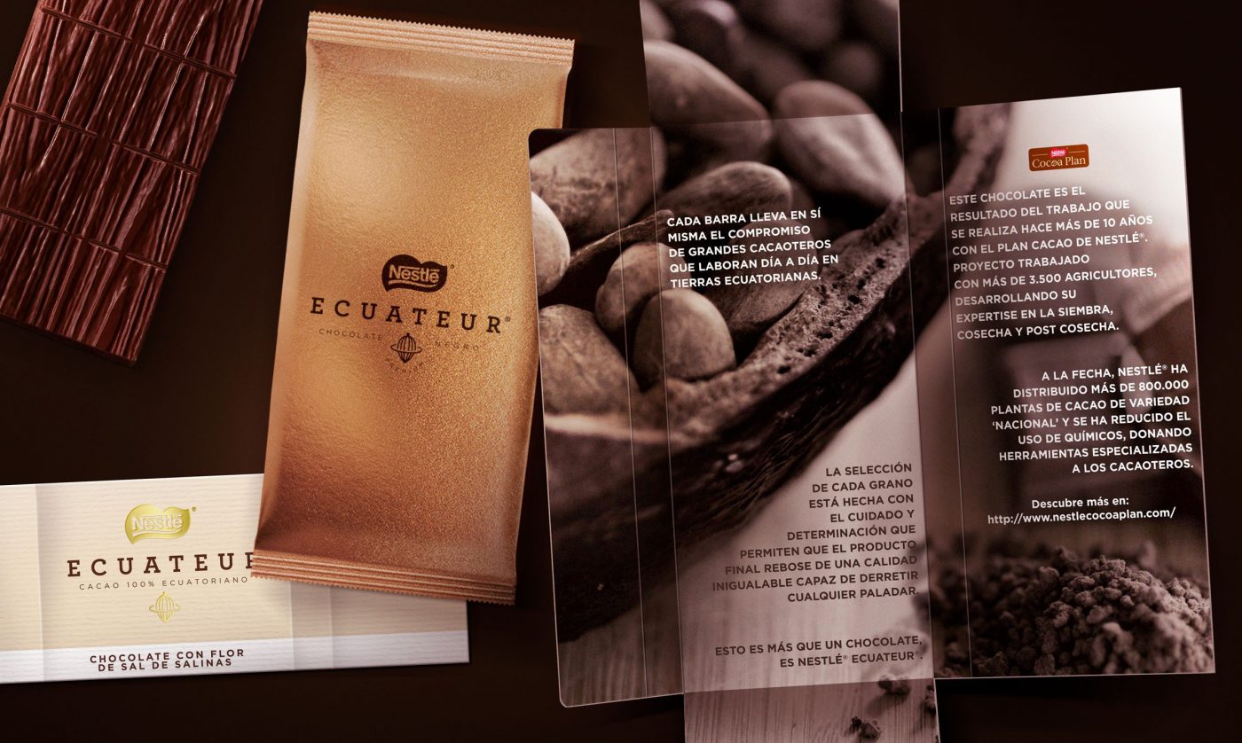
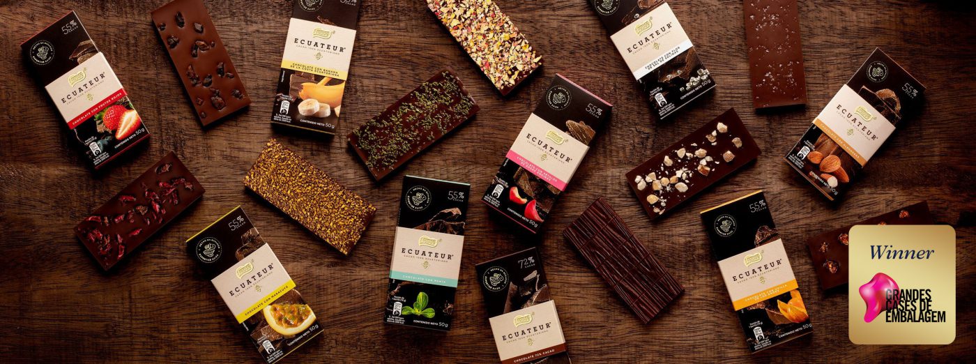
This project won the Grandes Cases de Embalagem 2019 Award, a traditional Brazilian prize that encourages and values packaging that stand out for the optimization of its design elements. The jury team was surprised not only by the packaging design but also by the production process and its concern for the environment, once both the producer – with its commitment to sustainable cocoa production – and we – developing the packaging in a wallet format that avoids the use of glue – embrace sustainability.
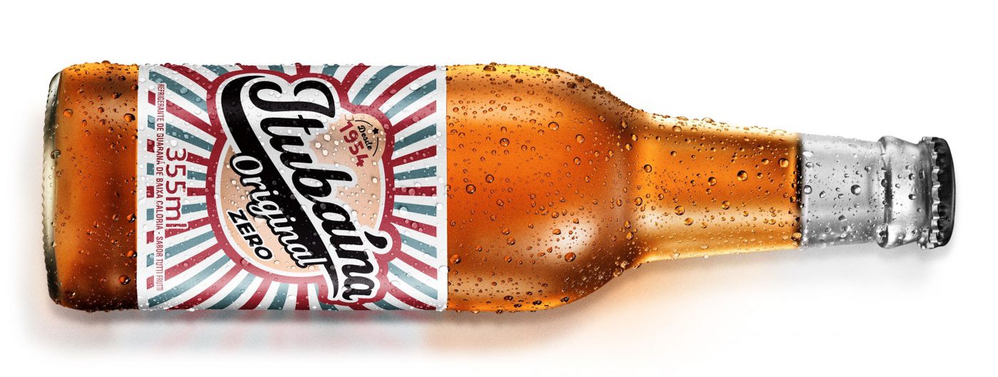
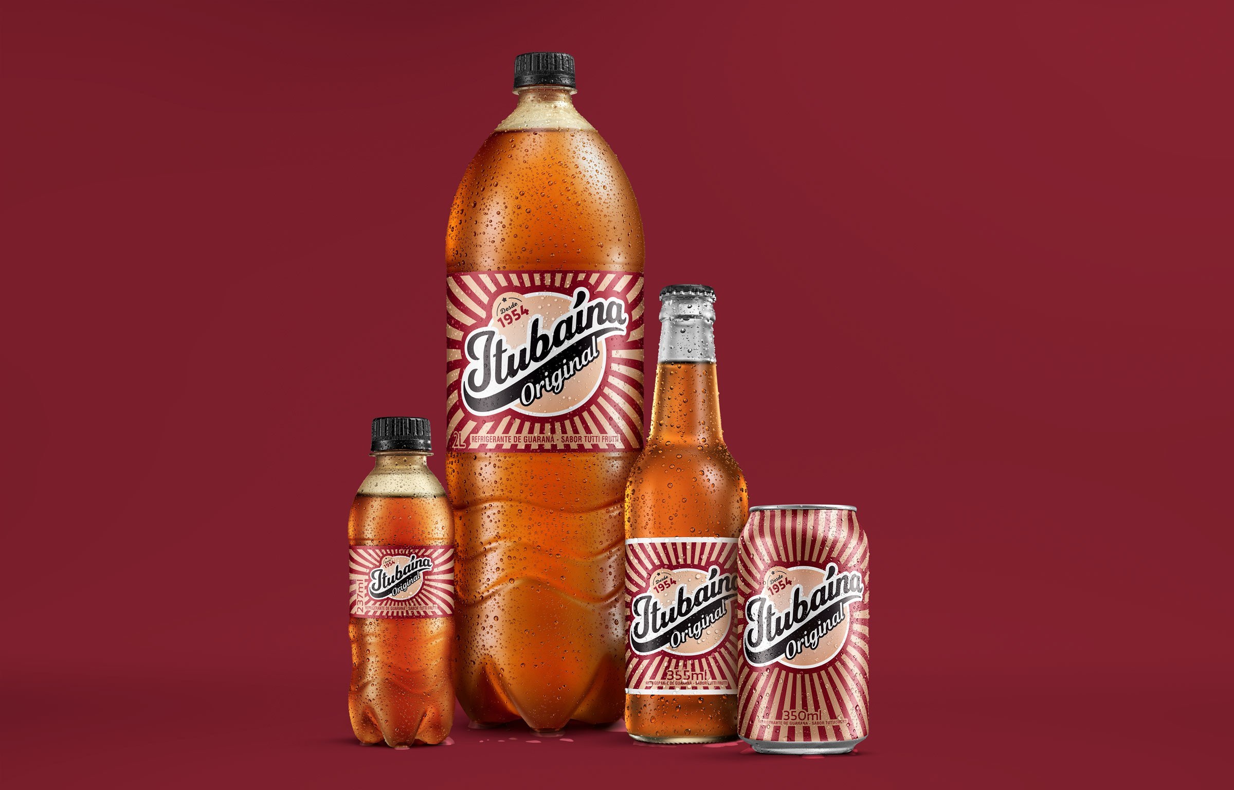
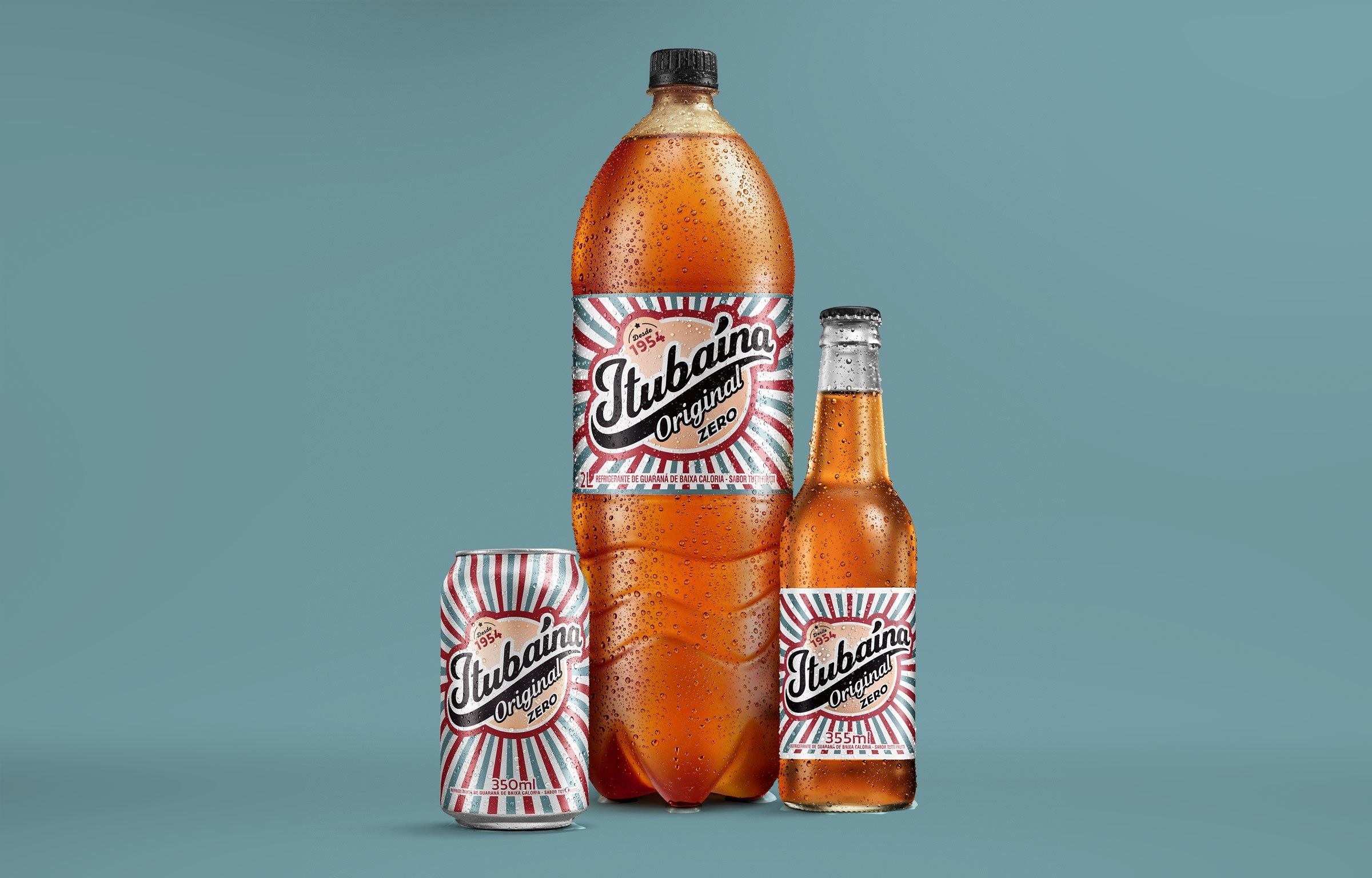
Although it was born in the 1950’s, Itubaína is an eternal child. Just one sip is enough for its traditional and distinctive taste to make people go back to childhood. Over the years the brand has changed, increased its portfolio, broadened its range of versions and flavors, but has retained its essence.
So, the challenge presented to our team was to convey the brand’s new positioning, leveraging the brand’s assets and iconic identity while keeping its unmistakable spirit.
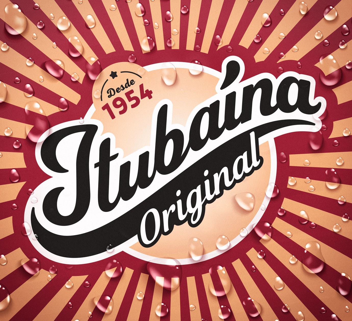
Itubaína’s brand repositioning followed an ambitious value proposition: to be perceived not only as vintage, inexpensive or a niche brand, but acknowledged as a mainstream brand, although not a conventional one. A brand that has a spontaneous spirit, with a touch of authenticity, and still essentially fun and dynamic.
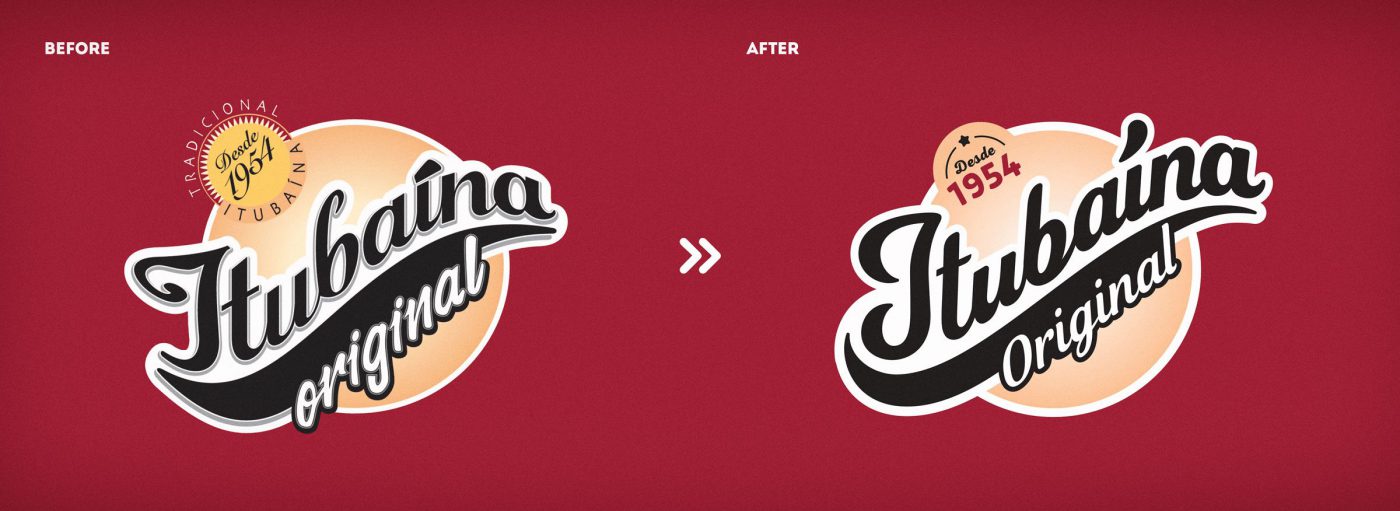

Our challenge was to give the brand a facelift, keeping the strong assets and brand recognition codes, whilst refreshing the brand’s visual identity. An evolution that reinforces its new positioning of spontaneous fun, so to attract new consumers without losing the features recognized by its present consumers.
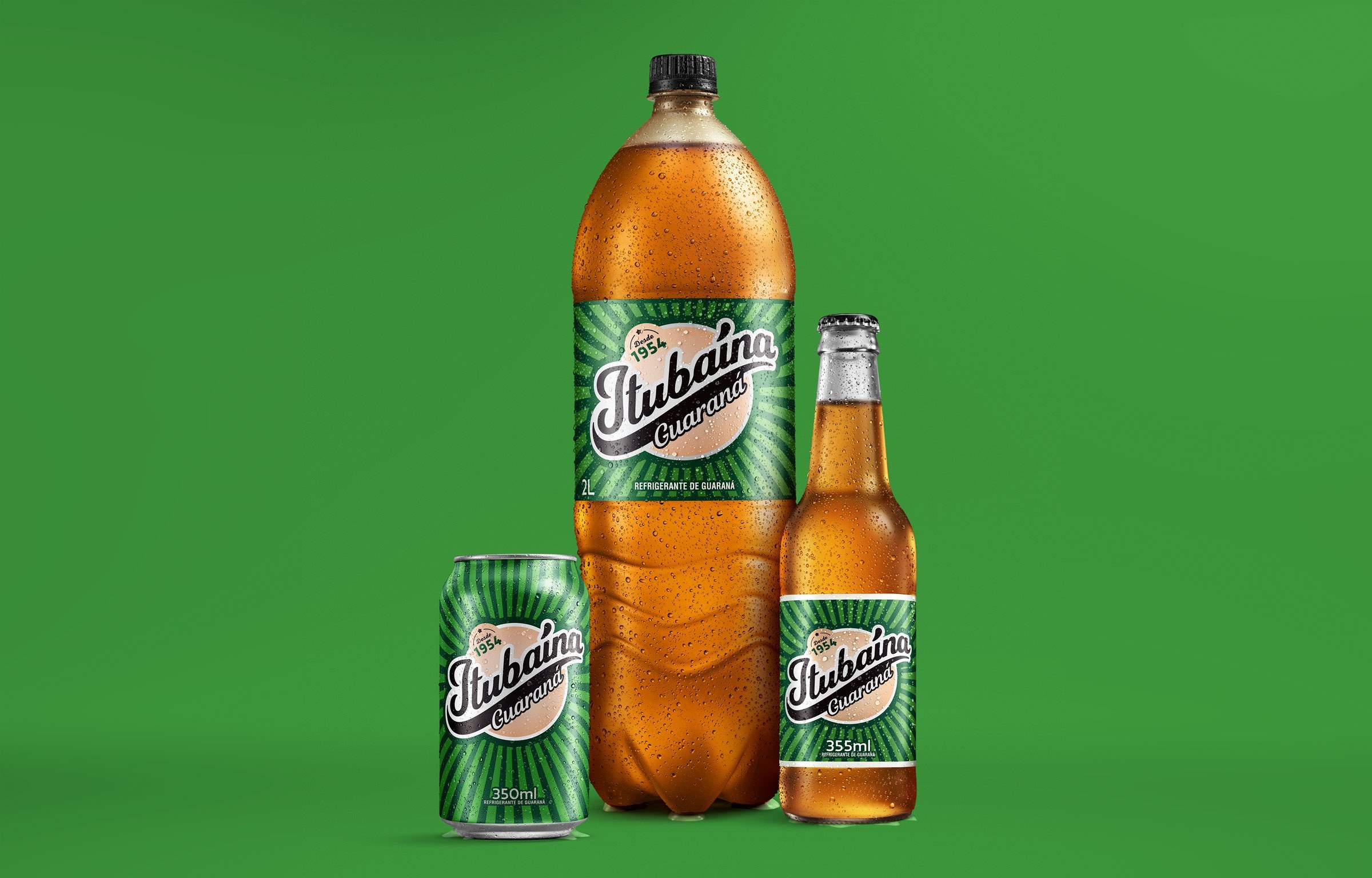
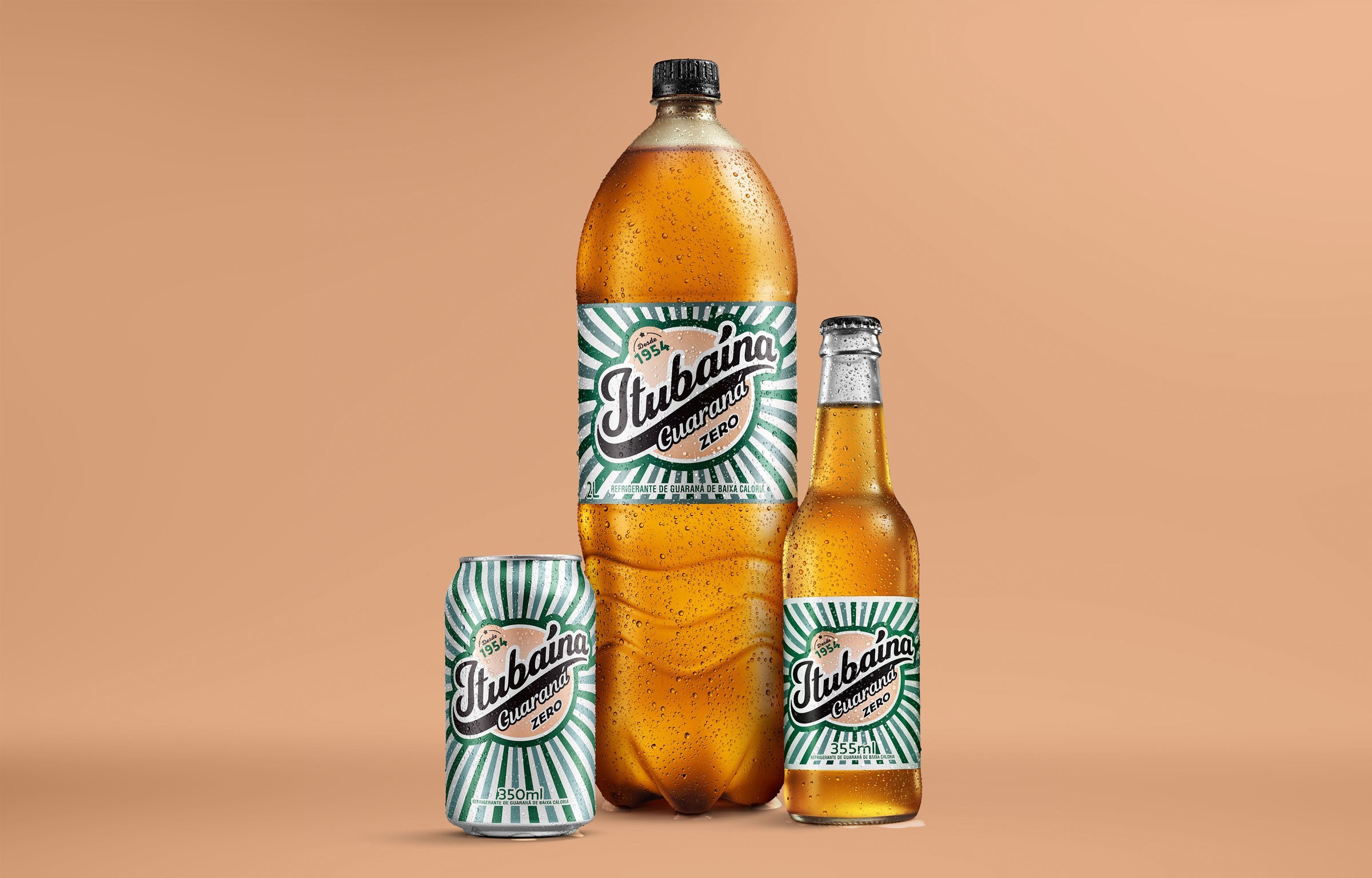
The new visual identity brings life to the brand revealing Itubaína’s dynamic, fun and authentic world. The vibrant colors, contrasting with the burgundy and beige (main trademark colors) denote pleasure; the rays suggest energy, a texture that adds vitality and vibration to the visual composition; the sans-serif letterform confers fluidity, freedom and modernity to the brand – all features of evolution present in the packaging and visual concept.
The guidelines were organized in a Brand book, an operation and implementation brand guide, approaching from strategy to communication in all touchpoints, including portfolio structure and launching of new flavors. A global and integrated view of all the brand’s touchpoints, praising Itubaína’s spontaneous, fun and authentic world. Because we can’t wait for fun!
Although enjoying a strong market share in the country chocolate market, Nestlé Peru had not yet entered the premium segment, which has been growing in importance and relevance over the years. So, the company decided to ask its consumers which of their portfolio brands would better fit the premium category, and D’Onofrio was the answer – a centenary brand loved by Peruvians.
Besides understanding which brand would better fit the new segment, a yet more important question has arisen: what does it mean being premium, after all?
For Peruvians, sophistication comes from origin. They take pride in their ancestral roots and the popular culture is their most precious asset.
Therefore, our first move was to explore the country traditions. Together with a team from Nestlé we traveled around Peru to get a close look at their fairs, villages, and cities, taking a deep dive into the local culture and costumes. Then, we went to the Peruvian Amazon rainforest. We visited small and medium-scale cocoa farms where farmers, together with their families, produce the best and purest cocoa paste in the country. We have learned that it takes 3 to 5 years to complete the cultivation cycle, from sowing to the first harvest.
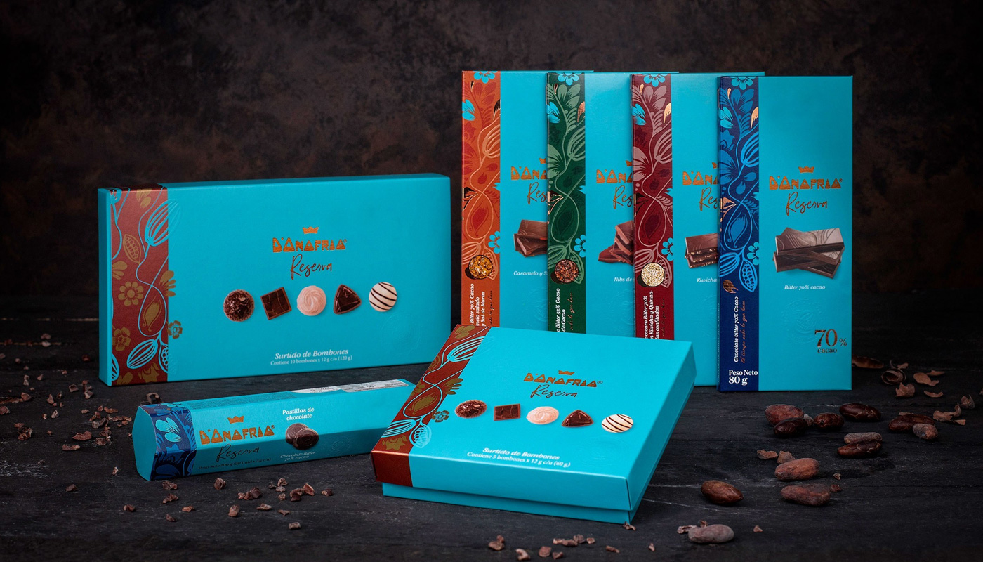
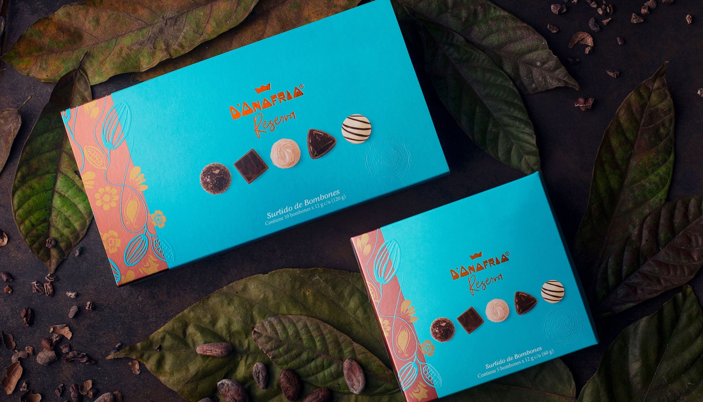
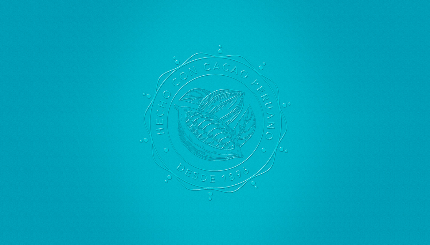
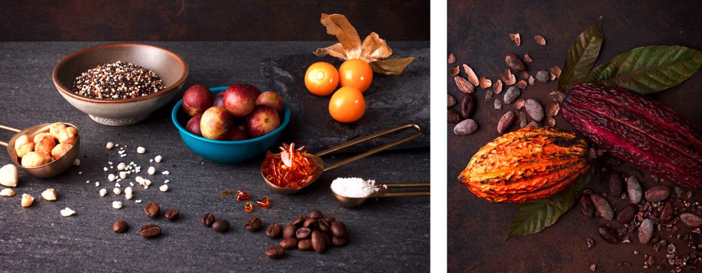
Inspired by the living contact with the local culture and tradition, we moved to the next step – the creation of the new chocolate brand concept. We studied D’Onofrio Masterbrand’s strategic documents, such as the essence, consumer profile, market surveys and the existing brand portfolio, that already has premium Panettones. Based on the living experience and adding the strategic analysis, we developed the creative concept for the whole line. Inspired by the abundance of the rainforest, we have created an illustration that represents the cocoa in its environment. The colors chosen were also inspired by nature, with earthy pastel tones. The copper tone contrasts with the other colors highlighting the quality and care of the new premium line.
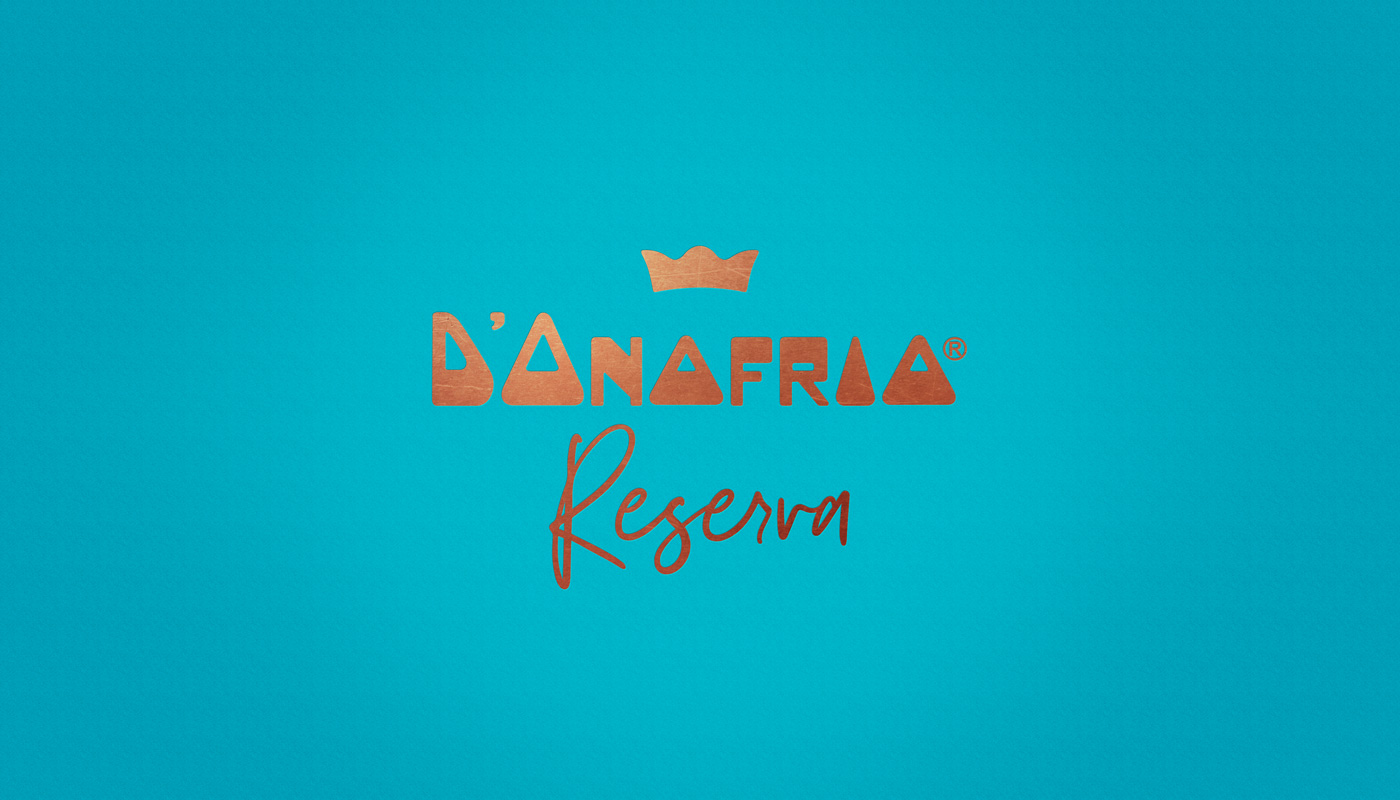
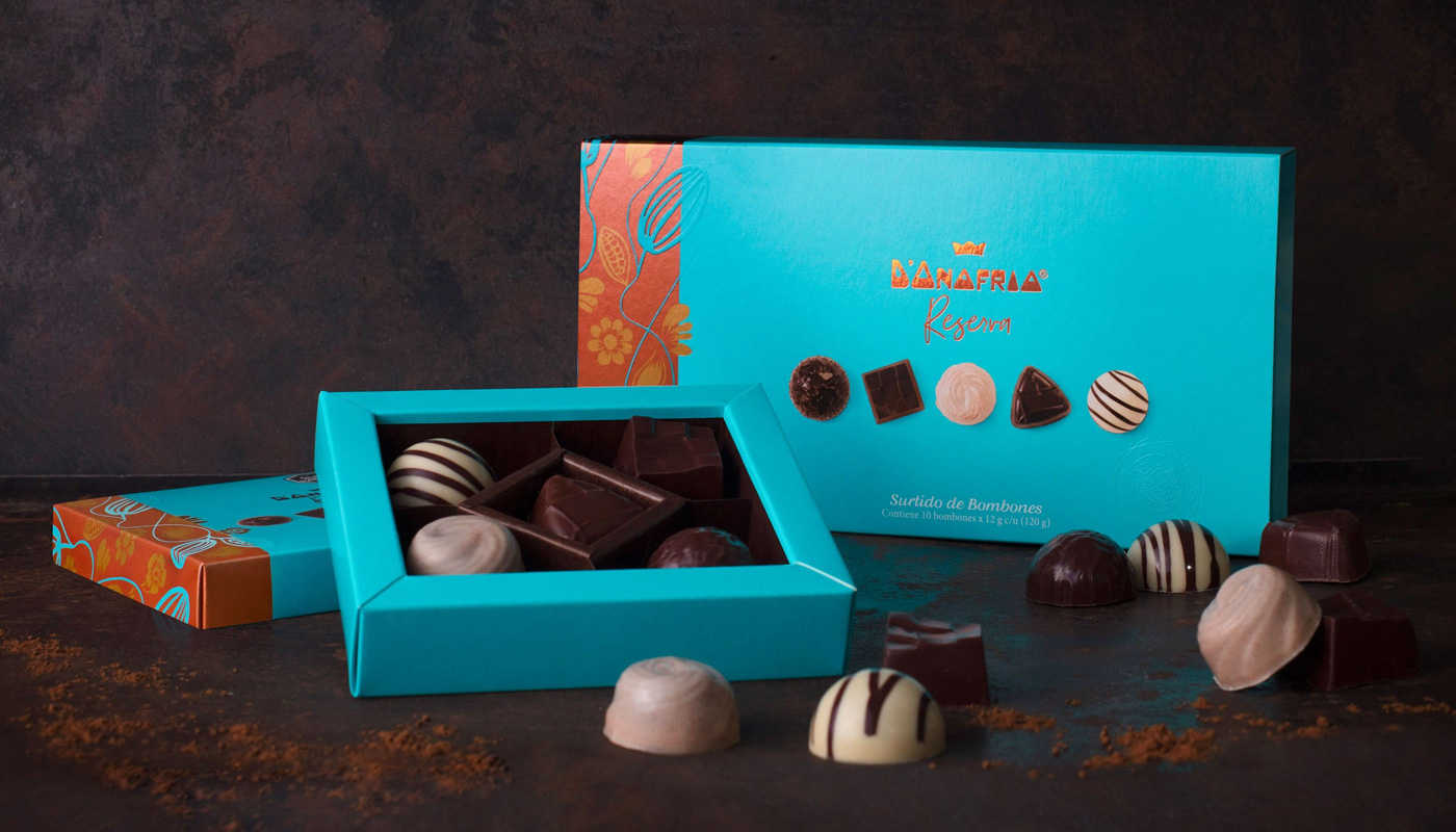
We have presented visual codes for the parent brand, such as typography, colors, patterns, textures, and hierarchy of elements, besides the naming strategy. These cross elements are the foundation for the graphic system of the new brand, named D’Onofrio Reserva.
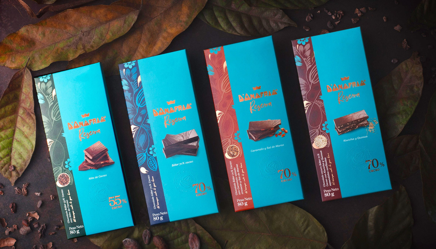
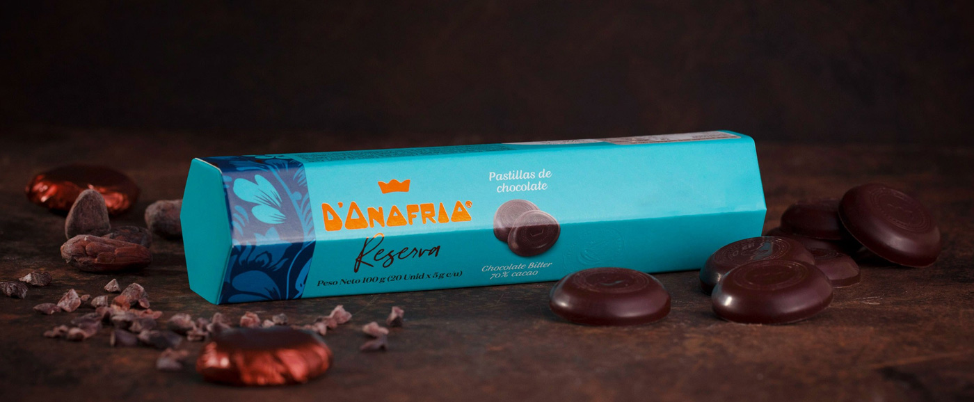
To complete the brand rationale, we felt the urge to add an important element: the cocoa origin history. This emotional element, essential to lend credibility to the new line and build a connection with people, is in the inside of the packaging. Following the creative concept El tiempo sabe lo que hace (time knows best), stories are told, enhancing the cultivation, the harvest, and the selection of the best beans. It is a product that cherishes the making of chocolate, the time and dedication behind its production. A line of chocolates that values authentic recipes and the respect for the origin, producers, and ingredients, as do the Peruvians.
D’Onofrio Reserva line has 70% cocoa bars, bonbons and pralines, all wrapped in vibrant colors and traditions of the Peruvian culture.
This project won the Nielsen Design Impact Awards 2019, a global award that highlights cases of packaging redesign, assessing them as marketing tools. Prestígio’s packaging redesign stood out for increasing the brand’s sales by 46% after the new packaging reached the POS. In 2018, it was also awarded for ABRE Brazilian Packaging Award and Grandes Cases de Embalagem.
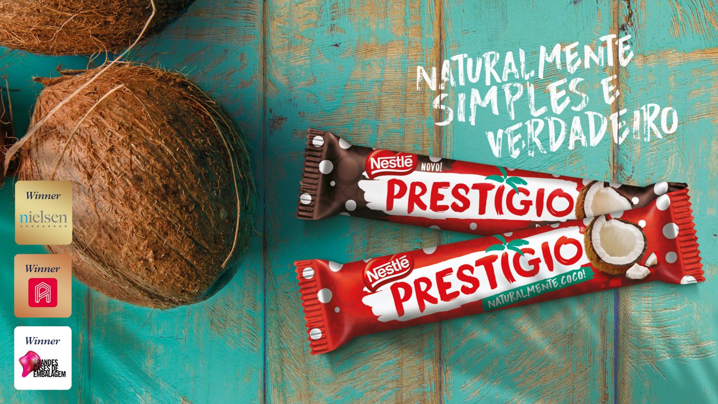
Prestígio is natural coconut, Prestígio is Brazil.
Created in 1961, and up to now a synonym for homemade recipes with coconut and chocolate, Prestígio is a genuine Brazilian chocolate deservedly recognized as one of Brazil’s symbolic brands.
Attentive to consumers’ tendencies and desire for more and more natural products, the Swiss multinational, as a leader in products which join nutrition, health and wellness, decided to renew the Prestígio brand. The preservation of its ‘natural coconut origin’ essence was established as the main goal, and CBA B+G was invited to the challenge of reconnecting the brand with its Brazilian chocolovers.
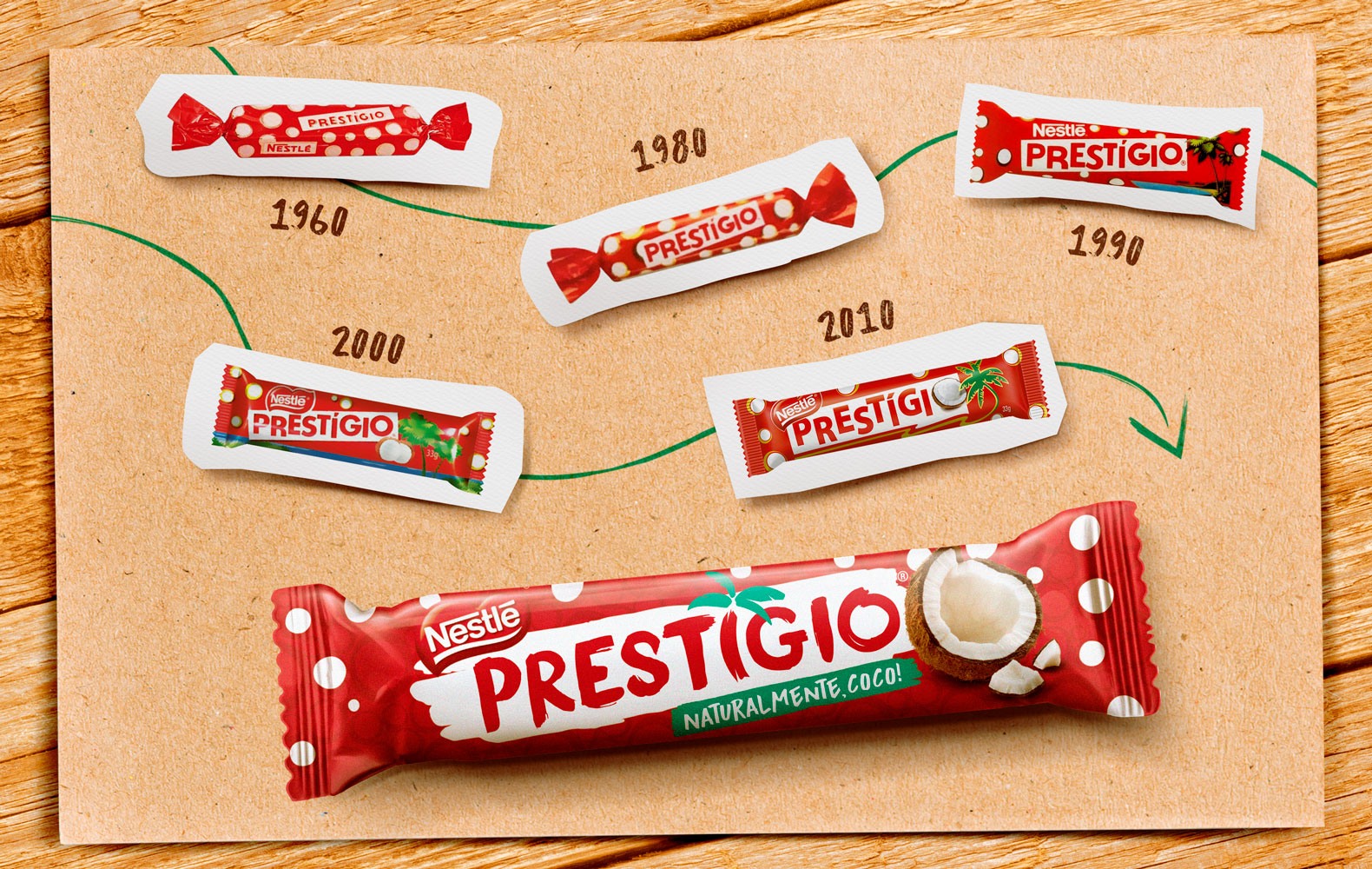
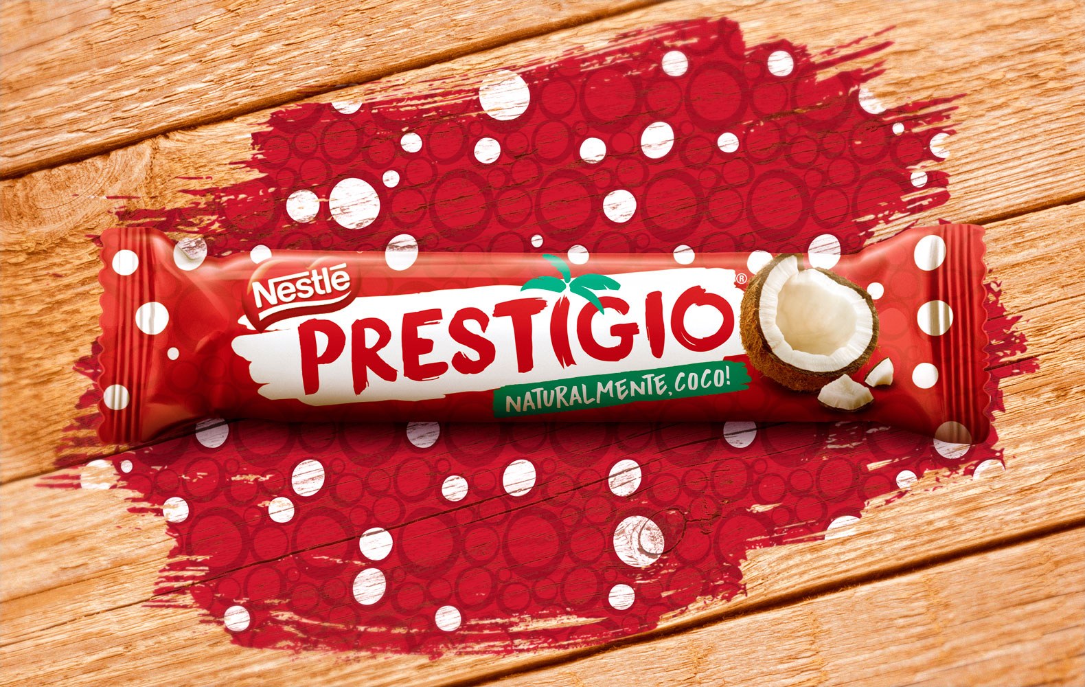
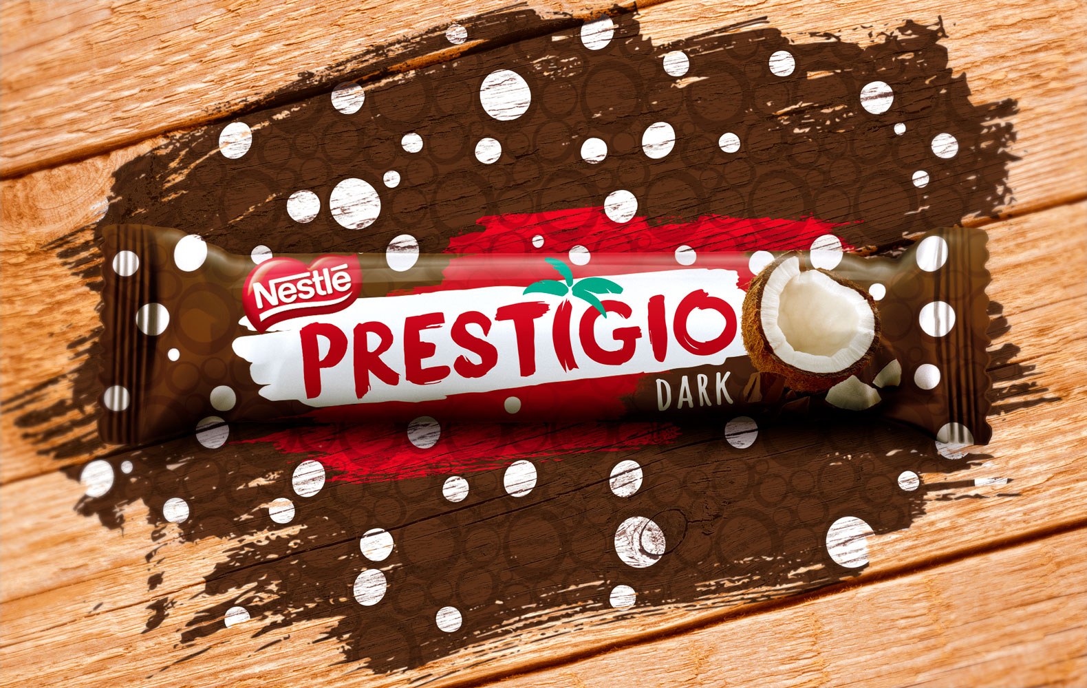
Despite being a traditional brand, preserving its memory is important.
So we started off from the brand’s archeology, in a way to rescue its codes and original shapes and visuals, the fundamental elements for settling down Prestígio’s essence and positioning. In order to grasp the real meaning behind the visual codes and reconnect them with its target audience, we carried out dense exploratory researches, both quantitative and qualitative, always checking the brand’s preliminary concepts and triggers. The research oriented a creative process that gathered strategy, research and design staff.
Hundreds of consumers from several Brazilian states were considered in a deep semiotic study with lots of learnings. We also carried out the Brand Senses methodology, which explores the brand’s five senses and orients the guiding principles that would shape the creative path to reconnecting with its identity: fresh air, nature sounds, the perfect combination of natural coconut and chocolate flavors.
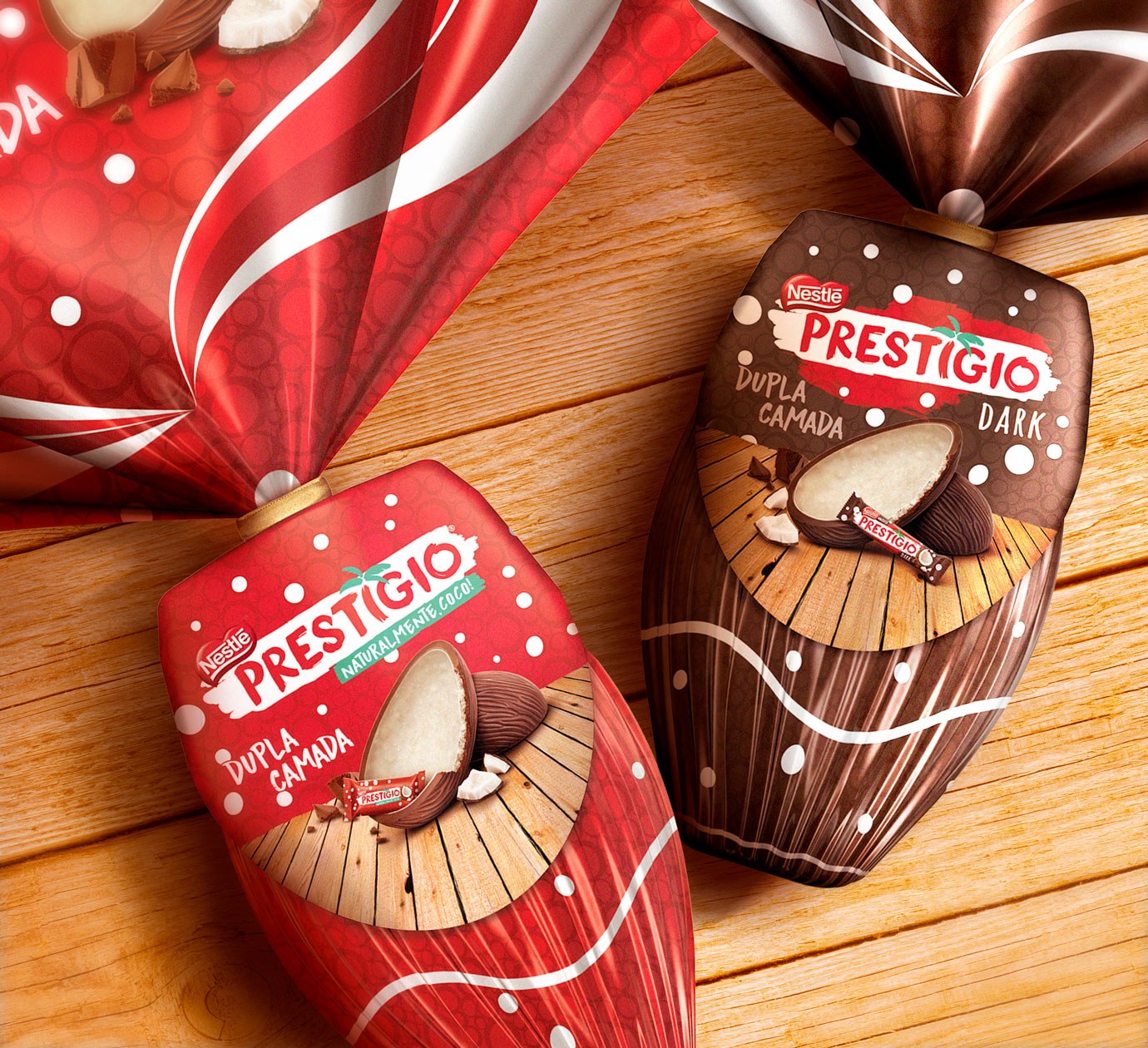
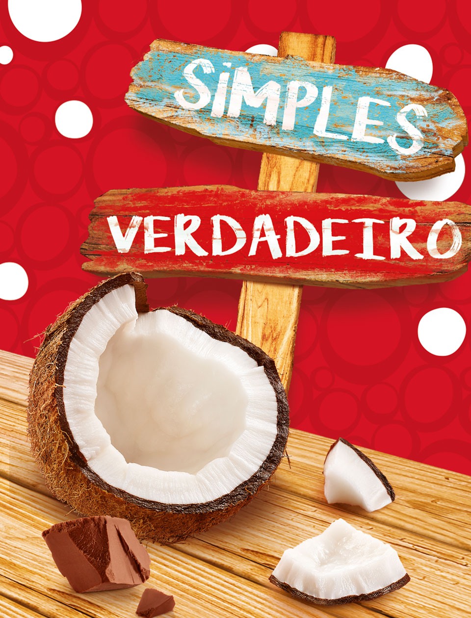
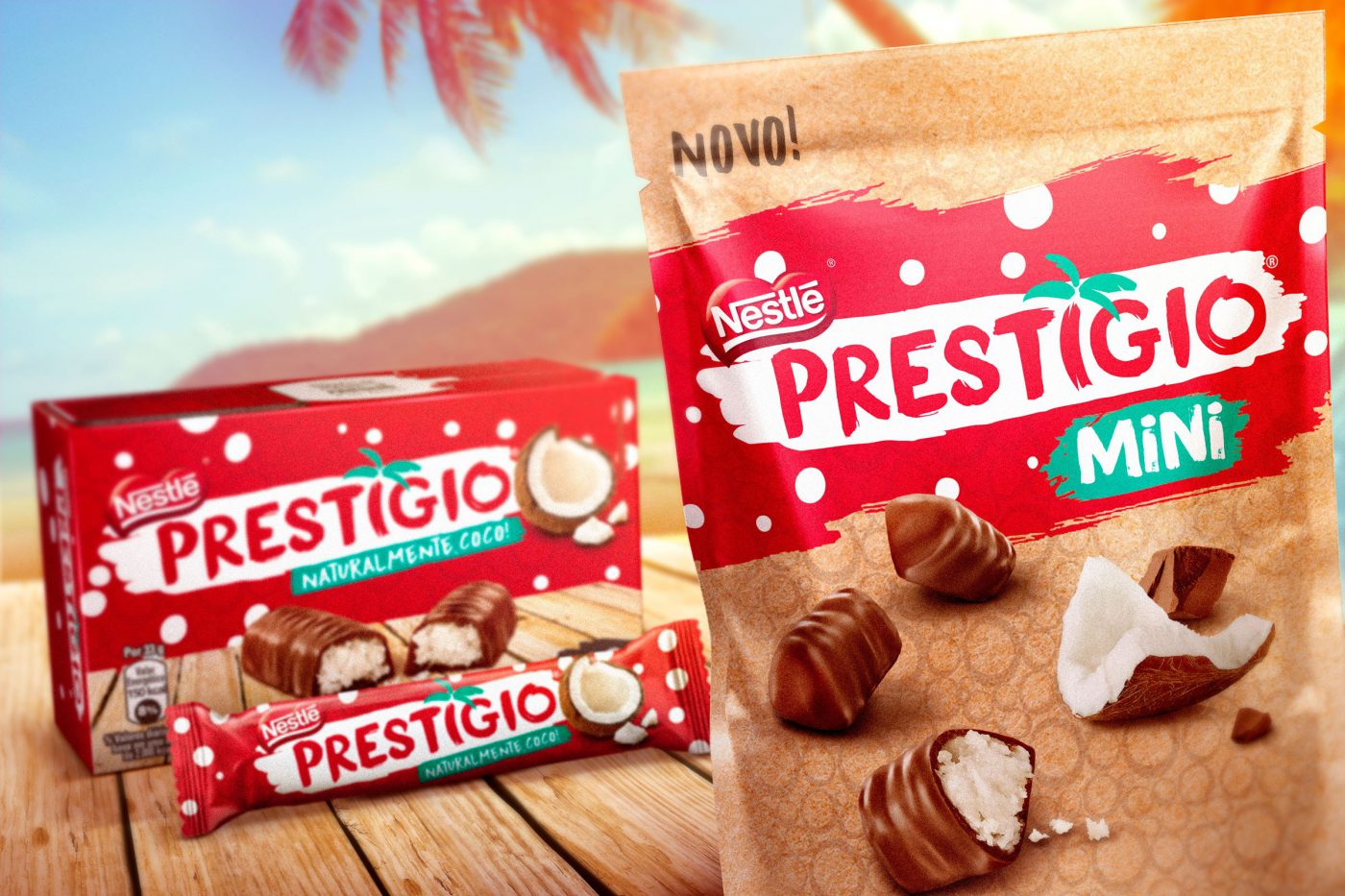
The outcome from the strategy and design works was the translation of all we heard from Prestígio consumers. Its iconic elements – the red color, the textures and the coconut were kept on, although represented in a more natural and authentic way. The sign typography, also recalling a more natural and truthful feeling. On the packaging, wooden boards, slivered ingredients, details in green – nature showing off closer to reality. The boxes were finished with embossment and textures to reinforce the brand’s sensorial aspect. An authentic simplicity to the exact Prestígio extent.
How to keep updated at the age of 60? This is Neston’s challenge, a brand that was born decades ago with the aim of contributing for a healthier and more balanced nutrition, and which is still faithful to its purpose until today. However, the world and the people have evolved a great deal since 1958, and to realign the brand communication we, from CBA B+G, were asked to reposition the brand.
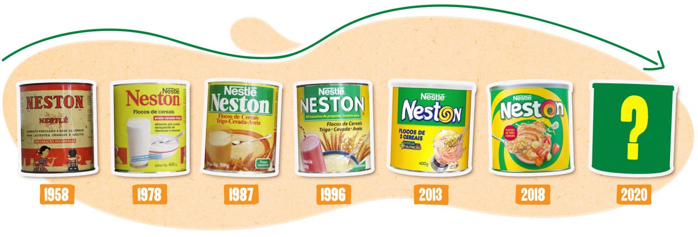
Although the company was aware of its target audience – generation Z people (born between 1995-2010), also known as centennials – Neston decided to broaden its knowledge of these youths and get to know their habits better so to connect to their needs.
To develop the new brand positioning we deeply immersed in the food routine of dozens of youths from generation Z, to understand Neston’s function.
We started this in-depth study carrying out a qualitative research with a significant sample of young consumers and potential consumers of the cereal. We used an online multimedia tool which allowed for a deep analysis – during 5 days in a row, the youths filled out an online diary with interactive activities, which enabled the identification of consumer drivers and needs of the target audience. The great differential of this tool was the possibility of obtaining more spontaneous insights, since the language used is closer to the codes used by young people to express themselves, such as apps and social media.
Based on this survey we were able to map territories where Neston could operate for an ideal brand expression.


Once the brand territory was defined, the next step was to rethink the visual identity. For that purpose we used our Brand Senses methodology, that analyses the brand through the 5 senses on an approach that aims to enhance the basic features and properties of the product: satisfy hunger combining different textures – dry or wet, crispy or creamy, yet always healthy. And always in movement, constantly energetic and vibrant.
The visual identity is nearing completion and will be the outcome of this deep analysis of the target audience. Stay tuned, cause soon Neston will get a new look – connected to the youths and their needs for movement and nutrition.
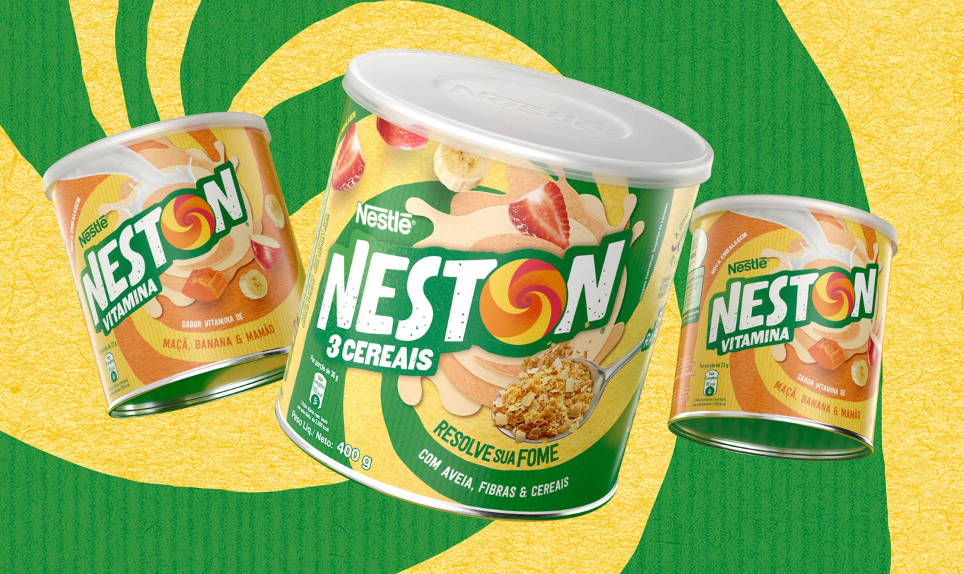
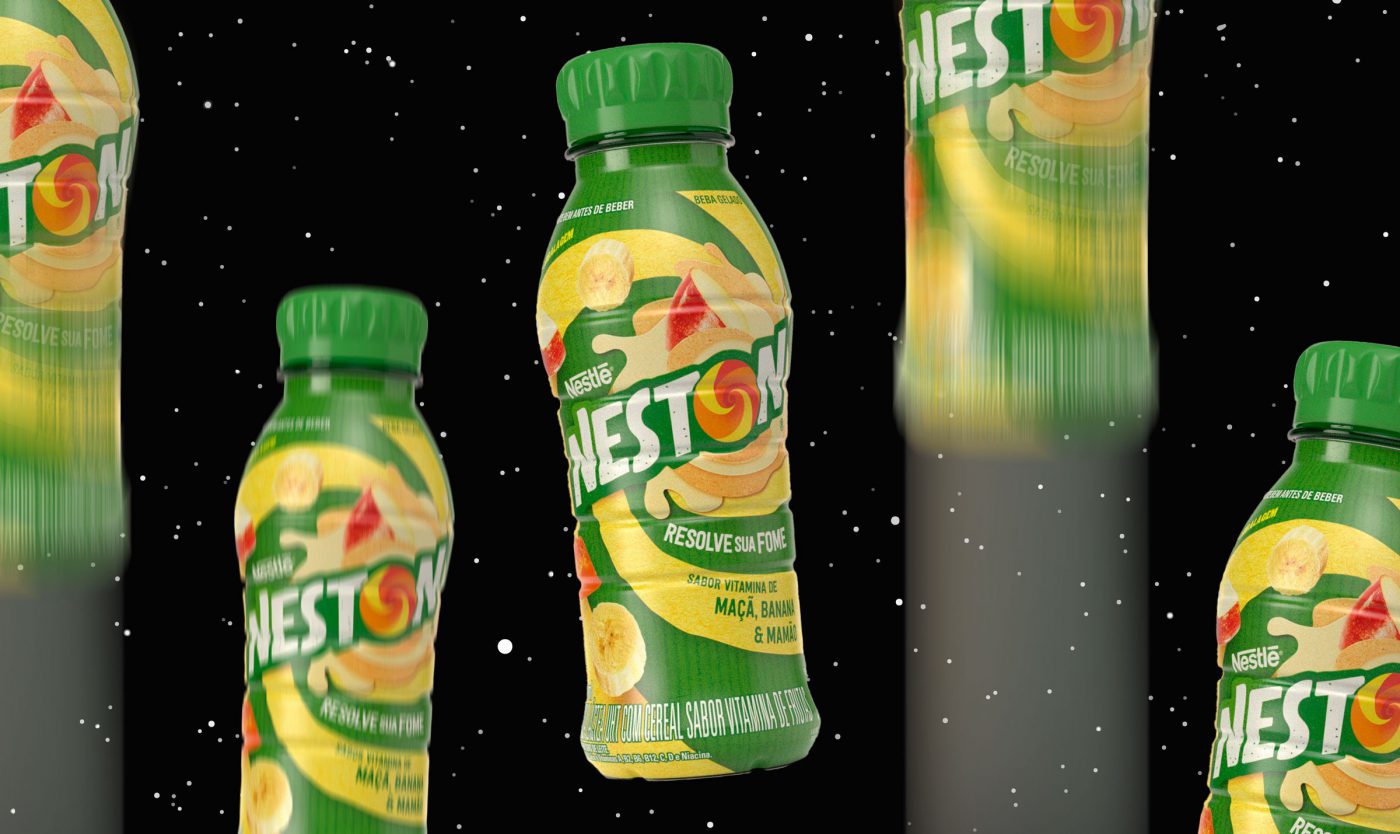
The new visual identity developed translates the deep analysis conducted with the target consumer – urban youth that move and recreate their surrounding world; people who speak up, talk, recognize their flaws and continually reinvent themselves. The visual codes were inspired on their language, in a collage of styles. The movement emerging from the letter ‘O’ sweeping and twirling all around; the imperfect-textured font; the intensity and freedom represented by the natural colors. As the target audience would say: fuel up, set off and enjoy the ride. It’s excitement and nutrition. It’s Neston.

Privacy Overview