Background
Nescafé, a leader and pioneering brand for 75 years decided to reclaim its know-how of the coffee experience with a new brand baseline « It all starts with a Nescafé » which highlights the opportunities that can be triggered by or around a cup of Nescafé. Through this repositioning, the brand wishes to consolidate its competitive advantage on the market, as well as to enhance its iconic potentialacross all touchpoints. CBA gave life to this signature by redefining all the identity system of the brand.
True Vision
The new VIS needs to call on the multiple experiences that Nescafé has to offer, and should unlock its love brand dimension: it’s all about sharing moments, finding inspiration, triggering new opportunities…
This evolution is deeply strategic for Nescafé : it acts as a cultural shift in the brand image management, leaving a product brand approach to adopt a “masterbrand” vision. The new system allows a graphic flexibility within a consistent frame.

Creative expression
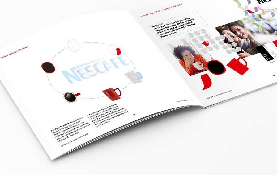
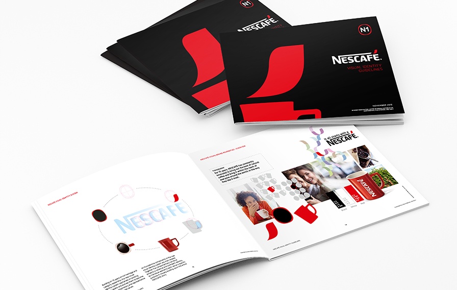
This is the very first time Nescafé empowers itself with a coherent identity system,which is immediately recognizable and leans on 3 complementary visual markers, which act as coffee experience revelations.


The final accent of Nescafé takes off as a red sign, and evokes the daily inspiration that is transmitted by Nescafé to its consumers.


The red mug’s graphic and structural design is modernized, and gains importance in Nescafé’s global communication.
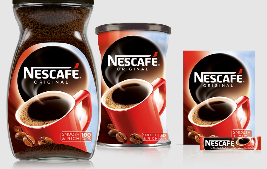
CBA also created an impactful blockmark: a hub (a view from the top of the mug) symbolizes an open window onto Nescafé’s universe. The graphic system, supported by graphic guidelines and in-store signage displays is implemented progressively on packaging and each range of Nescafé products all over the world by CBA agencies.


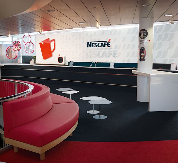
Space design of the cafeteria in Vevey, HQ of Nestlé
After rethinking the global strategy of the brand, CBA imagined a new concept for Nescafé’s points of sale, spearhead of the recruitment of millenials and digital natives around the globe.

