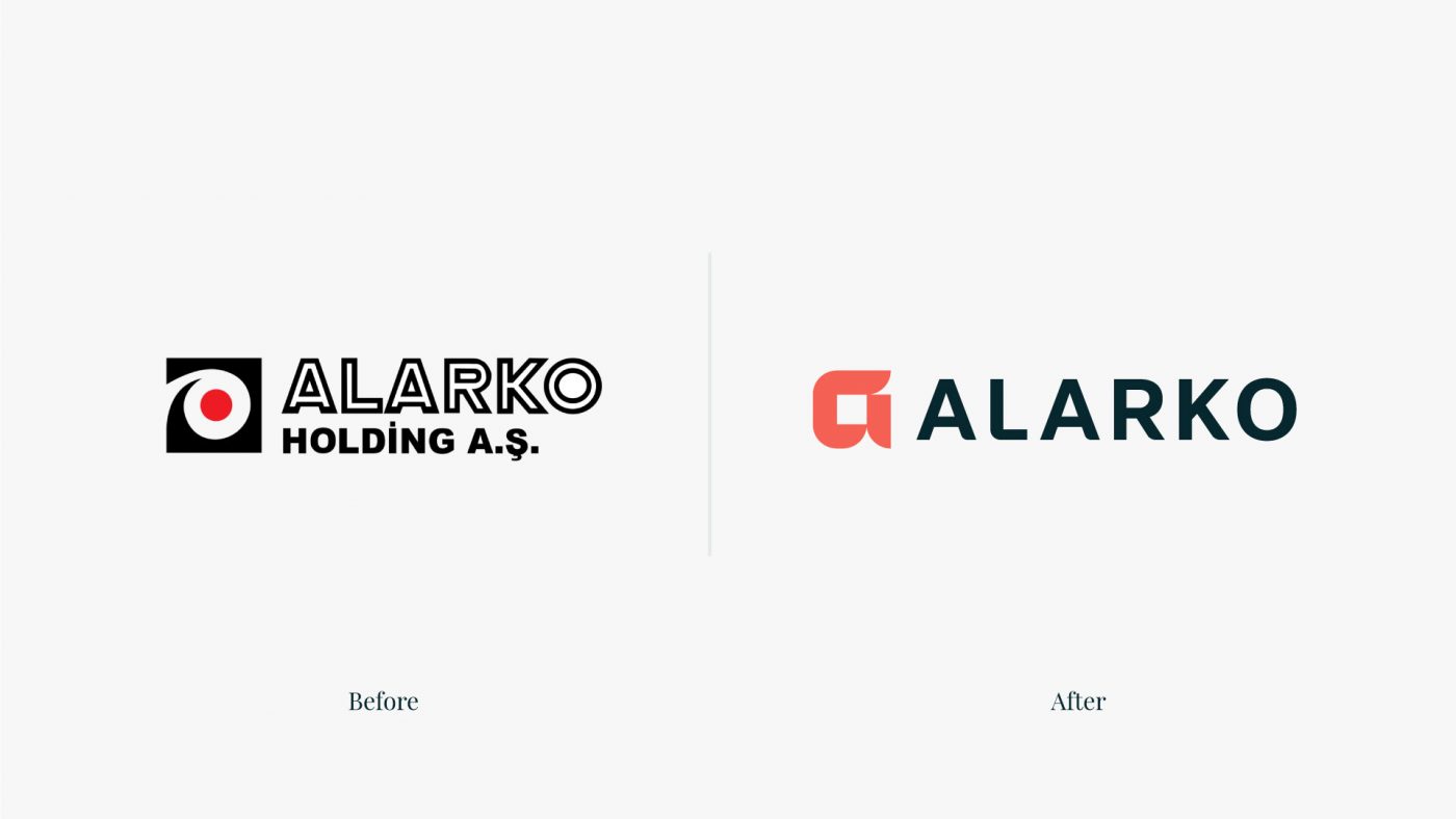
Alarko Holding, one of Turkey’s leading business conglomerates, operates in a variety of sectors, including construction, power generation and distribution, tourism, and real estate, and recognized the need for a transformative approach to evolve its brand.
CBA Turkey and CBA B+G collaborated on an extensive rebranding project for the company’s corporate identity. The project aimed to draw from its rich legacy and carry it forward into the future, all while respecting and honoring the core values established by its founders.
CBA Turkey and CBA B+G collaborated on an extensive rebranding project for the company’s corporate identity. The project aimed to draw from its rich legacy and carry it forward into the future, all while respecting and honoring the core values established by its founders.


A strategy to guide the future.
To create an effective brand strategy, CBA first needed to deeply understand the brand’s principles. This involved engaging with management to comprehend their vision for the future, their values, and to gain an in-depth understanding of their heritage—the legacy of the founders and the core values upon which the Alarko brand stands. Based on the insights generated, our team applied our Brand pulse methodology to identify a unique territory for Alarko. This allowed them to establish a strategic field that combines the fundamentals of the brand and the needs of the stakeholders, building a differentiated and relevant positioning.
The company positions itself as a portfolio company with more than 70 years of experience and a diversified portfolio, always in search of consistency and meaningful relationships that favor an ecosystem of value for people, businesses, society and planet.
The company positions itself as a portfolio company with more than 70 years of experience and a diversified portfolio, always in search of consistency and meaningful relationships that favor an ecosystem of value for people, businesses, society and planet.


Value in every dimension.
With the strategy established, guided by values such as consistency, sensitivity to people, orientation towards the future, embracing change, virtue advocacy, and business proficiency, we focused on bringing the brand to life through its identity. To represent Alarko’s essence, “Value in every dimension”, the human, social, business and planet aspects are reflected in the logo. The symbol features a precise geometric design to show the brand’s consistency in everything it does. Rounded corners represent the human side, while capital letters show the grandeur of the company. The structure remains the same but embraces change.
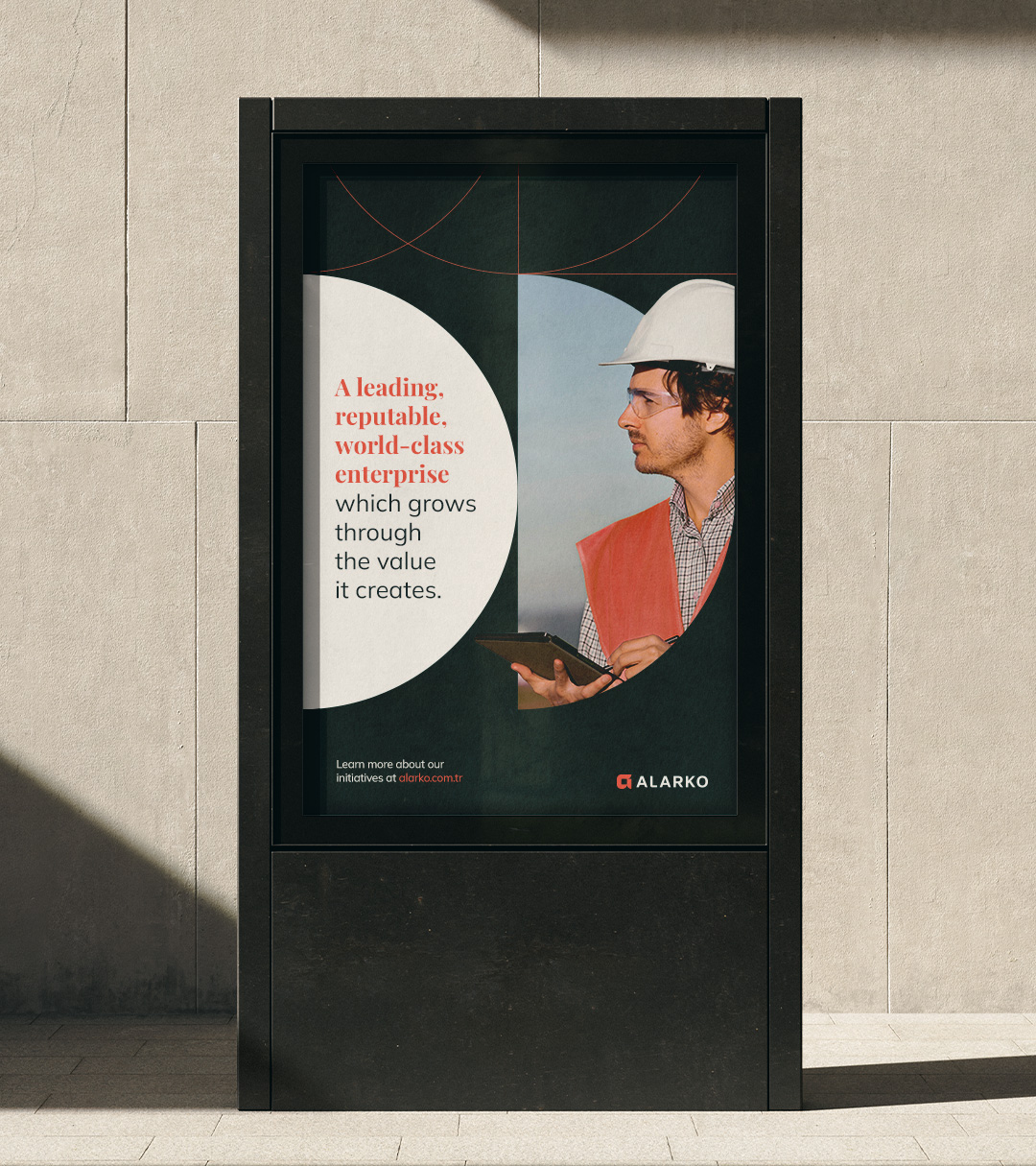
The color palette, including dark grey, white, beige and coral, conveys elegance, neutrality, warmth and modernity. The typography features two types of fonts, to connect with Alarko’s tradition and history, while still showing the brand’s modern and visionary side. The photographs highlight Alarko’s vast influence in various industries through images focused on the corporate and industrial world, while supergraphics incorporate circular shapes and rectangles with rounded corners to maintain the brand’s consistency.


Principles reflected in verbal identity.
The brand has also been given a manifesto that represents its positioning, to reinforce Alarko’s spirit, expressed in a passionate way to resonate with people. It is not only a statement of values and beliefs, but also a living document that reflects the brand’s purpose, its evolution and its commitment to making a significant impact. It is designed to inspire and unite a community around shared visions and convictions, guiding the brand’s journey and ensuring that every touchpoint reflects the principles and ambitions that define Alarko.
The tagline “Value redefined” concisely communicates its essence and personality. More than a motto, it reflects its mission and its lasting legacy.

