Background
LEONA is a contemporary wine brand having gained popularity with Leona Blush amongst young adults.. LEONA ask CBA to strengthen its brand awareness by rejuvenating its visual identity and having a consistent communication platform for branded and unbranded universe.


True vision
CBA work on a premiumization project to make Leona take the lead on the market by reinforcing both its market position & its brand image.
- From cluttered to consistent = PROUD BRAND
- From medium level to accessible premiumness = APPEALING BRAND
- From functional/didactic to more emotional approach = WARM & LIVELY LOOK&FEEL

Creative expression
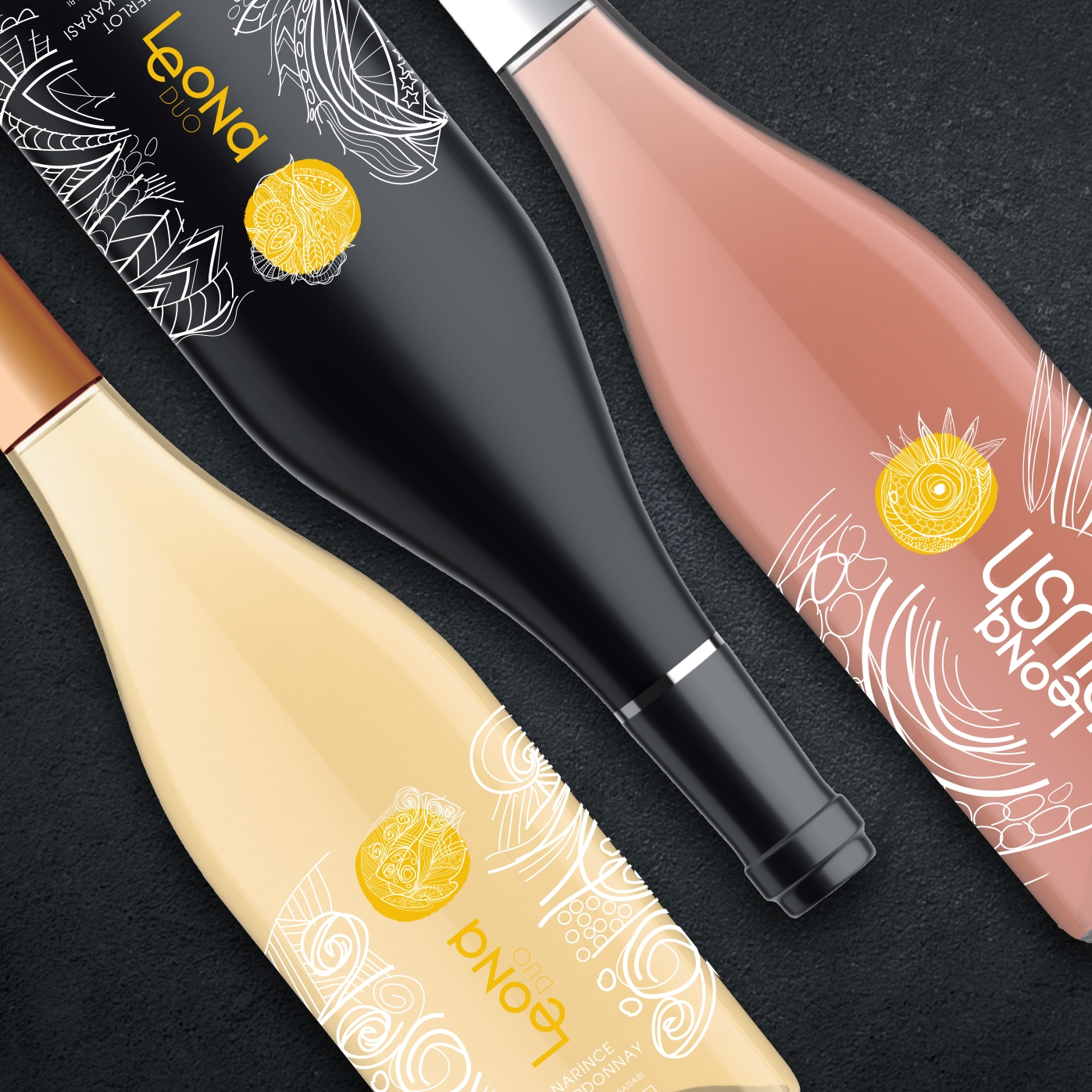
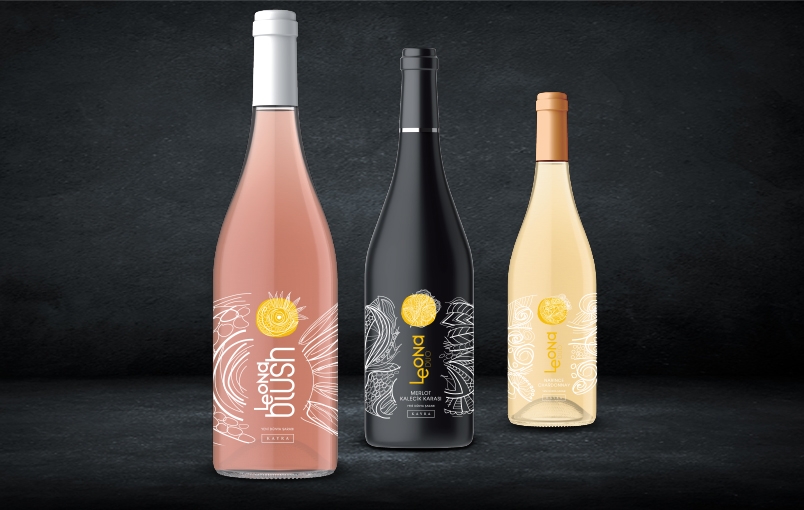
A graphic translation of the brand positioning has been proposed to create a unified brand look and visual identity. LEONA visual style has been interpreted to become a powerful brand with a recognizable and appealing visual universe in order to offer a real experience to target audience.
According to the design concept, a graphical composition made of illustrative elements are combined with real photography in the brand universe. The bipolarity of the elements is showing the richness: The richness of the people, the richness of Leona, that talks truly to you inner you.
Let your inner dreams become reality!

