France
Paris
Switch to your local agency
Retour au menu
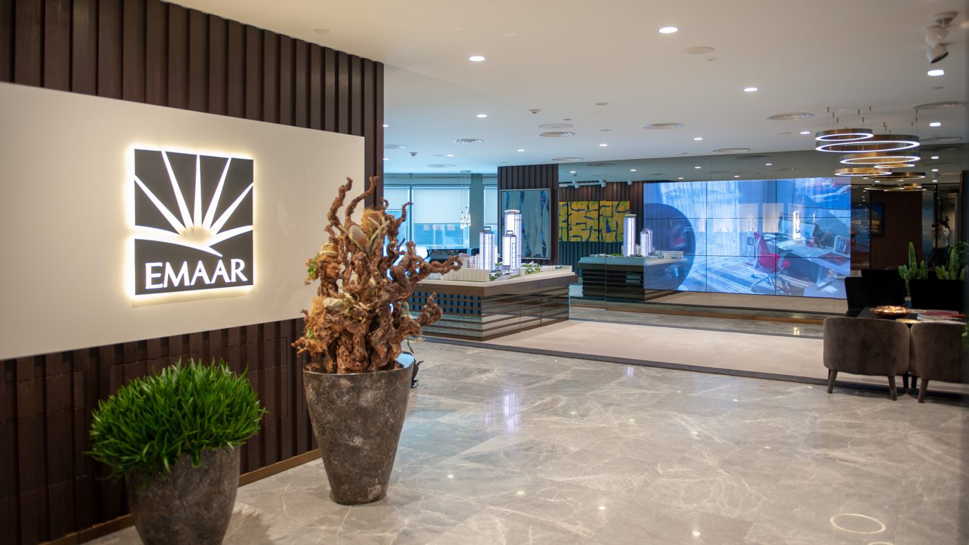
EMAAR being one of the leading land-development companies globally, asked CBA to work on a Customer Experience project, for its Sales Office in Istanbul.
CBA proposed to design with Business Lounge concept according to workshop made with client.
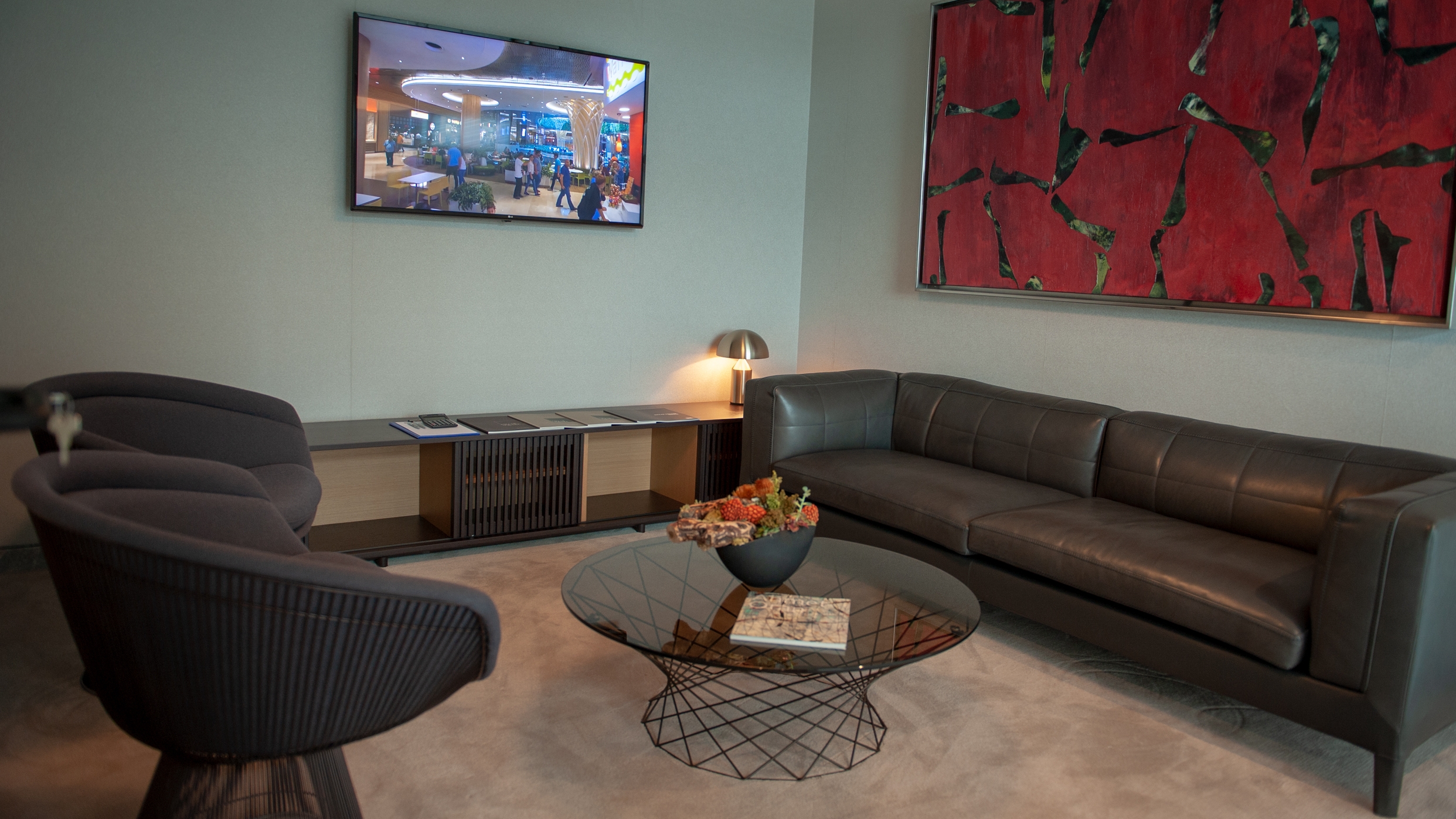
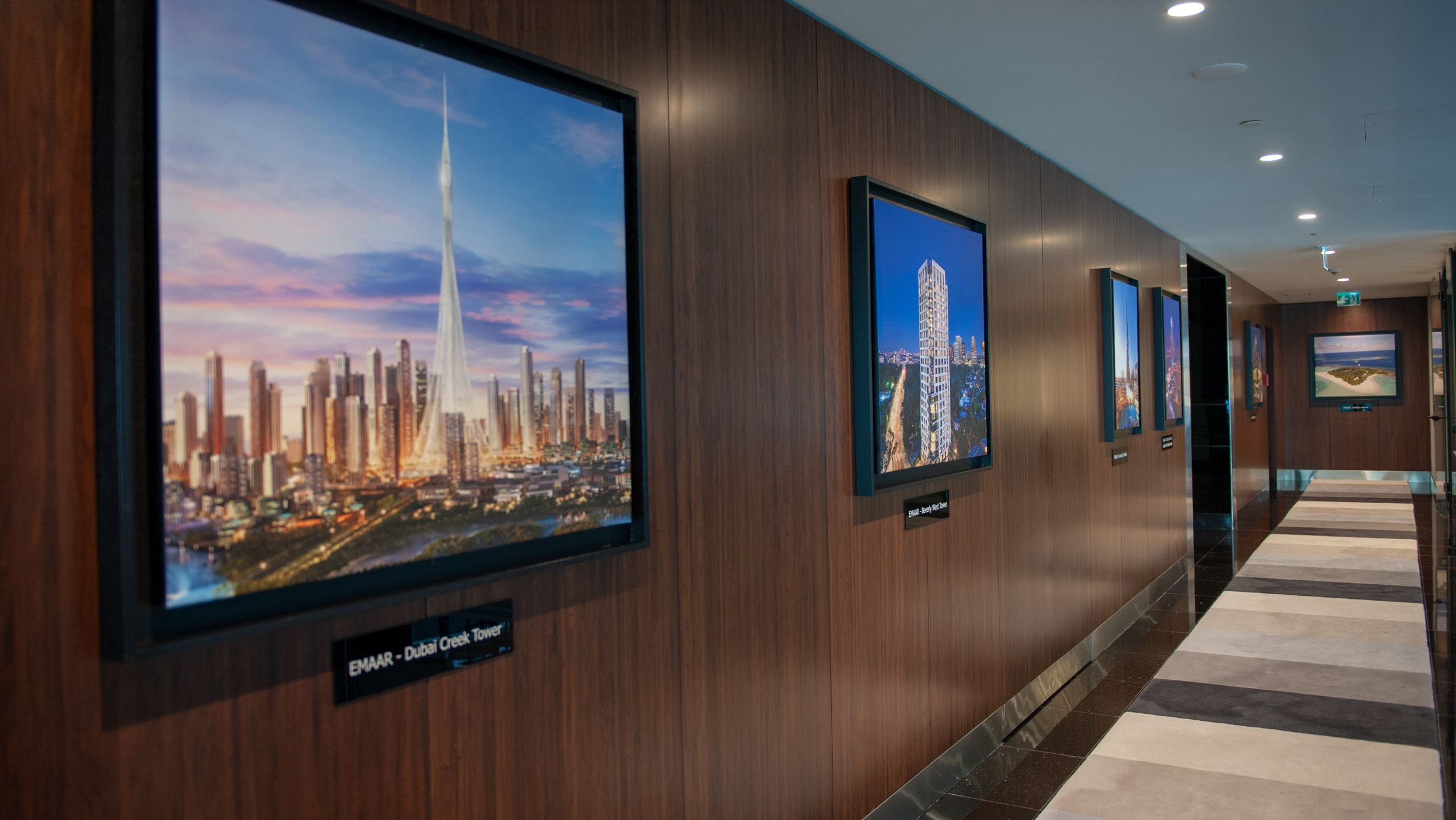
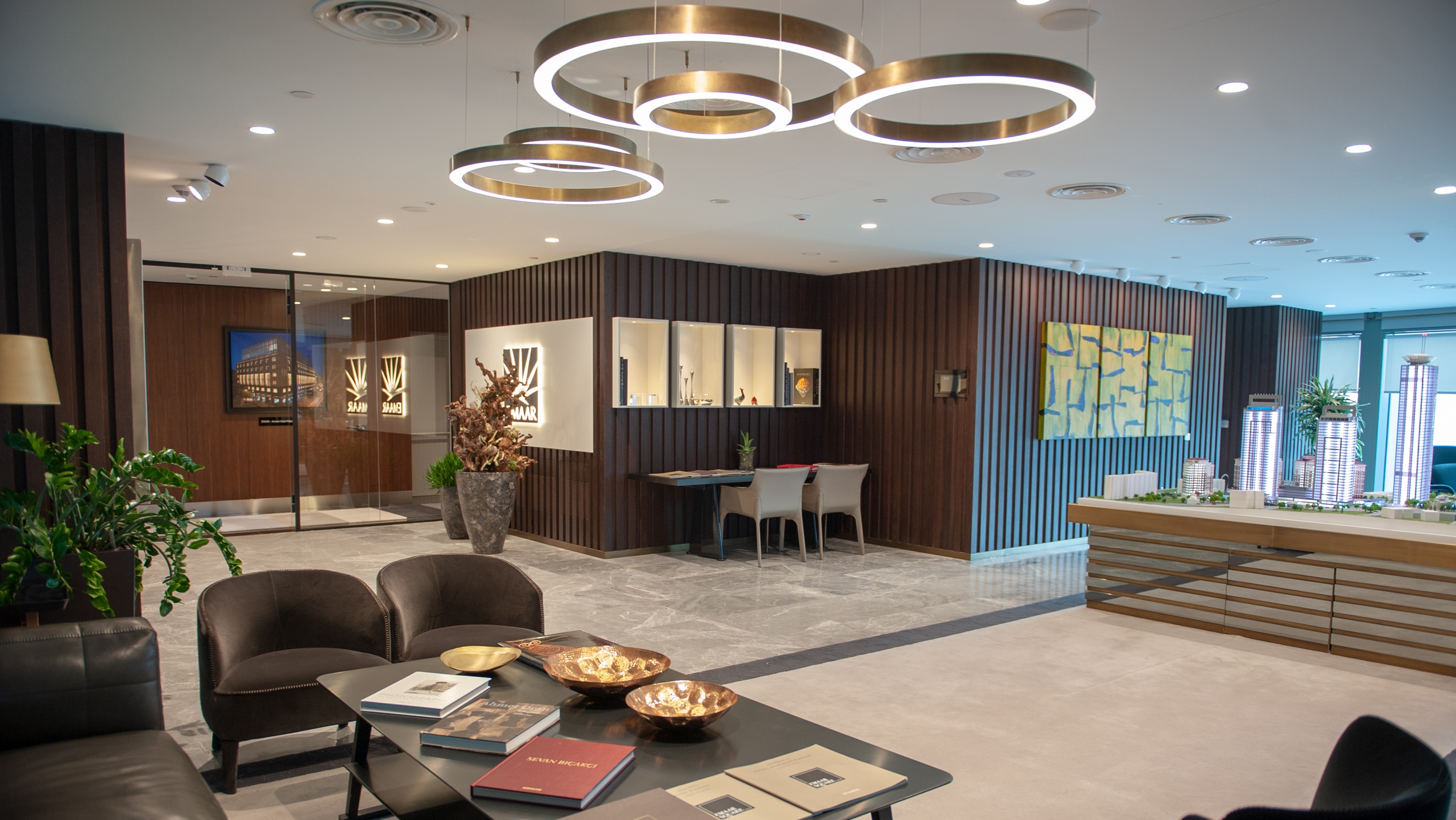
Welcome the visitor with the glamour and to underline its global footprint “Hall of Fame” is created with impressive works of EMAAR from all around the world. To express its high tech vision, a huge digital screen is placed as the first to see in the main area. In line with the value, EMAAR puts on Art, an eye-catchy mock-up display of the construction site is placed at the heart of the office as an art piece. Private rooms were created in order to enhance exclusivity and leverage Business Lounge concept at a premium level.
The result is a highly appreciated brand experience created in the Sales Office, securing the brand equity and brand positioning.
Turkcell is a converged telecommunication and technology services provider, serving its customers with voice, data, TV and value-added consumer and enterprise services on mobile and fixed networks. Turkcell’s target has been to become an integrated communication and technology services player in the region, operating a converged mobile and fixed network platform and offering a wide range of innovative products and services.
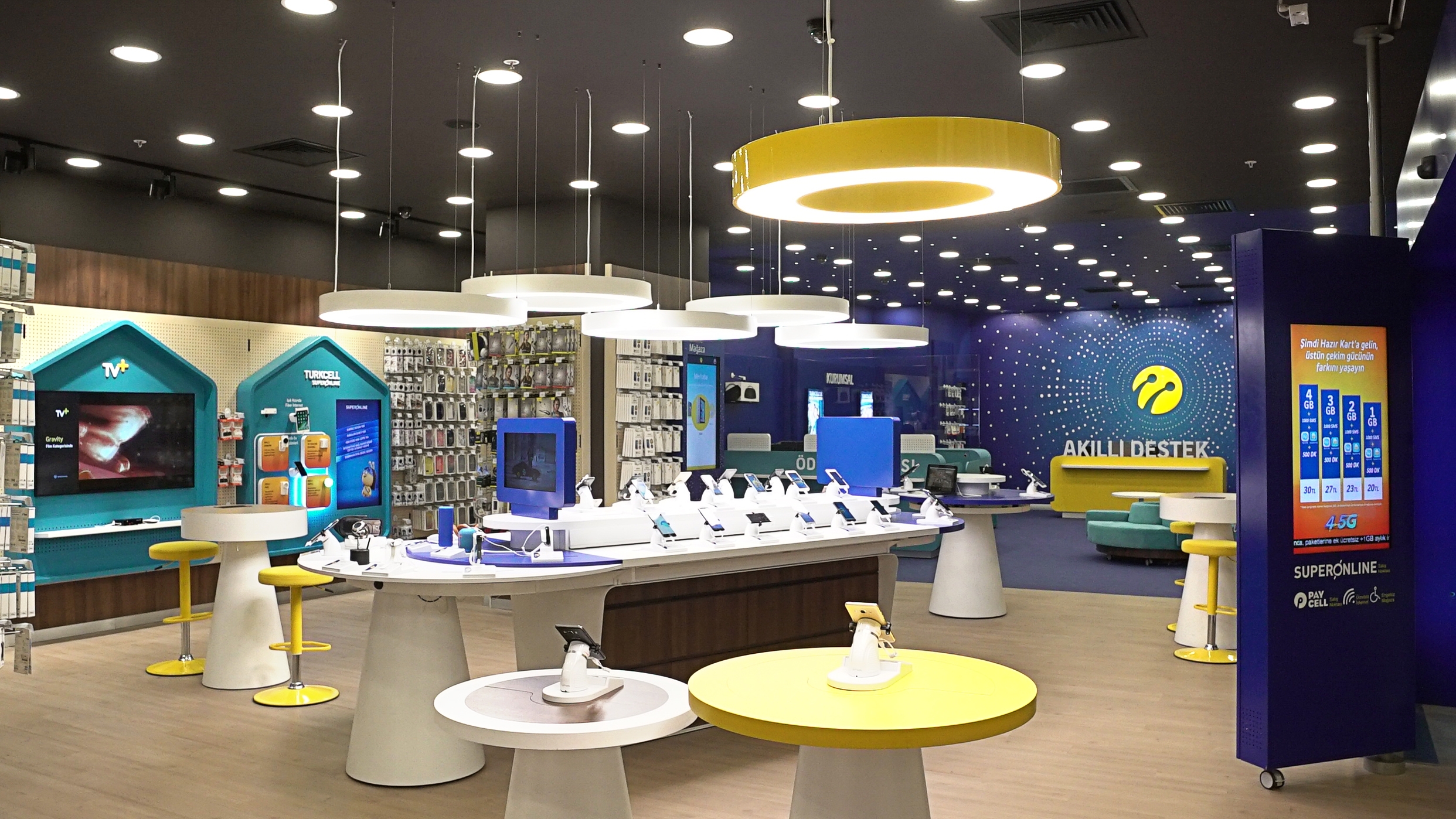
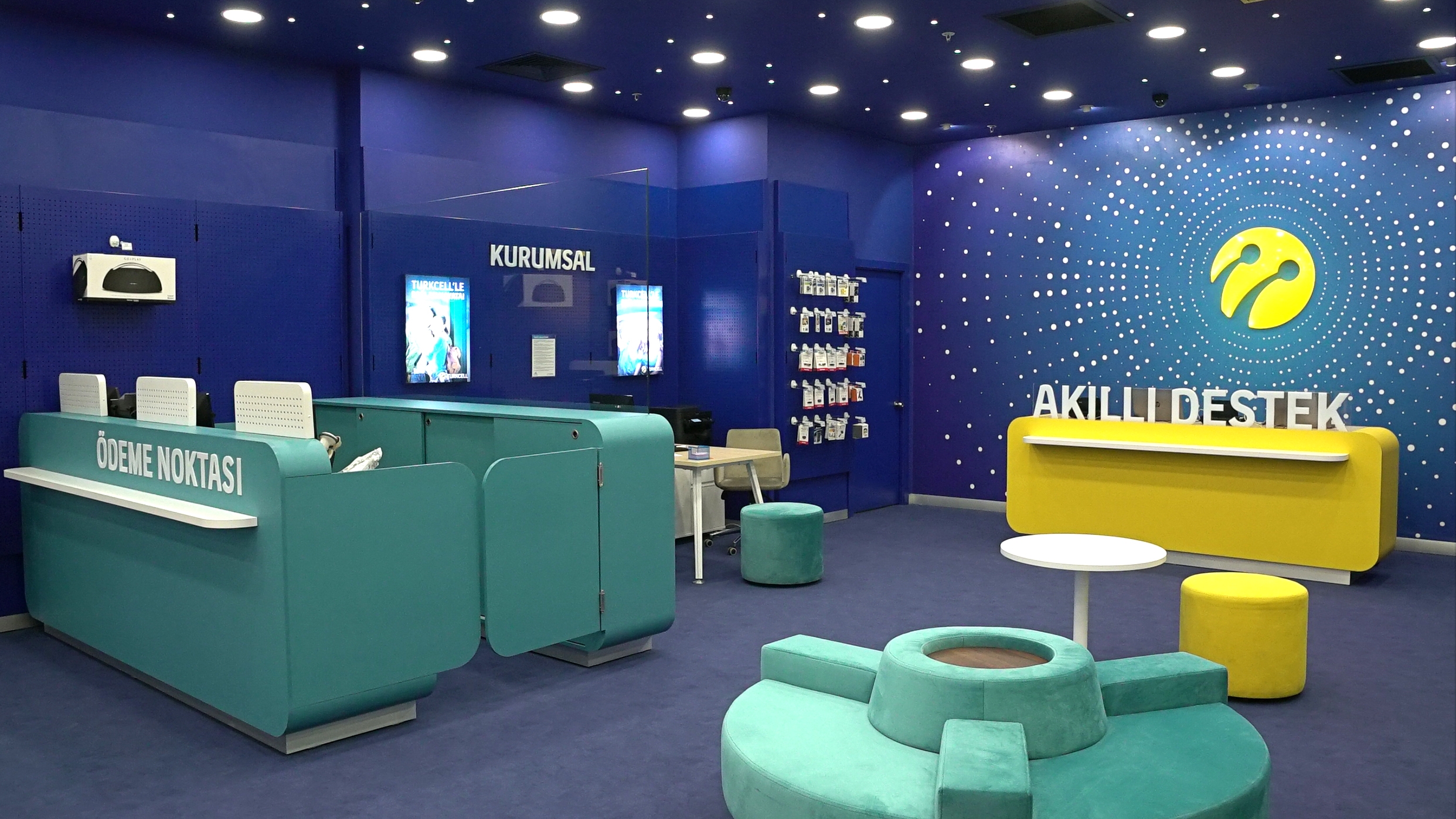
Being the leading digital operator in Turkey over 1500 stores, Turkcell asked CBA to work on its retail design via putting customer experience at the heart, to maket he Turkcell stores convey it’s being “the” digital innovation leader.
Project aimed to secure a consistency in terms of look and feel among all the brand communication areas, for an improved customer experience. The visual identity system for in-store was developed via merging high end technology with sincere service, enabling a flexible consistency.
Based upon the strategic approach developed by CBA, the brand idea for the project was defined as “Sparkling Network” for Turkcell.
In Sparkling network concept, the integrity among all the stars (points) represent the connection between human and technology, human and data and among the people themselves. And the connecting light, called as the “Guiding Light” represents Turkcell, in line with the brand’s message “Turkcell does not only get you connected, but also helps you to find the right solution via enlightening and guiding your way” This is the reference point of the in-store visual identity system.
In line with the visual identity system, graphical elements such as shapes, colors, typography and tone of voice have been developed , the design principles of in-store and other communication channels have been idenitified and stations within the store are assigned to specific customer needs.
As a result now Turkcell store do have:
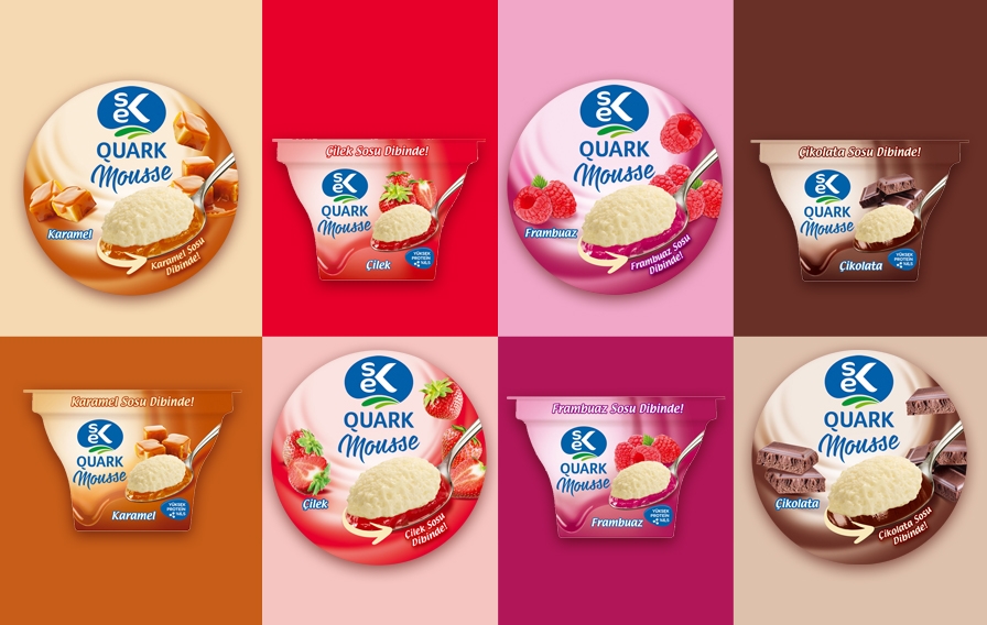
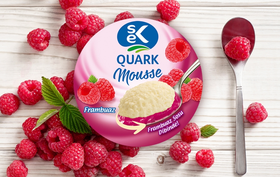
Having being found in 1963, SEK has always been an innovative company, offering Turkish consumers pioneering dairy products. Upon the increasing need of the consumers and growing trend of healthy living, SEK decided to launch Quark to Turkish market and reached out to CBA for the strategic packaging design of this innovative product line.
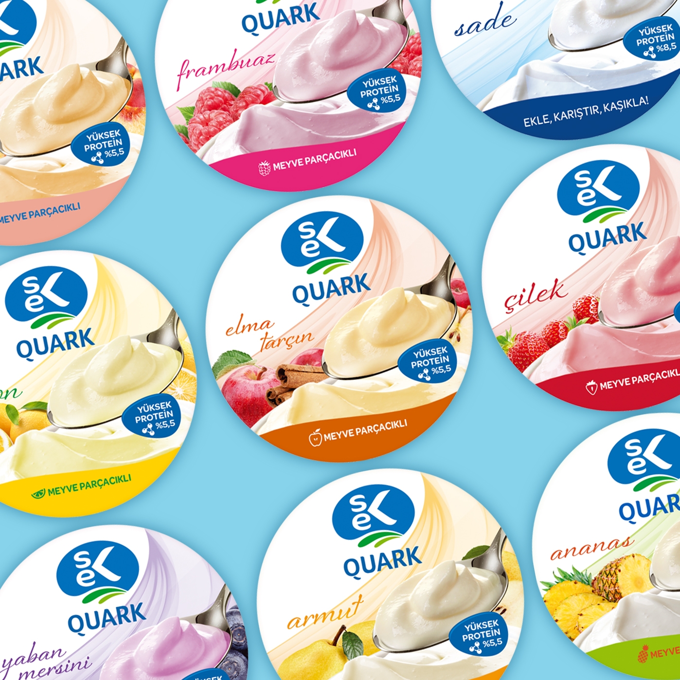
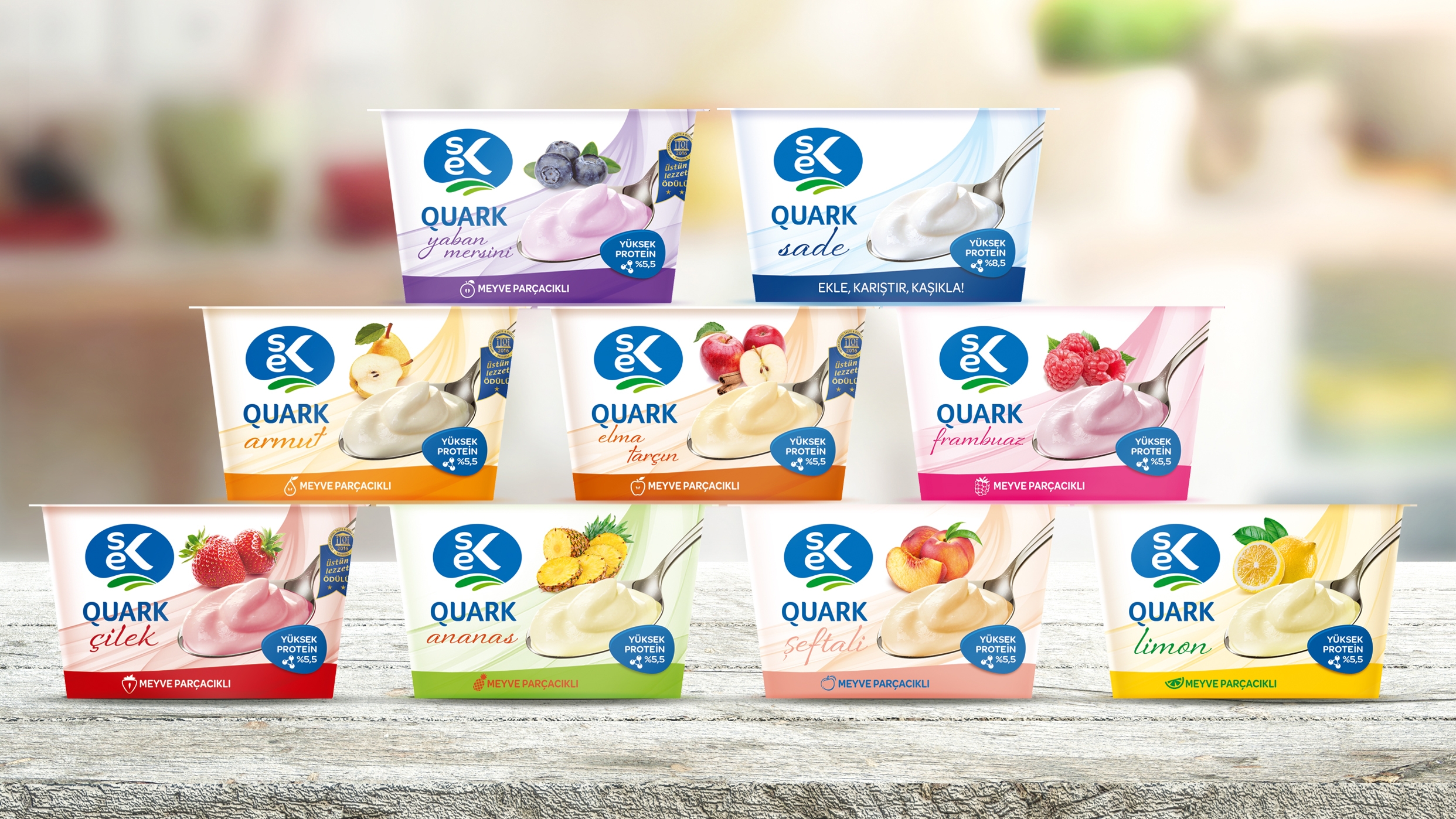
CBA worked on “innocent dessert” idea for this new product category launch.
CBA merged the pure and natural design cues of SEK dairy together with the taste appeal of packed desserts. The innocence of the dessert has been successfully leveraged through the white background and the lightness via the floating design element, whereas the taste has been conveyed though the full spoon referring to maximum pleasure and satisfaction of dessert.
LEONA is a contemporary wine brand having gained popularity with Leona Blush amongst young adults.. LEONA ask CBA to strengthen its brand awareness by rejuvenating its visual identity and having a consistent communication platform for branded and unbranded universe.
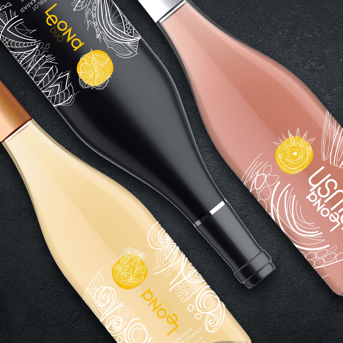
CBA work on a premiumization project to make Leona take the lead on the market by reinforcing both its market position & its brand image.
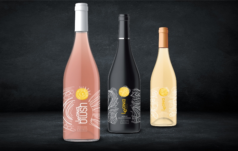
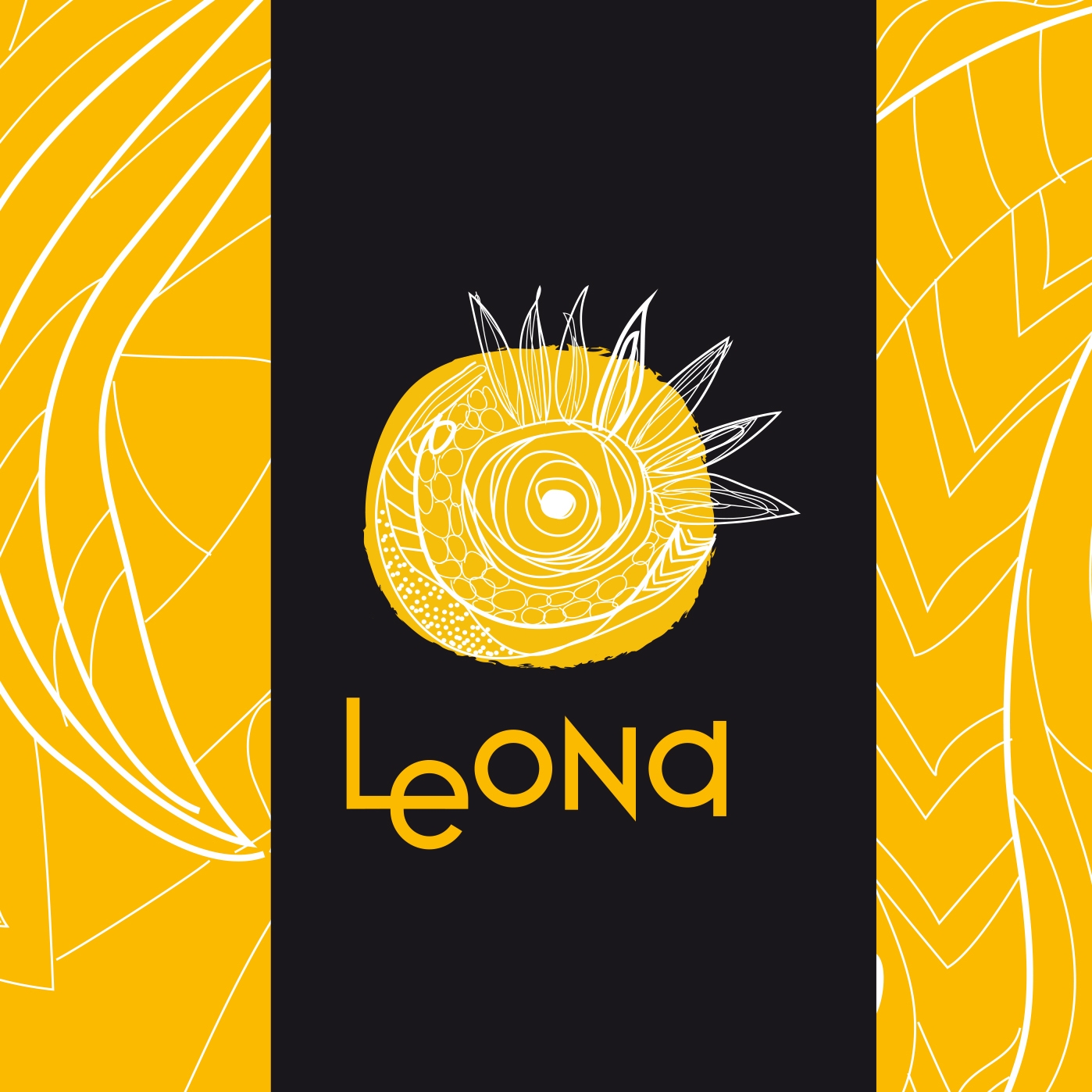
A graphic translation of the brand positioning has been proposed to create a unified brand look and visual identity. LEONA visual style has been interpreted to become a powerful brand with a recognizable and appealing visual universe in order to offer a real experience to target audience.
According to the design concept, a graphical composition made of illustrative elements are combined with real photography in the brand universe. The bipolarity of the elements is showing the richness: The richness of the people, the richness of Leona, that talks truly to you inner you.
Let your inner dreams become reality!
LEONA is a contemporary wine brand having gained popularity with Leona Blush amongst young adults. CBA is asked to develop a boosting and engaging packaging design for the innovation from Cumartesi brand, RTD and support with brand universe and applications that will appeal to millennials and make them prefer the product against beer.
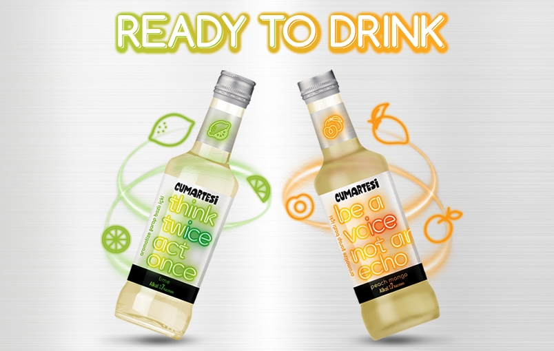
CBA leveraged NEON concept to convey the product message “Let’s have fun together”, to make consumers get inspired with Cumartesi innovation and live true unforgettable out-of-the box fun moments.


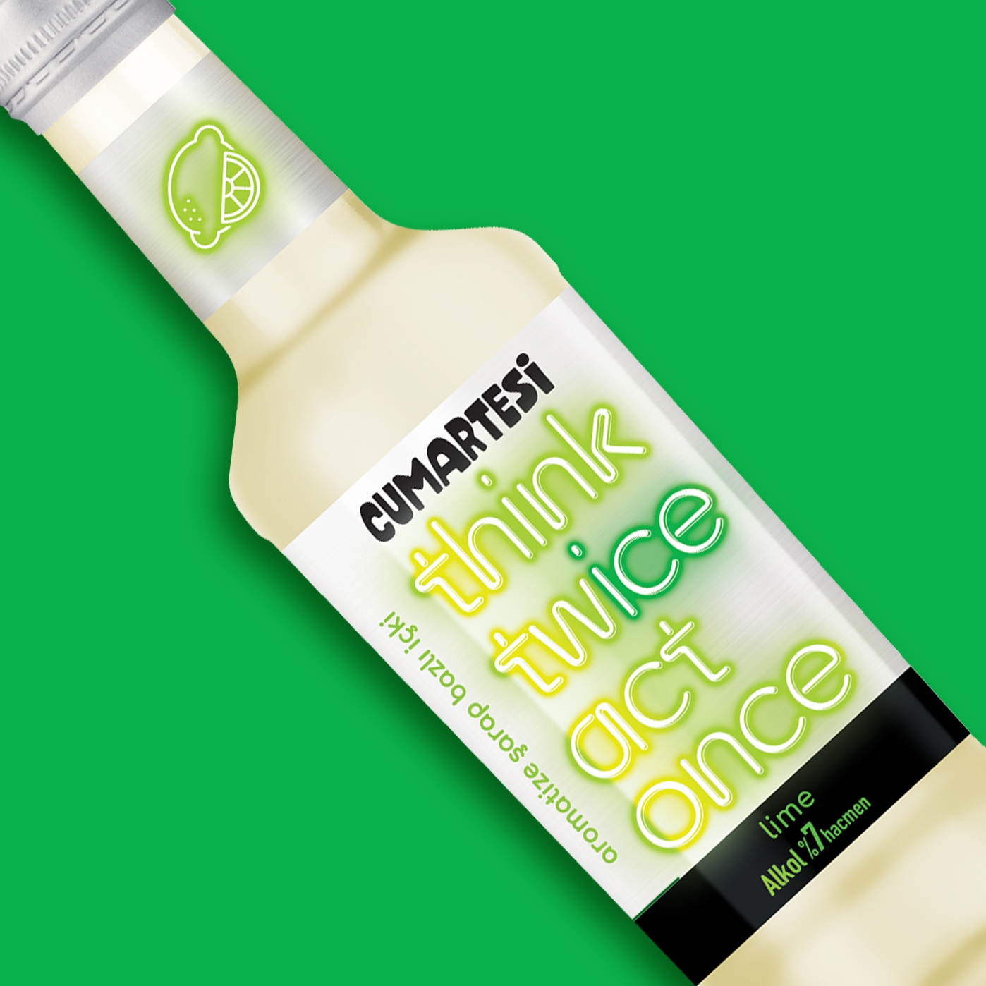
Since Cumartesi RTD is an expression of the spontaneous and fun side of life, a “shining” design has been worked on in line with the product’s unique value proposition. Cumartesi Ice will be the enlightener of the night with a trendy and attractive bottle with a neon effect color. Different messages, all including “ICE” in a creative way will start the engagement.

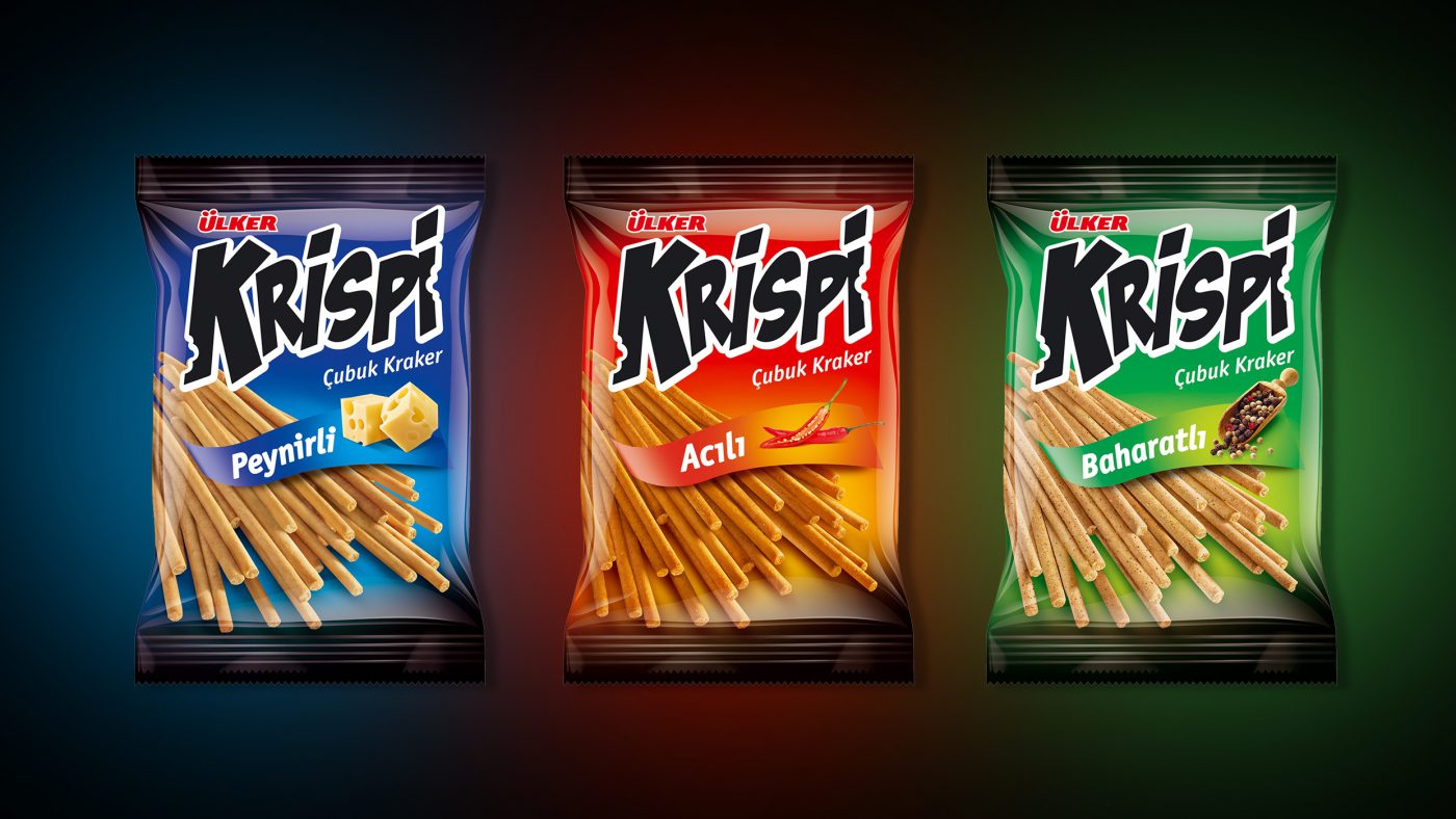
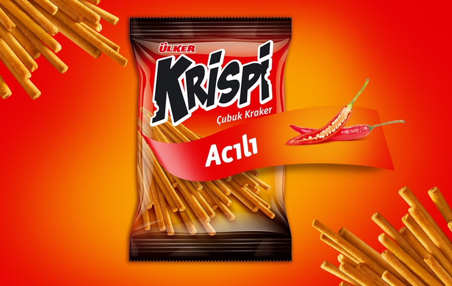
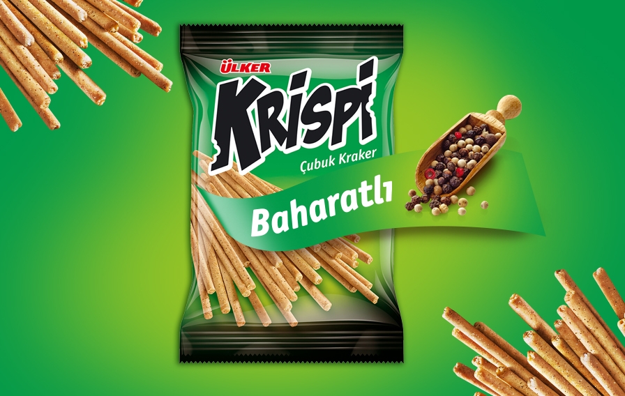
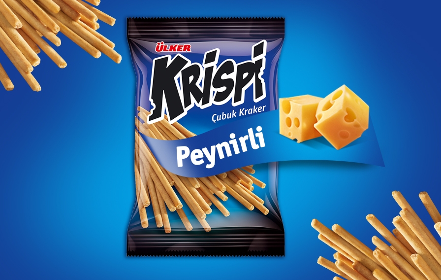
Ülker, whose history goes back to 1944, is one of the loved marks in Turkey, manufacturing a wide span of products such as biscuits, chocolate, candy, chewing gum, liquid oil, dairy products, carbonated beverages, ice cream, coffee and baby food. In the years that followed, the name Ülker became synonymous with happy memories and it is being constantly rejuvenated through innovations.
Leveraging savoury snacking codes on salty cracker design.
Being positioned like a savoury snack instead of “just another” salty cracker widened the product offer and differentiated the product.
CBA worked on a packaging design, supporting the positioning via leveraging savoury snacking design cues. Both the visuals and the typography strongly referred to the crispiness of the product, as if it was a savoury snack.
Turkey is a black tea market, where Doğadan is one of the 4 major players, whereas in infusion tea category Doğadan is by far the market leader.
Dogadan’s challenges were;
CBA was asked to create an over-arching VIS to protect the whole family image and keep the differences clear between sub categories.
To come up with a visual identity system to be leveraged on packaging design enabling:
CBA’s objective was having a category relevant design in Black tea with transforming Doğadan’s infusion heritage (crafting, expertise and nature’s goodness) to the black tea portfolio and navigating the consumer for the different motivations of each category, in order to avoid the complexity of infusion category.
Immersing ourselves completely in the brand and market, foundational strategy work helped CBA to unlock the brand vision of Doğadan and the emotional connection that Turkish people feel with the brand. Its pioneering roots gave CBA powerful inspiration to bridge the gap between the brand vision and how it expressed itself visually.
CBA’s concept was entitled ‘the beating heart of nature’. Doğadan logo is a living, breathing organism at the heart of the story – it brings you its offerings through its nature credentials. The interplay of our wordmark with the leaves accentuates our know-how and how it feels to drink nature.
The packaging design gives pride of place to the logo. CBA intention was to free Doğadan logo from the pharmaceutical-like capsule to reconnect with nature via the leaves, enabling the logo to embody nature in a fresh, modern and lively way to make people think “When it is about nature, Doğadan delivers the best”
The new logo and visual identity system unify the large portfolio of Doğadan ranges and products on the shelf to steer the consumer in the right direction. The supporting color palette for the range is inspired by nature in soft, modern tones while allowing strong range navigation.
CBA wanted to move to more realistic depictions of nature to reinforce our goodness of nature and differentiate from other tea and infusion brands in Turkey. Specific to the black category CBA wanted to appeal to the senses with heightened taste appeal front and center (cup).
Now, the new Doğadan Look&Feel answers the increasing desire of the consumer to reconnect with nature and our authentic self again for keeping a balance of the body, mind, and soul.
Adel has been found in 1969 by one of the leading conglomerates of Turkey, Anadolu Group.
Adel’s high-quality pencils and stationery products have become well known in Turkey taking an important place in the education of endless generations. Adel, except for paper products, both in terms of output and product range, is the biggest stationery manufacturer of Turkey and nearby countries. Since its foundation, Adel has had cooperations with Faber-Castell and with this partnership, Adel continues its investments which add value to Turkey.
Although being one of the leaders in stationery business with his heritage, expertise and production capacity, Adel’s brand value and perception were not at its deserved level.
So, CBA has been asked to define Adel brand vision and build its brand positioning.
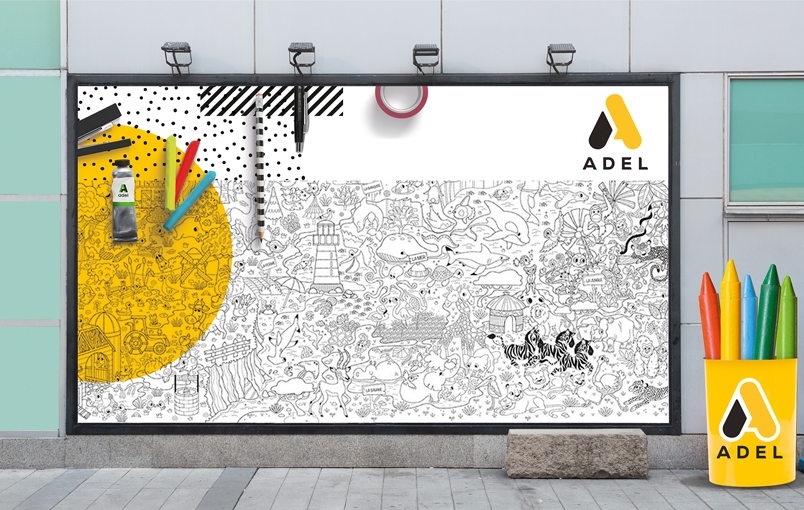
Building an inspiring corporate brand to create a win-win synergy between the corporate brand and its portfolio.
This crucial brand “renaissance” project started with a deep analysis of the brand through interviews held with various stakeholders and wide scope assessment of the competitive landscape. Upon the pain points and challenges identified, CBA defined a new brand positioning and brand essence both for the corporate and product brand of ADEL leveraging its values and unique propositions.
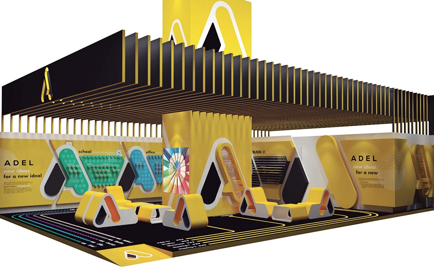
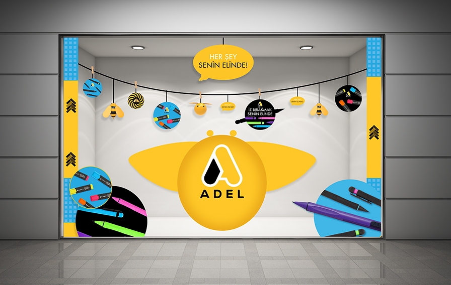
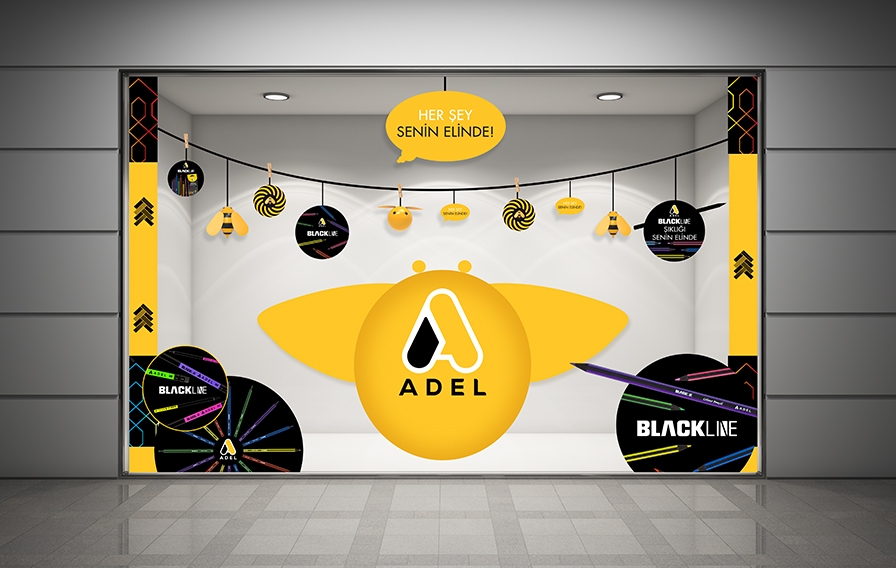
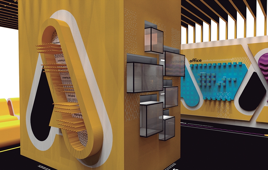
A brand new visual identity has been created to support Adel’s new brand positioning and strategy, where the colors already associated with Adel, yellow and black were leveraged in an innovative way, reflecting the values of Adel. The new visual identity has been designed in a way to organize the newly to be structured Brand Architecture of Adel, covering its very wide product portfolio. Associated colors and elements of both the main visual identity and subcategory identities were successfully extended by CBA to create a brand universe to enhance brand awareness.
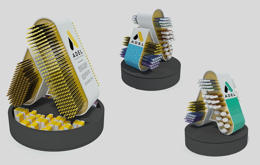
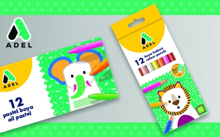
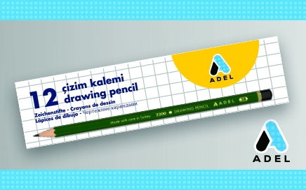
Visual identity and brand universe creation steps were followed by the packaging design relaunch initiative, which enabled ADEL brand to rejuvenate on a shelf. Varying from in-store application/material design to consumer experience designs at exhibitions or even further to new product design innovations, CBA leveraged the new identity of ADEL in multiple legs of the holistic communication of the brand.
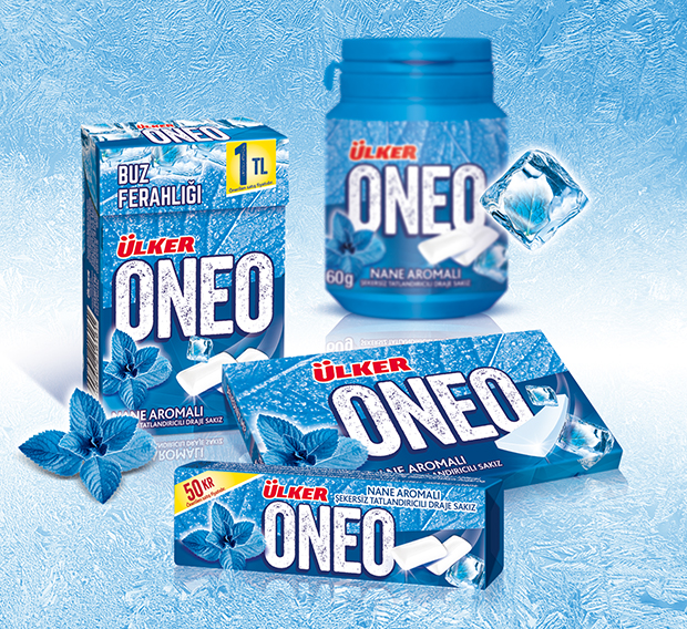
Oneo is a Turkish chewing-gum brand. Oneo is being completely renovated to answer consumers demands within the chewing-gum market: New formulation, new brand strategy and new packaging design.
The main objective of ONEO was to establish its position as a fun, cool, tasteful and dynamic chewing-gum brand and strengthen its brand awareness against strong international competitors.
CBA Turkey gave life to the new brand identity and packaging design of re-born ONEO.
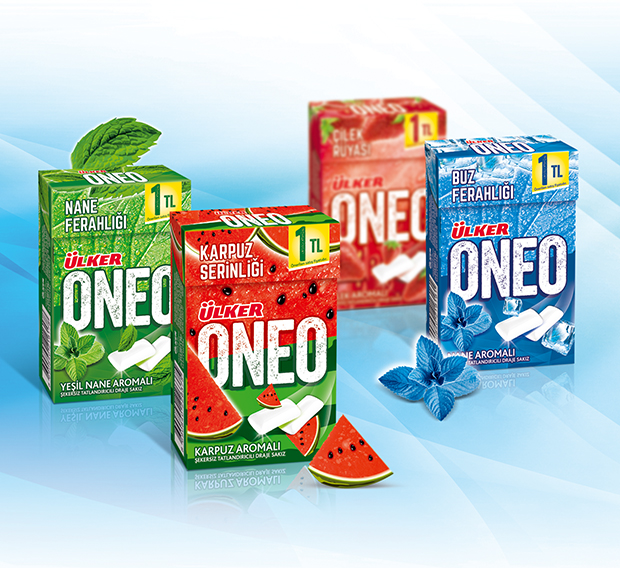
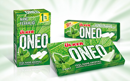
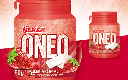
With its positioning ‘Every moment has an Oneo’, the brand promises to offer to the consumers refreshing tastes for every moment: fruity for tasty moments, strong mint for refreshing.
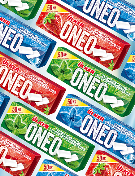
In this direction, we created a new brand identity and graphic design using strong colors cause every occasion of chewing has its special purpose.
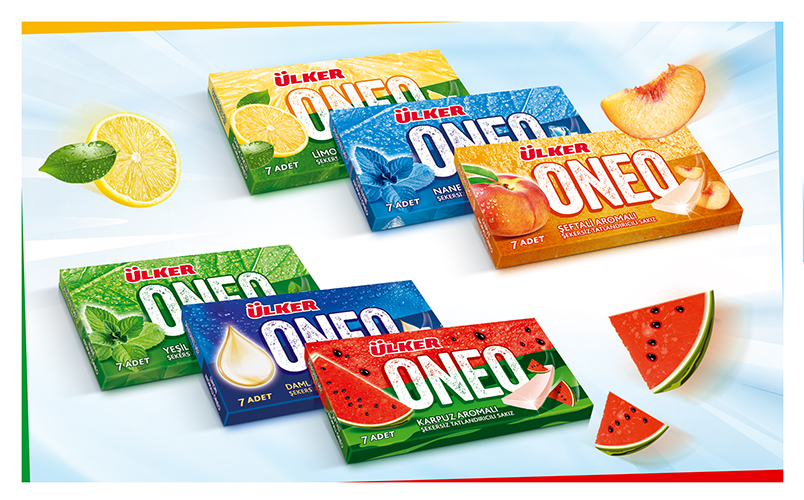
The starting point of the graphic design was the branding that creates real impact in a cool and iconic way. The logo was build with a textured background to give the sensation of taste.
The second point is the use of vivid colors used to give a fresh and dynamic look to an old-fashioned brand.
CBA Turkey created a new brand identity and package design system for Oneo portfolio to communicate the brand story to all the chewing-gum target group: Pleasure seekers, simple enjoyers and daily refreshers.
Privacy Overview
| Cookie | Duration | Description |
|---|---|---|
| pll_language | 1 year | This cookie is set by Polylang plugin for WordPress powered websites. The cookie stores the language code of the last browsed page. |
| Cookie | Duration | Description |
|---|---|---|
| _gat | 1 minute | This cookies is installed by Google Universal Analytics to throttle the request rate to limit the colllection of data on high traffic sites. |
| Cookie | Duration | Description |
|---|---|---|
| _ga | 2 years | This cookie is installed by Google Analytics. The cookie is used to calculate visitor, session, campaign data and keep track of site usage for the site's analytics report. The cookies store information anonymously and assign a randomly generated number to identify unique visitors. |
| _gid | 1 day | This cookie is installed by Google Analytics. The cookie is used to store information of how visitors use a website and helps in creating an analytics report of how the website is doing. The data collected including the number visitors, the source where they have come from, and the pages visted in an anonymous form. |
| Cookie | Duration | Description |
|---|---|---|
| cookielawinfo-checkbox-functional | 1 year | The cookie is set by GDPR cookie consent to record the user consent for the cookies in the category "Functional". |
| cookielawinfo-checkbox-others | 1 year | No description |