France
Paris
Switch to your local agency
Retour au menu
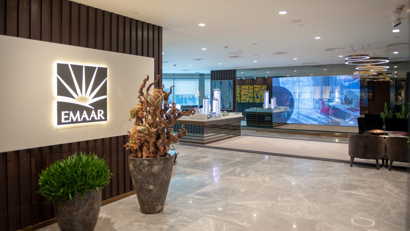
EMAAR being one of the leading land-development companies globally, asked CBA to work on a Customer Experience project, for its Sales Office in Istanbul.
CBA proposed to design with Business Lounge concept according to workshop made with client.
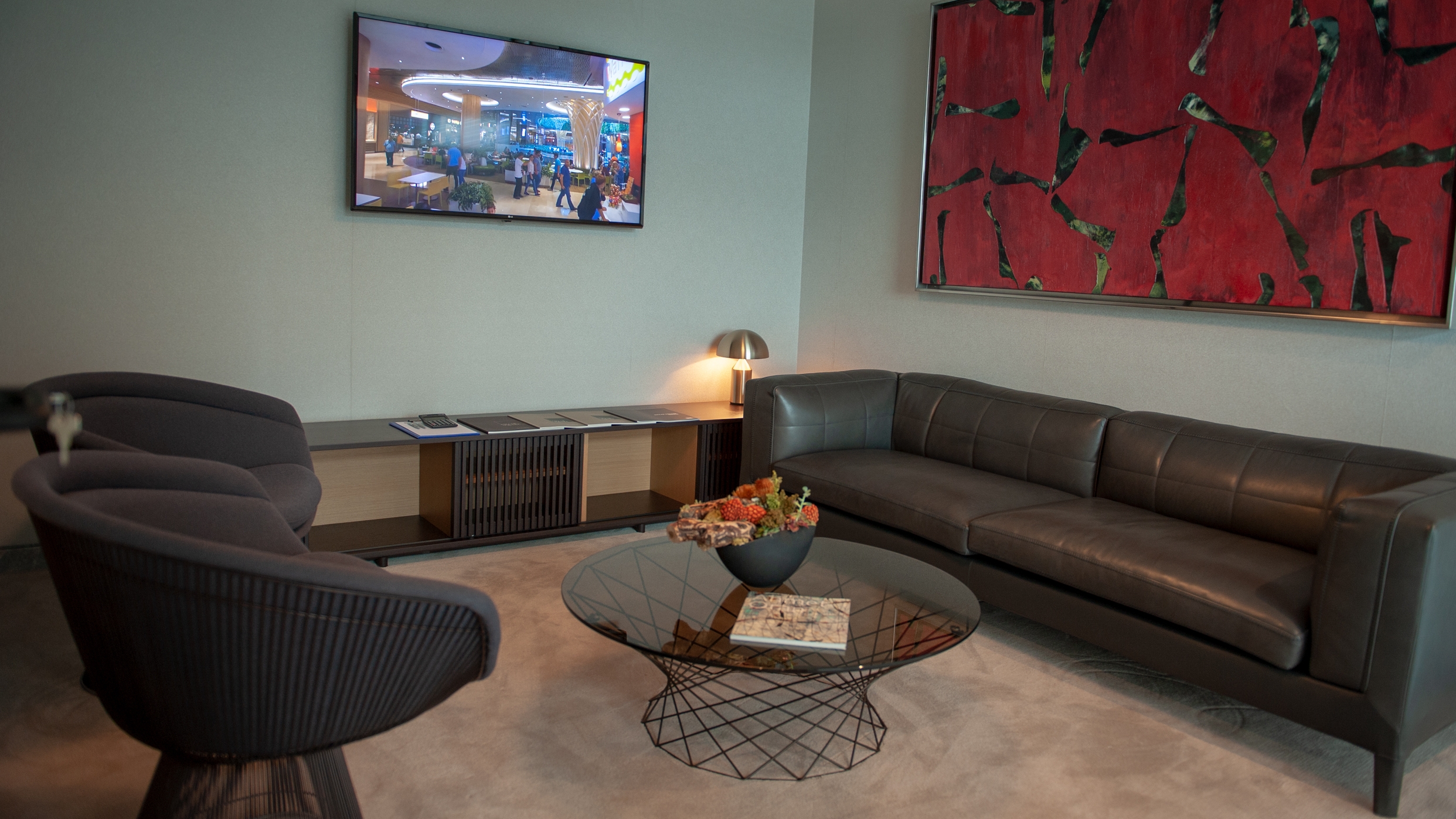
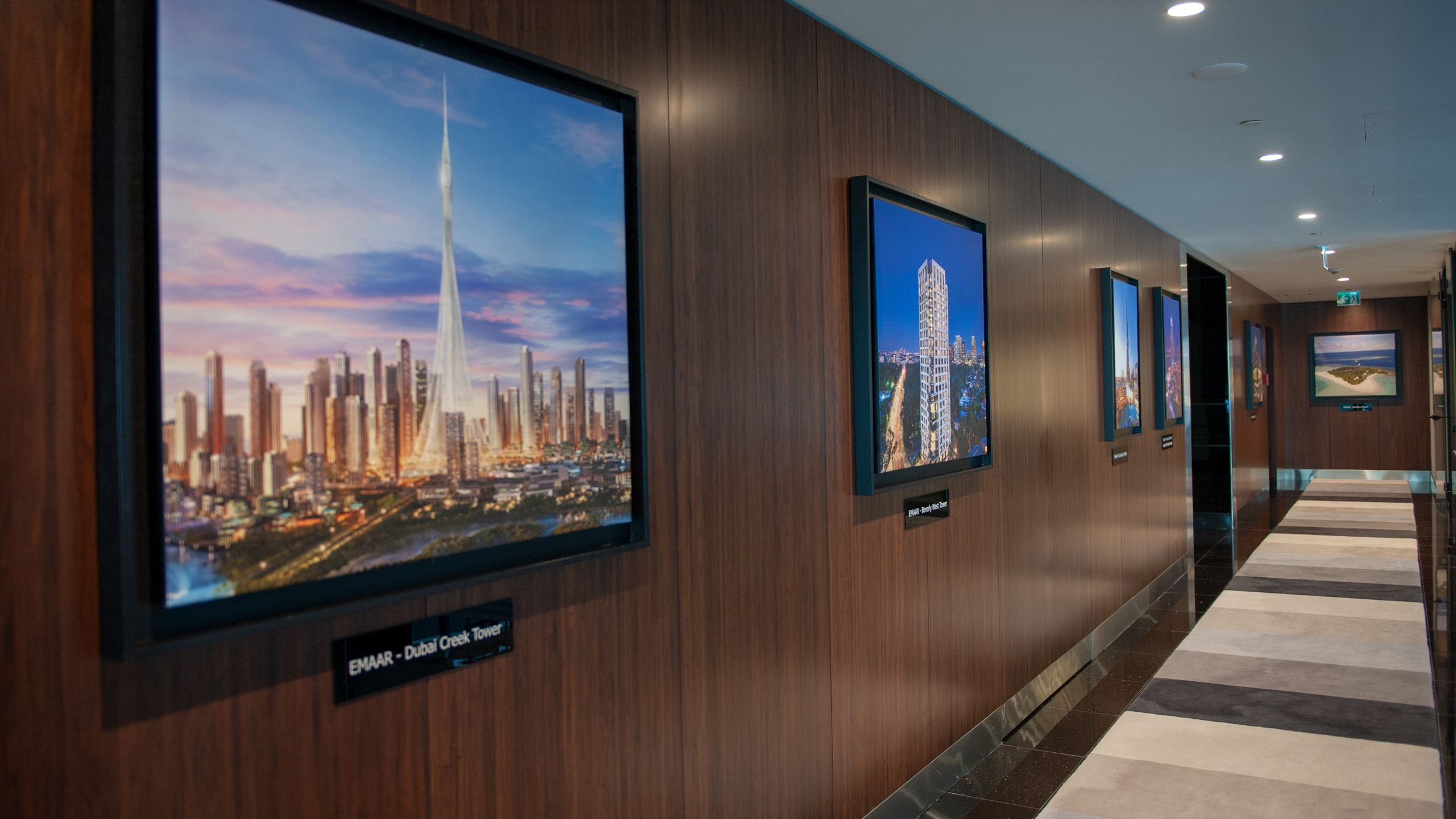
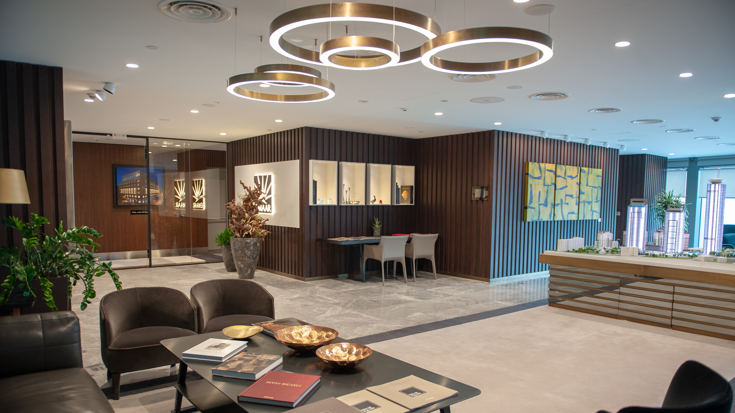
Welcome the visitor with the glamour and to underline its global footprint “Hall of Fame” is created with impressive works of EMAAR from all around the world. To express its high tech vision, a huge digital screen is placed as the first to see in the main area. In line with the value, EMAAR puts on Art, an eye-catchy mock-up display of the construction site is placed at the heart of the office as an art piece. Private rooms were created in order to enhance exclusivity and leverage Business Lounge concept at a premium level.
The result is a highly appreciated brand experience created in the Sales Office, securing the brand equity and brand positioning.
Turkcell is a converged telecommunication and technology services provider, serving its customers with voice, data, TV and value-added consumer and enterprise services on mobile and fixed networks. Turkcell’s target has been to become an integrated communication and technology services player in the region, operating a converged mobile and fixed network platform and offering a wide range of innovative products and services.
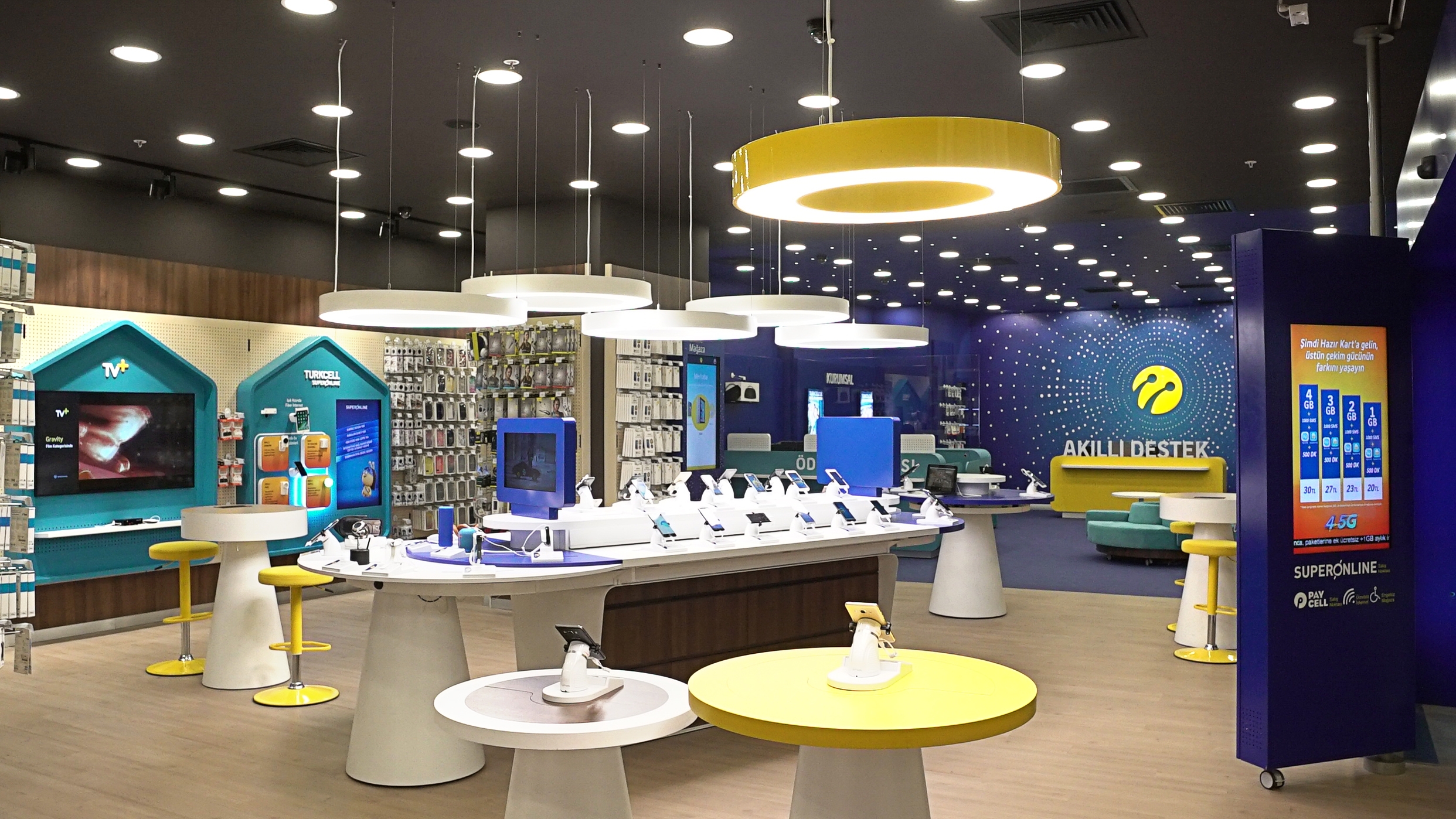
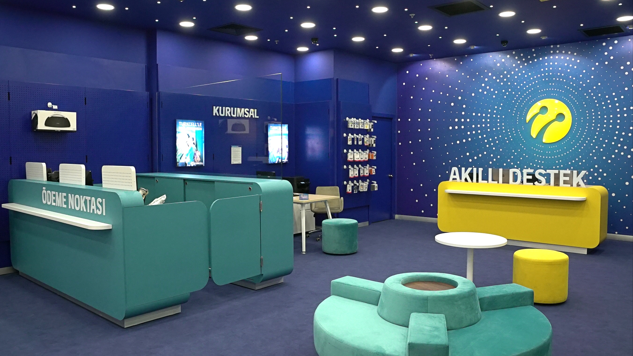
Being the leading digital operator in Turkey over 1500 stores, Turkcell asked CBA to work on its retail design via putting customer experience at the heart, to maket he Turkcell stores convey it’s being “the” digital innovation leader.
Project aimed to secure a consistency in terms of look and feel among all the brand communication areas, for an improved customer experience. The visual identity system for in-store was developed via merging high end technology with sincere service, enabling a flexible consistency.
Based upon the strategic approach developed by CBA, the brand idea for the project was defined as “Sparkling Network” for Turkcell.
In Sparkling network concept, the integrity among all the stars (points) represent the connection between human and technology, human and data and among the people themselves. And the connecting light, called as the “Guiding Light” represents Turkcell, in line with the brand’s message “Turkcell does not only get you connected, but also helps you to find the right solution via enlightening and guiding your way” This is the reference point of the in-store visual identity system.
In line with the visual identity system, graphical elements such as shapes, colors, typography and tone of voice have been developed , the design principles of in-store and other communication channels have been idenitified and stations within the store are assigned to specific customer needs.
As a result now Turkcell store do have:
Adel has been found in 1969 by one of the leading conglomerates of Turkey, Anadolu Group.
Adel’s high-quality pencils and stationery products have become well known in Turkey taking an important place in the education of endless generations. Adel, except for paper products, both in terms of output and product range, is the biggest stationery manufacturer of Turkey and nearby countries. Since its foundation, Adel has had cooperations with Faber-Castell and with this partnership, Adel continues its investments which add value to Turkey.
Although being one of the leaders in stationery business with his heritage, expertise and production capacity, Adel’s brand value and perception were not at its deserved level.
So, CBA has been asked to define Adel brand vision and build its brand positioning.
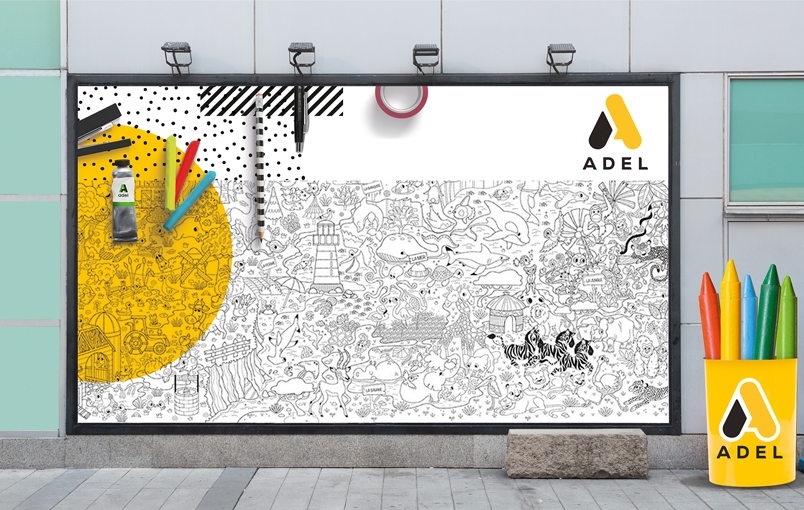
Building an inspiring corporate brand to create a win-win synergy between the corporate brand and its portfolio.
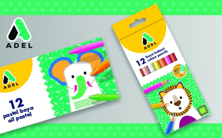
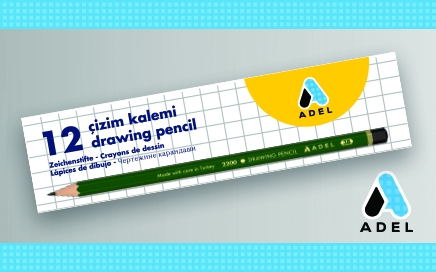
This crucial brand “renaissance” project started with a deep analysis of the brand through interviews held with various stakeholders and wide scope assessment of the competitive landscape. Upon the pain points and challenges identified, CBA defined a new brand positioning and brand essence both for the corporate and product brand of ADEL leveraging its values and unique propositions.
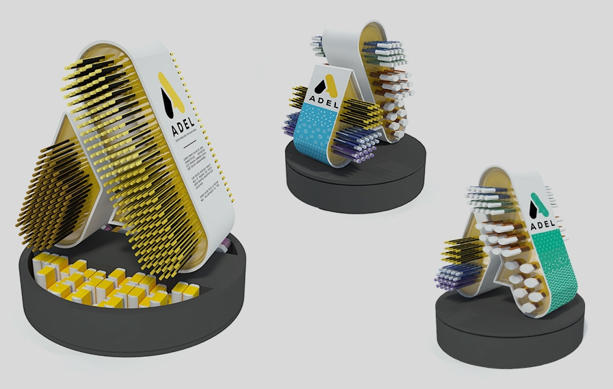
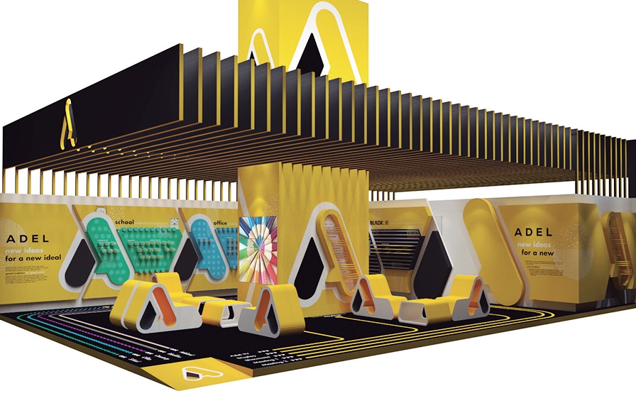
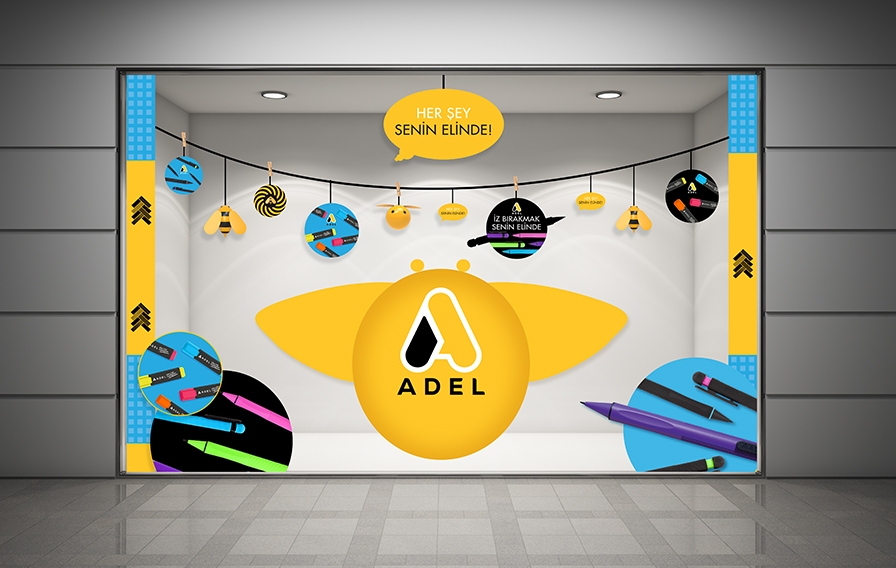
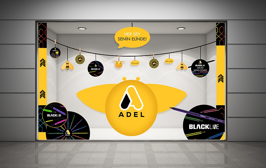
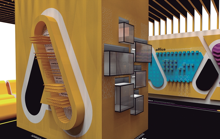
A brand new visual identity has been created to support Adel’s new brand positioning and strategy, where the colors already associated with Adel, yellow and black were leveraged in an innovative way, reflecting the values of Adel. The new visual identity has been designed in a way to organize the newly to be structured Brand Architecture of Adel, covering its very wide product portfolio. Associated colors and elements of both the main visual identity and subcategory identities were successfully extended by CBA to create a brand universe to enhance brand awareness.
Visual identity and brand universe creation steps were followed by the packaging design relaunch initiative, which enabled ADEL brand to rejuvenate on a shelf. Varying from in-store application/material design to consumer experience designs at exhibitions or even further to new product design innovations, CBA leveraged the new identity of ADEL in multiple legs of the holistic communication of the brand.
Carrefour Property in Turkey asked CBA to work on the redesign of a shopping mall in Maltepe, a lively and popular district in Istanbul. This mall had been losing momentum, despite the availability of potential consumers, because of its impersonal image, and its weak customer experience. The shopping mall needed to address a changing market, and more active competitors, by adapting itself to consumer expectations that had hitherto been ignored.
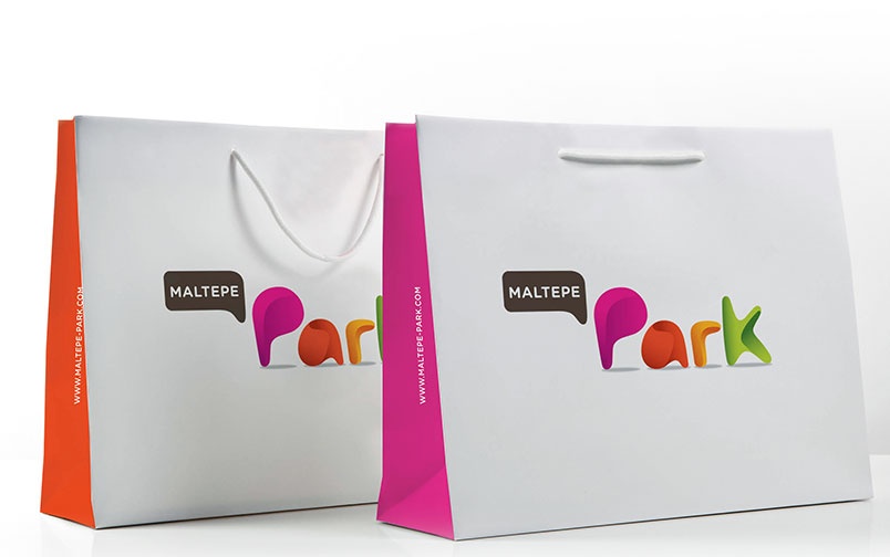
The objective for the renovation was to associate the center more strongly with the characteristics of its local area and core family customers: welcoming, warm and generous. A colourful space has thus been created inspired by the themes of joy and vitality, and based around the notion of a ‘contemporary urban park’, to create an environment that will build loyalty with existing customers as well as attract new ones.
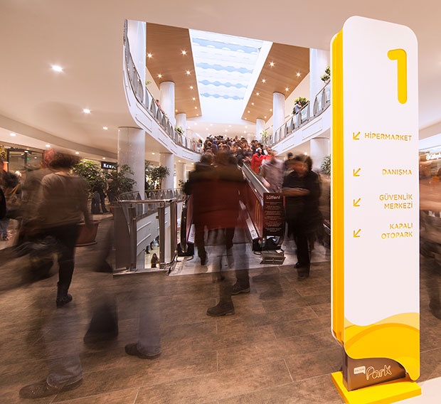
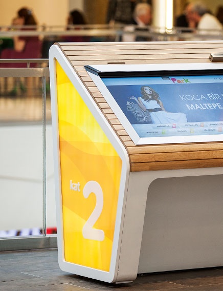
The customer path was completely redesigned using vivid colours representing joy and optimism. A childlike logo and a warm look and feel with bright colours and rounded shapes were designed to engage families looking for novel and engaging events.
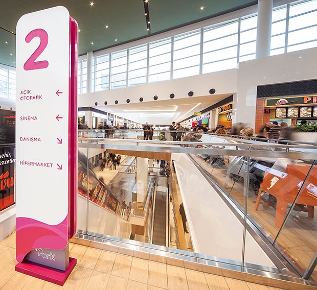
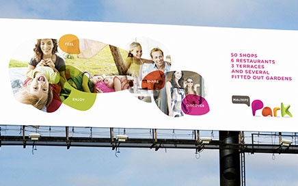
The re-design and renovation of the mall increased considerably the frequency of visits and created a welcoming and family-friendly environment.
Sölen is one of the biggest confectionary company in Turkey with more than 20 years expertise in the category of chocolate & chocolate-covered products. Sölen is a pioneer in innovation and quality improvement within the confectionary segment. Sölen is very active internationally as 60% of its sales comes from export. Their original source of business was gift & offering chocolate & candies, which gets along now with day-to-day chocolate treats. Sölen has a portfolio with strong product brands on daily offer. The brand has built its roots on daring success opportunities and innovation by continuously surprising its publics, and always being true to its courageous spirit.
Solen is eager to create a difference and add value to society, consumers, business partners and its employees. Quality and innovation stand at the heart of Solen process. Sölen promises to offer to the consumers unique tastes for unique experiences. And therefore are willing to break their traditional image for a more spontaneous and courageous visual identity.
The new corporate identity was aiming to renew the image and branding of Sölen in order to convey the idea of a modern, innovative young brand and to gain sensuality to be more suitable for the confectionary segment. Sölen new image should convey the idea of pleasure and festive moments. The colorful dots are symbolizing children, young people, adults cause Sölen offers products for every occasion and suitable for the whole family. It also symbolizes the expansion of Sölen in the chocolate & candy world and the wide offer range.
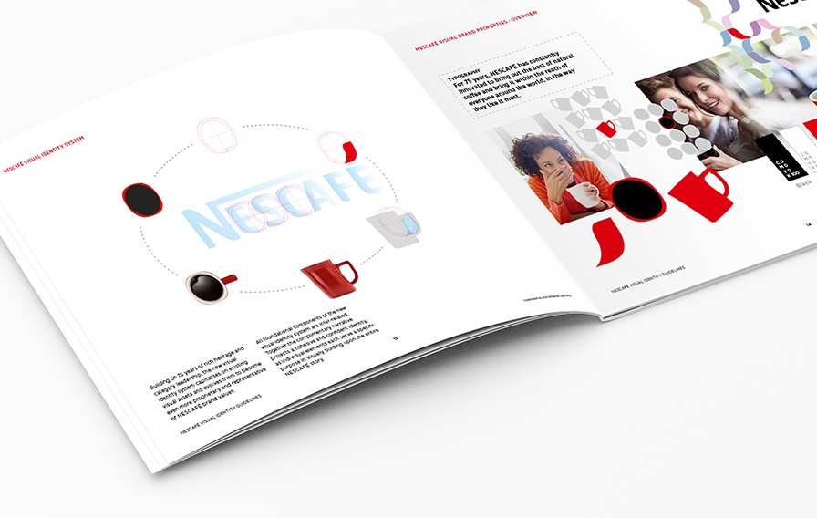
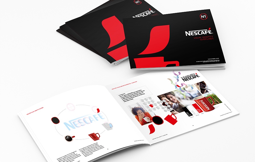
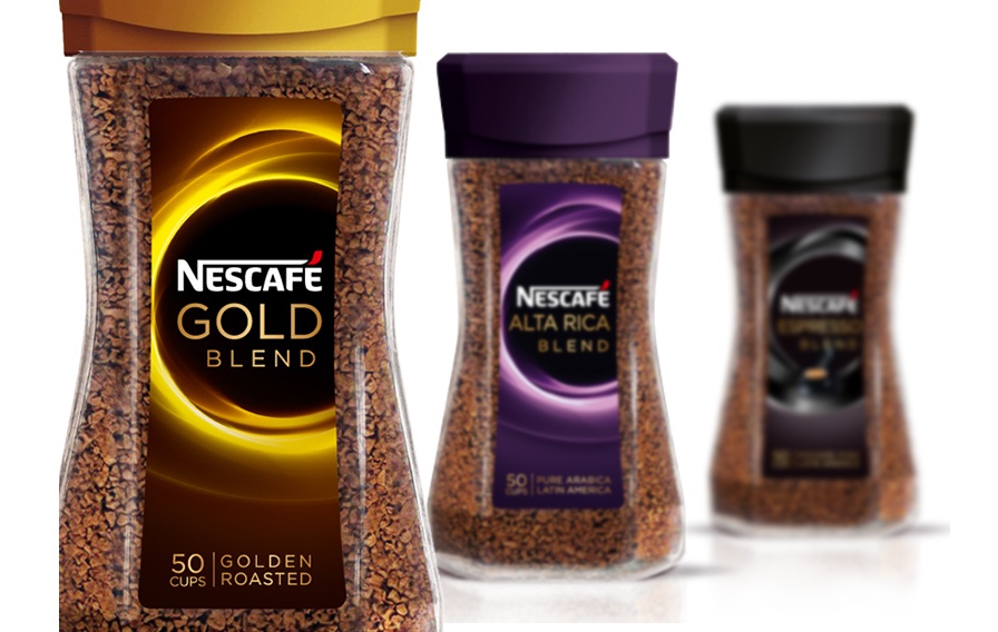
Nescafé, a leader and pioneering brand for 75 years decided to reclaim its know-how of the coffee experience with a new brand baseline « It all starts with a Nescafé » which highlights the opportunities that can be triggered by or around a cup of Nescafé. Through this repositioning, the brand wishes to consolidate its competitive advantage on the market, as well as to enhance its iconic potentialacross all touchpoints. CBA gave life to this signature by redefining all the identity system of the brand.
The new VIS needs to call on the multiple experiences that Nescafé has to offer, and should unlock its love brand dimension: it’s all about sharing moments, finding inspiration, triggering new opportunities…
This evolution is deeply strategic for Nescafé : it acts as a cultural shift in the brand image management, leaving a product brand approach to adopt a “masterbrand” vision. The new system allows a graphic flexibility within a consistent frame.

This is the very first time Nescafé empowers itself with a coherent identity system,which is immediately recognizable and leans on 3 complementary visual markers, which act as coffee experience revelations.


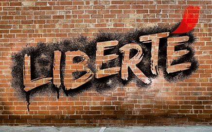
The final accent of Nescafé takes off as a red sign, and evokes the daily inspiration that is transmitted by Nescafé to its consumers.

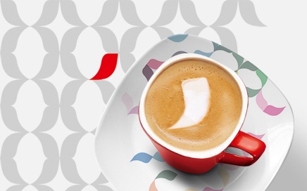
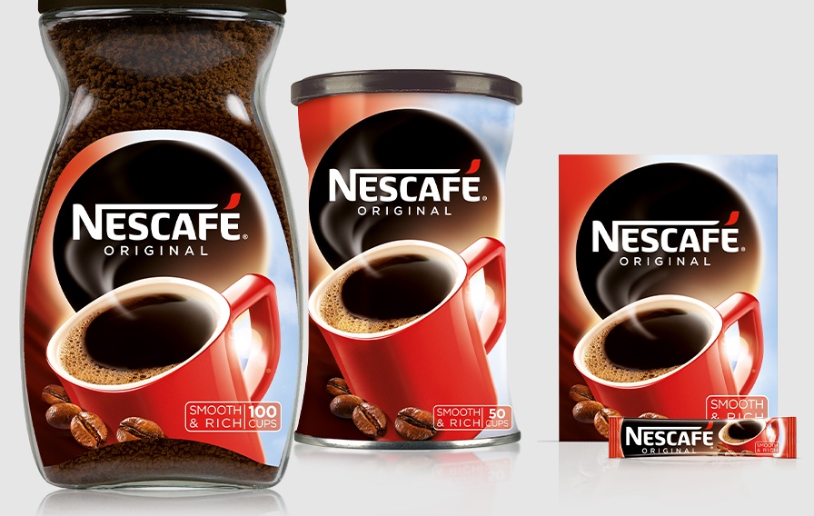
The red mug’s graphic and structural design is modernized, and gains importance in Nescafé’s global communication.
CBA also created an impactful blockmark: a hub (a view from the top of the mug) symbolizes an open window onto Nescafé’s universe. The graphic system, supported by graphic guidelines and in-store signage displays is implemented progressively on packaging and each range of Nescafé products all over the world by CBA agencies.
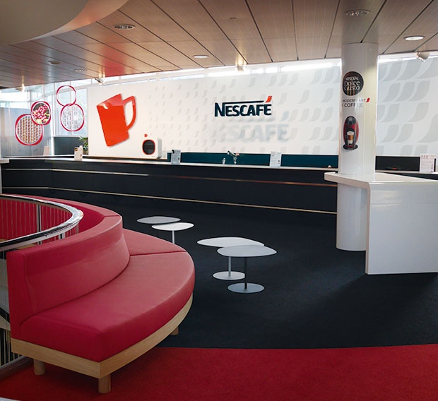

Space design of the cafeteria in Vevey, HQ of Nestlé
After rethinking the global strategy of the brand, CBA imagined a new concept for Nescafé’s points of sale, spearhead of the recruitment of millenials and digital natives around the globe.
Privacy Overview
| Cookie | Duration | Description |
|---|---|---|
| pll_language | 1 year | This cookie is set by Polylang plugin for WordPress powered websites. The cookie stores the language code of the last browsed page. |
| Cookie | Duration | Description |
|---|---|---|
| _gat | 1 minute | This cookies is installed by Google Universal Analytics to throttle the request rate to limit the colllection of data on high traffic sites. |
| Cookie | Duration | Description |
|---|---|---|
| _ga | 2 years | This cookie is installed by Google Analytics. The cookie is used to calculate visitor, session, campaign data and keep track of site usage for the site's analytics report. The cookies store information anonymously and assign a randomly generated number to identify unique visitors. |
| _gid | 1 day | This cookie is installed by Google Analytics. The cookie is used to store information of how visitors use a website and helps in creating an analytics report of how the website is doing. The data collected including the number visitors, the source where they have come from, and the pages visted in an anonymous form. |
| Cookie | Duration | Description |
|---|---|---|
| cookielawinfo-checkbox-functional | 1 year | The cookie is set by GDPR cookie consent to record the user consent for the cookies in the category "Functional". |
| cookielawinfo-checkbox-others | 1 year | No description |