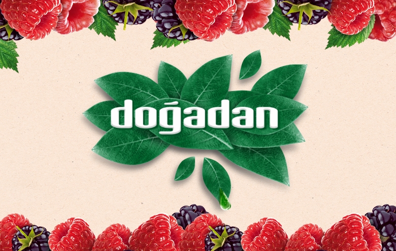
Turkey is a black tea market, where Doğadan is one of the 4 major players, whereas in infusion tea category Doğadan is by far the market leader.
Dogadan’s challenges were;
- Different Brand Perception in Black Tea and Infusion
- The complexity of products in Infusion category
- Black tea is a commodity market like the sea of sameness and it is hard to change consumers’ rooted purchasing habit
CBA was asked to create an over-arching VIS to protect the whole family image and keep the differences clear between sub categories.
To come up with a visual identity system to be leveraged on packaging design enabling:
- Doğadan Brand Vision to be reflected fully
- A clear segmentation throughout the wide product range

Immersing in a unique emotion that it can lived only with the brand
CBA’s objective was having a category relevant design in Black tea with transforming Doğadan’s infusion heritage (crafting, expertise and nature’s goodness) to the black tea portfolio and navigating the consumer for the different motivations of each category, in order to avoid the complexity of infusion category.
Immersing ourselves completely in the brand and market, foundational strategy work helped CBA to unlock the brand vision of Doğadan and the emotional connection that Turkish people feel with the brand. Its pioneering roots gave CBA powerful inspiration to bridge the gap between the brand vision and how it expressed itself visually.
CBA’s concept was entitled ‘the beating heart of nature’. Doğadan logo is a living, breathing organism at the heart of the story – it brings you its offerings through its nature credentials. The interplay of our wordmark with the leaves accentuates our know-how and how it feels to drink nature.
The packaging design gives pride of place to the logo. CBA intention was to free Doğadan logo from the pharmaceutical-like capsule to reconnect with nature via the leaves, enabling the logo to embody nature in a fresh, modern and lively way to make people think “When it is about nature, Doğadan delivers the best”
The new logo and visual identity system unify the large portfolio of Doğadan ranges and products on the shelf to steer the consumer in the right direction. The supporting color palette for the range is inspired by nature in soft, modern tones while allowing strong range navigation.
CBA wanted to move to more realistic depictions of nature to reinforce our goodness of nature and differentiate from other tea and infusion brands in Turkey. Specific to the black category CBA wanted to appeal to the senses with heightened taste appeal front and center (cup).
Now, the new Doğadan Look&Feel answers the increasing desire of the consumer to reconnect with nature and our authentic self again for keeping a balance of the body, mind, and soul.

