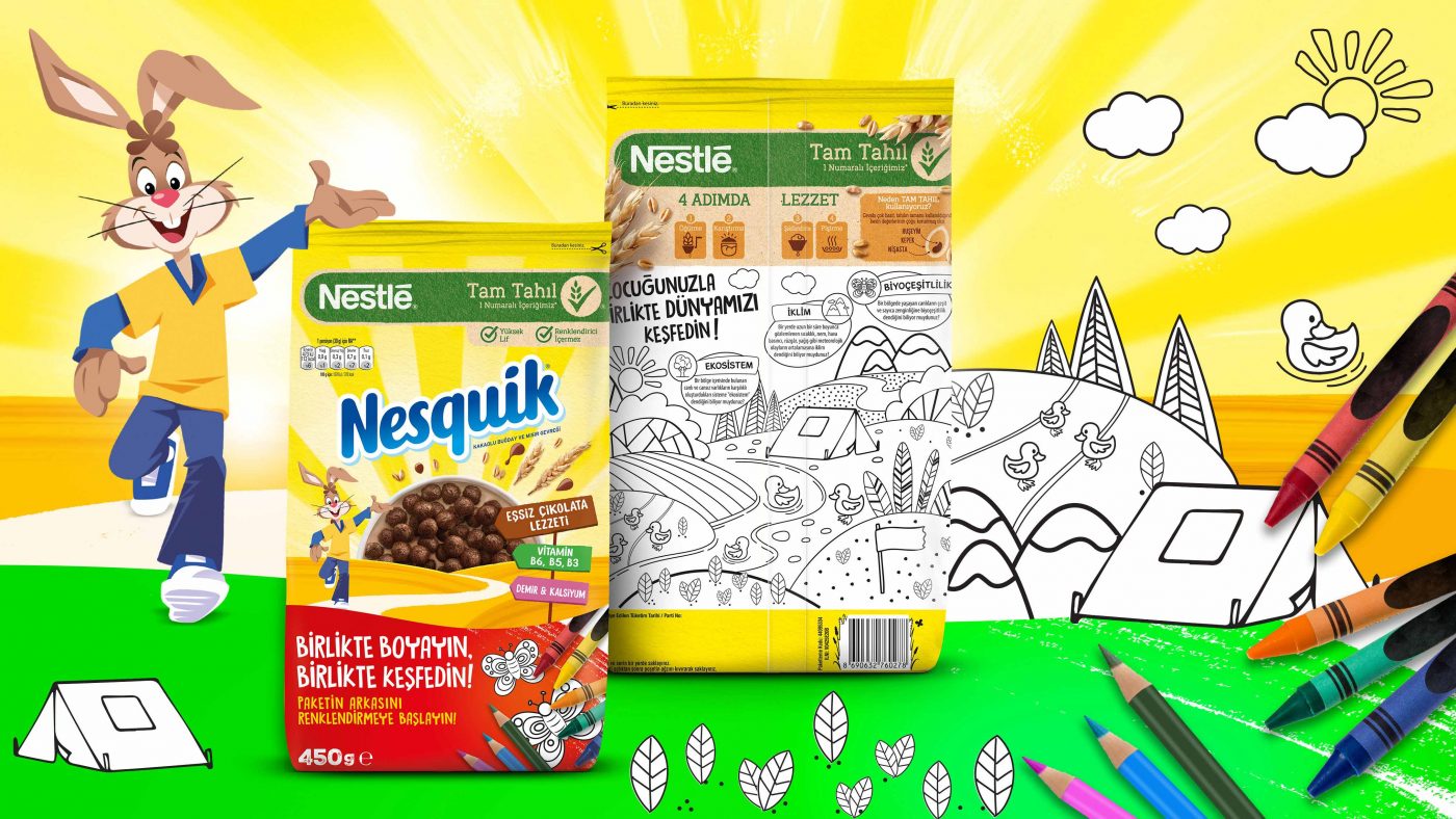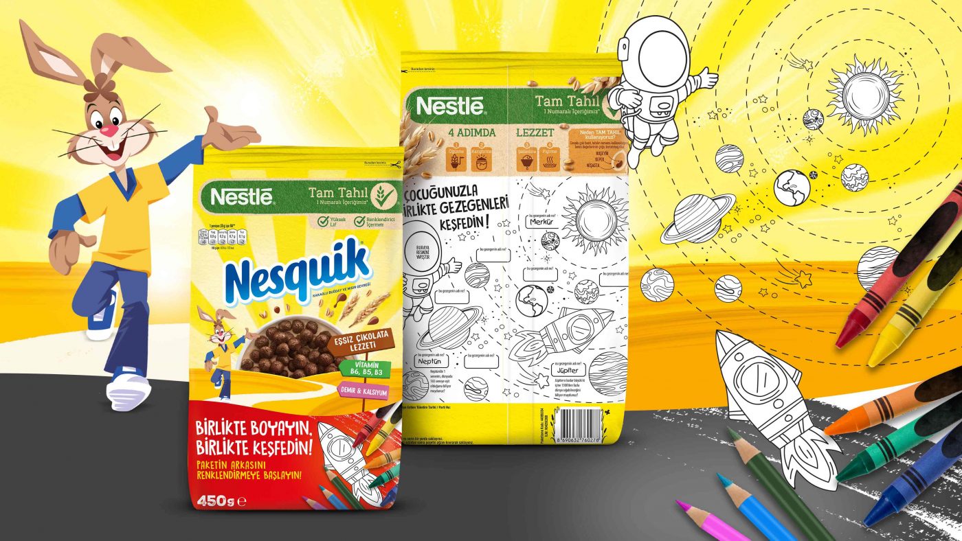
Nesquik first hit the shelves in 1948 and for the past 70 years, they have been providing parents a different way to get more out of milk. As the years past, they have expended their product portfolio with different flavored milk powders and cereals. Supporting the nutritional requirements of the children, Nesquik also focuses on education and entertainment needs of the children. In order to support these needs, Nesquik adapts different themes on their packaging.
Nesquik wanted to focus on the time spent between the children and their parents. Creating an environment where parents can enjoy quality time with their kids while teaching them about different concepts was the main priority of the project. As implementing an activity on the packaging, CBA wanted to stay in-line with the Nesquik brand identity and stand out on shelves as a product which also functions as an edutainment tool, rather than just a breakfast cereal.
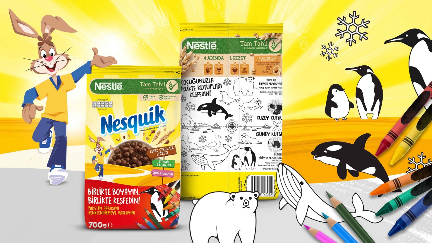
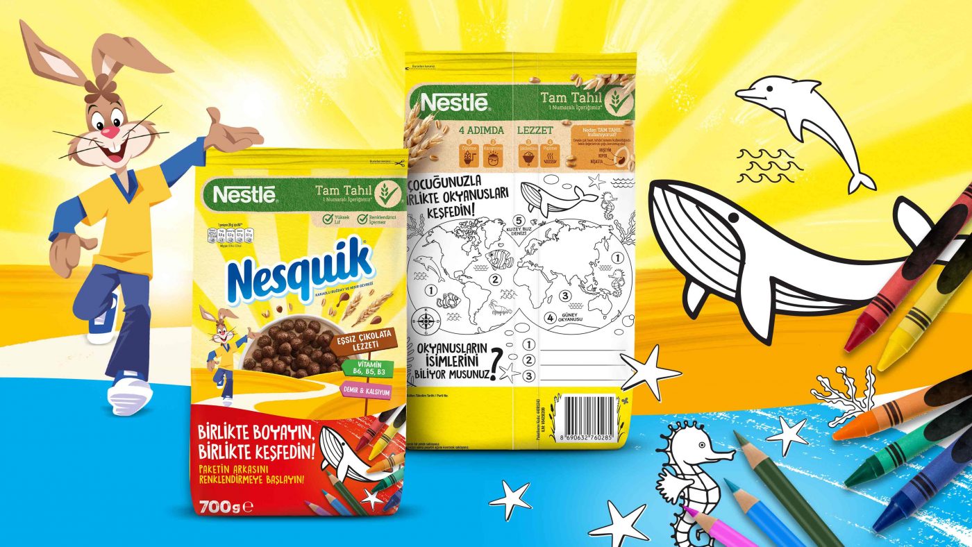
Focusing on edutainment, CBA created a thematic coloring activity area on the back sides of the packages which will enable parents to learn with their kids as they color. Driving from sustainability, 4 unique themes were created. which are: Planets, North Pole, Oceans and Our World. The concept and 4 themes were developed exclusively for Nesquik, by staying loyal to the brand identity and positioning.
