Paşabahçe, a pioneer and connoisseur of glassware, was founded in Istanbul in 1935. For nearly a century, they have dedicated themselves to crafting pure and delicate glass into beautiful, timeless, and stylish pieces. Today, as one of the top glassware companies, the brand enhances lives in 145 countries. They seamlessly blend tradition with innovation and combine classic with contemporary.
CBA was honored to partner with the Pasabahçe team to develop a new visual identity for the brand, one that encapsulates their inspiring ambition to make lives more beautiful around every table in the world.
Make lives beautiful worldwide, with the harmonious coexistence of beauty and strength, much like glass itself.
To gain a deeper understanding of the category and the brand’s essence, the CBA team engaged in meaningful conversations with those who matter most: Paşabahçe’s consumers.
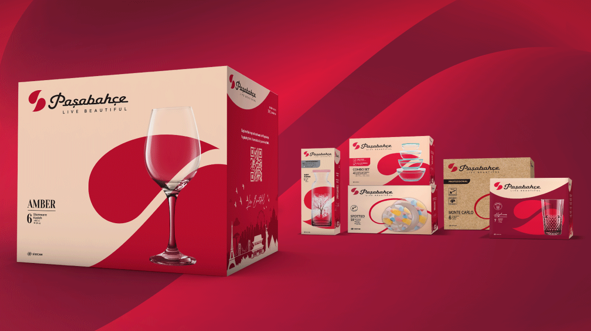
As part of our new, purpose-driven and relevant brand positioning, we undertook the task of revamping Paşabahçe’s packaging, drawing inspiration from the brand’s existing assets and its new positioning.
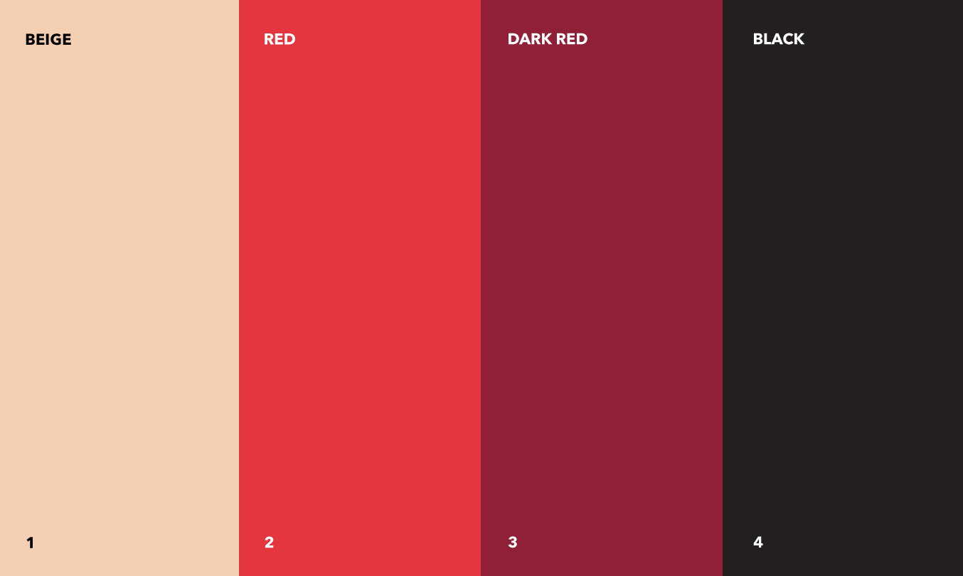
Colors.
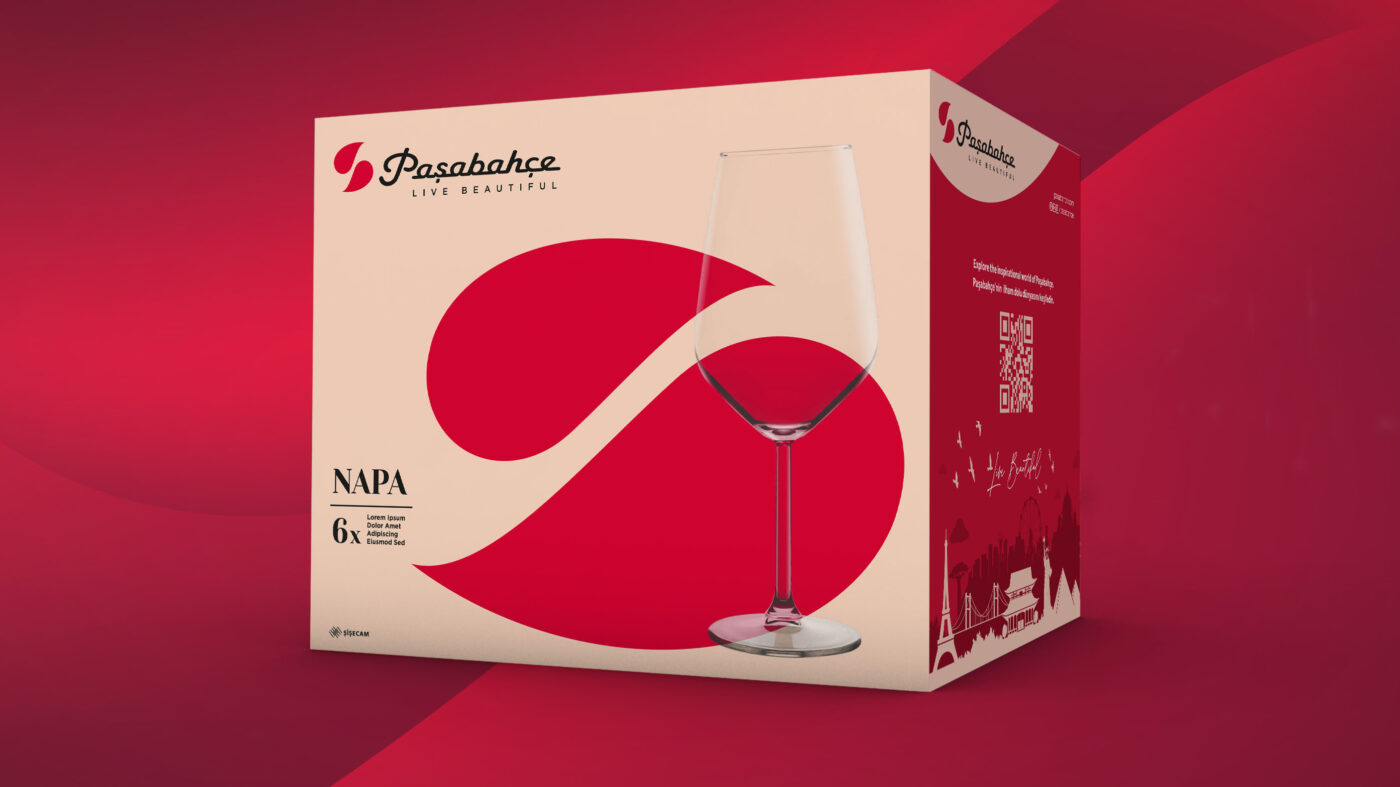
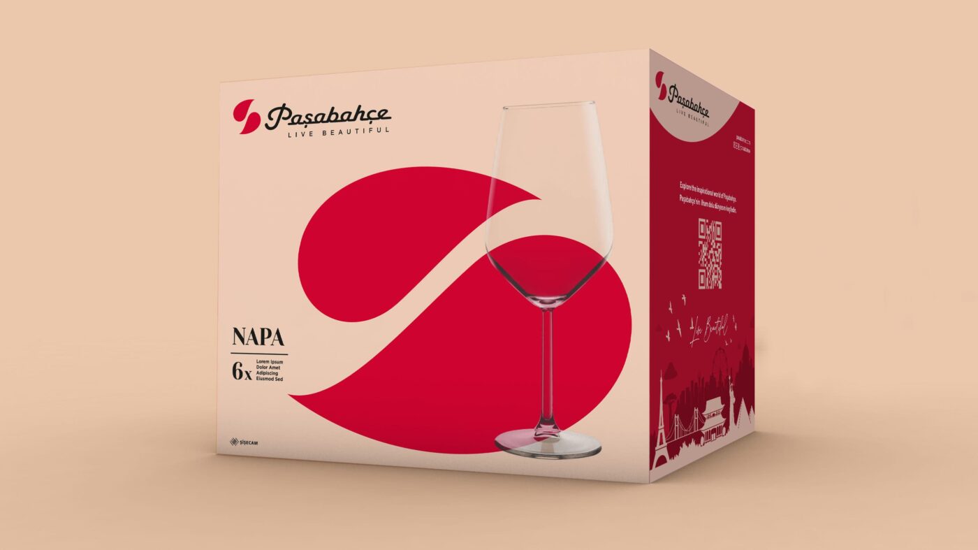
To base color of the new packaging is beige. This choice symbolizes two key elements: it signifies the sand, the raw material of glass, and it also embodies the celebratory spirit associated with the color of champagne. Beige is accompanied by red, which is Paşabahçe’s signature color, alongside dark red and black.
Supergraphic.
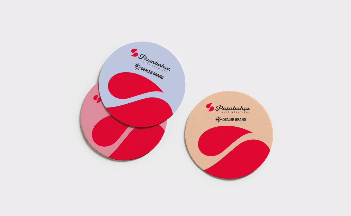
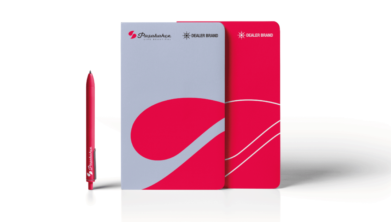
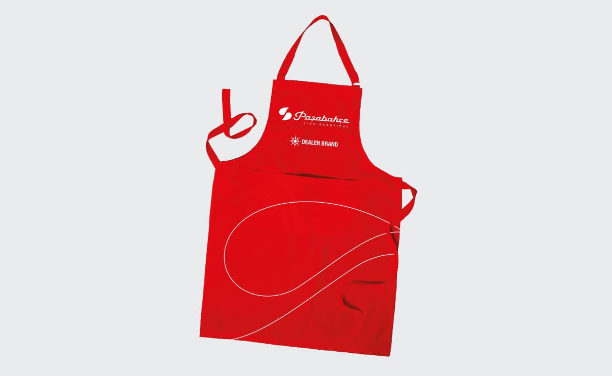
At the core of the packaging strategy lies the supergraphic, a dynamic and expressive element that infuses vitality into the layouts. Its creation drew inspiration from the brand’s symbol, reinforcing Paşabahçe’s visual identity.

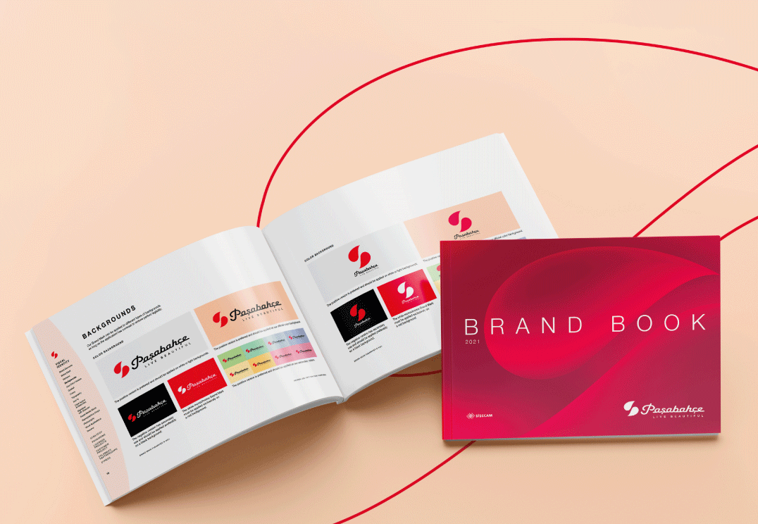
An iconic identity.
The brand’s narrative comes to life through an artist collaboration, creating a 5-sense brand experience, complete with the brand’s sonorous cues.
