Leading Canadian cured meat manufacturer Freybe sought to revitalize its master brands by appealing to a young, busy audience in search for nutritious habits. The exponential growth of the snacking category at the global scale led us to explore those new consumer needs. Modern, active lifestyles have created new meal occasions that called for innovative formats. Following a surge in demand for protein-packed goods, the “meat snack” has become mainstream.
A deep dive into the competitive landscape taught us the category did not have set codes and used very diverse claims all across. Brands aim at disrupting the traditional “specialist muscle benefits” positioning that kept meat snacks in a niche. This evolution opened up new frontiers to approach the category, with propositions ranging from origin to appetite, lifestyle and humor.
Humor in particular, has proven a particularly effective tone of voice in approaching “protein language”. It announces brand presence in a saturated category, as well as dis-arms the more serious value of meat, creating talk value.
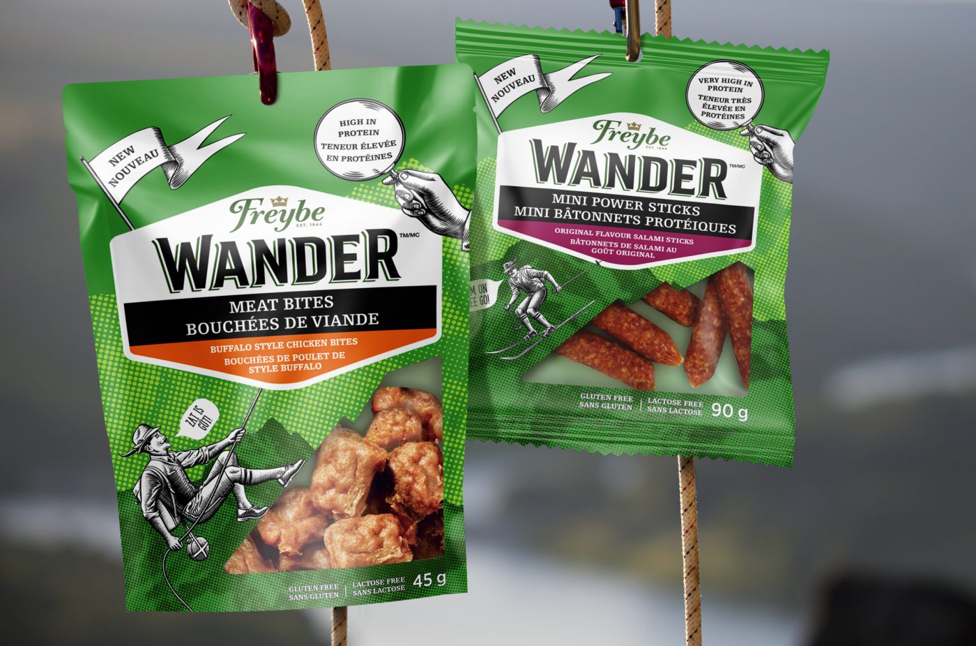
Through a two-day collaborative work session in Sprint mode that engaged the client, we aligned on the strategic direction our new Freybe sub-brand would take. Freybe’s meat expertise, we sought to create a sub-brand with an identity that echoed the active and adventurous lifestyle of its audience. To become the essential nourishing on-the-go companion, the brand had to adopt an optimistic mission, inspiring consumers to do the most and be their best self. “Fueling life’s adventures” became an evident definition of the Wander vision: a genuinely playful brand for all of life’s terrains, ensuring sustained energy from quality nutrients.
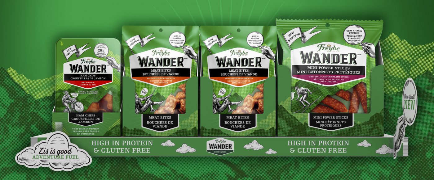
As part of the original Sprint mode work session, naming was developed hand in hand with the client. After a few rounds exploring different types of names, it became clear that it had to resonate with all outdoor-lovers, not just the bold and muscular (cue Jack Links, Epic), but also the curious and easygoing. Wander came from a sense of wanderlust, the desire to explore the great unknown, which translates to the everyday with a curiosity to try out new things, taste new flavors. The product is not just a for that mid-hike energy boost but a tasty solution for those in-between meal cravings.
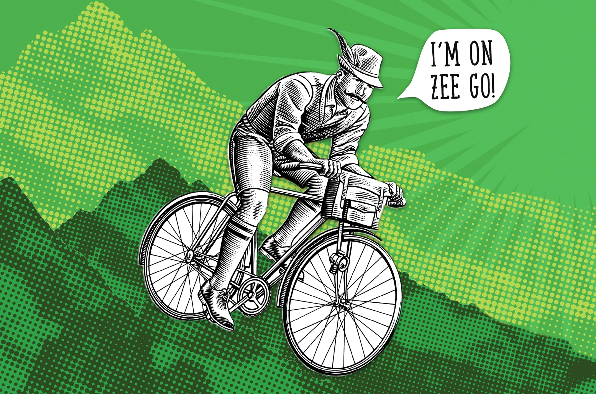


First, we sought to elevate one of the Freybe brand’s core properties, its green color scheme, from a bold and foresty tone to a brighter, lively color palette. We created the hero character of “Mr Freybe”, a charismatic personification of Wander. Mr Freybe is a woodprint interpretation of the brand’s heritage with an amusing attitude. Having this icon is a key foundation of Wander, that bears the potential to develop more characters for portfolio differentiation. We then established an iconic brandmark, a classic typography, a picturesque mountain background, and thorough brand guidelines to support the Wander vision.
Packaging design was developed drawing from the “Fueling Life’s Adventures” claim, a bold brand presence through the wordmark, with the masterbrand Freybe existing as a token of heritage. Packaging tells the tale of Mr Freybe, always active and changing spots, with an element of transparency, a reassuring cue for consumers.
Freybe is a family-owned business dedicated to perfecting the art of gourmet, handcrafted meats since 1844. Because when gourmet meats are crafted with the care and passion they deserve, the result is what matters most: taste as it should be.

