France
Paris
Switch to your local agency
Back to menu
Welcome to
New York has a string of iconic references to its name. It’s known as ‘the city that never sleeps and for being ‘so good they named it twice,’ for a start.
It’s a city that’s inspired the imaginations of many, never more so than as the fictional metropolis where Batman’s adventures were set. Gotham City is a ‘fantasy transposition’ of Manhattan, despite nobody ever saying so explicitly, often taking on the identity of the city’s noirish side.
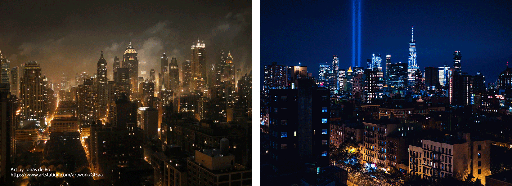
Bill Finger, a co-creator of Batman, wrote many of the superhero’s adventures. He’d been drawn to an entry in the phone book for Gotham Jewelers. The name Gotham, he felt, was a fit for his fantasy city. Little did we know that it actually dates back to medieval England when it meant ‘goat’s town.’
Typeface designer Tobias Frere-Jones, a partner with Hoefler & Co at the time, chose Gotham as the name for the sans serif font he created in 2000.
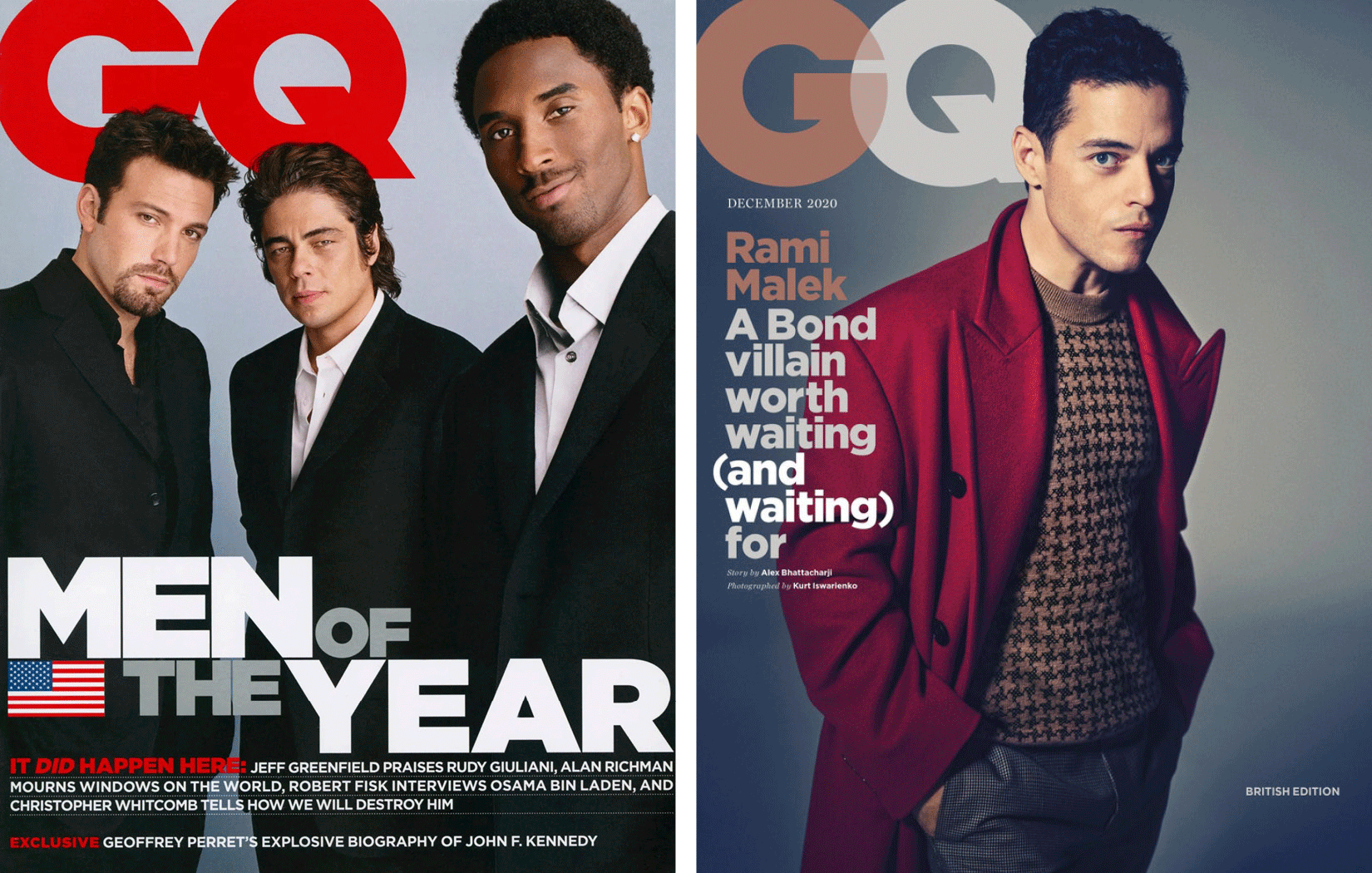
It was GQ who had actually commissioned this new font. The magazine was looking for a linear typeface with a geometric structure. Something ’masculine, new and fresh’ was the order of the day. This, it believed, would bring authority and credibility to its published articles.
To capture the essence of Manhattan, Tobias had spent hours taking thousands of photos around the city. He focused on signs from the mid-20th century. He wanted to capture the freethinking spirit found in architecture and urban planning during those years.
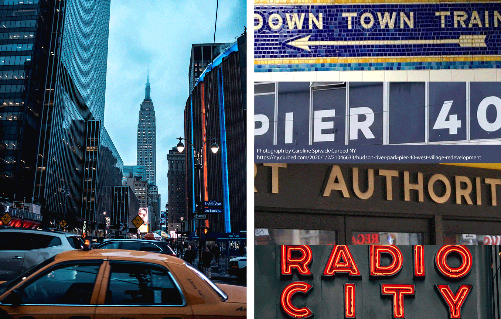
It was signage on the Eighth Avenue façade of the Port Authority Bus Terminal that caught his eye and captured his imagination. He summed up its simplicity when he said, ‘They are letters that only an engineer could have come up with. The fact that they were born outside a typography environment gives them a very distinctive flavor.’
The Gotham characters encapsulate the minimalist philosophy which inspired them. Initially there were 44 weight variants. Now there are 66. No room here for anything silly or nonsensical, Gotham is solid, concrete and functional. At the same time it’s an accessible typeface.
The description on the Hoefler & Co website is quite clear about all this. ‘From the letters that inspired it,’ it says, ‘Gotham has inherited an honest tone that is assertive but never imposing, friendly but never crazy, confident but never aloof.’
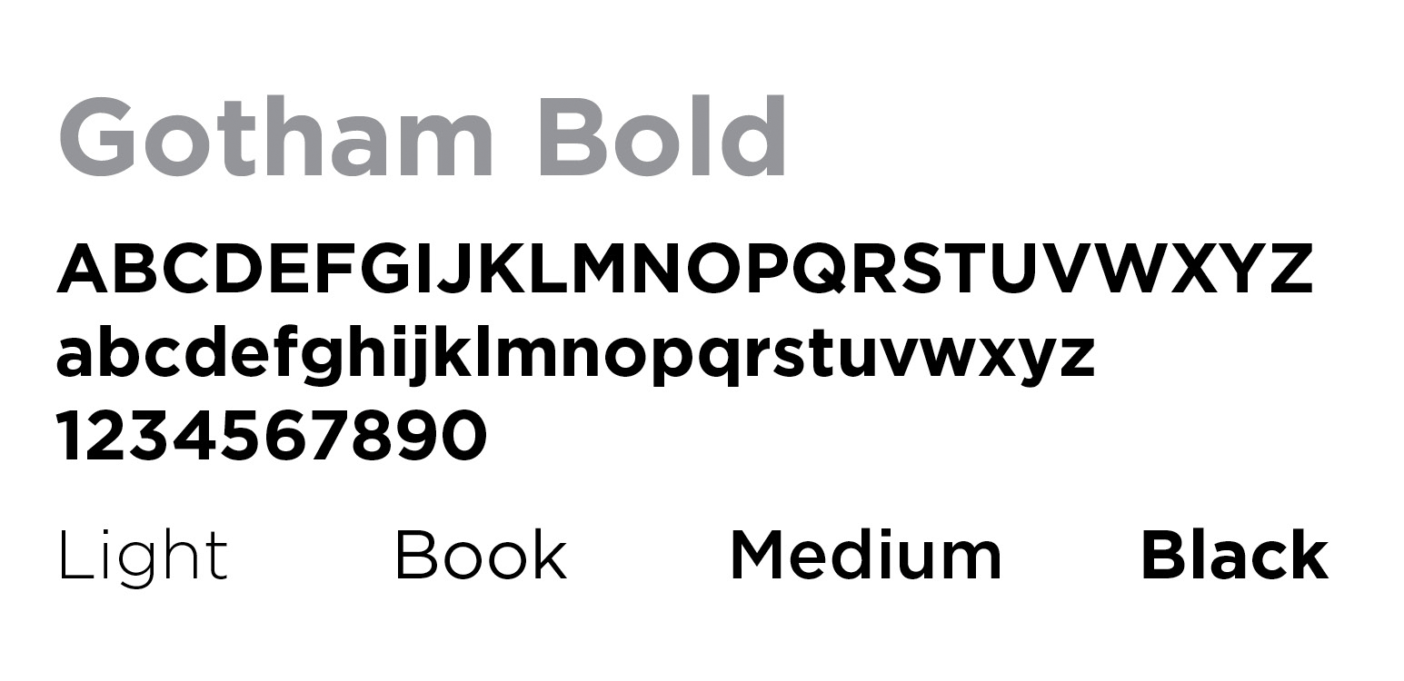
Among its most striking features are the circular shape of many of the letters and the very limited ascender and descender heights.
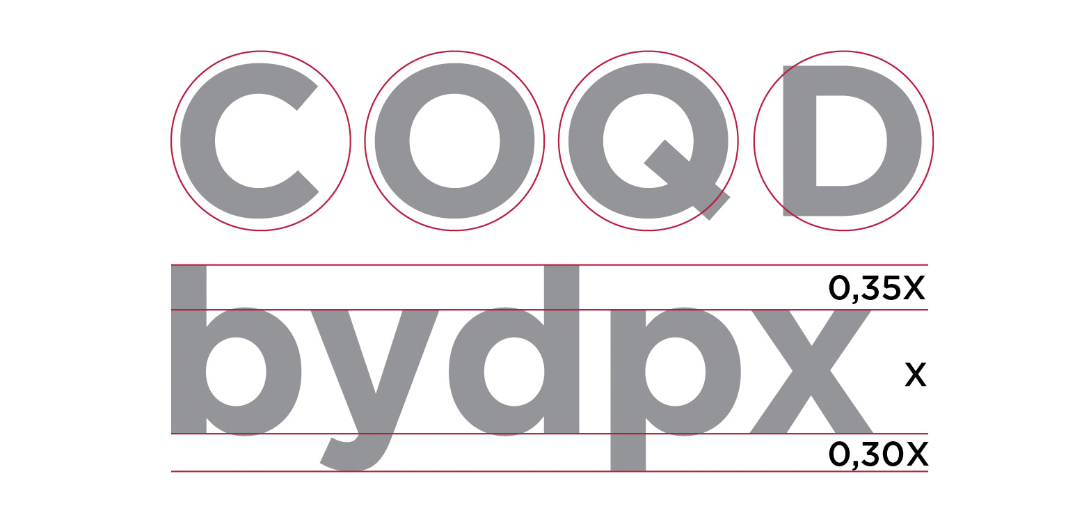
A few years after its birth and once the exclusive rights reserved by GQ had expired, more and more people began using Gotham. The Freedom Tower, the World Trade Center, and the National September 11 Memorial & Museum all chose it as their main character.

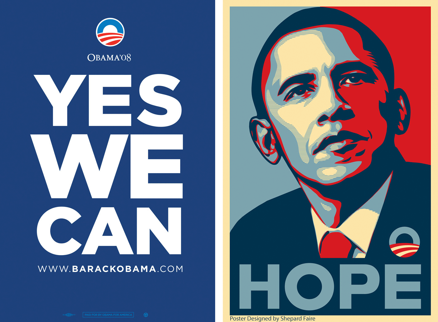
However, it was in 2008 that Gotham found true fame. The then American presidential candidate, Barack Obama, selected it as the official character for his candidacy.
Gotham, with its simple and incisive look, was a natural match for the clear and direct messages he wanted to get across. These included, ’YES WE CAN’, ‘CHANGE’ and ‘HOPE.’ Graphic designer Brian Collins described Gotham as the ‘linchpin’ to the former President’s entire campaign imagery.
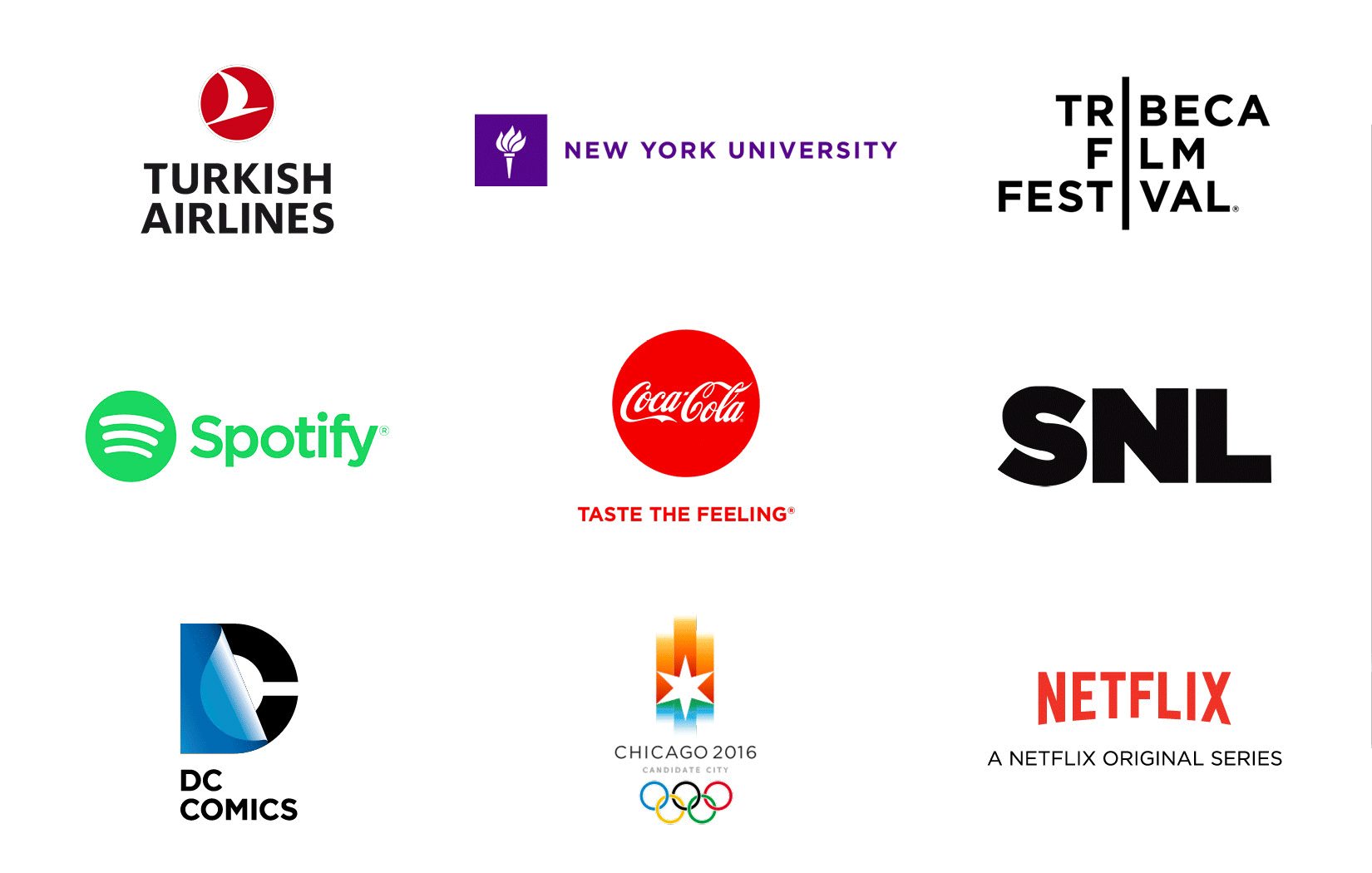
The ’Obama character’ has become popular not only in the United States but throughout the world. It’s used by Coca Cola, Netflix, Saturday Live Night, Turkish Airlines, DC Comics and the Tribeca Film Festival, to name but a few.
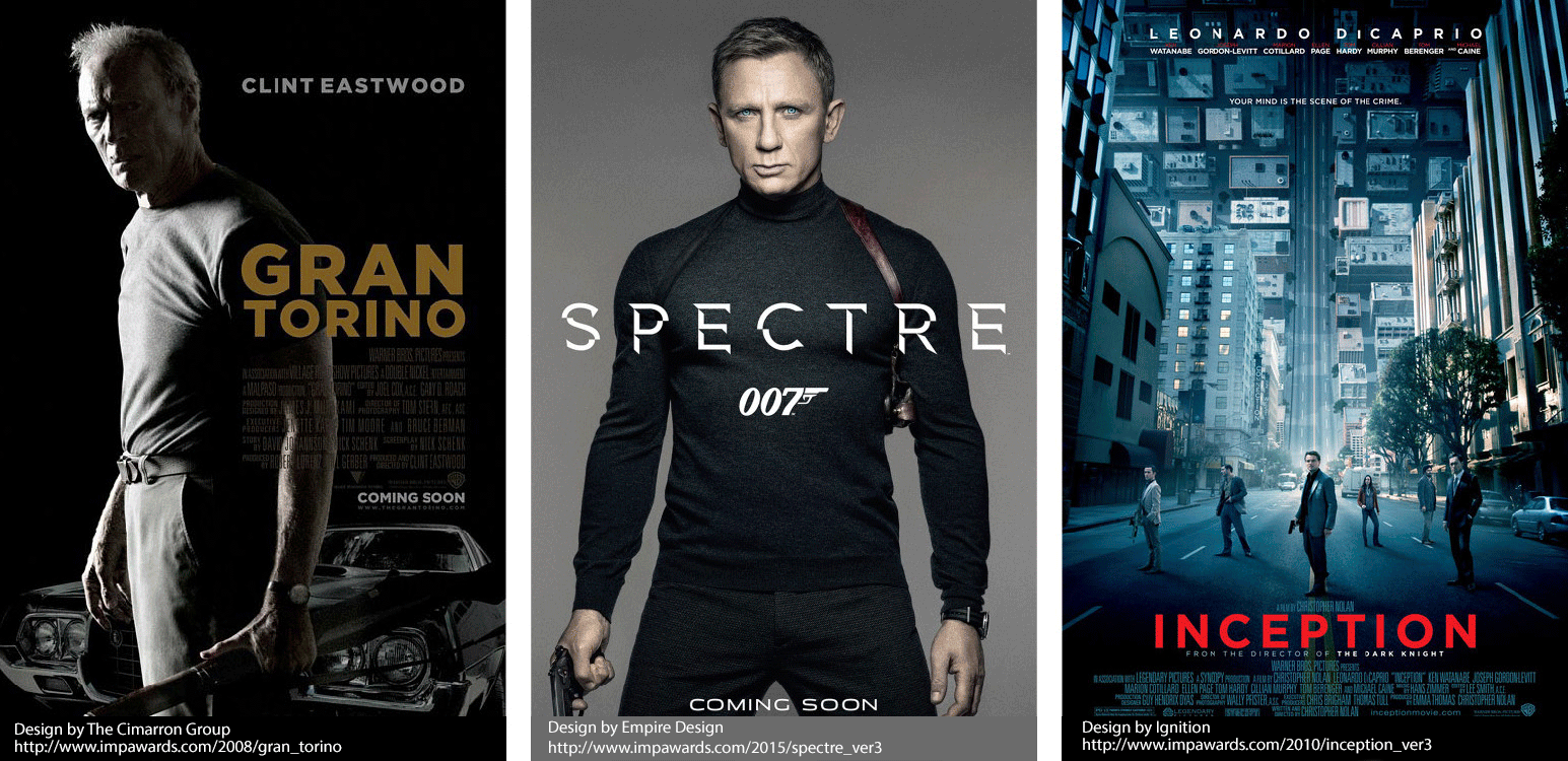
It’s even popular in the world of cinema, proudly standing out on the posters of countless blockbusters.
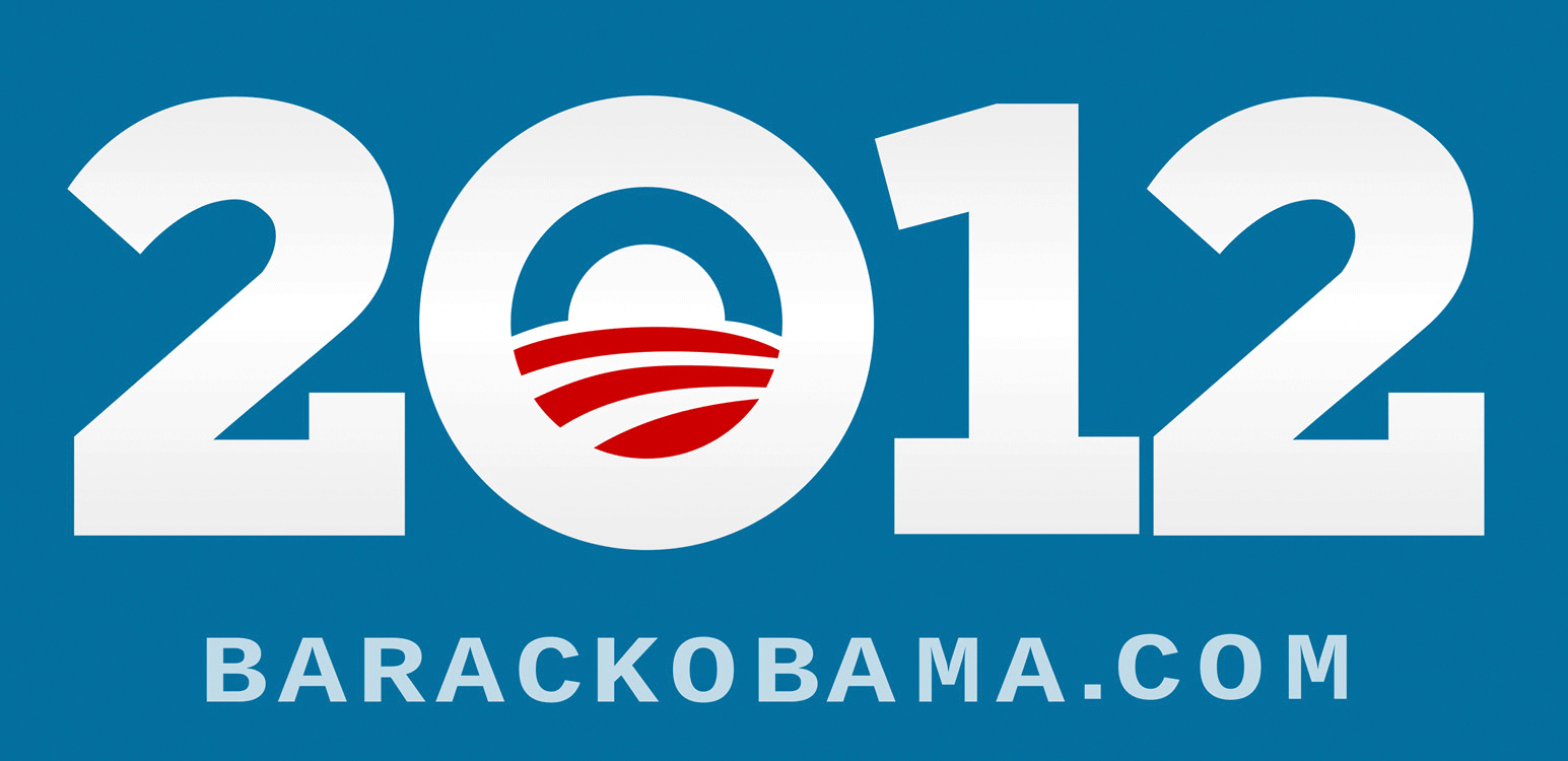
Four years after the first campaign, Barack Obama decided to use Gotham again for the 2012 midterm elections. This time serifs were added to ‘improve’ the typeface. When asked about how all this came about, Frere-Jones and Hoefler delighted by responding in words used in the Obama campaign,
I want to thank Giuseppe Mascia who’s based in Milan with CBA, Italy for writing this article. I hope you enjoyed discovering more about the Gotham typeface. Thank you for reading and I look forward to sharing a new and inspiring topic with you all next month!
Rutger, Executive Creative Director