France
Paris
Switch to your local agency
Back to menu
Welcome to
There are works that are considered untouchable, considered icons of the art to which they belong. Imagine Leonardo da Vinci’s Mona Lisa or Beethoven’s Ninth Symphony. Yet, every now and then, there is someone who goes against the trend, criticizing or even mocking what is unanimously considered a masterpiece. If, in the Art world, it was Marcel Duchamp who drew the moustache on the Mona Lisa, then on the typographic side, it was Erik Spiekermann who distanced himself from the symbol of modern typography: Helvetica.
It happened between the 80s and 90s. Erik Spiekermann, a German designer and typographer, claimed that Helvetica was boring and bland. A true heresy for the many supporters of the Swiss typeface, which, however, did not undermine Spiekermann’s idea. The German designer believed it was time for a change in the world of typography and decided to work on a font that would be, in his own words, the “complete antithesis of Helvetica”.

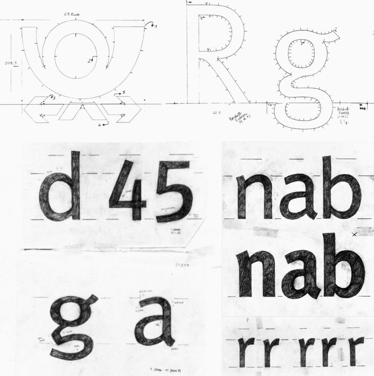
The opportunity arose for a work commissioned by the Deutsche Bundespost, the post office in West Germany, which in 1985 asked him to create a proprietary font. The project was interesting, but at the same time very difficult. The font needed to be extremely legible and easy to apply, both on large supports, such as moving vehicles, and on very small spaces, such as postage stamps. Moreover, it would potentially be printed quickly on cheap paper, with irregularities and poor ink yield.

Spiekermann got to work materializing his typographic vision: combining the grace of calligraphic letters with the functionality of linear characters. The optimization of space led him to minimize the ascenders and descendants, with a rather compact design of the letters. The humanist font designed by Spiekermann, initially called PT55, allowed you to write a lot of text in a small space, in a clear, elegant and distinctive way.
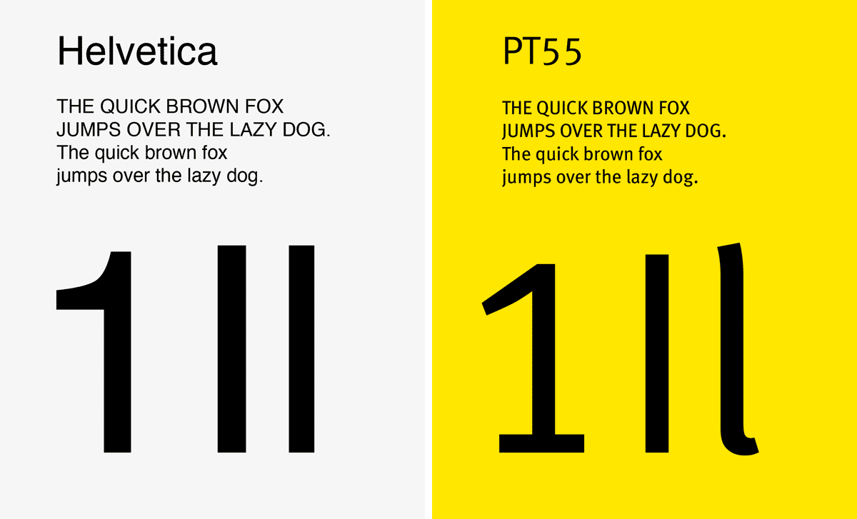
Unlike Helvetica, the PT55 left no room for ambiguity between letters or numbers. The three alphanumeric characters, “1Il,” are emblematic, which could often lead to confusion. Spiekermann’s letters and numbers, on the other hand, maintained a clear distinction.
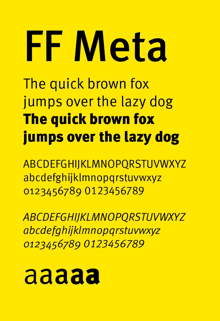
Unfortunately, the project did not go through with the Deutsche Bundespost, but Spiekermann was convinced of the potential of his character. He continued to work on it, independently, improving and expanding it, to include more weights and styles. He decided to call it Meta, taking a cue from his own design studio, MetaDesign, founded in Berlin a few years earlier. In 1991, the font was released by the newly created FontFont library with the full name FF Meta. Success was immediate and crossed national borders.
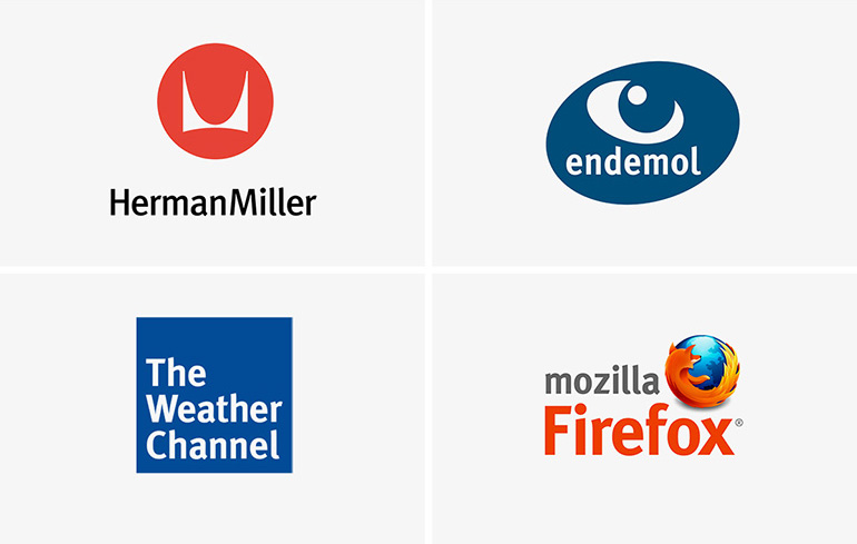
The clean, cheerful and distinctive aesthetic, combined with the ability to be used in various contexts, made it one of the most used fonts in the 90s. From Herman Miller, an office furniture company to The Weather Channel, passing through Endemol, Mozilla, Imperial College London and Fort Wayne International Airport, just to name a few of the brands that have adopted the Meta over the years.
Spiekermann himself used it as a guide font for his FontBook, a collection of all the main typefaces on the market, considered by many to be the Bible of fonts.
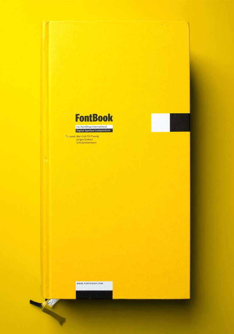
The growing popularity pushed its author to work on it again, expanding its weights and developing a character set that covers 110 different languages. This allowed Meta Greek, the Greek variant of Meta, to be adopted as an official character by the Greek government, in 2010.
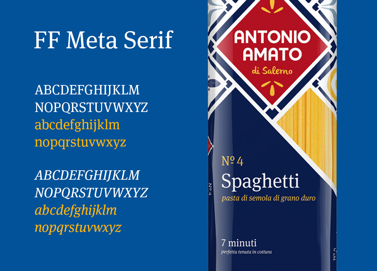
Today Meta has become a super family of fonts, which includes, among others, the Meta Serif, a version with serifs of the original font. Also in this case, the extreme legibility is the master, restoring a clear and elegant font, also used in the design of the visual identity of Antonio Amato.
The success of the Meta significantly contributed to Spiekermann’s fame, who today is considered one of the most authoritative figures in the field of typography. His creation was also selected by the MOMA in New York, which included it among the 23 most representative fonts of the digital age. Yet, despite the many awards, the most common appellation attributed to Meta is “the Helvetica of the 90s“, a compliment that probably does not sound like such, for its creator.
Giuseppe Mascia, Visual Design Lead