Meracinque : a unique grain of rice
The Meracinque project was started a few years ago by Silvia, Benedetta, Vittoria, Anna and Margherita: five sisters who, driven by a shared passion, decided to change their career paths after many years and work together to realise their dream of making the very best Carnaroli rice.
Until a few months ago, Meracinque rice was only distributed on the Horeca market, where it was a great success with Italy’s most renowned chefs. Why not expand so that consumers could enjoy these unique grains? And so CBA Italy met first with Silvia and then with the other sisters.
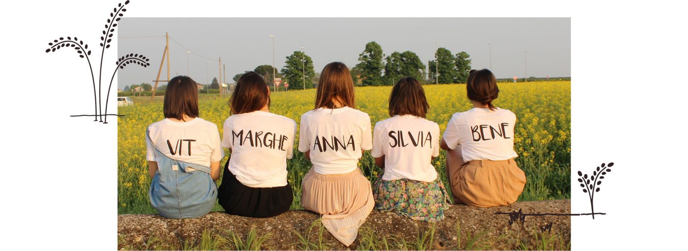
To meet the five sisters expectations, the challenge face by CBA was to design a new identity that would convey the high quality of the product with an emotive and rational consumer-driven approach.
Together, we outlined a concept that would communicate both the brand characteristics and the qualities of Meracinque rice and then translated this into a new pack, where the five sisters tell their story and describe the product.
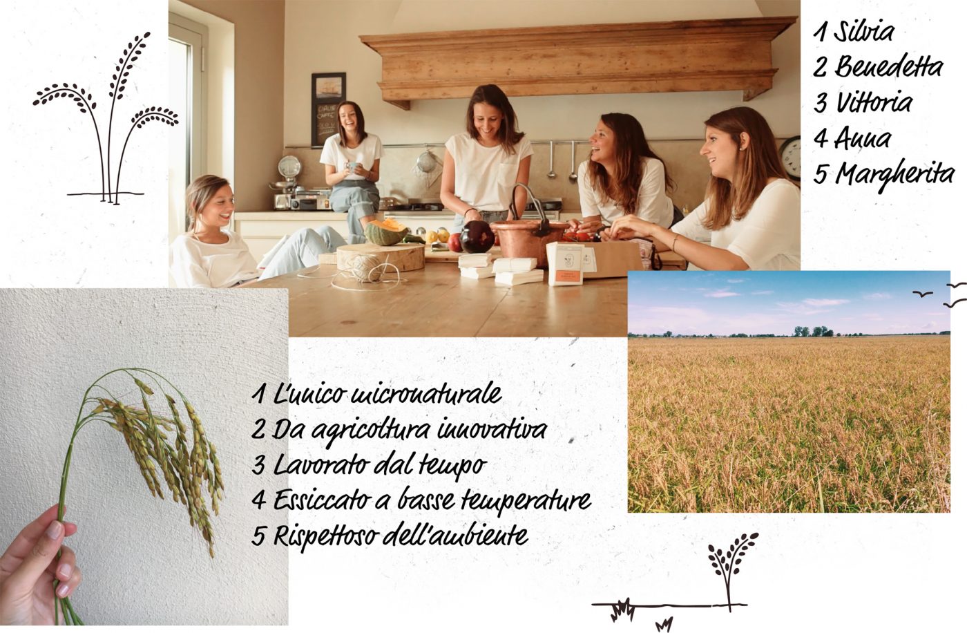
5 sisters, 5 characteristics, a wonderful story
Let’s start by taking a step back and looking at the name Meracinque.
Mera is short for meraviglia, which translates as wonder and has always been a pet name for the five sisters. Cinque is the number five in Italian and this functioned as the underlying theme around which we developed the design and storytelling.
Meracinque 100% Carnaroli isn’t like other rice: it’s the wonder rice.
It is the only rice to be cultivated using the Micro Natural® method (a patented technique of Japanese origin) which, thanks to the use of various agriculture 4.0 technologies, allows the health of the plant to be preserved while conserving the rice field itself. After a year-long production process, the result is a very high-quality rice that stays firm when cooked, a very popular quality.
The greatest challenge was to identify the right way to express the unique nature of the product. How to balance the technical production information with the more intimate sphere and the bond between the five sisters?
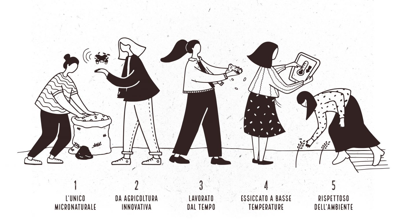
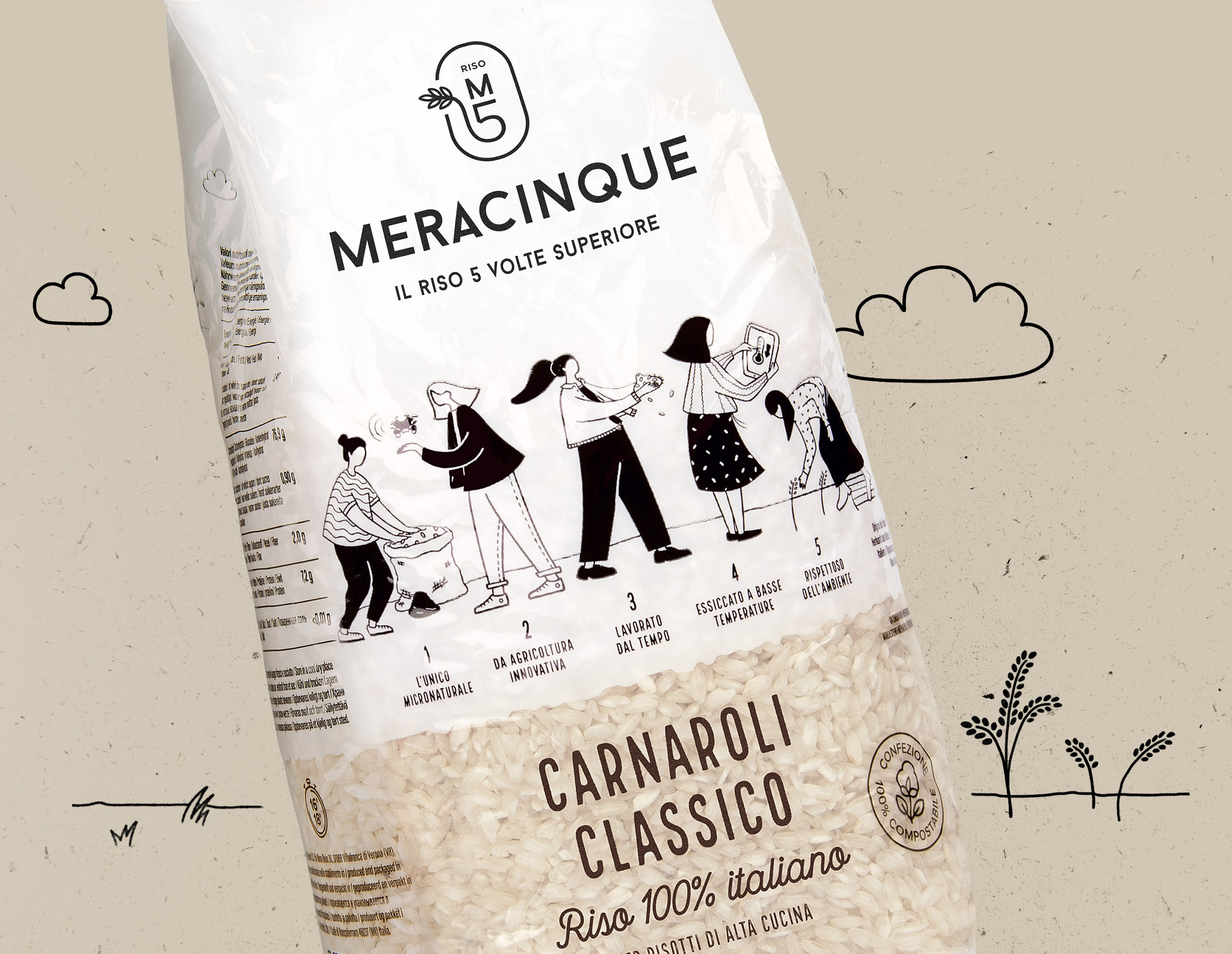
We featured the two different parts in equal measure, creating a choral experience: the illustration of the five sisters at work explains the five different steps that characterise the production process and therefore the unique nature of the final product.
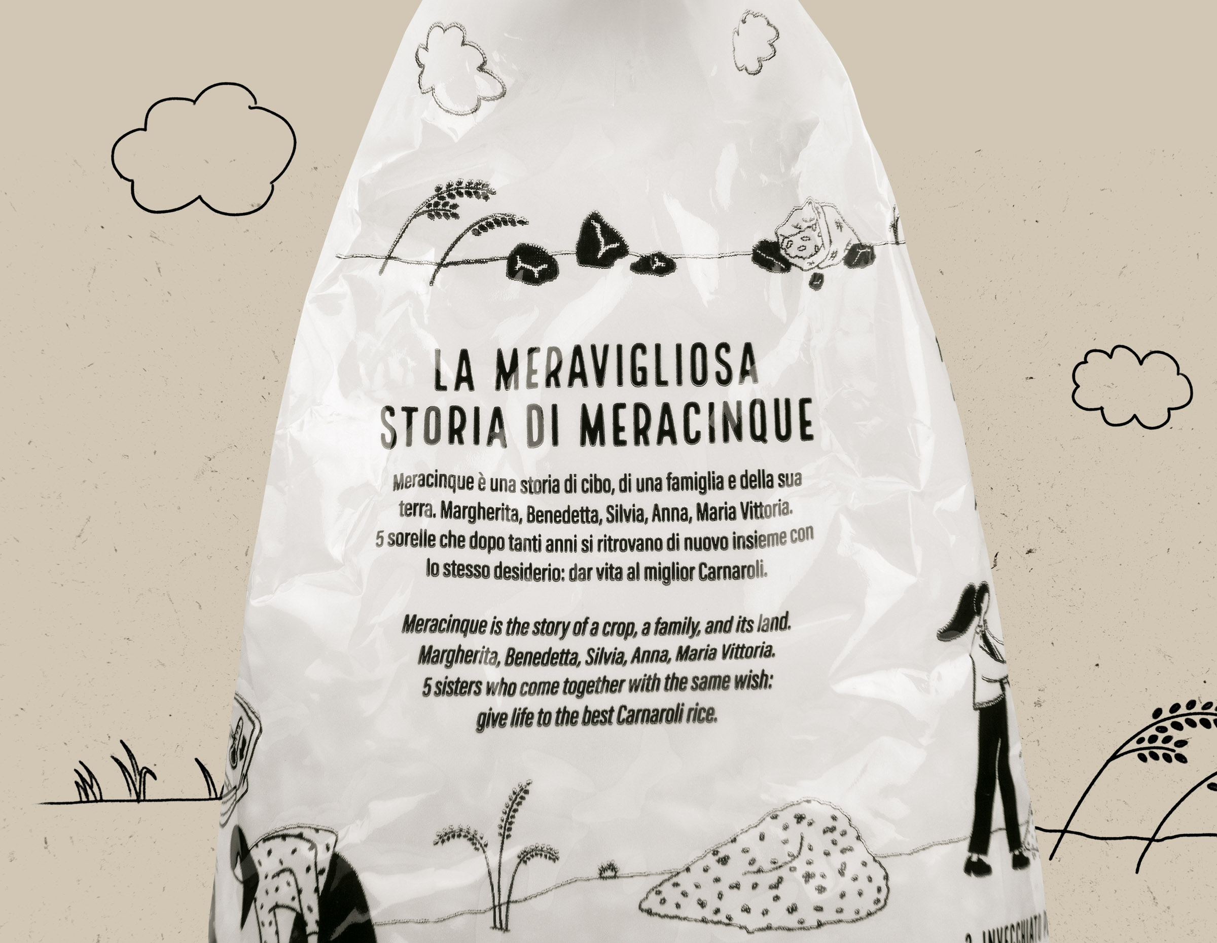
The story of the sisters and their project occupies a primary position on the pack. The pack as a medium focuses on narration, taking the consumer on a journey to discover a one-of-a-kind story and an extraordinary product.
The visual language chosen is fresh and spontaneous, able to both express the elegant feminine approach of the sisters and their adventure, and clearly describe the singular characteristics behind their product.
The illustrations are characterised by a subtle, soft and continuous line that highlights the family bond as well as the different information featured on the pack.
On the front of the pack, our team at CBA Italy wanted to tell the story as succinctly as possible for a simple and iconic result, while they expand upon it on the back, giving each sister the task of describing one of the five steps in the production process.
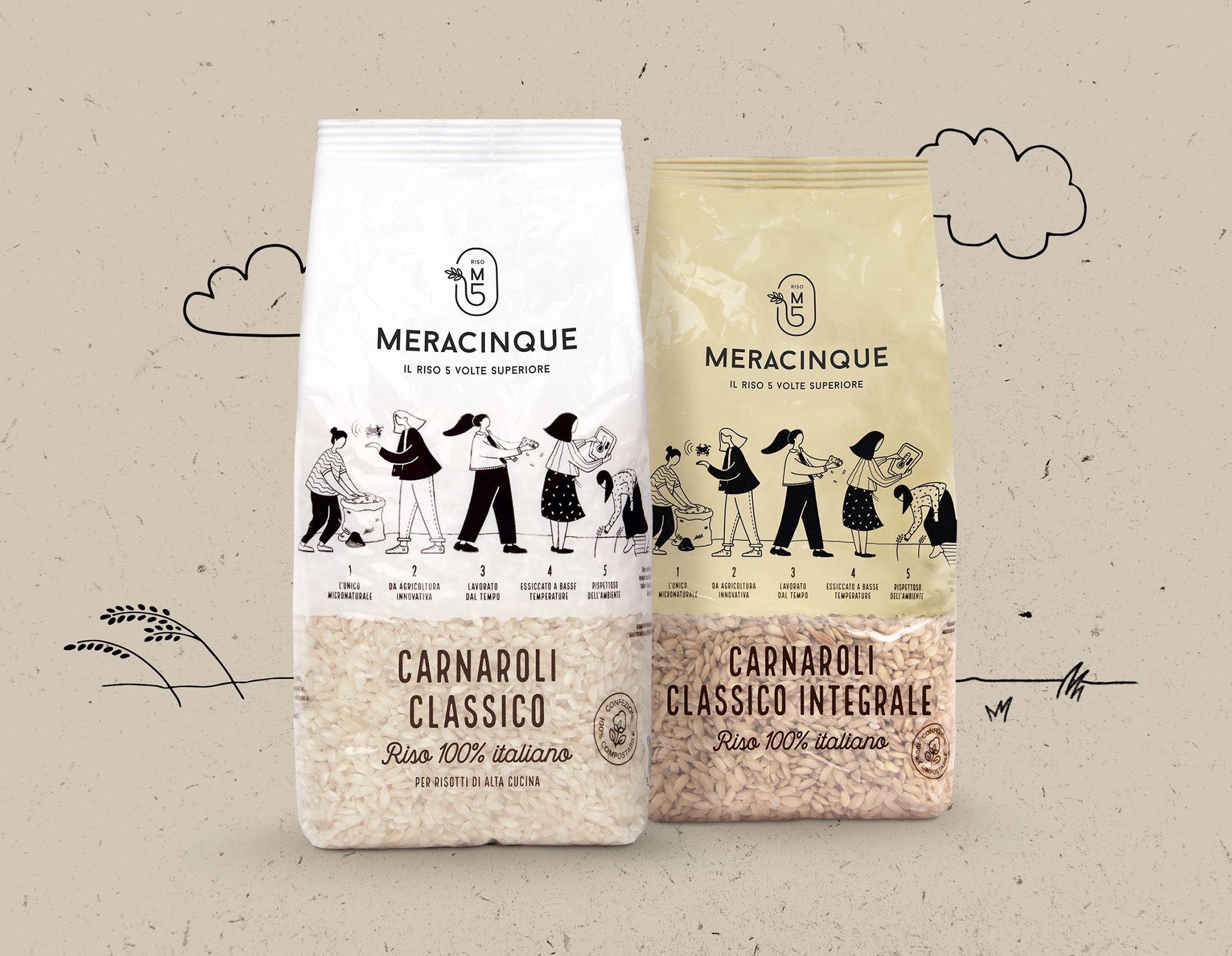
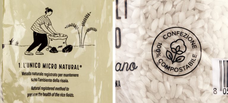
CBA designed a label to be integrated into the packaging that would transmit the family’s green commitment. Meracinque invests in 100% compostable packaging thanks to the use of an innovative material that decomposes within 90 days if composted with organic waste, leaving no trace of microplastic.
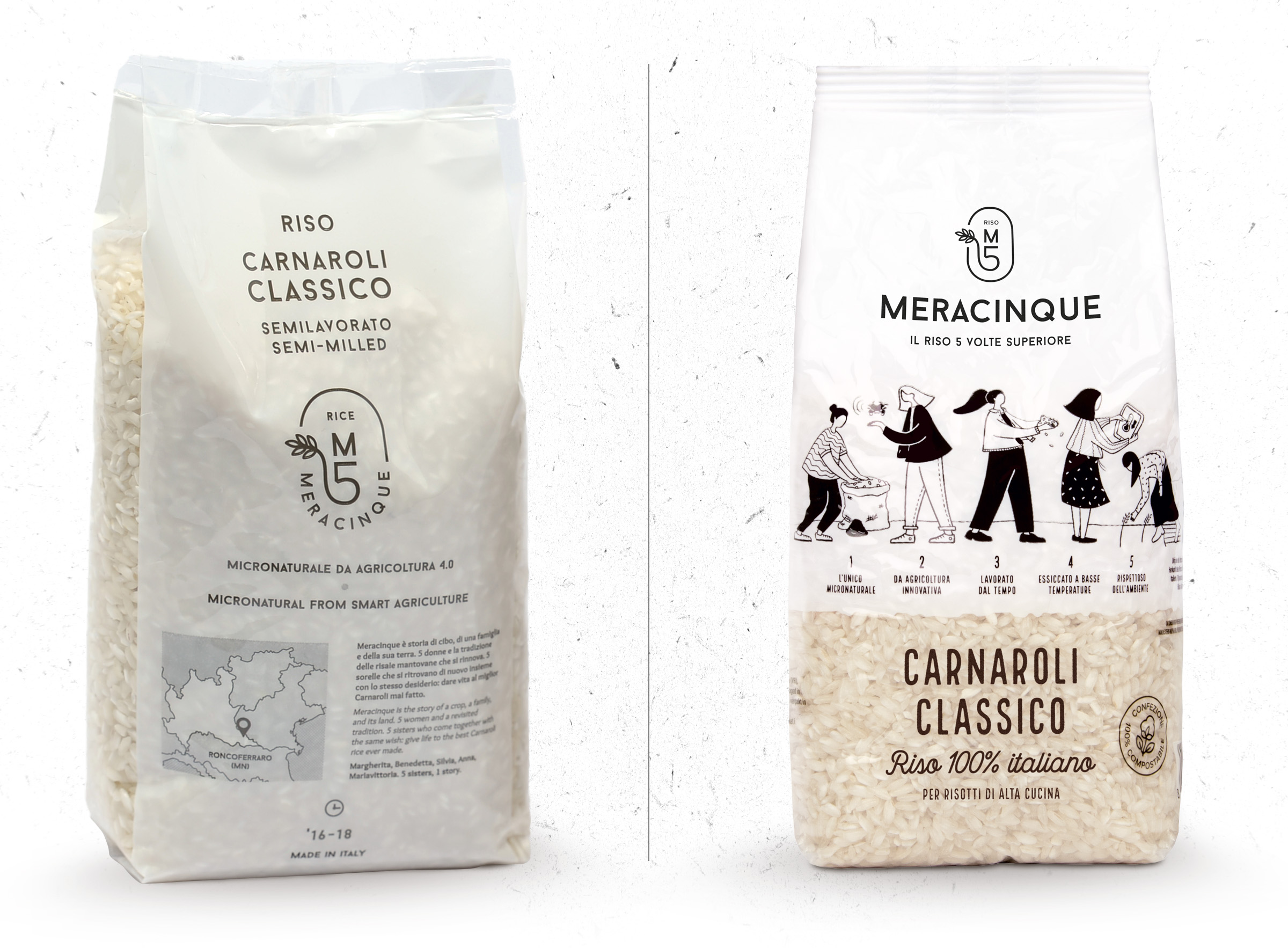
The previous logo has been slightly revisited with the aim of giving greater visibility to the name so as to communicate more effectively with the end consume
The packaging, before and after
The language developed is not limited to the packaging but extends coherently across all other touchpoints. The buyer presentation leaflet, which simulates a map, was designed to accompany the reader as they discover the brand’s story and unique product, opening after opening.
Meracinque is a family-run company started in the province of Mantua in 2017. It specialises in the development and production of Riso Carnaroli Classico. It stands out from its competitors thanks to the production method used which relies on innovative technologies in the name of sustainable agriculture for the future.
