To forge an exciting connection with a new consumer target, Forty Creek Distillery partnered with Niagara’s premier craft brewery Bench Brewing Company, to create a limited-edition batch of whisky secondary aged in beer-washed White Oak Barrels.
The result is a unique whisky flavor of spice, hops, and an appealing bitterness paired with a citrus and mint aroma. The packaging for this special offering would need to reflect its uniqueness of collaboration and flavor.


Crafted
Packaging
Aided by a jug-shaped bottle structure, CBA USA created an identity and packaging design that leverages cues from the world of craft beer to signal the product’s distinction from other Canadian whiskies.
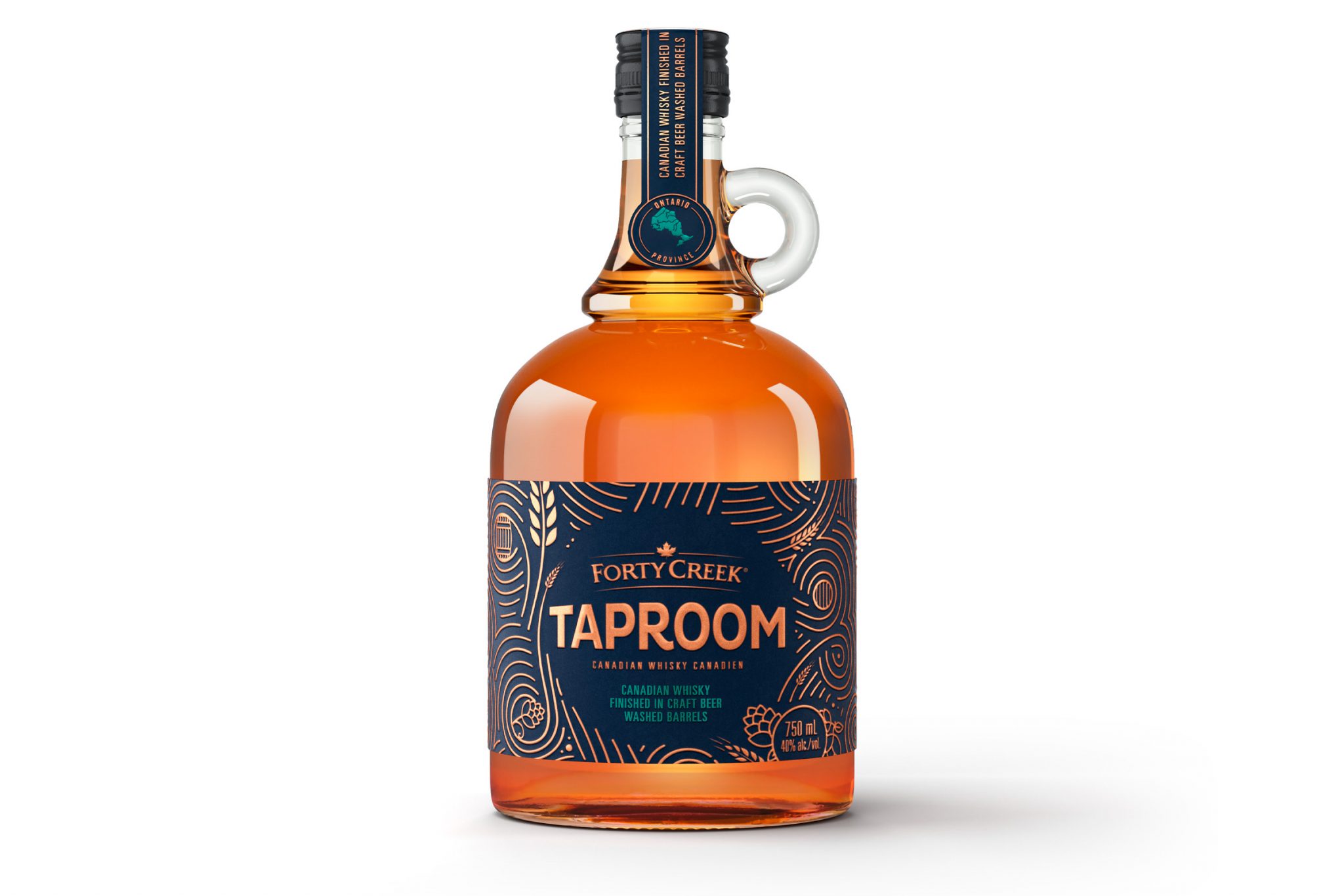
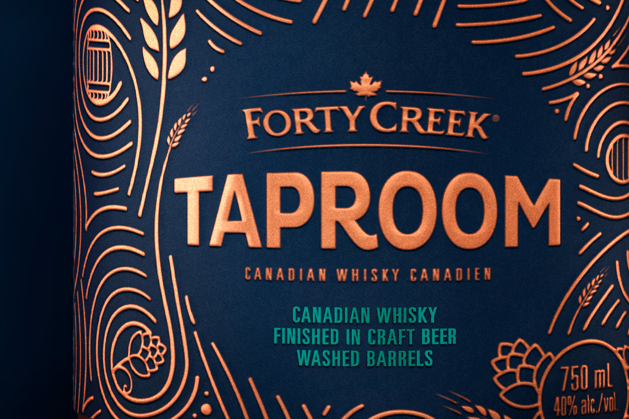
The wordmark typeface was designed to feel approachable yet modern, while embossing and metallic finishes reinforce the quality and sophistication of the product inside.
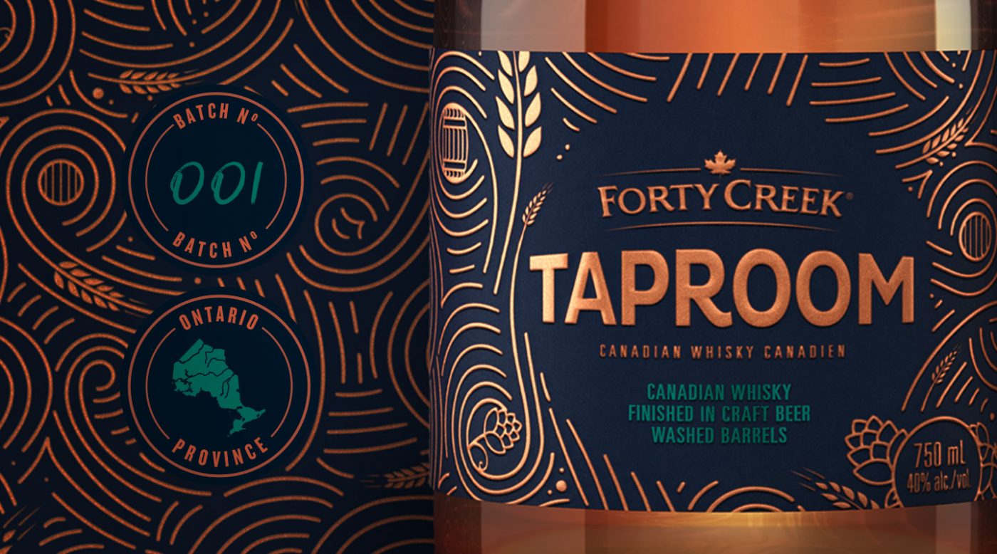
An intricate pattern incorporating line illustrations of hops, grains and barrels serves as a tapestry that tells the Taproom story in a unique and discoverable way.
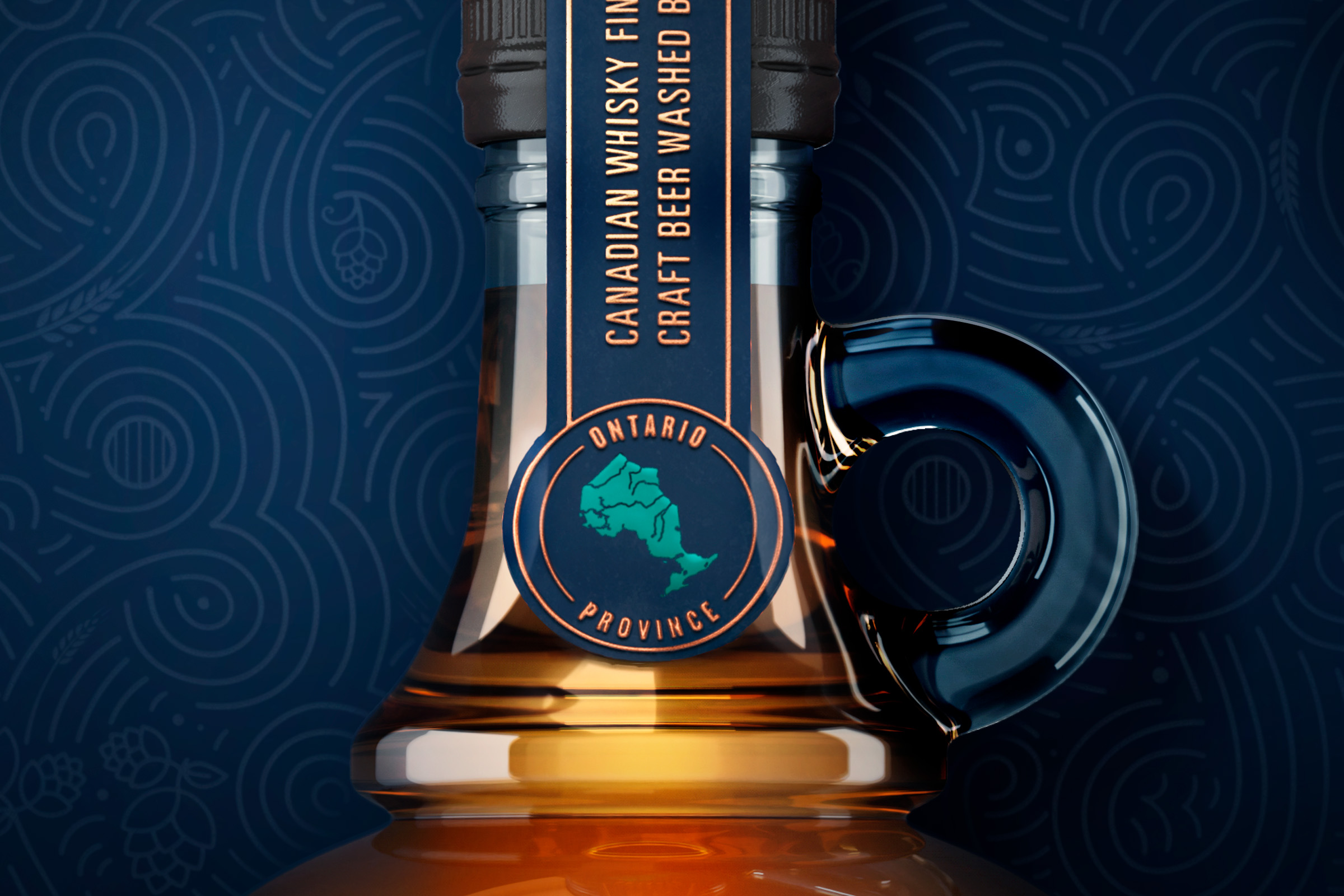
Since Taproom and its makers are proudly Canadian, a seal emblazoned with a metallic teal map of Ontario Province proclaims its heritage. It is affixed to the bottle with a Prohibition-style strip label, designed to highlight key messaging.
Each visual asset contributes to an overall packaging design that supports the unique positioning of this remarkable product. We’ll raise a glass to that!

Forty Creek Distillery is part of Campari Group, a major player in the global spirits industry, with a portfolio of over 50 premium and super premium brands.
