Hope is a powerful feeling - energizing, optimistic and exuding positive potential.
Colorado based Hummus creator, Hope Foods, uses fresh, organic and/or non-GMO ingredients in all its plant-based dips and spreads. Hope is a brand that fosters joy and wellbeing of the body, mind and planet.
CBA was honored to partner with the Hope Foods team to develop a visual identity for the brand that brings to life their inspiring ambition to “Spread Good Things.”

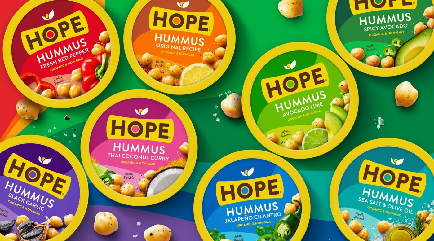
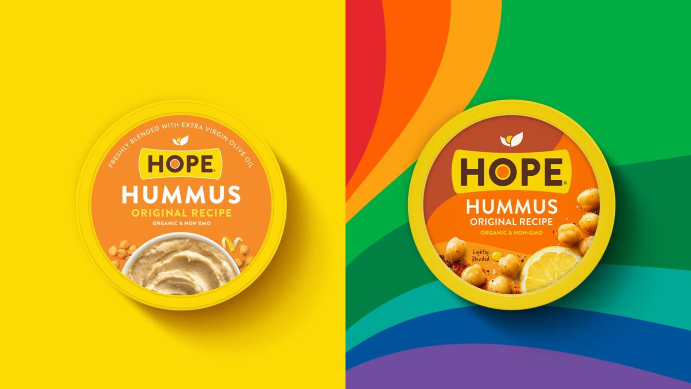
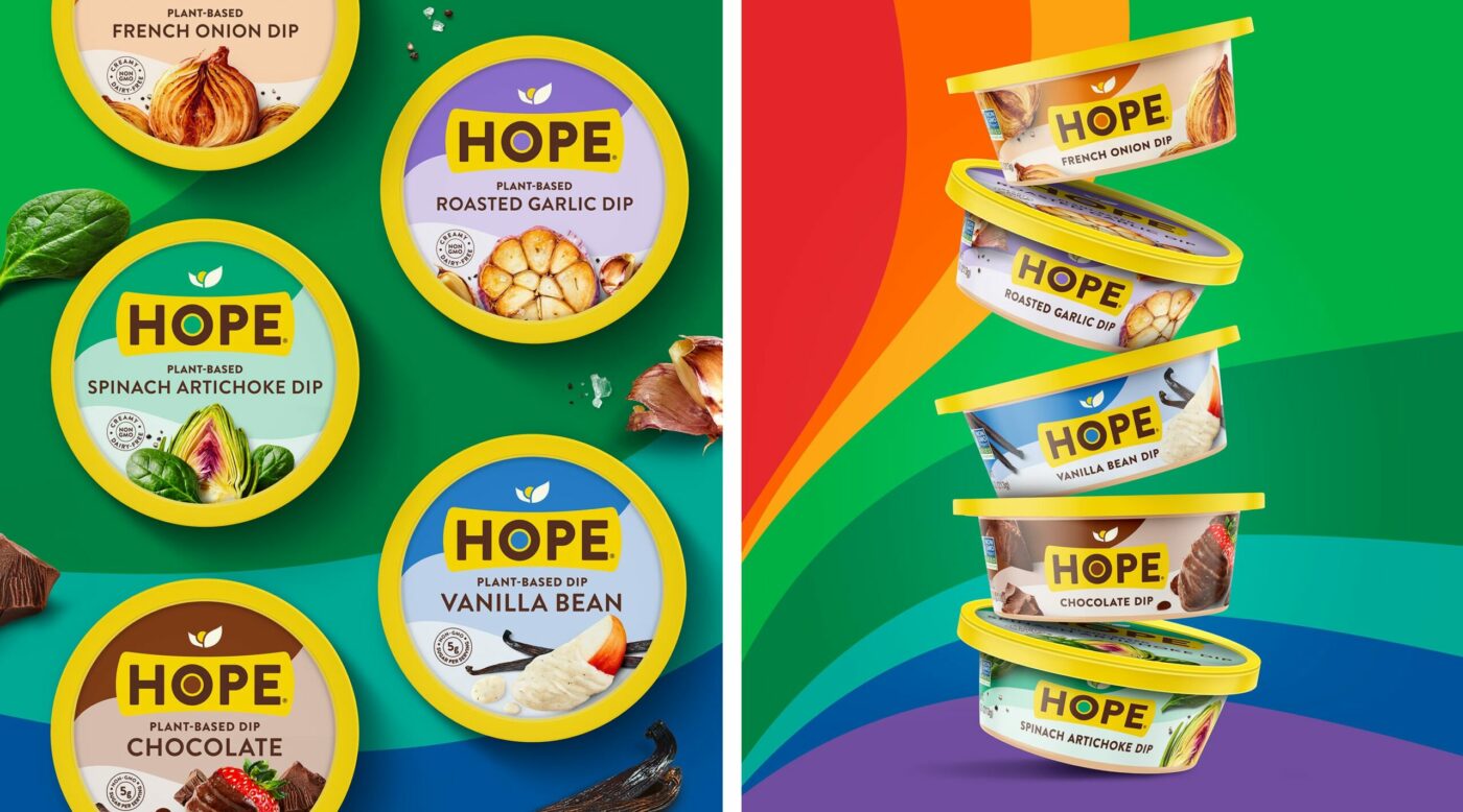
Hope is a powerful feeling – energizing, optimistic and exuding positive potential. The re-design evokes this emotion by making each pack a small part of the greater brand rainbow. Framed by the disruptive yellow, it forms a strong brand block on the shelf. It is designed to stand out and avoid clichés, elevating flavor imagery over product depiction.

Because the ingredients are at the core of the brand promise, we have placed them center stage to complete the story with sensorial impact and pride.


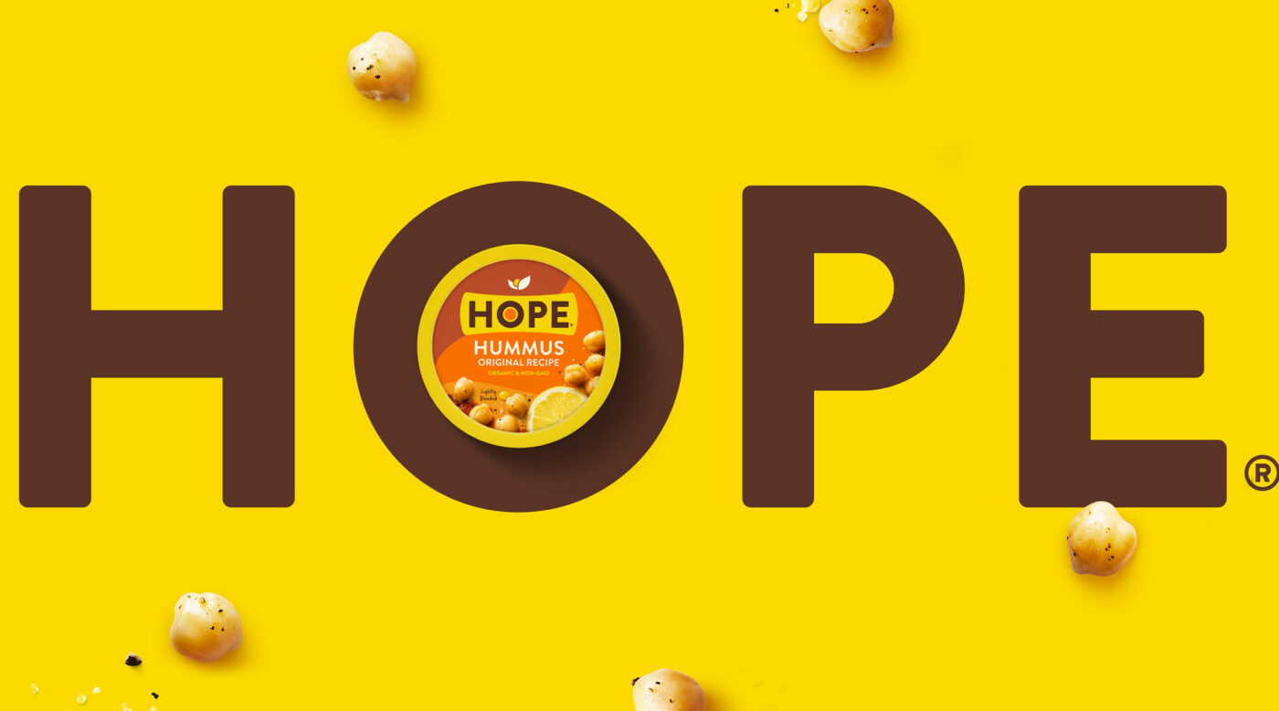
While maintaining the brand’s recognizability, it now also captures the energy of the optimistic and kind-spirited people running it. The newly created Hope brand hedonics now allow for the brand message to be communicated successfully in a multi-channel world.

